사용 이유
style부분과 구현부분을 나누어 가독성이 향상됩니다.
설치
# with npm
npm install styled-components

# with yarn
yarn add styled-components
시작
styled-components를 불러옵니다.- PascalCase 네이밍 변수를 만듭니다.
- 불러온
styled에 HTML 태그를 체이닝합니다. - 백틱(`)을 사용하여 CSS 속성을 입력합니다.
import styled from "styled-components";

function App() {
  const Wrapper = styled.div`
    display: flex;
  `;

  const BoxOne = styled.div`
    background-color: teal;
    width: 100px;
    height: 100px;
  `;

  const BoxTwo = styled.div`
    background-color: tomato;
    width: 100px;
    height: 100px;
  `;

  const Text = styled.span`
    color: white;
  `;

  return (
    <Wrapper>
      <BoxOne>
        <Text>Hello</Text>
      </BoxOne>
      <BoxTwo />
    </Wrapper>
  );
}

export default App;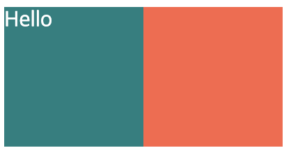
재사용
styled-components는 props를 사용하여 재사용할 수 있습니다.
재사용된 컴포넌트는 각각 다른 class를 부여 받게 됩니다.
import styled from "styled-components";

function App() {
  const Wrapper = styled.div`
    display: flex;
  `;

  // background-color를 동적으로 사용
  const Box = styled.div`
    background-color: ${(props) => props.bgColor};
    width: 100px;
    height: 100px;
  `;

  return (
    <Wrapper>
      <Box bgColor="teal" />
      <Box bgColor="tomato" />
    </Wrapper>
  );
}

export default App;
확장(extend)
기존 컴포넌트의 속성에 새로운 것들을 더한 컴포넌트를 만들 수 있습니다.
불러온 styled에 HTML 태그를 체이닝하지 않고 소괄호(())를 사용하여 상속할 컴포넌트를 입력합니다.
import styled from "styled-components";

function App() {
  const Wrapper = styled.div`
    display: flex;
  `;

  const Box = styled.div`
    background-color: ${(props) => props.bgColor};
    width: 100px;
    height: 100px;
  `;

  // Box 컴포넌트의 속성에 Circle에서 작성한 속성을 확장하여 Circle 컴포넌트 구성
  const Circle = styled(Box)`
    border-radius: 50px;
  `;

  return (
    <Wrapper>
      <Box bgColor="teal" />
      <Circle bgColor="tomato" />
    </Wrapper>
  );
}

export default App;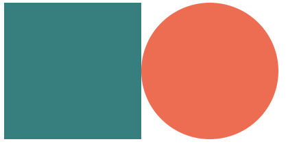
태그를 동적으로 교체(as)
as props를 사용해서 요소를 동적으로 교체 할 수 있습니다.
import styled from "styled-components";

function App() {
  const Wrapper = styled.div`
    display: flex;
  `;

  const Btn = styled.button`
    color: white;
    background-color: tomato;
    border: 0;
    border-radius: 15px;
  `;

  // `Btn` 컴포넌트의 속성은 그대로 가져가지만, `button` 태그를 `a` 태그로 바꿔서 사용
  return (
    <Wrapper>
      <Btn as="a" href="/">
        Log in
      </Btn>
    </Wrapper>
  );
}

export default App;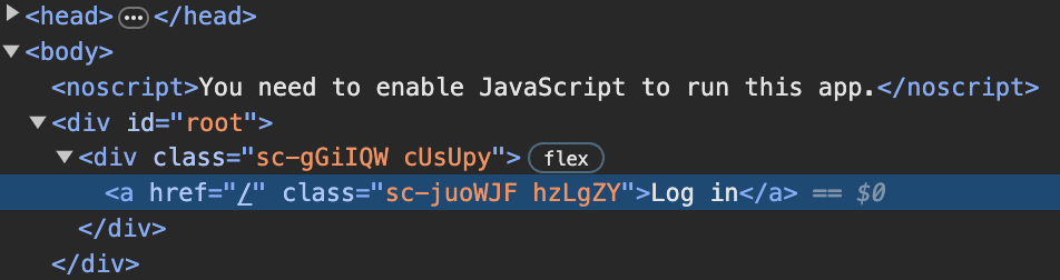
속성 추가
attrs 메서드로 컴포넌트에 속성을 추가할 수 있습니다.
한 번의 추가로 모든 컴포넌트에 적용할 수 있습니다.
import styled from "styled-components";

function App() {
  const Wrapper = styled.div`
    display: flex;
  `;

  // Input 컴포넌트 모두에 required 속성 추가
  const Input = styled.input.attrs({ required: true })`
    background-color: tomato;
  `;

  return (
    <Wrapper>
      <Input />
      <Input />
      <Input />
    </Wrapper>
  );
}

export default App;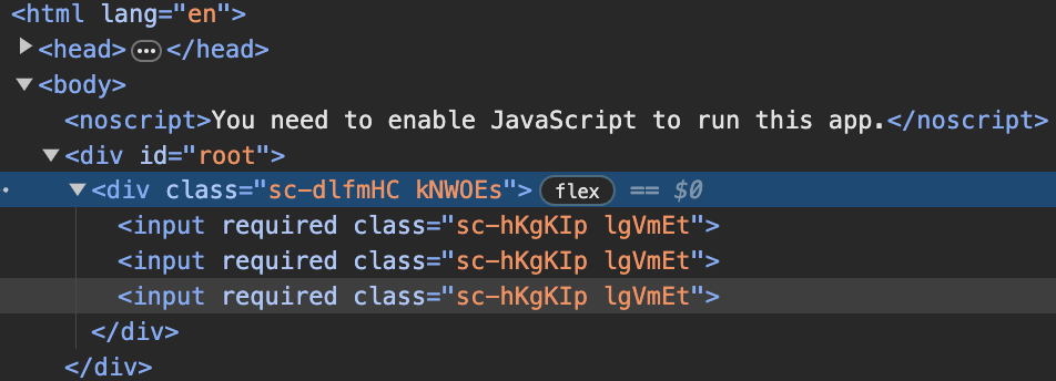
Animations
keyframes
styled-components에서 keyframes를 사용하면 CSS 애니메이션을 생성할 수 있습니다.
keyframes 함수는 특정한 CSS 애니메이션을 정의하고, 그것을 styled-components의 keyframes 유틸리티를 사용하여 사용할 수 있게 도와줍니다.
// `styled-components`에서 `keyframes`을 불러오기
import styled, { keyframes } from "styled-components";

function App() {
  const Wrapper = styled.div`
    display: flex;
  `;

  // `keyframes`을 사용하여 적용할 Animation을 작성하여 변수에 초기화
  const rotationAnimation = keyframes`
    from {
      transform: rotate(0deg);
      border-radius: 0px;
    } to {
      transform: rotate(360deg);
      border-radius:100px;
    }
  `;

  // `animation` 속성에 string interpolation으로 Animation을 작성한 변수를 사용
  const Box = styled.div`
    height: 200px;
    width: 200px;
    background-color: tomato;
    animation: ${rotationAnimation} 1s linear infinite;
  `;

  return (
    <Wrapper>
      <Box />
    </Wrapper>
  );
}

export default App;
아래와 같이 코드를 작성하면 원래대로 돌아오는 Animation을 만들 수 있습니다.
import styled, { keyframes } from "styled-components";

function App() {
  const Wrapper = styled.div`
    display: flex;
  `;

  const rotationAnimation = keyframes`
    0% {
      transform: rotate(0deg);
      border-radius: 0px;
    }
    50% {
      transform: rotate(360deg);
      border-radius:100px;
    }
    100% {
      transform: rotate(0deg);
      border-radius: 0px;
    }
  `;

  const Box = styled.div`
    height: 200px;
    width: 200px;
    background-color: tomato;
    animation: ${rotationAnimation} 1s linear infinite;
  `;

  return (
    <Wrapper>
      <Box />
    </Wrapper>
  );
}

export default App;
Selectors
컴포넌트 하위의 요소에 접근하여 스타일을 변경할 수 있습니다.
가상 선택자(ampersand)
가상 선택자에는 앰퍼샌드(&) 기호를 사용하여 적용할 수 있습니다.
& 기호는 & 기호가 사용된 컴포넌트에 대해 특별한 가상선택자를 사용하겠다고 선언하는 것입니다.
예시
Box 컴포넌트 하위의 span에 대해서 font-size, hover, active를 적용합니다.
import styled, { keyframes } from "styled-components";

function App() {
  const Wrapper = styled.div`
    display: flex;
  `;

  const rotationAnimation = keyframes`
    0% {
      transform: rotate(0deg);
      border-radius: 0px;
    }
    50% {
      transform: rotate(100deg);
    }
    100% {
      transform: rotate(360deg);
      border-radius: 0px;
    }
  `;

  // span의 &:hover과 &:active는 span:hover과 span:active와 동일
  const Box = styled.div`
    height: 200px;
    width: 200px;
    background-color: tomato;
    display: flex;
    justify-content: center;
    align-items: center;
    animation: ${rotationAnimation} 1s linear infinite;
    span {
      font-size: 36px;
	  &:hover {
		  font-size: 40px;
	  }
	  &:active {
	  	opacity: 0;
	  }
    }
  `;

  return (
    <Wrapper>
      <Box>
        <span>😀</span>
      </Box>
    </Wrapper>
  );
}

export default App;
접근할 하위의 요소를 컴포넌트화 하여 사용할 수도 있습니다.
import styled, { keyframes } from "styled-components";

const Wrapper = styled.div`
  display: flex;
  height: 100vh;
  width: 100vw;
  justify-content: center;
  align-items: center;
`;

const rotationAnimation = keyframes`
  0% {
    transform:rotate(0deg);
    border-radius:0px;
  }
  50% {
    border-radius:100px;
  }
  100%{
    transform:rotate(360deg);
    border-radius:0px;
  }
`;

const Emoji = styled.span`
  font-size: 36px;
`;

// 기존의 `span` 대신 `Emoji` 컴포넌트를 만들어서 사용
const Box = styled.div`
  height: 200px;
  width: 200px;
  background-color: tomato;
  display: flex;
  justify-content: center;
  align-items: center;
  animation: ${rotationAnimation} 1s linear infinite;
  ${Emoji}:hover {
    font-size: 98px;
  }
`;

function App() {
  return (
    <Wrapper>
      <Box>
        <Emoji>🤩</Emoji>
      </Box>
      <Emoji>🔥</Emoji>
    </Wrapper>
  );
}

export default App;
Themes
Theme은 모든 색상을 가지고 있는 object입니다.
// index.js

import React from "react";
import ReactDOM from "react-dom/client";
// `styled-components`에서 `ThemeProvider`를 가져오기
import { ThemeProvider } from "styled-components";
import App from "./App";

const darkTheme = {
  textColor: "whitesmoke",
  backgroundColor: "#111",
};

const lightTheme = {
  textColor: "#111",
  backgroundColor: "whitesmoke",
};

const root = ReactDOM.createRoot(document.getElementById("root"));
root.render(
  <React.StrictMode>
    // 사용할 색상 `Theme object`를 `theme props`로 사용
    <ThemeProvider theme={darkTheme}>
      // `ThemeProvider`를 `App`컴포넌트의 상위 컴포넌트로 사용
      // App 컴포넌트에 darkTheme 전달
      <App />
    </ThemeProvider>
  </React.StrictMode>
);
// App.js
import styled, { keyframes } from "styled-components";
// `theme props`로 사용
// color는 darkTheme의 textColor인 whitesmoke 적용
const Title = styled.h1`
color: ${(props) => props.theme.textColor};
`;
// background-color는 darkTheme의 backgroundColor인 #111 적용
const Wrapper = styled.div`
display: flex;
height: 100vh;
width: 100vw;
justify-content: center;
align-items: center;
background-color: ${(props) => props.theme.backgroundColor};
`;
function App() {
return (
<Wrapper>
<Title>Hello</Title>
</Wrapper>
);
}
export default App;
미디어 쿼리
미디어 쿼리는 적용하고 싶은 컴포넌트에서 @media로 사용할 수 있습니다.
import styled from 'styled-components';
const Button = styled.button`
width: 100%;
font: inherit;
padding: 0.5rem 1.5rem;
border: 1px solid #8b005d;
color: white;
background: #8b005d;
box-shadow: 0 0 4px rgba(0, 0, 0, 0.26);
cursor: pointer;
@media (min-width: 768px) {
width: auto;
}
&:focus {
outline: none;
}
&:hover,
&:active {
background: #ac0e77;
border-color: #ac0e77;
box-shadow: 0 0 8px rgba(0, 0, 0, 0.26);
}
`;
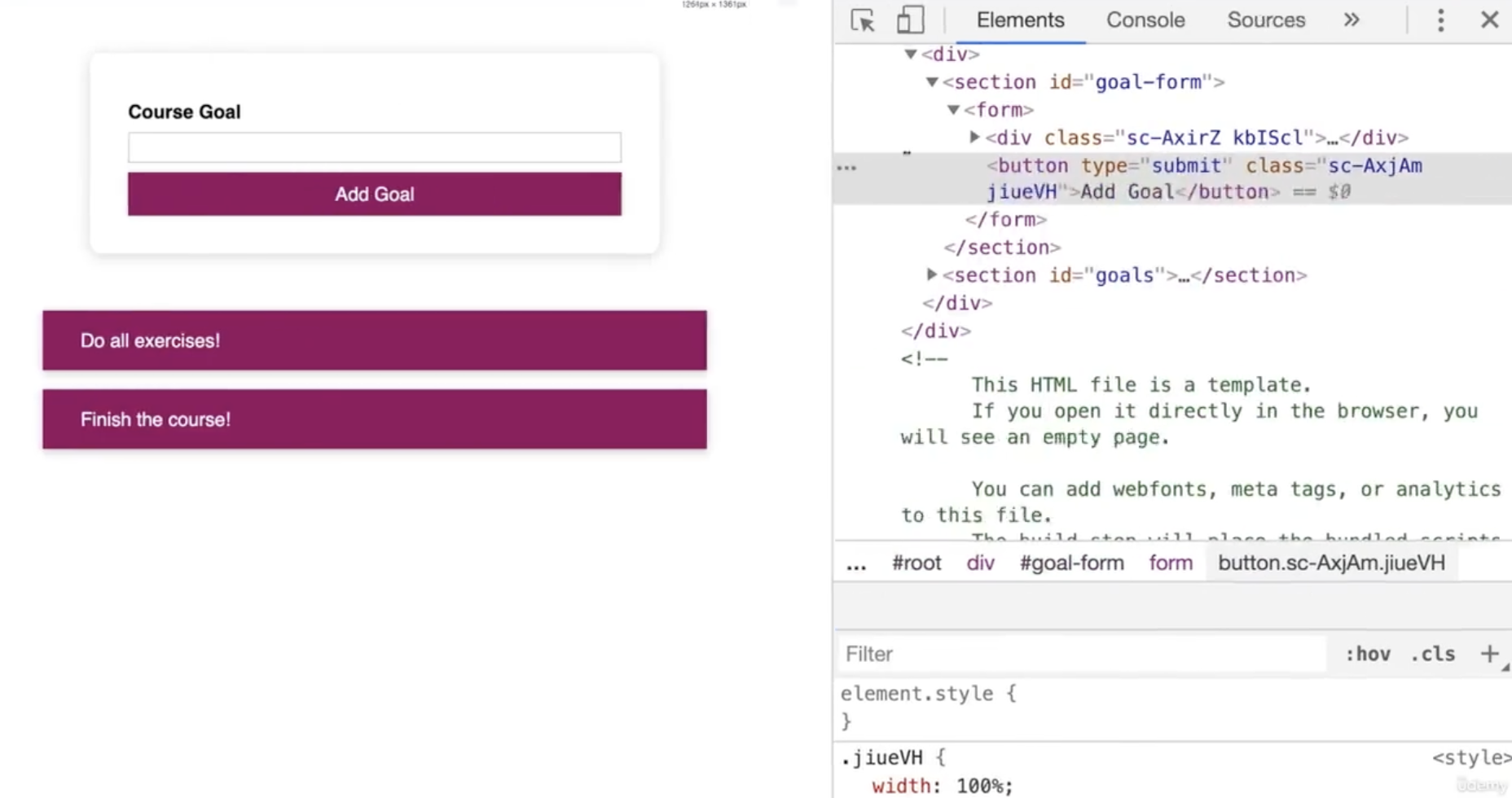
export default Button;화면 너비가 768px 이상일 때
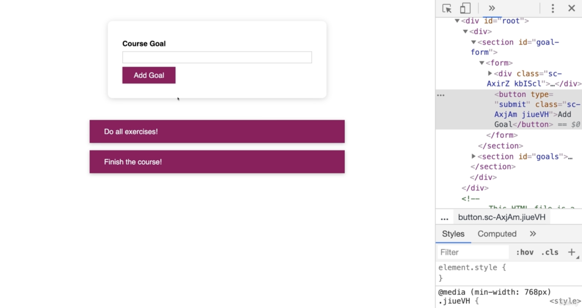
화면 너비가 768px 미만일 때
createGlobalStyle
전역 스타일을 처리하는 특수 Styled Component를 생성하는 helper 함수입니다.
Reset CSS 적용
import { createGlobalStyle } from "styled-components";
import Router from "./Router";

const GlobalStyle = createGlobalStyle`
html, body, div, span, applet, object, iframe,
h1, h2, h3, h4, h5, h6, p, blockquote, pre,
a, abbr, acronym, address, big, cite, code,
del, dfn, em, img, ins, kbd, q, s, samp,
small, strike, strong, sub, sup, tt, var,
b, u, i, center,
dl, dt, dd, menu, ol, ul, li,
fieldset, form, label, legend,
table, caption, tbody, tfoot, thead, tr, th, td,
article, aside, canvas, details, embed,
figure, figcaption, footer, header, hgroup,
main, menu, nav, output, ruby, section, summary,
time, mark, audio, video {
  margin: 0;
  padding: 0;
  border: 0;
  font-size: 100%;
  font: inherit;
  vertical-align: baseline;
}
/* HTML5 display-role reset for older browsers */
article, aside, details, figcaption, figure,
footer, header, hgroup, main, menu, nav, section {
  display: block;
}
/* HTML5 hidden-attribute fix for newer browsers */
*[hidden] {
    display: none;
}
body {
  line-height: 1;
}
menu, ol, ul {
  list-style: none;
}
blockquote, q {
  quotes: none;
}
blockquote:before, blockquote:after,
q:before, q:after {
  content: '';
  content: none;
}
table {
  border-collapse: collapse;
  border-spacing: 0;
}
* {
  box-sizing: border-box;
}
body {

}
a {
  text-decoration: none;
  color: inherit;
}
`;

function App() {
  return (
    <>
      <GlobalStyle />
      <Router />
    </>
  );
}

export default App;
출처:
styled-components
노마드 코더 Nomad Coders
React 완벽 가이드 with Redux, Next.js, TypeScript