📌반응형 웹
💡미디어 쿼리
미디어 쿼리란 사이트에 접속하는 미디어 타입과 특징, 해상도에 따라 다른 스타일 속성을 적용할 수 있게 하는 기술이다. 미디어 쿼리의 기본 문법은 다음과 같다.
@media <not|only> <media type> and (<media feature>) <and|or|not> (<media feature>) {
/* css 코드; */
}
📖not/only
- not : 뒤에 오는 모든 조건을 부정한다.
- only : 미디어 쿼리를 지원하는 기기만 지원한다.
📖media type
미디어 타입은 미디어 쿼리가 적용될 미디어 타입을 말한다.
- all : 모든 기기
- print : 인쇄 장치(ex.프린터기)
- screen : 컴퓨터 화면 장치 또는 스마트 기기
- speech : 스크린 리더기 같은 보조 프로그램으로 웹 페이지를 소리 내어 읽어주는 장치
📖media feature
media feature는 미디어 쿼리가 적용될 미디어 조건이다.
- min-width : 미디어 쿼리가 적용될 최소 너비
- max-width : 미디어 쿼리가 적용될 최대 너비
- orientation portrait : 세로 모드, 뷰포트의 세로 높이가 가로 너비보다 큰 경우
- orientation landscape : 가로 모드, 뷰포트의 가로 너비가 세로 높이보다 큰 경우
💬뷰포트란 웹 페이지가 접속한 기기에서 보이는 실제 영역의 크기를 말한다.
🔥연습하기!
<!DOCTYPE html>
<html lang="en">
<head>
<meta charset="UTF-8">
<meta http-equiv="X-UA-Compatible" content="IE=edge">
<meta name="viewport" content="width=device-width, initial-scale=1.0">
<title>Document</title>
<style>
*{
margin: 0;
padding: 0;
box-sizing: border-box;
}
.container{
width: 700px;
background-color: black;
margin: 0 auto;
}
.header{
width: 100%;
height: 100px;
background-color: darkgreen;
}
.aside{
float: left;
width: 30%;
height: 600px;
background-color: darkseagreen;
}
.item1, .item2, .item3 {
float: left;
width: 70%;
height: 200px;
}
.item1{
background-color: darkcyan;
}
.item2{
background-color: darkolivegreen;
}
.item3{
background-color: darkslateblue;
}
.footer{
clear:both;
height: 200px;
background-color: green;
}
@media screen and (max-width:700px) {
.container{
width:100%;
}
}
@media screen and (max-width:550px) {
.aside{
height: 200px;
width: 100%;
}
.item1, .item2 {
width: 33.3%;
}
.item3{
width: 33.4%;
}
}
@media screen and (max-width:400px){
.item1, .item2, .item3 {
width: 100%;
}
}
</style>
</head>
<body>
<div class="container">
<div class="header"></div>
<div class="aside"></div>
<div class="item1"></div>
<div class="item2"></div>
<div class="item3"></div>
<div class="footer"></div>
</div>
</body>
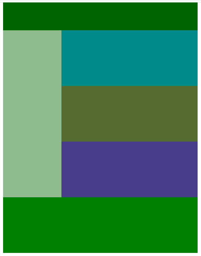
</html>🔽width 700px
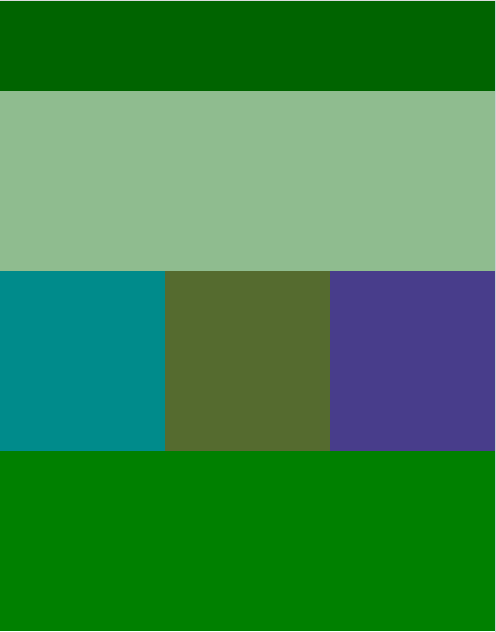
🔽width 550px
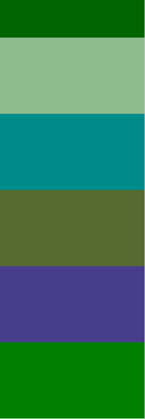
🔽 width 400px
Have a good day ⌯’▾’⌯