Sass
(Syntactically Awesome Style Sheets)
문법적으로 매우 멋진 스타일시트
CSS 전처리기로 복잡한 작업을 쉽게 할 수 있도록 해 주고, 스타일 코드의 재활용성을 높여 줄 뿐만 아니라 코드의 가독성을 높여서 유지 보수를 더욱 쉽게 해준다.
Sass에서는 두 가지 확장자 .scss와 .sass를 지원한다. 이 두가지의 문법은 꽤 다르다. 아래 코드를 살펴 보자
- .sass
$font-stack: Helvetica, sans-serif
$primary-color: #333

body
  font: 100% $font-stack
  color: $primary-color
- .scss
$font-stack: Helvetica, sans-serif;
$primary-color: #333;

body {
  font: 100% $font-stack;
  color: $primary-color:
npm install node-sass 설치해보자!
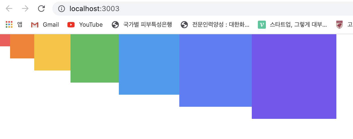
- SassComponent.js
import React from 'react';
import './SassComponent.scss';

const SassComponent = () => {
  return (
    <div className='SassComponent'>
      <div className='box red' />
      <div className='box orange' />
      <div className='box yellow' />
      <div className='box green' />
      <div className='box blue' />
      <div className='box indigo' />
      <div className='box violet' />
    </div>
  );
};

export default SassComponent;
- SassComponent.sass
// 변수 사용하기
$red: #fa5252;
$orange: #fd7e14;
$yellow: #fcc419;
$green: #40c057;
$blue: #339af0;
$indigo: #5c7cfa;
$violet: #7950f2;

// 믹스인 만들기 - 재사용되는 스타일 블록을 '함수처럼' 사용할 수 있다.
@mixin square($size) {
  $calculated: 32px * $size;
  width: $calculated;
  height: $calculated;
}

.SassComponent {
  display: flex;
  .box {
    background: red;
    cursor: pointer;
    transition: all 0.3s ease-in;
    &.red {
      // .red 클래스가 .box 와 함께 사용할 때
      background: $red;
      @include square(1);
    }
    &.orange {
      background: $orange;
      @include square(2);
    }
    &.yellow {
      background: $yellow;
      @include square(3);
    }
    &.green {
      background: $green;
      @include square(4);
    }
    &.blue {
      background: $blue;
      @include square(5);
    }
    &.indigo {
      background: $indigo;
      @include square(6);
    }
    &.violet {
      background: $violet;
      @include square(7);
    }
    &:hover {
      background: black;
    }
  }
}
utils 함수 분리하기
여러 파일에서 사용될 수 있는 Sass 변수 및 믹스인은 다른 파일로 따로 분리하여 작성한 뒤 필요한 곳에서 쉽게 불러와 사용할 수 있다.
src 디렉터리는 styles 라는 디렉터리를 생성하고, 그 안에
utils.scss 파일을 생성하자
- utils.scss
// 변수 사용하기
$red: #fa5252;
$orange: #fd7e14;
$yellow: #fcc419;
$green: #40c057;
$blue: #339af0;
$indigo: #5c7cfa;
$violet: #7950f2;

// 믹스인 만들기 - 재사용되는 스타일 블록을 '함수처럼' 사용할 수 있다.
@mixin square($size) {
  $calculated: 32px * $size;
  width: $calculated;
  height: $calculated;
}
- SassComponent.scss
@import './styles/utils.scss';

.SassComponent {
  display: flex;
  .box {
    background: red;
    cursor: pointer;
    transition: all 0.3s ease-in;
    &.red {
      // .red 클래스가 .box 와 함께 사용할 때
      background: $red;
      @include square(1);
    }
    &.orange {
      background: $orange;
      @include square(2);
    }
    &.yellow {
      background: $yellow;
      @include square(3);
    }
    &.green {
      background: $green;
      @include square(4);
    }
    &.blue {
      background: $blue;
      @include square(5);
    }
    &.indigo {
      background: $indigo;
      @include square(6);
    }
    &.violet {
      background: $violet;
      @include square(7);
    }
    &:hover {
      background: black;
    }
  }
}
