
캐러셀 슬라이드는 Y축을 기준으로 아이템들을 일정각도로 회전시킨후, 원의 반지름만큼 Z축으로 이동(translateZ)하여 배치하는 방식이다
일단 HTML,CSS 기본적인 세팅을 다음과 같이 작성하였다
<div class="scene">
  <div class="carousel">
    <div class="item">1</div>
    <div class="item">2</div>
    <div class="item">3</div>
    <div class="item">4</div>
    <div class="item">5</div>
    <div class="item">6</div>
    <div class="item">7</div>
    <div class="item">8</div>
    <div class="item">9</div>
  </div>
</div>

<style>
  * {
    padding: 0;
    margin: 0;
    box-sizing: border-box;
  }
  .item {
    width: 200px;
    height: 150px;
    display: flex;
    align-items: center;
    justify-content: center;
    border: 1px solid black;
    color: #fff;
    font-size: 32px;
    font-weight: 600;
  }

  .item:nth-child(1){ background-color: #ff7979;}
  .item:nth-child(2){ background-color: #ffbe76;}
  .item:nth-child(3){ background-color: #f0932b;}
  .item:nth-child(4){ background-color: #7ed6df;}
  .item:nth-child(5){ background-color: #e056fd;}
  .item:nth-child(6){ background-color: #22a6b3;}
  .item:nth-child(7){ background-color: #be2edd;}
  .item:nth-child(8){ background-color: #4834d4;}
  .item:nth-child(9){ background-color: #30336b;}
</style>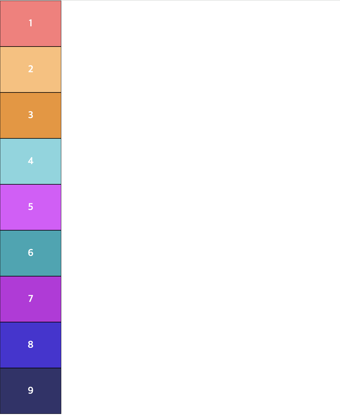
이제 현재 공간을 2D에서 3D로 변환시켜보자. 이를 위해 화면에는 원근감을 줘야한다. 원근감을 주기 위해 item 요소의 부모인 scene 태그에 perspective 속성을 줘야한다
.scene {
	perspective: 1000px
}
2D가 아니라 z축이 개입된 3D 환경이기 때문에 1부터 9까지 카드를 수직, 수평 모두 가운데 정렬 속성을 주어 포개듯이 위치를 겹쳐야한다. 다음을 적용한 CSS 코드를 보자
.item {
  position: absolute;
  top: 0;
  left: 0;
  width: 200px;
  height: 150px;
  display: flex;
  align-items: center;
  justify-content: center;
  border: 1px solid black;
  color: #fff;
  font-size: 32px;
  font-weight: 600;
}

.scene {
  height: 100vh;
  display: flex;
  justify-content: center;
  align-items: center;
  perspective: 1000px;
}
.carousel{
  width: 200px;
  height: 150px;
  position: relative;
	transform-style : preserve-3d;
}
다음이 한쪽에 포개어 위치하기 때문에 정구각형 모양을 만들어 3D 느낌을 줄려고 한다. 정구각형 형태로 나타내기 위해서는 Y축에 40(360/9)만큼의 각도를 부여해주면 된다
.item:nth-child(1){ background-color: #ff7979; transform: rotateY(0deg);}
.item:nth-child(2){ background-color: #ffbe76; transform: rotateY(40deg);}
.item:nth-child(3){ background-color: #f0932b; transform: rotateY(80deg);}
.item:nth-child(4){ background-color: #7ed6df; transform: rotateY(120deg);}
.item:nth-child(5){ background-color: #e056fd; transform: rotateY(160deg);}
.item:nth-child(6){ background-color: #22a6b3; transform: rotateY(200deg);}
.item:nth-child(7){ background-color: #be2edd; transform: rotateY(240deg);}
.item:nth-child(8){ background-color: #4834d4; transform: rotateY(280deg);}
.item:nth-child(9){ background-color: #30336b; transform: rotateY(320deg);}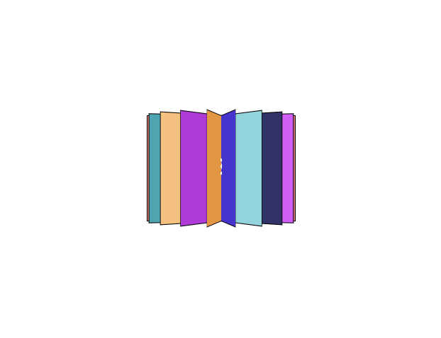
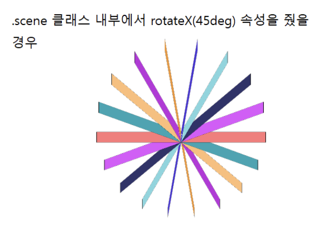
첫번째 그림은 단순히 위 코드를 실행하였을 경우 그림이고, 두번째 그림은 어떻게 배치가 됬는지 알기 위해 x축 방향으로 85도 만큼 각도를 준 그림이다
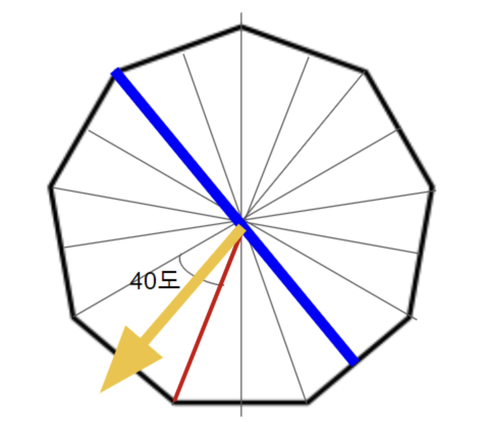
x축으로 회전해서 본 모형을 보면 가운데 꼭짓점을 중심으로 다음 위와 같은 사진과 같이 붙어있는 형태가 되어 있는 것을 알 수 있다. 따라서 원근법을 이용해서 파란색 선분이 있는 위치를 노란색 화살표 길이만큼 이동하여 정구각형 모서리를 210px만큼 만들어줘야한다. 노란색 선분 길이는 삼각함수를 사용하여 간단하게 구할 수 있다
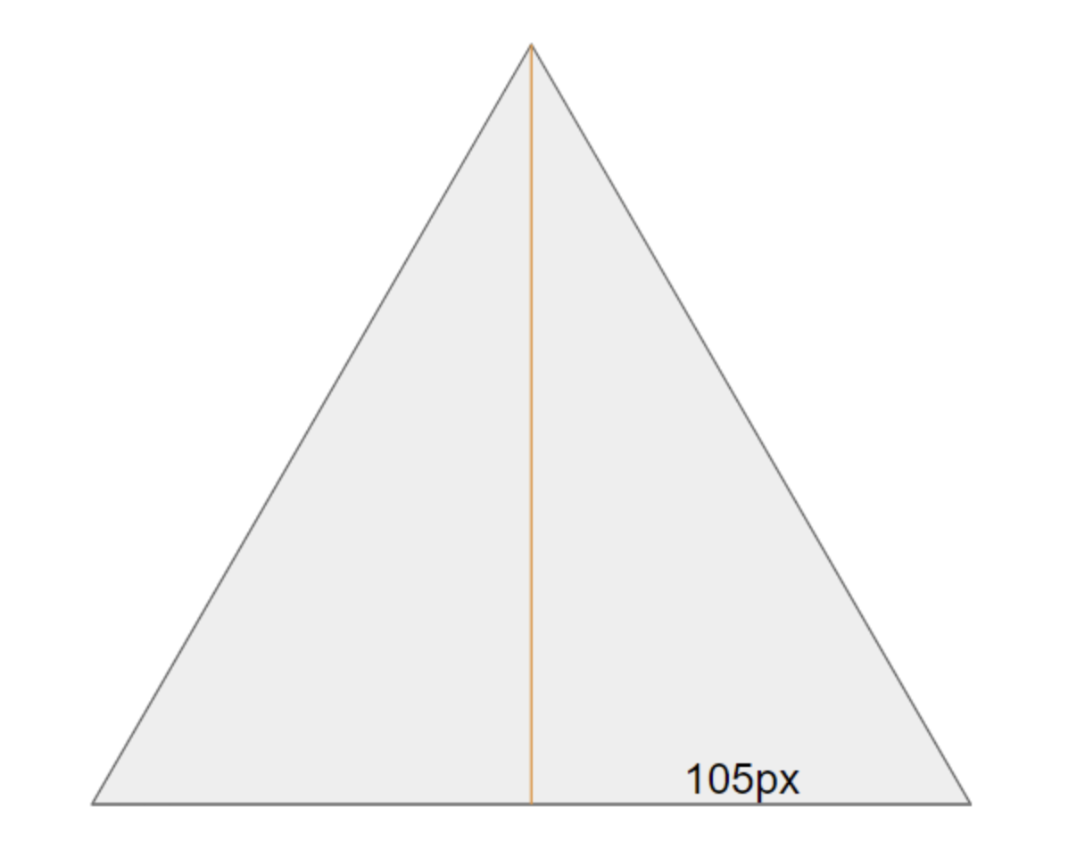
밑면의 길이가 210px이기 때문에, 반으로 나눈 105px임을 알 수 있다. 또, 삼각형의 각도는 40도 이지만, 반으로 나누면 20도가 되어 노란색 선분의 길이는 105/tan20인 288.485임을 알 수 있다
따라서 각 아이템 값에 translateZ(288px) 속성을 부여하면된다. 그리고 각 블록마다 간격을 주기 위해서 너비 값을 210px에서 200px으로 바꾸자
.item{
	width: 200px;
}

.item:nth-child(1){
  background-color: #ff7979;
  transform: rotateY(0deg) translateZ(288px);
}
.item:nth-child(2){
  background-color: #ffbe76;
  transform: rotateY(40deg) translateZ(288px);
}
.item:nth-child(3){
  background-color: #f0932b;
  transform: rotateY(80deg) translateZ(288px);
}
.item:nth-child(4){
  background-color: #7ed6df;
  transform: rotateY(120deg) translateZ(288px);
}
.item:nth-child(5){
  background-color: #e056fd;
  transform: rotateY(160deg) translateZ(288px);
}
.item:nth-child(6){
  background-color: #22a6b3;
  transform: rotateY(200deg) translateZ(288px);
}
.item:nth-child(7){
  background-color: #be2edd;
  transform: rotateY(240deg) translateZ(288px);
}
.item:nth-child(8){
  background-color: #4834d4;
  transform: rotateY(280deg) translateZ(288px);
}
.item:nth-child(9){
  background-color: #30336b;
  transform: rotateY(320deg) translateZ(288px);
}
이제 캐러셀 슬라이가 완성되었다
여기서 회전을 주기위해서는 y축 방향으로 40도씩 이동을 하면된다. 아니면 애니메이션 값을 주면 된다
.carousel{
  width: 210px;
  height: 150px;
  position: relative;
  transform-style : preserve-3d;
  animation: spin 5s infinite linear;
}
@keyframes spin {
  from {
    transform: rotateY(0deg);
  }
  to {
    transform: rotateY(360deg);
  }
}
전체 코드는 다음과 같다
<div class="scene">
  <div class="carousel">
    <div class="item">1</div>
    <div class="item">2</div>
    <div class="item">3</div>
    <div class="item">4</div>
    <div class="item">5</div>
    <div class="item">6</div>
    <div class="item">7</div>
    <div class="item">8</div>
    <div class="item">9</div>
  </div>
</div>

<style>
  * {
    padding: 0;
    margin: 0;
    box-sizing: border-box;
  }

  .scene {
    height: 100vh;
    display: flex;
    justify-content: center;
    align-items: center;
    perspective: 1000px;
  }
  .carousel{
    width: 210px;
    height: 150px;
    position: relative;
    transform-style : preserve-3d;
    animation: spin 5s infinite linear;
  }
  @keyframes spin {
    from {
      transform: rotateY(0deg);
    }
    to {
      transform: rotateY(360deg);
    }
  }

  .item {
    position: absolute;
    top: 0;
    left: 0;
    width: 200px;
    height: 150px;
    display: flex;
    align-items: center;
    justify-content: center;
    border: 1px solid black;
    color: #fff;
    font-size: 32px;
    font-weight: 600;
  }

  .item:nth-child(1){
    background-color: #ff7979;
    transform: rotateY(0deg) translateZ(288px);
  }
  .item:nth-child(2){
    background-color: #ffbe76;
    transform: rotateY(40deg) translateZ(288px);
  }
  .item:nth-child(3){
    background-color: #f0932b;
    transform: rotateY(80deg) translateZ(288px);
  }
  .item:nth-child(4){
    background-color: #7ed6df;
    transform: rotateY(120deg) translateZ(288px);
  }
  .item:nth-child(5){
    background-color: #e056fd;
    transform: rotateY(160deg) translateZ(288px);
  }
  .item:nth-child(6){
    background-color: #22a6b3;
    transform: rotateY(200deg) translateZ(288px);
  }
  .item:nth-child(7){
    background-color: #be2edd;
    transform: rotateY(240deg) translateZ(288px);
  }
  .item:nth-child(8){
    background-color: #4834d4;
    transform: rotateY(280deg) translateZ(288px);
  }
  .item:nth-child(9){
    background-color: #30336b;
    transform: rotateY(320deg) translateZ(288px);
  }
</style>- 부모 컨테이너: perspective를 적용 → 원근감 부여
- 캐러셀(.carousel) : transform-style: preserve-3d → 자식 요소의 3D 유지
- 아이템(.item) : rotateY로 각도 배치 + translateZ로 원형 배치