
HTML 요소를 원하는 위치에 배치하기 위해 사용하는 속성인 position에 대해 알아보자. 많은 경우 position 속성은 정확한 위치 지정을 위해서 top left bottom right 속성과 함께 사용된다
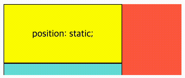
01 position : static
position 속성을 별도로 지정하지 않으면 기본값인 static 이 적용된다. static인 요소는 HTML에 작성된 순서 그대로 브라우저 화면에 표시된다
- 따라서
topleftbottomright속성 값은 무시된다 - static은 z-index가 적용되지 않는다
<main>
  <div>position: static;</div>
  <div>position: static;</div>
  <div>position: static;</div>
</main>

<style>
  main{
    width: 300px;
    height: 400px;
    background: tomato;
  }

  div{
    width: 200px;
    height: 100px;
    border: 1px solid;
    background: yellow;
    text-align: center;
    line-height: 100px;
    box-sizing: border-box;
  }

  div:nth-of-type(2){
    position: static;
    background: cyan;
    opacity: 0.8;
  }
</style>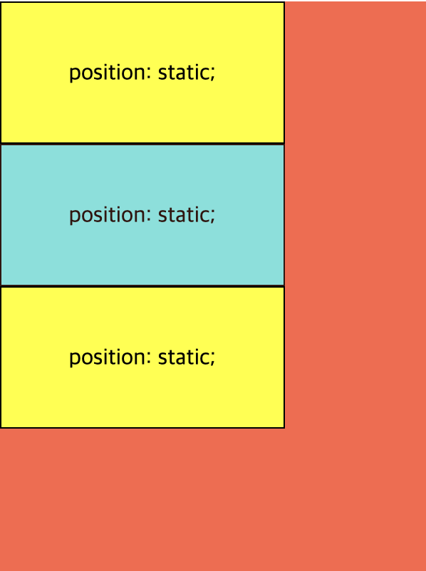
02 position : relative
div:nth-of-type(2){
position: relative;
top: 28px;
left: 48px;
background: cyan;
opacity: 0.8;
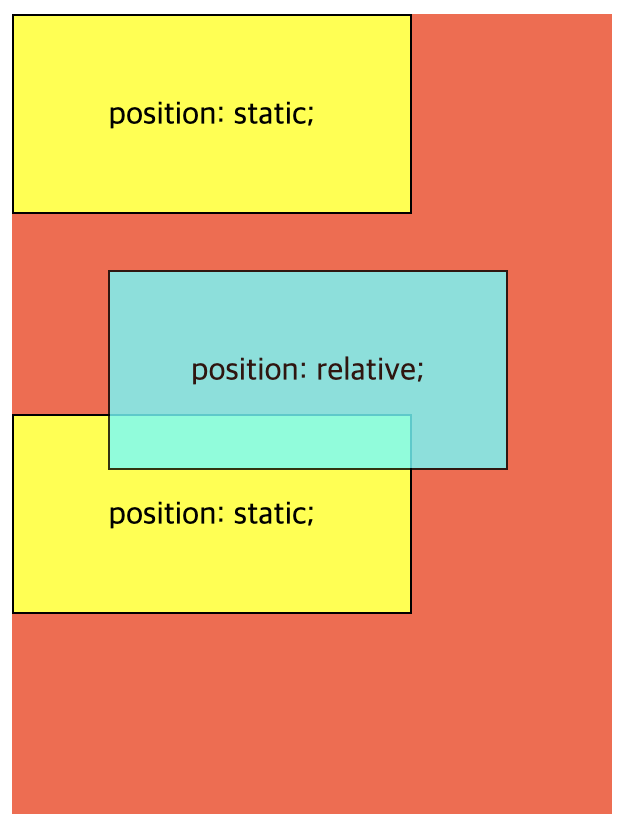
}position 속성을 relative 로 설정하게 되면, 요소를 원래 위치에서 벗어나게 배치할수 있게 된다. 요소를 원래 위치를 기준으로 상대적(relative)으로 배치한다고 생각하면 좋다
요소의 위치 지정은 top left bottom right 속성을 이용해서, 원래 위치에서 상하좌우로부터 얼마나 떨어지게 할지를 지정할 수 있다
<main>
  <div>position: static;</div>
  <div>position: relative;</div>
  <div>position: static;</div>
</main>

<style>
  main{
    width: 300px;
    height: 400px;
    background: tomato;
  }

  div{
    width: 200px;
    height: 100px;
    border: 1px solid;
    background: yellow;
    text-align: center;
    line-height: 100px;
    box-sizing: border-box;
  }

  div:nth-of-type(2){
    position: relative;
    top: 28px;
    left: 48px;
    background: cyan;
    opacity: 0.8;
  }
</style>
03 position : absolute
배치 기준이 상황에 따라 달라지기 때문에 주의해서 사용해야하는 속성값이다
배치 기준을 자신이 아닌 상위 요소에서 찾는다. DOM 트리를 따라 올라가다가 position이 static이 아닌 첫번째 상위 요소가 배치 기준이 된다. 상위 요소가 없다면 DOM 트리 최상위에 있는 body 요소가 배치 기준이 된다
복잡하게 느껴지겠지만 실제로 대부분의 경우 부모 요소를 기준으로 top left bottom right 속성을 적용한다
일단 예제 CSS 코드에서 두 번째 <div> 요소의 부모인 <main> 요소의 position 속성을 relative로 변경해보자
main{
	position: relative;
	width: 300px;
	height: 400px;
	background: tomato;
}
그 다음 두 번째 <div> 요소의 position 속성을 absolute로 변경하고, 부모 요소를 기준으로 하단에서 8px, 우측에서 16px 떨어지도록 bottom과 right 속성을 설정해주자
div:nth-of-type(2){
	position: absolute;
	bottom: 8px;
	right: 16px;
	background: cyan;
	opacity: 0.8;
}<main>
<div>position: static;</div>
<div>position: absolute;</div>
<div>position: static;</div>
</main>
<style>
main{
position: relative;
width: 300px;
height: 400px;
background: tomato;
}
div{
width: 200px;
height: 100px;
border: 1px solid;
background: yellow;
text-align: center;
line-height: 100px;
box-sizing: border-box;
}
div:nth-of-type(2){
position: absolute;
bottom: 8px;
right: 16px;
background: cyan;
opacity: 0.8;
}
</style>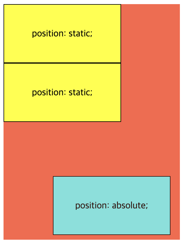
이제 두 번째 요소가 <main> 요소의 우측 하단에 배치된 것을 확인할 수 있다
여기서 중요한 점은 position: absolute 인 요소는 HTML 문서 상에서 독립되어 앞뒤에 나온 요소와 더 이상 상호작용을 하지 않게 된다. 그렇게 되어 첫번째 요소 아래에 바로 세번째 요소가 배치된 것이다
04 position : fixed
position 속성을 fixed로 지정하면 이렇게 요소를 항상 고정된(fixed) 위치에 배치할 수 있다
이러한 동작이 가능한 이유는 배치 기준이 뷰포트, 즉 브라우저 전체 화면이기 때문이다. top left bottom right 속성은 각각 브라우저 상단, 좌측, 하단, 우측으로 부터 해당 요소가 얼마나 떨어져있는지를 결정한다
div:nth-of-type(2){
	position: fixed;
	bottom: 8px;
	right: 16px;
	background: cyan;
	opacity: 0.8;
}<main>
<div>position: static;</div>
<div>position: fixed;</div>
<div>position: static;</div>
</main>
<style>
main{
position: relative;
width: 300px;
height: 400px;
background: tomato;
}
div{
width: 200px;
height: 100px;
border: 1px solid;
background: yellow;
text-align: center;
line-height: 100px;
box-sizing: border-box;
}
div:nth-of-type(2){
position: fixed;
bottom: 8px;
right: 16px;
background: cyan;
opacity: 0.8;
}
</style>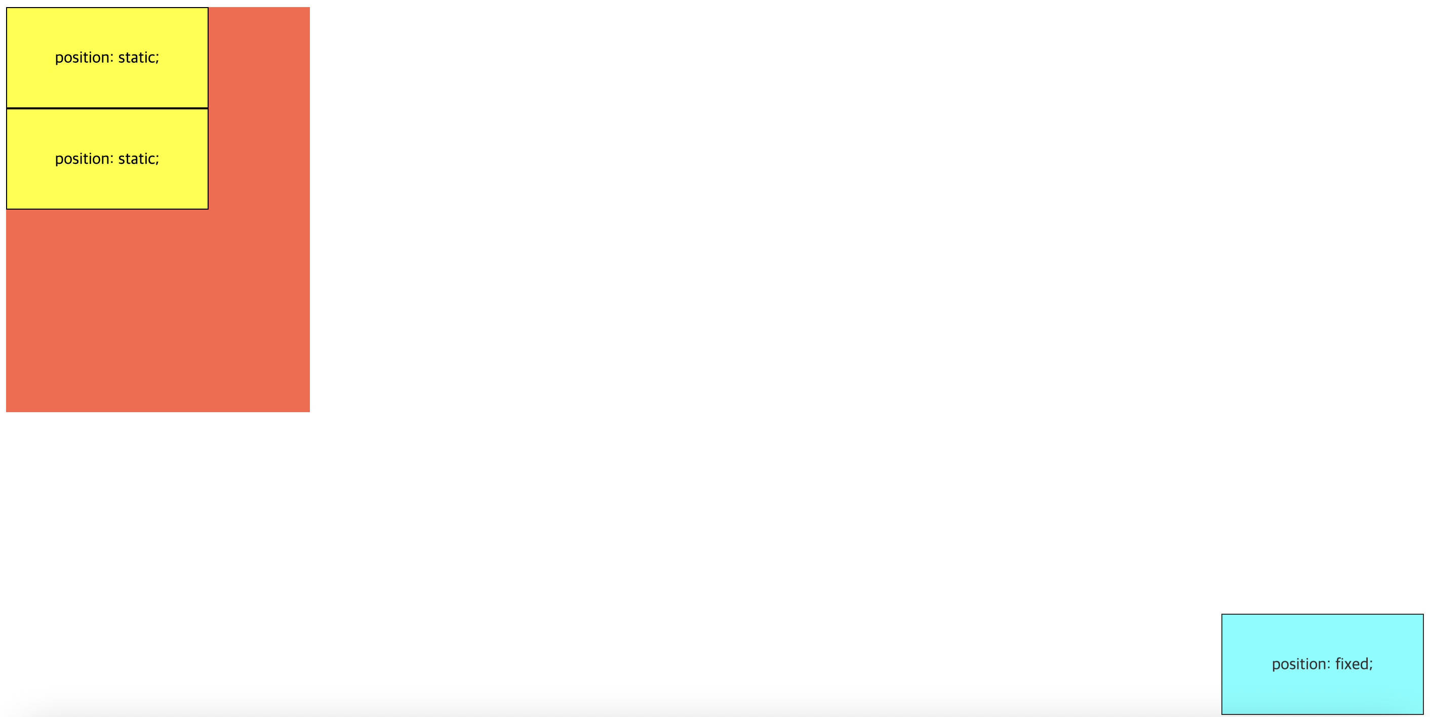
두번째 요소가 부모인 <main> 요소를 벗어나 브라우저 전체화면 기준으로 우측 하단에 배치되었다
fixed 요소는 문서 흐름에서 빠져 독립적으로 동작하며, 기준이 브라우저 뷰포트이다
position: sticky
position 속성의 sticky 값은 특이하게도 브라우저 화면을 스크롤링할때 효과가 나타난다
sticky는 부모 요소의 스크롤 영역(overflow) 안에서만 동작한다. 기준점 이상을 넘지 않을 때는 relative 처럼 동작하다가 그 이상을 넘게 될 경우 fixed처럼 동작한다. 그러다 스크롤이 scroll 박스 밖으로 벗어나게 될 경우 그 위치에서 정지하게 된다
먼저, <div> 요소의 부모인 <main> 요소의 높이를 줄이고 스크롤링이 가능해지도록 height외 overflow 속성을 조정해보자
main{
	position: relative;
	width: 300px;
	height: 120px;
	overflow: auto;
	background: tomato;
}div:nth-of-type(2){
position: sticky;
top: 0;
background: cyan;
opacity: 0.8;
}이제 스크롤바를 아래로 내려서 화면을 위로 올려보면 두번째 요소가 화면 상단에 끈적(sticky)하게 붙어서 움직이지 않은 것을 알 수 있다
scroll 박스란 overflow 속성이 존재하는 부모 요소를 뜻한다. 부모의 overflow: hidden이나 overflow: auto 설정에 주의해야 한다. sticky가 의도대로 동작하지 않을 수 있다
05 z-index
복잡한 웹페이지를 구햔할 때는 마치 3차원 공간처럼 요소를 앞뒤로 겹쳐서 배치해야할 경우가 생기기 마련이다. 이렇게 웹에서 요소의 Z축 방향의 깊이를 결정하는 CSS의 z-index속성에 대해서 배워보자
z-index가 없을 때 요소 간 상대적 깊이
z-index를 배우기 전에 z-index가 없을 때 어떻게 요소간의 상대적 깊이가 결정되는지 이해하는 것이 중요하다. z-index를 너무 많이 사용하면 스타일 유지 보수가 힘들어지기 때문에 z-index를 아예 사용하지 않은 편이 낫기 때문이다
기본적으로 z-index 속성이 적용되지 않은 요소 간에는 HTML 문서 상에서 나중에 나오는 요소가 먼저 나오는 요소보다 위로 올라가게 된다
<div class="first box">1</div>
<div class="second box">2</div>

<style>
  .first.box{
    background: yellow;
  }
  .second.box{
    background: tomato;
    margin-top: -50px;
    margin-left: 50px;
  }

  .box{
    width: 200px;
    height: 200px;
    border: 2px solid;
    font-size: 2rem;
    text-align: center;
    line-height: 200px;
  }
</style>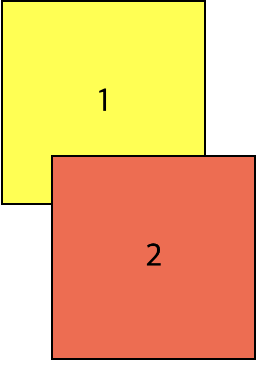
하지만 position 속성이 static이 아닌 relative나 absolute fixed sticky인 요소가 나타나기 시작하면 겹치는 순서가 바뀔 수 있다
정리를 해보면, z-index가 없을 때 요소 간 상대적 깊이는 HTML 문서 상에서 요소가 나오는 순서와 각 요소의 position 속성이 static이냐 아니냐에 따라서 결정이 된다
position속성이static이 아닌 요소는 무조건position속성이static인 요소 위로 올라온다position속성이static인 요소 간에는 HTML 문서 상에서 나중에 나오는 요소가 먼저 나오는 원소 위로 올라온다position속성이relative나absolute,fixed,sticky인 요소 간에는 HTML 문서 상에서 나중에 나오는 요소가 먼저 나오는 원소 위로 올라온다
z-index가 있을 때 요소 간 상대적 깊이
z-index 속성을 사용하면 위에서 다룬 기본적인 규칙을 무시하고 HTML 문서 상에서 먼저 나온 요소를 나중에 나온 요소보다 앞으로 나오게 할 수 있다
z-index가 낮은 요소를 먼저 그리고, z-index가 높은 요소를 나중에 그린다
예를 들어, 첫번째 상자의 z-index 속성을 1로 설정해주면, 두번째 상자의 앞으로 나오는 것을 알 수 있다
.first.box{
	z-index: 1;
	background: yellow;
	position: relative;
	top: 50px;
	left: 50px;
}<div class="first box">1</div>
<div class="second box">2</div>
<style>
.first.box{
z-index: 1;
background: yellow;
position: relative;
top: 50px;
left: 50px;
}
.second.box{
position: relative;
z-index: 2;
background: tomato;
}
.box{
width: 200px;
height: 200px;
border: 2px solid;
font-size: 2rem;
text-align: center;
line-height: 200px;
}
</style>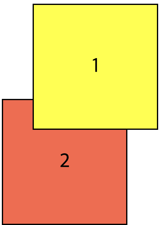
이번에는 두번째 상자의 z-index 속성을 2로 설정해보자. 그러면 다음과 같이 결과가 나온다
.second.box{
	z-index: 2;
	background: tomato;
	position: relative;
}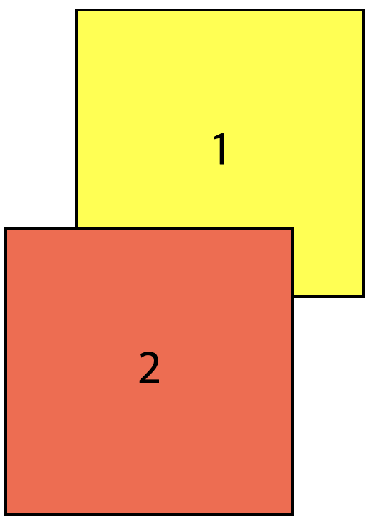
여기서 관가하기 쉬운 부분이 바로 position 속성이 static인 요소(position을 선언하지 않은 것까지 포함해서) z-index가 아무 효력을 내지 못한다는 것이다. 왜나햐면 position 속성이 static인 요소는 z-index 속성이 auto, 즉 0으로 고정되어 있기 때문이다
예를 들어서, 이 상태에서 두번째 상자에 작용된 position: relative 를 제거하면 첫번째 상자가 다시 앞으로 나오는 것을 볼 수 있다
.second.box{
	z-index: 2;
	/* position: relative; */
	background: tomato;
}
또한 z-index 속성은 음수로도 설정할 수 있다. 이럴 경우, 해당 요소는 브라우저가 가장 먼저 그리기 때문에 심지어 position 속성이 static인 요소보다도 더 뒤에 나타내게 된다
.first.box{
	z-index: -1;
	background: yellow;
	position: relative;
	top: 50px;
	left: 50px;
}<div class="first box">1</div>
<div class="second box">2</div>
<style>
.first.box{
z-index: -1;
background: yellow;
position: relative;
top: 50px;
left: 50px;
}
.second.box{
background: tomato;
}
.box{
width: 200px;
height: 200px;
border: 2px solid;
font-size: 2rem;
text-align: center;
line-height: 200px;
}
</style>
정리를 해보면, z-index 속성을 사용하면 position 속성이 static이 아닌 요소의 깊이를 조절할 수 있다
position속성이static인 요소에는z-index속성이 0으로 고정되어 있으며 바꿀 수 없다z-index속성이 양수로 설정된 요소는position속성이static인 요소보다 앞으로 올라온다z-index속성이 음수로 설정된 요소는position속성이static인 요소보다 뒤로 내려간다position속성이static이 아닌 요소 간에는z-index속성값이 클 수록 앞으로 올라오고, 작으면 작을수록 뒤로 내려간다 (예:z-index: 1인 요소보다z-index: 2인 요소가 더 앞에 나오고z-index: -1인 요소보다z-index: -2인 요소가 더 뒤로 들어감)