SARIMA 모델 실습을 위해 kaggle에서 Data Model - Pizza Sales 을 다운 받았다.
이 데이터셋은 2015년 1년간의 피자 판매 데이터이다.
이 데이터를 전처리하고 SARIMA 모델을 적용해 매출 예측을 진행해볼 예정이다. (실습 환경: Google Colab)
(참고영상: https://www.youtube.com/watch?v=ySiKZwoTX54&t=317s)
day 기준 전체 매출 예측을 해보려고 한다.
데이터 전처리
데이터셋을 살펴보니
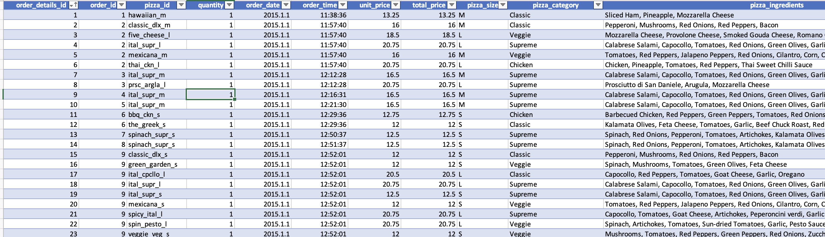
이런 식으로 pizza_id, quantity, order_date, order_time, unit_price, total_price 등 여러 종류의 데이터들이 있다.
내가 필요한 데이터는 day 기준 매출의 총 합이다.
그래서 일단 order_date와 total_price만 남기고 모든 column을 삭제했다.
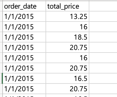
이후 같은 일자의 total_price를 모두 합쳐야 한다.
import pandas as pd
try:
df = pd.read_csv('date&price.csv')
# Convert 'order_date' to datetime objects if it's not already
df['order_date'] = pd.to_datetime(df['order_date'])
# Group by 'order_date' and sum 'total_price'
grouped_df = df.groupby('order_date')['total_price'].sum().reset_index()
# Save the result to a new CSV file
grouped_df.to_csv('aggregated_orders.csv', index=False)
print("Aggregation complete. The result is saved to 'aggregated_orders.csv'")
except FileNotFoundError:
print("Error: File not found. Please check the file path.")
except KeyError as e:
print(f"Error: Column '{e}' not found in the CSV file. Please ensure 'order_date' and 'total_price' columns exist.")
except Exception as e:
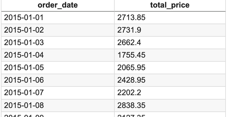
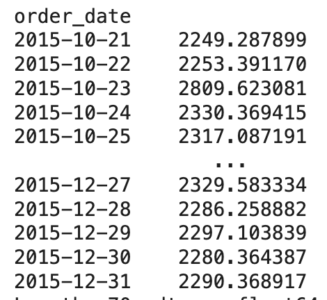
print(f"An unexpected error occurred: {e}")이러한 코드로 같은 일자의 매출을 합쳤다. 결과는 아래와 같다.
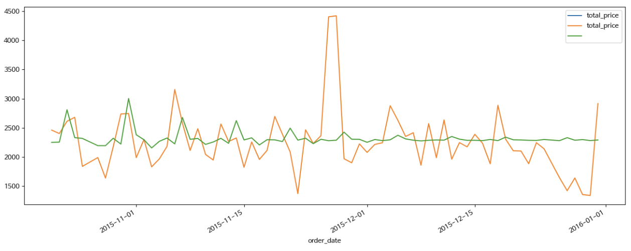
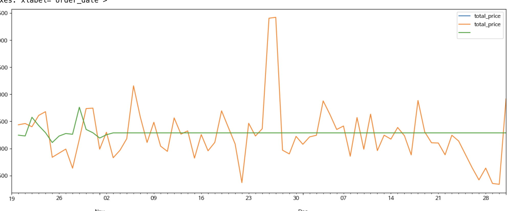
이 데이터를 그래프로 보면 아래와 같다.
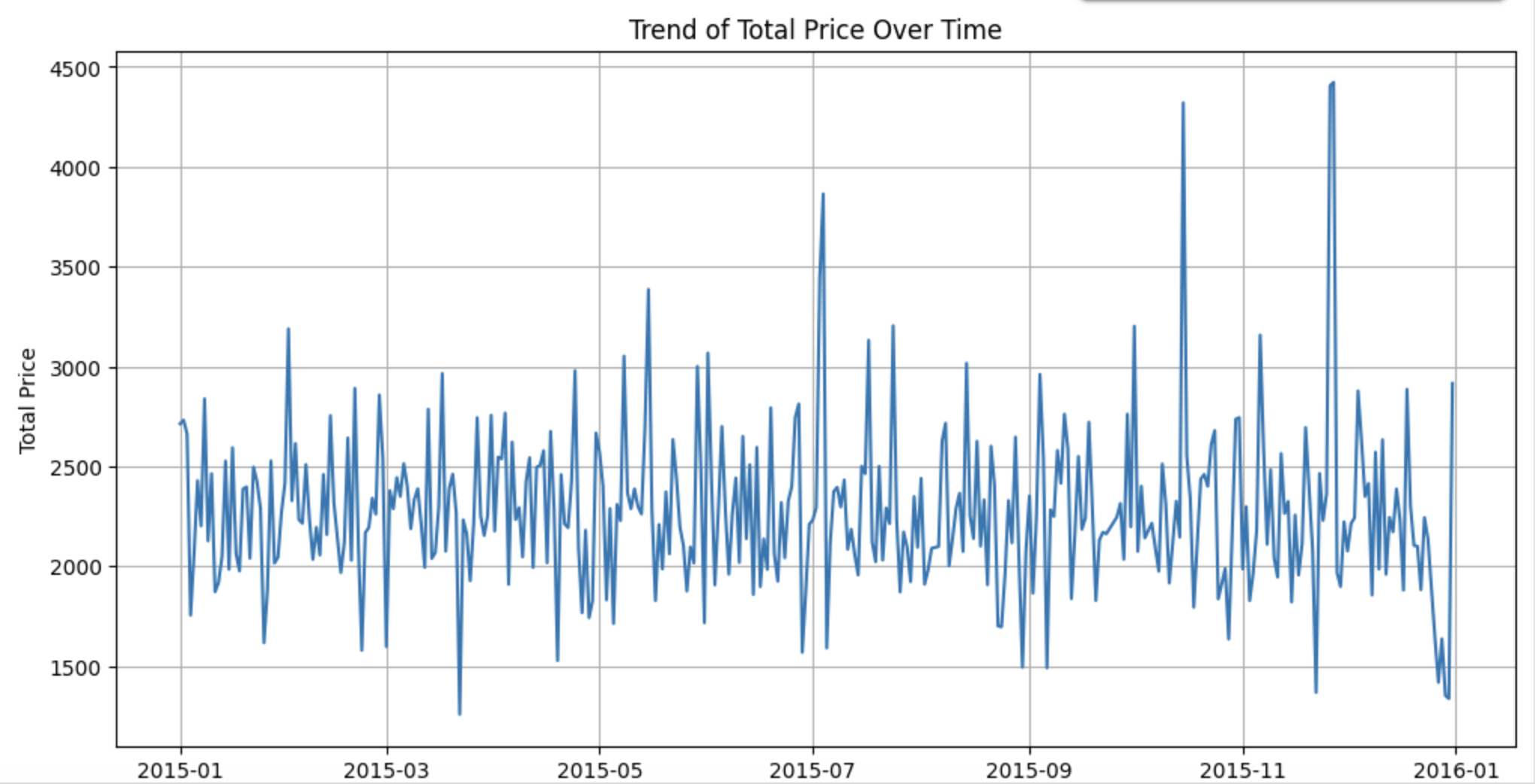
눈으로만 보면 stationary 인지 잘 모르겠다.
그래서 테스트를 해보았다.
Data Stationary Test
ADF 테스트를 진행했다.
# 필요한 라이브러리 설치
import matplotlib.pyplot as plt
from statsmodels.tsa.stattools import adfuller
import pandas as pd # Import pandas here as well

# CSV 불러오기 (직접 파일 경로 지정)
try:
    df = pd.read_csv("aggregated_orders.csv", parse_dates=["order_date"])
    df.set_index("order_date", inplace=True)
    ts = df["total_price"]

    # 시계열 시각화
    ts.plot(figsize=(10, 4), title="일별 총 주문 금액")
    plt.grid()
    plt.show()

    # ADF 테스트 함수 정의
    def adf_test(series):
        print(">> ADF Test 결과")
        result = adfuller(series, autolag='AIC')
        labels = ['ADF Statistic', 'p-value', '#Lags Used', 'Number of Observations Used']
        for value, label in zip(result[:4], labels):
            print(f"{label}: {value:.4f}")
        print("Critical Values:")
        for key, value in result[4].items():
            print(f"   {key}: {value:.4f}")
        if result[1] <= 0.05:
            print("정상성 있음 (p <= 0.05)")
        else:
            print("비정상 시계열 (p > 0.05) → 차분 필요")

    # ADF 테스트 실행
    adf_test(ts)

except FileNotFoundError:
    print("Error: 'aggregated_orders.csv' not found. Please ensure the file exists in the correct directory.")
except KeyError as e:
    print(f"Error: Column '{e}' not found in the CSV file. Please ensure 'order_date' and 'total_price' columns exist.")
except Exception as e:
    print(f"An unexpected error occurred: {e}")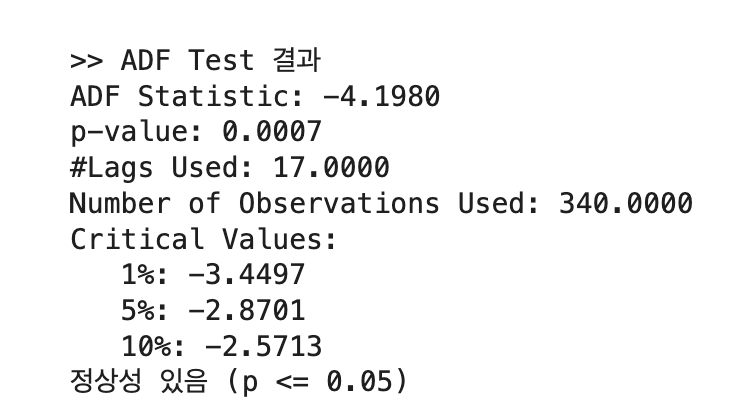
테스트 p-value가 0.0007로 0.05보다 적어 귀무가설이 기각되며 정상성이 있다는 결과가 나왔다. 그러므로 바로 SARIMA 모델의 적용이 가능하다.
!pip install pmdarima
from pmdarima import auto_arima
을 실행했는데 계속 auto_arima impor가 안돼서 검색을 통해 해결 코드를 찾았다.
# Install Condacolab to integrate Conda with Colab
!pip install -q condacolab

# Import and run Condacolab to enable Conda
import condacolab
condacolab.install()

# Install pmdarima from conda-forge using Conda
!conda install -c conda-forge pmdarima -y
위에 코드를 실행 후. 다시 import를 하니 잘 되었다.
day 기준 데이터이므로 asfreq("D")로 CSV 파일 불러오기
df = pd.read_csv("aggregated_orders.csv",
            index_col = "order_date",
            parse_dates = True).asfreq("D")
결측치 제거
training_y = df.iloc[:-73]["total_price"].dropna()
test_y = df.iloc[-73:]["total_price"].dropna()
전체가 1냔(365일) 이므로 그거에 약 20%인 73일의 데이터를 뺀 나머지를 테스팅, 73일의 데이터를 트레이닝 셋에 넣었다.
SARIMA model
model = auto_arima(y=training_y, m=7, seasonal=True, trace=True)auto_arima 함수 호출
계절성을 고려하므로 seasonal은 True로 설정,
그리고 day 기준이므로 m=7을 사용한다고 영상에서 설명해주었다.
(trace는 진행상태 출력하게하는 입력값)
Prediction
forecast_horizon = len(test_y)

predictions = pd.Series(model.predict(n_periods=forecast_horizon))  # 예측 개수는 test_y 크기만큼
predictions.index = test_y.index
print(predictions)
Prediction 값 출력
n_periods의 값이 test_y (테스팅 데이터셋)의 개수와 일치해야한다.
위에서 결측치를 제거하면서 미리 설정한 73개가 아닐수 있으므로 len(test_y)로 개수를 확인후 그만큼만 n_periods에 입력하게 하였다.
Prediction results
Visualization
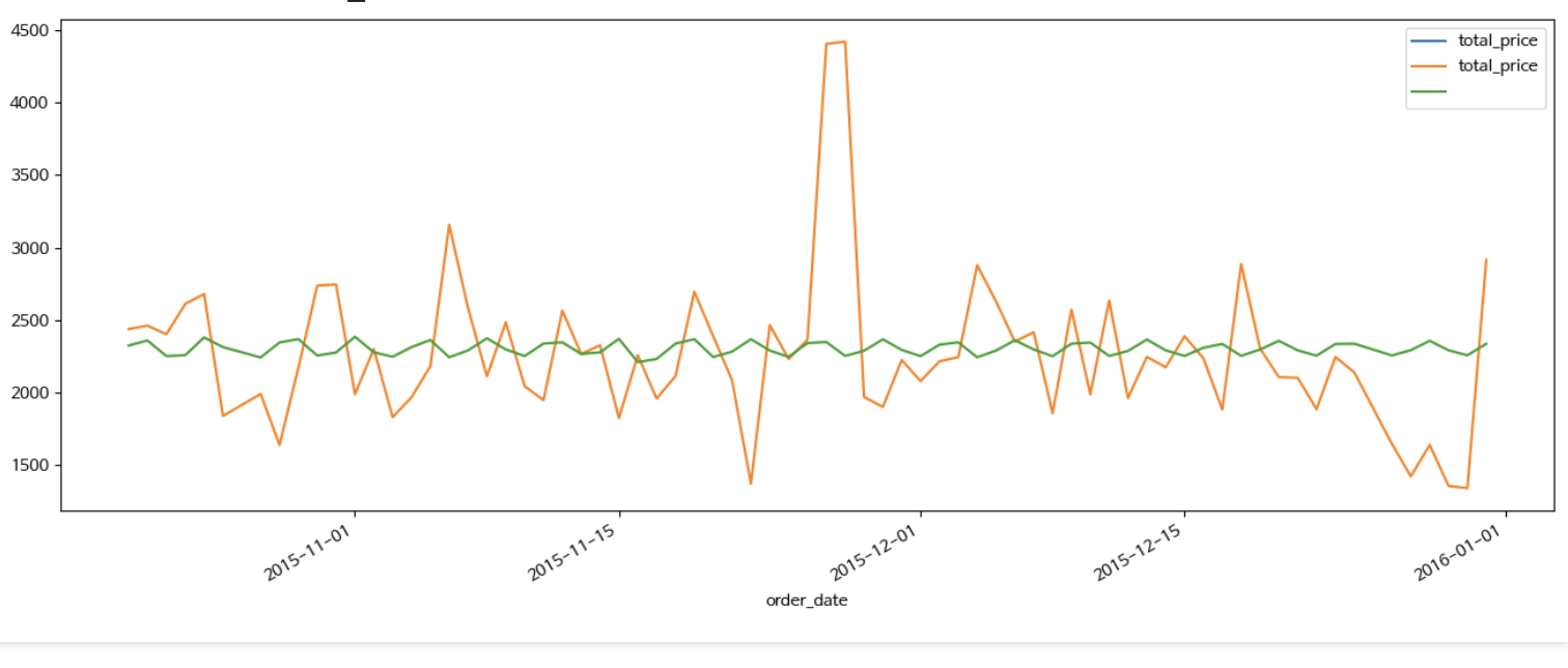
training_y['2015-10-21':].plot(figsize = (16, 6), legend = True)
test_y.plot(legend = True)
predictions.plot(legend = True)
Prediction 값이 2015-10-21 부터 존재하므로 이때부터만 그래프로 그리게 설정
testing data set으로 빼둔 값과 Prediction 값을 비교
생각보다 너무 다르다..
Evaluation
일단 수치적으로 이 예측을 평가해보자
평가할 지표는 다음과 같다
| 지표 이름 | 계산 방식 | 의미 | 해석 기준 예시 |
|---|---|---|---|
| MAE (Mean Absolute Error) | 평균 절대 오차 | 예측값과 실제값 차이의 절댓값 평균 | 작을수록 좋음. 단위는 예측 대상과 동일 |
| MSE (Mean Squared Error) | 평균 제곱 오차 | 오차를 제곱한 후 평균 → 큰 오차에 더 민감 | 값이 클수록 나쁨. 단위는 제곱된 값 |
| RMSE (Root Mean Squared Error) | MSE의 제곱근 | MSE를 원래 단위로 되돌린 지표 | MAE보다 큰 오차에 민감. 작을수록 좋음 |
| MAPE (Mean Absolute Percentage Error) | 평균 상대 오차 비율 (%) | 예측 오차를 실제값 기준으로 비율화한 값 | 10% 이하 → 매우 양호, 20% 이하 → 괜찮음 |
from sklearn.metrics import mean_absolute_error, mean_squared_error
import numpy as np

# MAE
mae = mean_absolute_error(test_y, predictions)

# MSE & RMSE
mse = mean_squared_error(test_y, predictions)
rmse = np.sqrt(mse)

# MAPE
mape = np.mean(np.abs((test_y - predictions) / test_y)) * 100

# 출력
print(f"MAE: {mae:.2f}")
print(f"MSE: {mse:.2f}")
print(f"RMSE: {rmse:.2f}")
print(f"MAPE: {mape:.2f}%")
위 코드로 평가했을때
MAE: 357.71
MSE: 278674.34
RMSE: 527.90
MAPE: 16.47%
아래와 같은 수치가 나왔다.
일단 MAPE는 16.47%로 20%는 넘지않아 나쁘지는 않은 결과가 나왔다.
하지만 RMSE가 꽤 높다. 11월 말에 갑자기 튀는 데이터를 예측하지 못해 이런 결과가 나온것 같다.
R2 점수도 확인해 보았다.
from sklearn.metrics import r2_score

r2 = r2_score(test_y, predictions)

print(f"R² Score: {r2:.4f}")
좀 충격적인 결과가 나왔다.
R² Score: -0.0035
R2 점수가 마이너스인 모델은 처음봤다...
| R² Score 범위 | 해석 |
|---|---|
| 0.9 ~ 1.0 | 매우 우수한 예측 (Excellent) |
| 0.7 ~ 0.9 | 좋은 예측 (Good) |
| 0.5 ~ 0.7 | 괜찮은 예측 (Fair) |
| 0.3 ~ 0.5 | 낮은 예측력 (Low) |
| 0.1 ~ 0.3 | 매우 낮은 예측력 (Very Low) |
| 0 ~ 0.1 | 거의 설명 못함 (Barely useful) |
| < 0 | 모델이 평균보다도 못함 (Poor Model) |
찾아보니 그냥 평균값으로 예측한 결과보다 더 예측을 못하면 마이너스가 나온다고 한다.
수정 1
주기(m)을 30으로 바꾼후 다시 테스트 해보기로 했다.
model = auto_arima(y=training_y, m=30, seasonal=True, trace=True)이렇게만 수정후 다시 테스트를 해보았다.
이렇게 하니 예측값이 거의 직선에 가깝게, 평균과 크게 다르지 않게 나왔다.
수정 2
생각을 해보니 결측치를 제거하면 요일 순서가 틀어져 m=7로 계절성을 고려하며 예측했을때 오류가 생길수 있다고 생각해 결측치를 제거한 후 그 자리에 새 정보를 채우는 코드를 추가해야 한다.
아래의 코드로 그 작업을 진행하였다.
df["total_price"] = df["total_price"].interpolate(method="linear")
 # 결측치 보간 후 test, train dataset 분할
training_y = df.iloc[:-73]["total_price"]
test_y = df.iloc[-73:]["total_price"]
이후 다시 m=7로 설정하고 테스트를 해봤다.
이렇게 하니 11월 예측치부터 예측값이 모두 평균값으로 나온다.
수정 3
SARIMA 모델에서 장기 예측으로 갈수록 값이 평균에 수렴하는 문제가 자주 발생한다고 한다.
이 문제를 해결해보고자 일단 결측치 보간 방식을 주기성을 보존하도록 바꿨다.
df["total_price"] = df["total_price"].interpolate(method="time")
그래도 똑같다..
단기를 예측해도 R2가 계속 마이너스가 나온다..
더 많은 데이터를 찾아서 SARIMAX나 LSTM을 시도해 봐야겠다.
회고
Problem
사용한 데이터가 1년짜리인데 10월까지 학습시키고 11,12월에 테스트를 하다보니 연 단위의 예측이 약간 안되는것 같다. 또한 요일이나 공휴일 설명변수(X)가 포함되지 않은 SARIMA 모델이다보니 더 정확도가 떨어진 것 같다.
R2-score가 계속 마이너스가 나오는데 왜 그러는지 모르겠다.
Try
다음에는 2년 이상의 데이터를 이용하고, 설명변수를 추가해 더 정확도를 높여보아야겠다. 또한, LSTM도 사용해 볼 것이다.
Keep
단기 예측(1달)의 정확도가 생각보다 높았다.
MAPE가 생각보다 낮았다.
