1) 학습한 내용
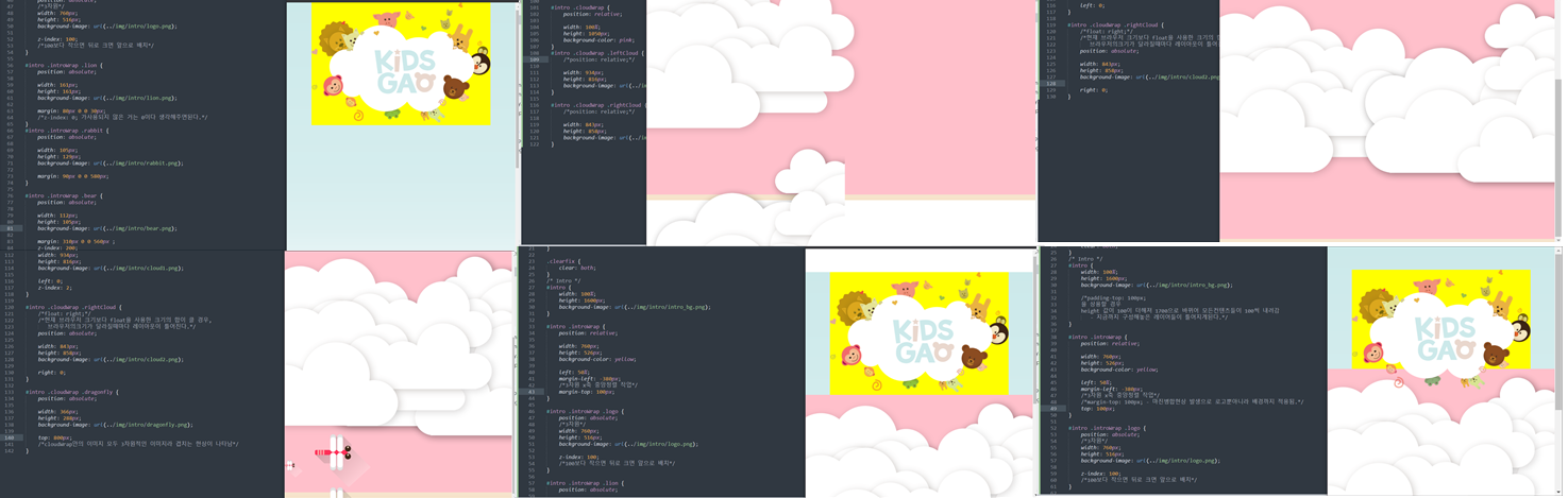
오늘은 키즈가오 intro부터 farm3 까지 js 부분만 제외하고 만들어보았다.
1.파일들 연결하기 및 메타 태그 넣기, css 초기화작업
<!DOCTYPE html>
<html>
<head>
	<meta charset="utf-8">
	<meta name="descfiption" content="우리쌀 점토로 만든 키즈가오 웹사이트 소개">
	<meta name="keywords" content="키즈가오, 점토, 장난감">
	<meta name="author" content="키즈가오">

	<meta name="viewport" content="width=divice-width, initial-scale=1.0">

	<title>키즈가오</title>

	<link rel="stylesheet" type="text/css" href="css/style.css">
	<link rel="stylesheet" type="text/css" href="css/animation.css">
	<link rel="stylesheet" type="text/css" href="css/mobile.css">

</head>
/* 초기화작업 Default CSS */
html, body {
margin: 0;
padding: 0;
}
body {
overflow-x: hidden;
/*가로스크롤이 생성되지 않도록 히든처리*/
}
h1, h2, h3, h4, h5, h6, p {
margin: 0;
padding: 0;
}
button {
border: none;
background-color: transparent;
/*버튼은 기본적으로 테두리와 연한 회색배경을 갖고있다*/
}
.clearfix {
clear: both;
}2. intro
-html
	<header id="intro">
		<div class="introWrap">
			<div class="logo"></div>
			<div class="lion"></div>
			<div class="rabbit"></div>
			<div class="bear"></div>
			<div class="monkey"></div>

		</div>

		<div class="cloudWrap">
			<div class="leftCloud"></div>
			<div class="rightCloud"></div>
			<div class="dragonfly"></div>
		</div>

	</header>
-style.css
/* Intro */
#intro {
	width: 100%;
	height: 1600px;
	background-image: url(../img/intro/intro_bg.png);

	/*padding-top: 100px;*/
	/*을 상용할 경우
	height 값이 100이 더해져 1700으로 바뀌어 모든컨텐츠들이 100씩 내려감
	   - 지금까지 구성해놓은 레이어들이 틀어지게된다.*/
}

#intro .introWrap {
	position: relative;

	width: 760px;
	height: 516px;
	/*background-color: yellow; - 작업을 할때 공간을 잘 보이도록 도와주는 역할
	배치작업이 끝나면 지워준다.*/

	left: 50%;
	margin-left: -380px;
	/*3차원 x축 중앙정렬 작업*/
	/*margin-top: 100px; - 마진병합현상 발생으로 로고뿐아니라 배경까지 적용됨.*/
	top: 100px;
	/*#intro .introWrap과 #intro .cloudWrap 모두 relative를 적용하여
	나중에 사용한 것이 앞으로 나오게 되어있다.*/
}

#intro .introWrap .logo {
	position: absolute;
	/*3차원*/
	width: 760px;
	height: 516px;
	background-image: url(../img/intro/logo.png);

	z-index: 100;
	/*100보다 작으면 뒤로 크면 앞으로 배치*/
}

#intro .introWrap .lion {
	position: absolute;

	width: 161px;
	height: 161px;
	background-image: url(../img/intro/lion.png);

	margin: 80px 0 0 30px;
	/*top과 left를 가지고 좌표를 설정할 수 있지만 지금은 상속을받아 부모의 값을 기준으로 형성된다.
	자식의 포지션을 absolute 트로 적용할 경우 부모의 포지션을 relative로 감싸주는 것이 좋다.*/
	/*z-index: 0; 가사용되지 않은 거는 0이다 생각해주면된다.*/
}
#intro .introWrap .rabbit {
	position: absolute;

	width: 105px;
	height: 129px;
	background-image: url(../img/intro/rabbit.png);

	margin: 90px 0 0 580px;
}

#intro .introWrap .bear {
	position: absolute;

	width: 112px;
	height: 105px;
	background-image: url(../img/intro/bear.png);

	margin: 310px 0 0 560px ;
	z-index: 200;
}

#intro .introWrap .monkey {
	position: absolute;

	width: 85px;
	height: 93px;
	background-image: url(../img/intro/monkey.png);

	margin: 310px 0 0 50px ;
	z-index: 200;
}
/* background-image를 사용 할 경우 배경이미지를 제외한 데코레이션과 같은 요소 이미지들은
공간과 이미지의 크기를 동일하게 작업을 해주어야 반복되는 공간 크기를 피할 수 있다.*/

#intro .cloudWrap {
	position: relative;

	width: 100%;
	height: 1050px;
	/*background-color: pink;*/
}
#intro .cloudWrap .leftCloud {
	/*float: left;*/
	position: absolute;

	width: 934px;
	height: 816px;
	background-image: url(../img/intro/cloud1.png);

	left: 0;
	z-index: 2;
}

#intro .cloudWrap .rightCloud {
	/*float: right;*/
	/*현재 브라우저 크기보다 float을 사용한 크기의 합이 클 경우,
	   브라우저의크기가 달라질때마다 레이아웃이 틀어진다.*/
	position: absolute;

	width: 843px;
	height: 858px;
	background-image: url(../img/intro/cloud2.png);

	right: 0;
}

#intro .cloudWrap .dragonfly {
	position: absolute;

	width: 366px;
	height: 228px;
	background-image: url(../img/intro/dragonfly.png);

	top: 800px;
	/*cloudWrap안의 이미지 모두 3차원적인 이미지라 겹치는 현상이 나타남*/
}
/*보통 이미지의 크기는 끝자리가 짝수나 5로 떨어져야한다- 레이아웃의 크기가 딱 떨어지기위해서*/
-animation.css
/* Intro */

#intro .introWrap .lion{
	animation: spinlion 1500ms linear infinite alternate;
}
@keyframes spinlion{
	from{
		transform: rotate(-10deg);
	}
	to{
		transform: rotate(10deg);
	}
}
#intro .introWrap .rabbit{
	animation: spinrabbit 1000ms linear infinite alternate;
}
@keyframes spinrabbit{
	from{
		transform: rotate(0deg);
	}
	to{
		transform: rotate(5deg);
	}
}
#intro .introWrap .bear{
	animation: spinbear 1000ms linear infinite alternate;
}
@keyframes spinbear{
	from{
		transform: rotate(10deg);
	}
	to{
		transform: rotate(-10deg);
	}
}
#intro .introWrap .monkey{
	animation: spinmonkey 800ms linear infinite alternate;
}
@keyframes spinmonkey{
	from{
		transform: rotate(20deg);
	}
	to{
		transform: rotate(50deg);
	}
}

#intro .cloudWrap .dragonfly{
	animation: flydragonfly 7000ms linear infinite ;
}
@keyframes flydragonfly{
	from{
		left: -366px;
	}
	to{
	  left: 100%;
	}
}
-moblie.css
@media (max-width:  767px) {

	#intro {
		height: 1150px;
		background-image: url(../img/mobile/intro/mobile_intro_bg.png); }

	#intro .introWrap {
		width: 189px;
		height: 129px;

		margin-left: -94.5px;

		top: 230px;
	}
	#intro .introWrap .logo {
		width: 189px;
		height: 129px;
		background-image: url(../img/mobile/intro/mobile_logo.png);
	}

	#intro .introWrap .lion,
	#intro .introWrap .rabbit,
	#intro .introWrap .bear,
	#intro .introWrap .monkey,
	#intro .cloudWrap .dragonfly{
		display: none;
	}
	#intro .cloudWrap {
		height: 350px;

		top: 280px;
	}
	#intro .cloudWrap .leftCloud {
		width: 267px;
		height: 314px;
		background-image: url(../img/mobile/intro/mobile_cloud1.png);
	}
	#intro .cloudWrap .rightCloud {
		width: 237px;
		height: 309px;
		background-image: url(../img/mobile/intro/mobile_cloud2.png);
	}
3. farm1
-html
<div id="farm1">
		<div class="leftRice1"></div>
		<div class="farmer"></div>
		<div class="rightRice1"></div>

		<div class="farmSpeechWrap">
			<img src="img/farm/farm1/farmspeech.png" align="우리쌀 점토">
			<p class="farmSpeech">
				식재료만 넣은 안전한<br>
				우리쌀 점토 키즈가오는<br>
				우리 쌀을 사용하여 만들어요,<br>
				화학물질을 사용하지 않고,<br>
				식재료를 사용해서 만든<br>
				안전한 제품이랍니다.
			</p>
		</div>
	</div>
-style.css
/* Farm1 */
#farm1 {
	position: relative;

	width: 100%;
	height: 800px;
	background-image: url(../img/farm/farm1/farm1_bg.png);
}

#farm1 .leftRice1 {
	position: absolute;

	width: 390px;
	height: 670px;
	background-image: url(../img/farm/farm1/leftrice.png);

	left: 0;
}
#farm1 .rightRice1 {
	position: absolute;

	width: 335px;
	height: 570px;
	background-image: url(../img/farm/farm1/rightrice.png);

	right: 0;
	top: 100px;
}

#farm1 .farmer {
	position: absolute;

	width: 747px;
	height: 1078px;
	background-image: url(../img/farm/farm1/farmer.png);

	left: 50%;
	margin-left: -310px;
}

#farm1 .farmSpeechWrap {
	position: relative;

	top: 250px;
	left: 150px;
}
#farm1 .farmSpeechWrap .farmSpeech {
	color: #895c2f;
	font-size: 18px;
	line-height: 27px;
}
-mobile.css
/* Farm1 */
	#farm1 {
		height: 450px;
		background-image: url(../img/mobile/farm/farm1/mobile_farm1_bg.png);
	}

	#farm1 .leftRice1 {
		width: 86px;
		height: 150px;
		background-image: url(../img/mobile/farm/farm1/mobile_leftrice.png);
	}
	#farm1 .rightRice1 {
		width: 95px;
		height: 170px;
		background-image: url(../img/mobile/farm/farm1/mobile_rightrice.png);

		top: -20px;
	}
	#farm1 .farmer {
		width: 160px;
		height: 250px;
		background-image: url(../img/mobile/farm/farm1/mobile_farmer.png);

		margin-left: -69px;
	}
	#farm1 .farmSpeechWrap {
		width: 300px;

		text-align: center;

		left: 50%;
		margin-left: -150px;
	}

	#farm1 .farmSpeechWrap img {
		width: 79px;
	}
	#farm1 .farmSpeechWrap .farmSpeech {
		line-height: 20px;
		font-size: 12px;

} 
4. farm2
-html
	<div id="farm2">
		<div class="leftRice2"></div>
		<div class="scarecrow"></div>
		<div class="rightRice2"></div>
	</div>
-style.css
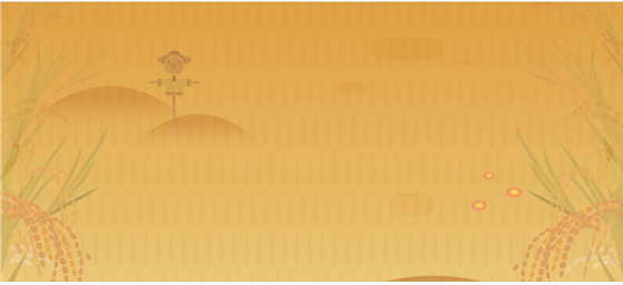
/* Farm2 */
#farm2 {
	width: 100%;
	height: 850Px;
	background-image: url(../img/farm/farm2/farm2_bg.png);
}

#farm2 .leftRice2 {
	float: left;

	width: 250px;
	height: 850px;
	background-image: url(../img/farm/farm2/leftrice2.png);
}
#farm2 .rightRice2 {
	float: right;
	/*두벼가 만나기전에 모바일버전으로 변경되므로 float 사용가능*/

	width: 236px;
	height: 850px;
	background-image: url(../img/farm/farm2/rightrice2.png);
}

#farm2 .scarecrow {
	position: absolute;

	width: 103px;
	height: 206px;
	background-image: url(../img/farm/farm2/scarecrow.png);

	margin: 200px 0 0 300px;
}
-mobile.css
/* Farm2 */
	#farm2 {
		height: 440px;
		background-image: url(../img/moblie/farm/farm2/mobile_farm2_bg.png);
	}
	#farm2 .leftRice2{
		width: 57px;
		height: 201px;
		background-image: url(../img/moblie/farm/farm2/mobile_leftrice2.png);
	}
	#farm2 .rightRice2{
		width: 54px;
		height: 202px;
		background-image: url(../img/moblie/farm/farm2/mobile_rightrice2.png);
	}
	#farm2 .scarecrow {
		display: none;
	}
5. farm3
-html
	<div id="farm3">
		<div class="farm3Window"></div>
		<div class="machineWrap">
			<div class="machine1"></div>
			<div class="sawShadow"></div>
			<div class="saw1"></div>
			<div class="saw2"></div>
			<div class="machineBird"></div>
			<div class="timer"></div>
		</div>

		<img class="farm3Bublle" src="img/farm/farm3/farm3bubble.png"
		alt="기계를 통해서 쌀알이 딱딱한 껍질을 벗어 냅니다.">

	</div>
-style.css
/* farm3 */
#farm3 {
	position: relative;

	width: 100%;
	height: 850px;
	background-image: url(../img/farm/farm3/farm3_bg.png);
}
#farm3 .farm3Window {
	position: absolute;

	width: 247px;
	height: 169px;
	background-image: url(../img/farm/farm3/window.png);

	margin: 100px 0 0 100px;
}
#farm3 .machineWrap {
	position: relative;

	width: 600px;
	height: 455px;
	/*background-color: yellow;*/

	left: 50%;
	margin-left: -285px;
	top: 150px;
}

#farm3 .machineWrap .machine1 {
	position: absolute;

	width: 586px;
	height: 455px;
	background-image: url(../img/farm/farm3/machine1.png);

	z-index: 900;
}

#farm3 .machineWrap .sawShadow{
	position: absolute;

	width: 95px;
	height: 95px;
	background-image: url(../img/farm/farm3/sawshadow.png);

	margin: 145px 0 0 145px;
}

#farm3 .machineWrap .saw1,
#farm3 .machineWrap .saw2 {
	position: absolute;
	width: 95px;
	height: 95px;
	background-image: url(../img/farm/farm3/saw.png);
}
#farm3 .machineWrap .saw1 {
	margin: 140px 0 0 140px;
}
#farm3 .machineWrap .saw2 {
	margin: 140px 0 0 350px;
}
#farm3 .machineWrap .timer {
	position: absolute;

	width: 103px;
	height: 104px;
	background-image: url(../img/farm/farm3/second.png);

	margin: 125px 0 0 43px;

	z-index: 999;
}

#farm3 .machineWrap .machineBird {
	position: absolute;

	width: 44px;
	height: 49px;
	background-image: url(../img/farm/farm3/machinebird.png);

	margin: 220px 0 0 20px;

	z-index: 999;

}
#farm3 .farm3Bublle {
	position: absolute;

	top: 350px;
	right: 80px;
}
-animation.css
/* Farm3 */
#farm3 .machineWrap .timer {
	animation: rotateTimer 10000ms linear infinite;
}
@keyframes rotateTimer {
	from {transform: rotate(0deg);}
	to {transform: rotate(360deg);}
}
#farm3 .machineWrap .saw1 {
	animation: rotateLeftSaw 10000ms linear infinite;
}
@keyframes rotateLeftSaw {
	from {transform: rotate(0deg);}
	to {transform: rotate(360deg);}
}
#farm3 .machineWrap .saw2 {
	animation: rotateRightSaw 10000ms linear infinite;
}
@keyframes rotateRightSaw {
	from {transform: rotate(360deg);}
	to {transform: rotate(0deg);}
}
-mobile.css
/* Farm3 */

	#farm3 {
		height: 500px;
		background-image: url(../img/mobile/farm/farm3/mobile_farm3_bg.png);
	}
	#farm3 .farm3Window {
		width: 82px;
		height: 56px;
		background-image: url(../img/mobile/farm/farm3/mobile_window.png);

		margin: 10px 0 0 10px;
	}

	#farm3 .machineWrap {
		width: 200px;
		height: 150px;

		top: 120px;
		margin-left: -96px;
	}

	#farm3 .machineWrap .machine1 {
		width: 191px;
		height: 149px;
		background-image: url(../img/mobile/farm/farm3/mobile_machine1.png);
	}
	#farm3 .machineWrap .sawShadow,
	#farm3 .machineWrap .timer,
	#farm3 .machineWrap .machineBird {
		display: none;
	}
	#farm3 .machineWrap .saw1,
	#farm3 .machineWrap .saw2 {
		width: 31px;
		height: 31px;
		background-image: url(../img/mobile/farm/farm3/mobile_saw.png);
	}
	#farm3 .machineWrap .saw1 {
		margin: 50px 0 0 50px;
	}
	#farm3 .machineWrap .saw2{
		margin: 50px 0 0 115px;
	}
	#farm3 .farm3Bublle {
		position: absolute;

		width: 152px;

		left: 50%;
		margin: 0 0 0 -70px;
	}
2) 학습내용 중 어려웠던 점 및 해결방법
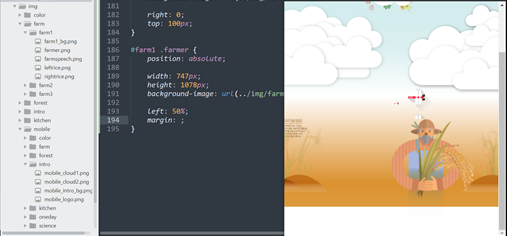
오늘은 intro에서 잠자리 부분과 farm1 에 농부이미지 부분에서 레이아웃이 맞지 않아 엄청 고생을 했다.
이부분을 찾는다고 2시간은 낭비한것같다ㅠ_ㅠ....
코드가 너무 길어 몇번을 봐도 다른점이 보이지 않았다.
그리고 잠자리와 농부가 다른걸 보고 그 부분 코드만 엄청 많이 봤는데도 보이지 않다가..
결국 코드를 다 지워가며 확인을 하니 갑자기 눈에보였다..!!!!!!!!
잠자리부분은 크기에 높이 값을 228인데 288로 해서 잠자리가 밑으로 반마리가 더 반복되는게 보였다. 특히 css에서 이미지를 넣을때 크기를 정확하게 맞추지 않으면 계속 반복되어 나온다는것을 알았음에도 이렇게 한번에 찾으려니 너무 어려웠다.
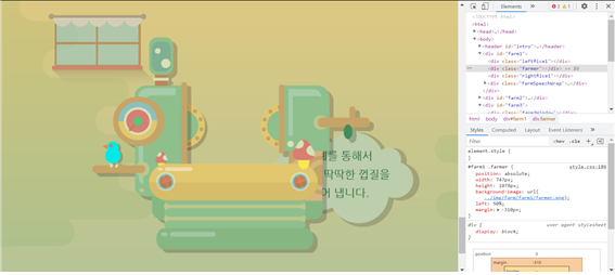
또 농부 이미지에서는 margin-left 값을 주어야했는데, 그냥 margin 값을 주어 위치가 다르게 나타났다. 특히 원래 margin 값을 주기전 농부 이미지의 위치를 알았다면 더빨리 찾았을 수 도 있었을 텐데 그것을 모른체 찾았더니 더 오래걸렸다. 농부 이미지는 마진값을 주지 않으면 왼쪽에 나타나 중간정렬을 해주기 위해 margin-left : -크기의절반가량 의 값을 넣어 주었어야 하는데, 그냥 margin으로 전체적으로 넣어주어 잠자리쪽에 붙어서 나타났다.
오랜시간이 걸렸지만 그래도 찾아서 다행이다!!!
3) 학습소감
확실히 코드가 길어지니 문제점이 생겼을 때 찾기가 조금 어려운것 같다.
그래서 하는 중간중간에 더더욱더 한번씩 체크하고 문제가 발생하면 바로바로 해결을 해야하는 것 같다. 또 내가 디자인 하고 원하는 대로 하는 것이 아니라 수업을 따라하는 거다 보니 조금 더 헷깔리고 어려운점도 있는 것 같다.
다음부터는 강의에서 확인을 하지 않더라도 끊어가며 확인을 해봐야겠다.