1) 학습한 내용
오늘은 kids gao 페이지의 forest 에서 nitght1부분 까지 해보았다.
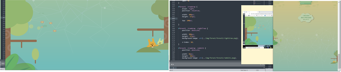
1. forest 1
- html
<div id="forest1">
		<div class="leftTree"></div>

		<div class="treeWrap">
			<div class="rabbit1"></div>
			<div class="rabbit2"></div>
			<div class="rightTree"></div>
		</div>
	</div>
- style.css
#forest1 {
	width: 100%;
	height: 1050px;
	background-image: url(../img/forest/forest1/forest1_bg.png);
}

#forest1 .leftTree{
	position: absolute;

	width: 445px;
	height: 1200px;
	background-image: url(../img/forest/forest1/lefttree.png);

	left: 0;
}

#forest1 .treeWrap {
	float: right;
	position: relative;

	width: 304px;
	height: 572px;

	top: 100px;

}

#forest1 .treeWrap .rightTree {
	position: absolute;

	width: 304px;
	height: 572px;
	background-image: url(../img/forest/forest1/righttree.png);

	z-index: 10;
}

#forest1 .treeWrap .rabbit1 {
	position: absolute;

	width: 82px;
	height: 103px;
	background-image: url(../img/forest/forest1/rabbit1.png);

	margin: 435px 0 0 107px;
}

#forest1 .treeWrap .rabbit2 {
	position: absolute;

	width: 56px;
	height: 75px;
	background-image: url(../img/forest/forest1/rabbit2.png);

	margin: 435px 0 0 200px;
}
- animation.css
#forest1 .treeWrap .rabbit1 {
	animation: spinRabbit1 1000ms linear infinite alternate;
}

@keyframes spinRabbit1 {
	from { transform: rotate(0deg); }
	to { transform: rotate(10deg); }
}

#forest1 .treeWrap .rabbit2 {
	animation: spinRabbit2 1000ms linear infinite alternate;
}

@keyframes spinRabbit2 {
	from { transform: rotate(10deg); }
	to { transform: rotate(0deg); }
}
- mobile.css
#forest1 {
		position: relative;

		height: 400px;
		background-image: url(../img/mobile/forest/forest1/mobile_forest1_bg.png);
	}
	#forest1 .leftTree {
		width: 79px;
		height: 187px;
		background-image: url(../img/mobile/forest/forest1/mobile_lefttree.png);
	}
	#forest1 .treeWrap {
		width: 68px;
		height: 129px;

		top: 200px;
	}
	#forest1 .treeWrap .rabbit1,
	#forest1 .treeWrap .rabbit2 {
		display: none;
	}

	#forest1 .treeWrap .rightTree {
		width: 68px;
		height: 129px;
		background-image: url(../img/mobile/forest/forest1/mobile_righttree.png);

} 
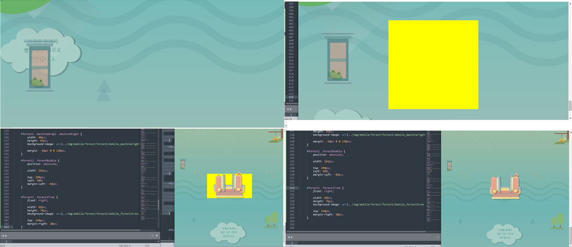
2. forest 2
- html
<div id="forest2">
		<div class="frog"></div>
		<div class="machineWrap2">
			<div class="machineBottom"></div>
			<div class="machineLeft"></div>
			<div class="machineRight"></div>
		</div>

		<img class="forestBubble" src="img/forest/forest2/forestbubble.png" alt="기계를 통해서 쌀을 고운 가루로 만든답니다.">

		<div class="forest2Tree"></div>

	</div>
- style.css
#forest2 {
	width: 100%;
	height: 750px;
	background-image: url(../img/forest/forest2/forest2_bg.png);
}

#forest2 .frog {
	position: absolute;

	width: 153px;
	height: 257px;
	background-image: url(../img/forest/forest2/frog.png);

	margin: 50px 0 0 100px;
}

#forest2 .machineWrap2 {
	position: relative;

	width:400px;
	height: 400px;

	left: 50%;
	margin-left: -200px;
	top: 180px;
}

#forest2 .machineWrap2 .machineBottom {
	position: absolute;

	width:374px;
	height: 162px;
	background-image: url(../img/forest/forest2/machineBottom.png);

	margin-top: 220px;

	z-index: 200;
}

#forest2 .machineWrap2 .machineLeft {
	position: absolute;

	width:123px;
	height: 228px;
	background-image: url(../img/forest/forest2/machineleft.png);

	margin-top: 30px;

	z-index: 200;
}

#forest2 .machineWrap2 .machineRight {
	position: absolute;

	width:123px;
	height: 248px;
	background-image: url(../img/forest/forest2/machineright.png);

	margin: 10px 0 0 260px;

	z-index: 200;
}

#forest2 .forestBubble{
	position: relative;

	float: right;

	top: -100px;
	margin-right: 100px;
}

#forest2 .forest2Tree {
	float: left;
	position: relative;

	width: 304px;
	height: 282px;
	background-image: url(../img/forest/forest2/forest2tree.png);

	top: 50px;
}
- animation.css
#forest2 .machineWrap2 .machineLeft {
	animation: moveLeft 1000ms linear infinite alternate;
}

@keyframes moveLeft {
	from { left: 30px; }
	to { left: 0; }
}

#forest2 .machineWrap2 .machineRight {
	animation: moveRight 1000ms linear infinite alternate;
}

@keyframes moveRight {
	from { left: -30px; }
	to { left: 0; }
}
- mobile.css
#forest2 {
		position: relative;

		height: 400px;
		background-image: url(../img/mobile/forest/forest2/mobile_forest2_bg.png);
	}

	#forest2 .frog {
		width: 34px;
		height: 57px;
		background-image: url(../img/mobile/forest/forest2/mobile_frog.png);

		margin: 0 0 0 20px;
	}


	#forest2 .machineWrap2 {
		width: 200px;
		height: 110px;

		top: 70px;
		margin-left: -97px;
	}

	#forest2 .machineWrap2 .machineBottom {
		width: 141px;
		height: 60px;
		background-image: url(../img/mobile/forest/forest2/mobile_machinebottom.png);

		left: 50%;
		margin: 50px 0 0 -70.5px;
	}

	#forest2 .machineWrap2 .machineLeft {
		width: 46px;
		height: 85px;
		background-image: url(../img/mobile/forest/forest2/mobile_machineleft.png);

		margin: 0 0 0 20px;
	}

	#forest2 .machineWrap2 .machineRight {
		width: 46px;
		height: 93px;
		background-image: url(../img/mobile/forest/forest2/mobile_machineright.png);

		margin: -10px 0 0 130px;
	}

	#forest2 .forestBubble {
		position: absolute;

		width: 161px;

		top: 290px;
		left: 50%;
		margin-left: -83px;
	}


	#forest2 .forest2Tree {
		float: right;

		width: 69px;
		height: 76px;
		background-image: url(../img/mobile/forest/forest2/mobile_forest2tree.png);

		top: 130px;
		margin-right: 20px;
	}
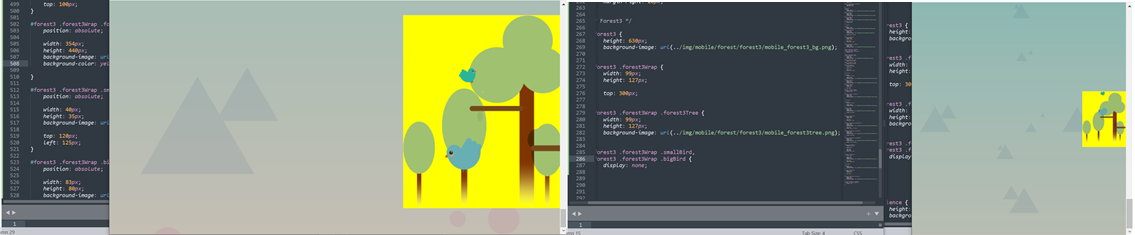
3. forest 3
- html
<div id="forest3">

		<div class="forest3Wrap">
			<div class="forest3Tree"></div>
			<div class="smallBird"></div>
			<div class="bigBird"></div>
		</div>

	</div>
- style.css
#forest3 {
	width: 100%;
	height: 600px;
	background-image: url(../img/forest/forest3/forest3_bg.png);
}

#forest3 .forest3Wrap {
	float: right;
	position: relative;

	width: 354px;
	height: 440px;

	top: 100px;
}

#forest3 .forest3Wrap .forest3Tree {
	position: absolute;

	width: 354px;
	height: 440px;
	background-image: url(../img/forest/forest3/forest3tree.png);
}

#forest3 .forest3Wrap .smallBird {
	position: absolute;

	width: 40px;
	height: 35px;
	background-image: url(../img/forest/forest3/bird_sm.png);

	top: 120px;
	left: 125px;
}

#forest3 .forest3Wrap .bigBird {
	position: absolute;

	width: 83px;
	height: 80px;
	background-image: url(../img/forest/forest3/bird_big.png);

	margin: 280px 0 0  94px;

}
- animation.css
#forest3 .forest3Wrap .smallBird{
	animation: spinSmallBird 1000ms linear infinite alternate;
}

@keyframes spinSmallBird {
	from { transform: rotate(0); }
	to { transform: rotate(10deg); }
}

#forest3 .forest3Wrap .bigBird {
	animation: spinBigBrid 1000ms linear infinite alternate;
}

@keyframes spinBigBrid {
	from {
		transform: rotate(-10deg);
	}

	to {
		transform: rotate(10deg);
	}
}
- mobile.css
#forest3 {
		height: 630px;
		background-image: url(../img/mobile/forest/forest3/mobile_forest3_bg.png);
	}

	#forest3 .forest3Wrap {
		width: 99px;
		height: 127px;

		top: 300px;
	}

	#forest3 .forest3Wrap .forest3Tree {
		width: 99px;
		height: 127px;
		background-image: url(../img/mobile/forest/forest3/mobile_forest3tree.png);
	}

	#forest3 .forest3Wrap .smallBird,
	#forest3 .forest3Wrap .bigBird {
		display: none;
	}
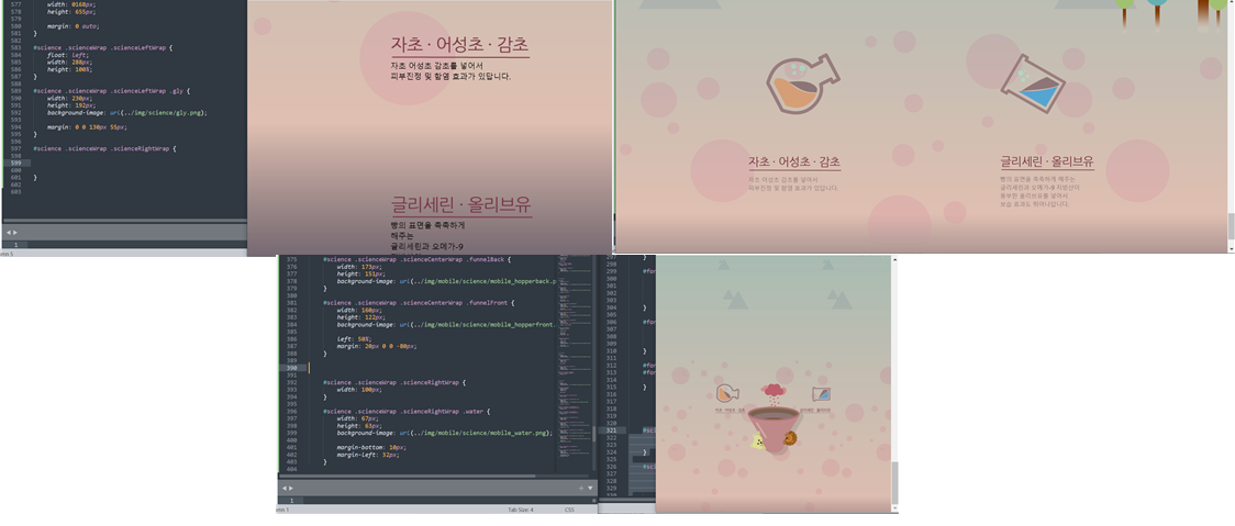
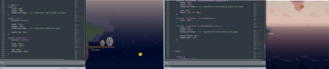
4. science
- html
<div id="science">

		<div class="scienceWrap">


			<div class="scienceLeftWrap">
				<div class="gly"></div>
				<img src="img/science/leftTitle.png" alt="자초, 어성초, 감초">

				<p>
					자초 어성초 감초를 넣어서<br>
					피부진정 및 함염 효과가 있답니다.
				</p>
			</div>


			<div class="scienceCenterWrap">

				<div class="purpleSteam"></div>
				<div class="funnelBack"></div>
				<div class="funnelFront"></div>

			</div>


			<div class="scienceRightWrap">

				<div class="water"></div>
				<img src="img/science/rightTitle.png" alt="글리세린, 올리브유">
				<p>
					빵의 표면을 촉촉하게 해주는<br>
					글리세린과 오메가-9 지방산이<br>
					풍부한 올리브유를 넣어서<br>
					보습 효과도 뛰어나답니다.
				</p>

			</div>

		</div>

	</div>
- style.css
#science {
	position: relative;

	width: 100%;
	height: 800px;
	background-image: url(../img/science/science_bg.png);
}

#science .scienceWrap{
	position: relative;

	width: 1068px;
	height: 655px;

	margin: 0 auto;
}

#science .scienceWrap .scienceLeftWrap {
	float: left;
	width: 288px;
	height: 100%;
}

#science .scienceWrap .scienceLeftWrap .gly {
	width: 230px;
	height: 192px;
	background-image: url(../img/science/gly.png);

	margin: 0 0 130px 55px;
}


#science .scienceWrap .scienceLeftWrap p,
#science .scienceWrap .scienceRightWrap p {
	color: #8e7577;
	font-size: 18px;
	line-height: 26px;

	padding-top: 10px;
}


#science .scienceWrap .scienceCenterWrap {
	position: relative;
	float: left;
	width: 488px;
	height: 100%;
}

#science .scienceWrap .scienceCenterWrap .purpleSteam {
	position: relative;

	width: 241px;
	height: 216px;
	background-image: url(../img/science/grape.png);

	left: 50%;
	margin-left: -120px;
}

#science .scienceWrap .scienceCenterWrap .funnelBack {
	position: absolute;

	width: 488px;
	height: 438px;
	background-image: url(../img/science/funnelback.png);
}

#science .scienceWrap .scienceCenterWrap .funnelFront {
	position: relative;

	width: 485px;
	height: 390px;
	background-image: url(../img/science/funnelfront.png);

	margin-top: 48px;
}


#science .scienceWrap .scienceRightWrap {
	float: left;
	width: 292px;
	height: 100%;
}


#science .scienceWrap .scienceRightWrap .water {
	width: 204px;
	height: 191px;
	background-image: url(../img/science/water.png);

	margin-bottom: 130px;
}
- animation.css
#science .scienceWrap .gly {
	animation: spinGly 1500ms linear infinite alternate;
}

@keyframes spinGly {
	from { transform: rotate(0deg); }
	to { transform: rotate(50deg); }
}

#science .scienceWrap .water {
	animation: spinWater 1500ms linear infinite alternate;
}

@keyframes spinWater {
	from { transform: rotate(0deg); }
	to { transform: rotate(-50deg); }
}
- mobile.css
#science {
		height: 580px;
		background-image: url(../img/mobile/science/mobile_science_bg.png);
	}

	#science .scienceWrap {
		overflow: hidden;
		width: 360px;
		height: auto;
		/*자식의 높이값으로 부모의 값을 대체하겠다.*/

		top: 180px;
	}

	#science .scienceWrap .scienceLeftWrap {
		width: 100px;
	}

	#science .scienceWrap .scienceLeftWrap .gly {
		width: 76px;
		height: 63px;
		background-image: url(../img/mobile/science/mobile_gly.png);

		margin: 0 0 10px 0;
	}

	#science .scienceWrap .scienceLeftWrap img,
	#science .scienceWrap .scienceRightWrap img {
		height: 15px;
	}

	#science .scienceWrap .scienceLeftWrap p,
	#science .scienceWrap .scienceRightWrap p {
		display: none;
	}


	#science .scienceWrap .scienceCenterWrap {
		width: 160px;
		height: 222px;
	}

	#science .scienceWrap .scienceCenterWrap .purpleSteam {
		width: 80px;
		height: 71px;
		background-image: url(../img/mobile/science/mobile_grape.png);

		margin-left: -40px;
	}

	#science .scienceWrap .scienceCenterWrap .funnelBack {
		width: 173px;
		height: 151px;
		background-image: url(../img/mobile/science/mobile_hopperback.png);
	}

	#science .scienceWrap .scienceCenterWrap .funnelFront {
		width: 160px;
		height: 122px;
		background-image: url(../img/mobile/science/mobile_hopperfront.png);

		left: 50%;
		margin: 20px 0 0 -80px;
	}

	#science .scienceWrap .scienceRightWrap {
		width: 100px;
	}

	#science .scienceWrap .scienceRightWrap .water {
		width: 67px;
		height: 63px;
		background-image: url(../img/mobile/science/mobile_water.png);

		margin-bottom: 10px;
		margin-left: 32px;
	}
5. night 1
- html
<div id="night1">

		<div class="owl"></div>

		<div class="starWrap">
			<div class="star1"></div>
			<div class="star2"></div>
			<div class="star3"></div>
		</div>

	</div>
- style.css
#night1 {
	width: 100%;
	height: 700px;
	background-image: url(../img/oneday/night1/night1_bg.png);
}

#night1 .owl {
	position: absolute;

	width: 334px;
	height: 571px;
	background-image: url(../img/oneday/night1/owl.png);

	margin-top: 50px;
}

#night1 .starWrap {
	position: relative;

	width: 750px;
	height: 400px;

	top: 150px;
	margin-left: 600px;
}


#night1 .starWrap .star1,
#night1 .starWrap .star2,
#night1 .starWrap .star3 {
	position: absolute;

	width: 53px;
	height: 50px;
	background-image: url(../img/oneday/night1/star1.png);
}

#night1 .starWrap .star1 {
	margin-top: 350px;
}

#night1 .starWrap .star2 {
	margin-left: 650px;
}

#night1 .starWrap .star3 {
	margin: 250px 0 0 500px;
}
- animation.css
#night1 .starWrap .star1,
#night1 .starWrap .star2,
#night1 .starWrap .star3 {
	animation: pulseStar 1s linear infinite alternate;
}

@keyframes pulseStar {
	from {  transform: scale(1); }
	to { transform: scale(0.8); }
}
- mobile.css
	#night1 {
		position: relative;
		height: 500px;
		background-image: url(../img/mobile/oneday/night1/mobile_night1_bg.png);
	}

	#night1 .owl {
		width: 88px;
		height: 151px;
		background-image: url(../img/mobile/oneday/night1/mobile_owl.png);

		margin-top: 0;
	}

	#night1 .starWrap {
		position: absolute;

		width: 308px;
		height: 157px;
		background-image: url(../img/mobile/oneday/night1/mobile_star.png);

		top: 300px;
		margin-left: 50px;
	}


	#night1 .starWrap .star1,
	#night1 .starWrap .star2,
	#night1 .starWrap .star3 {
		display: none;
	}
2) 학습내용 중 어려웠던 점 및 해결방법
오늘은 어제에 이어서 kids gao 를 만들어보았다.
수업을 듣기 전 position,float 부분에 대해 다시한번 공부를 했는데도
막상 만들때는 잘 생각이 나지 않고 마진병합 상속 등 들이 어려웠던 것 같다.
또 강사님을 따라가면서 타이핑을 하니 자꾸 오류가 나서 레이아웃이 자꾸 틀어지는 것이 힘들었다.
그래도 또 다시 position,float 이부분에 대해 공부를 하면 어느정도는 어느 부분에 어떻게 써야할지 조금더 명확해 질 것 같다.
특히 relative 와 absolute를 자유 자재로 쓰시는데 정말 부러웠다!!!
또 파일들을 여러개 만들어서 사용을 하면 가독성은 좋아지는 것 같으나, 내가 어느부분에 어떤 속성을 줬는지 계속 확인 해야하는 것은 불편했던 것같다.
3) 학습소감
오늘도 무사히 마친것 같다. 속성값들을 자유자재로 쓰시는 강사님이 부러웠다!!ㅠㅠ
그래도 오늘 position,float 부분에 대해 다시 공부를 하였는데, 처음에 들었을때와는 다르게 조금더 잘 들리고 와닿았던 것 같다.
몇번더 반복해서 듣다보면 조금 더 나아지지 않을까 하는 생각을 한다 :)
어제는 오탈자 찾는데 너무 진이 빠졌어서 오늘은 강사님 께서 미리 주신 완성본과 비교해보면서 찾으니 조금 더 빠르고 쉽게 찾을 수 있어서 좋았다!!
아아아아!! 남은 시간도 뽜이팅 :)
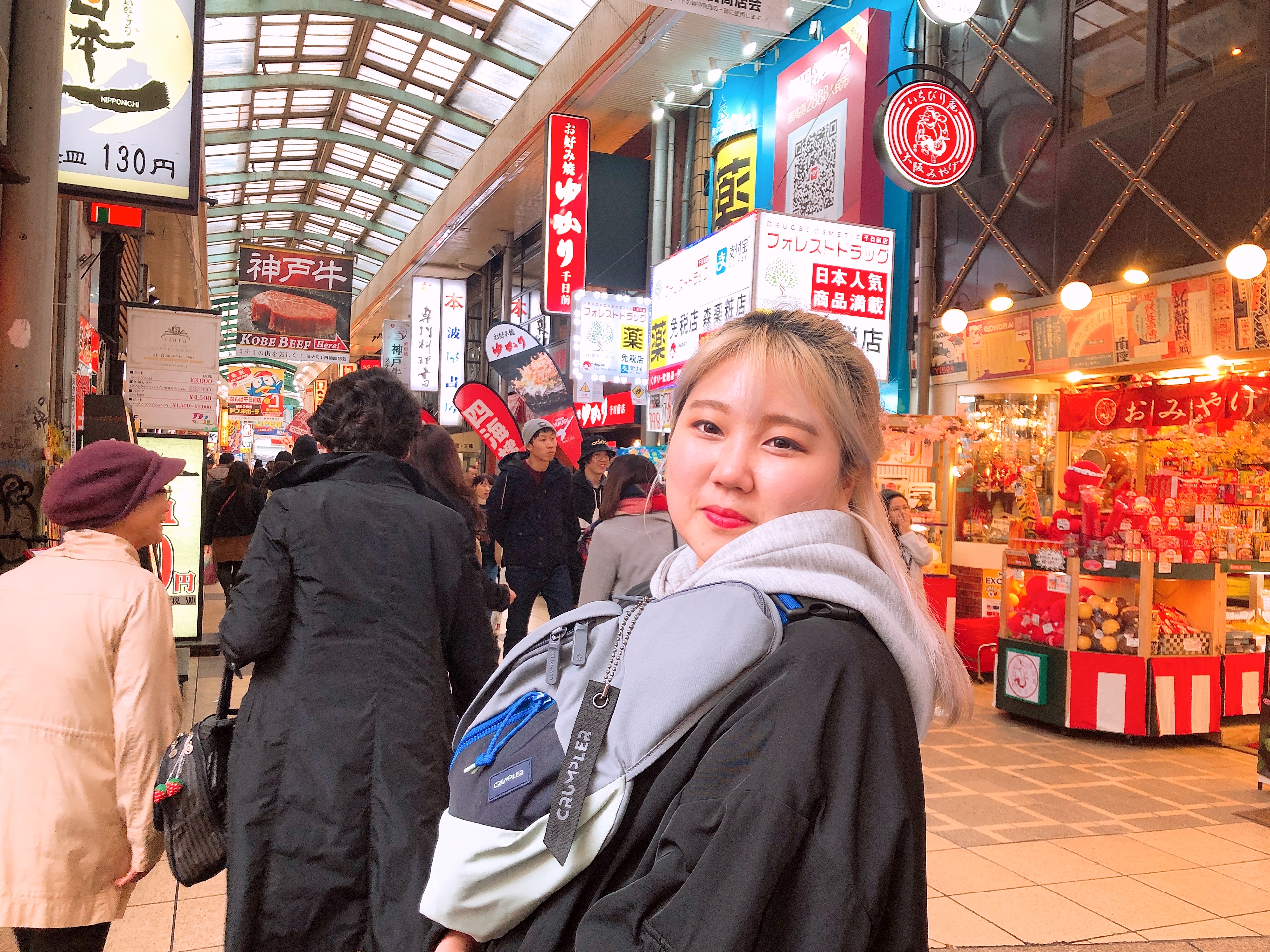
아직 여백이 많은 개린이입니다.