1) 학습한 내용
오늘은 박스모델과,vertical-align속성,position 속성들에 대해 알아보았다.
각 속성들의 특징과 사용시 주의 할 점에 대해 알아보았다.
1.박스모델(margin,padding,border,contents)
-html
<!DOCTYPE html>
<html>
<head>
<meta charset="utf-8">
<link rel="stylesheet" type="text/css" href="css/style.css">
</head>
<body>
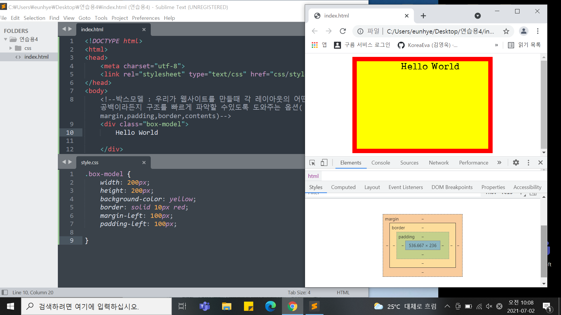
<!--박스모델 : 우리가 웹사이트를 만들때 각 레이아웃의 어떤 공백이라든지 구조를 빠르게 파악할 수있도록 도와주는 옵션(margin,padding,border,contents)
<div class="box-model">
Hello World
</div>
-->
<!--
<div class="margin-one"></div>
<div class="margin-two"></div>
<div class="margin-parent">
<div class="margin-child"></div>
</div>-css
/*html,body는 각각 자체적으로 margin,padding의 기본값이 있으므로
웨사이트 만들때는 0으로 적용하는 것이 좋음*/
html, body {
margin: 0;
padding: 0;
}
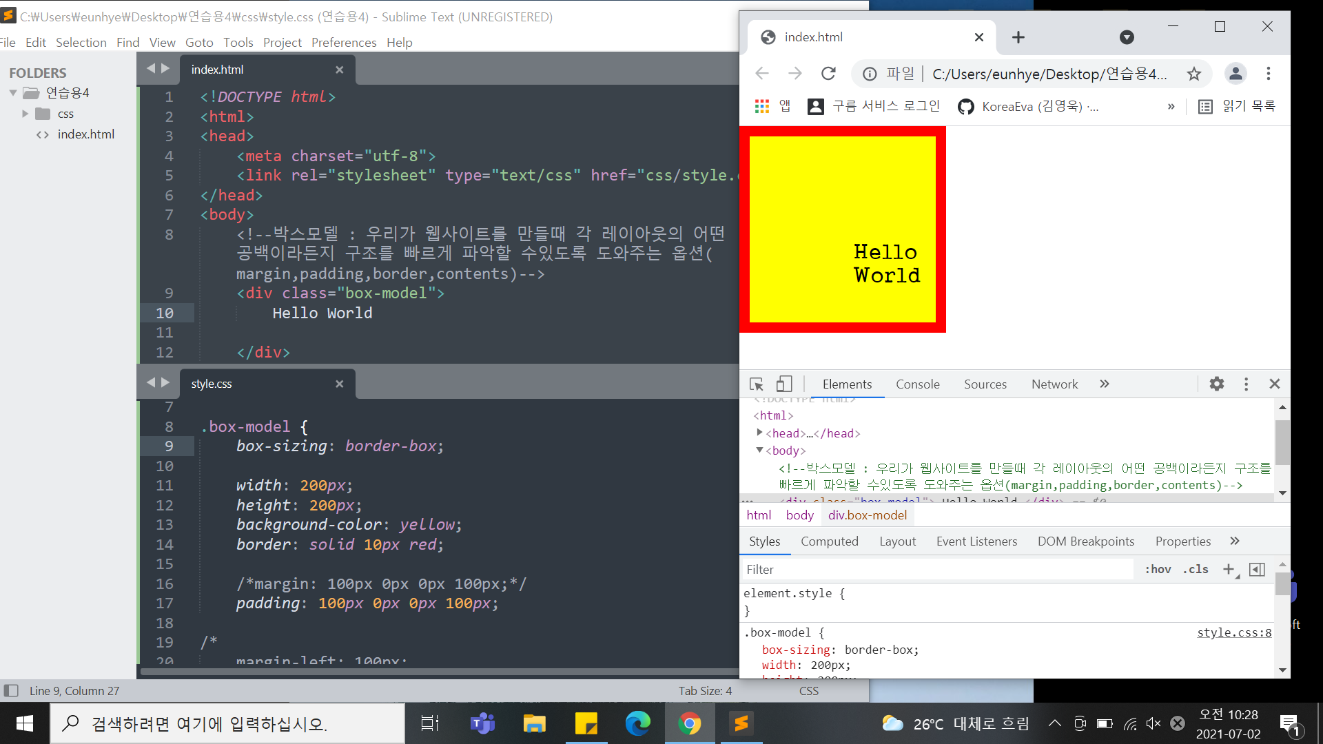
.box-model {
box-sizing: border-box;
width: 200px;
height: 200px;
background-color: yellow;
border: solid 10px red;
margin: 100px 0px 0px 100px;
padding: 100px 0px 0px 100px;
}
/*
margin-left: 100px;
margin-top: 100px;
margin-right: ;
margin-bottom: ;
padding-left: 100px;
padding-top: 100px;
padding-right: ;
padding-bottom: ;
}
*/
/*padding 을 사용하게되면 원래 크기 + 벌어지는 공간으로 인해
크기가 달라질 수 있다.
-> but 사용하더라도 공간의 크기를 그대로 유지했으면 좋겠다 싶을때는
box-sizing: border-box; 사용
margin,padding: toppx rightpx bottompx leftpx;
<코드가 길어질수록 웹사이트 로딩속도가 느려지기때문에 최대한 줄여
/*적으면 로딩속도가 빨라짐-한줄로 작성하는 연습하기>*/
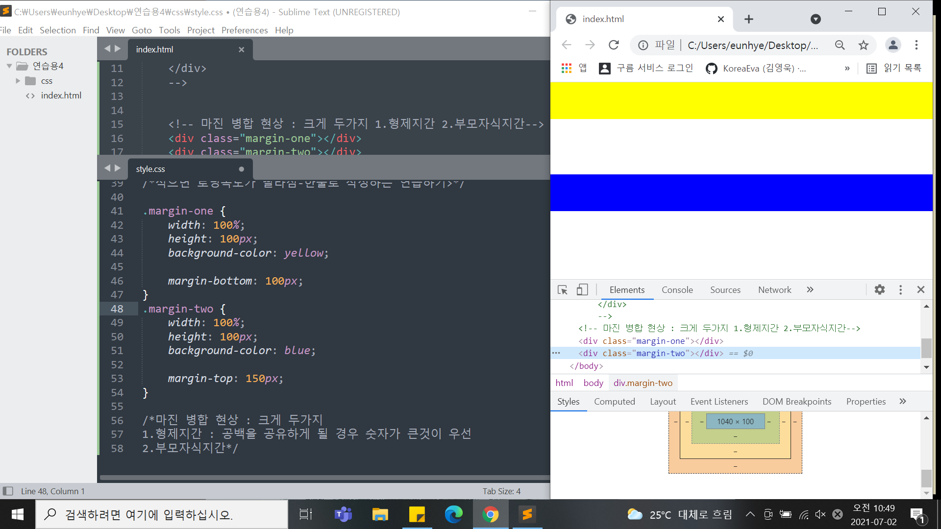
.margin-one {
width: 100%;
height: 100px;
background-color: yellow;
margin-bottom: 100px;
}
.margin-two {
width: 100%;
height: 100px;
background-color: blue;
margin-top: 150px;
}
.margin-parent{
width: 300px;
height: 300px;
background-color: yellow;
}
.margin-child{
position: absolute;
width: 150px;
height: 150px;
background-color: blue;
margin-top: 100px
}
/*마진 병합 현상 : 크게 두가지
1.형제지간 : 공백을 공유하게 될 경우 숫자가 큰것이 우선
2.부모자식지간 : position: absolute; 를 꼭 사용해야 일어나지 않는다.*/
- 컨텐츠는 각 태그 안에 있는 내용을 그태그의 컨텐츠라고 한다.
예를 들어
1)
2)<div class="box-model"> Hello World </div> 여기서는 "Hello World"가 div의 컨텐츠가된다.
여기서는 "div"가 body의 컨텐츠가 된다.<body> <div class="box-model"> Hello World </div> </body>
2.inline,block,vertical-align
-html
<!--display 는 inline(나란히),block(줄바꿈현상) 으로 나뉜다.
<h1>block</h1>
<h1>block</h1>
<h1>block</h1>
<span>Inline</span>
<span>Inline</span>
<span>Inline</span>
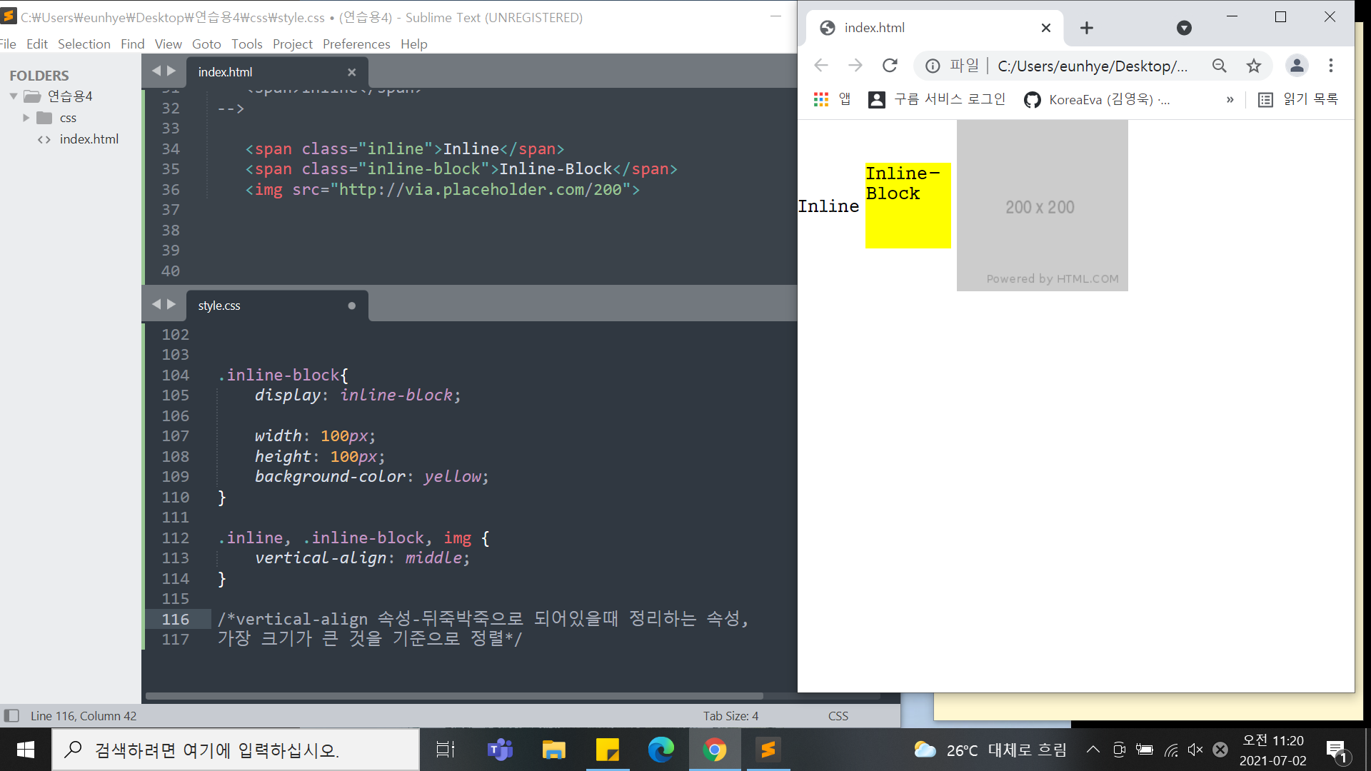
<span class="inline">Inline</span>
<span class="inline-block">Inline-Block</span>
<img src="http://via.placeholder.com/200">-css
h1 {
	display: inline-block;

	width: 200px;
	height: 200px;
	background-color: yellow;

	margin-top: 100px;
}

span {
	display: block;

	width: 100px;
	height: 100px;
	background-color: pink;

	margin-top: 100px
}
*/

/*inline(나란히, 공간을 가지고 있지 않음-상 하 배치작업x,미세한공백을 갖고있음),
block(줄바꿈현상,자체적 공간을 만들수 있음)

->but 서로의 특징을 갖고싶을때 사용하는 것 display:  ;
두가지 모두의 속성을 갖고싶을땐 -으로 연결*/


.inline-block{
	display: inline-block;

	width: 100px;
	height: 100px;
	background-color: yellow;
}

.inline, .inline-block, img {
	vertical-align: middle;
}

/*vertical-align 속성-뒤죽박죽으로 되어있을때 정리하는 속성,
가장 크기가 큰 것을 기준으로 정렬
but, inline 요소에서만 사용가능
img 태그는 "inline-block"의 속성을 갖고 있어서 적용됨 */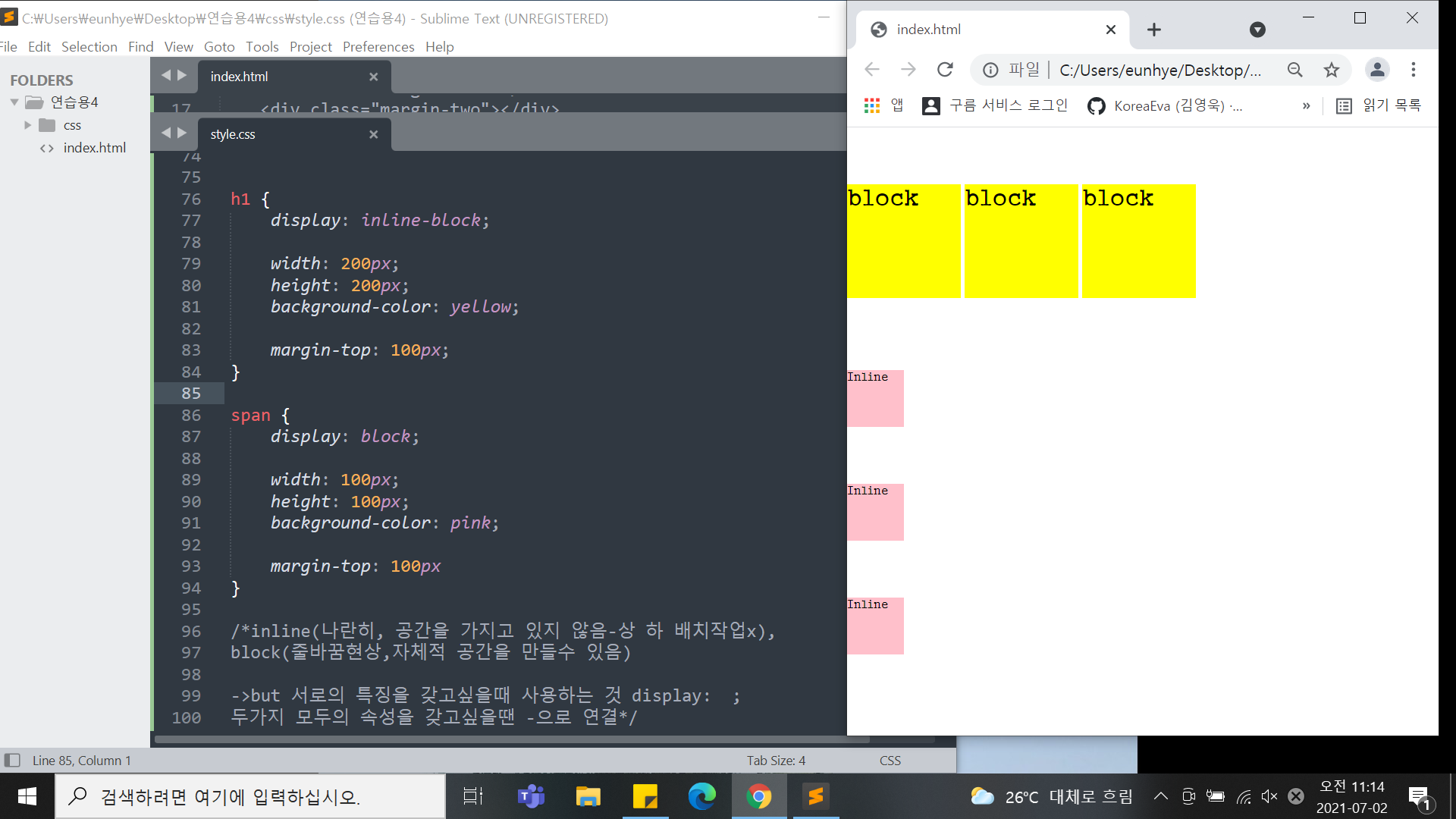
3.position(static, fixed, relative, absolute)
-html
<div class="static-parent">
<div class="static-child"></div>
</div>
<div class="box1"></div>
<div class="fixed-parent">
<div class="fixed-child"></div>
</div>
<div class="box2"></div>
<div class="box1"></div>
<div class="relative-parent">
<div class="relative-child"></div>
</div>
<div class="box1"></div>
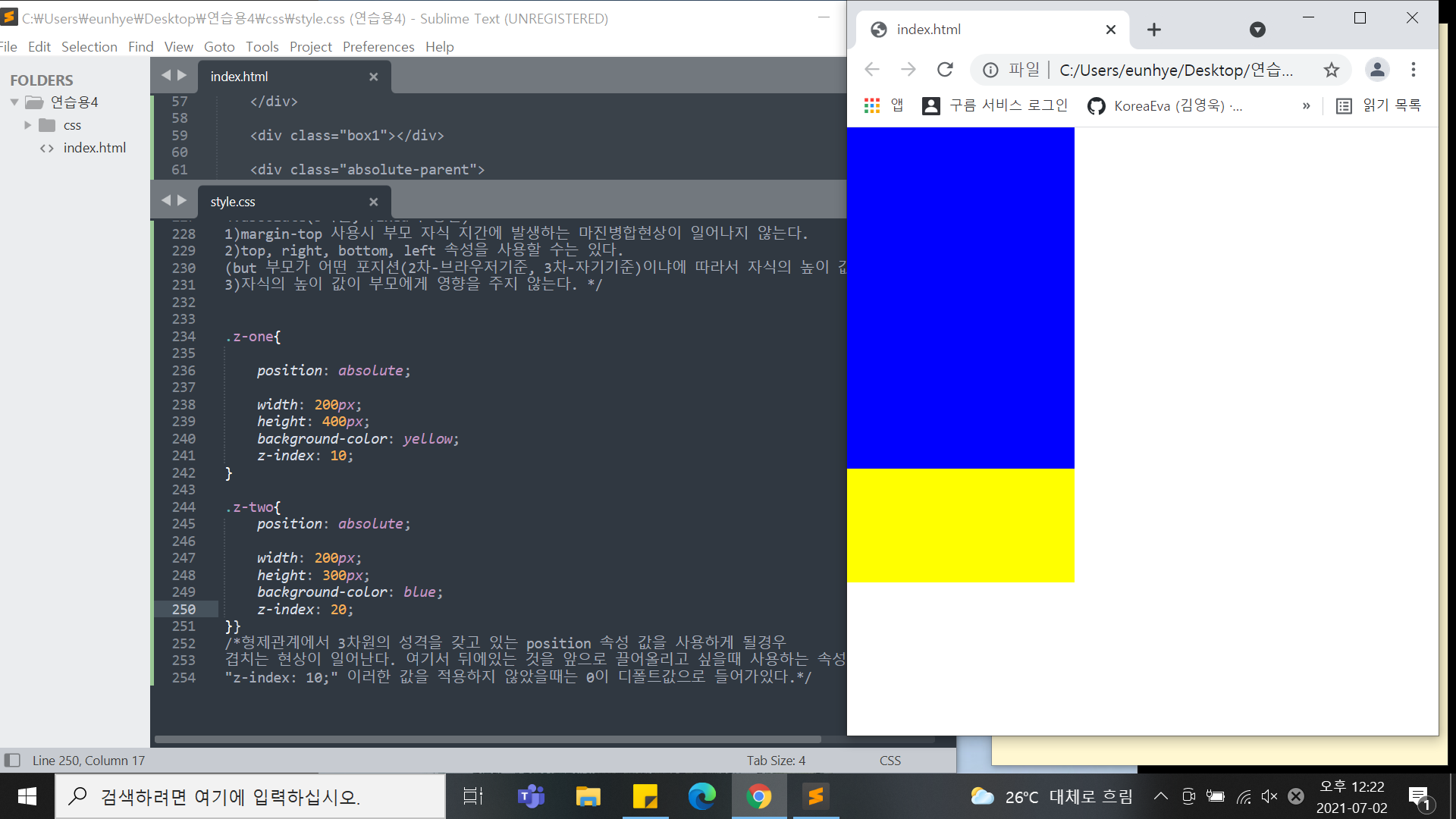
<div class="absolute-parent">
<div class="absolute-child"></div>
</div>
-->
<div class="z-one"></div>
<div class="z-two"></div>
</body>
</html>-css
.static-parent{
	width: 300px;
	height: 300px;
	background-color: yellow;
}
.static-child{
	width: 150px;
	height: 150px;
	background-color: blue;

	margin-top: 100px;
	top: 100px;
}

.box1{
	width: 300px;
	height: 200px;
	background-color: gray;
}
.fixed-parent {
	width: 300px;
	height: 300px;
	background-color: yellow;
}
.fixed-child {
	position: fixed;

	width: 100px;
	height: 100px;
	background-color: blue;

	margin-top: 100px;
	top: 100px;
}
.box2 {
	width: 300px;
	height: 2000px;
	background-color: green;
}


.box1{
	width: 300px;
	height: 200px;
	background-color: gray;
}
.relative-parent {
	width: 300px;
	height: 300px;
	background-color: yellow;
}
.relative-child {
	position: relative;

	width: 100px;
	height: 100px;
	background-color: blue;

	/*margin-top: 100px;*/
	top: 100px;
}

.box1{
	width: 300px;
	height: 200px;
	background-color: gray;
}
.absolute-parent {
	width: 300px;
	height: 300px;
	background-color: yellow;
}
.absolute-child {
	position: absolute;

	width: 100px;
	height: 100px;
	background-color: blue;

	/*margin-top: 100px;*/
	top: 100px;
}

/*
*차원 : 1차원(선), 2차원(평면-하나를움직이면 옆에 붙어있는 것도 함께 움직임),
 3차원(z축이 존재-하나를 옮겨도 다른것이 옮겨지는것은 아님)
-> 홈페이지는 2,3 차원의 조합으로 이루어짐
*position(static, fixed, relative, absolute)
아래 세가지를 기준으로 포지선 속성값이 갖고있는 특징 파악

1.static(2차원,모든html은 기본적으로 포지션스테틱상태,디폴드 값으로 갖고있다.)
1)margin-top 사용시 부모 자식 지간에 발생하는 마진병합현상이 일어난다.
2)top, right, bottom, left 속성을 사용할 수 있는지- 사용불가
3)자식의 높이 값이 부모가 높이를 갖고있지 않을때 영향을 준다.

2.fixed(3차원영역)
1)margin-top 사용시 부모 자식 지간에 발생하는 마진병합현상이 일어나지 않는다.
2)top, right, bottom, left 속성을 사용가능하지만,브라우저 왼쪽 상단기준으로 움직인다.)
3)자식의 높이 값이 부모에게 영향을 주지 않는다.

3.relative(2차원+3차원)
1)margin-top 사용시 부모 자식 지간에 발생하는 마진병합현상이 일어난다.(2차원)
2)top, right, bottom, left 속성을 사용할 수는 있지만,
브라우저 기준이 아닌 최초 있었던 위치를 기준으로 움직인다(내가주체).(3차원)
3)자식의 높이 값이 부모에게 영향을 준다.(2차원)

4.absolute(3차원, fixed와 동일)
1)margin-top 사용시 부모 자식 지간에 발생하는 마진병합현상이 일어나지 않는다.
2)top, right, bottom, left 속성을 사용할 수는 있다.
(but 부모가 어떤 포지션(2차-브라우저기준, 3차-자기기준)이냐에 따라서 자식의 높이 값이 달라진다.)
3)자식의 높이 값이 부모에게 영향을 주지 않는다. */


.z-one{
	/*position: absolute;*/

	width: 200px;
	height: 400px;
	background-color: yellow;
	/*z-index: 10;*/
}

.z-two{
	position: absolute;

	width: 200px;
	height: 300px;
	background-color: blue;
	/*z-index: 20;*/
}}
/*형제관계에서 3차원의 성격을 갖고 있는 position 속성 값을 사용하게 될경우
겹치는 현상이 일어난다. 여기서 뒤에있는 것을 앞으로 끌어올리고 싶을때 사용하는 속성값
"z-index: 10;" 이러한 값을 적용하지 않았을때는 0이 디폴트값으로 들어가있다.
->z축의 위치를 조정할 수 있다. 즉 , 3차원적인 특징이 있는 영역에서만 사용이가능하다.
ex)absolute.fixed(3차원), relative(2,3차원)*/
2) 학습내용 중 어려웠던 점
오늘은 css 속성들중 서로 겹쳐 문제가 일어날 수 있는 점 들을 알아보았는데, 너무 속성들이 많아 하나하나 헷깔렸던것같다. 또한 모든 곳에 적용되는 것이 아니라 부모 자식 관계 형제 관계 등 여러 관계에 따라 달라지다 보니 더 어려웠다.
3) 해결방법
따라가던 중 선생님과 똑같이 노란색으로 글자 배경화면을 선택했는데, 나의 글자는 배경이 다 덮히지 않았다. 그래서 왜그런지 찾아보던 도중, 검사로 보니 다른 문제점은 없었다. 그래서 생각한게 글자 크기 였는데, 선생님의 폰트 사이즈와 내사이즈가 달라서 발생한 문제였다. 그러나 오늘 속성값에서는 폰트 사이즈를 적용하지 않았기에 나는 나의 배경 크기를 조금 더 크게하여 선생님과 동일한 결과물이 나올수 있도록하였다.
4) 학습소감
점점 배우면 배울수록 더 어려워지는 느낌이다 정말 많은 언어들이 하나 같이 다른 속성들을 가지고 있어서, 한가지의 속성을 쓰더라도 완벽하게 알고 사용해야할 것같았다. 특히 비슷한 속성들은 각자의 상황에 따라 달라지기 때문에 더 적절한 속성 값들이 있으므로 잘 찾아서 해야겠다는 생각이 들었다.
어느새 또 일주일이 지나고 시작한지 한달이 지났다. 한달동안 너무 많은 것들을 갑자기 머릿속에 넣으려니 조금 벅찼던 것 같기도 하다. 하지만 하면 할 수록 더 흥미가 생기고 열정이 생겨갔던것 같다. 처음과는 다르게 지금은 이걸이용해 내가 무엇을 하면되겠다는 생각까지 들게되니 지난 한달이 참 의미 있게 느껴지면서도 남은 세달이 짧고 아쉽게까지 느껴졌다.
끝까지 이렇게 열정을 갖고 해야할텐데..! 이마음가짐을 잊지 않을 수 있도록 개발일지를 한번씩 다시 읽어야겠다!!