1) 학습한 내용
오늘은 네이버 모바일 버전에 대해 카피캣 해보았다.
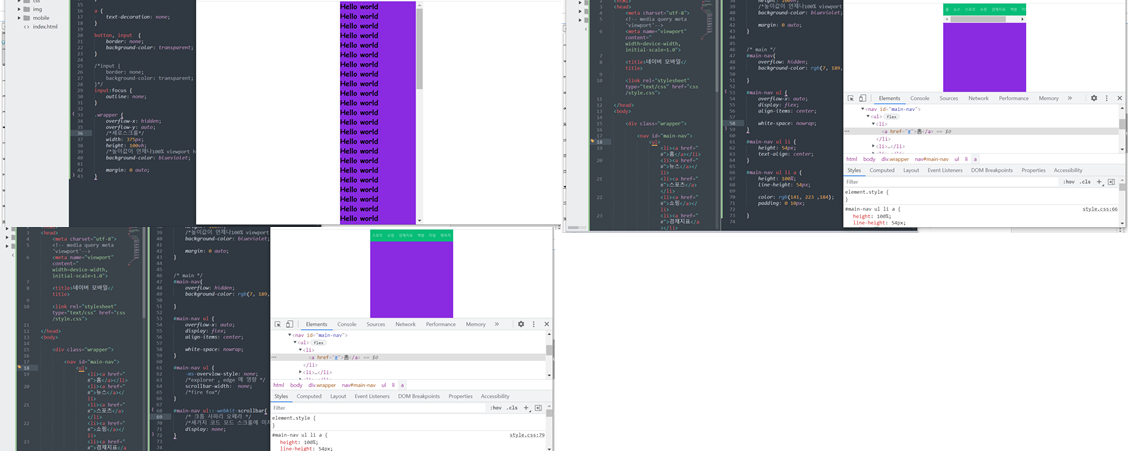
1. main-nav
- html
<nav id="main-nav">
			<ul>
				<li><a href="#">홈</a></li>
				<li><a href="#">뉴스</a></li>
				<li><a href="#">스포츠</a></li>
				<li><a href="#">쇼핑</a></li>
				<li><a href="#">경제지표</a></li>
				<li><a href="#">책방</a></li>
				<li><a href="#">리빙</a></li>
				<li><a href="#">뭐하지</a></li>
			</ul>
		</nav>
- css
* {
	margin: 0;
	padding: 0;
}

html, body {
	width: 100%;
	height: 100%;
}
ol, ul {
	list-style: none;
}
img {
	vertical-align: middle;
}

a {
	text-decoration: none;
}

button, input  {
	border: none;
	background-color: transparent;
}

/*input {
	border: none;
	background-color: transparent;
}*/
input:focus {
	outline: none;
}

.wrapper {
	overflow-x: hidden;
	overflow-y: auto;
	/*세로스크롤*/
	width: 375px;
	height: 100vh;
	/*높이값이 언제나100% viewport heigt*/
	background-color: #eaeef3;

	margin: 0 auto;
}


/* main */
#main-nav{
	overflow: hidden;
	background-color: rgb(7, 189, 120);
	border-top: solid 1px #000000;
	border-bottom: solid 1px #000000;

}

#main-nav ul {
	overflow-x: auto;
	display: flex;
	align-items: center;

	white-space: nowrap;
}

#main-nav ul {
	/*-ms-overvlow-style: none;*/
	/*explorer , edge 에 영향 */
	/*scrollbar-width:  none;*/
	/*fire fox*/
}

#main-nav ul::-webkit-scrollbar{
	/* 크롬 사파리 오페라 */
	/*세가지 코드 모드 스크롤에 미치는 속성*/
	/*display: none;*/
}


#main-nav ul li {
	height: 54px;
	text-align: center;
}

#main-nav ul li a {
	height: 100%;
	line-height: 54px;

	color: rgb(141, 223 ,184);
	padding: 0 10px;

}
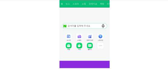
2. header
- html
<header id="header">

			<div class="search-wrap">
				<a href="#" class="link-logo"></a>
				<input type="text" placeholder="검색어를 입력해 주세요">
				<a href="#" class="link-voice"></a>
			</div>


			<nav class="header-nav">
				<ul>
					<li>
						<a href="#">
							<i class="icon">
								<img src="img/news.png">
							</i>
							<span>뉴스판</span>
						</a>
					</li>
					<li>
						<a href="#">
							<i class="icon">
								<img src="img/shopping.png">
							</i>
							<span>쇼핑판</span>
						</a>
					</li>
					<li>
						<a href="#">
							<i class="icon">
								<img src="img/arrow.png">
							</i>
							<span>경제지표판</span>
						</a>
					</li>
					<li>
						<a href="#">
							<i class="icon">
								<img src="img/sports.png">
							</i>
							<span>스포츠판</span>
						</a>
					</li>
					<li>
						<a href="#">
							<i class="icon">
								<img src="img/mail.png">
							</i>
							<span>메일</span>
						</a>
					</li>
					<li>
						<a href="#">
							<i class="icon">
								<img src="img/cafe.png">
							</i>
							<span>카페</span>
						</a>
					</li>
					<li>
						<a href="#">
							<i class="icon">
								<img src="img/blog.png">
							</i>
							<span>블로그</span>
						</a>
					</li>
					<li>
						<a href="#">
							<i class="icon">
								<img src="img/more.png">
							</i>
							<span></span>
						</a>
					</li>
				</ul>
			</nav>
		</header>
- css
/*header*/
#header {
	background-color: #f4f6f8;
	padding: 120px 0 80px;
}

#header .search-wrap {
	overflow: hidden;
	display: flex;
	flex-direction: row;
	flex-wrap: wrap;
	justify-content: flex-start;
	align-items: center;
	align-content: stretch;


	position: relative;

	width: 333px;
	border: solid 1px rgb(7, 189, 120);
	border-radius: 23px;

    margin: 0 auto 24px;

    background-color: white;

}
#header .search-wrap .link-logo{
	display: block;
	width: 40px;
    height: 40px;
	 background-image: url(../img/logo.png);
    background-size: 100% 100%;
    background-repeat: no-repeat;
    background-position: 50% 50%;

}
#header .search-wrap input{
	width: calc(100% - 78px);
	height: 22px;

	font-size: 16px;
	padding: -1px 17px;

}
#header .search-wrap .link-voice{
	display: block;
    width: 30px;
    height: 30px;
    /* background-color: green; */
    background-image: url(../img/voice.png);
    background-size: 100% 100%;
    background-repeat: no-repeat;
    background-position: 50% 50%;
}


#header .header-nav {
	width: 316px;
	margin: 0 auto;
}

#header .header-nav ul {
	display: flex;
	flex-direction: row;
	flex-wrap: wrap;
	justify-content: flex-start;
	align-items: flex-start;
	align-content: flex-start;

	width: 100%;

}

#header .header-nav  li {
	width: 25%;
	padding-top: 12px ;
}

#header .header-nav a {
	display: block;
	width: 100%;

	text-align: center;
}

#header .header-nav .icon img {
	display: inline-block;
	width: 44px;
	height: 44px;
	border-radius: 8px;
	/*border: solid 1px grey;*/
	background-color: #ffffff;

}

#header .header-nav span {
	display: block;

	font-size: 9px;
	color: #1e1e23;

	/*margin-top: 5px;*/

}
3. banner-1
- html
<div id="banner-1">
			<div class="banner-wrap">
				<img src="https://via.placeholder.com/750x160">
			</div>

		</div>
- css
#banner-1{
	background-color: #f4f6f8;
}

#banner-1 .banner-wrap {
	width: 100%;
	margin: 0 auto;
}

#banner-1 .banner-wrap img {
	width: 100%;
}

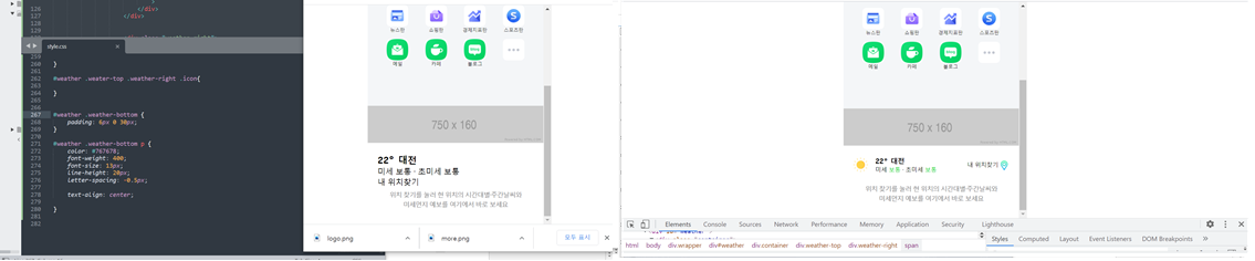
4. weather
- html
<div id="weather">

			<div class="container">

				<div class="weather-top">
					<div class="weather-left">
						<img src="img/sun.png">
						<div class="txt-wrap">
							<h3>22° 대전</h3>
							<p>미세 <span>보통</span> · 초미세 <span>보통</span></p>
						</div>
					</div>


					<div class="weather-right">
						<span>내 위치찾기</span>
						<i class="icon">
							<img src="img/pin.png">
						</i>
					</div>
				</div>

				<div class="weather-bottom">
					<p>
						위치 찾기를 눌러 현 위치의 시간대별·주간날씨와<br>
						미세먼지 예보를 여기에서 바로 보세요
					</p>
				</div>
			</div>

		</div>
- css
#weather {
	background-color: #ffffff;
}

#weather .container {
	padding: 0 20px;
}


#weather .weather-top{
	display: flex;
	flex-direction: row;
	flex-wrap: wrap;
	justify-content: space-between;
	align-items: center;
	align-content: center;

	padding: 22px 0 16px;

}
#weather .weather-top .weather-left {
	display: flex;
	flex-direction: row;
	flex-wrap: wrap;
	justify-content: flex-start;
	align-items: center;
	align-content: center;

}

#weather .weather-top .weather-left img {
	width: 30px;
	height: 30px;
	border-radius: 50%;

	margin-right: 15px;
}

#weather .weather-top .weather-left .txt-wrap{

}
#weather .weather-top .weather-left .txt-wrap h3 {
	font-size: 14px;
}

#weather .weather-top .weather-left .txt-wrap p {
	font-size: 12px;
}
#weather .weather-top .weather-left .txt-wrap p span {
	color: #00d01d;
}


#weather .weather-top .weather-right {
	display: flex;
	flex-direction: row;
	flex-wrap: wrap;
	justify-content: flex-end;
	align-items: center;
	align-content: center;
}

#weather .weather-top .weather-right span{
	font-size: 12px;
	margin-right: 2px;
}

#weather .weather-top .weather-right .icon img{
	display: inline-block;
	width: 20px;
	height: 20px;
	/*background-color: blue;*/
	border-radius: 50%;

	color: #767678;
}


#weather .weather-bottom {
	padding: 6px 0 30px;
}

#weather .weather-bottom p {
	color: #767678;
	font-weight: 400;
	font-size: 13px;
	line-height: 20px;
	letter-spacing: -0.5px;

	text-align: center;

}
2) 학습내용 중 어려웠던 점 및 해결방법
어려웠던 점이라고 하면 상단 네비부분에 원래는 자바스크립트로 가로스크롤이 생기지 않고도 옆으로 넘기는 기능을 사용하는 것인데, 대신에 우리는 스크롤이 생기되
없앨 수 있는 작업을 하였다.
그러나 키보드로 옆으로 페이지 이동이 가능해야 하므로 잠깐 작업해보고 다시 없앴다.
이런부분의 자바스크립트를 배워 얼른 완성에 가까운 페이지를 만들어야겠다.
3) 학습소감
오늘은 모바일 작업을 해보았다. 오랜만에 모바일 작업을 해서 좀더 집중해서 할 수 있었다.
특히나 네이버에 있는 그대로의 아이콘들을 사용하고싶었으나 몇몇은 가지고 왔지만 몇개는 다른 것을 사용해 아쉬웠다. 그래도 많은부분이 얼추 비슷하게 된 것 같아.
기분이 좋았다!!!
또 오늘은 월말평가가 있던날, 조금의 문제가 있어 다시 몇번을 치고 제출을 하느라 시간이 조금더 소비가 되었다.
그래도 무사히 마쳐서 다행이다 :)
남은 9월도 뽜이팅 해보자!!!
아직 여백이 많은 개린이입니다.