1) 학습한 내용
오늘은 어제 네이버 모바일버전 작업을 이어서 해보았다.
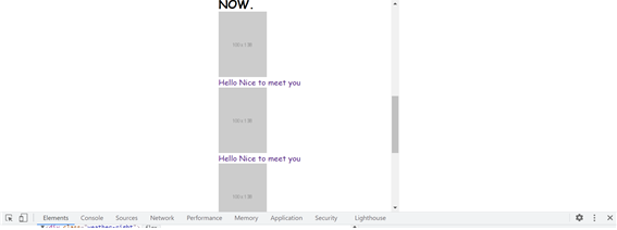
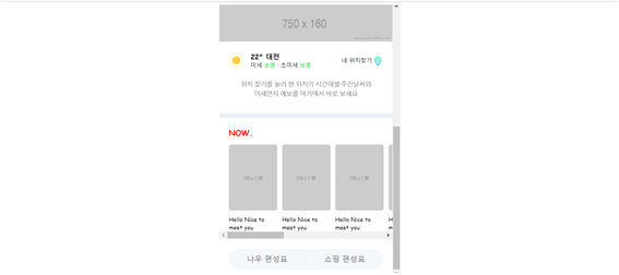
1. now
- html
<div id="now">
			<h2>NOW.</h2>
			<ul>
				<li>
					<a href="#">
						<img src="https://via.placeholder.com/100x138">
						<p>Hello Nice to meet you</p>
					</a>
				</li>
				<li>
					<a href="#">
						<img src="https://via.placeholder.com/100x138">
						<p>Hello Nice to meet you</p>
					</a>
				</li>
				<li>
					<a href="#">
						<img src="https://via.placeholder.com/100x138">
						<p>Hello Nice to meet you</p>
					</a>
				</li>
				<li>
					<a href="#">
						<img src="https://via.placeholder.com/100x138">
						<p>Hello Nice to meet you</p>
					</a>
				</li>
				<li>
					<a href="#">
						<img src="https://via.placeholder.com/100x138">
						<p>Hello Nice to meet you</p>
					</a>
				</li>
				<li>
					<a href="#">
						<img src="https://via.placeholder.com/100x138">
						<p>Hello Nice to meet you</p>
					</a>
				</li>
				<li>
					<a href="#">
						<img src="https://via.placeholder.com/100x138">
						<p>Hello Nice to meet you</p>
					</a>
				</li>

				<li>
					<a href="#">
						<img src="https://via.placeholder.com/100x138">
						<p>Hello Nice to meet you</p>
					</a>
				</li>
				<li>
					<a href="#">
						<img src="https://via.placeholder.com/100x138">
						<p>Hello Nice to meet you</p>
					</a>
				</li>
			</ul>

			<div class="btn-wrap">
				<a href="#" class="btn-now">나우 편성표</a>
				<a href="#" class="btn-shopping">쇼핑 편성표</a>
			</div>
		</div>
- css
/* NOW */

#now {
	background-color: white;
	padding: 20px 0 16px;
	margin-top: 10px;
}

#now h2 {
	font-size: 16px;
	font-weight: 900;
	color: red;

	margin-bottom: 14px;
	margin-left: 20px;
}

#now ul {
	overflow-y: auto;
	display: flex;
	flex-direction: row;
	flex-wrap: nowrap;
	justify-content: flex-start;
	align-items: center;
	align-content: center;

	padding-left: 20px;
}

#now ul li {
	margin-right: 10px;
}

#now ul li:last-child {
	margin-right: 0;
}

#now ul li a {
	color: #000000;
}

#now ul li a img {
	width: 100px;
	height: 138px;

	border-radius: 5px;
}

#now ul li a p {
	font-size: 12px;
	padding-top: 10px;
}

#now .btn-wrap {
	overflow: hidden;
	width: 320px;
	border-radius: 22px;
	background-color: #f5f8fb;

	display: flex;
	flex-direction: row;
	flex-wrap: nowrap;
	justify-content: space-between;
	align-items: center;
	align-content: center;

	margin: 20px auto 0;
}


#now .btn-wrap a {
	display: block;
	width: 50%;
	height: 44px;
	text-align: center;
	line-height: 44px;

	color: #767678;

}
#now .btn-wrap .btn-now {

}
#now .btn-wrap .btn-shopping {

}

#now .btn-wrap .btn-shopping:before {
	content: "";
	display: block;
	width: 1px;
	height: 14px;


	margin-top: 15px;
	background-color: rgba(125, 127, 133, 0.2);

	vertical-align: top;

	float: left;
} 
2.banner-2 & 3
- html
<div id="banner-2">
			<div class="banner-wrap">
				<img src="https://via.placeholder.com/320x53">
			</div>

		</div>

		<div id="banner-3">
			<div class="banner-wrap">
				<img src="https://via.placeholder.com/320X75">
			</div>

		</div>
- css
#banner-2{
	background-color: #ffffff;
	margin-top: 10px;
}

#banner-2 .banner-wrap {
	width: 320px;
	margin: 0 auto;
}

#banner-2 .banner-wrap img {
	width: 100%;
}


#banner-3{
	background-color: #ffffff;
	margin-top: 10px;
}

#banner-3 .banner-wrap {
	width: 320px;
	margin: 0 auto;
}

#banner-3 .banner-wrap img {
	width: 100%;
}
3. banner-4
- html
<div id="banner-4">
			<div class="banner-wrap">
				<img src="img/ad.jpg">
				<span>AD</span>
			</div>

		</div>
- css
#banner-4{
	overflow: hidden;
	background-color: #ffffff;
	margin-top: 10px;
}

#banner-4 .banner-wrap {
	position: relative;
	width: 100%;
	height: 155px;
}

#banner-4 .banner-wrap img {
	position: absolute;
	height: 100%;

	left: 50%;
	transform: translate(-50%);
}
#banner-4 .banner-wrap span {
	position: absolute;
	display: block;
    width: 26px;
    height: 18px;
    background-color: rgba(157, 157, 157, 0.5);
    border-radius: 8%;
    font-size: 13px;
    color: #ffffff;

    text-align: center;
    bottom: 8px;
    right: 18px;
}
4.corona
- html
<div id="corona">
			<div class="container">
				<div class="corona-wrap">
					<a href="#" class="left-corona">
						<img src="https://via.placeholder.com/35x35">
						<div class="txt-wrap">
							<h3>코로나19</h3>
							<p>국내외 확진 현황</p>
						</div>
					</a>
					<a href="#" class="right-corona">
						<img src="https://via.placeholder.com/35x35">
						<div class="txt-wrap">
							<h3>선별진료소</h3>
							<p>내 주변 진료소 찾기</p>
						</div>
					</a>
				</div>
			</div>
		</div>
- css
#corona {
	background-color: white;
	margin-top: 10px;
}

#corona .container {

}

#corona .corona-wrap {
	display: flex;
	flex-direction: row;
	flex-wrap: nowrap;
	justify-content: space-between;
	align-items: center;
	align-content: center;
}

#corona .corona-wrap a {
	position: relative;
	display: flex;
	flex-direction: row;
	flex-wrap: nowrap;
	justify-content: flex-start;
	align-items: center;
	align-content: center;

	padding: 20px 0;
}
#corona .corona-wrap .right-corona {
	padding-left: 11px;
}

#corona .corona-wrap .right-corona:before {
	content: "";
	display: block;

	position: absolute;
	width: 1px;
	height: 42px;
	background-color: #efeff0;

	top: 20px;
	left: 0;
}

#corona .corona-wrap img {
	width: 35px;
	margin-right: 8px;

	border-radius: 50%;
}
#corona .corona-wrap .txt-wrap {

}
#corona .corona-wrap .txt-wrap h3 {
	font-size: 14px;
	font-weight: 700;

	color: #000000;
}
#corona .corona-wrap .txt-wrap p {
	font-size: 12px;
	font-weight: 400;
}
5.
- html
<div id="ai">
			<div class="container">
				<div class="ai-wrap">
					<div class="ai-left">
						<img src="https://via.placeholder.com/40x40">
						<div class="txt-wrap">
							<p>
								더 편리해진 AI 검색 기능<br>
								네이버앱에서 만나보세요.
							</p>
						</div>
					</div>

					<div class="ai-right">
						<span>앱 사용하기</span>
					</div>

				</div>
			</div>
		</div>
- css
#ai {
	background-color: #ffffff;
	margin-top: 10px;
}

#ai .container {
	padding: 0 20px;

}

#ai .ai-wrap {
	display: flex;
	flex-direction: row;
	flex-wrap: nowrap;
	justify-content: space-between;
	align-items: center;
	align-content: center;

	padding: 20px 0;
}

#ai .ai-wrap .ai-left {
	display: flex;
	flex-direction: row;
	flex-wrap: nowrap;
	justify-content: flex-start;
	align-items: center;
	align-content: center;
}

#ai .ai-wrap .ai-left img {
	width: 40px;
	height: 40px;
	border-radius: 8px;

	margin-right: 8px;
}

#ai .ai-wrap .ai-left .txt-wrap {

}

#ai .ai-wrap .ai-left .txt-wrap p {
	font-size: 13px;
	color: #424242;
	font-weight: 400;
}


#ai .ai-wrap .ai-right  {
	display: flex;
	flex-direction: row;
	flex-wrap: nowrap;
	justify-content: flex-end;
	align-items: center;
	align-content: center;
}

#ai .ai-wrap .ai-right span {
	font-size: 12px;
	font-weight: 400;
	color: #03c95b;
}
2) 학습내용 중 어려웠던 점 및 해결방법
오늘은 배너4 부분에서 이미지를 넣는데 위치를 선정하는 것이 어려웠다.
부모의 상속을 받아 브라우저기준이아닌 부모기준으로 위치를 옮기도록 설정을 하는데, left: 50%; transform: translate(-50%); 를 사용하였고,
또 배너안에 광고라는 표시의 span태그도 위치를 선정하는데 img와 같이 position absolute를 사용하여야 했다. 부모인 배너는 relative를 가지게 하여 부모안에서의 위치를 잡아줄 수 있었다.또 display block을 주어 top bottom 과 같은 태그를 사용해 위치를 잡았다.
강사님과 이전에 네이버에서 이런작업을 여러번해주었음에도 혼자서 하려니 헷깔리고 어려웠다. 계속 더 해봐야 할 것같다.
3) 학습소감
조금더 디테일하게 잡아주려니 시간이 더많이 걸리는 것 같다. 좀 느리지만 그래도 조금더 깊이 알게되는 것 같기도해서 좋다 :)
9월1일이다. 오늘도 뽜이팅 !!
아직 여백이 많은 개린이입니다.