1) 학습한 내용
오늘은 네이버 모바일버전을 이어서 마무리 해보았다.
1. talk
- html
<div id="talk">
			<ul>
				<li class="left-list">
					<a href="#">
						<i class="icon-arrow icon-arrow-left"><img src="img/left-arrow.png"></i>
						<div class="content-wrap">

							<div class="txt-wrap">
								<h3>패션뷰티판</h3>
								<p>
									동해물과 백두산이<br>
									마르고 닳도록
								</p>
							</div>
							<img src="https://via.placeholder.com/52">
						</div>
					</a>
				</li>

				<li class="right-list">
					<a href="#">
						<div class="content-wrap">
							<img src="https://via.placeholder.com/52">
							<div class="txt-wrap">
								<h3>패션뷰티판</h3>
								<p>
									동해물과 백두산이<br>
									마르고 닳도록
								</p>
							</div>

						</div>
						<i class="icon-arrow icon-arrow-right"><img src="img/right-arrow.png"></i>
					</a>
				</li><li class="right-list">
					<a href="#">

						<div class="content-wrap">
							<img src="https://via.placeholder.com/52">
							<div class="txt-wrap">
								<h3>패션뷰티판</h3>
								<p>
									동해물과 백두산이<br>
									마르고 닳도록
								</p>
							</div>

						</div>
						<i class="icon-arrow icon-arrow-right"><img src="img/right-arrow.png"></i>
					</a>
				</li>
			</ul>
		</div>
- css
#talk {

}

#talk ul {
	overflow: hidden;
	/*float을 사용해 자식의 높이값을 부모가 인식을 못하는 상태
	이므로 hidden을 사용해 높이값 생성*/

}

#talk ul li {
	position: relative;
	width: 277px;
	background-color: #ffffff;
	padding: 15px 0 ;
	box-shadow: 0 1px 6px 0 rgb(0 0 0 / 6%), 0 1px 0 0 rgb(0 0 0 / 2%);

	margin-bottom: 12px;
}

#talk ul li:last-child {
	margin-bottom: 0;
}

#talk ul li .icon-arrow img {
	display: inline-block;
	width: 20px;
	height: 16px;
	/*background-color: purple;*/
}

#talk ul li img {
	width: 52px;
	height: 52px;
	border-radius: 50%;
}

#talk ul a {
	display: flex;
	flex-direction: row;
	flex-wrap: wrap;
	justify-content: space-between;
	align-items: center;
	align-content: center;

	padding: 0 20px;

	color: #000000;

}


#talk ul .content-wrap .txt-wrap h3 {
	font-size: 12px;
	font-weight: 600;
}

#talk ul .content-wrap .txt-wrap p {
	font-size: 11px;
	line-height: 16px;
	margin-top: 3px;
}


#talk ul .left-list {
	float: left;

	border-top-right-radius: 40px;
	border-bottom-right-radius: 40px;
}
/*한쪽만 동글*/


#talk ul .left-list .icon-arrow-left {

}

#talk ul .left-list .content-wrap {
	display: flex;
	flex-direction: row;
	flex-wrap: wrap;
	justify-content: flex-start;
	align-items: center;
	align-content: center;

}

#talk ul .left-list .content-wrap img {
	margin-left: 8px;
}
#talk ul .left-list .content-wrap .txt-wrap h3 {
	color: purple;
}


#talk ul .right-list {
	float: right;

	border-top-left-radius: 40px;
	border-bottom-left-radius: 40px;
}
/*한쪽만 동글*/


#talk ul .right-list .icon-arrow-right {

}

#talk ul .right-list .content-wrap {
	display: flex;
	flex-direction: row;
	flex-wrap: wrap;
	justify-content: flex-start;
	align-items: center;
	align-content: center;

}

#talk ul .right-list .content-wrap img {
	margin-right: 8px;
}
#talk ul .right-list .content-wrap .txt-wrap h3 {
	color: #0ac666;
}
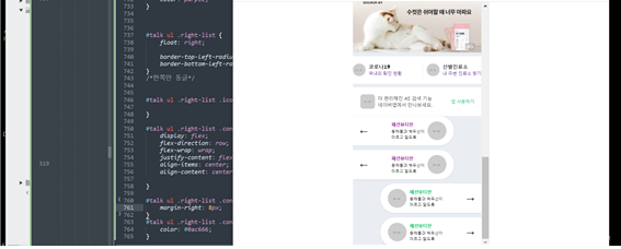
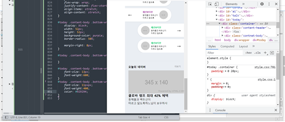
2. today
- html
<div id="today">
<div class="container">
<div class="content-header">
<h2>오늘의 네이버</h2>
<a href="#">더보기</a>
</div>
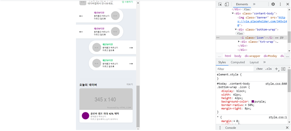
<div class="content-body">
<img class="banner" src="https://via.placeholder.com/345x140">
<div class="bottom-wrap">
<i class="icon"></i>
<div class="txt-wrap">
<h3>클로바 램프 최대 42% 혜택</h3>
<p>
동해물과 백두산이<br>
마르고 닳도록하느님이 보우하사
</p>
</div>
</div>
</div>
</div>
</div>
- css
#today{
	padding: 50px 0;
}

#today .container {
	padding: 0 20px;
}

#today .content-header {
	display: flex;
	flex-direction: row;
	flex-wrap: wrap;
	justify-content: space-between;
	align-items: stretch;
	align-content: stretch;

	border-top: solid 1px #e0e4ea;

	padding-top: 24px;
	margin-bottom: 10px;

}

#today .content-header h2 {
	font-size: 16px;
	font-weight: bold;
}

#today .content-header a {
	color: #767678;
	font-size: 12px;
	font-weight: 400;
}


#today .content-body {
	overflow: hidden;

	width: 100%;
	background-color: #ffffff;
	border-radius: 8px;

	box-shadow: 0 1px 6px 0 rgb(0 0 0 / 6%), 0 1px 0 0 rgb(0 0 0 / 2%);


}
#today .content-body .banner {
	width: 100%;
}

#today .content-body .bottom-wrap {
	display: flex;
	flex-direction: row;
	flex-wrap: wrap;
	justify-content: flex-start;
	align-items: stretch;
	align-content: stretch;

	padding: 14px 13px 12px 15px;
}

#today .content-body .bottom-wrap .icon {
	display: block;
	width: 42px;
    height: 42px;
	background-color: purple;
	border-radius: 50%;

	margin-right: 8px;
}

#today .content-body .bottom-wrap .txt-wrap {

}

#today .content-body .bottom-wrap h3 {
	font-size: 13px;
	font-weight:600;
}
#today .content-body .bottom-wrap p {
	font-size: 11px;
	font-weight:400;
	color: #929294;
}
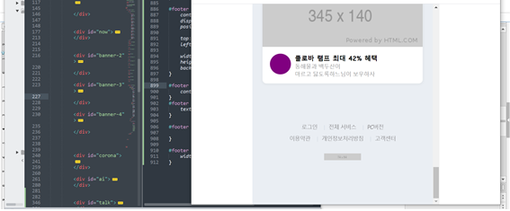
3. footer
- html
<footer id="footer">
			<div class="txt-wrap">
				<div class="link">
					<a href="#">로그인</a>
					<a href="#">전체 서비스</a>
					<a href="#">PC버전</a>
				</div>
				<div class="link">
					<a href="#">이용약관</a>
					<a href="#">개인정보처리방침</a>
					<a href="#">고객센터</a>
				</div>

			</div>

			<h1>
				<a href="#">
					<img class="banner" src="https://via.placeholder.com/74x14">
				</a>
			</h1>
		</footer>
- css
#footer {
	padding: 25px 0 80px;
}

#footer .txt-wrap {
	text-align: center;
}

#footer .txt-wrap a {
	position: relative;

	display: inline-block;
	padding: 3px 9px;
	color: #929294;
	font-size: 11px;
	font-weight: 400;

	letter-spacing: -0.5px;
}

#footer .txt-wrap a:before {
	content: "";
	display: block;
	position: absolute;

	top: 7px;
	left: 0;

	width: 1px;
	height: 10px;
	background-color: #d7dfe7;
}

#footer .txt-wrap .link a:first-child:before{
	content: none;
}
#footer h1 {
	text-align: center;
}

#footer h1 a {

}

#footer h1 a img {
	width: 74px;
}
2) 학습내용 중 어려웠던 점 및 해결방법
어려웠던 내용은 크게 없었으나 마지막 footer 부분에서 before에 content 를 적용해 세로 바를 만드는데, 첫번째와 네번째 앞에는 적용 되지 않도록 다시 줬는데, 다른 것들로 인해 적용이 안되어 계속 나타났다.
그래서 그럴때 사용하는 것이
따로 문단을 나누고 각각의 다른 박스안에 넣어 first-child에게만 주지 않는 방법으로 하니 간단하게 해결이 되었다.
지금까지 했던 방법이 통하지 않을때 사용한 새로운 방법이라 조금더 기억에 남았던 것 같다.
3) 학습소감
하다보면 다양한 문제들이 나타나는데, 이 문제들을 해결할때 틀이 없는것 같다. 당연히 반복적으로 사용되는 해결방법들이 있지만, 그 외에도 다양한 방법들로 해결할 수 있어 창의력과 순발력을 발휘할 수 있는 노력이 필요한것같다.
많이 알수록 다양한 해결방법도 찾아가는 것 같아 더 재밌는 것 같다.
아직 여백이 많은 개린이입니다.