
들어가기에 앞서
이 글은 CSS의 Position 속성,
특히 지정값 중 relative와 absolute에 대해 다루고 있습니다.
먼저, 요소를 이동시키는 방법에는
1. 네거티브 마진
2. tranform: translateX(또는 Y) 값 부여하기가 있다.
(이 외에도 있겠지만..)
오늘은 이 두 가지 속성 말고도,
요소를 이동시키는 속성인 position에 대해 알아보았다.
(* 1. 네거티브 마진과 transform의 차이점
: 네거티브 마진은 뒷 요소를 함께 끌고 이동하지만,
transform은 속성이 적용된 요소만 이동한다.
* 2. translateX(또는 Y)에 퍼센트 값을 준다면 자기 너비의 퍼센트를 기준으로 요소가 이동된다.)
Position이란?
문서 상에서 요소를 배치하는 방법을 지정하는 CSS 속성
initial value:static, inheritance: no
지정값: relative, absolute, fixed, sticky
이 글에서는 static, relative, absolute에 대해 다뤄보겠다.
1. position: static
- position 속성의 기본값이며, 요소들이 html에 작성된 순서 그대로 브라우저 화면에 표시가 된다.
- 요소들이 배치될 때, 보통 좌->우(우횡서 방식일 경우 우->좌), 상->하 순으로 배치된다.
top,left,bottom,right속성값은 요소의 position이static일 때엔 무시된다.
2. position: relative
자기 자신을 기준으로
top,right,bottom,left의 값에 따라 오프셋 거리만큼 이동한다.
현재 위치에서 상대적으로 이동하겠다는 개념
- 마진까지 포함해서 자기 공간은 그대로 두고, 시각적으로만 이동한다.
- 따라서 절대적인 위치 좌표를 표시하는 것이 아니다.
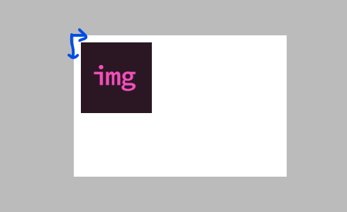
relative사용 예제
위 예시는 현위치(파란 화살표가 시작하는 지점)에서 left로 10px, top으로 10px 이동한다는 뜻이다..div { position: relative; left: 10px; top: 10px; }
결과:
3. position: absolute
position: static 속성을 가지고 있지 않은 조상을 기준으로 움직인다.
그렇지 않다면, 뷰포트를 기준점으로 시작한다.
absolute가 부여된 요소는 공간을 차지하지 않는다.- 절대적인 위치는
top,right,bottom,left로 조정한다. position: absolute가 부여된 요소의 최초 컨테이닝 블럭= 뷰포트- 부모 또는 조상 요소에
position: static이 아닌 값이 적용되어 있다면,
컨테이닝 블럭은 부모 또는 조상 요소가 된다.- 따라서 absolute가 부여된 요소는 컨테이닝 블럭을 기준으로 이동한다.
- 만약 부모와 조상 둘 다 position: static이 아니라면, 컨테이닝 블럭은 부모 요소가 된다.
(자식 이기는 부모 없다고.. 부모 이기는 조상도 없는듯.. 못이기긴해)
- 마진이나 패딩값을 주어도 그 박스까지 함께 이동한다.
absolute가 부여된 요소는 공간을 차지하지 않는다.- 절대적인 위치로 이동해야하기 때문에 요소의 콘텐츠 만큼만 크기를 가진다.
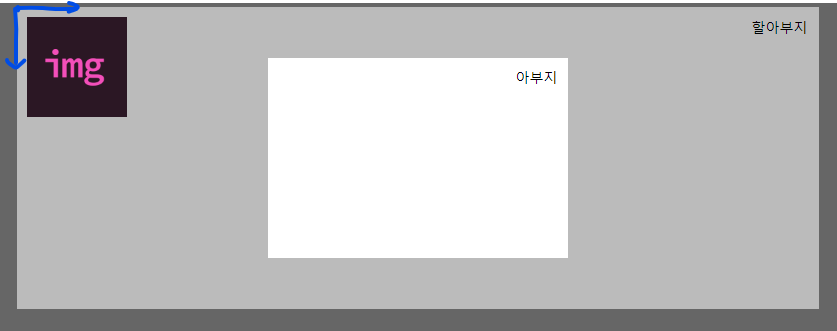
(-> 인라인 요소처럼 보이게 되는 이유) absolute사용 예제/* html */ <div class="grand-parents"> <div class="parents" <img class="children" src="img.png"> </div> </div>
위 예시는 컨테이닝 블럭인.grand-parents { position: relative; } .children { position: absolute; left: 10px; top: 10px; }.grand-parents를 기준으로 왼쪽 10px, 위쪽 10px의 위치로 이동된다.
(.grand-parents가 컨테이닝 블럭이 된 이유: position: static이 아니므로)
결과:
position 속성이 요소를 이동시키는 것이라면, 가운데 정렬도 가능할까?
대답은 Yes다.
실험대상이 될 코드 ↓
/* html */
<div class="grand-parents">
	<div class="parents"
    <img class="children" src="img.png">
  </div>
</div>
.grand-parents {
position: static;
background-color: #bbb;
width: 800px;
margin: 0 auto;
padding: 1px;
}
.children {
width: 100px;
height: 100px;
} 위 코드의 결과 ↓
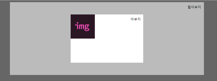
absolute로 가운데 정렬하기 ① (with transform)
이번 실험에선, 저 img 이미지를 할아부지의 정중앙으로 이동시킬 것이다.
그러기 위해 위 CSS 코드를 살짝 수정시켜 보았다.
.grand-parents {
    position: static;
    background-color: #bbb;
    width: 800px;
    margin: 0 auto;
    padding: 1px;
    position: relative;
}
.children {
    width: 100px;
    height: 100px;
    /*추가*/
    position: absolute;
    left: 50%;
    top: 50%;
}
(이렇게 수정한 이유: left와 top의 50%만큼 가면 가운데로 갈 수 있으니까라고 생각해서)
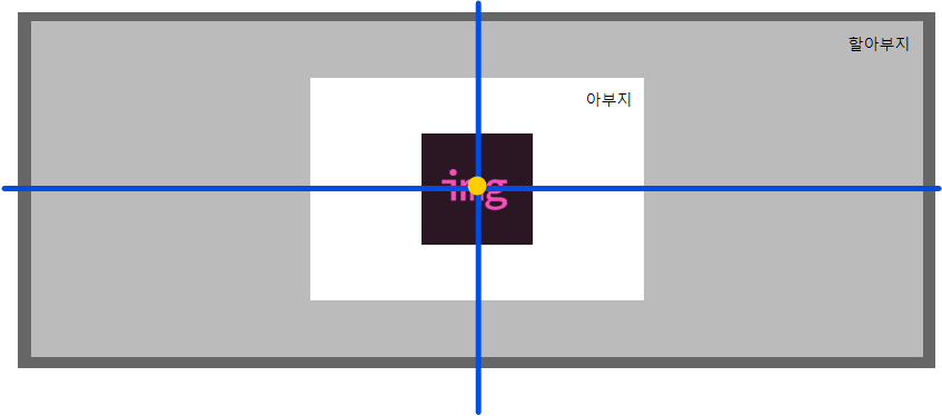
수정한 코드의 결과는? ↓
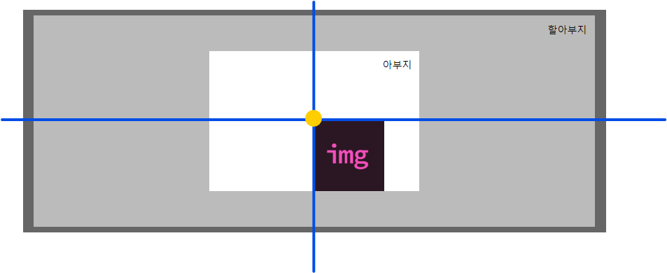
아뿔싸! 정중앙(노란 점)을 기준으로 좀 더 오른쪽, 밑쪽으로 치우쳐져 보인다.
(치우쳐진게 맞다)
이런 결과가 나온 이유는, 이미지가 자기 왼쪽 위(노란 점이 묻은 부분)를 기준점으로 이동하기 때문이다.
따라서 이 때엔 상단에 잠시 나온 translate를 이용하여 내 너비의 퍼센트만큼 다시 이동시킨다.
.grand-parents {
    position: static;
    background-color: #bbb;
    width: 800px;
    margin: 0 auto;
    padding: 1px;
    position: relative;
}
.children {
    width: 100px;
    height: 100px;
    position: absolute;
    left: 50%;
    top: 50%;
    /*추가*/
    transform: translate(-50%,-50%);
}
결과 ↓

수직, 수평 가운데 정렬 완성!
absolute로 가운데 정렬하기 ②
transform 속성을 사용하지 않고도 할 수 있는 방법이 있다!
바로, top, right, ,bottom, left 속성에 0을 준 후
margin: auto; 값을 주는 것이다.
실험대상에 코드를 추가해보았다. 결과는?
.grand-parents {
    position: static;
    background-color: #bbb;
    width: 800px;
    margin: 0 auto;
    padding: 1px;
    position: relative;
}
.children {
    width: 100px;
    height: 100px;
    /*추가*/
    position: absolute;
    left: 0;
    right: 0;
    top: 0;
    bottom: 0;
    margin: auto;
}
결과 ↓
실험 ① 보다 훨씬 간편하게 수직, 수평 가운데 정렬을 할 수 있었다.
하지만 이 방법은 top, right, ,bottom, left 속성이 0이어야 한다.
또한, 이동할 요소의 너비와 높이가 설정되어 있어야 한다.
만약 너비와 높이가 설정되지 않았을 때 top, right, ,bottom, left 속성이 0 이라면..?
/* html */
<div class="grand-parents">
	<div class="parents"
    <div class="children">멋사</div>
  </div>
</div>
.grand-parents {
position: static;
background-color: #bbb;
width: 800px;
margin: 0 auto;
padding: 1px;
position: relative;
}
.children {
position: absolute;
left: 0;
right: 0;
top: 0;
bottom: 0;
background-color: salmon;
}일 때 어떻게 될까?
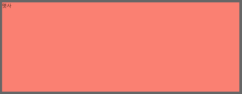
위 사진처럼, 컨테이닝 블록을 기준으로 상하좌우로 늘어나서 마치..
할아부지를 잡아먹은 것처럼 보인다.. ㅠㅠ (flex-grow와 비슷?)
사실은 컨테이닝 블록 안에서 사용 가능한 공간을 최대치로 채워주는 느낌이다..!
자투리 지식
position의 top, right, bottom, left을 사용하려면 네 줄의 코드가 필요하다.
이를 줄여주는 단축 속성이 있는데, 바로 inset 이다. (IE에선 사용불가!)
나는 솔직히 단축속성은 예시로 봐야 더 이해가 잘 되어서 예시를..ㅎ 보이며 이만 글을 줄입니다.
left: 20px;
right: 20px;
top: 10px;
bottom: 40px;
/* 이것을 inset으로 요약한다면 */
inset: 10px 20px 40px;
---
left: 0;
right: 0;
top: 0;
bottom: 0;
/* 이것을 inset으로 요약한다면 */
inset: 0;
---
left: 20px;
right: 40px;
top: 50px;
bottom: 30px;
/* 이것을 inset으로 요약한다면 */
inset: 50px 40px 30px 20px;
오늘은 position의 static, relative, absolute의 성질과,
absolute일 때 요소를 가운데 정렬하는 것에 대해 배워보았습니다.
사실..
다른 분들이 포지션 쓰실 때 보면서
'저거 뭔데 저렇게 남발하지???'
'진짜 편한가보다....그래서 많이 쓰는갑네'
라고 생각했거든요..
근데 오늘 배우고 나니까
저라도 남발할 것 같다는 생각이 드네욧...ㅋㅋ
개인적으론 flex보다 더 편하게 요소를 이동시킬 수 있을거 같아서
flex와 position 둘 중 사용할 수 있는 상황이 온다면
잘 보고 position을 쓰도록 하겠습니다 ^^
이만 끝!