복습하다가 노션이 다운돼서 오랜만에 벨로그를 쓰게되었다는 슬픈 얘기를 전하며... 시작
CSS Module (CSS in CSS)
리액트 프로젝트에서 컴포넌트를 스타일링할 때, 여러 개의 CSS 파일을 사용하다보면 동일한 이름의 클래스가 중복으로 정의될 수 있다.
중복된 클래스가 정의된 리액트 엘리먼트는 여러 클래스에서 지정한 스타일이 모두 다 적용되며 내가 원하는 스타일이 안나올 수 있다!
이때, CSS Module 기술을 사용하면 CSS 클래스가 중첩되는 것을 방지할 수 있다.
[클래스 이름]_[해시값] 형태로 만들어진다.
같은 rounded-button을 가지고 있지만, 클래스 이름에 대해 고유한 이름이 만들어지기 때문에 CSS 클래스 이름과 중복되는 일에 대해 걱정할 필요는 없다.
👩🏻💻 사용 방법 & 예제
간단하게, css 파일의 확장자를 .module.css 로 하면 된다.
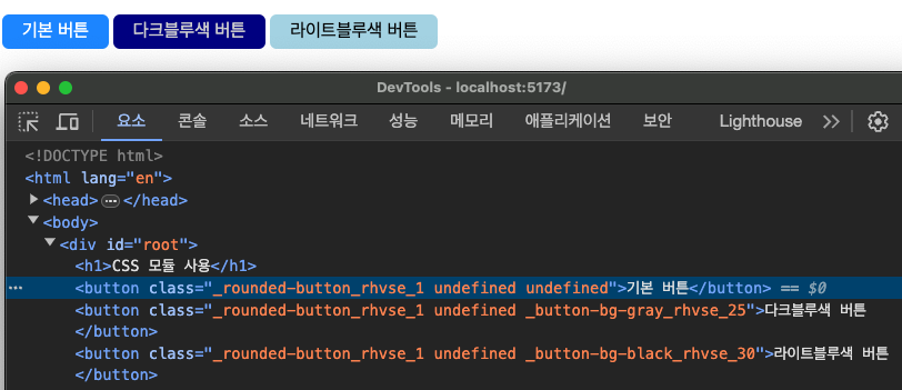
css module 기술을 이용해 위 사진의 버튼 컴포넌트들을 만들어 보았다.
Button.module.css css 파일 ⬇️
📁 cssmodule/src/components/Button.module.css

.rounded-button {
  background-color: dodgerblue; /* background */
  border: none; /* Remove borders */
  color: white; /* White text */
  padding: 6px 18px; /* Padding */
  text-align: center; /* Center text */
  text-decoration: none; /* Remove underline */
  display: inline-block; /* Display as inline-block */
  font-size: 16px; /* Font size */
  margin: 4px 2px; /* Margin */
  cursor: pointer; /* Cursor pointer */
  border-radius: 6px; /* Border radius */
}

.button-darkblue-gray {
  background-color: darkblue;
  color: gray;
}

.button-lightblue-black {
  background-color: lightblue;
  color: black;
}

.button-bg-gray {
  background-color: darkblue;
  color: lightgray;
}

.button-bg-black {
  background-color: lightblue;
  color: black;
}

.button-salmon {
  background-color: salmon;
}
Button.jsx 컴포넌트 파일 ⬇️
컴포넌트 상단에 module.css 파일을 import 한 후 사용
📁cssmodule/src/components/Button.jsx
import PropTypes from 'prop-types';
import styles from './Button.module.css'

// propType 지정
Button.propTypes = {
  children: PropTypes.string.isRequired,
  color: PropTypes.string,
  backgroundColor: PropTypes.string
}


function Button({ children, color, backgroundColor }) {
  return <button className={
    `${styles['rounded-button']}
	 ${styles['button-'+backgroundColor]}
	 ${styles['button-bg-'+color]}` }>{ children }
	</button>
}

export default Button;
템플릿 리터럴 방식으로 클래스 이름을 가져와준다.
근데 만약 여러 개라면 ${style.first}, ${style.second} 이렇게 해야 하는데 너무 번거롭게 느껴진다..
(-> 를 해결하기 위해 classNames 라이브러리를 쓸 수 있다.
이건 다음에 알아봐야지..)
App.jsx 최종 렌더링 파일 ⬇️
📁cssmodule/src/App.jsx
import './App.css'
import Button from './components/Button';
function App(){
return (
<>
<h1>CSS 모듈 사용</h1>
<Button>기본 버튼</Button>
<Button backgroundColor="darkblue" color="gray">다크블루색 버튼</Button>
<Button backgroundColor="lightblue" color="black">라이트블루색 버튼</Button>
</>
)
}
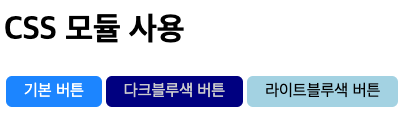
export default App;렌더링 결과 ⬇️
🔍 그렇다면 언제 사용하는 것이 좋을까?
- 레거시 프로젝트에 리액트를 도입할 때
- 기존 프로젝트에 있던 CSS 클래스와 이름이 중복되어도 스타일이 꼬이지 않음
- CSS 클래스 네이밍 규칙을 만들기 귀찮을 때, 힘들 때, 번거로울 때
- 클래스명을 모듈 내에서만 중복되지 않게 작성하면 되기 때문에 클래스명 네이밍 고민이 줄어든다.
- 보통 컴포넌트 당 CSS 모듈을 작성하기 때문에 스타일을 유지보수할 때에도 편하다.
💡 새로 알게 된 사실
CSS Module은 Sass에서도 사용할 수 있다! (아직은 안써봤지만)
node-sass 를 설치한 후, 확장자를 .module.scss 로만 바꿔주면 사용할 수 있다.
styled-components (CSS in JS)
💅 styled-components ! 저 네일아트 하는 이모지가 인상 깊어서 정말 써보고 싶었던 라이브러리다.
styled-components는 대표적인 css in js 라이브러리이며, 그만큼 대중적으로 많이 사용하고 있다.
(이 외에는 emotion과 styled-jsx가 있다.)
(css in js: 자바스크립트 코드로 css를 작성하는 것)
css module 방식과는 다르게, class로 지정하는 것이 아니라 props를 이용해서 css를 적용하는 것을 볼 수 있다.
그럼 어떻게 사용하느냐?
👩🏻💻 사용 방법 & 예제
설치
npm i styled-componentsstyled-components가 필요한 프로젝트 폴더에서 명령어를 입력해주고 엔터치면 설치 완료!
예제
styled-components를 이용해 버튼을 만들어보았다.
버튼 컴포넌트를 만들고, 스타일 입히기
StyledButton.jsx ⬇️
📁 styledcomponents/src/components/StyledButton.jsx
import styled from 'styled-components';
import PropTypes from 'prop-types';
// Tagged Template Literal 방식을 사용해 컴포넌트의 props를 읽어온다.
const ButtonStyle = styled.button`
background-color: ${ props => props.backgroundColor || 'dodgerblue' }; /* background */
border: none; /* Remove borders */
color: ${ props => props.color || 'white' }; /* White text */
padding: 6px 18px; /* Padding */
text-align: center; /* Center text */
text-decoration: none; /* Remove underline */
display: inline-block; /* Display as inline-block */
font-size: ${ props => props.size || '16px' }; /* Font size */
margin: 4px 2px; /* Margin */
cursor: pointer; /* Cursor pointer */
border-radius: 6px; /* Border radius */
`;
// ButtonStyle에서 색상만 따로 바꾸고 싶다면 이렇게 작성한다.
const ButtonStyleSalmon = styled(ButtonStyle)`
background-color: salmon; /* background */
`;
// propType 지정
Button.propTypes = {
children: PropTypes.string.isRequired,
}
Submit.propTypes = {
children: PropTypes.string.isRequired,
backgroundColor: PropTypes.string
}
// props를 하나하나 넣어주는 번거로운 짓은 하지 말고, rest 문법을 사용한다.
function Button({ children, ...rest }){
return <ButtonStyle type="button" { ...rest }>{ children }</ButtonStyle>
}
function Submit({ children, ...rest }){
return <ButtonStyleSalmon type="submit" { ...rest }>{ children }</ButtonStyleSalmon>
}
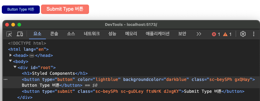
export { Button, Submit }최종 렌더링 파일 App.jsx ⬇️
📁 styledcomponents/src/App.jsx
import { Button, Submit } from "./components/StyledButton";
function App(){
return (
<>
<h1>Styled Components</h1>
// props를 넘겨주어 size, color, bgColor 등 원하는 것을 바꿔줄 수도 있다.
<Button
size="12px"
color="lightblue"
backgroundColor="darkblue">Button Type 버튼</Button>
<Submit>Submit Type 버튼</Submit>
</>
)
}
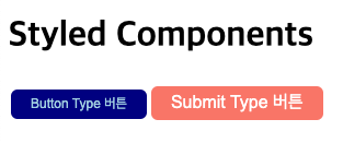
export default App;렌더링 결과 ⬇️
🔍 styled-components의 장점
- 얘도 css module 방식처럼, css 클래스명의 중복을 고려할 필요가 없다. 고유한 클래스 이름을 자동으로 생성해주기 때문에!
- 자바스크립트 코드의 변수 값을 CSS 스타일링에 사용할 수 있기 때문에, 동적으로 스타일링이 가능하다. (
props,state등을 이용해서) - 컴포넌트와 스타일이 결합 -> 컴포넌트 단위로 스타일을 수정하기 용이하다.
- vender prefix가 자동으로 추가된다!
- vender prefix
- css 표준안으로 확정되지 않았거나 특정 브라우저에서만 지원되는 css 속성을 사용하고 싶을 때, 벤더 프리픽스 사용 -> 기능이 포함되어 있지 않은 브라우저에서도 사용할 수 있게 해준다.
- 예)
-webkit-line-clamp: 5;
(css 처음 배울 때가 기억나는구먼..)
- vender prefix
💬 css module vs styled-components
내 개인적 의견으로는 styled-components가 더 쓰기 편한 것 같다!
한 파일 안에서 컴포넌트를 관리하는게 더 좋아서 .. (프로젝트 시작하면 또 다를 수도?)
일단 오늘 처음 배워본 입장에선, styled-components 압승
tailwindCSS
CSS 수업이 끝나고 혼자 조금 독학해 본 테일윈드!
리액트에서도 쓸 수 있는 줄 몰랐는데, 오늘 배우게 되었다~!
- utility-first CSS framework
- 미리 정의된 CSS 클래스를 이용해서 스타일링을 할 수 있는 프레임워크
- CSS 파일을 따로 만들 필요 없이 제공되는 클래스를 HTML 태그에 직접 지정한다.
👩🏻💻 사용 방법 & 예제
설치
tailwindcss를 사용할 프로젝트 폴더에 아래 명령어를 입력해서 설치해준다.
npm i -D tailwindcss postcss autoprefixerpostcss
- CSS 변환 도구
- 다양한 CSS 전처리기, 후처리기 및 CSS 확장을 사용하도록 도와줌
- PostCSS를 사용해서 CSS를 처리하고 변경할 수 있다.
- 플러그인 생태계: 다양한 플러그인을 사용해 CSS를 확장하고 향상시킬 수 있다.
- autoprefixer: vender prefix를 자동으로 추가
- tailwindcss: tailwindcss를 사용할 수 있게 함
- 성능 개선: CSS를 효율적으로 처리하고 최적화함
- 최신 CSS 스펙을 지원하지 않는 브라우저에서도 최신 CSS 사용을 가능하게 해준다.
- 자동화 도구와 통합 -> CSS 작업 자동화, 효율적 관리
설치를 마쳤으면, 설정 파일을 수정해주어야 한다.
npx tailwindcss init -p를 터미널에 입력해주면,
postcss.config.js 파일이 생성된다.
tailwind.config.js 파일도 확인할 수 있다.
설정 파일 수정
📁 tailwind/postcss.config.js

export default {
  plugins: {
    tailwindcss: {},
    autoprefixer: {},
  },
}
기본적으로 tailwindcss와 autoprefixer 플러그인이 추가되어 있다. 없다면 수정해주기~
📁 tailwind/tailwind.config.js

/** @type {import('tailwindcss').Config} */
export default {
  content: [
    "./index.html",
    // 타입스크립트를 사용한다면, ts, tsx 확장자명도 추가해준다.
    "./src/**/*.{js,jsx}",
  ],
  theme: {
    extend: {},
  },
  plugins: [],
}
tailwindcss 지시어 추가
📁 tailwind/src/index.css

@import 'tailwindcss/base';
@import 'tailwindcss/components';
@import 'tailwindcss/utilities';
@import './App.css';
이렇게 써도 되고, 아니면
// 이 때, App.css import 구문은 최상단에 위치해야 함
@import './App.css';
@tailwind base;
@tailwind components;
@tailwind utilities;
요렇게 써도 된다.
만약 esLint에서 자꾸 경고를 준다면
vscode settings - unknown at rules - CSS > Lint: Unknown At Rules를 ignore로 변경한다.
예제
테일윈드로도 똑같이 버튼 컴포넌트를 만들어 보았다~
버튼 컴포넌트 파일 ⬇️
📁 tailwind/src/components/Button.jsx

import PropTypes from 'prop-types';

// propType 설정
Button.propTypes = {
  children: PropTypes.string.isRequired,
  bgColor: PropTypes.string,
  fontSize: PropTypes.string
}

// 역시나 여기서도 rest 문법을 사용한다.
function Button({ children, bgColor="red", fontSize="sm", ...rest }){

let btnColor = {
  blue: `bg-blue-400`,
  green: `bg-green-400`,
  gray: `bg-gray-400`,
  red: `bg-rose-400`
};

let btnSize = {
  sm: 'py-1 px-2 text-sm',
  md: 'py-2 px-4 text-base',
  lg: 'py-2 px-6 text-lg',
  xl: 'py-2 px-8 text-xl'
};

let btnHoverColor = {
  blue: `hover:bg-blue-300`,
  green: `hover:bg-green-300`,
  gray: `hover:bg-gray-300`,
  red: `hover:bg-rose-300`
};

  return <button
  			className={`
              ${btnColor[bgColor]}
              text-gray-50
              font-bold ${btnSize[fontSize]}
              mx-2
              my-3
              rounded-md
              ${btnHoverColor[bgColor]}
			`}
			{...rest} >{ children }</button>
}

export default Button;
💡 중요한 사실!
tailwind 공식 문서에 따르면, Dynamic class name을 설정할 때는 항상 완전한 클래스 이름으로 설정해야 한다.
완전한 클래스 네임만 따로 추출해서 그 추출한 애들만 최종 결과에 반영하기 때문이다.
따라서, bg-${bgColor}-300 이렇게 사용하는 것은 안된다!!
(이거 때문에 tailwind 쓰기 싫다 엉엉 코드가 너무 길어~!)
아무튼 계속해서 최종 렌더 파일인 App.jsx 파일을 보자.
(벨로그는 콜아웃 기능이 없나요?.... 불편해)
📁 tailwind/src/App.jsx
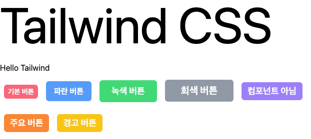
import Button from "./components/Button";
function App(){
return (
<>
<h1 className="myTitle">Tailwind CSS</h1>
<p>Hello Tailwind</p>
<Button>기본 버튼</Button>
<Button
bgColor="blue"
fontSize="md">파란 버튼</Button>
<Button
type="submit"
bgColor="green"
fontSize="lg"
onClick={ () => alert('등록하시겠습니까?') }>녹색 버튼</Button>
<Button
bgColor="gray"
fontSize="xl">회색 버튼</Button>
<button
className={`
bg-violet-400
text-gray-50
font-bold
px-3
py-1
mx-2
my-3
text-lg
rounded-md
hover:bg-violet-300
`}>컴포넌트 아님</button>
<br />
<button className="btn btn-primary">주요 버튼</button>
<button className="btn btn-warn">경고 버튼</button>
</>
)
}
export default App;클래스를 이용해 스타일을 입히다 보니, 아주 번잡스럽기 그지 없다.
그럴 땐 주요 버튼과 경고 버튼의 코드를 보자. 깔끔하지 않는가요?
저렇게 줄여쓰기 위해.. index.css 파일을 이용해 자주 사용하는 버튼들을 따로 설정해주었다.
📁 tailwind/src/index.css

@import 'tailwindcss/base';
@import 'tailwindcss/components';
@import 'tailwindcss/utilities';
@import './App.css';

@layer components {
  .btn {
    @apply
    	bg-violet-400
    	text-gray-50
    	font-bold
    	px-3
    	py-1
    	mx-2
    	my-3
    	text-lg
    	rounded-md
    	hover:bg-violet-300
  }

  .btn-primary {
    @apply bg-orange-400 hover:bg-orange-300
  }

  .btn-warn {
    @apply bg-yellow-400 hover:bg-yellow-300
  }
}
이렇게 설정해두고 갖고오면 된다!
최종 결과물 ⬇️
ㅎ Button 컴포넌트 파일을 만드는가 vs index.css 파일에서 한번에 하는가~는 자신의 선택입니다용
근데 .. 나는 너무너무 불편해서 못쓸 것 같다 ㅠㅠ
🔍 tailwindcss의 장점
- 개발 생산성이 높다.
- 개발자가 CSS 클래스 정의할 필요 X, 미리 정의된 클래스 사용 -> 개발 속도와 생산성 향상 가능
- 재사용 가능한 클래스 제공 -> 동일한 클래스를 여러 엘리먼트에 사용해 일관된 디자인을 구축할 수 있다.
- 많은 유틸리티 클래스를 제공하며 커스터마이징이 가능해 유연성이 높다.
- 클래스 이름이 직관적이라 가독성이 높다.
- 사용하는 클래스만 포함해 최적화된 CSS 파일을 생성한다.
💬 여담
난.. tailwind 잘 모르겠다.. (새로운게 아니라 그런가?ㅋㅋㅋ)
근데 배우는 입장이니까.. 다 열심히 써봐야겠다...!!
그럼 오늘 정리는 끝! 휴 이거 다쓰니까 노션 복구됐네~!