1. CSS 레이아웃
   → 요소들의 배치, 배열을 디자인에서는 레이아웃이라고 표현
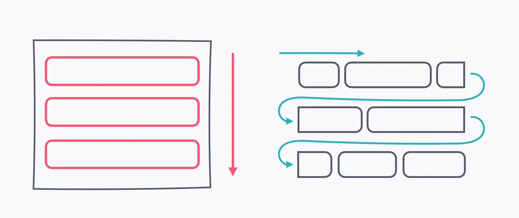
   → 기본적으로 HTML, CSS에서는 글의 흐름대로 요소가 배치
   → 일반적인 글의 흐름을 노말 플로우(Normal Flow)라고 한다
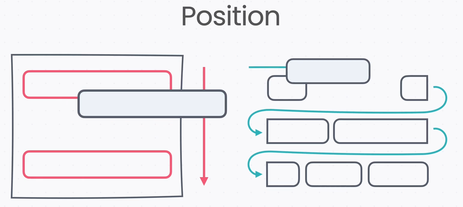
→ position은 이 흐름에서 벗어나 위치를 직접 지정하는 방식
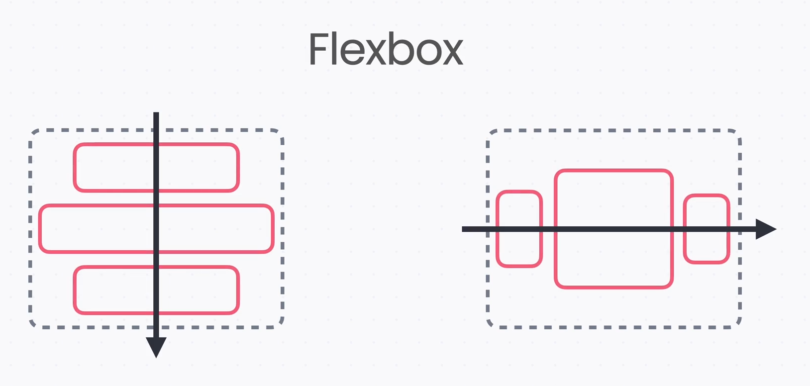
→ flex box는 박스를 만들고 방향을 정해서 요소를 배치하는 방식
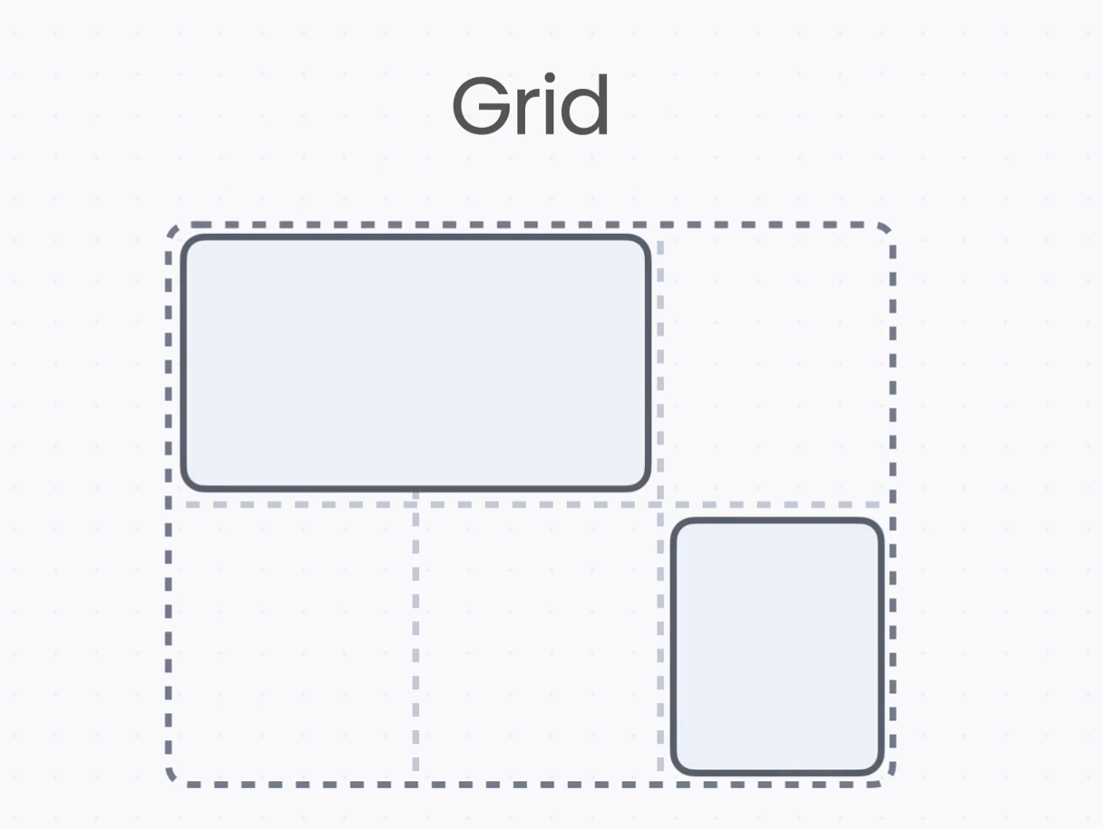
→ grid는 쉽게 말해 바둑판이나 엑셀처럼 칸을 나눈 다음, 여기에 요소를 배치하는 방식
2. Position

    - position 속성
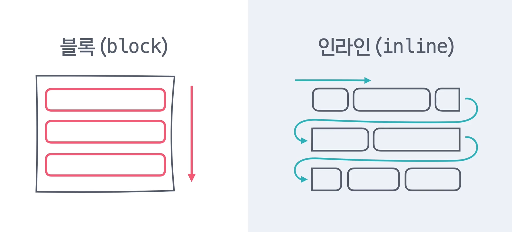
   	  → 디스플레이는 글의 흐름에서 요소를 어떻게 배치할지 정하는 것
      → 블록(block)은 위에서 아래로 블록처럼 배치되고, h1, div, p 태그가 디스플레이 블록
      → 인라인(inline)은 평소에 글쓰는 방향으로 배치되고, a, span, img 태그가 있다.
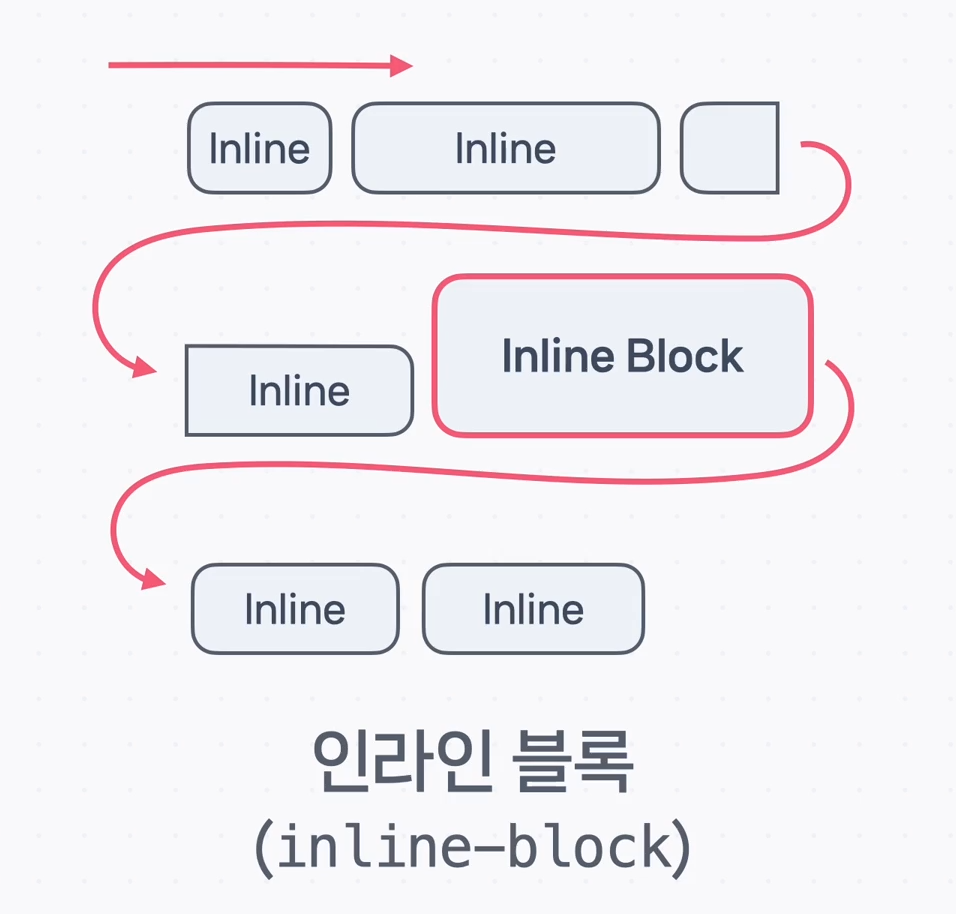
      → 인라인은 위아래로 크기가 없으므로 크기를 주고 싶다면 인라인 블록(inline block)을 사용

      → 이 흐름에서 벗어나 배치를 하고 싶을 때, 예를 들어 이미지나 영상 위에 글자를 겹치거나
        화면 위쪽 메뉴가 스크롤을 해도 계속 떠 있는 것과 같이 글의 흐름과 상관없이 배치하고 싶을때
        position이라는 속성을 사용
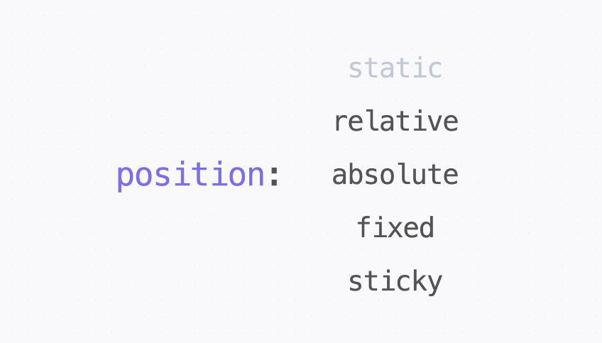
→ postion의 속성은 static, relative, absolute, fixed, sticky 5가지 속성이 있다.
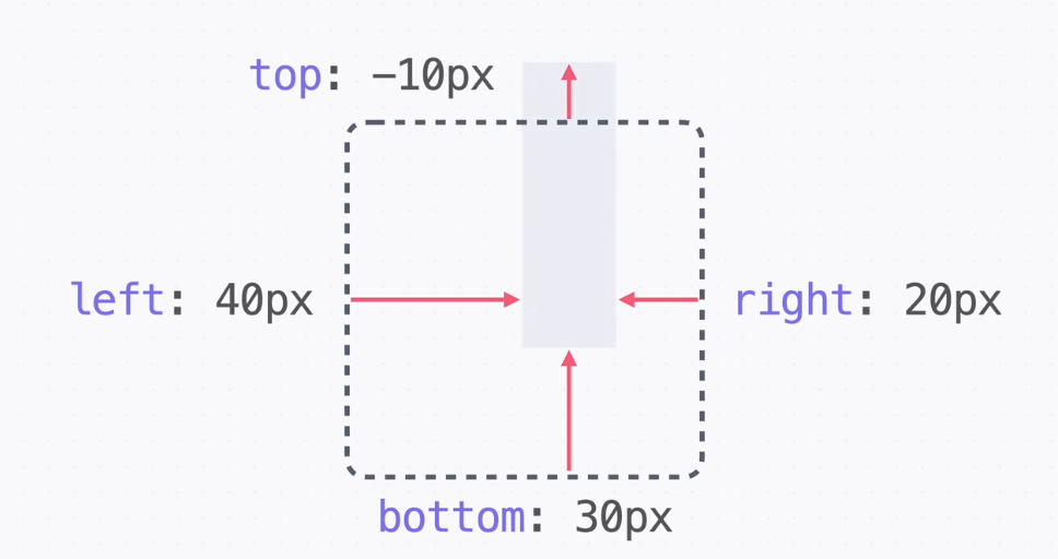
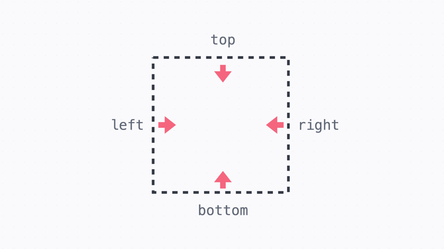
      → 위치의 기준을 정하는 것은 position 속성이고, 구체적인 위치 top, right, bottom, left
        이런 속성으로 정한다.

      static
      → position 속성의 기본 값
      → 원래 있어야 할 위치에 그대로 배치하는 것을 의미
      → 즉, 일반적인 글의 흐름을 따르는 방식
        만일 postion의 값을 다른 값으로 바꾼다면 일반적인 글의 흐름에서 벗어나 배치할 수 있다.
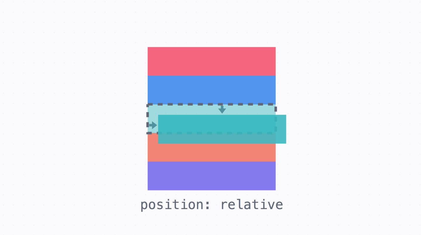
- relative 포지션
      → div 태그는 블록 디스플레이이므로 위에서부터 차례대로 쌓이면서 원래 있어야 할 공간에 위치
      → relative는 한국어로 상대적인 이라는 의미를 가지고 있다.
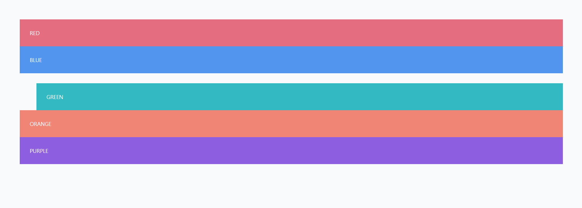
      → margin과 postion relative의 차이점은 margin의 경우 margin 값이 들어간 요소와 주변의
        요소들이 같이 밀려나 이동하는 반면, position relative는 position이 적용된 요소만 이동
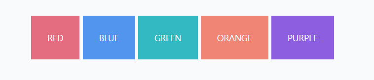
      → inline-block으로 바꾸게 되면 div 태그들이 글 쓰는 방향으로 배치
      → relative 포지션을 사용하면 원래 있어야 하는 위치를 기준으로 배치
      → 이동 전 원래 있던 공간은 그냥 그대로 비워놓고 배치
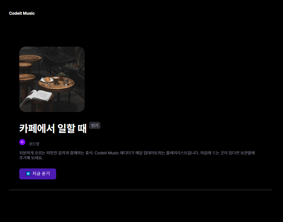
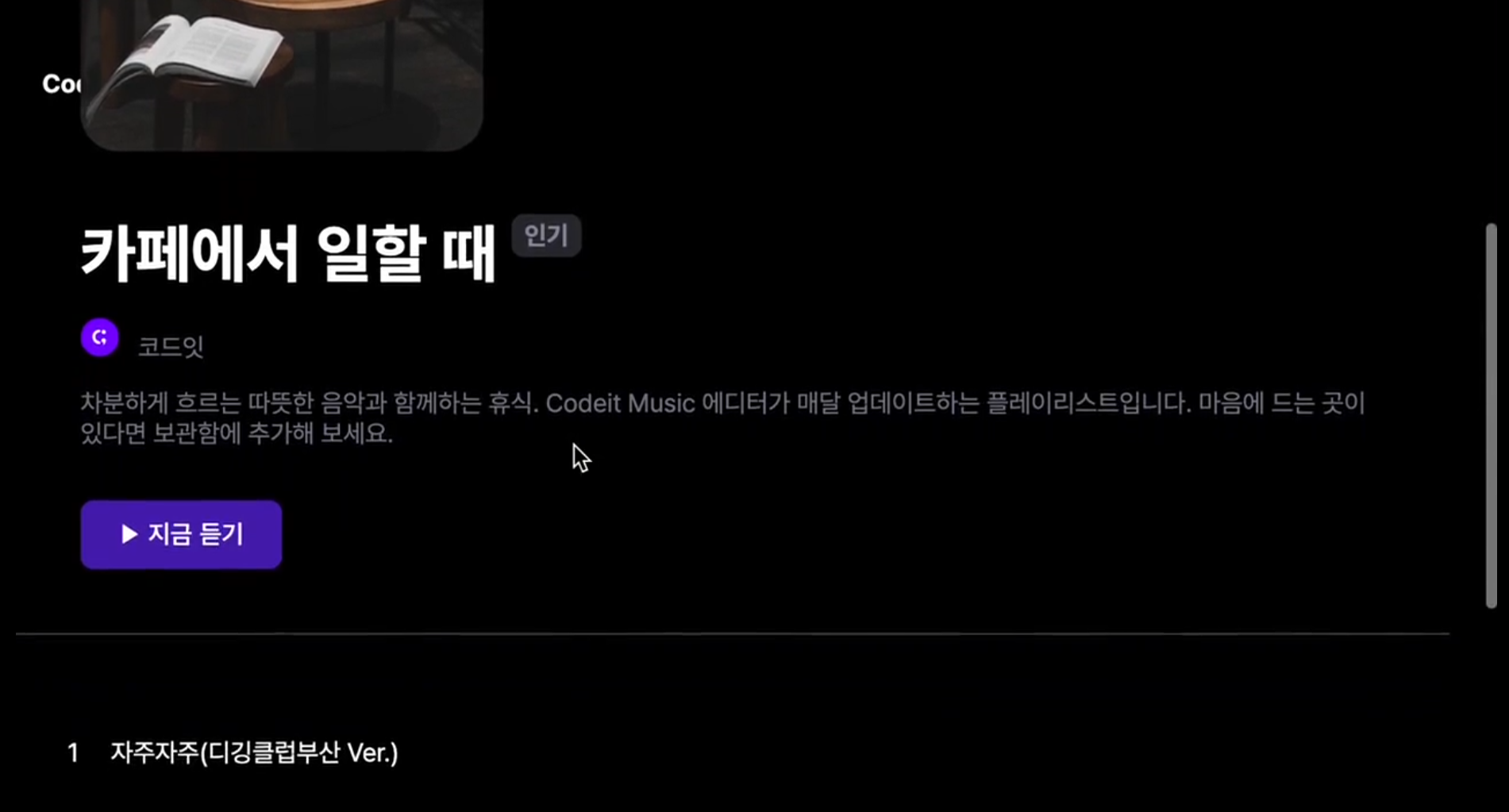
- 인기 플레이리스트
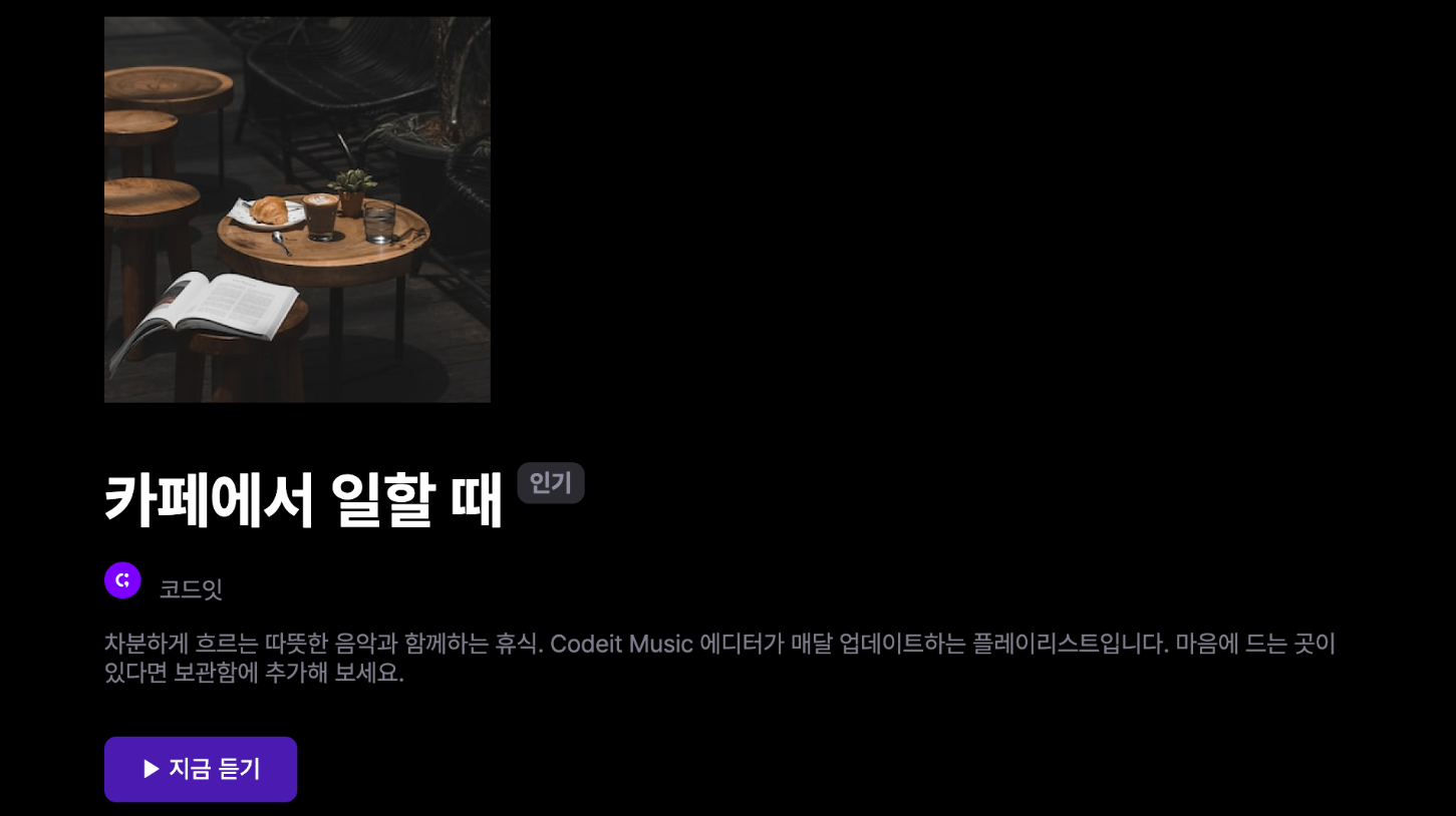
    → 인기 있는 플레이리스트 제목에 "인기" 배지의 위치를 원래 위치에서 20px 위쪽으로 수정해서
      오른쪽 위에 배치해 보세요.

	.hot-badge {
        position: relative;
        top: -20px;
        padding: 4px 8px;
        border-radius: 8px;
        background-color: #2a2a31;
        color: #8e8ea0;
        font-weight: 700;
        font-size: 16px;
        line-height: 19px;
     }
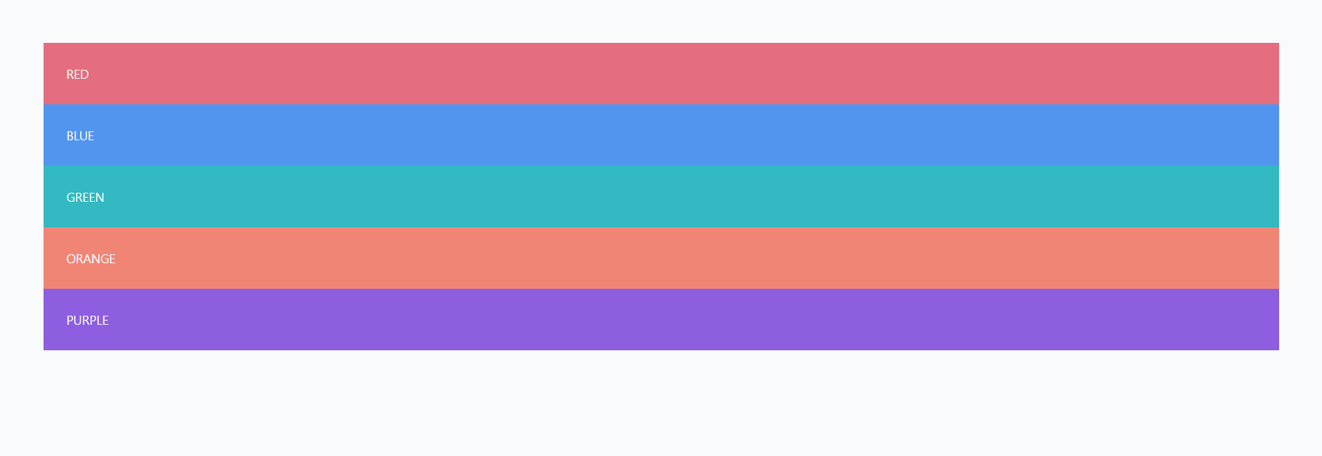
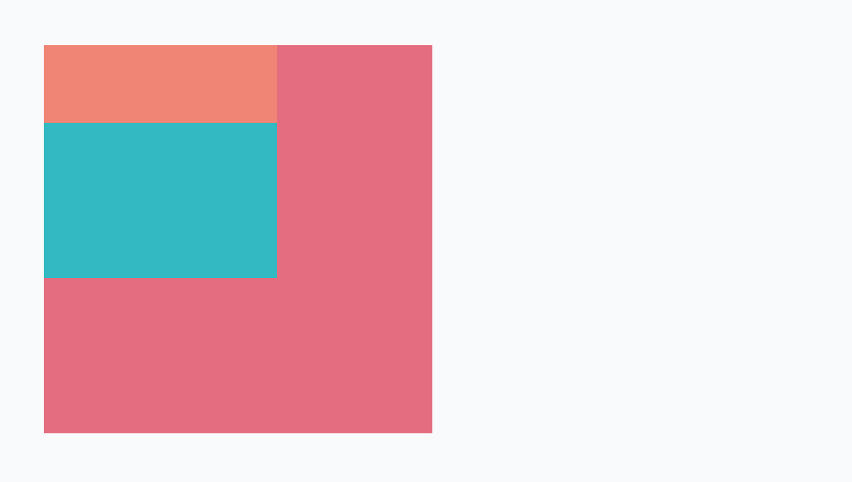
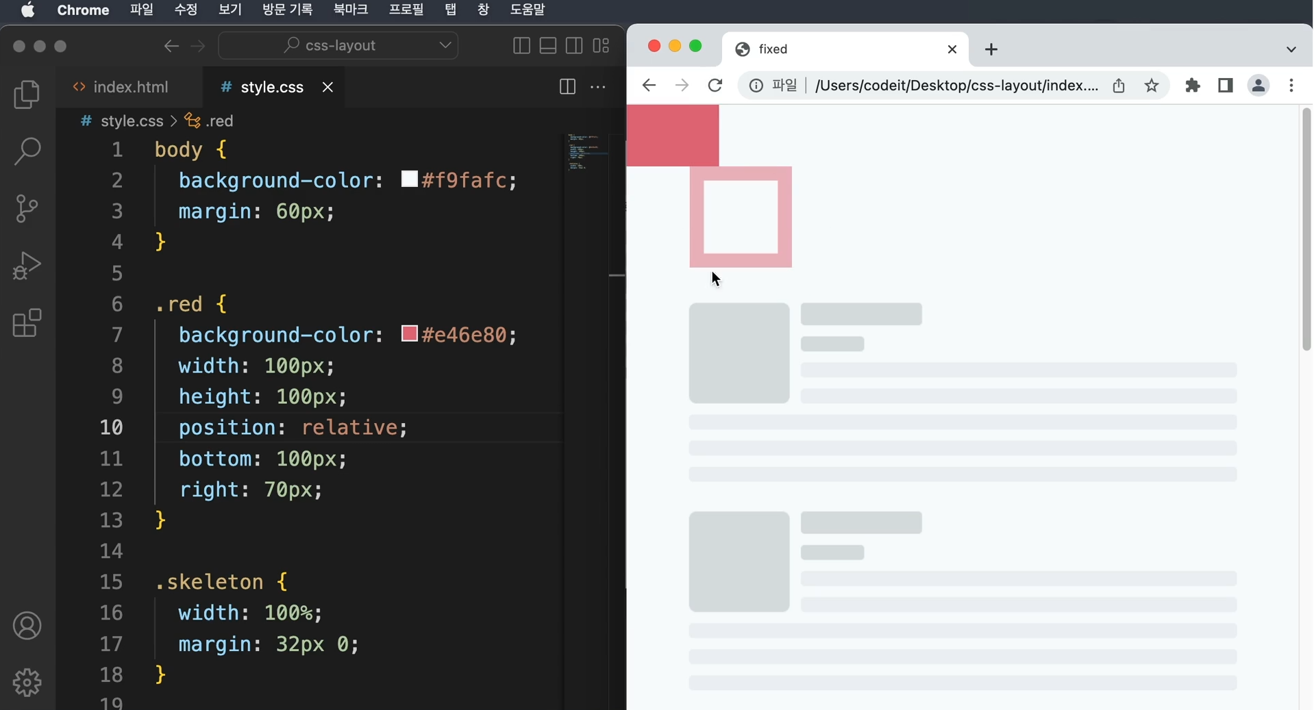
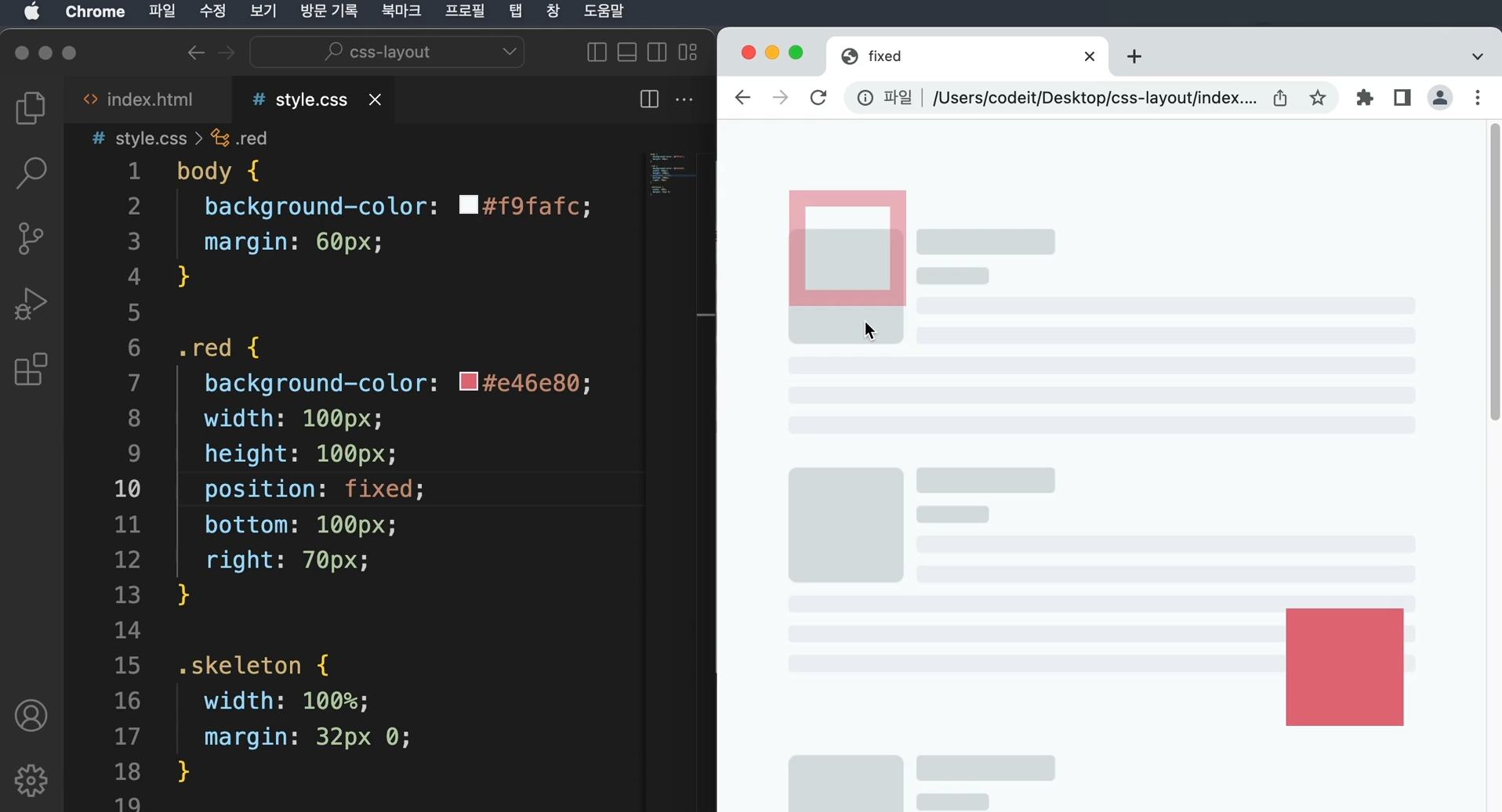
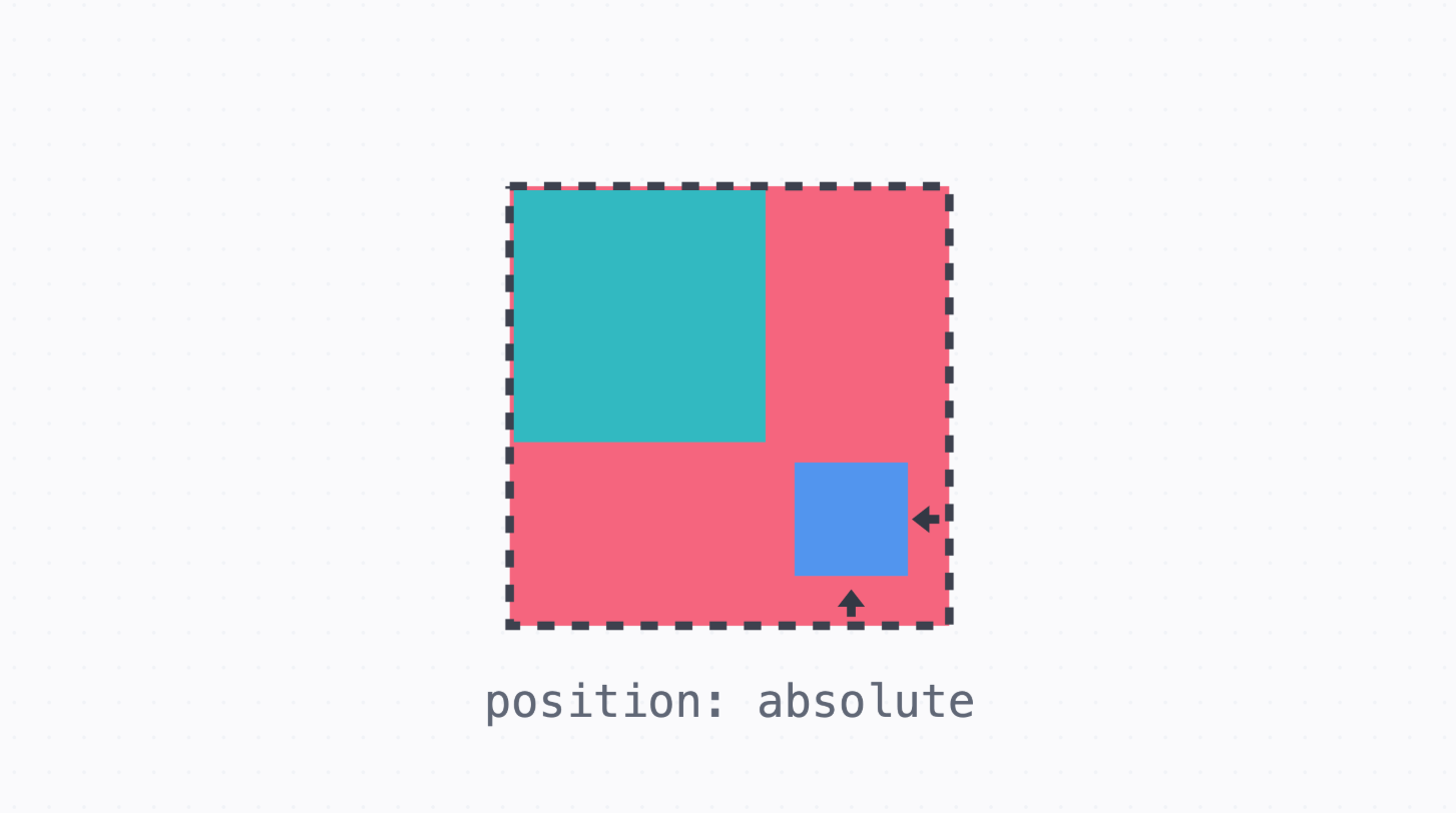
- absolute 포지션
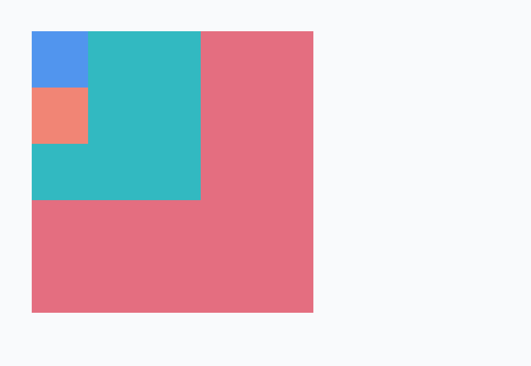
      → absolute 포지션은 가장 가까운 포지셔닝이 된 조상 요소를 기준으로 위치 지정
      → 기본적으로 다 왼쪽 위에 쏠려서 생성된다.
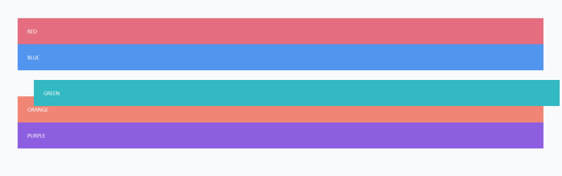
      → green 색상에 position을 relative로 주면 원래 위치에서 40px 공간이 생기고,
        왼쪽으로 90px의 공간이동을 한다.

      → blue 색상에 position을 absolute로 주면 원 위치에서 이동이 아닌 green을 따라
        움직인 위치에서의 이동이 일어난다.

      → blue의 가장 가까운 조상은 green이고 green은 relative로 값이 포지셔닝 되어 green의
        이동된 위치를 기준으로 이동한 것

      → 포지셔닝이 되었다는 의미는 position의 속성을 기본값인 static이 아닌 다른 값으로
        지정했다는 뜻이다.
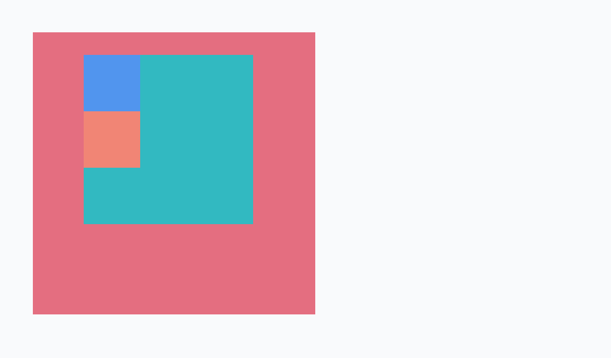
→ green의 position을 지우고, red에 position 값을 relative로 바꾸면
위의 이미지와 같이 이동한다.
→ 가장 까운 포지셔닝이 된 조상요소를 기준으로 위치를 잡는다고 하였는데
blue의 부모는 green인데 green은 position이 static 상태이므로 green을 건너뛰고
더 상위 조상인 red를 확인하였을 때, position이 relative로 바뀌었으므로 blue는 red를
기준으로 position을 잡게 된다.
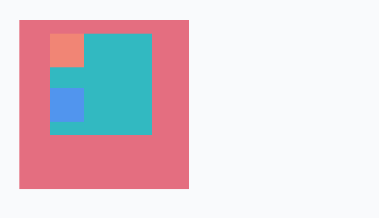
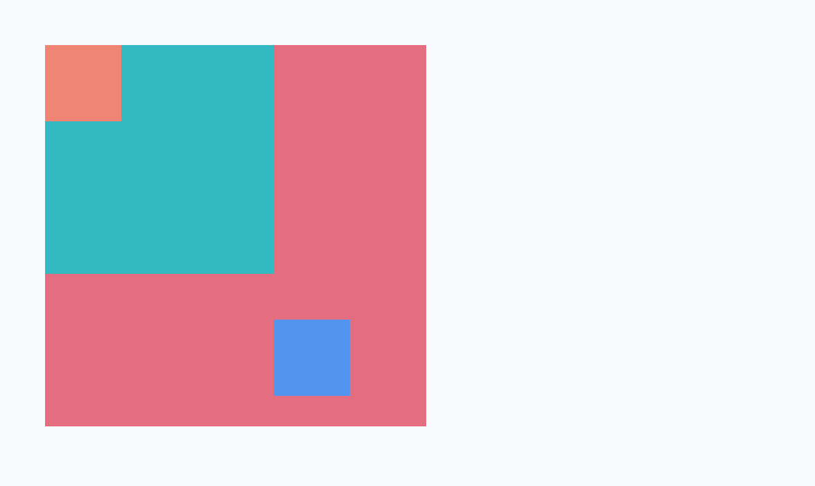
→ absolute의 경우 기존의 배치에서 완전히 벗어나서 배치된다는 특징이 있다.
→ absolute 포지션을 쓰면 relative 포지션과는 다르게 원래 배치에서 자리를 차지 하지 않는다.
      → blue와 orange에서 너비를 지워보면 orange는 블록 디스플레이이므로 기본적으로 부모
        영역에서 너비가 꽉차도록 배치되는데 blue는 아예 보이지 않는다.
        왜냐하면 blue는 absolute 포지션이므로 원래 위치에서 빠져버리게 되니
        블록 디스플레이처럼 부모 영역의 너비만큼 늘어나지 않는다.
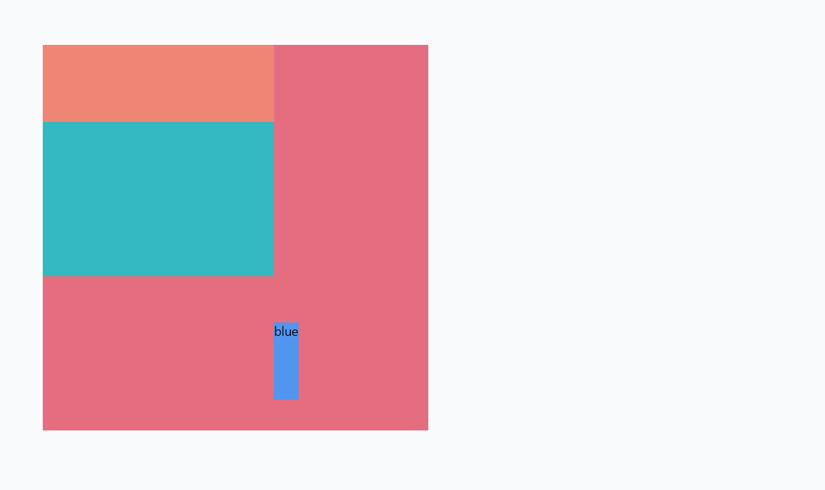
      → blue라고 텍스트를 적어보면 텍스트만큼의 너비가 생성된다.
        absolute 포지션에서 크기를 정해주지 않으면, 기본적으로 안에 있는 내용만큼의 크기를 갖는다

      → 영역 전체를 꽉 차도록 겹쳐놓고 싶을 때에는 다음과 같은 코드를 작성한다.

        position: absolute;
        top: 0;
        right: 0;
        bottom: 0;
        left: 0;

      → inset: 0으로 작성하면 모든 방향에 대한 위치를 0이라고 할 수 있다.
- 호버 재생 버튼
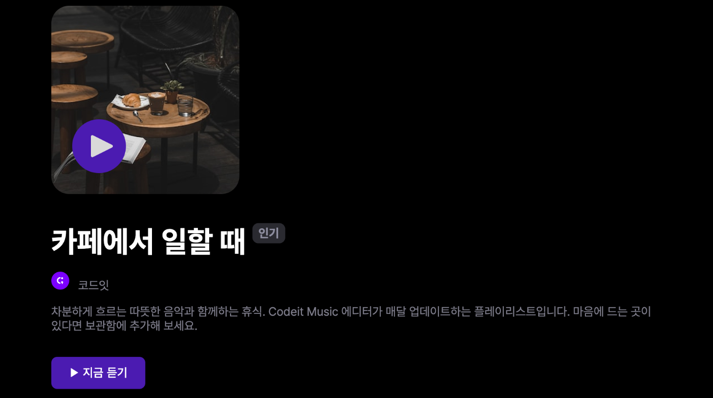
      .cover {
        width: 252px;
        height: 252px;
        border-radius: 24px;
        /* overflow: hidden; */
      }

      → .cover 클래스의 overflow: hidden을 잠깐만 주석 처리하고 실행
        커버에 마우스를 올렸을 때 아래에 이상한 위치에 재생 버튼이 생성
      → 이 버튼을 커버 이미지랑 겹치게 배치
        커버 이미지의 왼쪽에서 28px, 아래쪽에서 28px만큼 이동한 위치에 배치


      → 커버 이미지는 .cover 클래스 <div> 안에 있고, 재생 버튼에는 .cover-play-icon이라는
        클래스를 씁니다.

      <div class="cover">
        <img
          class="cover-image"
          src="images/img_cafe.png"
          alt="카페에서 일할 때 커버 이미지"
       >
        <img
          src="images/icon_play.png"
          alt="재생 아이콘"
          class="cover-play-icon"
       >
      </div>

      → .cover 클래스에서는 252px의 정사각형으로 이미지를 꽉 채워서 보여 주고 있습니다.
      → overflow: hidden과 border-radius: 24px을 사용해서 둥근 모서리로 처리
      → .cover-play-icon이라는 클래스는 기본적으로 display: none으로 화면에서 안 보이다가
        .cover에 마우스를 올리는 경우 display: block으로 화면에 보여 줍니다.

      .cover {
        width: 252px;
        height: 252px;
        border-radius: 24px;
        overflow: hidden;
      }

      .cover-image {
        width: 100%;
        height: 100%;
      }

      .cover-play-icon {
        display: none;
        width: 72px;
        height: 72px;
      }

      .cover:hover .cover-play-icon {
        display: block;
      }
index.html
<!DOCTYPE html>
<html lang="ko">
<head>
<meta charset="utf-8">
<title>Codeit Music</title>
<link
rel="stylesheet"
as="style"
crossorigin
href="https://cdn.jsdelivr.net/gh/orioncactus/pretendard@v1.3.6/dist/web/static/pretendard.css"
>
<link rel="stylesheet" href="style.css">
</head>
<body>
<header>
<div class="wrap">Codeit Music</div>
</header>
<main class="wrap">
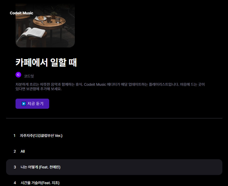
<div class="info">
<div class="cover">
<img
class="cover-image"
src="images/img_cafe.png"
alt="카페에서 일할 때 커버 이미지"
>
<img
src="images/icon_play.png"
alt="재생 아이콘"
class="cover-play-icon"
>
</div>
<h1 class="playlist-title">
카페에서 일할 때
<span class="hot-badge"> 인기 </span>
</h1>
<div class="artist">
<img
src="images/img_codeit.png"
alt="코드잇 프로필"
class="artist-profile"
>
코드잇
</div>
<div class="description">
차분하게 흐르는 따뜻한 음악과 함께하는 휴식. Codeit Music 에디터가
매달 업데이트하는 플레이리스트입니다. 마음에 드는 곳이 있다면 보관함에
추가해 보세요.
</div>
<button class="play-button">▶️ 지금 듣기</button>
</div>
</main>
</body>
</html>
style.css
* {
box-sizing: border-box;
}
html {
word-break: keep-all;
font-family: Pretendard, sans-serif;
}
body {
margin: 0;
background-color: #000;
color: #fff;
}
.wrap {
margin: 0 auto;
padding: 32px;
max-width: 1080px;
width: 100%;
}
header {
padding: 16px;
background-image: linear-gradient(
180deg,
#000000 15.1%,
rgba(0, 0, 0, 0) 100%
);
font-weight: 700;
}
.info {
margin-bottom: 40px;
padding: 40px;
border-bottom: 1px solid #595864;
}
.cover {
width: 252px;
height: 252px;
border-radius: 24px;
overflow: hidden;
position: relative;
}
.cover-image {
width: 100%;
height: 100%;
position: relative;
}
.cover-play-icon {
display: none;
width: 72px;
height: 72px;
position: absolute;
left: 28px;
bottom: 28px;
}
.cover:hover .cover-play-icon {
display: block;
position:absolute;
}
.playlist-title {
margin: 40px 0 16px;
font-weight: 700;
font-size: 40px;
line-height: 48px;
}
.hot-badge {
position: relative;
top: -20px;
padding: 4px 8px;
border-radius: 8px;
background-color: #2a2a31;
color: #8e8ea0;
font-weight: 700;
font-size: 16px;
line-height: 19px;
}
.artist {
color: #7d7c8a;
font-weight: 400;
font-size: 16px;
line-height: 19px;
}
.artist-profile {
overflow: hidden;
width: 24px;
height: 24px;
border-radius: 50%;
margin-right: 8px;
}
.description {
margin: 16px 0 32px;
color: #7d7c8a;
font-weight: 400;
font-size: 16px;
line-height: 19px;
}
.play-button {
padding: 12px 24px;
border: none;
border-radius: 8px;
background-color: #4b1bb1;
color: #ffffff;
font-weight: 500;
font-size: 16px;
line-height: 19px;
}
- 코딩을 넘어, 음악의 즐거움까지 1
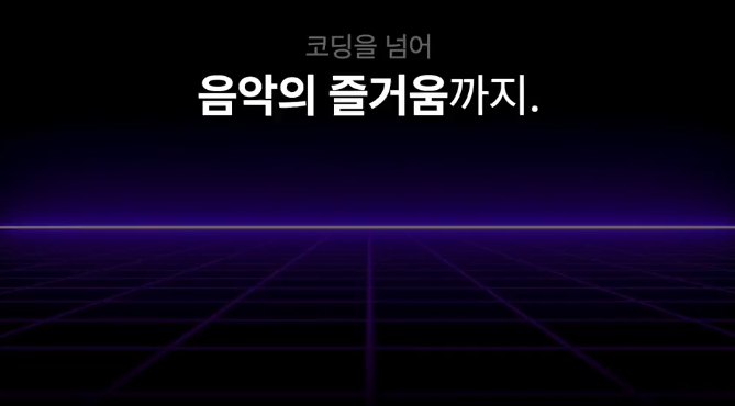
      → 주어진 코드에서 텍스트 영역을 비디오 영역에 완전히 겹치도록 배치
      → 참고로 조상 요소에 꽉 차게 배치하려면 위쪽에서 0px, 오른쪽에서 0px, 아래쪽에서 0px,
        왼쪽에서 0px로 배치

      → <video> 태그가 있는데, .bg라는 클래스로 비디오의 너비를 화면에 꽉 차게 100%로 했습니다.
      → .hero-heading 안에는 <h1> 태그가 있는데, 배경을 투명한 검정에서 점점 불투명한 검정으로
        변하는 그라디언트 배경을 적용
      → 이 모든 걸 감싸고 있는 .hero에서는 position: relative로 포지셔닝 했습니다.
        따로 위치를 지정하지 않았기 때문에 사실상 원래 위치 그대로 배치
        하지만 이렇게 하면 그안에 있는 요소를 이 안에서 자유롭게 배치할 수 있겠죠?

      <section class="hero">
        <video src="videos/bg.mp4" class="bg" autoplay loop muted></video>
        <div class="hero-heading">
          <h1>
            <span class="small">코딩을 넘어</span><br>
            <span class="big">음악의 즐거움</span>까지.
          </h1>
        </div>
      </section>


      .hero {
        position: relative;
      }

      .bg {
        width: 100%;
        opacity: 0.5;
      }

      .hero-heading {
        margin: 0;
        padding: 24px;
        background-image: linear-gradient(rgba(0, 0, 0, 0) 50%, rgba(0, 0, 0, 1) 100%);
      }

      .hero-heading h1 {
        margin: 0;
        font-weight: 400;
        font-size: 80px;
        line-height: 95px;
        text-align: center;
        color: #ffffff;
      }

      .hero-heading .small {
        font-size: 48px;
        line-height: 57px;
        text-align: center;
        color: rgba(217, 217, 217, 0.5);
      }

      .hero-heading .big {
        font-weight: 700;
      }
index.html

  <!DOCTYPE html>
  <html lang="ko">
  <head>
    <meta charset="utf-8">
    <title>Codeit Music</title>
    <link rel="stylesheet" as="style" crossorigin href="https://cdn.jsdelivr.net/gh/orioncactus/pretendard@v1.3.6/dist/web/static/pretendard.css">
    <link rel="stylesheet" href="style.css">
  </head>
  <body>
    <section class="hero">
      <video src="videos/bg.mp4" class="bg" autoplay loop muted></video>
      <div class="hero-heading">
        <h1>
          <span class="small">코딩을 넘어</span><br>
          <span class="big">음악의 즐거움</span>까지.
        </h1>
      </div>
    </section>
  </body>
  </html>


style.css

html {
  font-family: Pretendard, sans-serif;
  word-break: keep-all;
}

body {
  background-color: #000;
  color: #fff;
  margin: 0;
}

.hero {
  position: relative;
}

.bg {
  width: 100%;
  opacity: 0.5;
}

.hero-heading {
  margin: 0;
  padding: 24px;
  background-image: linear-gradient(rgba(0, 0, 0, 0) 50%, rgba(0, 0, 0, 1) 100%);
  position: absolute;
  inset: 0;
}

.hero-heading h1 {
  margin: 0;
  font-weight: 400;
  font-size: 80px;
  line-height: 95px;
  text-align: center;
  color: #ffffff;

}

.hero-heading .small {
  font-size: 48px;
  line-height: 57px;
  text-align: center;
  color: rgba(217, 217, 217, 0.5);
}

.hero-heading .big {
  font-weight: 700;
}

- fixed 포지션
      → fixed라는 것은 영어로 고정되었다는 뜻
      → 아무리 스크롤을 하더라도 화면을 기준으로 고정된 자리에 고정되어 있다.
      → position : relative일 때에는 원래 요소의 자리가 공백이었는데,
        position : fixed를 하면 원래 있던 자리와 전혀 상관없이 기존 배치에서 완전히 빠져서
        자리를 차지하지 않는다. ( position:absolute )
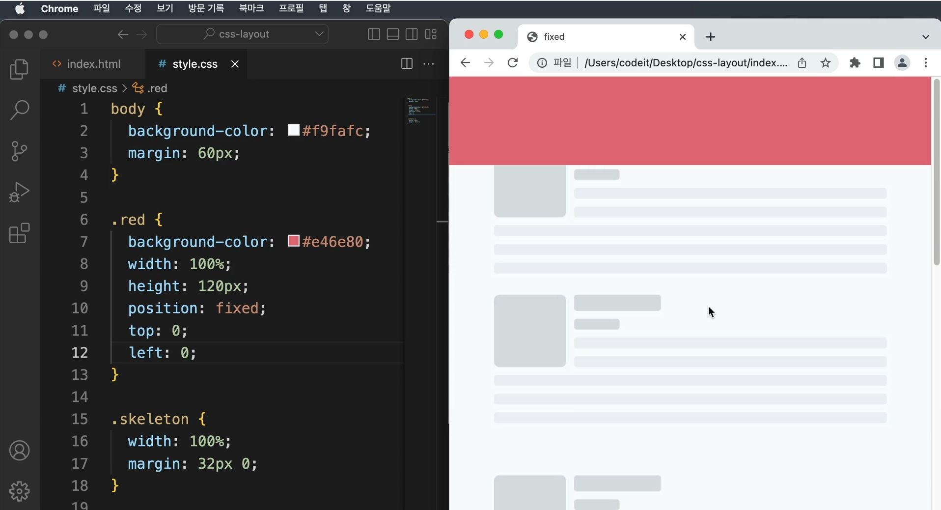
      → fixed 포지션은 주로 내비게이션에서 사용된다.
      → 기존 배치에서 완전히 빠지는 것이므로 따로 크기를 지정하지 않으면,
        기본 크기는 요소 안에 있는 내용만큼으로 지정되므로 width : 100% 처럼 크기를 지정하거나
        아니면 right : 0 이렇게 좌우 위치를 모두 정하는 식으로 해야 요소를 꽉 채울 수 있다.
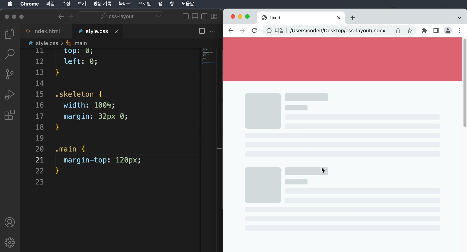
      → 또 다른 문제점은 내비게이션이랑 내용이 겹쳐서 안 보이는 부분이 생긴다.
        fixed를 쓰면 이 흐름에서 완전히 빠지므로 원래 있던 공간이 남아 있지 않는다.
        이럴때에는 위에 내비게이션의 높이만큼 margin을 넣어주면 된다.
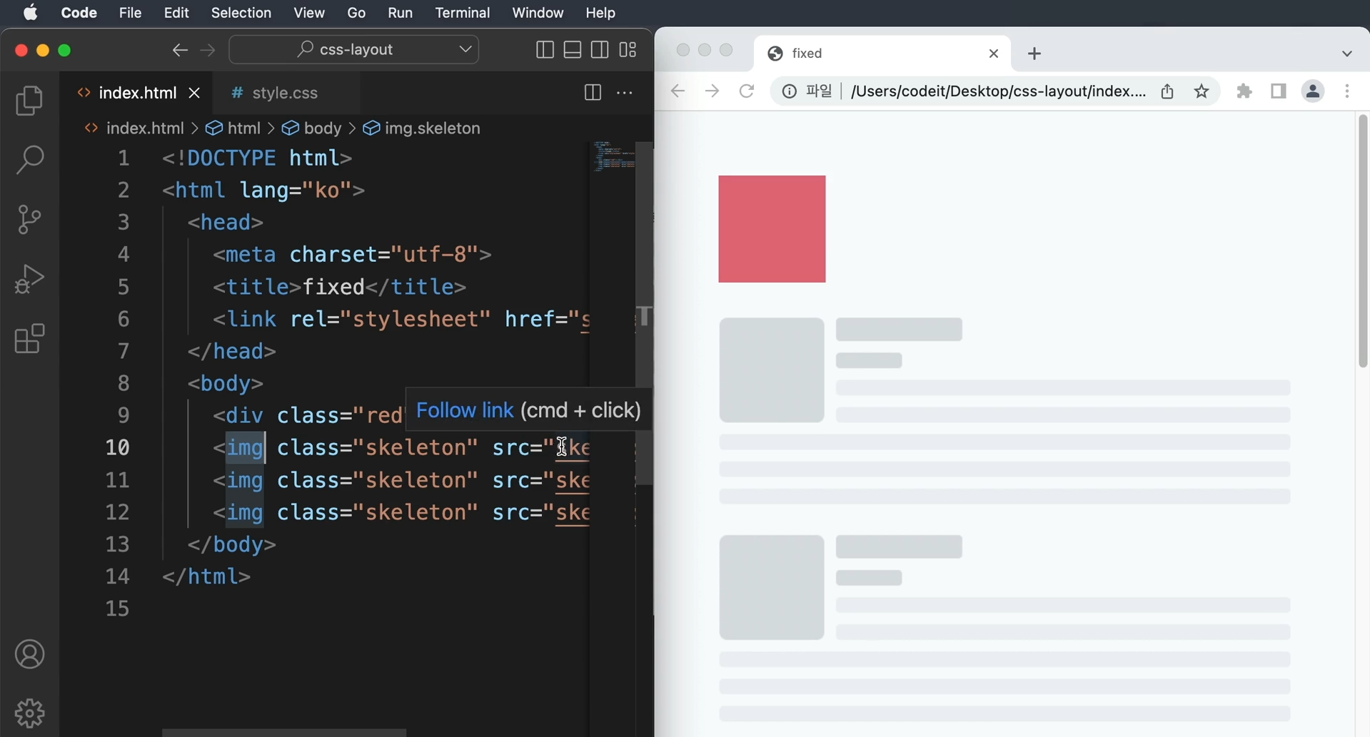
- 내비게이션 바 1
      → <body> 태그 안에 있는 태그들 중 가장 위쪽에 <header> 라는 태그
        여러 가지 스타일을 적용하고 있는데, 그중에서도 높이가 90px

      <header>
        <div class="wrap">Codeit Music</div>
      </header>

      header {
        height: 90px;
        padding: 16px;
        background-image: linear-gradient(
          180deg,
          #000000 15.1%,
          rgba(0, 0, 0, 0) 100%
        );
        font-weight: 700;
      }

      → fixed 포지션은 브라우저 화면을 기준으로 배치
      → 화면을 기준으로 고정된 위치에 요소를 배치해서 항상 떠 있는 것 같은 효과
      → 왼쪽에서 0px, 위쪽에서 0px로 배치하고 width: 100% 를 하거나, 오른쪽에서 0px

      header {
        position: fixed;
        top: 0;
        left: 0;
        width: 100%;
        height: 90px;
        padding: 16px;
        background-image: linear-gradient(
          180deg,
          #000000 15.1%,
          rgba(0, 0, 0, 0) 100%
        );
        font-weight: 700;
      }

      → 맨 위로 스크롤했을 때 본문이랑 내비게이션이 겹쳐서 보이는 문제
      → 본문 내용이랑 겹치지 않으려면 내비게이션 높이만큼 여백을 추가
      → 내비게이션의 높이는 90px이고요, 저는 <body> 태그에 위쪽 마진을 90px만큼 추가

      body {
        margin: 90px 0 0;
        background-color: #000;
        color: #fff;
      }
index.html

  <!DOCTYPE html>
  <html lang="ko">
    <head>
      <meta charset="utf-8">
        <title>Codeit Music</title>
      <link
        rel="stylesheet"
        as="style"
        crossorigin
        href="https://cdn.jsdelivr.net/gh/orioncactus/pretendard@v1.3.6/dist/web/static/pretendard.css"
     >
      <link rel="stylesheet" href="style.css">
    </head>
    <body>
      <header>
        <div class="wrap">Codeit Music</div>
      </header>
      <main class="wrap">
        <div class="info">
          <div class="cover">
            <img
              class="cover-image"
              src="images/img_cafe.png"
              alt="카페에서 일할 때 커버 이미지"
           >
          </div>
          <h1 class="playlist-title">
            카페에서 일할 때
          </h1>
          <div class="artist">
            <img
              src="images/img_codeit.png"
              alt="코드잇 프로필"
              class="artist-profile"
           >
            코드잇
          </div>
          <div class="description">
            차분하게 흐르는 따뜻한 음악과 함께하는 휴식. Codeit Music 에디터가
            매달 업데이트하는 플레이리스트입니다. 마음에 드는 곳이 있다면 보관함에
            추가해 보세요.
          </div>
          <button class="play-button">▶️ 지금 듣기</button>
        </div>
        <div class="tracks">
          <div class="track">
            <div class="track-number">1</div>
            <div class="track-title">자주자주(디깅클럽부산 Ver.)</div>
          </div>
          <div class="track">
            <div class="track-number">2</div>
            <div class="track-title">All</div>
          </div>
          <div class="track active">
            <div class="track-number">3</div>
            <div class="track-title">나는 어떻게 (Feat. 천예린)</div>
          </div>
          <div class="track">
            <div class="track-number">4</div>
            <div class="track-title">시간을 거슬러(Feat. 지조)</div>
          </div>
          <div class="track">
            <div class="track-number">5</div>
            <div class="track-title">우르르</div>
          </div>
          <div class="track">
            <div class="track-number">6</div>
            <div class="track-title">당신이 맞다는 대답을 할 거예요</div>
          </div>
        </div>
      </main>
    </body>
  </html>


style.css

  * {
    box-sizing: border-box;
  }

  html {
    word-break: keep-all;
    font-family: Pretendard, sans-serif;
  }

  body {
    margin: 90px 0 0;
    background-color: #000;
    color: #fff;
  }

  .wrap {
    margin: 0 auto;
    padding: 32px;
    max-width: 1080px;
    width: 100%;
  }

  header {
    position: fixed;
    top: 0;
    left: 0;
    width: 100%;
    height: 90px;
    padding: 16px;
    background-image: linear-gradient(
      180deg,
      #000000 15.1%,
      rgba(0, 0, 0, 0) 100%
    );
    font-weight: 700;
  }

  .info {
    margin-bottom: 40px;
    padding: 40px;
    border-bottom: 1px solid #595864;
  }

  .cover {
    width: 252px;
    height: 252px;
    border-radius: 24px;
    overflow: hidden;
  }

  .cover-image {
    width: 100%;
    height: 100%;
  }

  .playlist-title {
    margin: 40px 0 16px;
    font-weight: 700;
    font-size: 40px;
    line-height: 48px;
  }

  .artist {
    color: #7d7c8a;
    font-weight: 400;
    font-size: 16px;
    line-height: 19px;
  }

  .artist-profile {
    overflow: hidden;
    width: 24px;
    height: 24px;
    border-radius: 50%;
    margin-right: 8px;
  }

  .description {
    margin: 16px 0 32px;
    color: #7d7c8a;
    font-weight: 400;
    font-size: 16px;
    line-height: 19px;
  }

  .play-button {
    padding: 12px 24px;
    border: none;
    border-radius: 8px;
    background-color: #4b1bb1;
    color: #ffffff;
    font-weight: 500;
    font-size: 16px;
    line-height: 19px;
  }

  .track {
    padding: 24px 32px;
  }

  .track.active {
    border-radius: 16px;
    background-color: #19191F;
  }

  .track-number {
    display: inline;
    margin-right: 16px;
  }

  .track-title {
    display: inline;
  }
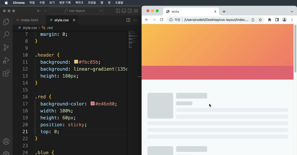
- sticky 포지션
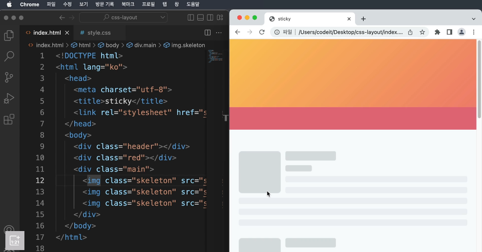
      → fixed 포지션으로 네비게이션 바를 만들었는데 이번에는 네비게이션 위에 커다란 영역을 배치
      → 웹 사이트에서는 로고라든지 광고라든지 이러한 것들이 들어가는 공간
      → 스크롤하다가 브라우저 상단에 내비게이션이 닿으면, 달라붙어서 고정되는 것을 만들어보자.
      → 스크롤하다가 내비게이션이 브라우저 상단에 닿을 때, fixed 포지션으로 바뀌어야 한다.
      → 이러한 역할을 해주는 것이 sticky 포지션이다.
      → fixed와 달리 sticky는 원래 위치에서 공간을 차지
      → 기본적으로는 static처럼 배치 웹 브라우저 상단에 닿으면 fixed로 포지션이 변경된 것처럼 고정

      ※ sticky 포지션은 요소를 웹 브라우저에 달라붙도록 배치하는 것
        지정한 위치로 스크롤되기 전까지는 마치 static 포지션처럼 원래 위치에 있다가
        지정한 위치에 닿으면 fixed 포지션처럼 고정
        → 위치의 기준은 fixed 포지션처럼 브라우저의 화면 기준
      → 한 가지 특별한 성질이 있는데 부모 요소 안에 갇혀 있다.
        static처럼 배치되니까 부모 요소에 소속되어 있다라고 이해하면 편하다
        만일, 부모 요소가 화면 밖으로 사라지면 같이 사라진다.
    - 내비게이션 바 2

      → fixed 로 배치한 내비게이션은 sticky 포지션으로 바꿔 보세요.
      → <body> 태그 안에 있는 태그들 중에 가장 위쪽에 <header>라는 태그
        <header>
          <div class="wrap">Codeit Music</div>
        </header>
      → header 선택자에서  fixed 포지션으로 위쪽에서 0px, 왼쪽에서 0px로 배치,
        그리고 너비 100%, 높이는 90px,
        내비게이션이랑 본문이 겹치지 않도록 body 선택자에서 높이만큼 90px 여백
        body {
          margin: 90px 0 0;
          background-color: #000;
          color: #fff;
        }

        .wrap {
          margin: 0 auto;
          padding: 32px;
          max-width: 1080px;
          width: 100%;
        }

        header {
          position: fixed;
          top: 0;
          left: 0;
          width: 100%;
          height: 90px;
          padding: 16px;
          background-image: linear-gradient(
            180deg,
            #000000 15.1%,
            rgba(0, 0, 0, 0) 100%
          );
          font-weight: 700;
        }

      → fixed 포지션을 sticky로 변경하면 스크롤 했을 때, 화면의 위쪽에 달라붙긴 하지만
        맨 위로 스크롤을 하게 되면 이상한 여백이 생긴다. fixed 포지션으로 배치 시 넣어준 여백
        body 안의 margin: 90px 0 0; 값을 0으로 바꿔주고, 불필요한 여백을 삭제
      → sticky 포지션은 위에 배치된 다음 스크롤하다가 정해진 위치에 닿으면 달라붙는다.
        <header>태그의 원래 배치는 div 태그와 마찬가지로 display:block 이므로 위에서부터
        아래로 쌓이면서 배치
        left : 0; width : 100%;은 sticky에서 필요없는 속성

        header {
          position: sticky;
          top: 0;
          height: 90px;
          padding: 16px;
          background-image: linear-gradient(
            180deg,
            #000000 15.1%,
            rgba(0, 0, 0, 0) 100%
          );
          font-weight: 700;
        }
index.html

  <!DOCTYPE html>
  <html lang="ko">
    <head>
      <meta charset="utf-8">
        <title>Codeit Music</title>
      <link
        rel="stylesheet"
        as="style"
        crossorigin
        href="https://cdn.jsdelivr.net/gh/orioncactus/pretendard@v1.3.6/dist/web/static/pretendard.css"
     >
      <link rel="stylesheet" href="style.css">
    </head>
    <body>
      <header>
        <div class="wrap">Codeit Music</div>
      </header>
      <main class="wrap">
        <div class="info">
          <div class="cover">
            <img
              class="cover-image"
              src="images/img_cafe.png"
              alt="카페에서 일할 때 커버 이미지"
           >
          </div>
          <h1 class="playlist-title">
            카페에서 일할 때
          </h1>
          <div class="artist">
            <img
              src="images/img_codeit.png"
              alt="코드잇 프로필"
              class="artist-profile"
           >
            코드잇
          </div>
          <div class="description">
            차분하게 흐르는 따뜻한 음악과 함께하는 휴식. Codeit Music 에디터가
            매달 업데이트하는 플레이리스트입니다. 마음에 드는 곳이 있다면 보관함에
            추가해 보세요.
          </div>
          <button class="play-button">▶️ 지금 듣기</button>
        </div>
        <div class="tracks">
          <div class="track">
            <div class="track-number">1</div>
            <div class="track-title">자주자주(디깅클럽부산 Ver.)</div>
          </div>
          <div class="track">
            <div class="track-number">2</div>
            <div class="track-title">All</div>
          </div>
          <div class="track active">
            <div class="track-number">3</div>
            <div class="track-title">나는 어떻게 (Feat. 천예린)</div>
          </div>
          <div class="track">
            <div class="track-number">4</div>
            <div class="track-title">시간을 거슬러(Feat. 지조)</div>
          </div>
          <div class="track">
            <div class="track-number">5</div>
            <div class="track-title">우르르</div>
          </div>
          <div class="track">
            <div class="track-number">6</div>
            <div class="track-title">당신이 맞다는 대답을 할 거예요</div>
          </div>
        </div>
      </main>
    </body>
  </html>


style.css

  * {
    box-sizing: border-box;
  }

  html {
    word-break: keep-all;
    font-family: Pretendard, sans-serif;
  }

  body {
    margin: 90px 0 0;
    background-color: #000;
    color: #fff;
  }

  .wrap {
    margin: 0 auto;
    padding: 32px;
    max-width: 1080px;
    width: 100%;
  }

  header {
    position: sticky;
    top: 0;
    height: 90px;
    padding: 16px;
    background-image: linear-gradient(
      180deg,
      #000000 15.1%,
      rgba(0, 0, 0, 0) 100%
    );
    font-weight: 700;
  }

  .info {
    margin-bottom: 40px;
    padding: 40px;
    border-bottom: 1px solid #595864;
  }

  .cover {
    width: 252px;
    height: 252px;
    border-radius: 24px;
    overflow: hidden;
  }

  .cover-image {
    width: 100%;
    height: 100%;
  }
  .playlist-title {
    margin: 40px 0 16px;
    font-weight: 700;
    font-size: 40px;
    line-height: 48px;
  }

  .artist {
    color: #7d7c8a;
    font-weight: 400;
    font-size: 16px;
    line-height: 19px;
  }

  .artist-profile {
    overflow: hidden;
    width: 24px;
    height: 24px;
    border-radius: 50%;
    margin-right: 8px;
  }

  .description {
    margin: 16px 0 32px;
    color: #7d7c8a;
    font-weight: 400;
    font-size: 16px;
    line-height: 19px;
  }

  .play-button {
    padding: 12px 24px;
    border: none;
    border-radius: 8px;
    background-color: #4b1bb1;
    color: #ffffff;
    font-weight: 500;
    font-size: 16px;
    line-height: 19px;
  }

  .track {
    padding: 24px 32px;
  }

  .track.active {
    border-radius: 16px;
    background-color: #19191F;
  }

  .track-number {
    display: inline;
    margin-right: 16px;
  }

  .track-title {
    display: inline;
  }
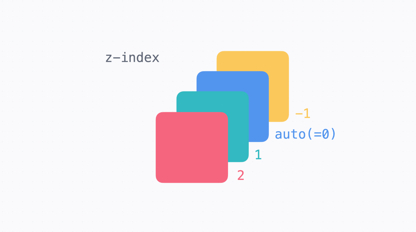
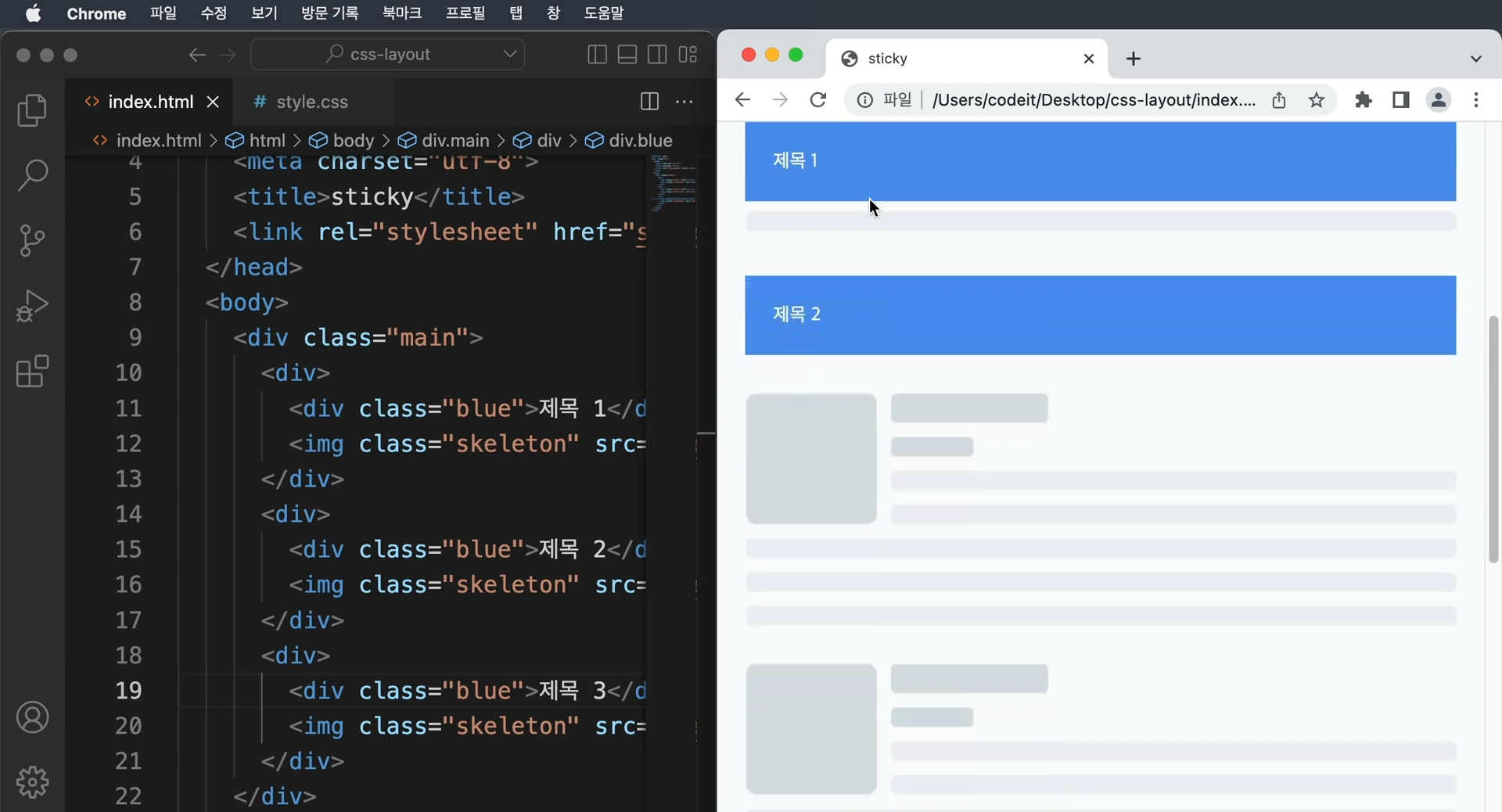
- z-index
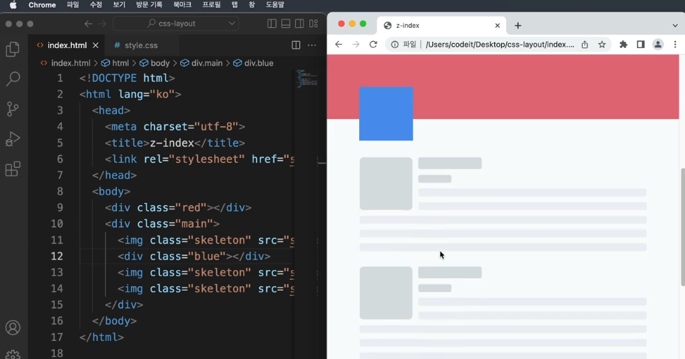
      → 같은 sticky 포지션을 red와 blue 모두에게 주었을 때, blue가 red를 덮어버리는 문제 발생
        만일 red가 blue보다 앞쪽에 위치하길 바라면 어떻게 해야할까?
      → z-index는 앞뒤의 순서를 정하는 것
      → z-index를 정하지 않으면 코드의 밑의 줄에 있을수록 화면에서는 앞쪽에 보인다.
      → z-index 뒤의 숫자는 1,2,3 뿐만 아니라 -1,-2,-3과 같이 마이너스 값도 사용 가능
- 내비게이션 바 3
      → 스크롤할 때마다 내비게이션 앞쪽에 커버 이미지랑, 배지가 보입니다.
        커버 이미지랑 배지를 내비게이션 뒤쪽에 보이도록 고쳐 보세요.
index.html

  <!DOCTYPE html>
  <html lang="ko">
    <head>
      <meta charset="utf-8">
        <title>Codeit Music</title>
      <link
        rel="stylesheet"
        as="style"
        crossorigin
        href="https://cdn.jsdelivr.net/gh/orioncactus/pretendard@v1.3.6/dist/web/static/pretendard.css"
     >
      <link rel="stylesheet" href="style.css">
    </head>
    <body>
      <header>
        <div class="wrap">Codeit Music</div>
      </header>
      <main class="wrap">
        <div class="info">
          <div class="cover">
            <img
              class="cover-image"
              src="images/img_cafe.png"
              alt="카페에서 일할 때 커버 이미지"
           >
           <img
              src="images/icon_play.png"
              alt="재생 아이콘"
              class="cover-play-icon"
           >
          </div>
          <h1 class="playlist-title">
            카페에서 일할 때
            <span class="hot-badge"> 인기 </span>
          </h1>
          <div class="artist">
            <img
              src="images/img_codeit.png"
              alt="코드잇 프로필"
              class="artist-profile"
           >
            코드잇
          </div>
          <div class="description">
            차분하게 흐르는 따뜻한 음악과 함께하는 휴식. Codeit Music 에디터가
            매달 업데이트하는 플레이리스트입니다. 마음에 드는 곳이 있다면 보관함에
            추가해 보세요.
          </div>
          <button class="play-button">▶️ 지금 듣기</button>
        </div>
        <div class="tracks">
          <div class="track">
            <div class="track-number">1</div>
            <div class="track-title">자주자주(디깅클럽부산 Ver.)</div>
          </div>
          <div class="track">
            <div class="track-number">2</div>
            <div class="track-title">All</div>
          </div>
          <div class="track active">
            <div class="track-number">3</div>
            <div class="track-title">나는 어떻게 (Feat. 천예린)</div>
          </div>
          <div class="track">
            <div class="track-number">4</div>
            <div class="track-title">시간을 거슬러(Feat. 지조)</div>
          </div>
          <div class="track">
            <div class="track-number">5</div>
            <div class="track-title">우르르</div>
          </div>
          <div class="track">
            <div class="track-number">6</div>
            <div class="track-title">당신이 맞다는 대답을 할 거예요</div>
          </div>
        </div>
      </main>
    </body>
  </html>


style.css

  * {
    box-sizing: border-box;
  }

  html {
    word-break: keep-all;
    font-family: Pretendard, sans-serif;
  }

  body {
    margin: 0;
    background-color: #000;
    color: #fff;
  }

  .wrap {
    margin: 0 auto;
    padding: 32px;
    max-width: 1080px;
    width: 100%;
  }

  header {
    position: sticky;
    top: 0;
    height: 90px;
    padding: 16px;
    background-image: linear-gradient(
      180deg,
      #000000 15.1%,
      rgba(0, 0, 0, 0) 100%
    );
    font-weight: 700;
  }

  .info {
    margin-bottom: 40px;
    padding: 40px;
    border-bottom: 1px solid #595864;
  }

  .cover {
    position: relative;
    width: 252px;
    height: 252px;
    border-radius: 24px;
    overflow: hidden;
    z-index: -1;
  }

  .cover-image {
    width: 100%;
    height: 100%;

  }

  .cover-play-icon {
    position: absolute;
    bottom: 28px;
    left: 28px;
    display: none;
    width: 72px;
    height: 72px;
  }

  .cover:hover .cover-play-icon {
    display: block;
  }

  .playlist-title {
    margin: 40px 0 16px;
    font-weight: 700;
    font-size: 40px;
    line-height: 48px;
  }

  .playlist-title span{
    z-index: -1;
  }

  .hot-badge {
    position: relative;
    top: -20px;
    padding: 4px 8px;
    border-radius: 8px;
    background-color: #2a2a31;
    color: #8e8ea0;
    font-weight: 700;
    font-size: 16px;
    line-height: 19px;
  }

  .artist {
    color: #7d7c8a;
    font-weight: 400;
    font-size: 16px;
    line-height: 19px;
  }

  .artist-profile {
    overflow: hidden;
    width: 24px;
    height: 24px;
    border-radius: 50%;
    margin-right: 8px;
  }

  .description {
    margin: 16px 0 32px;
    color: #7d7c8a;
    font-weight: 400;
    font-size: 16px;
    line-height: 19px;
  }

  .play-button {
    padding: 12px 24px;
    border: none;
    border-radius: 8px;
    background-color: #4b1bb1;
    color: #ffffff;
    font-weight: 500;
    font-size: 16px;
    line-height: 19px;
  }

  .track {
    padding: 24px 32px;
  }

  .track.active {
    border-radius: 16px;
    background-color: #19191F;
  }

  .track-number {
    display: inline;
    margin-right: 16px;
  }

  .track-title {
    display: inline;
  }
    - z-index가 내 맘대로 안될 때

      → z-index를 쓰다 보면 종종 마음대로 동작하지 않을 때가 있는데요.
      → 쌓임 맥락(Stacking Context)이라는 개념에 대해 알아보겠습니다.

      z-index: 9999로도 해결이 안 되는 이유

      → 빨강, 초록, 파랑 사각형 세 개를 배치했는데 원하는 대로 배치가 되지 않는 경우

      <div class="red">
        <div class="green"></div>
      </div>
      <div class="blue"></div>

	  .red {
          background-color: #e46e80;
          position: absolute;
          width: 100px;
          height: 100px;
          top: 100px;
          left: 100px;
          z-index: 1;
        }

       .green {
          background-color: #32b9c1;
          position: absolute;
          width: 50px;
          height: 50px;
          top: 25px;
          left: 25px;
          z-index: 3;
        }

       .blue {
          background-color: #5195ee;
          position: absolute;
          width: 100px;
          height: 100px;
          top: 150px;
          left: 150px;
          z-index: 2;
        }

      → .red, .green, .blue는 모두 absolute 포지션이고, z-index가 1, 3, 2니까
        초록, 파랑, 빨강 순서로 앞에 보일 거 같습니다.
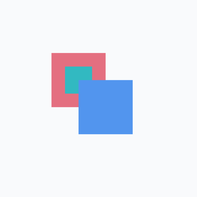
      → z-index: 2인 .blue가 z-index: 3인 .green 보다 앞 쪽에 보입니다.
      → 분명 z-index 값이 크면 앞 쪽에 보인다고 배웠는데, 이러니까 이상합니다.
      → 심지어 z-index: 3을 z-index: 9999로 바꿔도 안 됩니다.

      → z-index 값은 단순히 서로 비교만 하는 게 아니라, 쌓임 맥락(Stacking Context)
        안에서 비교하기 때문


      쌓임 맥락

      → z-index를 묶어서 생각하는 범위라고 할 수 있다.
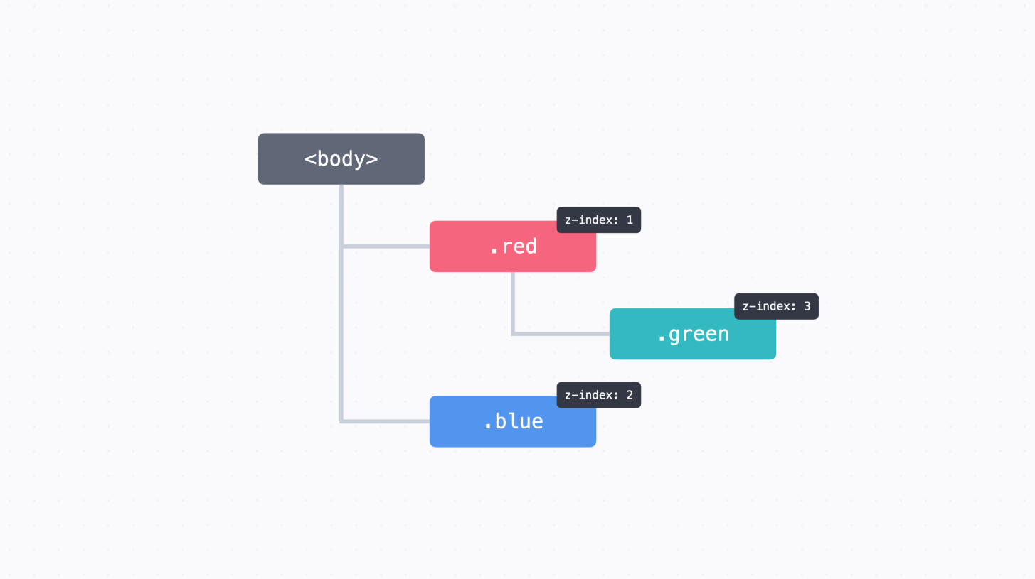
      → <body> 태그 아래에 이렇게 .red, .green 그리고 .blue가 배치
      → 그리고 각각 z-index 값이 있다.
      → .green 태그의 위치는 .red 태그의 자식이다.
        마침 조건이 맞아서 .red에는 쌓임 맥락이 만들어진 상태

      → .red 태그에서 쌓임 맥락이 만들어졌기 때문에 .red의 모든 자손 태그들은 (빗금 친 영역)
        마치 .red와 마찬가지로 z-index: 1로 묶어서 생각될 수 있다.
      → 항상 .blue 뒤쪽에 배치
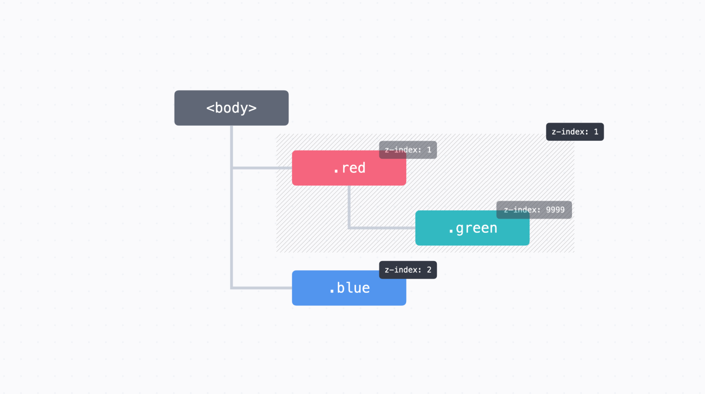
      → 심지어 .green에서 z-index: 9999라고 하더라도, 바깥에서 보면 쌓임 맥락 때문에
        z-index: 1과 마찬가지로 처리되어 아무런 효과가 없다.
      → 쌓임 맥락의 장점은 쌓임 맥락 안에서는 바깥을 신경 쓰지 않고 z-index 값을 쓸 수 있다는 점
      → HTML 태그가 수백 개, 수천 개, 수만 개 있다고 생각해보시면 이것들의 z-index를 고려해서
        CSS 코드를 쓰는 게 만만치 않다.
      → 쌓임 맥락만 분명하다면 바깥은 신경 쓰지 않고 코드를 쉽게 쓸 수 있다.
      → 내비게이션을 만들 때도 z-index 숫자를 무한정 크게 하지 않아도 깔끔하게 값을 쓸 수 있다.


      쌓임 맥락 만들기

      → 쌓임 맥락이 만들어지는 조건은 굉장히 복잡하다.

      (1) 문서의 루트 요소(<html>)
      (2) position이 absolute이거나 relative이고, z-index가 auto가 아닌 경우
      (3) position이 fixed이거나 sticky인 경우
      (4) 플렉스박스(우리가 다음 챕터에서 배울 개념)나 그리드(우리가 다음 다음 챕터에서 배울 내용)의
          자식 중 z-index가 auto가 아닌 경우
      (5) opacity가 1보다 작은 요소

      → 앞서 봤던 예시에서는 두 번째 조건인 "position이 absolute이거나 relative이고,
        z-index가 auto가 아닌 경우"에 해당했기 때문에 쌓임 맥락이 만들어졌다.
쌓임 맥락과 관련된 문서
z-index가 원하는 대로 동작하지 않을 때
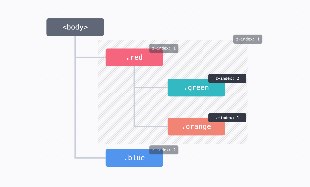
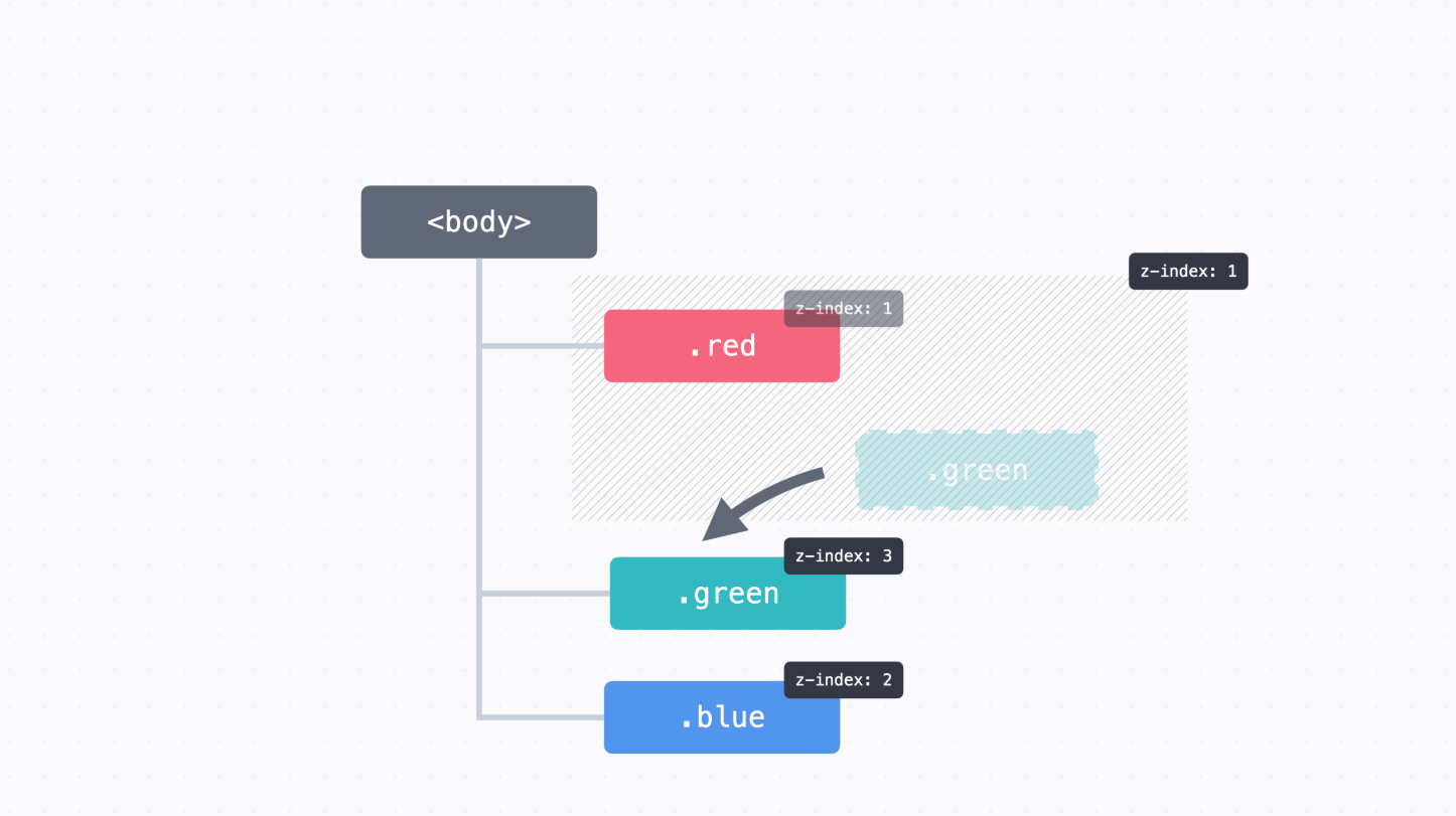
→ 가장 손쉬운 방법은 해당 요소를 쌓임 맥락 바깥으로 옮RLSMS QKDQJQ
앞에서 본 코드를 예로 들자면, .green의 <div>를 상위 태그로 옮기고 CSS도 약간 수정
<div class="red"></div>
<div class="green"></div>
<div class="blue"></div>
.green {
background-color: #32b9c1;
position: absolute;
width: 50px;
height: 50px;
top: 125px;
left: 125px;
z-index: 3;
}
	z-index 값이 너무 많아지고 복잡해질 때

    → 적절하게 쌓임 맥락을 만들어주면 된다.
    → (relative 포지션)을 이용하면 간단하게 쌓임 맥락을 만들 수 있다.
    → 예를 들어서 .container라는 <div> 안에 쌓임 맥락을 만들고 싶으면 아래처럼 position 속성과
      z-index를 추가

    <div class="container">
      ...
    </div>

    .container {
      position: relative;
      z-index: 0;
    }

    → position: relative는 원래 위치를 기준으로 요소를 배치
      이때 따로 위치를 정하지 않으면 그냥 원래 위치에 있다.
    → z-index의 기본 값은 auto인데, 0으로 지정한다고 해서 요소들 사이에 쌓이는 순서가
      바뀌지는 않습니다. (auto 와 0의 가장 큰 차이는 쌓임 맥락을 만드느냐 아니냐의 차이)

    → 예를 들어서 내비게이션 바를 만든다고 할 때,
      <header> 태그와 <main> 태그로 일단 영역을 크게 두 개로 나누고, <main>에 쌓임 맥락을 만들어
      놓으면 <header> 태그는 무슨 일이 있어도 <main> 태그 안에 있는 것들 보다 앞쪽에 보인다.

    <header>
      ...내비게이션
    </header>
    <main>
      ...본문 내용
    </main>

    header {
      position: sticky;
      top: 0;
      z-index: 1;
    }

    main {
      position: relative;
      z-index: 0;
    }
- 미니 프로젝트 : 리드잇북스
→ 주어진 코드를 수정해서 사이트를 완성
(1) 상단 내비게이션이 항상 위쪽에 고정되도록 배치해 주세요.
(2) 하단 배너 광고가 항상 아래 쪽에 고정되도록 배치해 주세요.
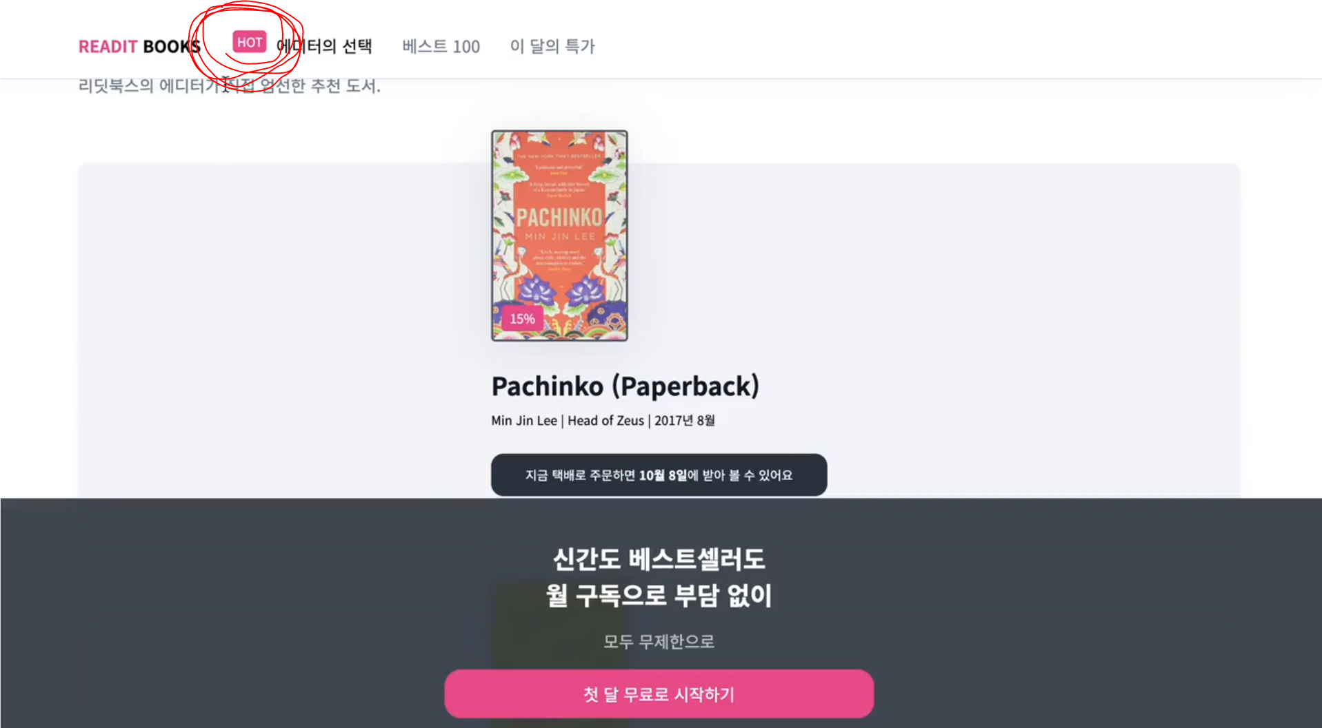
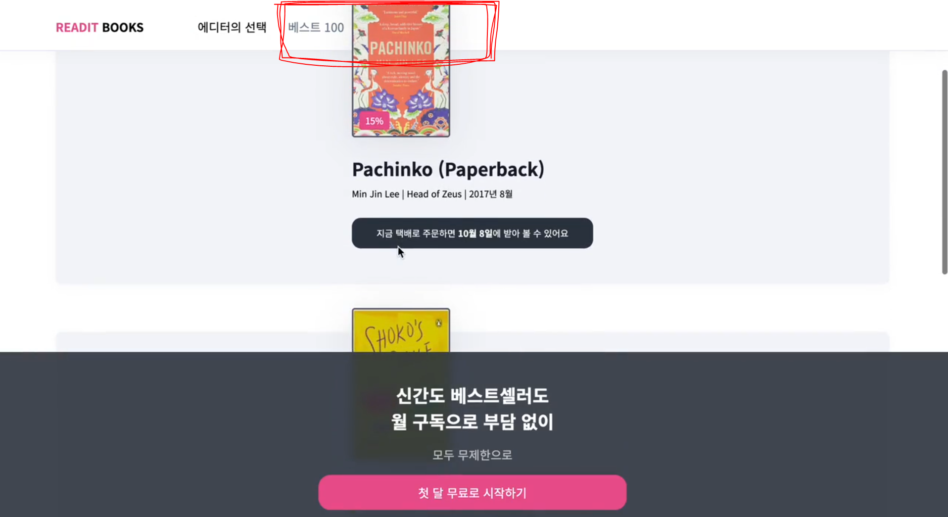
(3) "에디터의 선택" 제목 옆에 붙은 배지의 위치를 원래 위치에서 위에서 -10px,
왼쪽에서 10px 위치에 배치해 주세요.
(4) 책 표지 이미지랑 겹치게 15% 할인 배지를 아래에서 8px, 왼쪽에서 8px 위치에 배치해 주세요.
참고로 이번 실습은 position 속성을 활용해서 배치를 해 보는 것이 목적이니까,
세세한 여백이나 크기는 다르더라도 괜찮습니다.
→ 상단 내비게이션은 .nav 클래스를 쓰고 있고,
하단 배너 광고는 .ad-banner 클래스를 쓰고 있다.
이 두 개를 고정으로 배치하기 위해서 각각 position: sticky를 적용
.nav {
position: sticky;
top: 0;
padding: 20px 80px;
border-bottom: 1px solid #e1e6f1;
background-color: #ffffff;
box-shadow: 0px 0px 20px rgba(27, 39, 50, 0.05);
}
...
.ad-banner {
position: sticky;
bottom: 0;
padding: 40px;
background: rgba(49, 58, 71, 0.9);
color: #fff;
text-align: center;
backdrop-filter: blur(6px);
}
→ "에디터의 선택" 옆에 붙은 배지의 위치는 원래 위치를 기준으로 배치하는 것이기 때문에
position: relative를 적용
.hot-badge {
position: relative;
top: -10px;
left: 10px;
padding: 2px 4px;
border-radius: 4px;
background-color: #ea5493;
color: #ffffff;
font-weight: 500;
font-size: 12px;
line-height: 17px;
}
→ 책 표지 이미지랑 겹치게 15% 할인 배지를 배치하려면, position: absolute를
.book-promotion-badge에 적용
.book-promotion-badge {
position: absolute;
bottom: 8px;
left: 8px;
padding: 4px 8px;
border-radius: 4px;
background-color: #ea5493;
color: #ffffff;
font-weight: 500;
font-size: 12px;
line-height: 17px;
}
→ 그런데 absolute 포지션은 가장 가까운, 포지셔닝이 된 조상을 기준으로 배치
→ 책 표지 이미지와 할인 배지를 모두 포함하는 영역의 클래스인 .book-thumb 클래스에
position: relative를 적용
.book-thumb {
overflow: hidden;
margin-top: -56px;
width: 128px;
height: 200px;
border: 2px solid #595d6d;
border-radius: 4px;
filter: drop-shadow(0px 4px 23px rgba(16, 20, 32, 0.1));
position: relative;
}
      → 고정된 상단 내비게이션 앞으로 "HOT" 배지랑 책 표지 이미지가 보인다
      → z-index를 지정하면 내가 원하는 요소를 앞에다 보여줄 수 있다.
      → .nav 클래스에서 z-index: 1을 추가
      → main 태그에 position: relative와 z-index: 0을 추가해 주면 쌓임 맥락을 만들어서
        <main> 태그 아래에 있는 모든 요소들은 반드시 상단 내비게이션 뒤쪽에 보이기 때문에
        훨씬 견고한 코드를 짤 수 있다.

      .nav {
        position: sticky;
        top: 0;
        z-index: 1;
        padding: 20px 80px;
        border-bottom: 1px solid #e1e6f1;
        background-color: #ffffff;
        box-shadow: 0px 0px 20px rgba(27, 39, 50, 0.05);
      }

      /* ... */

      main {
        position: relative;
        z-index: 0;
        padding: 40px 80px;
      }
index.html

  <!DOCTYPE html>
  <html>
    <head>
      <meta charset="utf-8">
      <title>Readit Books</title>
      <link rel="preconnect" href="https://fonts.googleapis.com">
      <link rel="preconnect" href="https://fonts.gstatic.com" crossorigin>
      <link
        href="https://fonts.googleapis.com/css2?family=Noto+Sans+KR:wght@400;700&display=swap"
        rel="stylesheet">
      <link rel="stylesheet" href="style.css">
    </head>
    <body>
      <div class="nav">
        <div class="logo"><span class="logo-accent">READIT</span> BOOKS</div>
        <ul class="menu">
          <li class="menu-item active">에디터의 선택</li>
          <li class="menu-item">베스트 100</li>
          <li class="menu-item">이 달의 특가</li>
        </ul>
      </div>
      <main>
        <h1 class="title">에디터의 선택<span class="hot-badge">HOT</span></h1>
        <p class="description">리딧북스의 에디터가 직접 엄선한 추천 도서.</p>
        <div class="book">
          <div class="book-container">
            <div class="book-thumb">
              <img class="book-thumb-image" src="images/pachinko.jpeg">
              <div class="book-promotion-badge">15%</div>
            </div>
            <h2 class="title">
              <a href="https://codeit.kr">Pachinko (Paperback)</a>
            </h2>
            <p class="book-description">Min Jin Lee | Head of Zeus | 2017년 8월</p>
            <p class="book-info">
              지금 택배로 주문하면 <span class="date">10월 8일</span>에 받아 볼 수
              있어요
            </p>
          </div>
        </div>
        <div class="book">
          <div class="book-container">
            <div class="book-thumb">
              <img class="book-thumb-image" src="images/shokos-smile.jpeg">
            </div>
            <h2 class="title">Shoko's Smile (Paperback)</h2>
            <p class="book-description">
              EunYoung Choi | Penguin Books | 2021년 6월
            </p>
            <p class="book-info">
              지금 택배로 주문하면 <span class="date">11월 14일</span>에 받아 볼 수
              있어요
            </p>
          </div>
        </div>
        <div class="book">
          <div class="book-container">
            <div class="book-thumb">
              <img class="book-thumb-image" src="images/white.jpeg">
              <div class="book-promotion-badge">15%</div>
            </div>
            <h2 class="title">The White Book (Paperback)</h2>
            <p class="book-description">Kang Han | Granta Books | 2018년 4월</p>
            <p class="book-info">
              지금 택배로 주문하면 <span class="date">10월 8일</span>에 받아 볼 수
              있어요
            </p>
          </div>
        </div>
      </main>
      <div class="ad-banner">
        <h2 class="ad-banner-title">
          신간도 베스트셀러도<br>
          월 구독으로 부담 없이
        </h2>
        <div class="ad-banner-description">모두 무제한으로</div>
        <a href="#" class="ad-banner-cta">
          첫 달 무료로 시작하기
        </a>
      </div>
    </body>
  </html>


style.css

  body {
    margin: 0;
    font-family: 'Noto Sans KR', sans-serif;
  }

  a {
    color: #12172a;
    text-decoration: none;
  }

  a:hover {
    text-decoration: underline;
  }

  .nav {
    position: sticky;
    top: 0;
    z-index: 1;
    padding: 20px 80px;
    border-bottom: 1px solid #e1e6f1;
    background-color: #ffffff;
    box-shadow: 0px 0px 20px rgba(27, 39, 50, 0.05);
  }

  .logo {
    display: inline;
    margin-right: 56px;
    font-weight: 900;
    font-size: 16px;
    line-height: 23px;
  }

  .logo-accent {
    color: #ea5493;
  }

  .menu {
    display: inline;
    margin: 0;
    padding: 0;
  }

  .menu-item {
    display: inline;
    margin: 0 12px;
    color: #717f8e;
    list-style: none;
    font-weight: 500;
  }

  .menu-item.active {
    color: #000000;
  }

  main {
    position: relative;
    z-index: 0;
    padding: 40px 80px;
  }

  .title {
    margin: 0 0 8px;
    color: #12172a;
    font-weight: 700;
    font-size: 24px;
    line-height: 35px;
  }

  .hot-badge {
    position: relative;
    top: -10px;
    left: 10px;
    padding: 2px 4px;
    border-radius: 4px;
    background-color: #ea5493;
    color: #ffffff;
    font-weight: 500;
    font-size: 12px;
    line-height: 17px;
  }

  .description {
    margin: 0;
    color: #717f8e;
    font-weight: 400;
    font-size: 16px;
    line-height: 23px;
  }

  .book {
    margin: 64px 0;
    padding: 24px 48px;
    border-radius: 8px;
    background: #f4f5f9;
    box-shadow: 0px 4px 15px rgba(18, 23, 42, 0.03);
  }

  .book-container {
    margin: 0 auto;
    width: 324px;
  }

  .book-thumb {
    overflow: hidden;
    margin-top: -56px;
    width: 128px;
    height: 200px;
    border: 2px solid #595d6d;
    border-radius: 4px;
    filter: drop-shadow(0px 4px 23px rgba(16, 20, 32, 0.1));
  }

  .book-thumb-image {
    display: block;
    width: 100%;
    height: 100%;
  }

  .book-promotion-badge {
    position: absolute;
    bottom: 8px;
    left: 8px;
    padding: 4px 8px;
    border-radius: 4px;
    background-color: #ea5493;
    color: #ffffff;
    font-weight: 500;
    font-size: 12px;
    line-height: 17px;
  }

  .book .title {
    margin: 24px 0 8px;
    color: #12172a;
    font-weight: 700;
    font-size: 24px;
    line-height: 35px;
  }

  .book-description {
    font-weight: 400;
    font-size: 12px;
    line-height: 17px;
    margin: 8px 0;
  }

  .book-info {
    margin: 24px 0;
    padding: 12px;
    border-radius: 12px;
    background-color: #2e3846;
    color: #ffffff;
    text-align: center;
    font-weight: 400;
    font-size: 12px;
    line-height: 17px;
  }

  .book .date {
    font-weight: 700;
  }

  .ad-banner {
    position: sticky;
    bottom: 0;
    padding: 40px;
    background: rgba(49, 58, 71, 0.9);
    color: #fff;
    text-align: center;
    backdrop-filter: blur(6px);
  }

  .ad-banner-title {
    margin: 0;
    font-weight: 700;
    font-size: 24px;
    line-height: 35px;
  }

  .ad-banner-description {
    margin: 16px 0;
    color: #cbcbcb;
    font-weight: 500;
  }

  .ad-banner-cta {
    display: block;
    margin: 0 auto;
    padding: 12px;
    width: 390px;
    border-radius: 16px;
    background-color: #ea5493;
    color: #ffffff;
    text-align: center;
    text-decoration: none;
  }
- 포지셔닝 정리
position 속성
→ 글의 흐름에서 벗어나서 요소를 자유롭게 배치할 때 쓰는 속성
→ position에 따라서 위치를 정하는 기준이 달라진다.
→ 기본 값은 static이고, static인 경우 원래 있어야 할 위치에 배치
위치 정하기
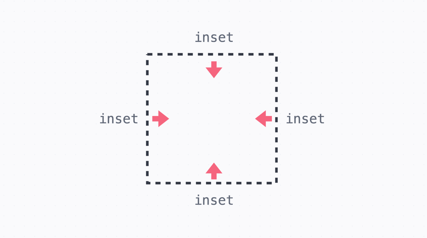
→ 위치를 정하는 기준에 대해서 top, right, bottom, left 속성으로 위치를 정할 수 있다.
→ 값이 모두 똑같은 경우 inset 속성을 쓸 수 있다.
	  relative 포지션

      → 요소의 원래 위치를 기준으로 배치합니다. 이때 요소의 원래 자리는 그대로 차지

      .green {
        position: relative;
        top: 15px;
        left: 10px;
      }
	  absolute 포지션

      → 가장 가까운 포지셔닝이 된 조상 요소를 기준으로 배치
      → 이때 포지셔닝이 되었다는 건 static이 아니라는 (position 속성을 지정했다는) 의미
      → 예시에서는 .red가 relative 포지션이어서 .blue는 .red를 기준으로 배치
      → 글의 흐름에서 완전히 빠져서, 요소의 원래 자리는 차지하지 않습니다.

      .red {
        position: relative;
        top: 0;
        left: 10px;
      }

      .blue {
        position: absolute;
        right: 10px;
        bottom: 15px;
      }
	  fixed 포지션

      → 브라우저 화면을 기준으로 고정된 배치
      → 글의 흐름에서 완전히 빠져서, 요소의 원래 자리는 차지하지 않습니다.
      → 내비게이션을 만들거나 할 때 겹치지 않도록 마진을 넣어준다.

      .red {
        position: fixed;
        top: 0;
        left: 0;
        width: 100%;
      }


	  sticky 포지션

      → static처럼 원래 위치에 배치되어 있다가, 정해진 위치에 브라우저가 스크롤되면
        그때부터 fixed처럼 고정되어 배치
      → 기본적으로는 static처럼 배치되기 때문에 요소의 원래 자리를 차지

      .red {
        position: sticky;
        top: 0;
        left: 0;
        width: 100%;
      }


	  z-index값

      → 앞뒤 순서를 정할 때 쓰는 값
      → 순서기 때문에 단위 없이 사용
      → 값이 높을수록 화면에서 앞쪽, 값이 같으면 코드에서 아래 줄에 있는 요소가 앞쪽에 보여진다.