1. Flexbox란?
- 사이트를 만들다보면 요소를 세로로 정렬하거나 요소를 양 끝에 배치하고 싶을 때가 있다.
- 이럴 때는 flexbox를 사용
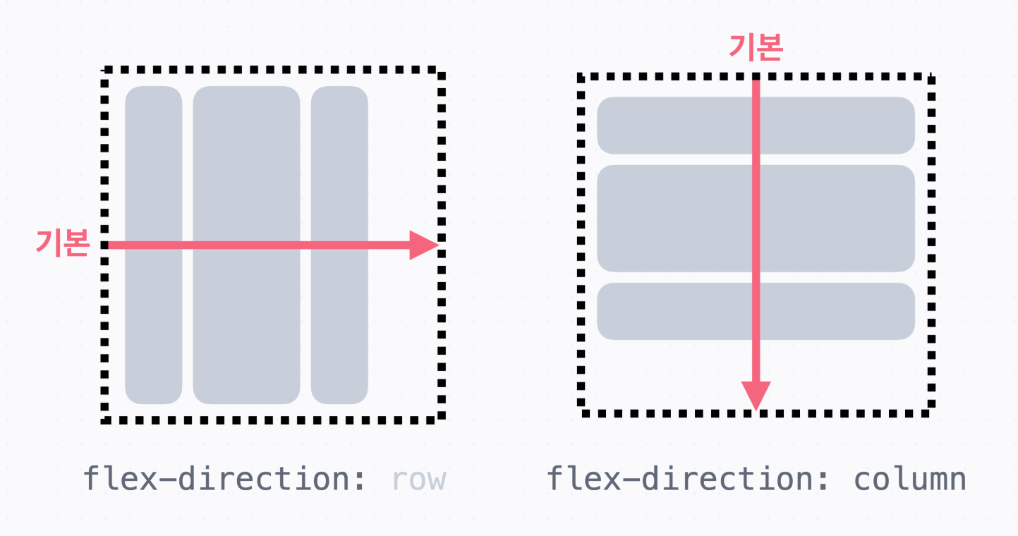
→ Flexbox는 1차원으로 요소를 배치하는 방식
가로 방향으로 배치하거나 세로 방향으로 배치할 수 있다.
   → Flexbox를 쓰려면 배치할 방향을 정해야 한다.
     가로 또는 세로 중에 고르면 됩니다.
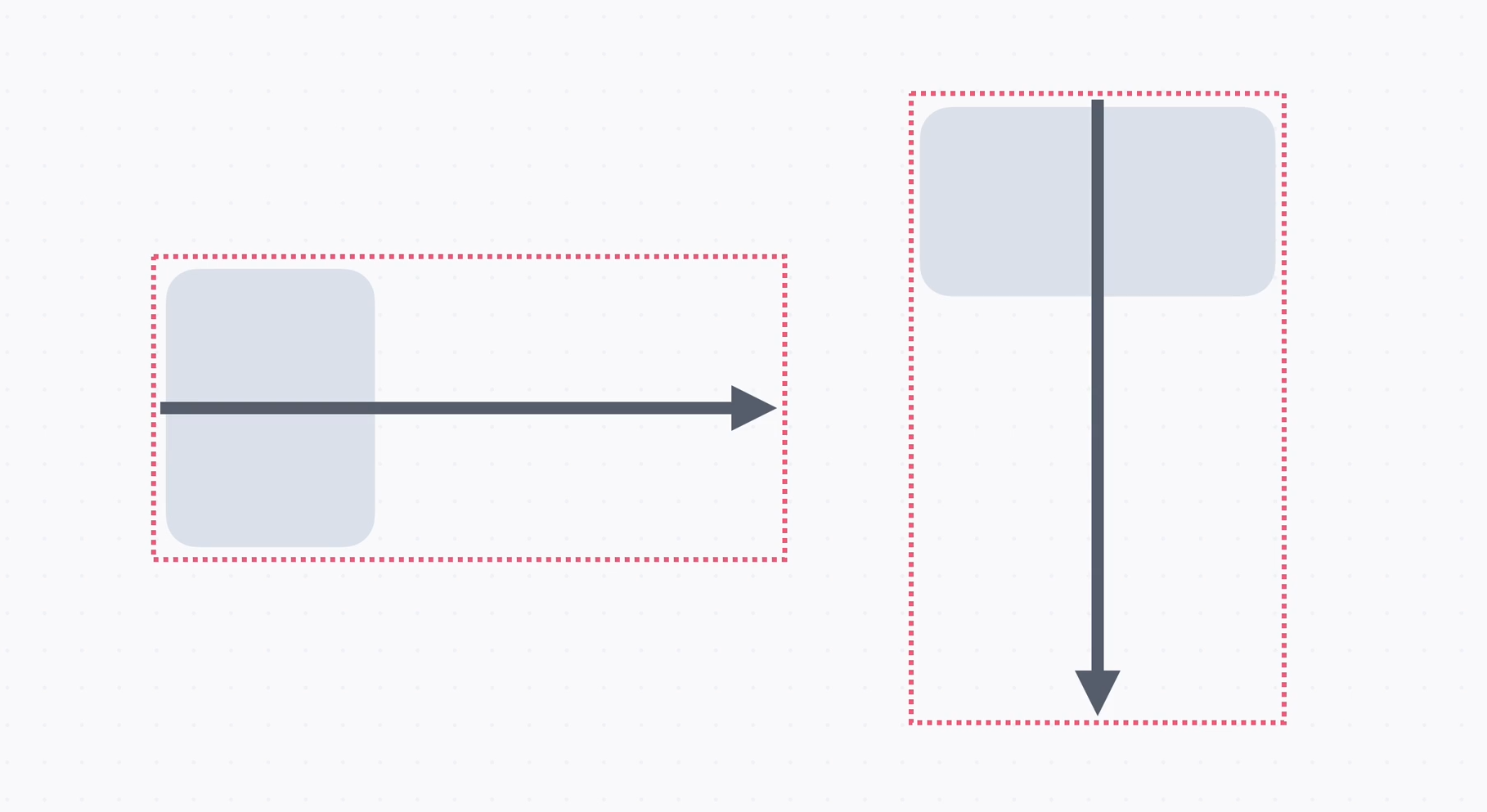
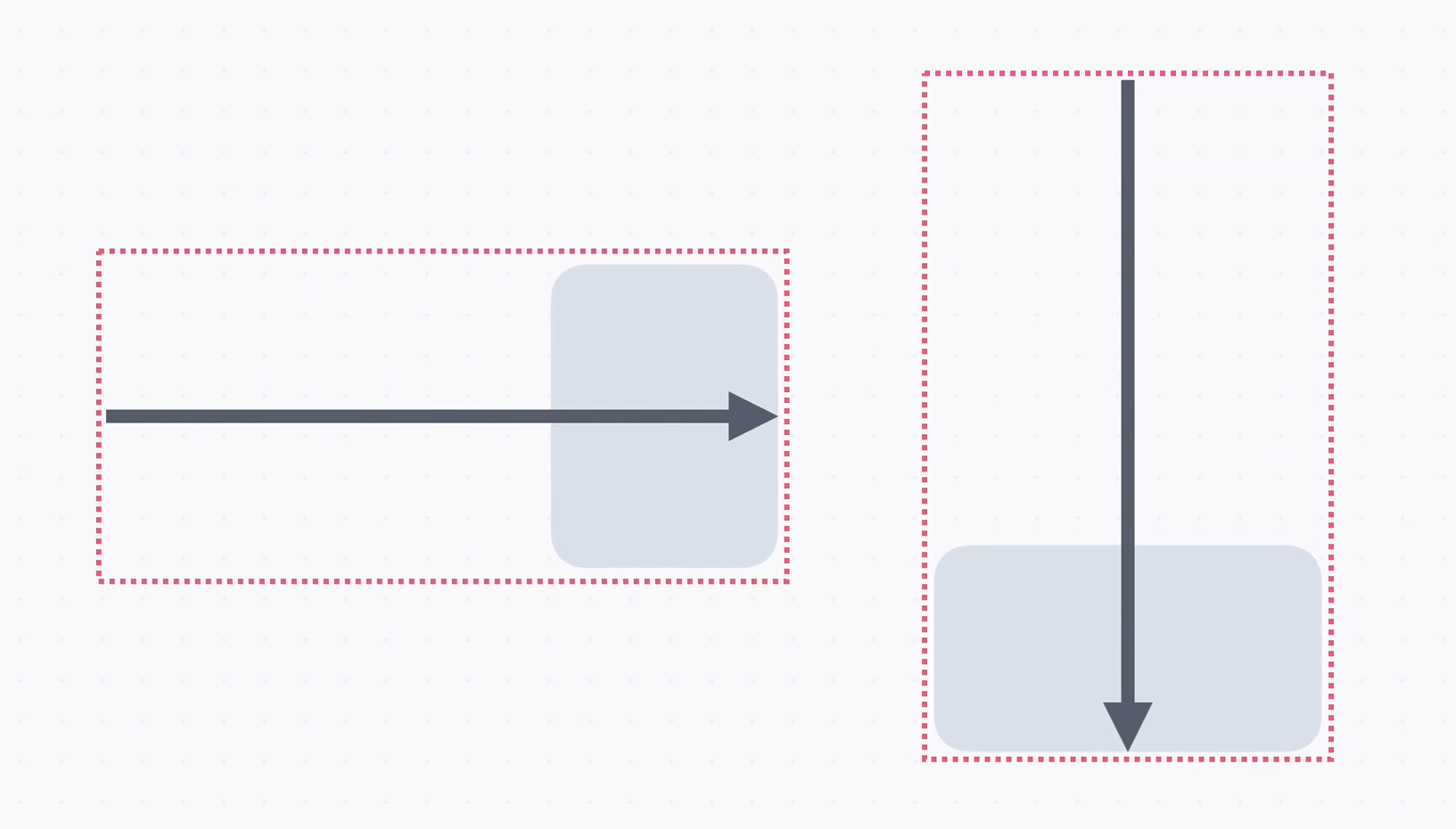
   → 여기에 요소를 배치하는데 박스 앞 부분에 정렬하거나 박스 뒷 부분에 정렬할 수도 있고,
     양 끝으로 나눠서 배치할 수도 있다.
→ 중앙정렬도 가능
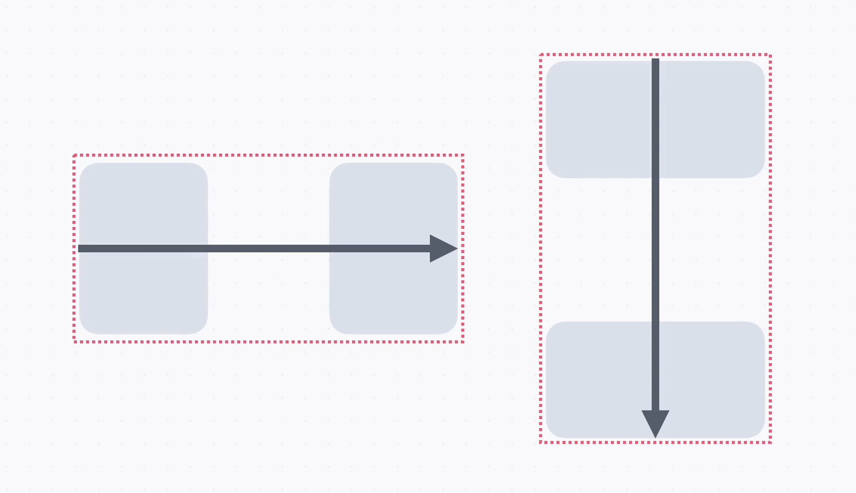
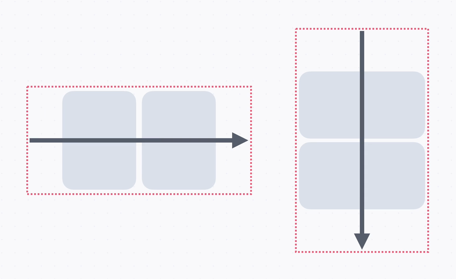
→ 요소의 개수가 많아져서 넘치면 어떤 식으로 보여줄지도 정할 수 있고,
요소들 사이의 간격을 정할 수도 있다.
   → 요소의 크기를 유연하게 늘리거나 줄일 수도 있다.

   → Flexbox에서는 배치할 방향을 정하고, 어떻게 정렬할지, 요소가 넘칠 때는 어떻게 배치할지,
     요소들 상의 간격은 얼마나 조절할지, 크기는 어떻게 늘이거나 줄일 것인지를 정할 수 있다.

   → 배치할 방향을 정하는 데는 flex-direction, 정렬할 때는 justify-content, align-items,
     요소가 넘칠 때는 flex-wrap, 간격에는 gap이라는 속성을 사용,
     크기를 늘리거나 줄일 때는 flex-grow, flex-shrink라는 속성을 사용하고
     flex-basis라는 속성으로 유연하게 크기를 정할 수 있다.
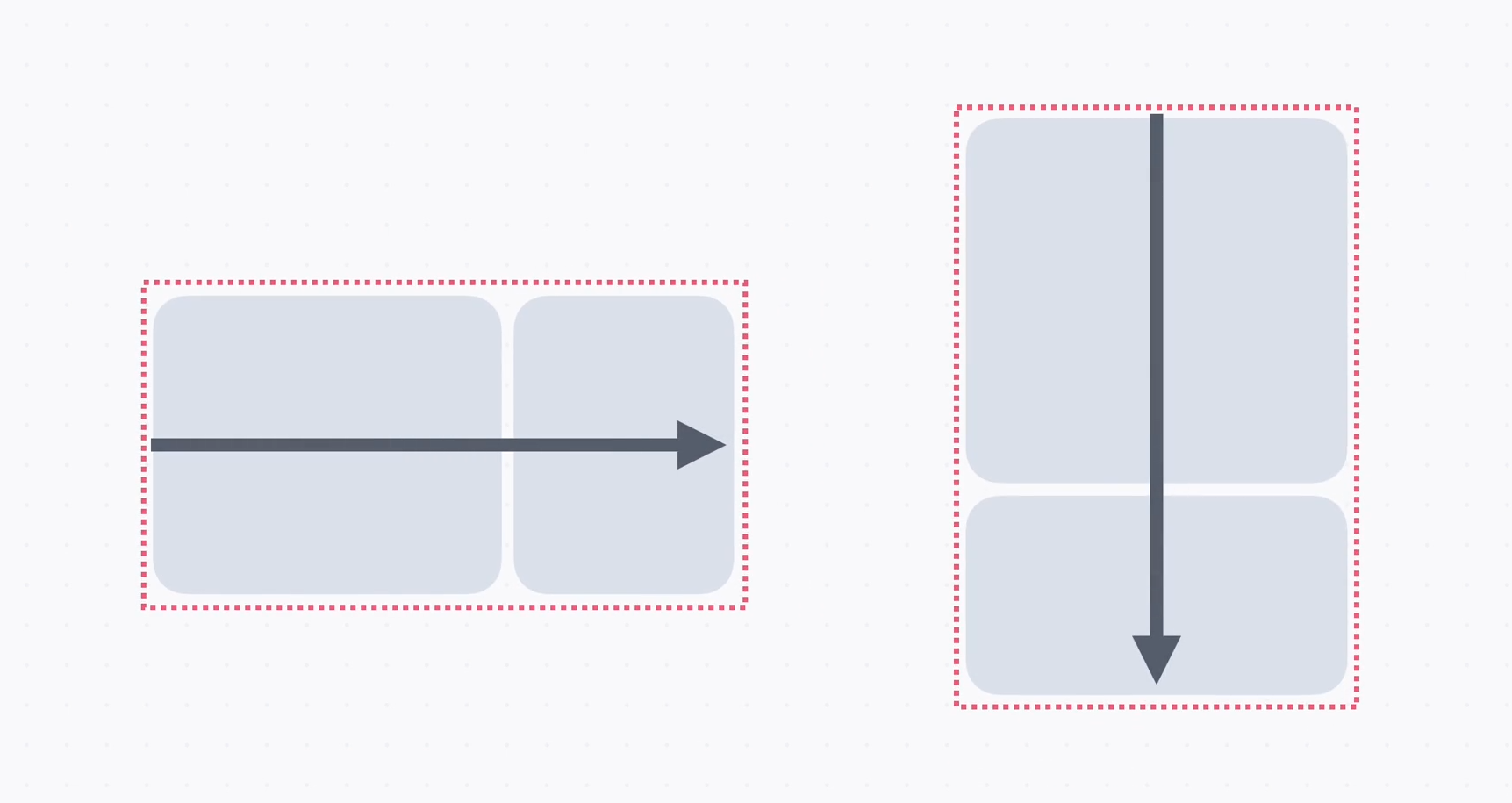
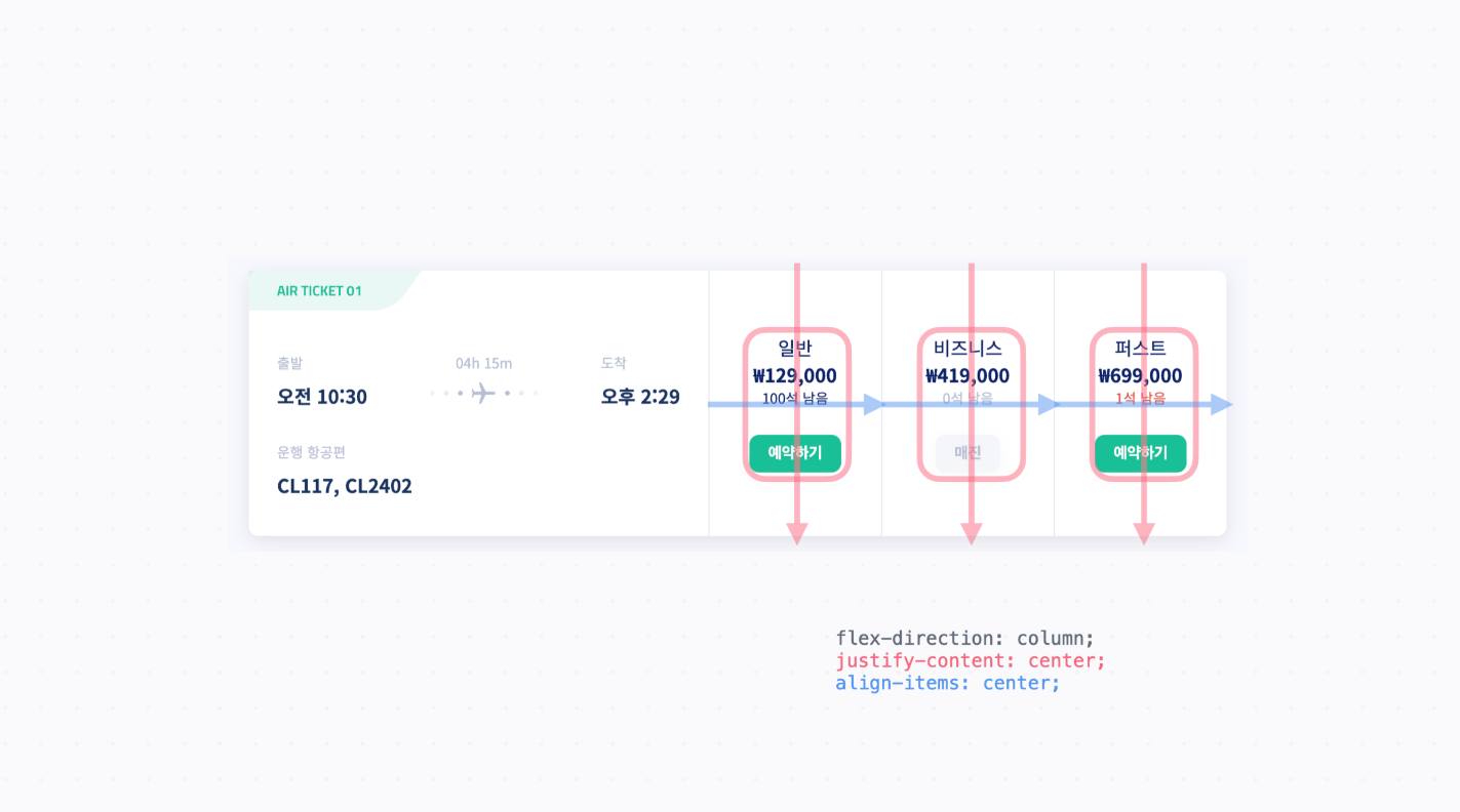
2. 배치 방향
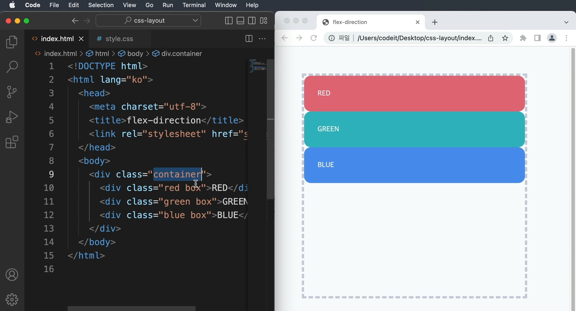
   → container라는 div 클래스 안에 div 태그 세 개를 배치
     red box, green box, blue box
   → css 코드를 보면 container div에는 회색 점선 테두리가 있고, 너비와 높이는 500px로 정했다.
   → box클래스에서는 border-radius로 모서리를 둥글게 하고, padding을 30px로 해서 여기 box랑
     글자 사이에 공간을 둔다.
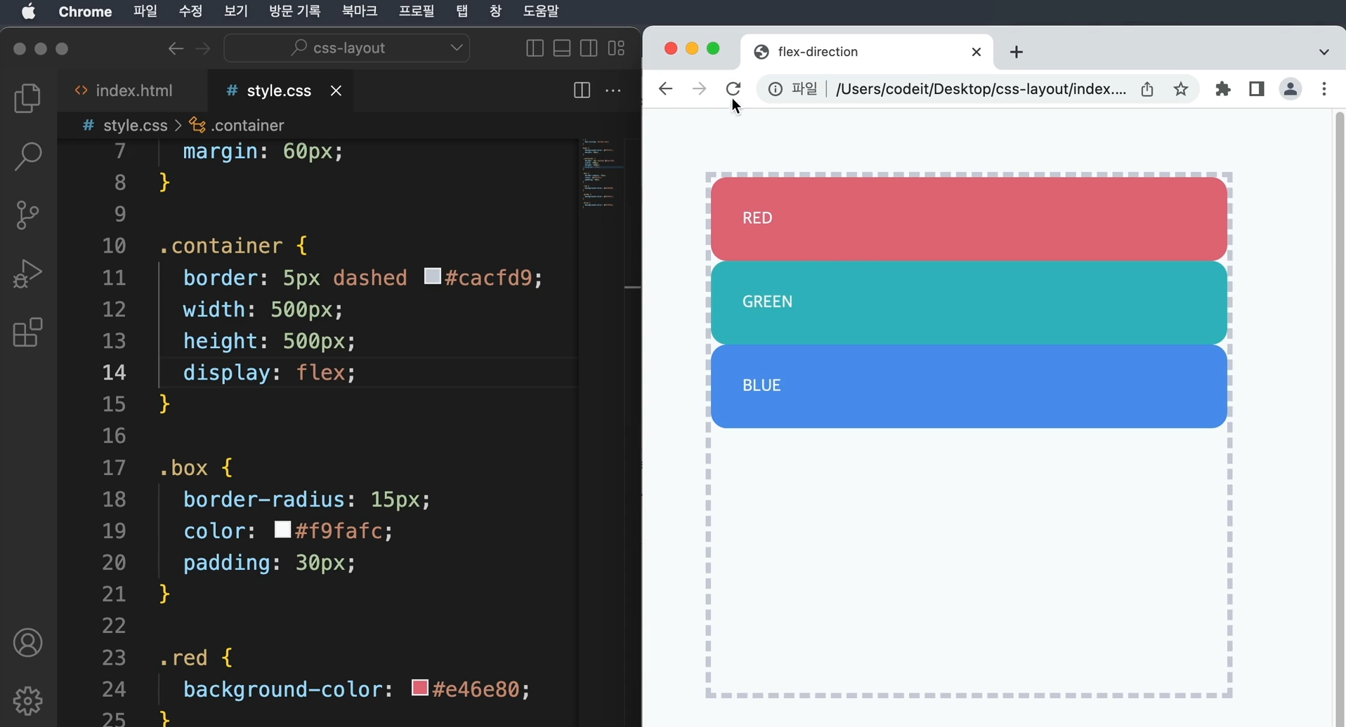
   → container div를 flexbox로 만들고, 배치 방향을 정한다.
   → display : block대신 display : flex라고 하면 flexbox를 만들 수 있다.
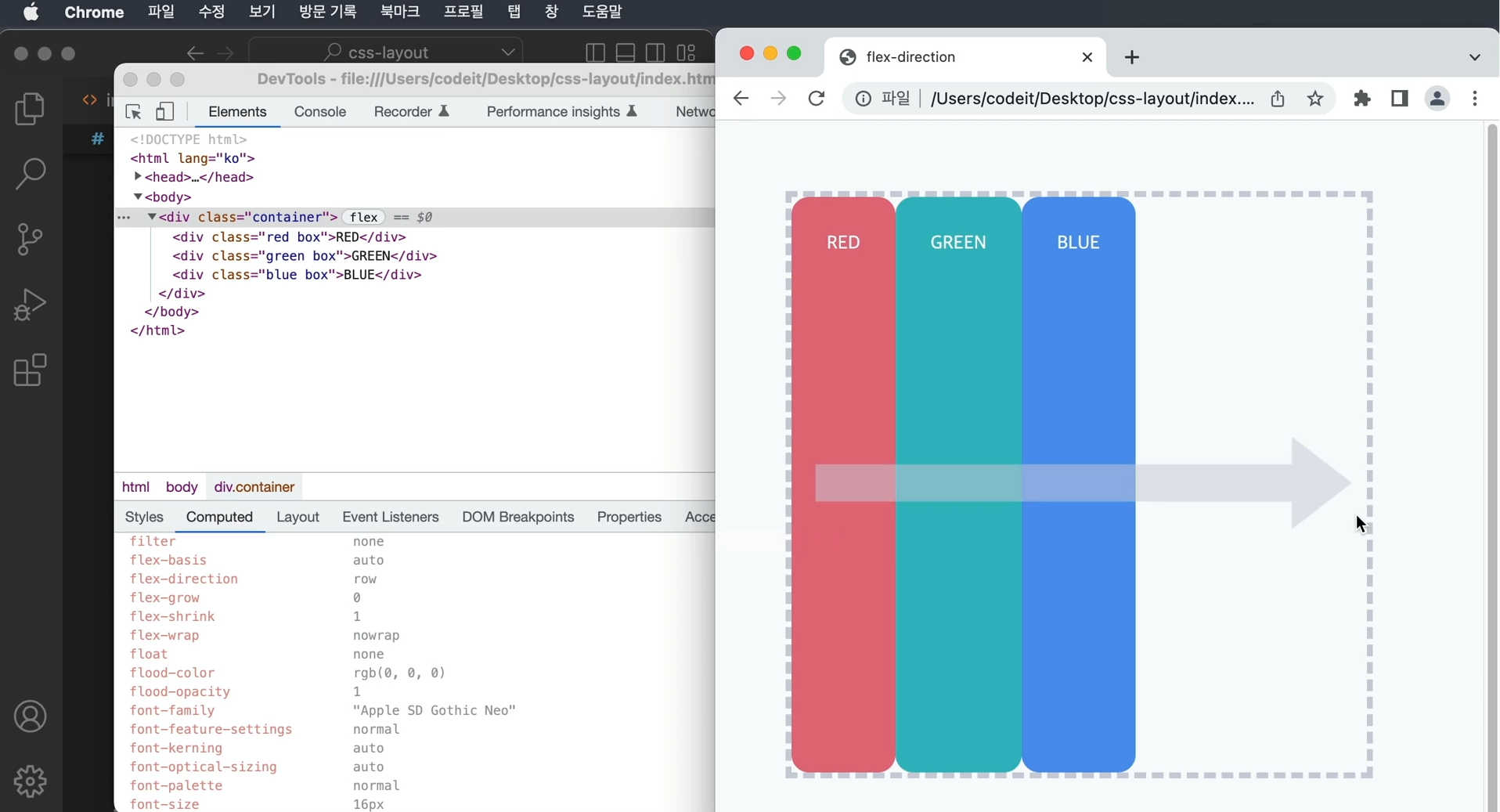
   → 기본적으로 flex-direction의 값이 row로 기본 설정되어 있다.
     row는 왼쪽에서 오른쪽 가로 방향을 뜻한다.
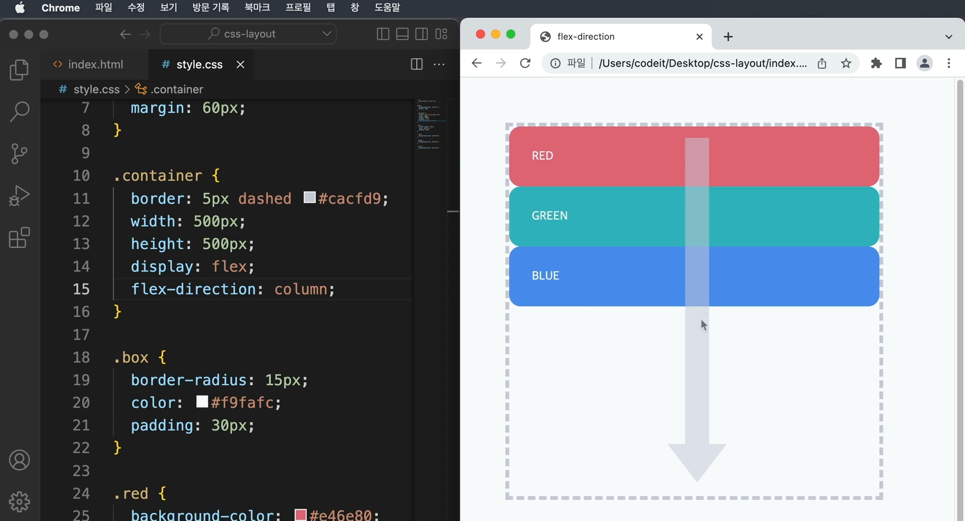
   → 세로 방향으로 바꿀 때에는 flex-direction : column; 이라고 하면 위에서 아래로 배치
   → display : block으로 배치하는 것과 다른 점은
     나중에 정렬이나 크기를 조절할 때 차이점을 알 수 있다.
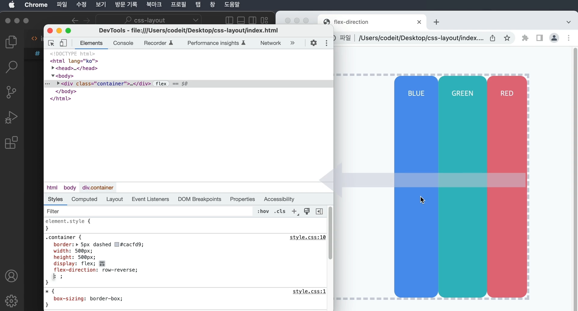
→ 방향을 반대로 하는 방법은 flex-direction : row-reverse라고 하여 가로방향이지만,
오른쪽에서 왼쪽으로 배치
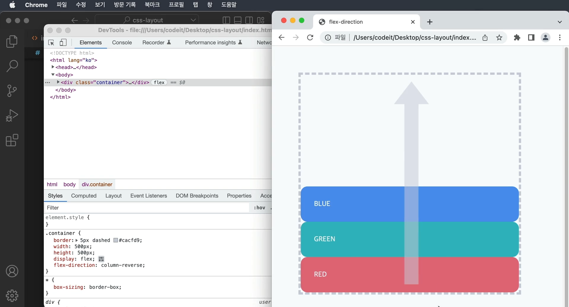
flex-direction : column-reverse라고 하면 아래에서 위쪽으로 배치
3. 이달의 플레이리스트1

   → 이달의 플레이스트들을 가로로 배치
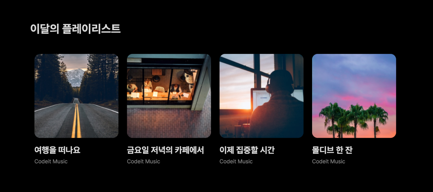
   템플릿 코드 설명

   → <section> 태그 안에 제목이 있고, .playlists라는 클래스로 모든 플레이리스트들을 감싸고
     있습니다. 각각의 플레이리스트는 .playlist라는 클래스로 감싸고 있습니다.

   index.html

   <section>
      <h2 class="section-title">이달의 플레이리스트</h2>
      <div class="playlists">
        <div class="playlist">
          <img class="playlist-thumb" src="images/img_playlist_1.png">
          <div class="playlist-title">
            여행을 떠나요
          </div>
          <div class="playlist-artist">
            Codeit Music
          </div>
        </div>
        <div class="playlist">
          <img class="playlist-thumb" src="images/img_playlist_2.png">
          <div class="playlist-title">
            금요일 저녁의 카페에서
          </div>
          <div class="playlist-artist">
            Codeit Music
          </div>
        </div>
        ...
        </div>
      </div>
    </section>


    style.css

    .playlists {
    }

    .playlist {
      width: 240px;
      margin: 12px;
    }

    .playlist-thumb {
      width: 100%;
      border-radius: 16px;
    }

    .playlist-title {
      font-weight: 700;
      font-size: 24px;
      line-height: 29px;
      margin: 16px 0 8px;
    }

    .playlist-artist {
      color: #868686;
      margin: 0;
    }
   [ 해설 ]

   → 플렉스박스를 만들려면 display 속성을 flex로 바꾸면 된다.
   → 플레이리스트 전체를 감싸고 있는 태그에 .playlists 클래스가 적용
     이 클래스를 플렉스박스로 만든다.

   .playlists {
      display: flex;
    }

   → 배치 방향을 정해야 한다.
   → 플렉스박스의 배치 방향을 바꾸려면 flex-direction 속성
   → row이면 왼쪽에서 오른쪽, column이면 위에서 아래로 배치
   → flex-direction: row를 추가

   .playlists {
      display: flex;
      flex-direction: row;
    }

   → 이렇게 해줘도 가로로 배치가 되지만, 플렉스박스의 기본 배치 방향은 왼쪽에서 오른쪽
   → 다시 말해서 flex-direction의 기본값은 row라는 건데요. 그래서 사실 이 코드는 지워도 됩니다.

   .playlists {
      display: flex;
    }
index.html

  <!DOCTYPE html>
  <html lang="ko">
  <head>
    <meta charset="utf-8">
    <title>Codeit Music</title>
    <link rel="stylesheet" href="style.css">
  </head>
  <body>
    <section>
      <h2 class="section-title">이달의 플레이리스트</h2>
      <div class="playlists">
        <div class="playlist">
          <img class="playlist-thumb" src="images/img_playlist_1.png">
          <div class="playlist-title">
            여행을 떠나요
          </div>
          <div class="playlist-artist">
            Codeit Music
          </div>
        </div>
        <div class="playlist">
          <img class="playlist-thumb" src="images/img_playlist_2.png">
          <div class="playlist-title">
            금요일 저녁의 카페에서
          </div>
          <div class="playlist-artist">
            Codeit Music
          </div>
        </div>
        <div class="playlist">
          <img class="playlist-thumb" src="images/img_playlist_3.png">
          <div class="playlist-title">
            이제 집중할 시간
          </div>
          <div class="playlist-artist">
            Codeit Music
          </div>
        </div>
        <div class="playlist">
          <img class="playlist-thumb" src="images/img_playlist_4.png">
          <div class="playlist-title">
            몰디브 한 잔
          </div>
          <div class="playlist-artist">
            Codeit Music
          </div>
        </div>
      </div>
    </section>
  </body>
  </html>


style.css

  * {
    box-sizing: border-box;
  }

  html {
    word-break: keep-all;
    font-family: Pretendard, sans-serif;
    font-size: 16px;
    line-height: 19px;
  }

  body {
    background-color: #000;
    color: #d9d9d9;
    margin: 0;
  }

  section {
    max-width: 1120px;
    width: 100%;
    margin: 80px auto;
    padding: 0 36px;
  }

  .section-title {
    font-weight: 700;
    font-size: 32px;
    line-height: 38px;
    margin: 40px 0;
  }

  .playlists {
    display: flex;
  }

  .playlist {
    width: 240px;
    margin: 12px;
  }

  .playlist-thumb {
    width: 100%;
    border-radius: 16px;
  }

  .playlist-title {
    font-weight: 700;
    font-size: 24px;
    line-height: 29px;
    margin: 16px 0 8px;
  }

  .playlist-artist {
    color: #868686;
    margin: 0;
  }
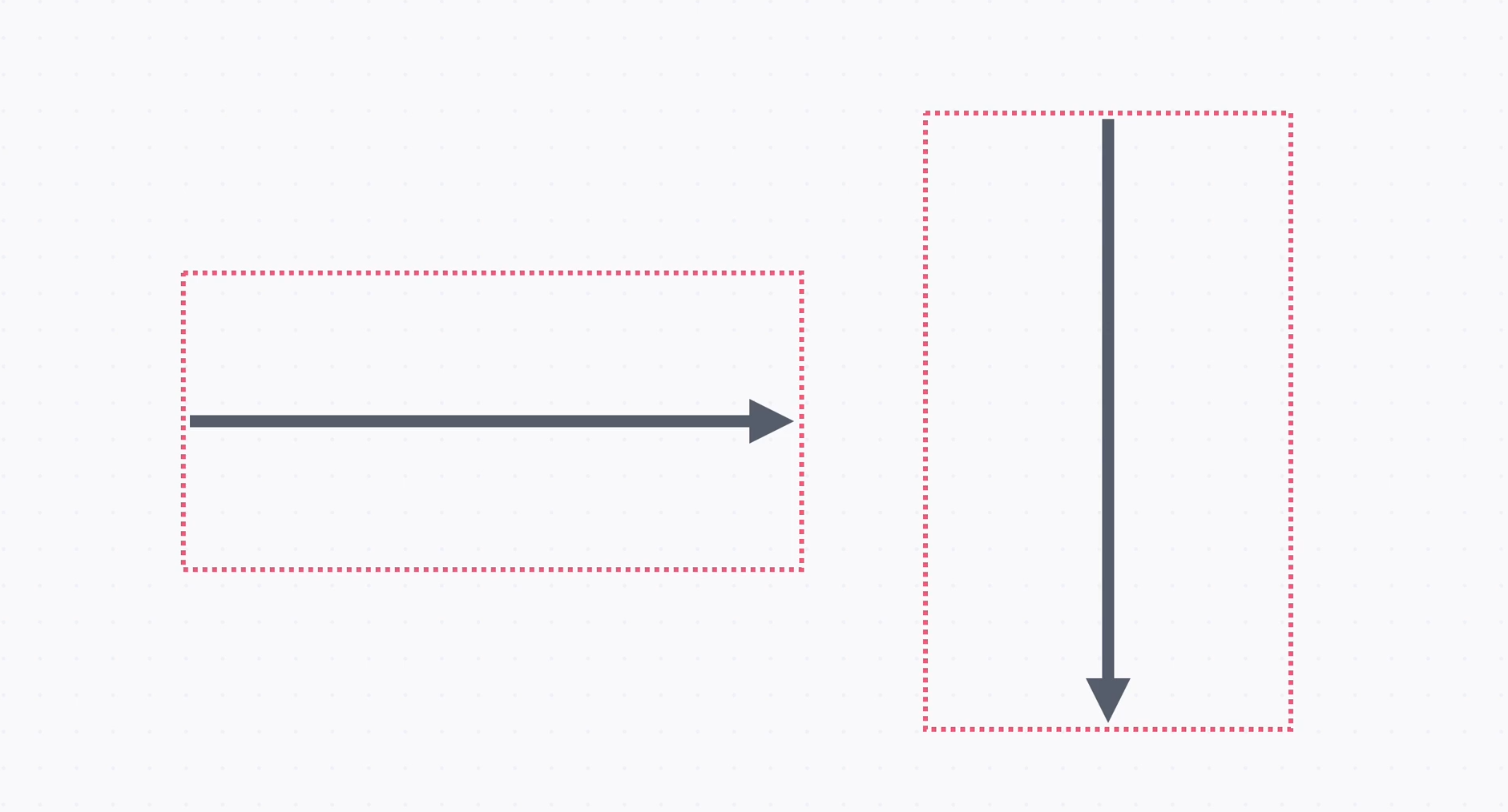
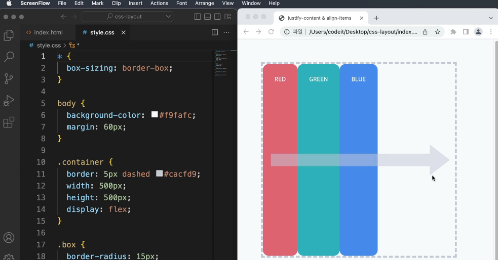
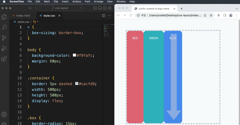
4. 정렬
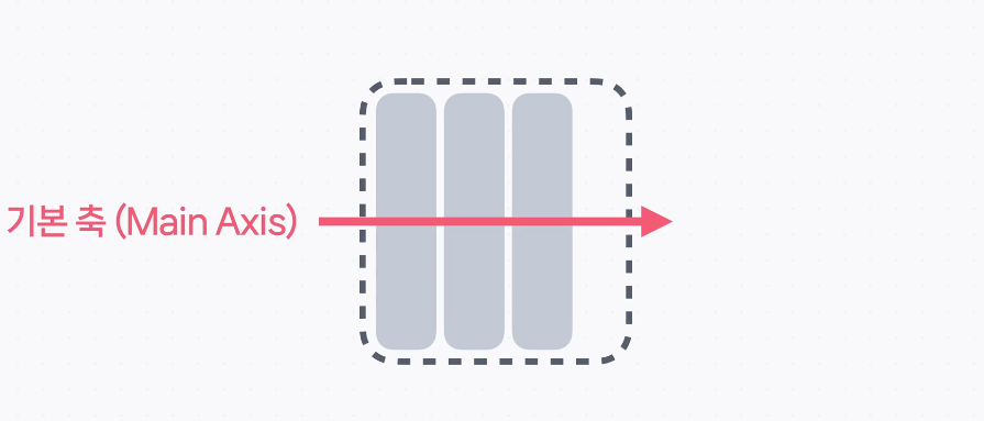
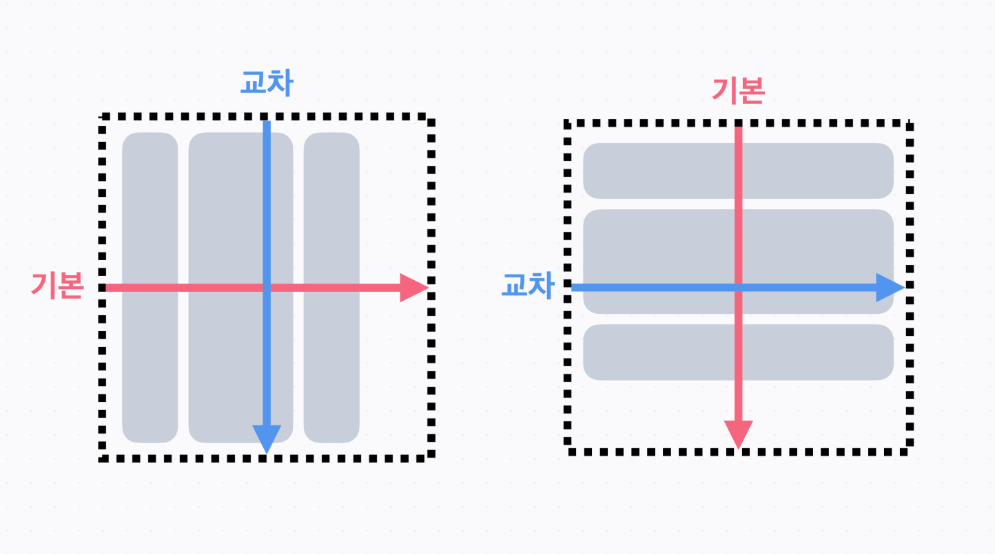
→ flex-direction으로 배치 방향을 정하고, 요소가 배치되는 방향을 기본 축(Main Axis)라고 한다.
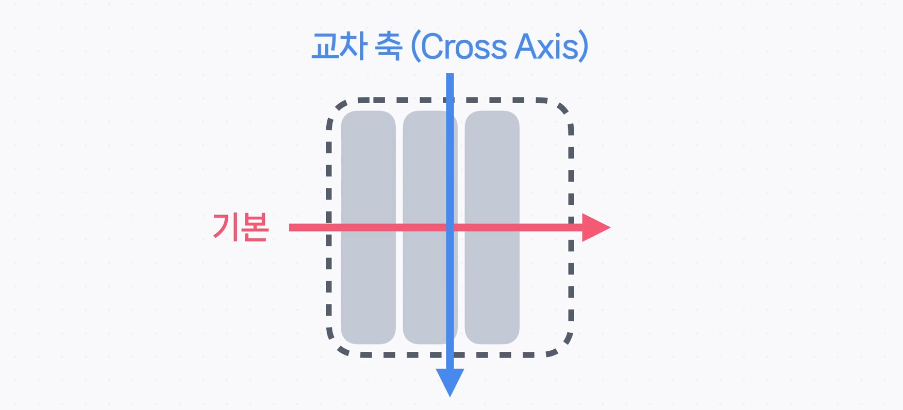
→ 기본 축에 수직인 방향을 교차 축(Cross Axis)라고 한다.
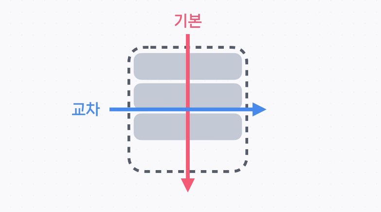
   → 만일 flex-direction의 값이 column이라면, 기본 축은 위에서 아래로 가는 방향이고,
     교차 축은 왼쪽에서 오른쪽으로 가는 방향
→ 기본적으로 요소들은 기본 축 방향 순서대로 배치되고, 교차 축 방향으로는 꽉 채워서 배치
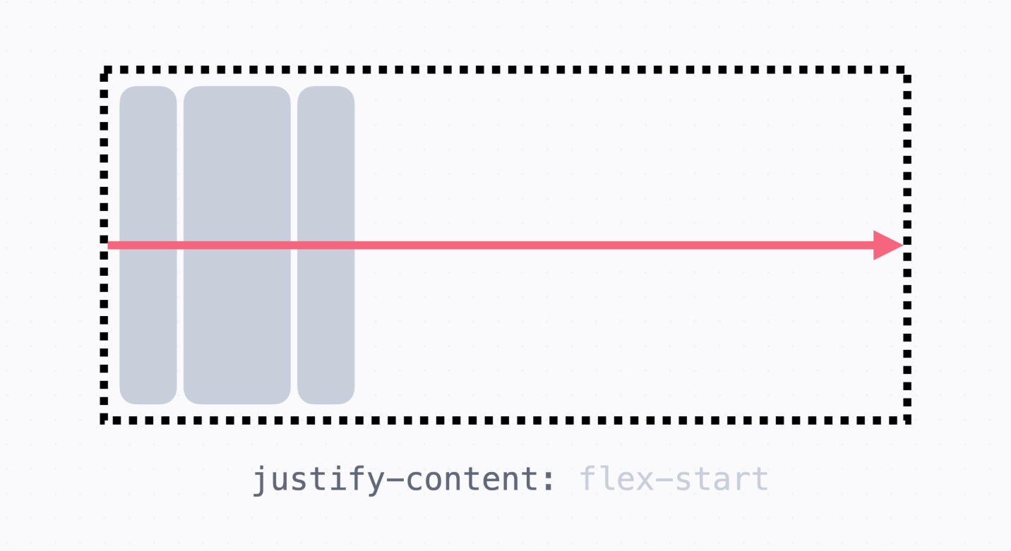
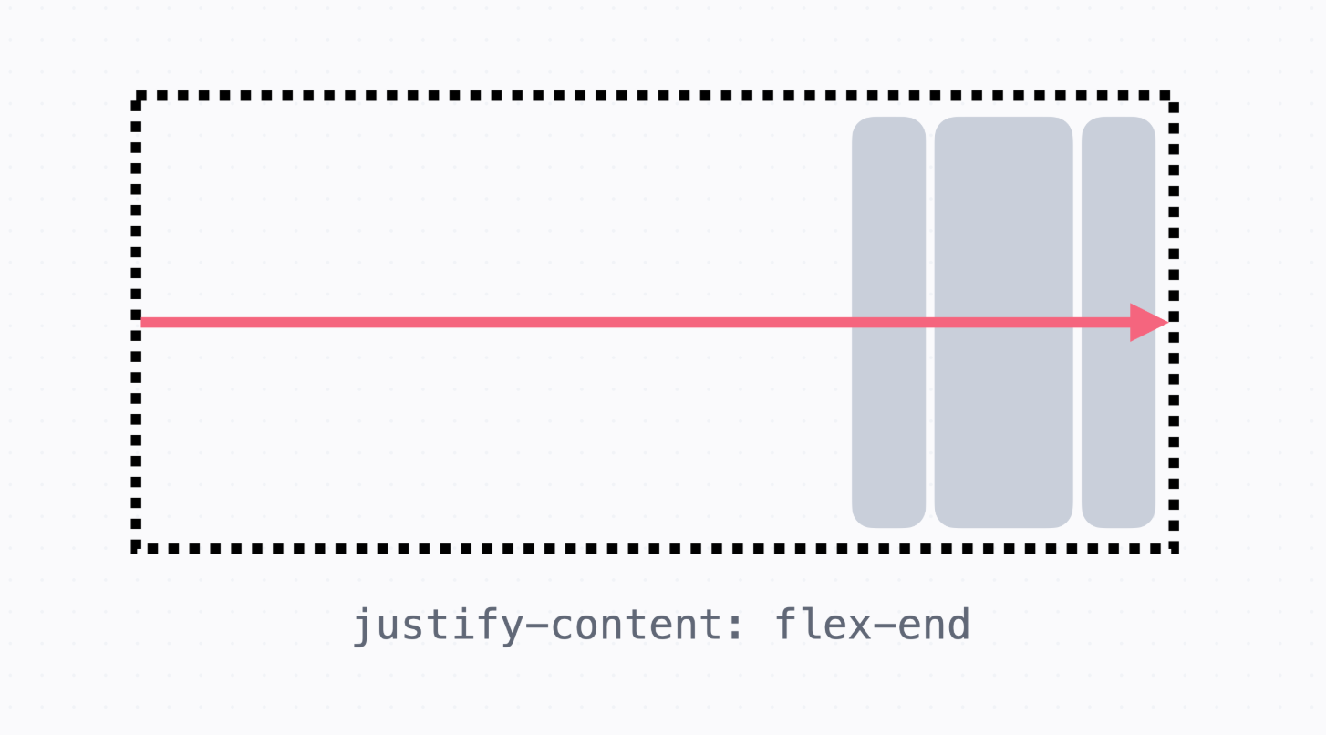
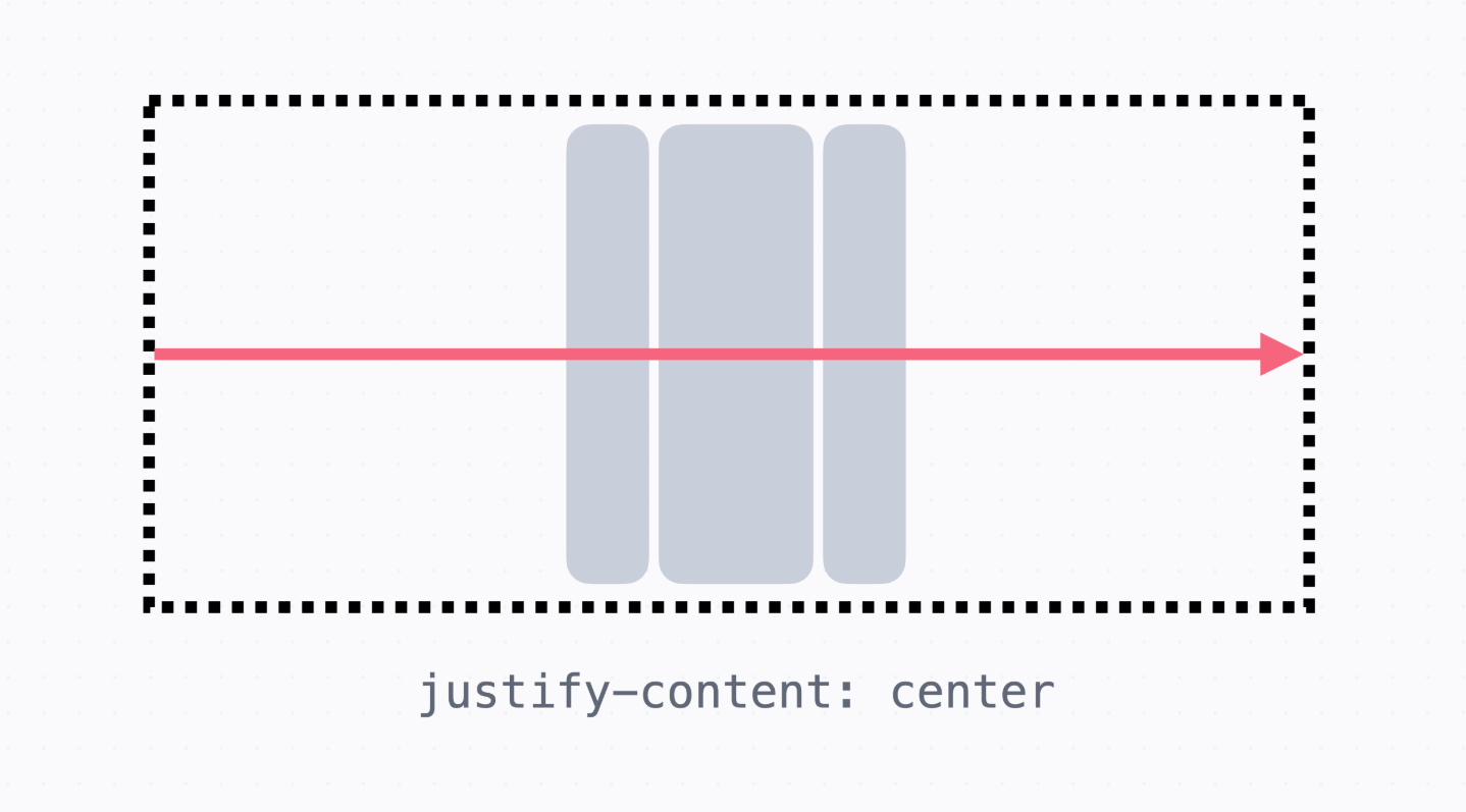
→ 기본 축 방향에서 정렬을 하기 위해서는 justify-content라는 속성을 쓴다.
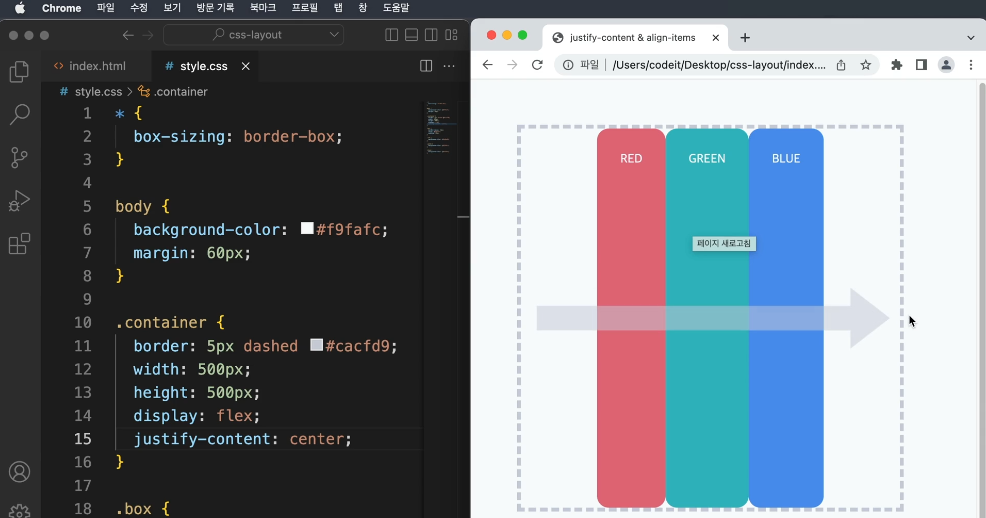
→ justify-content:center; 라고 하면 기본 축에서 중앙정렬이 된다.
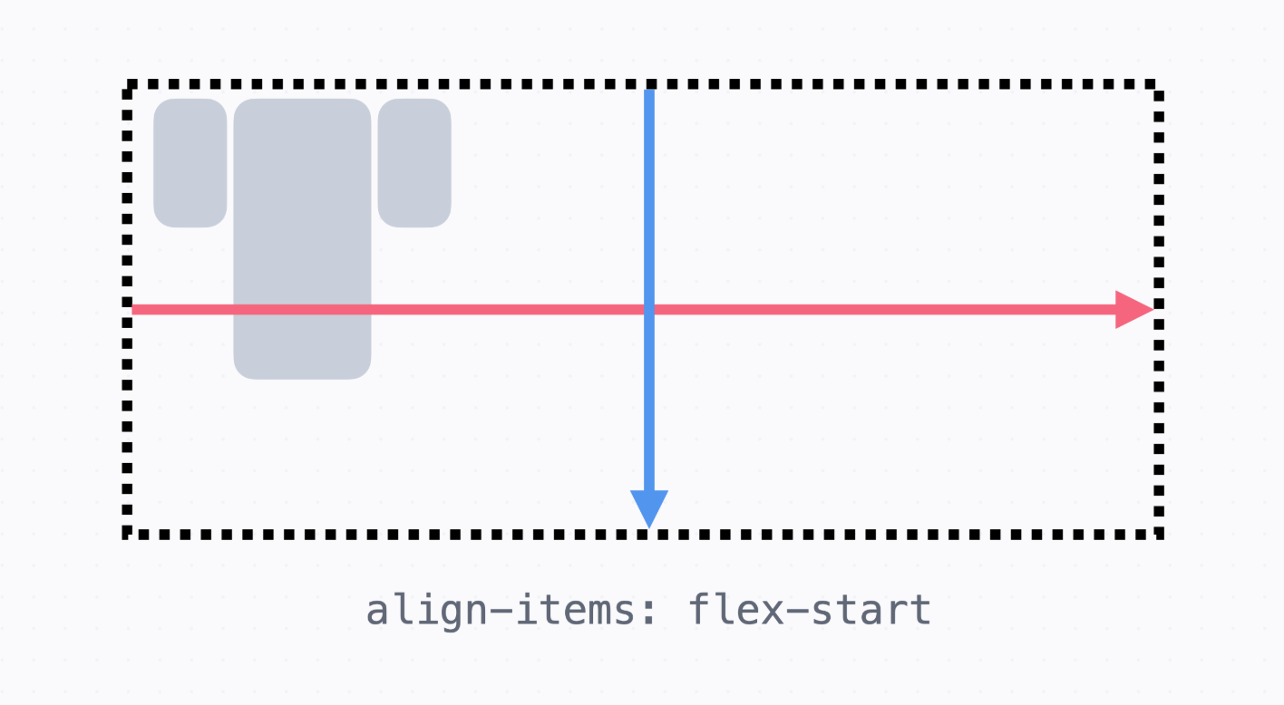
→ flex-end는 기본 축에서 맨 끝에 정렬, flex-start는 기본 축에서 맨 앞에 정렬
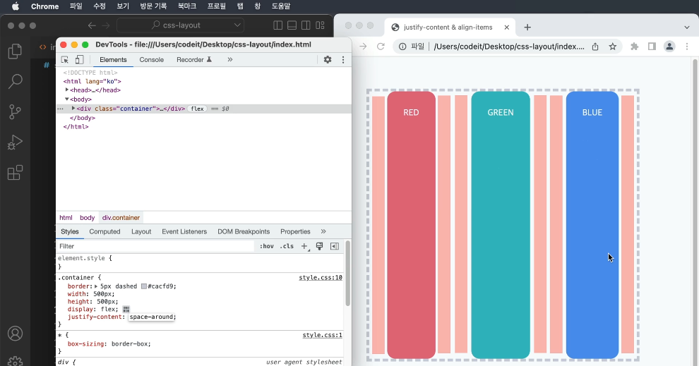
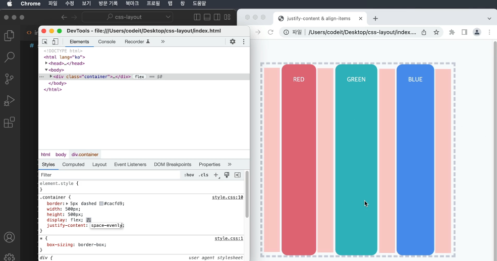
   → space-around라고 하면 기본 축의 공간을 나눠 띄엄띄엄 배치
     기본 축 방향으로 양쪽에 모두 같은 공간이 생긴다.
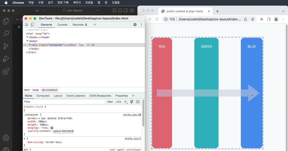
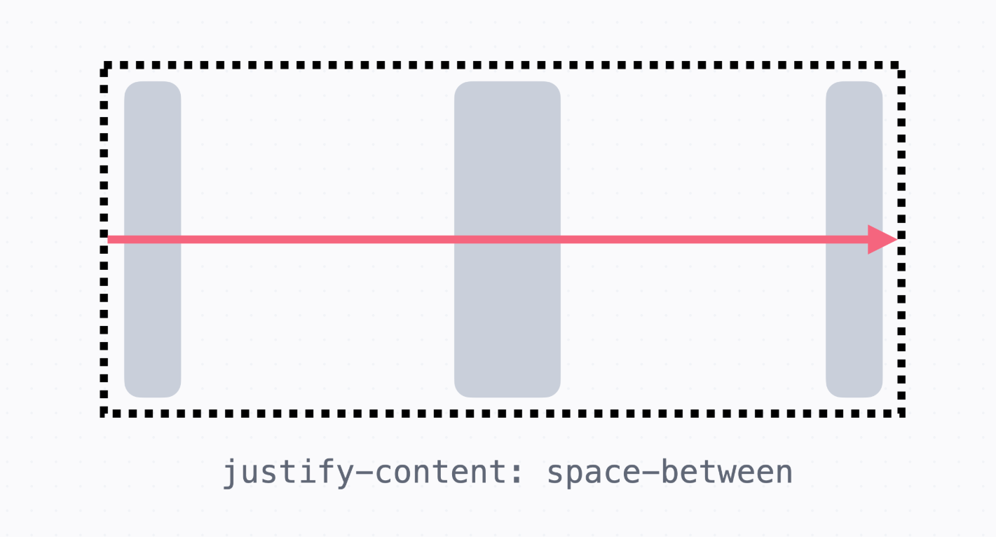
→ space-between은 기본 축 방향으로 양 끝을 늘어뜨려서 배치
→ space-evenly는 빈 공간의 크기가 모두 동일하도록 배치
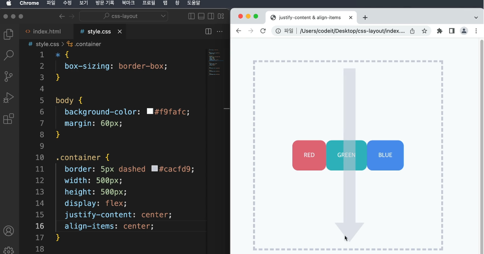
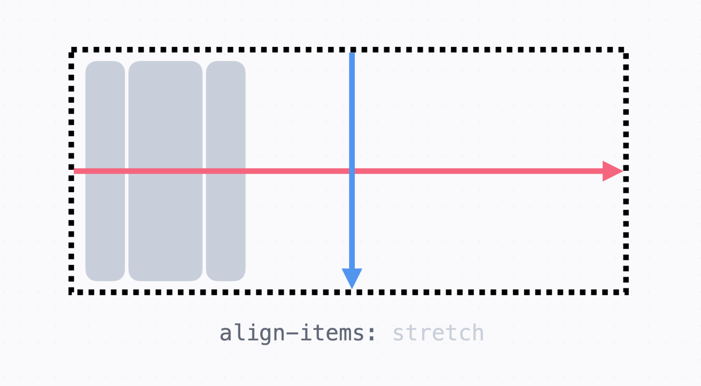
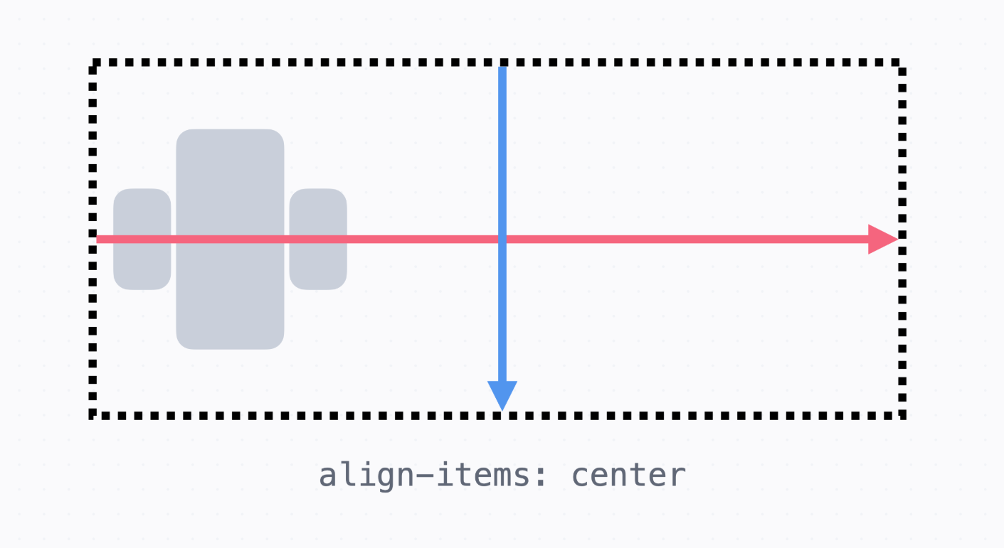
   → 교차 축에 대해서 정렬을 하게되면 align-items:center;라고 하면 교차 축에서 중앙 정렬
   → 크기를 꽉 채워서 배치되던 것이 요소의 원래 크기로 변하였다.
   → 여기서 요소의 height 값을 지정하면 높이를 유지하면서 중앙정렬된다.
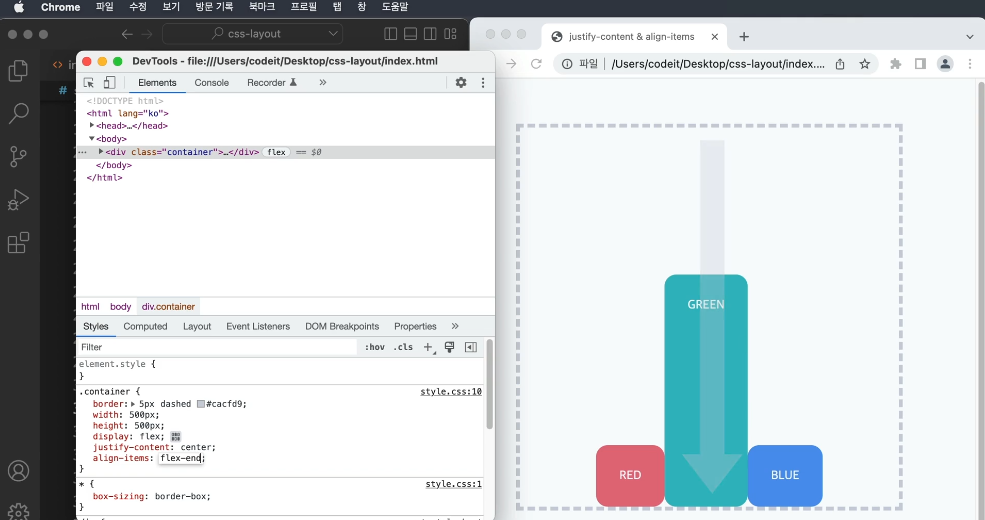
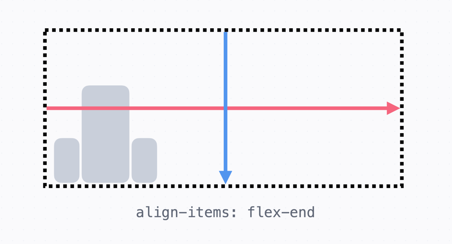
→ flex-end는 교차 축 방향에서 끝쪽에 정렬하는 방식
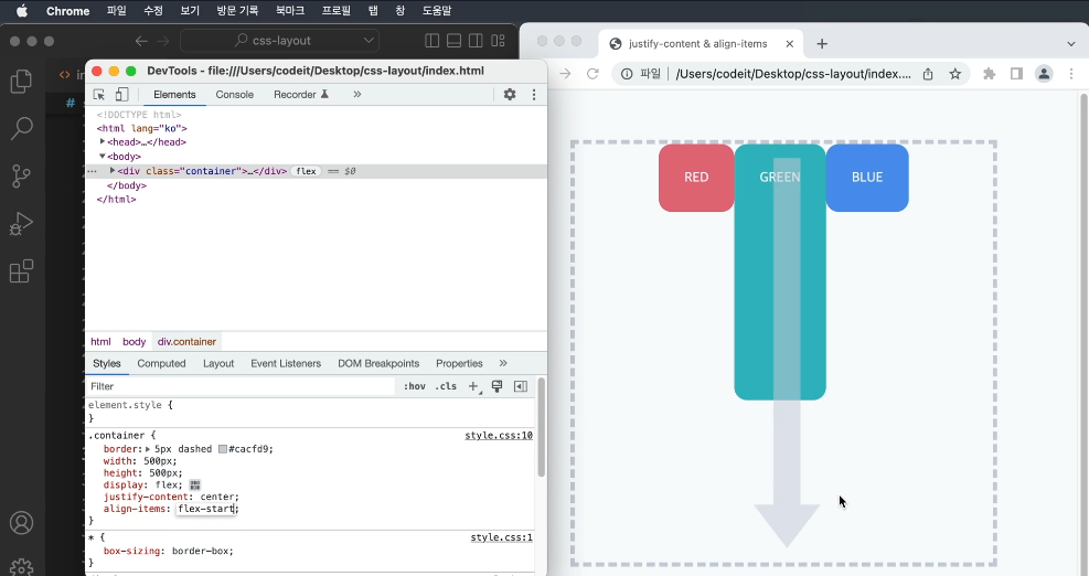
→ flex-start는 교차 축에서 앞쪽에 정렬하는 방식
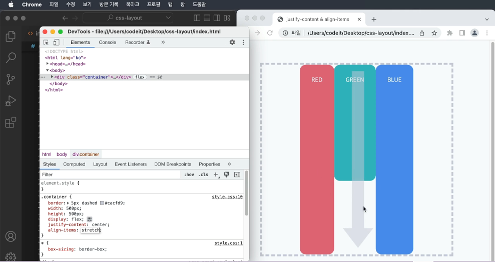
→ stretch라는 것은 교차 축에 늘려서 배치하는 방식 (기본동작)
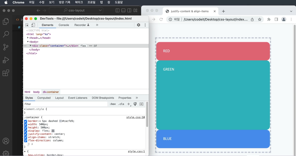
   → 방향을 바꿀 때에는 flex-direction : column; 으로 작성
   → 기본 축이 위에서 아래로, 교차 축이 왼쪽에서 오른쪽이다.

   → 기본 축 정렬 시에는 justify-content를 작성하고, 교차 축 정렬에는 align-items를 작성
   → 속성 값으로는 center와 space-between은 반드시 기억
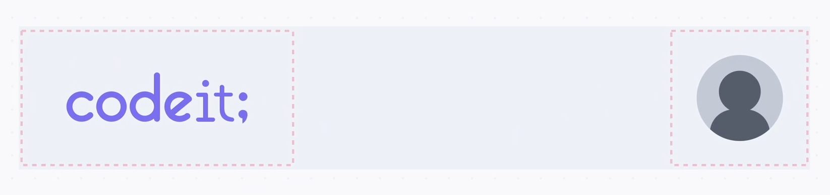
5. 아티스트 프로필
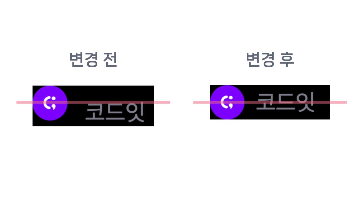
   → 플레이리스트 제목 아래에 아티스트 프로필이 적혀 있고, 아티스트 프로필 이미지(코드잇 로고) 옆에
     아티스트 이름(코드잇)이 적혀 있습니다. 이번 실습에서는 이미지와 이름을 세로로 정렬


    템플릿 코드 설명

   → 아티스트 프로필은 .artist라는 클래스로 감쌌고,
     프로필 이미지는 .artist-profile이라는 클래스로 스타일링

   index.html

   <div class="artist">
     <img
       src="images/img_codeit.png"
       alt="코드잇 프로필"
       class="artist-profile"
    >
     코드잇
   </div>


   style.css

   .artist {
      color: #7d7c8a;
      font-weight: 400;
      font-size: 16px;
      line-height: 19px;
    }

    .artist-profile {
      overflow: hidden;
      width: 24px;
      height: 24px;
      border-radius: 50%;
      margin-right: 8px;
    }
   [ 해설 ]

   → 우선 display 속성을 flex로 하고 플렉스박스를 만든다.
   → 가로 또는 세로 방향으로 요소들을 배치, 기본 배치 방향은 왼쪽에서 오른쪽
   → 세로로 정렬하려면 기본 배치 방향으로 일단 만들고 교차 축(위에서 아래 방향)에서 중앙 정렬

   .artist {
      color: #7d7c8a;
      font-weight: 400;
      font-size: 16px;
      line-height: 19px;
      display: flex;
    }

   → 기본 축(요소가 배치되는 방향)에서 정렬하려면 justify-content 속성을 사용
   → 교차 축(기본축에서 수직인 방향)에서 정렬하려면 align-items 속성을 사용
   → align-items: center라고 하면 교차 축에서 중앙 정렬 = 세로로 중앙 정렬

   .artist {
      color: #7d7c8a;
      font-weight: 400;
      font-size: 16px;
      line-height: 19px;
      display: flex;
      align-items: center;
    }
index.html

  <!DOCTYPE html>
  <html lang="ko">
    <head>
      <meta charset="utf-8">
        <title>Codeit Music</title>
      <link
        rel="stylesheet"
        as="style"
        crossorigin
        href="https://cdn.jsdelivr.net/gh/orioncactus/pretendard@v1.3.6/dist/web/static/pretendard.css"
     >
      <link rel="stylesheet" href="style.css">
    </head>
    <body>
      <header>
        <div class="wrap">Codeit Music</div>
      </header>
      <main class="wrap">
        <div class="info">
          <div class="cover">
            <img
              class="cover-image"
              src="images/img_cafe.png"
              alt="카페에서 일할 때 커버 이미지"
           >
          </div>
          <h1 class="playlist-title">
            카페에서 일할 때
            <span class="hot-badge"> 인기 </span>
          </h1>
          <div class="artist">
            <img
              src="images/img_codeit.png"
              alt="코드잇 프로필"
              class="artist-profile"
           >
            코드잇
          </div>
          <div class="description">
            차분하게 흐르는 따뜻한 음악과 함께하는 휴식. Codeit Music 에디터가
            매달 업데이트하는 플레이리스트입니다. 마음에 드는 곳이 있다면 보관함에
            추가해 보세요.
          </div>
          <button class="play-button">▶️ 지금 듣기</button>
        </div>
      </main>
    </body>
  </html>


style.css

  * {
    box-sizing: border-box;
  }

  html {
    word-break: keep-all;
    font-family: Pretendard, sans-serif;
  }

  body {
    margin: 0;
    background-color: #000;
    color: #fff;
  }

  .wrap {
    margin: 0 auto;
    padding: 32px;
    max-width: 1080px;
    width: 100%;
  }

  header {
    padding: 16px;
    background-image: linear-gradient(
      180deg,
      #000000 15.1%,
      rgba(0, 0, 0, 0) 100%
    );
    font-weight: 700;
    position: sticky;
    top: 0;
  }

  .info {
    margin-bottom: 40px;
    padding: 40px;
    border-bottom: 1px solid #595864;
  }

  .cover {
    width: 252px;
    height: 252px;
    border-radius: 24px;
    overflow: hidden;
  }

  .cover-image {
    width: 100%;
    height: 100%;
  }

  .playlist-title {
    margin: 40px 0 16px;
    font-weight: 700;
    font-size: 40px;
    line-height: 48px;
  }

  .hot-badge {
    position: relative;
    top: -20px;
    padding: 4px 8px;
    border-radius: 8px;
    background-color: #2a2a31;
    color: #8e8ea0;
    font-weight: 700;
    font-size: 16px;
    line-height: 19px;
  }

  .artist {
    color: #7d7c8a;
    font-weight: 400;
    font-size: 16px;
    line-height: 19px;
    display: flex;
    align-items: center;
  }

  .artist-profile {
    overflow: hidden;
    width: 24px;
    height: 24px;
    border-radius: 50%;
    margin-right: 8px;
  }

  .description {
    margin: 16px 0 32px;
    color: #7d7c8a;
    font-weight: 400;
    font-size: 16px;
    line-height: 19px;
  }

  .play-button {
    padding: 12px 24px;
    border: none;
    border-radius: 8px;
    background-color: #4b1bb1;
    color: #ffffff;
    font-weight: 500;
    font-size: 16px;
    line-height: 19px;
  }
6. 배너 광고
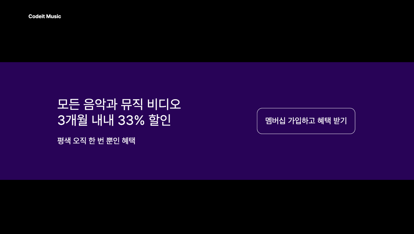
   → 코드잇 뮤직에서는 플레이리스트 페이지 맨 아래에 배너 광고를 추가
   → 배너 광고에 있는 텍스트와 버튼을 배치


   템플릿 코드 설명

   → 주어진 코드에서는 배너 전체를 .promotion이라는 클래스로 감쌌고, 배너의 버튼은
     .promotion-button이라는 클래스로 스타일링
   → 텍스트와 버튼이 왼쪽 위에 배치되어 있는데요. 이걸 세로로 가운데 정렬

   index.html

   <section class="promotion">
     <div class="promotion-content">
       <h2>모든 음악과 뮤직 비디오<br>3개월 내내 33% 할인</h2>
       <p>평생 오직 한 번 뿐인 혜택</p>
     </div>
     <button class="promotion-button">멤버십 가입하고 혜택 받기</button>
   </section>


   style.css

   .promotion {
      background-color: #280357;
      margin: 200px 0;
      padding: 80px 180px;
    }

    .promotion-content h2 {
      font-weight: 400;
      font-size: 40px;
      line-height: 48px;
      margin: 24px 0;
    }

    .promotion-content p {
      font-size: 24px;
      line-height: 29px;
    }

    .promotion-button {
      background-color: transparent;
      border: 1px solid #fff;
      padding: 24px;
      border-radius: 16px;
      font-size: 24px;
      line-height: 29px;
      color: #fff;
    }
  [ 해설 ]

   → 세로 정렬을 하기 위해서 .promotion 클래스를 플렉스박스로 만들어준다.
   → 안에 있는 요소들이 가로로 배치되어야 하니까, 방향은 기본 값인 flex-direction: row
   → 기본 축 방향에서 양쪽으로 배치하려면 justify-content: space-between
   → 교차 축 방향에서 중앙 정렬을 하려면 align-items: center

   .promotion {
      background-color: #280357;
      margin: 200px 0;
      padding: 80px 180px;
      display: flex;
      justify-content: space-between;
      align-items: center;
    }
index.html

  <!DOCTYPE html>
  <html lang="ko">
  <head>
    <meta charset="utf-8">
    <title>Codeit Music</title>
    <link rel="stylesheet" as="style" crossorigin href="https://cdn.jsdelivr.net/gh/orioncactus/pretendard@v1.3.6/dist/web/static/pretendard.css">
    <link rel="stylesheet" href="style.css">
  </head>
  <body>
    <section class="promotion">
      <div class="promotion-content">
        <h2>모든 음악과 뮤직 비디오<br>3개월 내내 33% 할인</h2>
        <p>평생 오직 한 번 뿐인 혜택</p>
      </div>
      <button class="promotion-button">멤버십 가입하고 혜택 받기</button>
    </section>
  </body>
  </html>


style.css

  html {
    font-family: Pretendard, sans-serif;
    word-break: keep-all;
  }

  body {
    background-color: #000;
    color: #fff;
    margin: 0;
  }

  .wrap {
    max-width: 1080px;
    width: 100%;
    margin: 0 auto;
    padding: 32px;
  }

  .promotion {
    background-color: #280357;
    margin: 200px 0;
    padding: 80px 180px;
    display: flex;
    justify-content: space-between;
    align-items: center;
  }

  .promotion-content h2 {
    font-weight: 400;
    font-size: 40px;
    line-height: 48px;
    margin: 24px 0;
  }

  .promotion-content p {
    font-size: 24px;
    line-height: 29px;
  }

  .promotion-button {
    background-color: transparent;
    border: 1px solid #fff;
    padding: 24px;
    border-radius: 16px;
    font-size: 24px;
    line-height: 29px;
    color: #fff;
  }
7. 코딩을 넘어, 음악의 즐거움까지 2
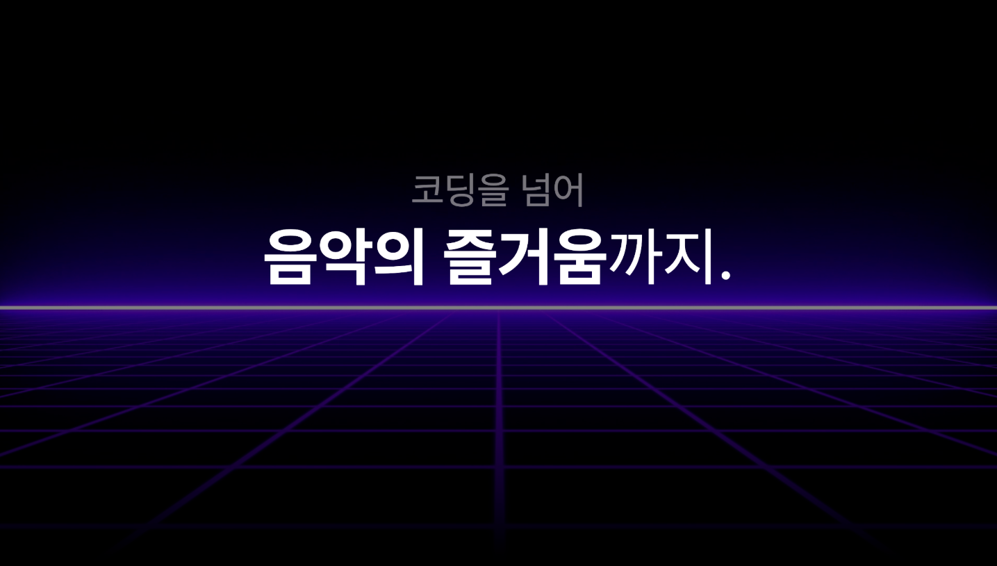
   → "코딩을 넘어 / 음악의 즐거움까지.”라는 텍스트가 중앙은 아니고,
     중앙에서 살짝 위로 정렬되어 있다.
   → 우선 <h1> 태그를 가운데로 정렬한 다음, <h1> 태그의 위쪽 마진을 -160px로 지정


   템플릿 코드 설명

   → 주어진 코드에서는 .hero라는 클래스로 요소 전체를 감싸고 있습니다.
   → 여기서 .bg 클래스는 비디오 태그를 꾸며 주고, .hero-heading 클래스에서는 absolute 포지션을
     사용해서 영역이 비디오 위에 완전히 겹치도록 배치하였다.
   → 반투명한 그라디언트 배경을 적용

   <section class="hero">
      <video src="videos/bg.mp4" class="bg" autoplay loop muted></video>
      <div class="hero-heading">
        <h1>
          <span class="small">코딩을 넘어</span><br>
          <span class="big">음악의 즐거움</span>까지.
        </h1>
      </div>
    </section>

    .hero {
      position: relative;
    }

    .bg {
      width: 100%;
      opacity: 0.5;
    }

    .hero-heading {
      position: absolute;
      inset: 0;
      margin: 0;
      padding: 24px;
      background-image: linear-gradient(rgba(0, 0, 0, 0) 50%, rgba(0, 0, 0, 1) 100%);
    }

    .hero-heading h1 {
      margin: 0;
      font-weight: 400;
      font-size: 80px;
      line-height: 95px;
      text-align: center;
      color: #ffffff;
    }

    .hero-heading .small {
      font-size: 48px;
      line-height: 57px;
      text-align: center;
      color: rgba(217, 217, 217, 0.5);
    }

    .hero-heading .big {
      font-weight: 700;
    }
  [해설]

   → 우선 정렬을 하기 위해서 .hero-heading 클래스를 플렉스박스로 만들어준다.
   .hero-heading {
      position: absolute;
      inset: 0;
      margin: 0;
      padding: 24px;
      display: flex;
      background-image: linear-gradient(rgba(0, 0, 0, 0) 50%, rgba(0, 0, 0, 1) 100%);
    }

   → 기본축 방향으로 정렬하려면 justify-content 속성을 쓰고, 교차축 방향으로 정렬하려면
     align-items 속성을 사용
   → 기본 축으로도 가운데 배치하고, 교차 축으로도 가운데 배치해야 하니까 둘 다 center로 정렬

   .hero-heading {
      position: absolute;
      inset: 0;
      margin: 0;
      padding: 24px;
      display: flex;
      justify-content: center;
      align-items: center;
      background-image: linear-gradient(rgba(0, 0, 0, 0) 50%, rgba(0, 0, 0, 1) 100%);
    }

   → <h1> 태그에는 위쪽 마진을 -160px으로 지정

   .hero-heading h1 {
      margin: -160px 0 0;
      font-weight: 400;
      font-size: 80px;
      line-height: 95px;
      text-align: center;
      color: #ffffff;
    }
index.html

  <!DOCTYPE html>
  <html lang="ko">
  <head>
    <meta charset="utf-8">
    <title>Codeit Music</title>
    <link rel="stylesheet" as="style" crossorigin href="https://cdn.jsdelivr.net/gh/orioncactus/pretendard@v1.3.6/dist/web/static/pretendard.css">
    <link rel="stylesheet" href="style.css">
  </head>
  <body>
    <section class="hero">
      <video src="videos/bg.mp4" class="bg" autoplay loop muted></video>
      <div class="hero-heading">
        <h1>
          <span class="small">코딩을 넘어</span><br>
          <span class="big">음악의 즐거움</span>까지.
        </h1>
      </div>
    </section>
  </body>
  </html>


style.css

  html {
    font-family: Pretendard, sans-serif;
    word-break: keep-all;
  }

  body {
    background-color: #000;
    color: #fff;
    margin: 0;
  }

  .hero {
    position: relative;
  }

  .bg {
    width: 100%;
    opacity: 0.5;
  }

  .hero-heading {
    position: absolute;
    inset: 0;
    margin: 0;
    padding: 24px;
    display: flex;
    justify-content: center;
    align-items: center;
    background-image: linear-gradient(rgba(0, 0, 0, 0) 50%, rgba(0, 0, 0, 1) 100%);
  }

  .hero-heading h1 {
    margin: -160px 0 0;
    font-weight: 400;
    font-size: 80px;
    line-height: 95px;
    text-align: center;
    color: #ffffff;
  }

  .hero-heading .small {
    font-size: 48px;
    line-height: 57px;
    text-align: center;
    color: rgba(217, 217, 217, 0.5);
  }

  .hero-heading .big {
    font-weight: 700;
  }
8. 요소가 넘칠 때
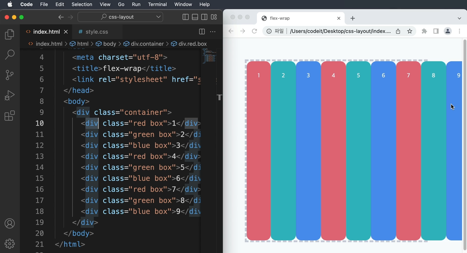
→ container라는 클래스로 Flexbox를 만들고, 9개의 div 태그를 배치
방향은 따로 정하지 않고 왼쪽에서 오른쪽으로 배치, 정렬도 기본 동작 그대로
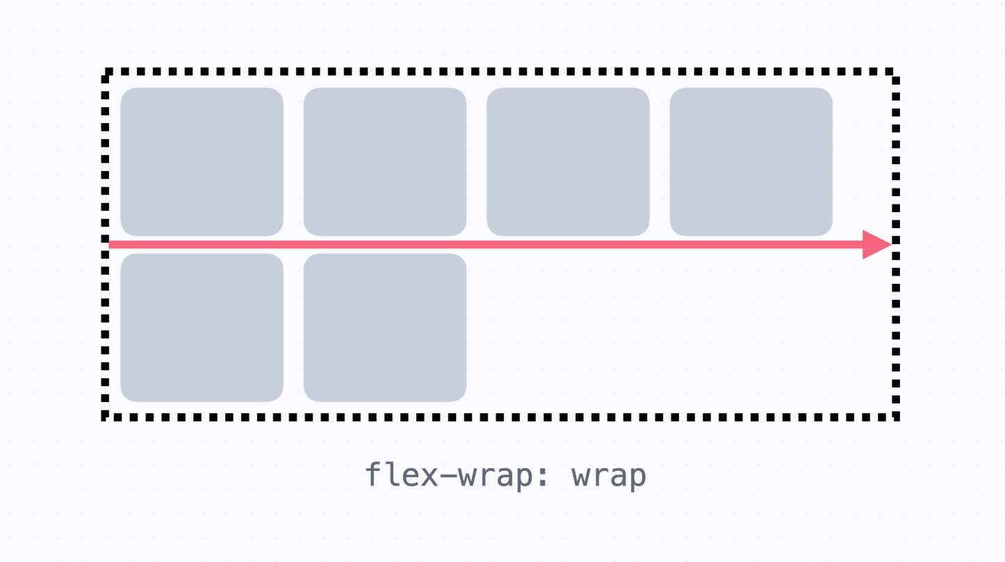
요소가 많아서 Flexbox으로 요소가 튀어나왔다.
이럴 떄에는 줄바꿈 하듯이 배치하는 방법을 사용한다.
→ container에 flex-wrap:wrap;이라고 작성하면 넘치는 요소는 교차 축 방향으로 넘어가서 배치
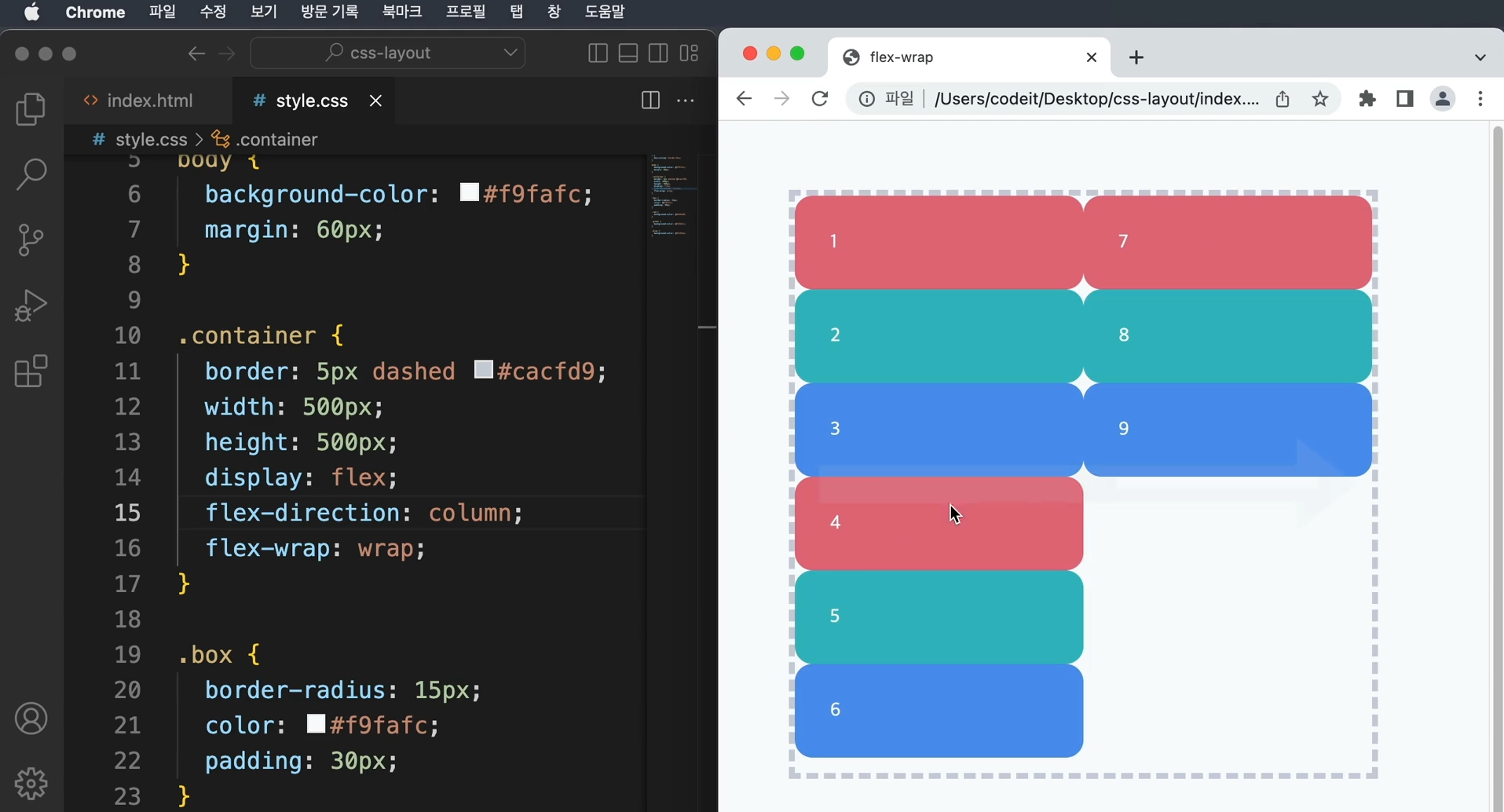
   → 기본 축의 방향을 column으로 바꾸게 된다면, (=flex-direction:column) 마찬가지로
     교차 축 방향으로 넘어가서 배치
   → 웹 사이트를 만들다보면 요소의 개수가 다양하게 변하는 경우가 있는데 이 때 flex-wrap을
     잘 사용하면 잘 배치할 수 있다.
9. 이달의 플레이리스트2
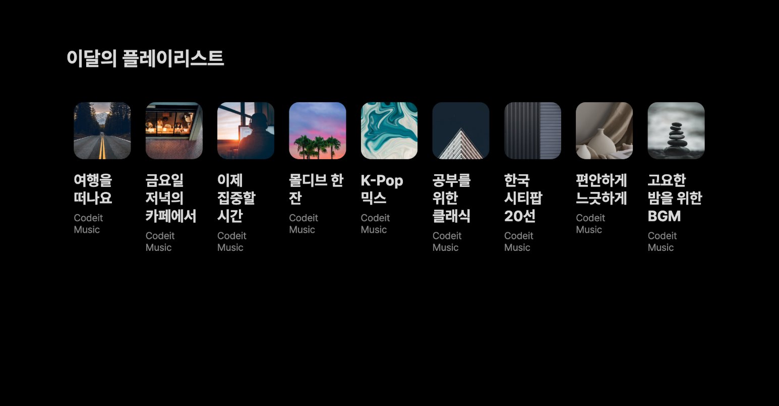
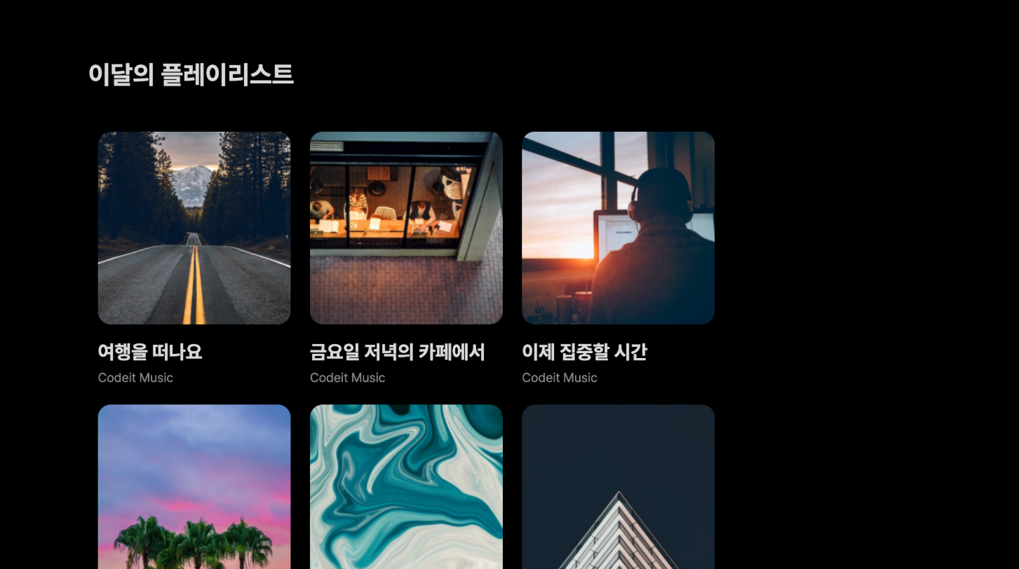
   → 앞에서 만들었던 플레이리스트에 요소를 추가했더니 첫 번째 스크린샷처럼 가로로 계속 배치되면서
     크기가 작게 보인다.
   → 두 번째 스크린샷처럼 요소가 넘쳤을 때 아래 줄로 넘어가도록 배치


   템플릿 코드 설명

   → 플레이리스트 전체는 .playlists라는 클래스로, 각각의 플레이리스트는 .playlist로 감쌌습니다.
     주어진 코드에서 .playlists에 display: flex라는 코드가 있어서 플렉스박스가 있다.
     요소들이 왼쪽에서 오른쪽으로 배치

   <section>
      <h2 class="section-title">이달의 플레이리스트</h2>
      <div class="playlists">
        <div class="playlist">
          <img class="playlist-thumb" src="images/img_playlist_1.png">
          <div class="playlist-title">
            여행을 떠나요
          </div>
          <div class="playlist-artist">
            Codeit Music
          </div>
        </div>
        <div class="playlist">
          <img class="playlist-thumb" src="images/img_playlist_2.png">
          <div class="playlist-title">
            금요일 저녁의 카페에서
          </div>
          <div class="playlist-artist">
            Codeit Music
          </div>
        </div>
        ...
      </div>
    </section>


	.playlists {
      display: flex;
    }

    .playlist {
      width: 240px;
      margin: 12px;
    }
   [ 해설 ]

   → 플렉스박스에서 요소가 넘치면 flex-wrap 속성으로 넘겨서 배치할 것인지 정할 수 있다.
   → flex-wrap: wrap이라 하면 요소가 넘쳤을 때 줄을 넘겨서 배치

   .playlists {
      display: flex;
      flex-wrap: wrap;
    }
index.html

  <!DOCTYPE html>
  <html lang="ko">
  <head>
    <meta charset="utf-8">
    <title>Codeit Music</title>
    <link rel="stylesheet" href="style.css">
  </head>
  <body>
    <section>
      <h2 class="section-title">이달의 플레이리스트</h2>
      <div class="playlists">
        <div class="playlist">
          <img class="playlist-thumb" src="images/img_playlist_1.png">
          <div class="playlist-title">
            여행을 떠나요
          </div>
          <div class="playlist-artist">
            Codeit Music
          </div>
        </div>
        <div class="playlist">
          <img class="playlist-thumb" src="images/img_playlist_2.png">
          <div class="playlist-title">
            금요일 저녁의 카페에서
          </div>
          <div class="playlist-artist">
            Codeit Music
          </div>
        </div>
        <div class="playlist">
          <img class="playlist-thumb" src="images/img_playlist_3.png">
          <div class="playlist-title">
            이제 집중할 시간
          </div>
          <div class="playlist-artist">
            Codeit Music
          </div>
        </div>
        <div class="playlist">
          <img class="playlist-thumb" src="images/img_playlist_4.png">
          <div class="playlist-title">
            몰디브 한 잔
          </div>
          <div class="playlist-artist">
            Codeit Music
          </div>
        </div>
        <div class="playlist">
          <img class="playlist-thumb" src="images/img_playlist_5.png">
          <div class="playlist-title">
            K-Pop 믹스
          </div>
          <div class="playlist-artist">
            Codeit Music
          </div>
        </div>
        <div class="playlist">
          <img class="playlist-thumb" src="images/img_playlist_6.png">
          <div class="playlist-title">
            공부를 위한 클래식
          </div>
          <div class="playlist-artist">
            Codeit Music
          </div>
        </div>
        <div class="playlist">
          <img class="playlist-thumb" src="images/img_playlist_7.png">
          <div class="playlist-title">
            한국 시티팝 20선
          </div>
          <div class="playlist-artist">
            Codeit Music
          </div>
        </div>
        <div class="playlist">
          <img class="playlist-thumb" src="images/img_playlist_8.png">
          <div class="playlist-title">
            편안하게 느긋하게
          </div>
          <div class="playlist-artist">
            Codeit Music
          </div>
        </div>
        <div class="playlist">
          <img class="playlist-thumb" src="images/img_playlist_9.png">
          <div class="playlist-title">
            고요한 밤을 위한 BGM
          </div>
          <div class="playlist-artist">
            Codeit Music
          </div>
        </div>
      </div>
    </section>
  </body>
  </html>


style.css

  * {
    box-sizing: border-box;
  }

  html {
    word-break: keep-all;
    font-family: Pretendard, sans-serif;
    font-size: 16px;
    line-height: 19px;
  }

  body {
    background-color: #000;
    color: #d9d9d9;
    margin: 0;
  }

  section {
    max-width: 1120px;
    width: 100%;
    margin: 80px auto;
    padding: 0 36px;
  }

  .section-title {
    font-weight: 700;
    font-size: 32px;
    line-height: 38px;
    margin: 40px 0;
  }

  .playlists {
    display: flex;
    flex-wrap: wrap;
  }

  .playlist {
    width: 240px;
    margin: 12px;
  }

  .playlist-thumb {
    width: 100%;
    border-radius: 16px;
  }

  .playlist-title {
    font-weight: 700;
    font-size: 24px;
    line-height: 29px;
    margin: 16px 0 8px;
  }

  .playlist-artist {
    color: #868686;
    margin: 0;
  }
10. 간격
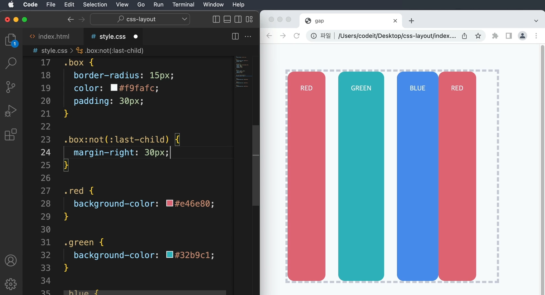
→ 여백을 넣을 때에는 margin 속성을 사용하였는데 flexbox 안에서도 margin을 사용할 수 있다.
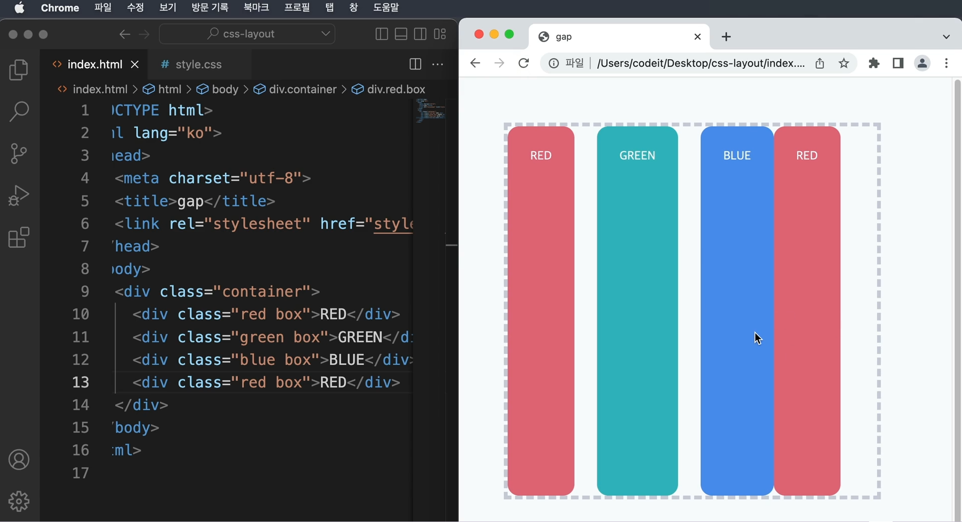
   → 요소 순서가 바뀌거나 요소가 추가되면 margin 코드를 수정해야 되는 단점
     굳이 margin으로 해결하려면 선택자를 활용
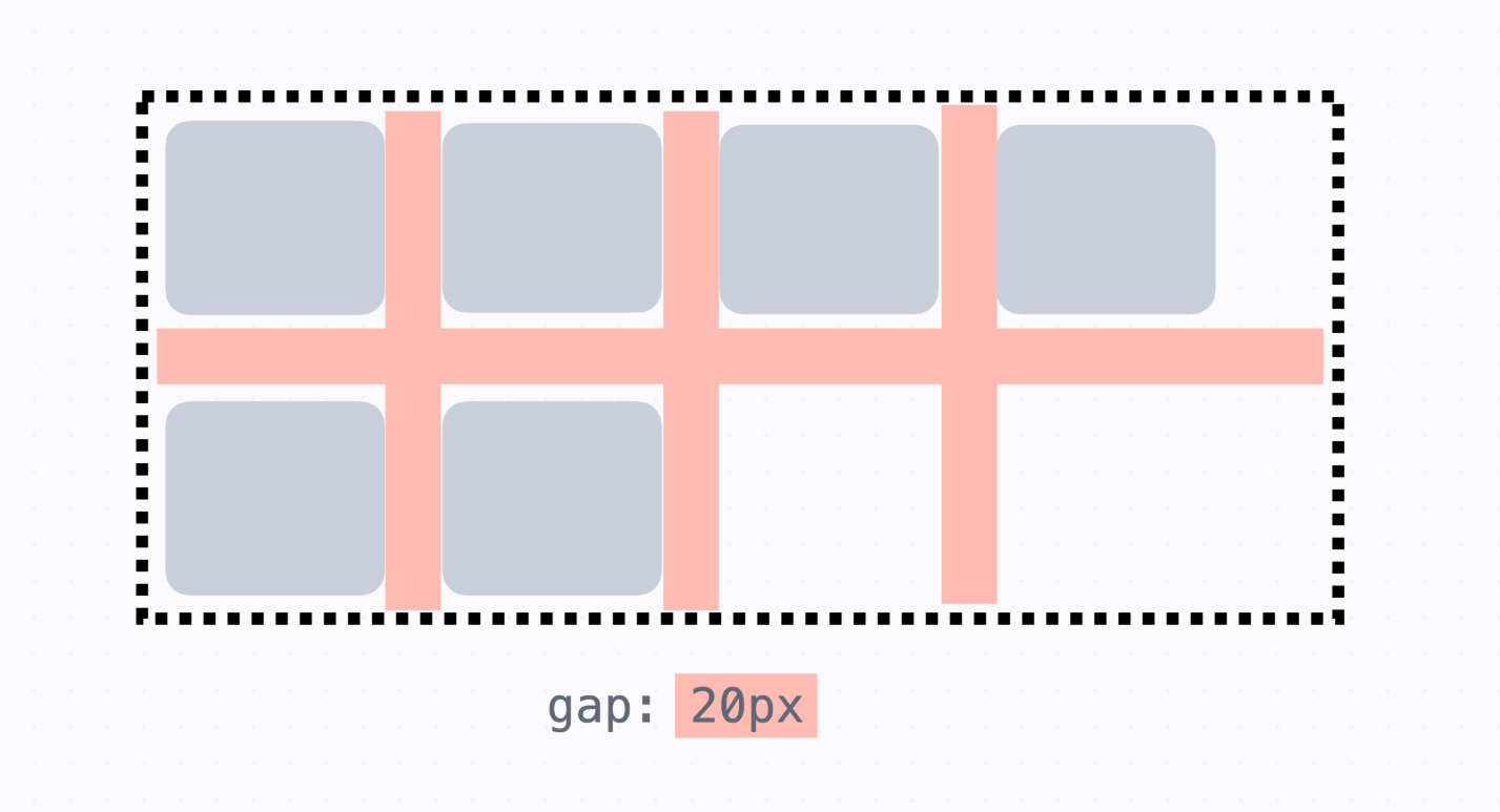
→ 위의 방식을 사용하면 코드가 복잡해지므로 flexbox에서는 이런 걸 편하게 해주는 gap 속성 사용
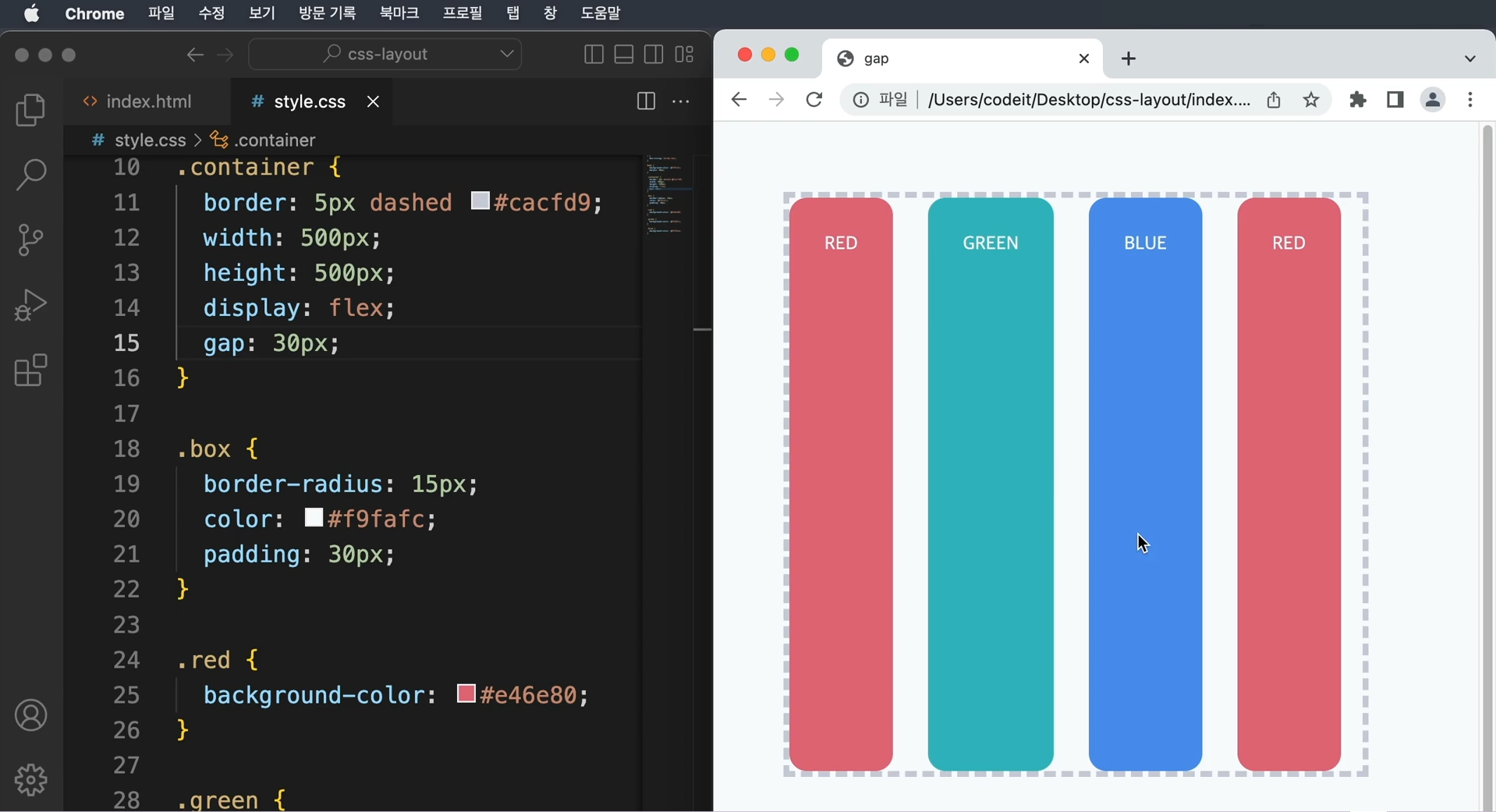
   → container에 gap을 주게 되면 위의 복잡한 코드와 동일하게 동작
   → gap의 장점은 가로 방향 뿐만 아니라 세로 방향으로도 적용 가능
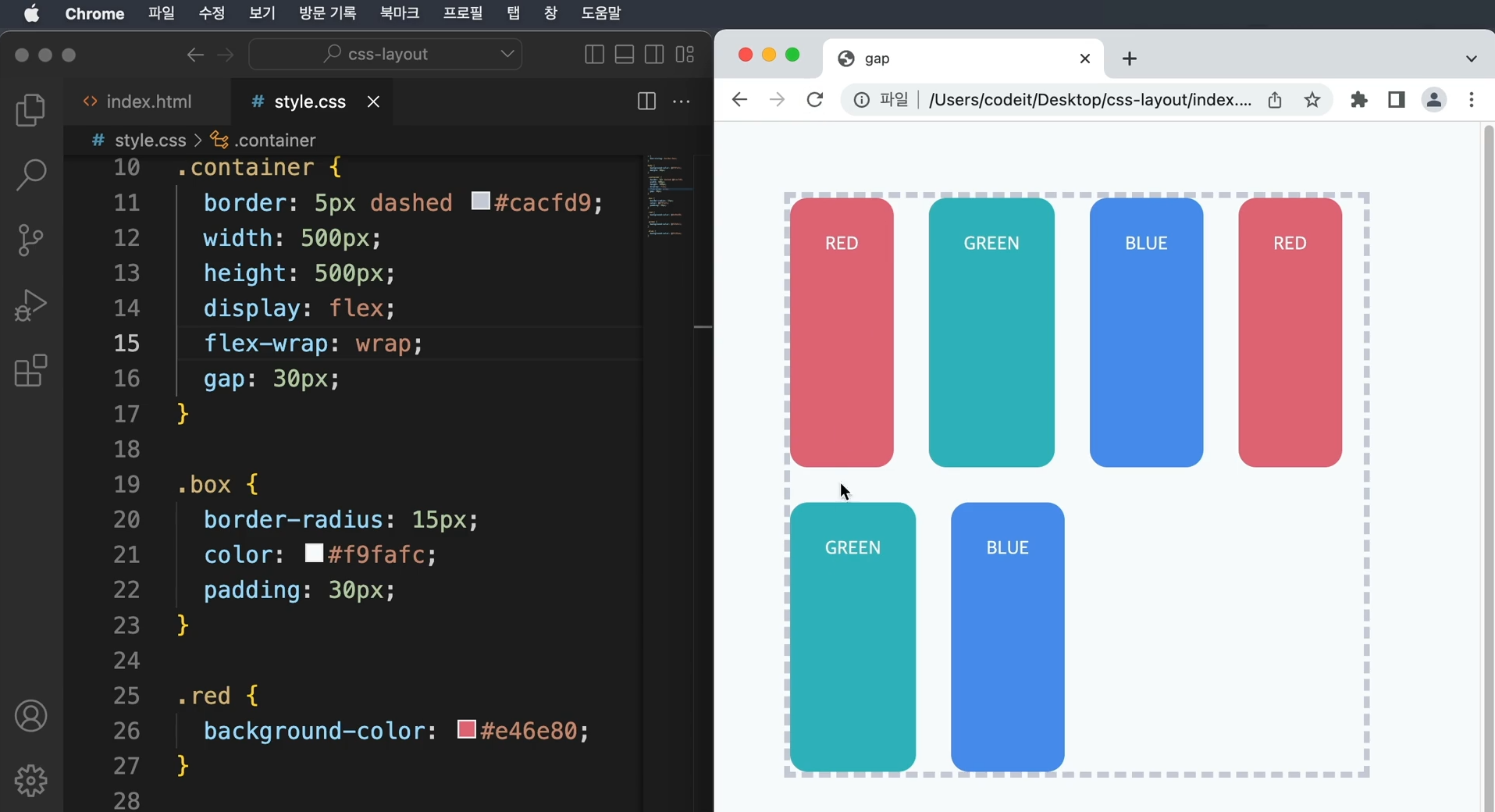
→ 임의로 넘치는 요소를 만들어서 동일하게 적용되는지 확인해보면 위와 같다.
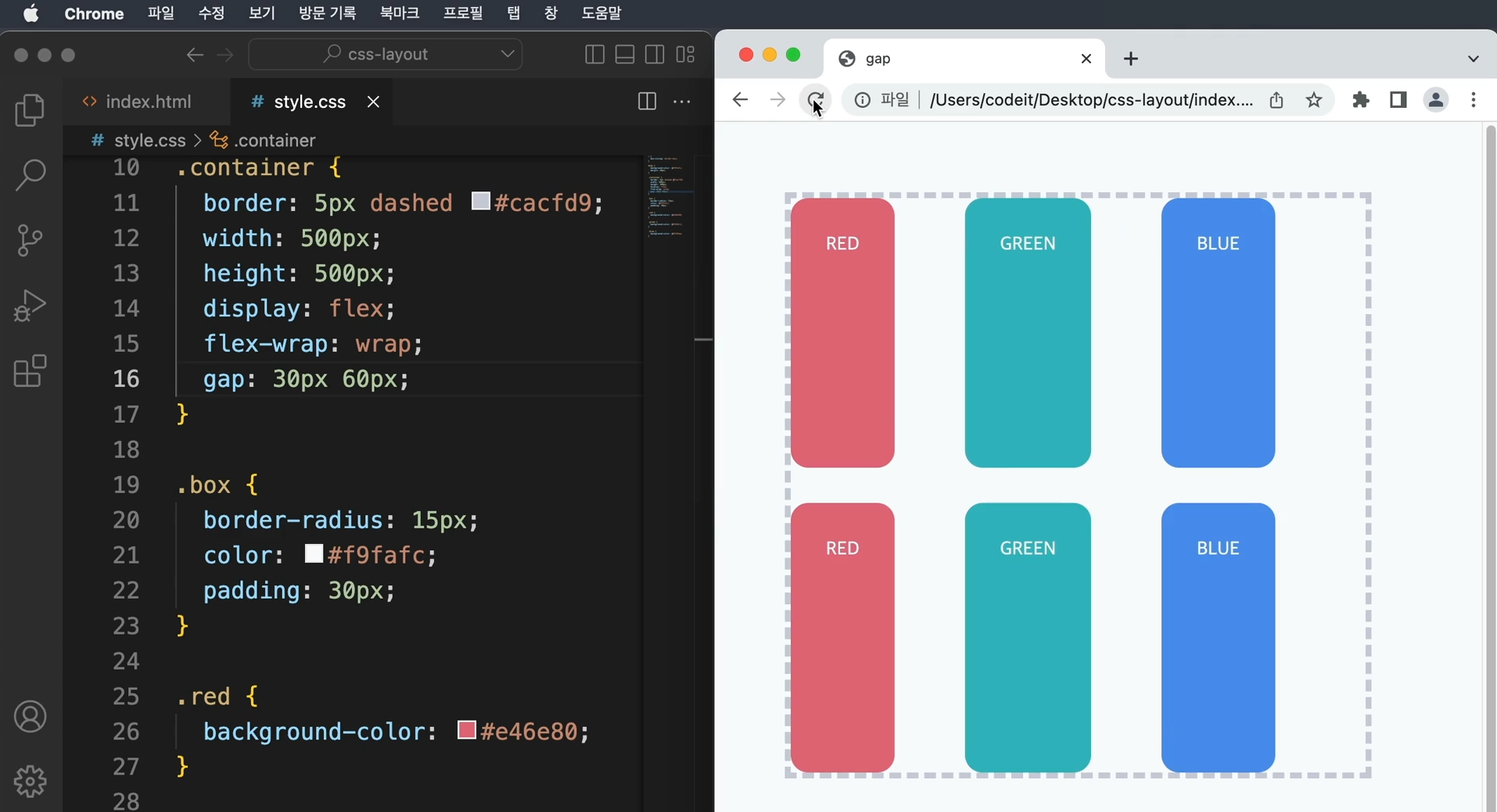
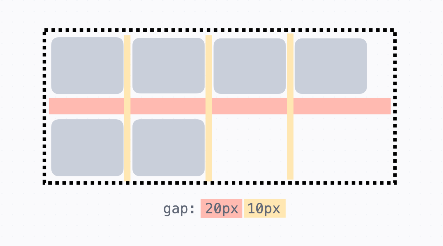
   → 세로와 가로의 간격을 다르게 줄 수도 있다.
     gap: 30px 60px이라고 하면 세로 방향으로는 30px, 가로 방향으로는 60px을 주게 된다.
   → gap 속성의 값은 기본 축, 교차 축과 상관없이 무조건 세로, 가로의 순서
     flex-direction으로 방향을 바꿔봐도 똑같이 세로, 가로의 순서
     gap 속성은 grid와 같이 쓰는 속성이므로 margin 속성을 쓸 때와 같다고 보면 된다.
11. 이달의 플레이리스트3
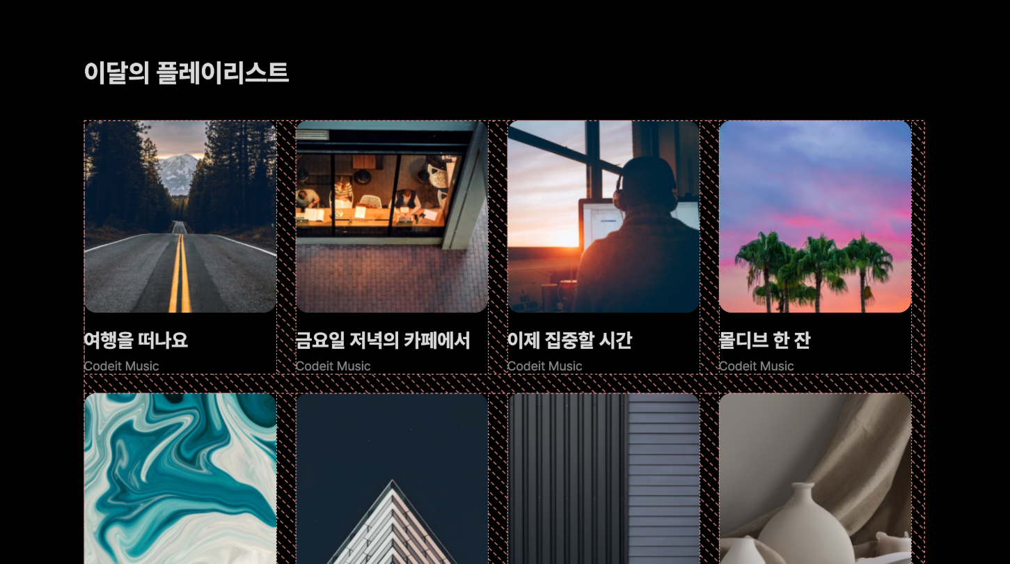
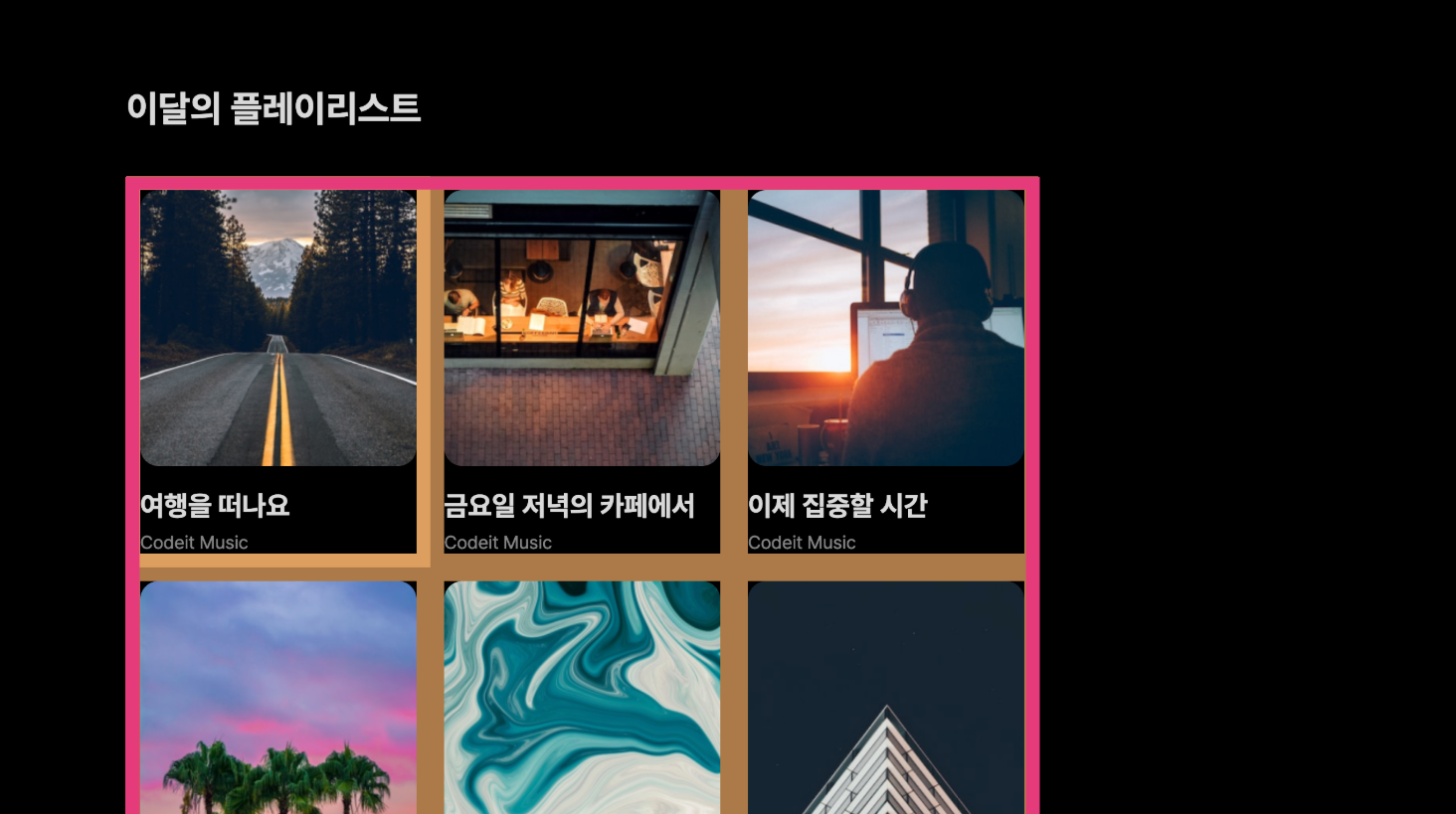
    → 마진을 사용해서 간격을 정했기 때문에 플레이리스트 전체 영역의 가장자리에 불필요한 여백
      (빨간색 부분)이 생긴다.
    → 플렉스박스 안에서 요소들 사이에서만 간격을 정해보자.
      마진 대신에 플렉스박스에서의 간격을 24px로 하고 불필요한 가장자리 여백을 제거해보자.


    템플릿 코드 설명

    → 플레이리스트 전체를 .playlists라는 클래스로 감싸고 여기에 플렉스박스를 만들어서
      (display: flex) 줄 넘김이 되도록 만들고, 각 플레이리스트에는 .playlist라는 클래스로 여백을
      12px로 적용(margin: 12px)

    <section>
      <h2 class="section-title">이달의 플레이리스트</h2>
      <div class="playlists">
        <div class="playlist">
          <img class="playlist-thumb" src="images/img_playlist_1.png">
          <div class="playlist-title">
            여행을 떠나요
          </div>
          <div class="playlist-artist">
            Codeit Music
          </div>
        </div>
        <div class="playlist">
          <img class="playlist-thumb" src="images/img_playlist_2.png">
          <div class="playlist-title">
            금요일 저녁의 카페에서
          </div>
          <div class="playlist-artist">
            Codeit Music
          </div>
        </div>
        ...
      </div>
    </section>

    .playlists {
      display: flex;
      flex-wrap: wrap;
    }

    .playlist {
      width: 240px;
      margin: 12px;
    }
	[ 해설 ]

    → 플렉스박스에서 간격을 정하려면 gap 속성을 사용
    → 플렉스박스에서 정하는 거기 때문에 .playlist가 아니라 .playlists 클래스에 적용
    → gap: 24px로 간격을 정해주고요. 각 플레이리스트에서 넣어 주던 마진은 삭제

    .playlists {
      display: flex;
      flex-wrap: wrap;
      gap: 24px;
    }

    .playlist {
      width: 240px;
    }
index.html

  <!DOCTYPE html>
  <html lang="ko">
  <head>
    <meta charset="utf-8">
    <title>Codeit Music</title>
    <link rel="stylesheet" href="style.css">
  </head>
  <body>
    <section>
      <h2 class="section-title">이달의 플레이리스트</h2>
      <div class="playlists">
        <div class="playlist">
          <img class="playlist-thumb" src="images/img_playlist_1.png">
          <div class="playlist-title">
            여행을 떠나요
          </div>
          <div class="playlist-artist">
            Codeit Music
          </div>
        </div>
        <div class="playlist">
          <img class="playlist-thumb" src="images/img_playlist_2.png">
          <div class="playlist-title">
            금요일 저녁의 카페에서
          </div>
          <div class="playlist-artist">
            Codeit Music
          </div>
        </div>
        <div class="playlist">
          <img class="playlist-thumb" src="images/img_playlist_3.png">
          <div class="playlist-title">
            이제 집중할 시간
          </div>
          <div class="playlist-artist">
            Codeit Music
          </div>
        </div>
        <div class="playlist">
          <img class="playlist-thumb" src="images/img_playlist_4.png">
          <div class="playlist-title">
            몰디브 한 잔
          </div>
          <div class="playlist-artist">
            Codeit Music
          </div>
        </div>
        <div class="playlist">
          <img class="playlist-thumb" src="images/img_playlist_5.png">
          <div class="playlist-title">
            K-Pop 믹스
          </div>
          <div class="playlist-artist">
            Codeit Music
          </div>
        </div>
        <div class="playlist">
          <img class="playlist-thumb" src="images/img_playlist_6.png">
          <div class="playlist-title">
            공부를 위한 클래식
          </div>
          <div class="playlist-artist">
            Codeit Music
          </div>
        </div>
        <div class="playlist">
          <img class="playlist-thumb" src="images/img_playlist_7.png">
          <div class="playlist-title">
            한국 시티팝 20선
          </div>
          <div class="playlist-artist">
            Codeit Music
          </div>
        </div>
        <div class="playlist">
          <img class="playlist-thumb" src="images/img_playlist_8.png">
          <div class="playlist-title">
            편안하게 느긋하게
          </div>
          <div class="playlist-artist">
            Codeit Music
          </div>
        </div>
        <div class="playlist">
          <img class="playlist-thumb" src="images/img_playlist_9.png">
          <div class="playlist-title">
            고요한 밤을 위한 BGM
          </div>
          <div class="playlist-artist">
            Codeit Music
          </div>
        </div>
      </div>
    </section>
  </body>
  </html>


style.css

  * {
    box-sizing: border-box;
  }

  html {
    word-break: keep-all;
    font-family: Pretendard, sans-serif;
    font-size: 16px;
    line-height: 19px;
  }

  body {
    background-color: #000;
    color: #d9d9d9;
    margin: 0;
  }

  section {
    max-width: 1120px;
    width: 100%;
    margin: 80px auto;
    padding: 0 36px;
  }

  .section-title {
    font-weight: 700;
    font-size: 32px;
    line-height: 38px;
    margin: 40px 0;
  }

  .playlists {
    display: flex;
    flex-wrap: wrap;
    gap: 24px;
  }

  .playlist {
    width: 240px;
  }

  .playlist-thumb {
    width: 100%;
    border-radius: 16px;
  }

  .playlist-title {
    font-weight: 700;
    font-size: 24px;
    line-height: 29px;
    margin: 16px 0 8px;
  }

  .playlist-artist {
    color: #868686;
    margin: 0;
  }
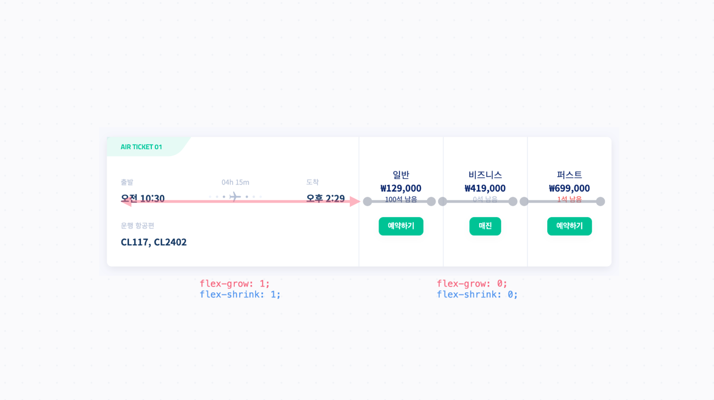
12. 요소 꽉 채우기
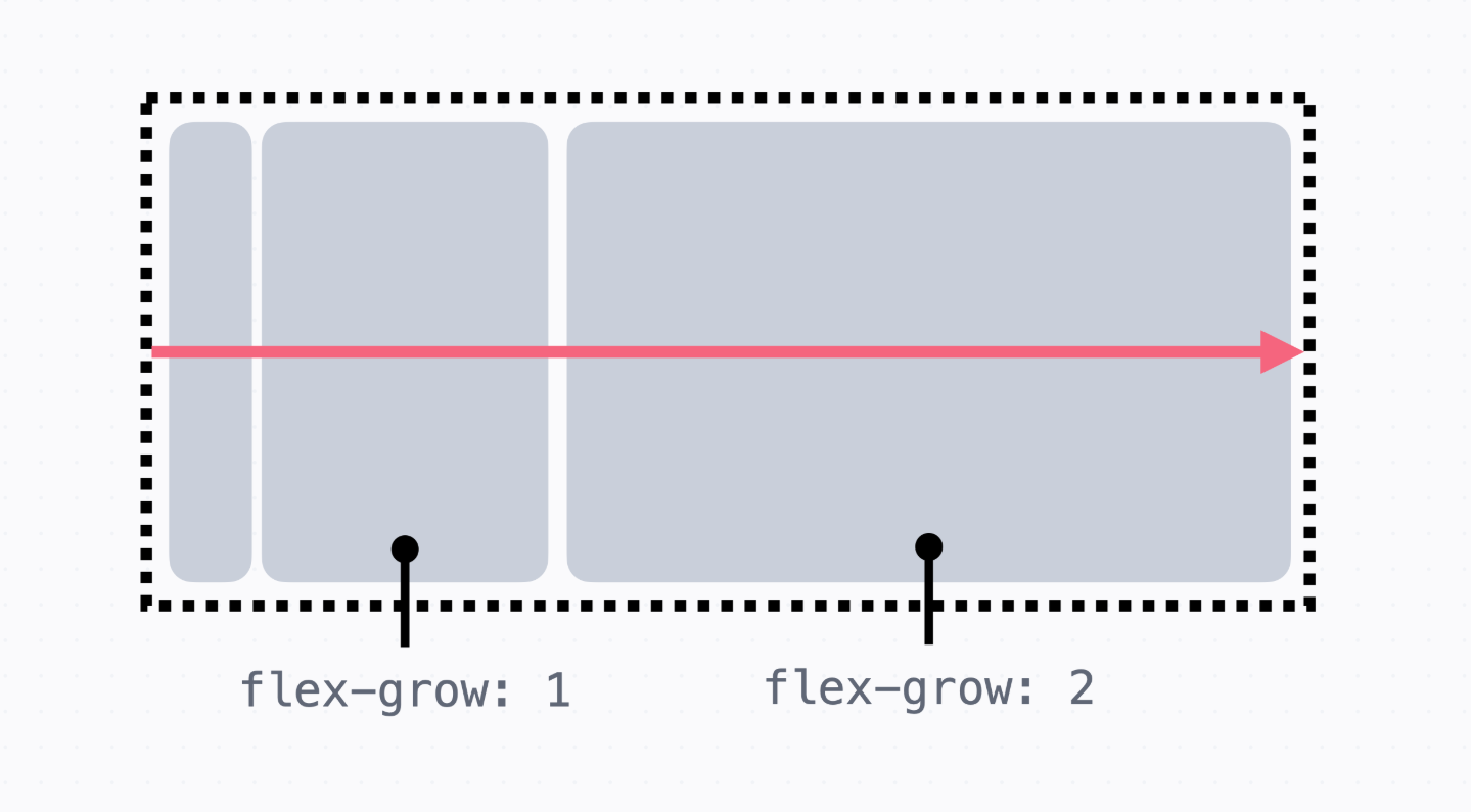
→ 요소 크기를 늘리거나 줄여서 flexbox 안에 요소를 꽉 채우는 방법
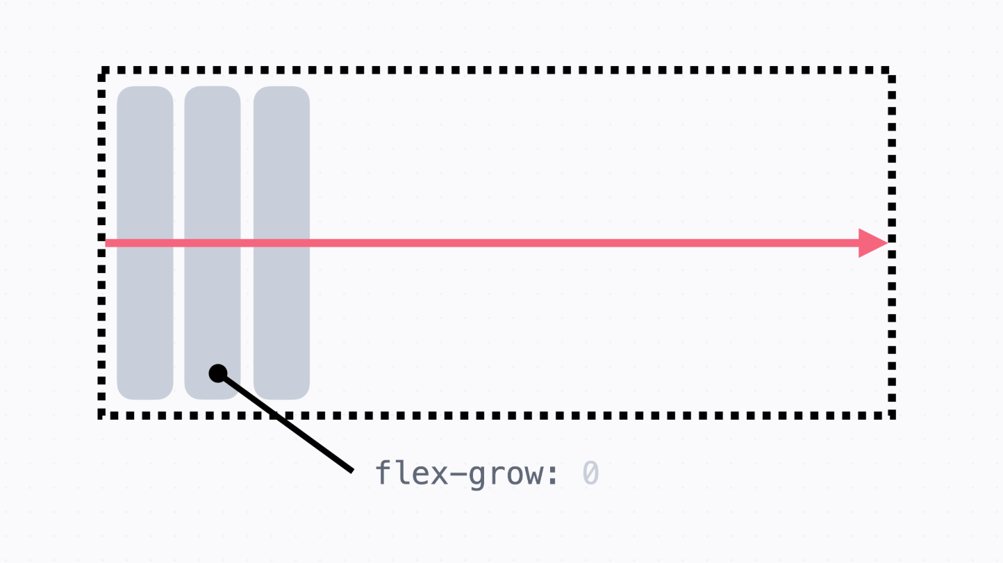
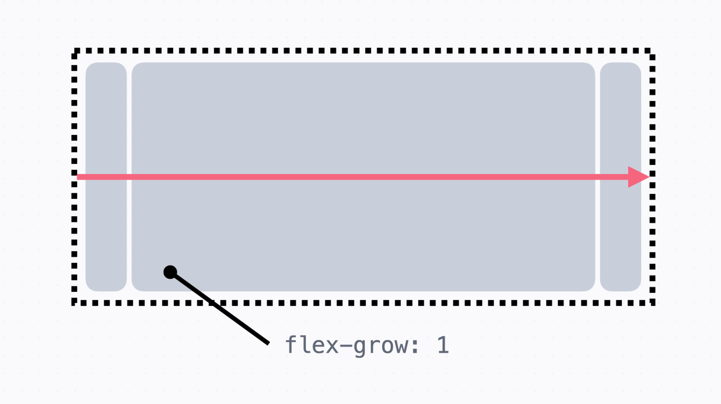
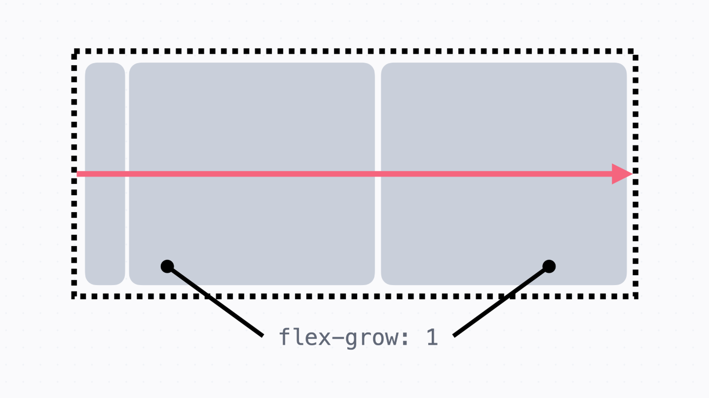
→ flex-grow라는 속성을 사용하여 요소를 늘리고 빈공간을 꽉 채우면 된다.
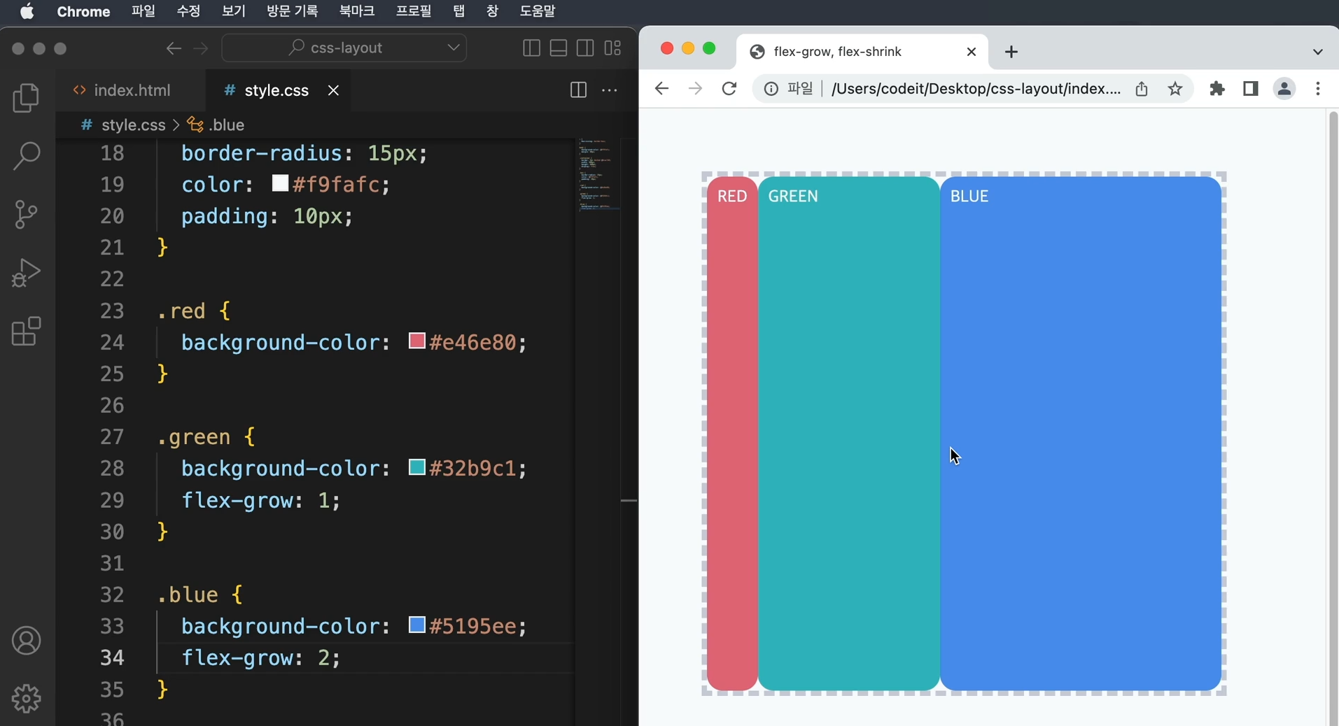
    → flex-grow : 1에서 숫자 1은 상대적인 값 flex-grow는 0이 기본값
      숫자를 쓰게 되면 숫자에 비례해서 더욱 많이 늘어난다.
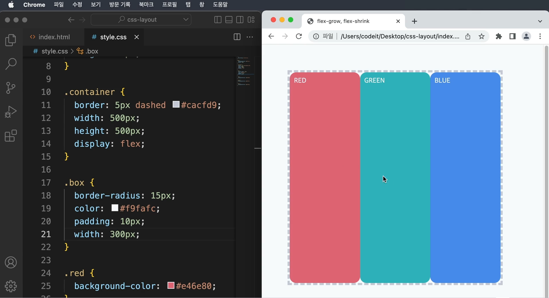
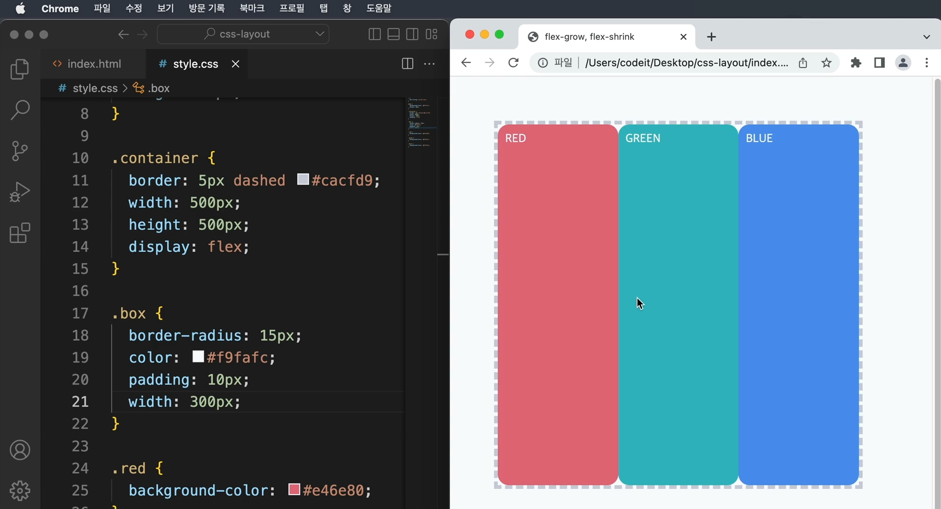
→ container의 너비가 500px이고, 각각의 box가 width 300으로 되어 있다면 900px이 되어
요소가 container의 밖으로 삐져나올 거 같으나 실제로 적용하면 그렇지 않다.
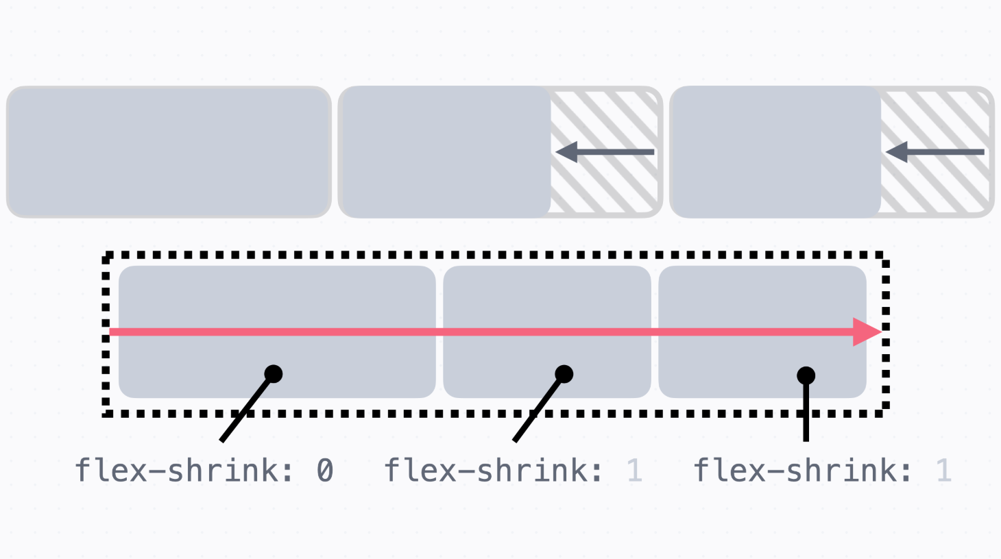
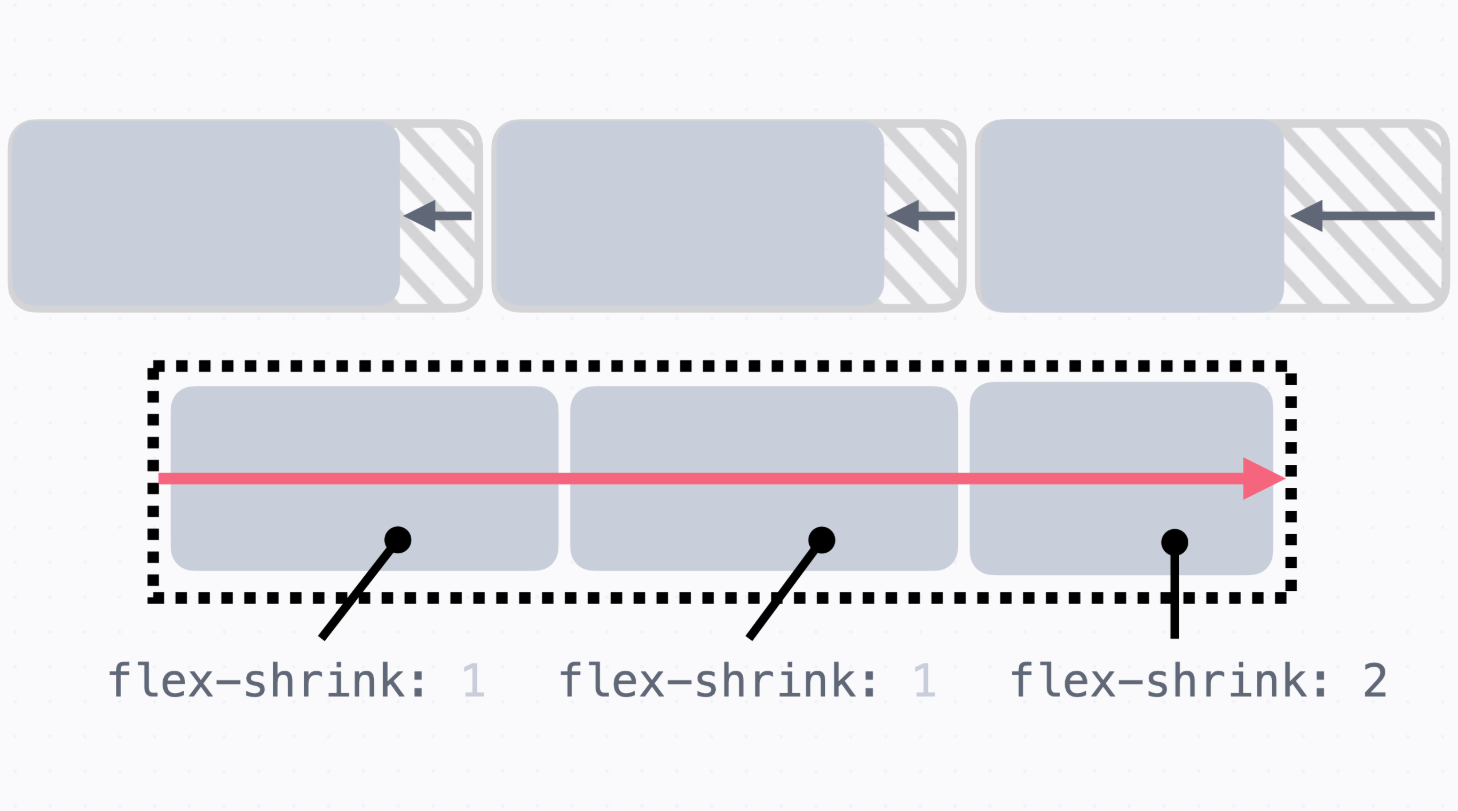
→ flexbox에서 각 요소의 크기를 줄여준 것으로 flex-shrink라는 속성으로 인해 다 같이 줄어든 것
→ flex-shrink와 flex-grow는 값이 클수록 더 많이 줄어든다.
→ flexbox에서 요소를 늘리거나 줄일 때에는 요소를 얼마나 늘릴지 정하려면 flex-grow를 쓰고,
줄이기 위해서는 flex-shrink를 사용
→ 대부분의 경우 빈 공간을 채우고 싶을 때, flex-grow:1을 쓰고
요소의 크기를 원하는 대로 고정하고 싶을 때에는 flex-shrink:0을 쓴다.
13. 플레스 요소의 크기
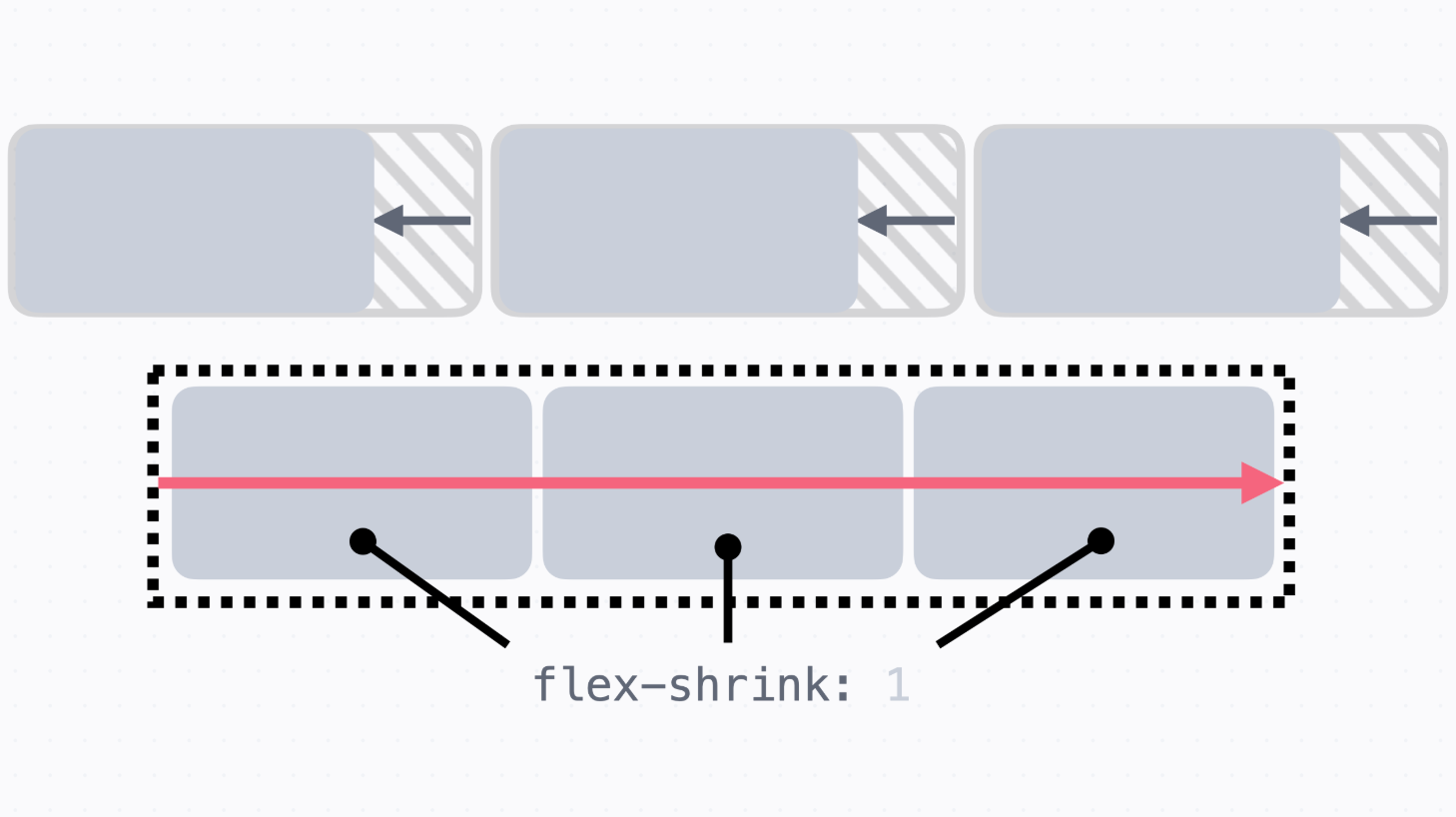
flex-basis 속성
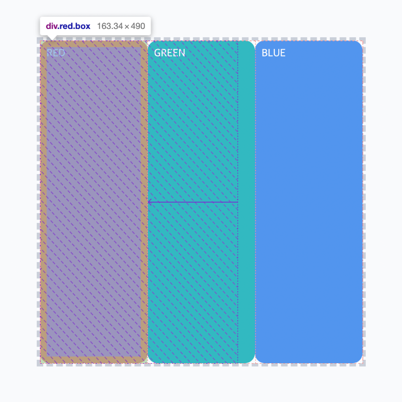
	+ (위 예시에서는 width 값이 큰 값이지만, flex-shrink에 의해서 줄어들었습니다.)


    → flex-grow와 flex-shrink를 쓰면서 요소들의 크기를 정할 때 특이한 점은
      우리가 정한 width나 height 값으로 크기가 결정되지 않는다는 것
    → 플렉스박스에서는 고정된 크기가 있는 게 아니라 시작 크기와 최종 크기가 있다.
      기본 축에서는 시작 크기를 정해 놓으면 플렉스박스 안에서 유연하게 최종 크기가 결정
      크롬 개발자 도구에서 플렉스박스의 요소를 검사해 보면 빗금을 친 부분만큼의 시작 크기에서,
      화살표만큼 최종 크기로 늘어나거나 줄어드는 걸 볼 수 있다.

    → 플렉스박스에서 요소의 시작 크기는 flex-basis라는 속성으로 지정
      flex-basis 값을 따로 정해 주지 않으면 기본값은 auto이고,
      width나 height를 참고해서 시작 크기를 정하고 기본 축의 방향이 가로 방향이면 width를,
      세로 방향이면 height를 참고해서 시작 크기를 정한다.
    → 사실 대부분의 경우 width나 height만 잘 정해주면 별문제 없이 동작
    → 플렉스박스에서 크기를 정하고 싶을 때는 보다 정확하게 flex-basis를 사용하는 걸 추천


    flex 속성

    → flex-basis를 사용하면 좋은 점은 flex라는 속성으로 코드를 짧게 쓸 수 있다는 것
    → flex 속성은 순서대로 flex-grow, flex-shrink, flex-basis 값을 한 번에 쓸 수 있는 속성
    → 아래의 코드는 모두 같은 역할을 하는 코드


    width 속성으로 시작 크기를 지정하기
    flex-grow: 1;
    flex-shrink: 0;
    width: 100px;

    flex-basis 속성으로 시작 크기를 지정하기
    flex-grow: 1;
    flex-shrink: 0;
    flex-basis: 100px;

	flex 속성으로 짧게 쓰기
    flex: 1 0 100px;
14. 곡 목록
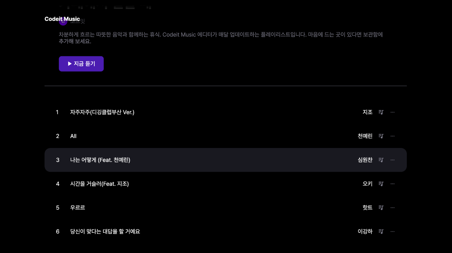
    → 이번 실습에서는 플레이리스트 페이지에서 곡 목록을 만들어 보겠습니다.
      아래를 참고해서 주어진 코드를 수정

    (1) 트랙 숫자 영역은 폭을 24px로 한다.
    (2) 트랙 제목 영역의 크기를 늘려서 플렉스박스에 꽉 채운다.
    (3) 아이콘들은 크기가 늘거나 줄어들지 않는다.


    템플릿 코드 설명

    → 전체 트랙은 .tracks라는 클래스로 감쌌고, 순서 리스트이지만 CSS 속성을 통해서 리스트 아이템을
      마치 <div> 태그처럼 배치
    → 각 트랙에 해당하는 .track이라는 클래스에 플렉스박스를 만들었다.
    → 안에 있는 요소들(트랙 숫자, 트랙 제목, 아티스트 이름, 그리고 여러 아이콘들)을 왼쪽에서
      오른쪽으로 배치
    → 각각 클래스 이름을 살펴보자면, .track-number는 트랙 숫자 영역
    → .track-title은 트랙 제목 영역, .track-artist는 아티스트 이름 영역, 그리고
      .track-icon은 각각 아이콘에 사용

    <ol class="tracks">
        <li class="track">
          <div class="track-number">1</div>
          <div class="track-title">자주자주(디깅클럽부산 Ver.)</div>
          <div class="track-artist">지조</div>
          <img
            class="track-icon"
            src="images/icon_playlist.svg"
            alt="플레이리스트에 넣기"
         >
          <img class="track-icon" src="images/icon_more.svg" alt="더 보기">
        </li>
        <li class="track">
          <div class="track-number">2</div>
          <div class="track-title">All</div>
          <div class="track-artist">천예린</div>
          <img
            class="track-icon"
            src="images/icon_playlist.svg"
            alt="플레이리스트에 넣기"
         >
          <img class="track-icon" src="images/icon_more.svg" alt="더 보기">
        </li>
        ...
      </ol>

    .tracks {
      list-style: none;
      margin: 0;
      padding: 0;
    }

    .track {
      display: flex;
      align-items: center;
      padding: 24px 32px;
      gap: 16px;
    }

    .track.active {
      border-radius: 16px;
      background-color: #19191F;
    }

    .track-number {
    }

    .track-title {
    }

    .track-icon {
      width: 16px;
      height: 16px;
    }
    [해설]

    트랙 숫자 영역은 폭을 24px로 한다.

    → width 속성을 써도 되지만, 플렉스박스에서는 flex-basis를 사용
    → flex-basis 속성으로 플렉스박스에서 요소의 시작 크기를 지정
    → 24px로 하고 싶다면 flex-basis: 24px

    .track-number {
      flex-basis: 24px;
    }


	트랙 제목 영역의 크기를 늘려서 플렉스박스에 꽉 채운다.

    → 플렉스박스에서 요소의 크기를 늘려서 꽉 채우려면 flex-grow 속성을 사용
    → 트랙 제목 영역에 해당하는 .title에다가 flex-grow: 1
    → 기본적으로 flex-grow의 값은 0이기 때문에 이렇게 하면 제목 영역을 늘려서 꽉찬다.

    .track-title {
      flex-grow: 1;
    }


	아이콘들은 크기가 늘거나 줄어들지 않는다.

    → 플렉스박스에서 요소의 크기를 늘리지 않으려면 flex-shrink 속성을 사용
    → flex-shrink의 기본 값은 1이고, 기본적으로 요소가 넘치면 크기를 줄여주기 때문
    → 이 값을 0으로 하면 줄어들지 않는다.
    → flex-grow:0과 flex-shrink: 0을 추가

    .track-icon {
      flex-shrink: 0;
      width: 16px;
      height: 16px;
    }
index.html

  <!DOCTYPE html>
  <html lang="ko">
  <head>
    <meta charset="utf-8">
    <title>Codeit Music</title>
    <link rel="stylesheet" href="style.css">
  </head>
  <body>
    <header>
      <div class="wrap">Codeit Music</div>
    </header>
    <main class="wrap">
      <div class="info">
        <div class="cover">
          <img
            class="cover-image"
            src="images/img_cafe.png"
            alt="카페에서 일할 때 커버 이미지"
         >
          <img
            src="images/icon_play.png"
            alt="재생 아이콘"
            class="cover-play-icon"
         >
        </div>
        <h1 class="playlist-title">
          카페에서 일할 때
          <span class="hot-badge"> 인기 </span>
        </h1>
        <div class="artist">
          <img
            src="images/img_codeit.png"
            alt="코드잇 프로필"
            class="artist-profile"
         >
          코드잇
        </div>
        <div class="description">
          차분하게 흐르는 따뜻한 음악과 함께하는 휴식. Codeit Music 에디터가
          매달 업데이트하는 플레이리스트입니다. 마음에 드는 곳이 있다면 보관함에
          추가해 보세요.
        </div>
        <button class="play-button">▶️ 지금 듣기</button>
      </div>
      <ol class="tracks">
        <li class="track">
          <div class="track-number">1</div>
          <div class="track-title">자주자주(디깅클럽부산 Ver.)</div>
          <div class="track-artist">지조</div>
          <img
            class="track-icon"
            src="images/icon_playlist.svg"
            alt="플레이리스트에 넣기"
         >
          <img class="track-icon" src="images/icon_more.svg" alt="더 보기">
        </li>
        <li class="track">
          <div class="track-number">2</div>
          <div class="track-title">All</div>
          <div class="track-artist">천예린</div>
          <img
            class="track-icon"
            src="images/icon_playlist.svg"
            alt="플레이리스트에 넣기"
         >
          <img class="track-icon" src="images/icon_more.svg" alt="더 보기">
        </li>
        <li class="track active">
          <div class="track-number">3</div>
          <div class="track-title">나는 어떻게 (Feat. 천예린)</div>
          <div class="track-artist">심원찬</div>
          <img
            class="track-icon"
            src="images/icon_playlist.svg"
            alt="플레이리스트에 넣기"
         >
          <img class="track-icon" src="images/icon_more.svg" alt="더 보기">
        </li>
        <li class="track">
          <div class="track-number">4</div>
          <div class="track-title">시간을 거슬러(Feat. 지조)</div>
          <div class="track-artist">오키</div>
          <img
            class="track-icon"
            src="images/icon_playlist.svg"
            alt="플레이리스트에 넣기"
         >
          <img class="track-icon" src="images/icon_more.svg" alt="더 보기">
        </li>
        <li class="track">
          <div class="track-number">5</div>
          <div class="track-title">우르르</div>
          <div class="track-artist">핫트</div>
          <img
            class="track-icon"
            src="images/icon_playlist.svg"
            alt="플레이리스트에 넣기"
         >
          <img class="track-icon" src="images/icon_more.svg" alt="더 보기">
        </li>
        <li class="track">
          <div class="track-number">6</div>
          <div class="track-title">당신이 맞다는 대답을 할 거예요</div>
          <div class="track-artist">이강하</div>
          <img
            class="track-icon"
            src="images/icon_playlist.svg"
            alt="플레이리스트에 넣기"
         >
          <img class="track-icon" src="images/icon_more.svg" alt="더 보기">
        </li>
      </ol>
    </main>
  </body>
  </html>


style.css

  * {
    box-sizing: border-box;
  }

  html {
    word-break: keep-all;
    font-family: Pretendard, sans-serif;
  }

  body {
    margin: 0;
    background-color: #000;
    color: #fff;
  }

  .wrap {
    margin: 0 auto;
    padding: 32px;
    max-width: 1080px;
    width: 100%;
  }

  header {
    position: sticky;
    top: 0;
    z-index: 1;
    padding: 16px;
    background-image: linear-gradient(
      180deg,
      #000000 15.1%,
      rgba(0, 0, 0, 0) 100%
    );
    font-weight: 700;
  }

  .info {
    margin-bottom: 40px;
    padding: 40px;
    border-bottom: 1px solid #595864;
  }

  .cover {
    width: 252px;
    height: 252px;
    border-radius: 24px;
    overflow: hidden;
    position: relative;
  }

  .cover-image {
    width: 100%;
    height: 100%;
  }

  .cover-play-icon {
    display: none;
    width: 72px;
    height: 72px;
    position: absolute;
    left: 28px;
    bottom: 28px;
  }

  .cover:hover .cover-play-icon {
    display: block;
  }

  .playlist-title {
    margin: 40px 0 16px;
    font-weight: 700;
    font-size: 40px;
    line-height: 48px;
  }

  .hot-badge {
    position: relative;
    top: -20px;
    padding: 4px 8px;
    border-radius: 8px;
    background-color: #2a2a31;
    color: #8e8ea0;
    font-weight: 700;
    font-size: 16px;
    line-height: 19px;
  }

  .artist {
    display: flex;
    align-items: center;
    color: #7d7c8a;
    font-weight: 400;
    font-size: 16px;
    line-height: 19px;

    gap: 8px;
  }

  .artist-profile {
    overflow: hidden;
    width: 24px;
    height: 24px;
    border-radius: 50%;
  }

  .description {
    margin: 16px 0 32px;
    color: #7d7c8a;
    font-weight: 400;
    font-size: 16px;
    line-height: 19px;
  }

  .play-button {
    padding: 12px 24px;
    border: none;
    border-radius: 8px;
    background-color: #4b1bb1;
    color: #ffffff;
    font-weight: 500;
    font-size: 16px;
    line-height: 19px;
  }

  .tracks {
    list-style: none;
    margin: 0;
    padding: 0;
  }

  .track {
    display: flex;
    align-items: center;
    padding: 24px 32px;

    gap: 16px;
  }

  .track.active {
    border-radius: 16px;
    background-color: #19191F;
  }

  .track-number {
    flex-basis: 24px;
  }

  .track-title {
    flex-grow: 1;
  }

  .track-icon {
    flex-shrink: 0;
    width: 16px;
    height: 16px;
  }
15. 음악 플레이어
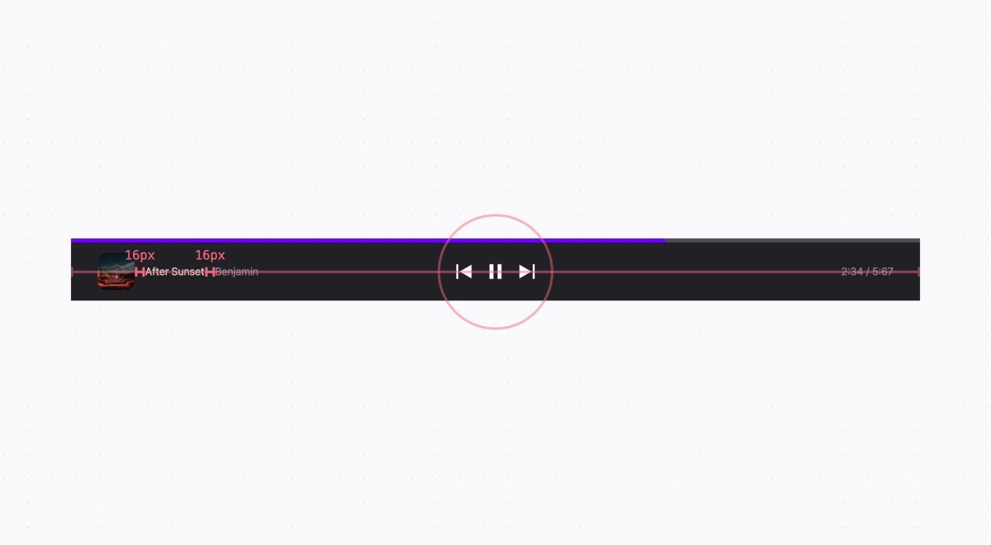
    (1) 앨범 커버 이미지와 제목, 아티스트 이름 사이의 간격은 16px로 해 주세요.
    (2) 앨범 커버 이미지, 제목, 아티스트 이름은 왼쪽에 배치해 주세요.
    (3) 이전 곡, 일시 정지, 다음 곡 아이콘들은 전체 상자의 정중앙에 배치해 주세요.
    (4) 재생 시간 텍스트는 오른쪽으로 배치해 주세요.
    (5) 음악 플레이어 안의 모든 요소들은 세로로 가운데 정렬해 주세요.


	템플릿 코드 설명

    → 음악 플레이어 전체는 .player라는 클래스의 <div>로 감싸고, 음악이 얼마나 재생되고 있는지
      보여주고 있는 .progress-bar 클래스의 <div> 태그가 있다.
    → 음악 플레이어의 내용이 들어있는 .player-main 클래스의 <div> 태그가 있다.
    → .player-main 안에는 총 세 개의 자식 요소가 있습니다.
       순서대로 .info 클래스, .controls 클래스 그리고 .time 클래스가 있다.
      .info 안에는 앨범 커버 이미지, 제목, 아티스트 이름이 있고요, .controls 안에는 이전 곡,
      일시 정지, 다음 곡 아이콘이 있습니다. 마지막으로 .time에는 재생 시간 텍스트가 있다.

    <div class="player">
      <div class="progress-bar">
        <div class="progress"></div>
      </div>
      <div class="player-main">
        <div class="info">
          <img class="current" src="images/img_current_song.png" alt="현재 재생 중인 곡">
          <div class="title">After Sunset</div>
          <div class="artist">Benjamin</div>
        </div>
        <div class="controls">
          <img src="images/icon_before.svg" alt="이전 곡" width="48" height="48">
          <img src="images/icon_pause.svg" alt="일시정지" width="48" height="48">
          <img src="images/icon_after.svg" alt="다음 곡" width="48" height="48">
        </div>
        <div class="time">
          2:34 / 5:67
        </div>
      </div>
    </div>


    * {
      box-sizing: border-box;
    }

    html {
      font-family: Pretendard, sans-serif;
      word-break: keep-all;
    }

    body {
      margin: 0;
      background-color: #000;
      color: #fff;
      font-size: 16px;
      line-height: 24px;
    }

    .progress-bar {
      height: 6px;
      background: linear-gradient(0deg, #4d4d54, #4d4d54),
        linear-gradient(0deg, #4d4d54, #4d4d54), #4d4d54;
    }

    .progress {
      width: 70%;
      height: 100%;
      background-color: #7000ff;
    }

    .player-main {
      padding: 16px 40px;
      background-color: rgba(48, 48, 55, 0.7);

      backdrop-filter: blur(15px);
    }

    .info,
    .time {
    }

    .info {
    }

    .current {
      border-radius: 14px;
    }

    .title {
      color: #d9d9d9;
    }

    .artist {
      color: #8c8993;
    }

    .playing {
      width: 48px;
      height: 48px;
    }

    .icon {
      width: 24px;
      height: 24px;
    }

    .controls {
    }

    .time {
      color: #8c8993;
    }
	[ 해설 ]

    → 앨범 커버 이미지랑 제목, 아티스트 이름을 가로로 배치하기 위해서 .info 클래스를
      플렉스박스로 만들고 세로로 정렬하여 간격을 16px로 준다.

    .info {
      display: flex;
      align-items: center;
      gap: 16px;
    }


    → .info , .control 그리고 .time을 정렬한다.
      우선, .player-main 클래스를 플렉스박스로 만들고, space-between으로 정렬하면
      요소들을 펼쳐서 배치
    → justify-content: space-between을 적용해서 기본 축에서 펼쳐서 배치하고,
       align-items: center로 세로 정렬

    .player-main {
      display: flex;
      justify-content: space-between;
      align-items: center;
      padding: 16px 40px;
      background-color: rgba(48, 48, 55, 0.7);
      backdrop-filter: blur(15px);
    }


    → 정렬이 안 맞는 이유는 맨 왼쪽의 요소와 맨 오른쪽의 요소의 너비가 달라서 그렇기 때문에
      flex-basis의 값을 설정.
      .info 클래스와 .sub-controls 클래스에서 flex-basis 값을 똑같이 설정한다.
      각각 따로 써 줘도 되지만, 값을 똑같이 하고 싶은 거기 때문에 아래처럼 선택자 목록으로 써준다.

    .info,
    .time {
      flex-basis: 300px;
    }


    → .controls와 .time에 있는 요소들의 정렬이 안 맞는 부분은 .controls에서는 정중앙으로 정렬을, .time에서는 기본 축 방향에서 맨 끝으로 정렬을 해준다.
      justify-content: flex-end로 속성 값을 주면 된다.

    .controls {
      display: flex;
      align-items: center;
      justify-content: center;
    }

    .time {
      display: flex;
      justify-content: flex-end;
      color: #8c8993;
    }
index.html

  <!DOCTYPE html>
  <html lang="ko">
  <head>
    <meta charset="utf-8">
    <title>Codeit Music</title>
    <link rel="stylesheet" href="style.css">
  </head>
  <body>
    <div class="player">
      <div class="progress-bar">
        <div class="progress"></div>
      </div>
      <div class="player-main">
        <div class="info">
          <img class="current" src="images/img_current_song.png" alt="현재 재생 중인 곡">
          <div class="title">After Sunset</div>
          <div class="artist">Benjamin</div>
        </div>
        <div class="controls">
          <img src="images/icon_before.svg" alt="이전 곡" width="48" height="48">
          <img src="images/icon_pause.svg" alt="일시정지" width="48" height="48">
          <img src="images/icon_after.svg" alt="다음 곡" width="48" height="48">
        </div>
        <div class="time">
          2:34 / 5:67
        </div>
      </div>
    </div>
  </body>
  </html>


style.css

  * {
    box-sizing: border-box;
  }

  html {
    font-family: Pretendard, sans-serif;
    word-break: keep-all;
  }

  body {
    margin: 0;
    background-color: #000;
    color: #fff;
    font-size: 16px;
    line-height: 24px;
  }

  .progress-bar {
    height: 6px;
    background: linear-gradient(0deg, #4d4d54, #4d4d54),
      linear-gradient(0deg, #4d4d54, #4d4d54), #4d4d54;
  }

  .progress {
    width: 70%;
    height: 100%;
    background-color: #7000ff;
  }

  .player-main {
    display: flex;
    justify-content: space-between;
    align-items: center;
    padding: 16px 40px;
    background-color: rgba(48, 48, 55, 0.7);
    backdrop-filter: blur(15px);
  }

  .info,
  .time {
    flex-basis: 300px;
  }

  .info {
    display: flex;
    align-items: center;
    gap: 16px;
  }

  .current {
    border-radius: 14px;
  }

  .title {
    color: #d9d9d9;
  }

  .artist {
    color: #8c8993;
  }

  .playing {
    width: 48px;
    height: 48px;
  }

  .icon {
    width: 24px;
    height: 24px;
  }

  .controls {
    display: flex;
    align-items: center;
    justify-content: center;
  }

  .time {
    display: flex;
    justify-content: flex-end;
    color: #8c8993;
  }
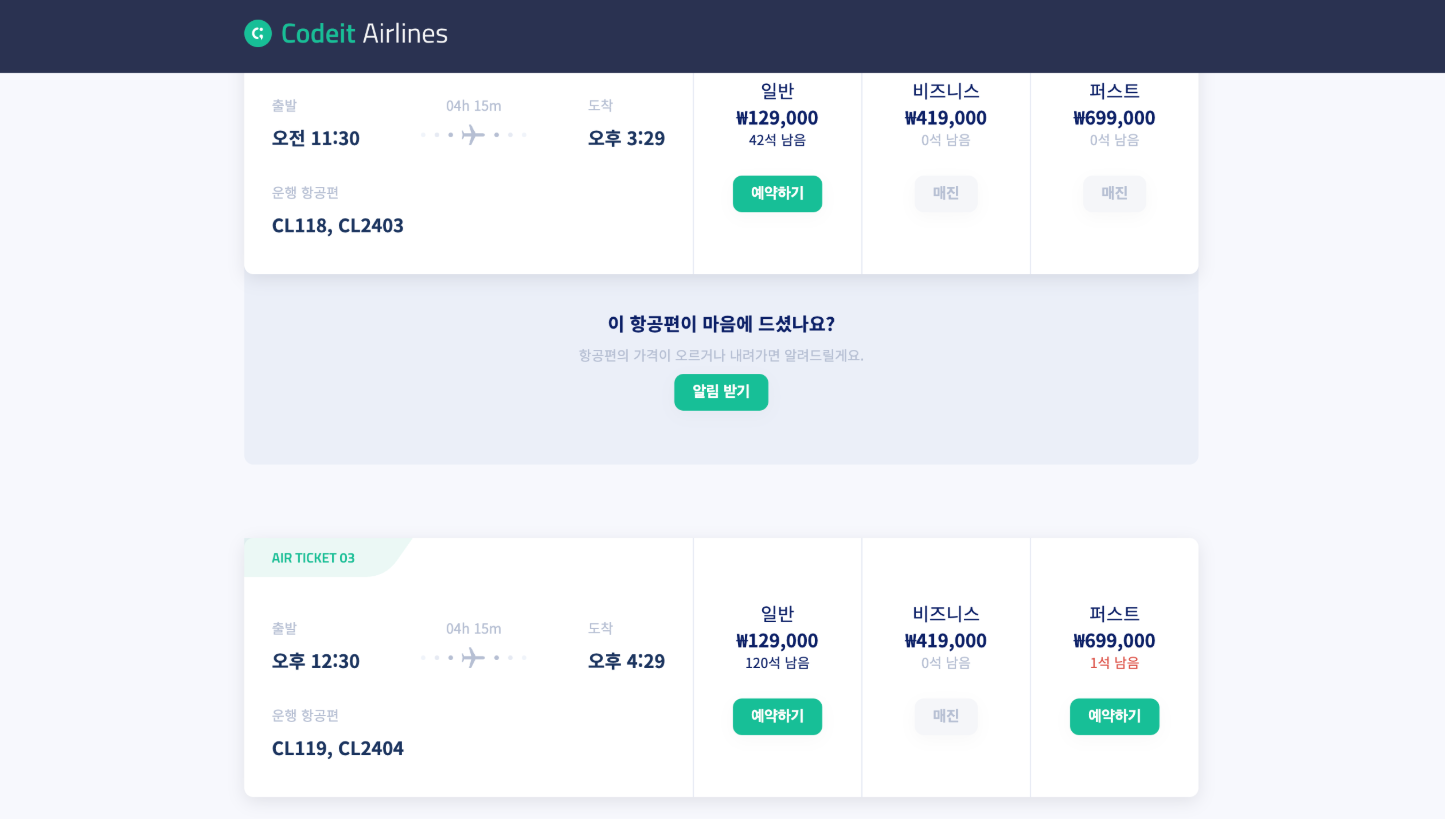
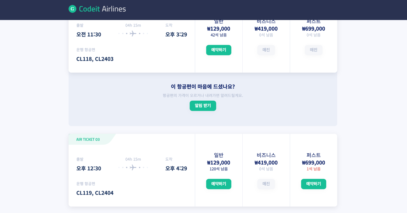
16. 미니 프로젝트 : 코드잇 항공
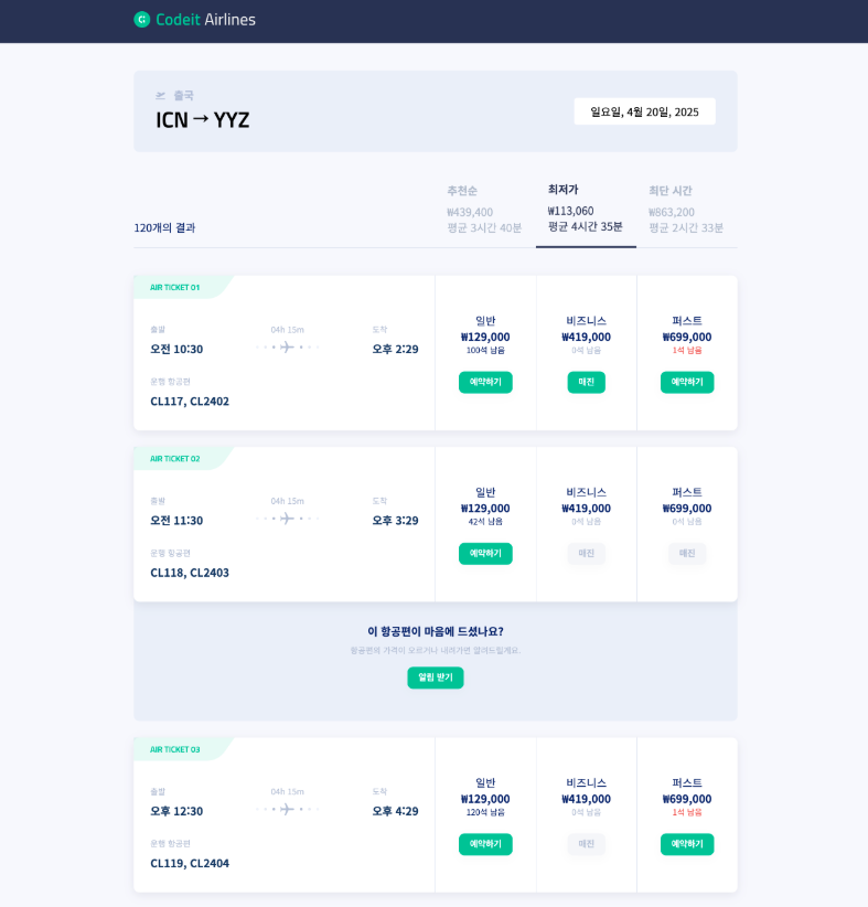
→ 필요한 경우 <div> 태그를 추가하면서 정렬
→ 포지션, 플렉스박스를 사용해서 사이트 전체를 배치해 보는 것이 목표이니까 세세한 여백이나 크기는 다르더라도 괜찮습니다.
템플릿 코드 설명
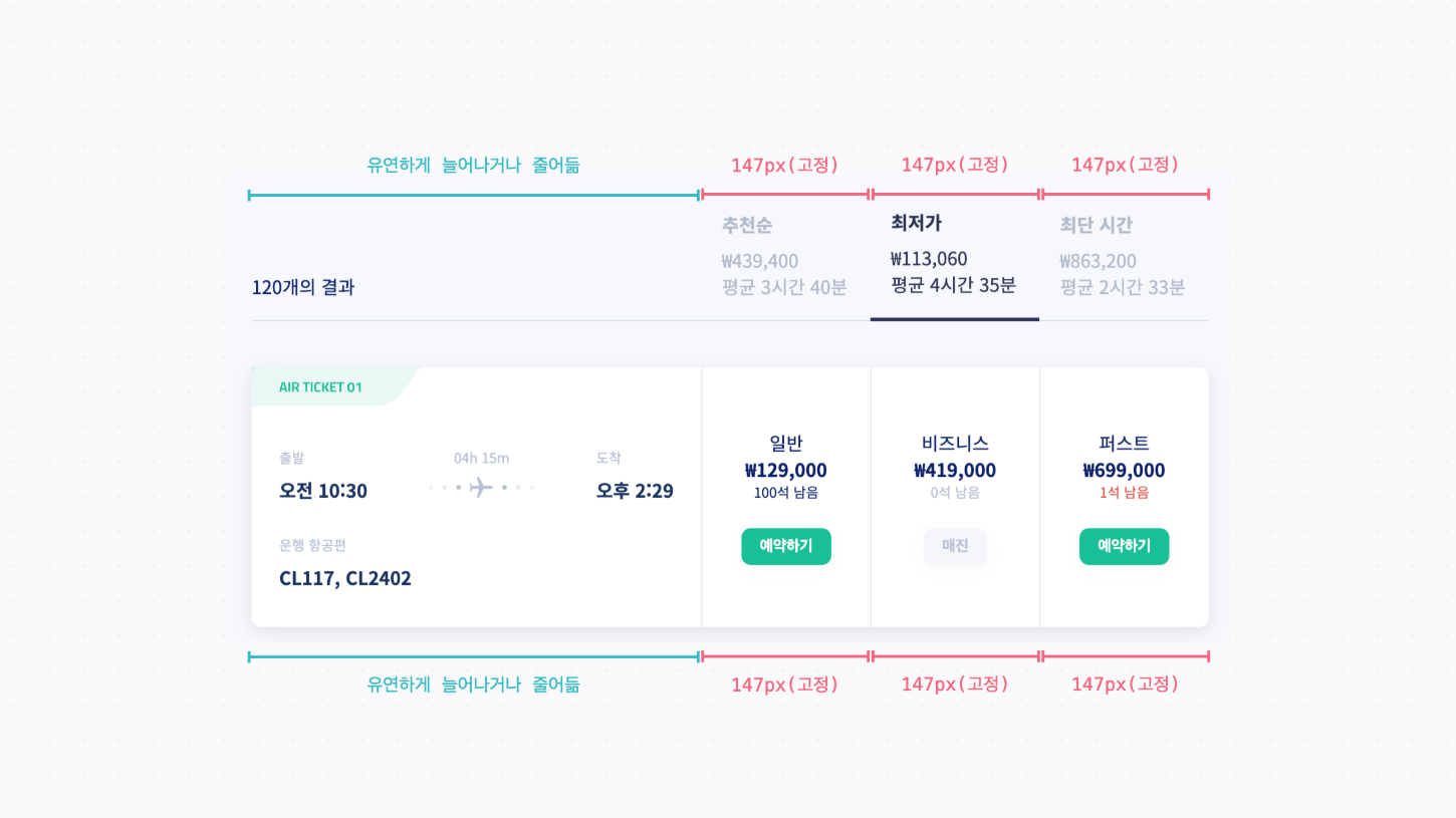
→ 추천순, 최저가, 최단 시간이 적혀있는 부분과 일반, 비즈니스, 퍼스트 좌석의 정보가 적혀있는
부분은 각각 .flight-header-col이란 클래스와 .cabin이라는 클래스로 스타일링
둘 다 너비를 147px로 지정
.flights-header-col {
width: 147px;
padding: 18px;
color: #b1bac9;
}
/* ... */
.flight-card > .cabin {
width: 147px;
border-left: 1px solid #e5e9f3;
}
→ 본문 내용을 모두 감싸고 있는 .container 클래스에서는 앞에서 배우지 않은 max-width라는
속성을 쓰고 있다.
기본적으로 너비를 100%로 꽉 채우면서도 최대 880px까지만 늘어나게 하는 코드
flex-grow, flex-shrink 등을 설정하고 브라우저 창 너비를 바꿔 보면서 각각이 어떻게 변하는지
확인
.container {
margin: 0 auto;
padding: 0 24px;
width: 100%;
max-width: 880px;
}
    [ 해설 ]

    → 플렉스박스에서 정렬을 쓰기 위해서 <div> 태그를 몇 개 추가한 다음 정렬
    → 맨 위의 .trip 영역은 .trip-route라는 <div>를 나누고 부모 태그인 .trip <div>에서 플렉스박스로 양쪽 정렬(space-between)
    → 세로로 정렬하기 위해서 align-items: center도 적용

	<div class="trip">
      <div class="trip-route">
        <div class="trip-title">
          <img
            class="trip-depart-icon"
            src="images/fa-solid_plane-departure.svg"
         >
          출국
        </div>
        <div class="trip-airports">ICN → YYZ</div>
      </div>
      <span class="trip-date">일요일, 4월 20일, 2025</span>
    </div>


    .trip {
      display: flex;
      justify-content: space-between;
      align-items: center;
      margin: 40px 0 24px;
      padding: 24px 32px;
      border-radius: 8px;
      background: #ebeff8;
    }

    .trip-title {
      color: #b3bdd5;
      font-weight: 700;
      font-size: 16px;
      line-height: 23px;
    }

    .trip-depart-icon {
      margin-right: 8px;
      height: 12px;
    }

    .trip-airports {
      margin: 8px 0;
      color: #000000;
      font-weight: 600;
      font-style: normal;
      font-size: 32px;
      font-family: 'Titillium Web';
      line-height: 32px;
    }

    .trip-date {
      display: inline-block;
      margin: 16px 0;
      padding: 8px 24px;
      border-radius: 4px;
      background: #ffffff;
      color: #000000;
    }
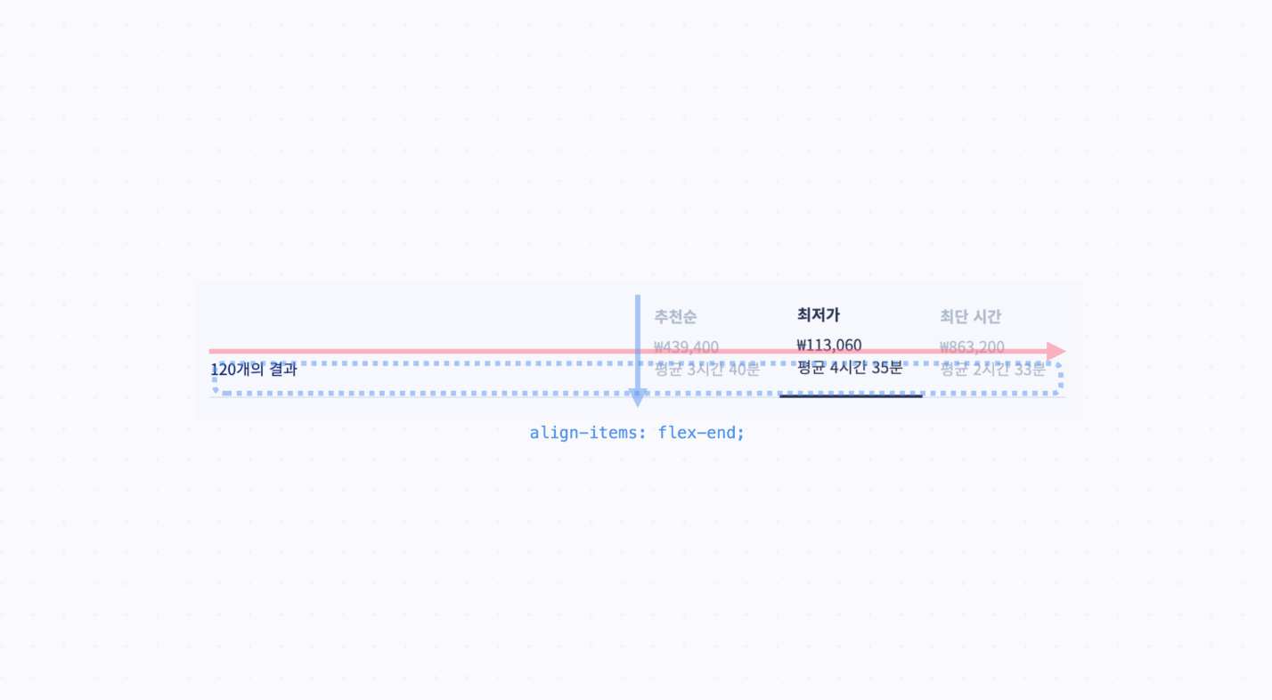
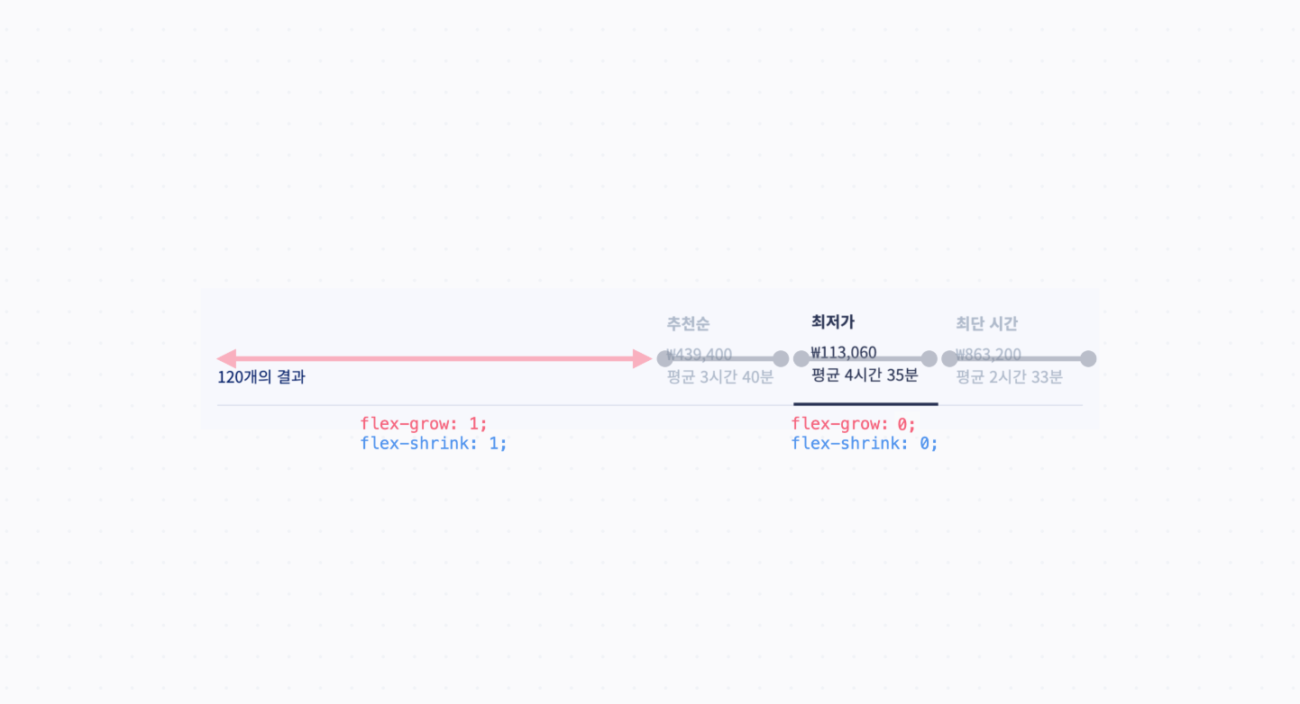
    →  .flights-header는 일단 안에 있는 요소들이 전부 아래쪽으로 몰려 있으니까 교차축 방향으로
       정렬, 즉 align-items: flex-end를 한다.
    → 그 안에 있는 요소 중에서, "120개의 결과"라고 쓰여 있는 영역은 .flights-header-result라는
      클래스에 해당
    → 이 영역을 늘리고 꽉 차게 배치하려고 flex-grow: 1이라는 값을 주고,
      나머지 영역들("추천순", "최저가", "최단 시간")은 크기가 변하지 않도록 flex-shrink: 0 준다
      이렇게 하면 크기가 .flights-header-col의 너비값인 147px로 고정
    <div class="flights-header">
      <div class="flights-header-result">120개의 결과</div>
      <div class="flights-header-col">
        <div class="order-by">추천순</div>
        <div>
          ₩439,400<br>
          평균 3시간 40분
        </div>
      </div>
      <div class="flights-header-col active">
        <div class="order-by">최저가</div>
        <div>
          ₩113,060<br>
          평균 4시간 35분
        </div>
      </div>
      <div class="flights-header-col">
        <div class="order-by">최단 시간</div>
        <div>
          ₩863,200<br>
          평균 2시간 33분
        </div>
      </div>
    </div>


    .flights-header {
      display: flex;
      align-items: flex-end;
      margin-bottom: 40px;
    }

    .flights-header-result,
    .flights-header-col {
      padding-bottom: 18px;
      border-bottom: 1px solid #d6dbe8;
    }

    .flights-header-result {
      flex-grow: 1;
    }

    .flights-header-col {
      flex-shrink: 0;
      width: 147px;
      padding: 18px;
      color: #b1bac9;
    }

    .flights-header-col.active {
      border-bottom: 3px solid #2a3251;
      color: #2a3251;
    }
    → 출발, 걸리는 시간, 도착을 각각 하나의 <div> 태그로 묶은 다음에 이걸 space-between으로 정렬

    <div class="departure-arrival">
      <div class="departure">
        <h3 class="label">출발</h3>
        <div>오전 10:30</div>
      </div>
      <div class="journey">
        <h3 class="label">04h 15m</h3>
        <img class="flight-icon" src="images/img_journey.svg">
      </div>
      <div class="arrival">
        <h3 class="label">도착</h3>
        <div>오후 2:29</div>
      </div>
    </div>


    .flight-card .departure-arrival {
      display: flex;
      justify-content: space-between;
      align-items: center;
      font-weight: 700;
    }
    → 오른쪽의 일반, 비즈니스, 퍼스트 좌석에 해당하는 .cabin <div> 들은 정중앙으로 정렬

    <div class="cabin">
      <h3 class="name">일반</h3>
      <p class="price">₩129,000</p>
      <p class="left">100석 남음</p>
      <button class="reserve">예약하기</button>
    </div>
    <div class="cabin soldout">
      <h3 class="name">비즈니스</h3>
      <p class="price">₩419,000</p>
      <p class="left">0석 남음</p>
      <button class="reserve" disabled>매진</button>
    </div>
    <div class="cabin soldout-soon">
      <h3 class="name">퍼스트</h3>
      <p class="price">₩699,000</p>
      <p class="left">1석 남음</p>
      <button class="reserve">예약하기</button>
    </div>


    .cabin {
      display: flex;
      flex-direction: column;
      justify-content: center;
      align-items: center;
    }
    → 위쪽의 .flights-header랑 정렬이 일치하도록, 왼쪽 영역은 늘어날 수 있도록
      flex-grow: 1을 지정 (.flight-card > .ticket 부분)
    → 각 좌석에 해당하는 영역은 크기가 변하지 않도록 flex-shrink: 0 을 지정
    → 마찬가지로 .cabin의 너비값인 147px로 고정(.flight-card > .cabin 부분)

    <div class="flight-card">
      <div class="ticket">
        <h2 class="ticket-label">AIR TICKET 01</h2>
        <div class="content">
          <div class="departure-arrival">
            <div class="departure">
              <h3 class="label">출발</h3>
              <div>오전 10:30</div>
            </div>
            <div class="journey">
              <h3 class="label">04h 15m</h3>
              <img class="flight-icon" src="images/img_journey.svg">
            </div>
            <div class="arrival">
              <h3 class="label">도착</h3>
              <div>오후 2:29</div>
            </div>
          </div>
          <div class="planes">
            <h3 class="label">운행 항공편</h3>
            <div>CL117, CL2402</div>
          </div>
        </div>
      </div>
      <div class="cabin">
        <h3 class="name">일반</h3>
        <p class="price">₩129,000</p>
        <p class="left">100석 남음</p>
        <button class="reserve">예약하기</button>
      </div>
      <div class="cabin soldout">
        <h3 class="name">비즈니스</h3>
        <p class="price">₩419,000</p>
        <p class="left">0석 남음</p>
        <button class="reserve" disabled>매진</button>
      </div>
      <div class="cabin soldout-soon">
        <h3 class="name">퍼스트</h3>
        <p class="price">₩699,000</p>
        <p class="left">1석 남음</p>
        <button class="reserve">예약하기</button>
      </div>
    </div>


    .flight-card {
      display: flex;
      margin: 24px 0;
      border-radius: 8px;
      background: #ffffff;
      box-shadow: 0px 4px 15px rgba(18, 23, 42, 0.1);
    }

    .flight-card > .ticket {
      flex-grow: 1;
    }

    .flight-card > .cabin {
      flex-shrink: 0;
      width: 147px;
      border-left: 1px solid #e5e9f3;
    }

    .ticket-label {
      margin: 0;
      padding: 8px 24px;
      background-image: url('images/bg_ticket_label.svg');
      background-position: 0 0;
      background-size: contain;
      background-repeat: no-repeat;
      color: #16bf97;
      font-size: 12px;
      font-family: 'Titillium Web';
      line-height: 18px;
    }

    .flight-card .content {
      display: flex;
      flex-direction: column;
      justify-content: center;
      padding: 24px 24px 32px;
      color: #1a345e;
      font-weight: 700;
      gap: 16px;
    }

    .flight-card .label {
      margin-bottom: 8px;
      color: #b6bfd3;
      font-weight: 500;
      font-size: 12px;
      line-height: 17px;
    }

    .flight-card .departure-arrival {
      display: flex;
      justify-content: space-between;
      align-items: center;
      font-weight: 700;
    }

    .flight-card .journey {
      text-align: center;
    }

    .cabin {
      display: flex;
      flex-direction: column;
      justify-content: center;
      align-items: center;
    }

    .cabin .name,
    .cabin .price,
    .cabin .left {
      margin: 0;
    }

    .cabin .name {
      font-weight: 500;
      font-size: 16px;
      line-height: 23px;
    }

    .cabin .price {
      font-weight: 700;
      font-size: 16px;
      line-height: 23px;
    }

    .cabin .left {
      font-weight: 500;
      font-size: 12px;
      line-height: 17px;
    }

    .cabin .reserve {
      margin-top: 23px;
    }

    .soldout.cabin .left {
      color: #b6bfd3;
    }

    .soldout-soon.cabin .left {
      color: #dc534a;
    }
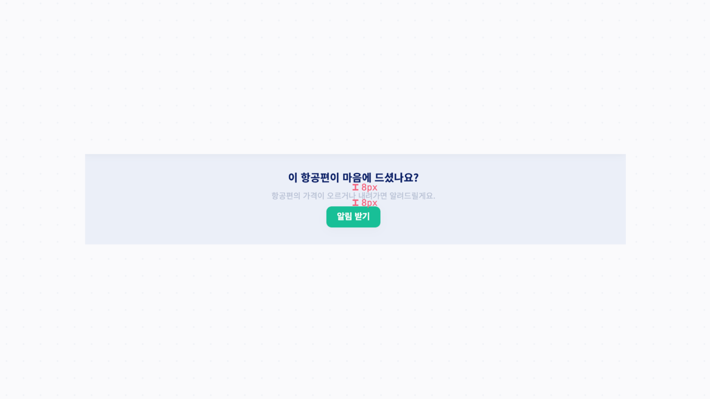
    → 광고 영역은 이전 요소의 뒷부분으로 가서 겹쳐져있으므로 요소를 뒤로 보내려면
      z-index 값을 낮게 설정 (z-index의 값의 기준은 0이니까, 음수로 지정)
    → .ad 클래스에서 position: relative; top: -40px; z-index: -1; 이렇게 해주면 현재 위치를
      기준으로 뒤쪽에 겹치면서 배치
    → relative 포지션은 원래 위치를 기준으로 배치되고, 원래 자리는 그대로 차지
    → top: -40px 대신에 margin-top: -40px이라고 배치
    → 아래의 요소들이 함께 올라오는데 z-index 설정을 하려면 요소가 포지셔닝되어 있어야 하기 때문에
      position: relative는 지우지 않고 그대로 남겨 둡니다.

    .ad {
      position: relative;
      z-index: -1;
      display: flex;
      align-items: center;
      flex-direction: column;
      margin-top: -40px;
      padding: 47px;
      border-radius: 8px;
      background-color: #ebeff8;
    }


    → .ad 안에 있는 각각의 요소들의 간격이 8px이니까 gap 속성을 사용해서 간격을 지정

    .ad {
      position: relative;
      z-index: -1;
      display: flex;
      align-items: center;
      flex-direction: column;
      margin-top: -40px;
      padding: 47px;
      border-radius: 8px;
      background-color: #ebeff8;
      gap: 8px;
    }
index.html

  <!DOCTYPE html>
  <html>
    <head>
      <meta charset="utf-8">
      <title>Codeit Airline</title>
      <link rel="preconnect" href="https://fonts.googleapis.com">
      <link rel="preconnect" href="https://fonts.gstatic.com" crossorigin>
      <link
        href="https://fonts.googleapis.com/css2?family=Noto+Sans+KR:wght@400;700&family=Titillium+Web:wght@300;600&display=swap"
        rel="stylesheet"
     >
      <link rel="stylesheet" href="style.css">
    </head>
    <body>
      <div class="header">
        <div class="container">
          <img id="logo" src="images/logo.png">
        </div>
      </div>
      <div class="content">
        <div class="container">
          <div class="trip">
            <div class="trip-route">
              <div class="trip-title">
                <img
                  class="trip-depart-icon"
                  src="images/fa-solid_plane-departure.svg"
               >
                출국
              </div>
              <div class="trip-airports">ICN → YYZ</div>
            </div>
            <span class="trip-date">일요일, 4월 20일, 2025</span>
          </div>

          <div class="flights-header">
            <div class="flights-header-result">120개의 결과</div>
            <div class="flights-header-col">
              <div class="order-by">추천순</div>
              <div>
                ₩439,400<br>
                평균 3시간 40분
              </div>
            </div>
            <div class="flights-header-col active">
              <div class="order-by">최저가</div>
              <div>
                ₩113,060<br>
                평균 4시간 35분
              </div>
            </div>
            <div class="flights-header-col">
              <div class="order-by">최단 시간</div>
              <div>
                ₩863,200<br>
                평균 2시간 33분
              </div>
            </div>
          </div>

          <div class="flight-card">
            <div class="ticket">
              <h2 class="ticket-label">AIR TICKET 01</h2>
              <div class="content">
                <div class="departure-arrival">
                  <div class="departure">
                    <h3 class="label">출발</h3>
                    <div>오전 10:30</div>
                  </div>
                  <div class="journey">
                    <h3 class="label">04h 15m</h3>
                    <img class="flight-icon" src="images/img_journey.svg">
                  </div>
                  <div class="arrival">
                    <h3 class="label">도착</h3>
                    <div>오후 2:29</div>
                  </div>
                </div>
                <div class="planes">
                  <h3 class="label">운행 항공편</h3>
                  <div>CL117, CL2402</div>
                </div>
              </div>
            </div>
            <div class="cabin">
              <h3 class="name">일반</h3>
              <p class="price">₩129,000</p>
              <p class="left">100석 남음</p>
              <button class="reserve">예약하기</button>
            </div>
            <div class="cabin soldout">
              <h3 class="name">비즈니스</h3>
              <p class="price">₩419,000</p>
              <p class="left">0석 남음</p>
              <button class="reserve" disabled>매진</button>
            </div>
            <div class="cabin soldout-soon">
              <h3 class="name">퍼스트</h3>
              <p class="price">₩699,000</p>
              <p class="left">1석 남음</p>
              <button class="reserve">예약하기</button>
            </div>
          </div>

          <div class="flight-card">
            <div class="ticket">
              <h2 class="ticket-label">AIR TICKET 02</h2>
              <div class="content">
                <div class="departure-arrival">
                  <div class="departure">
                    <h3 class="label">출발</h3>
                    <div>오전 11:30</div>
                  </div>
                  <div class="journey">
                    <h3 class="label">04h 15m</h3>
                    <img class="flight-icon" src="images/img_journey.svg">
                  </div>
                  <div class="arrival">
                    <h3 class="label">도착</h3>
                    <div>오후 3:29</div>
                  </div>
                </div>
                <div class="planes">
                  <h3 class="label">운행 항공편</h3>
                  <div>CL118, CL2403</div>
                </div>
              </div>
            </div>
            <div class="cabin">
              <h3 class="name">일반</h3>
              <p class="price">₩129,000</p>
              <p class="left">42석 남음</p>
              <button class="reserve">예약하기</button>
            </div>
            <div class="cabin soldout">
              <h3 class="name">비즈니스</h3>
              <p class="price">₩419,000</p>
              <p class="left">0석 남음</p>
              <button class="reserve" disabled>매진</button>
            </div>
            <div class="cabin soldout">
              <h3 class="name">퍼스트</h3>
              <p class="price">₩699,000</p>
              <p class="left">0석 남음</p>
              <button class="reserve" disabled>매진</button>
            </div>
          </div>

          <div class="ad">
            <h3>이 항공편이 마음에 드셨나요?</h3>
            <p>항공편의 가격이 오르거나 내려가면 알려드릴게요.</p>
            <button>알림 받기</button>
          </div>

          <div class="flight-card">
            <div class="ticket">
              <h2 class="ticket-label">AIR TICKET 03</h2>
              <div class="content">
                <div class="departure-arrival">
                  <div class="departure">
                    <h3 class="label">출발</h3>
                    <div>오후 12:30</div>
                  </div>
                  <div class="journey">
                    <h3 class="label">04h 15m</h3>
                    <img class="flight-icon" src="images/img_journey.svg">
                  </div>
                  <div class="arrival">
                    <h3 class="label">도착</h3>
                    <div>오후 4:29</div>
                  </div>
                </div>
                <div class="planes">
                  <h3 class="label">운행 항공편</h3>
                  <div>CL119, CL2404</div>
                </div>
              </div>
            </div>
            <div class="cabin">
              <h3 class="name">일반</h3>
              <p class="price">₩129,000</p>
              <p class="left">120석 남음</p>
              <button class="reserve">예약하기</button>
            </div>
            <div class="cabin soldout">
              <h3 class="name">비즈니스</h3>
              <p class="price">₩419,000</p>
              <p class="left">0석 남음</p>
              <button class="reserve" disabled>매진</button>
            </div>
            <div class="cabin soldout-soon">
              <h3 class="name">퍼스트</h3>
              <p class="price">₩699,000</p>
              <p class="left">1석 남음</p>
              <button class="reserve">예약하기</button>
            </div>
          </div>
        </div>
      </div>
    </body>
  </html>


style.css

  * {
    box-sizing: border-box;
  }

  body {
    margin: 0;
    background: #f7f8fd;
    color: #0b1f66;
    font-family: 'Noto Sans KR', sans-serif;
  }

  button {
    padding: 8px 16px;
    border: none;
    border-radius: 8px;
    background-color: #16bf97;
    box-shadow: 0px 4px 15px rgba(18, 23, 42, 0.03);
    color: #ffffff;
    font-weight: 700;
  }

  button:disabled {
    background-color: #f5f6f9;
    color: #b6bfd3;
  }

  .container {
    margin: 0 auto;
    width: 880px;
  }

  .header {
    position: sticky;
    top: 0;
    padding: 18px 0;
    background-color: #2a3251;
    color: #ffffff;
  }

  #logo {
    height: 24px;
  }

  .header > .divider {
    color: #3b4252;
  }

  .trip {
    display: flex;
    align-items: center;
    justify-content: space-between;
    margin: 40px 0 24px;
    padding: 24px 32px;
    border-radius: 8px;
    background: #ebeff8;
  }

  .trip-title {
    color: #b3bdd5;
    font-weight: 700;
    font-size: 16px;
    line-height: 23px;
  }

  .trip-depart-icon {
    margin-right: 8px;
    height: 12px;
  }

  .trip-airports {
    margin: 8px 0;
    color: #000000;
    font-weight: 600;
    font-style: normal;
    font-size: 32px;
    font-family: 'Titillium Web';
    line-height: 32px;
  }

  .trip-date {
    display: inline-block;
    margin: 16px 0;
    padding: 8px 24px;
    border-radius: 4px;
    background: #ffffff;
    color: #000000;
  }

  .flights-header {
    display: flex;
    align-items: flex-end;
    margin-bottom: 40px;
  }

  .flights-header-result,
  .flights-header-col {
    padding-bottom: 18px;
    border-bottom: 1px solid #d6dbe8;
  }

  .flights-header-result {
    flex: 1 1 auto;
  }

  .flights-header-col {
    flex: 0 0 147px;
    padding: 18px;
    color: #b1bac9;
  }

  .flights-header-col.active {
    border-bottom: 3px solid #2a3251;
    color: #2a3251;
  }

  .order-by {
    margin-bottom: 8px;
    font-weight: 700;
  }

  .flight-card {
    display: flex;
    margin: 24px 0;
    border-radius: 8px;
    background: #ffffff;
    box-shadow: 0px 4px 15px rgba(18, 23, 42, 0.1);
  }

  .flight-card > .ticket {
    flex: 1 1 auto;
  }

  .flight-card > .cabin {
    flex: 0 0 147px;
    border-left: 1px solid #e5e9f3;
  }

  .ticket-label {
    margin: 0;
    padding: 8px 24px;
    background-image: url('images/bg_ticket_label.svg');
    background-position: 0 0;
    background-size: contain;
    background-repeat: no-repeat;
    color: #16bf97;
    font-size: 12px;
    font-family: 'Titillium Web';
    line-height: 18px;
  }

  .flight-card .content {
    display: flex;
    flex-direction: column;
    justify-content: center;
    padding: 24px 24px 32px;
    color: #1a345e;
    font-weight: 700;

    gap: 16px;
  }

  .flight-card .label {
    margin-bottom: 8px;
    color: #b6bfd3;
    font-weight: 500;
    font-size: 12px;
    line-height: 17px;
  }

  .flight-card .departure-arrival {
    display: flex;
    align-items: center;
    justify-content: space-between;
    font-weight: 700;
  }

  .flight-card .journey {
    text-align: center;
  }

  .cabin {
    display: flex;
    align-items: center;
    flex-direction: column;
    justify-content: center;
  }

  .cabin .name,
  .cabin .price,
  .cabin .left {
    margin: 0;
  }

  .cabin .name {
    font-weight: 500;
    font-size: 16px;
    line-height: 23px;
  }

  .cabin .price {
    font-weight: 700;
    font-size: 16px;
    line-height: 23px;
  }

  .cabin .left {
    font-weight: 500;
    font-size: 12px;
    line-height: 17px;
  }

  .cabin .reserve {
    margin-top: 23px;
  }

  .soldout.cabin .left {
    color: #b6bfd3;
  }

  .soldout-soon.cabin .left {
    color: #dc534a;
  }

  .ad {
    position: relative;
    z-index: -1;
    display: flex;
    align-items: center;
    flex-direction: column;
    margin-top: -40px;
    padding: 47px;
    border-radius: 8px;
    background-color: #ebeff8;
  }

  .ad > h3 {
    margin: 0 0 8px;
    font-weight: 700;
    font-size: 16px;
    line-height: 23px;
  }

  .ad > p {
    margin: 0 0 16px;
    color: #b6bfd3;
    font-size: 12px;
    line-height: 17px;
  }
17. Flexbox정리

	플렉스박스 만들기
    → display: flex;
→ 기본 축과 교차 축
	배치 방향
    → flex-direction을 사용하면 기본 축의 방향을 정할 수 있습니다. 이때 기본 값은 row
    기본 축 정렬: justify-content
    → justify-content를 사용하면 기본 축 방향으로 정렬할 수 있습니다. 기본 값은 flex-start입니다.
    교차 축 정렬: align-items
    → 교차 축 방향으로 정렬할 때는 align-items를 사용합니다.
      기본 값은 stretch(늘려서 배치하기) 입니다.
    요소가 넘칠 때: flex-wrap
    → 요소가 넘치는 경우 flex-wrap: wrap을 지정해주면 교차 축 방향으로 넘어가서 배치
    간격: gap
    → 숫자를 하나만 쓰면, 모든 방향의 간격을 지정
    → 세로, 가로 순서대로 숫자를 두 개 쓰면 세로 간격, 가로 간격을 지정
    → 세로와 가로는 기본 축 방향이랑은 상관없다.
    요소 늘려서 채우기: flex-grow
    → 기본 값은 0입니다. flex-grow 값이 클수록 많이 늘어난다.
    요소 줄여서 채우기: flex-shrink
    → 요소들의 크기가 커서 넘치는 경우, 요소의 크기를 줄여서 플렉스박스 안에 가득 채운다.
    → flex-shrink의 기본 값이 1이기 때문에 기본적으로 요소를 줄여서 배치하고,
      0으로 지정하면 크기가 줄어들지 않는다.
    → flex-shrink 값이 클수록 상대적으로 많이 줄어든다.
18. 인라인 안에서 Flexbox 만들기
→ 인라인 요소 안에서 플렉스박스를 쓰는 방법
→ 가끔씩 인라인 안에서 세로 정렬을 하고 싶을 때가 있습니다.
예를 들어서 이렇게 링크 안에 작은 새 창 열기 아이콘을 하나 넣는다면
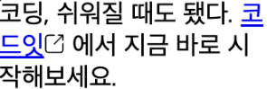
<p>
코딩, 쉬워질 때도 됐다.
<a class="new-window-link" href="https://codeit.kr">
코드잇
<img class="icon" src="new-window-link.svg" alt="새 창 열기" width="13" height="13">
</a>
에서 지금 바로 시작해보세요.
</p>
.logo {
width: 13px;
height: 13px;
}
.new-window-link {
}
    → 새 창 열기 아이콘을 정확히 글 가운데다가 세로로 정렬하고 싶을때,
      <a> 태그에 적용된 .new-window-link 클래스에다가 display: flex로 플렉스박스를 만들고,
      여기다 정렬이랑 간격을 넣어준다.

    .new-window-link {
      display: flex;
      align-items: center;
      gap: 4px;
    }
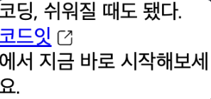
    → 이런 식으로 아예 줄이 넘어가 버립니다
    → .new-window-link 클래스에서
      <a> 태그의 display: inline이라는 기본 값을 display: flex로 바꿔 줬기 때문
    → display: flex라고 하면 그 안에서는 플렉스박스의 규칙에 따라 배치되고,
      그 바깥에서 플렉스박스 전체에 대해서는 마치 display: block처럼 위에서 아래로 배치
    → 이럴 때는 display: inline-flex를 써서 플렉스박스를 만들면서
      동시에 플렉스박스 전체를 마치 display: inline처럼 배치하는 방식

    .new-window-link {
      display: inline-flex;
      align-items: center;
      gap: 4px;
    }
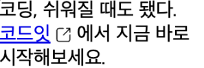
    → 이제 "코드잇"이라는 링크랑 "-에서 지금 바로 시작해 보세요."가
      한 줄로 붙는다.
    → 플렉스박스가 인라인처럼 배치된다.
      앞으로 인라인 안에서 플렉스박스를 만들고 싶을 때는 display: inline-flex를 활용
19. Flexbox안에서 포지셔닝하기
→ 플렉스박스와 포지션을 함께 쓸 때 어떻게 하면 좋을까?
→ position 속성을 배우면서 relative, absolute, fixed 그리고 sticky까지
다양한 포지션이 있다.
이번에는 플렉스박스의 요소에 position을 지정하면 어떻게 될까?
→ 자기 자신의 원래 위치를 기준으로 배치되는 static(기본값), relative, sticky를 제외하고는
플렉스박스의 흐름에서 벗어나서 배치
→ 흐름에서 벗어난다는 건, 플렉스박스 바깥에 있는 요소처럼 동작
→ 앞에서 absolute랑 fixed는 원래 자리를 차지하지 않고, 글의 흐름에서 아예 빠진다.
플렉스박스에서도 마찬가지로 플렉스박스의 영향을 받지 않습니다.
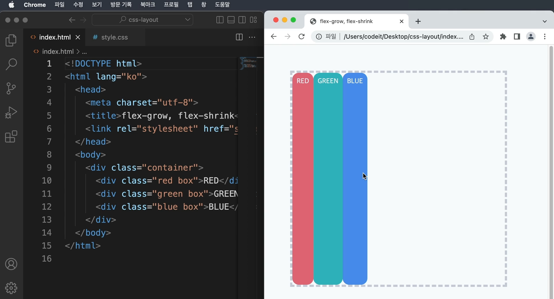
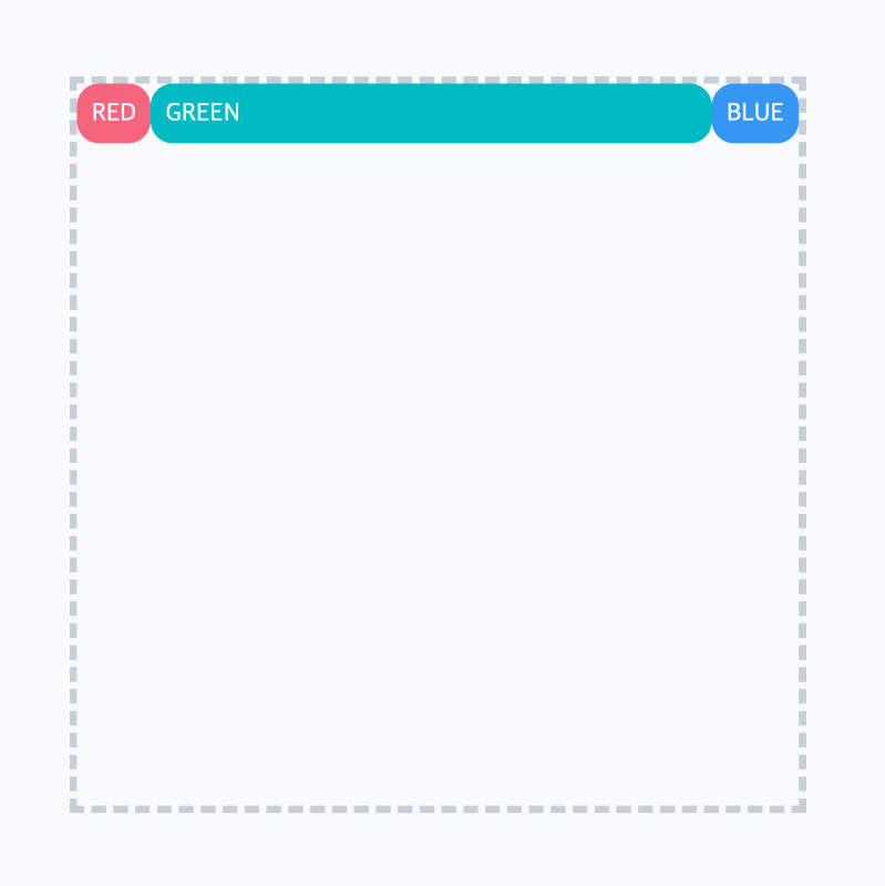
플렉스박스에 배치되는 경우: relative, sticky
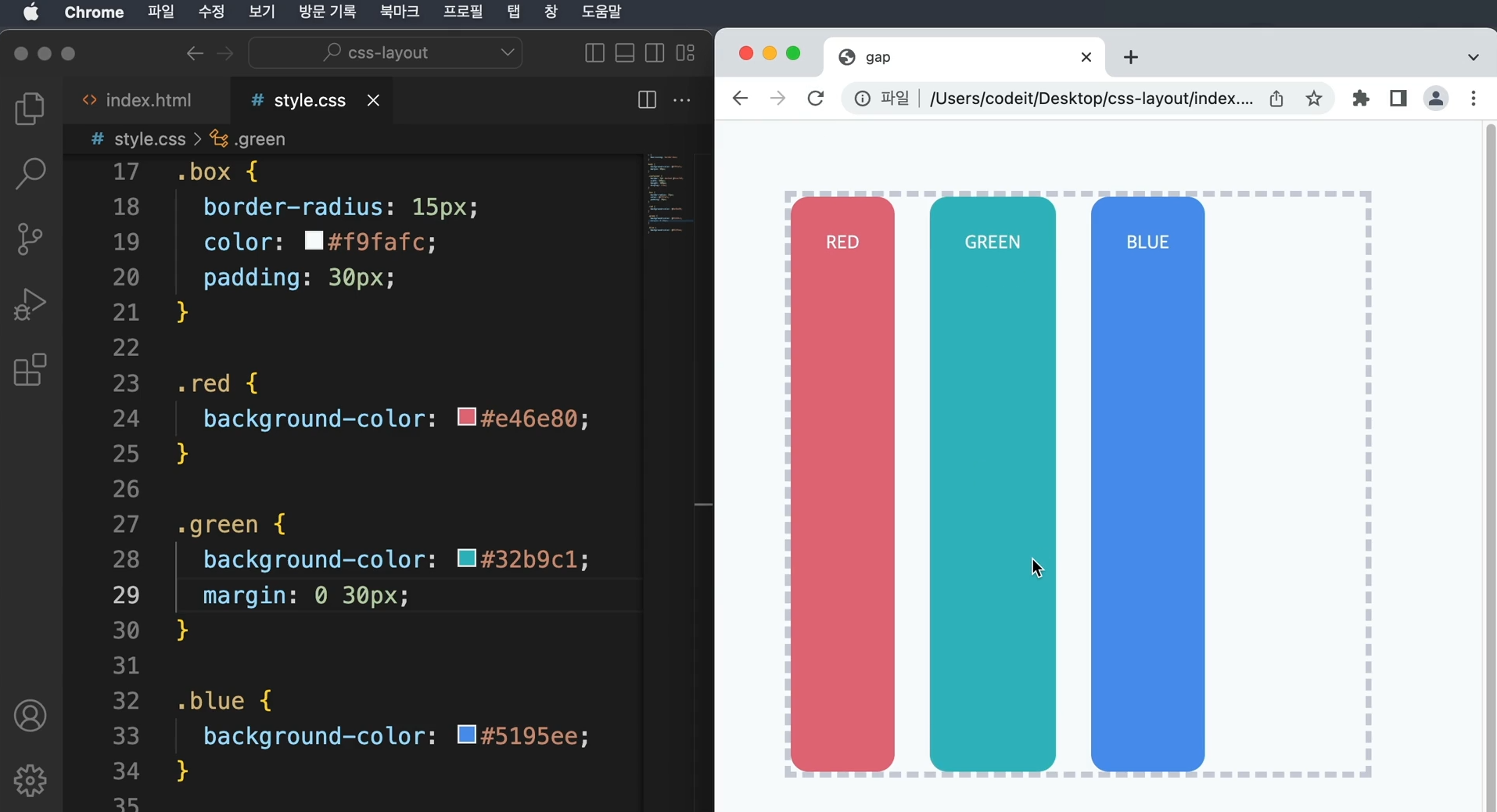
<div class="container">
<div class="red box">RED</div>
<div class="green box">GREEN</div>
<div class="blue box">BLUE</div>
</div>
.container {
border: 5px dashed #cacfd9;
width: 100%;
height: 500px;
display: flex;
position: relative;
align-items: flex-start;
}
.box {
border-radius: 15px;
color: #f9fafc;
padding: 10px;
}
.red {
background-color: #e46e80;
}
.green {
background-color: #32b9c1;
flex-grow: 1;
position: relative;
top: 100px;
left: 100px;
}
.blue {
background-color: #5195ee;
}
→ relative 포지션은 요소의 원래 위치를 기준으로 배치
→ 플렉스박스 안에서 다른 요소들처럼 배치된 다음에 그 위치를 기준으로 배치
→ 즉, 원래 자리를 차지하고 있다.
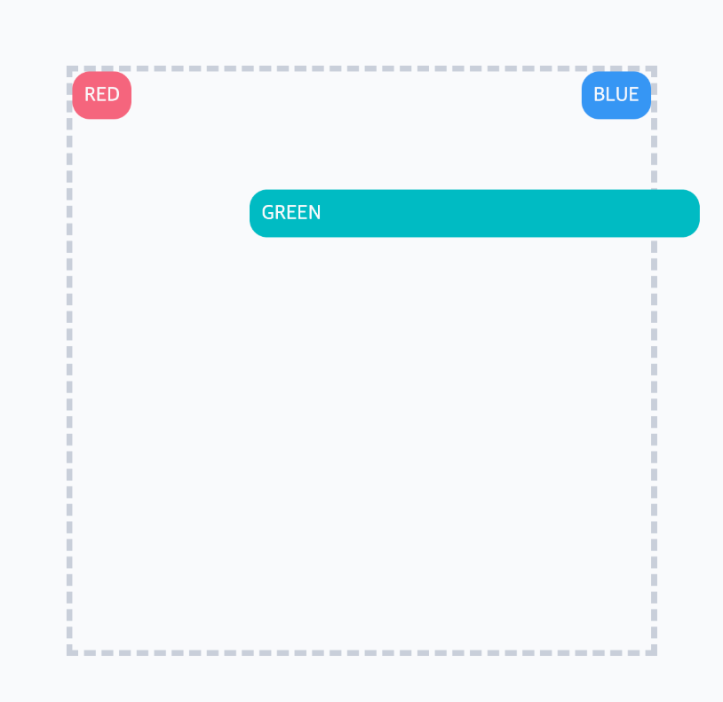
    → sticky로 바꿔도 마찬가지이다.
    → sticky 포지션은 기본적으로 static처럼 원래 위치에 있다가, 지정한 위치에 스크롤되면
      fixed처럼 화면에 고정
    → 그렇기 때문에 일단은 플렉스박스 안에서 배치되고 그다음에 sticky로 배치

    .green {
      background-color: #32b9c1;
      flex-grow: 1;
      position: sticky;
      top: 0;
    }
→ (스크롤 하는 경우 sticky로 동작합니다.)
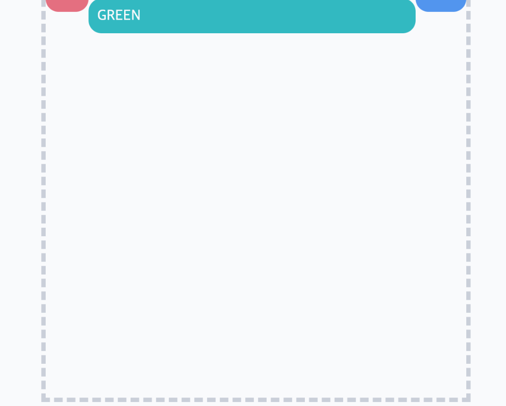
	플렉스박스에서 벗어나는 경우: absolute, fixed

    → absolute 포지션은 포지셔닝된 가장 가까운 조상을 기준으로 배치되고,
      fixed는 브라우저 화면을 기준으로 배치된다
    → 이 둘의 공통점은 요소의 원래 자리를 차지하지 않는다
      즉, 글의 흐름에서 벗어나는 것으로 플렉스박스 안에서도 아예 벗어난다.
      그래서 이런 경우에는 마치 플렉스박스와 상관없는 요소처럼 배치된다.

    <div class="container">
      <div class="red box">RED</div>
      <div class="green box">GREEN</div>
      <div class="blue box">BLUE</div>
    </div>


    .container {
      border: 5px dashed #cacfd9;
      width: 100%;
      height: 500px;
      display: flex;
      position: relative;
      align-items: flex-start;
    }

    .box {
      border-radius: 15px;
      color: #f9fafc;
      padding: 10px;
    }

    .red {
      background-color: #e46e80;
    }

    .green {
      background-color: #32b9c1;
      flex-grow: 1;
      position: absolute;
      top: 100px;
      left: 100px;
    }

    .blue {
      background-color: #5195ee;
    }
    → absolute 포지션에서 플렉스박스 안에서는 마치 .green <div>가 없는 것처럼 배치된다.
      아예 흐름에서 벗어나게 된다.
      또, flex-grow: 1도 적용이 안 된다.
      (만약 적용되었더라면 플렉스박스 너비만큼 꽉 채우게 된다.)


    → fixed 포지션을 보면,

	.green {
      background-color: #32b9c1;
      flex-grow: 1;
      position: fixed;
      top: 100px;
      left: 100px;
    }
→ (스크롤 했을 때)
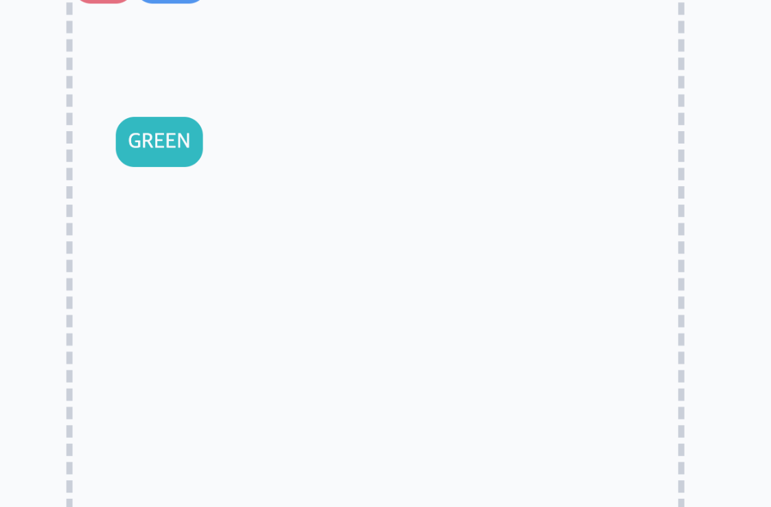
    → fixed는 브라우저 화면을 기준으로 배치되기 때문에 마찬가지로 플렉스박스와 상관없이 배치됩니다.
      나머지 요소들은 마치 .green <div>가 없는 것처럼 배치되고,
      flex-grow도 적용이 안됩니다.


    정리

    → 간단히 정리하자면 relative, sticky는 요소의 원래 자리를 차지하기 때문에 플렉스박스의
      영향을 받는다.
    → absolute랑 fixed는 요소의 원래 자리에서 빠져버리기 때문에 글의 흐름에서 빠지는 것처럼
      플렉스박스랑 상관없이 배치됩니다.