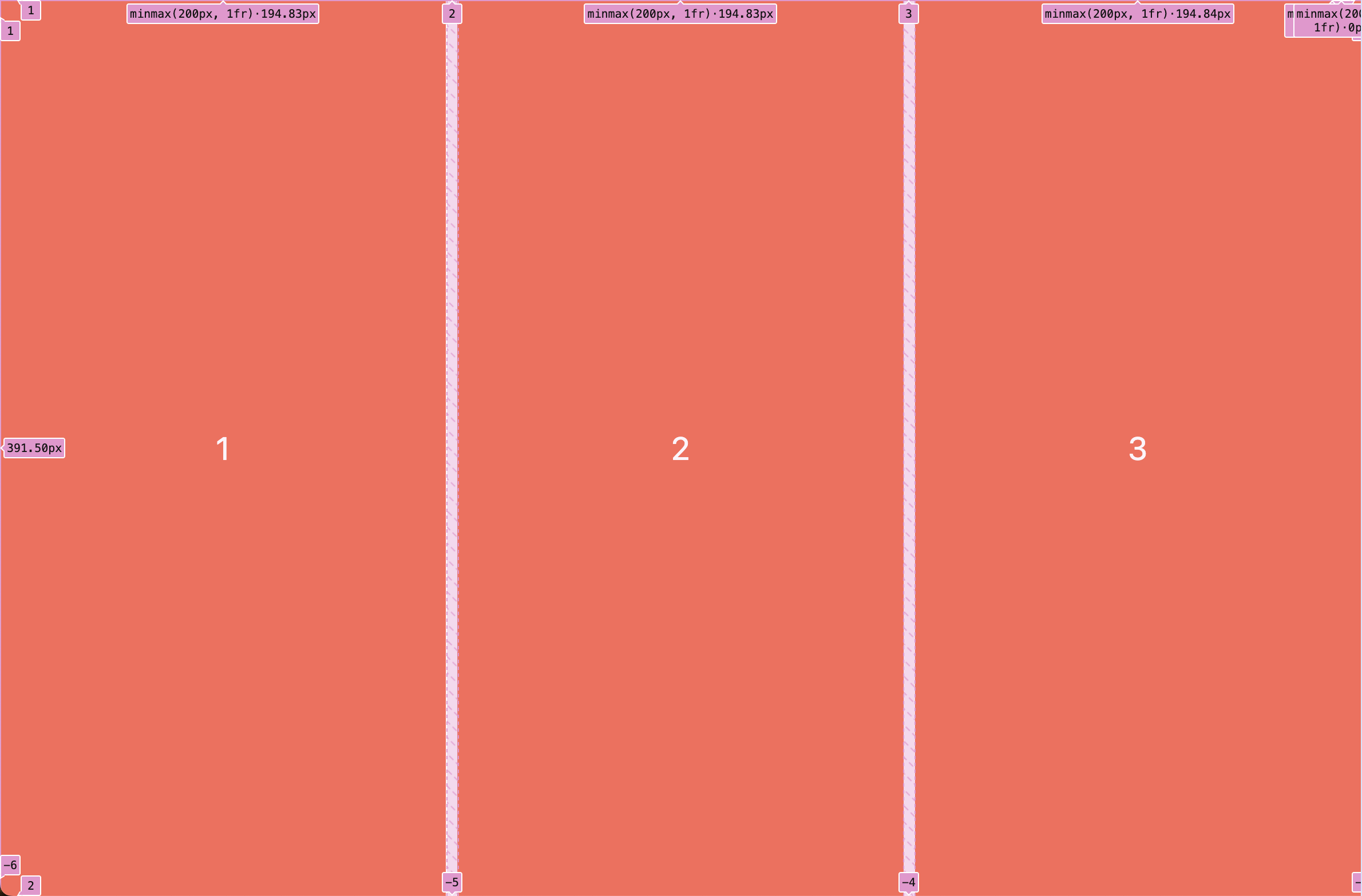
Auto Fill 이나 Auto Fit을 사용하면 반응형 웹사이트를 쉽게 만들수 있다.
.father {
     height:100vh;
     display: grid;
     gap:10px;
     grid-template-columns: repeat(auto-fill, minmax(200px, 1fr));
   }

   .child {
    background-color: tomato;
    color:white;
    font-size: 28px;
    display: flex;
    justify-content: center;
    align-items: center;
   }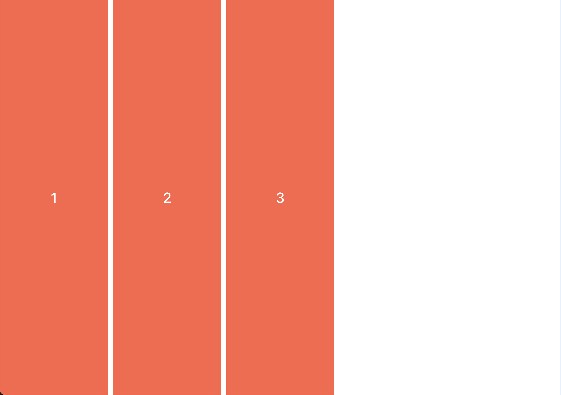
auto-fill 을 사용하면 남겨진 화면에 콘텐츠가 비어 있어도 새로운 그리드를 추가한다. 하지만 auto-fit을 하면 아래와 같이 비어진 화면에 기존의 컨텐츠가 확장되어 채워 진다.

호주 개발자