애니메이션
<!DOCTYPE html>
<html lang="en">
<head>
<meta charset="UTF-8">
<meta http-equiv="X-UA-Compatible" content="IE=edge">
<meta name="viewport" content="width=device-width, initial-scale=1.0">
<title>애니메이션</title>
<style>
body {
background: #333;
}
.box {
font-size: 200px;
width: 200px;
height: 200px;
background: transparent;
position: relative;
animation-name: animate2;
/* 이름 */
animation-duration: 15s;
/* 시간 */
animation-iteration-count: infinite;
/* 횟수 */
animation-fill-mode: forwards;
/* 마지막 상태 */
animation-direction: alternate;
/* 진행방향 */
}
/* 애니메이션 사용시 따로 @keyframes 이름 {} 만든다. */
@keyframes animate1 {
/* 처음 시작 0% 끝날때 100% */
0% {
/* 이동없음, 색은 빨간색 */
transform: translateX(0);
background-color: red;
}
100% {
/* 가로로 500%이동 하면서 1.5배 크기 회전 360도 */
transform: translateX(500%) scale(1.5) rotate(360deg);
background-color: blue;
}
}
@keyframes animate2 {
/* % 방법 */
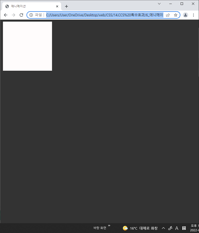
0% {
left: 0px;
top: 0px;
background-color: white;
border-radius: 0 0 0 0;
}
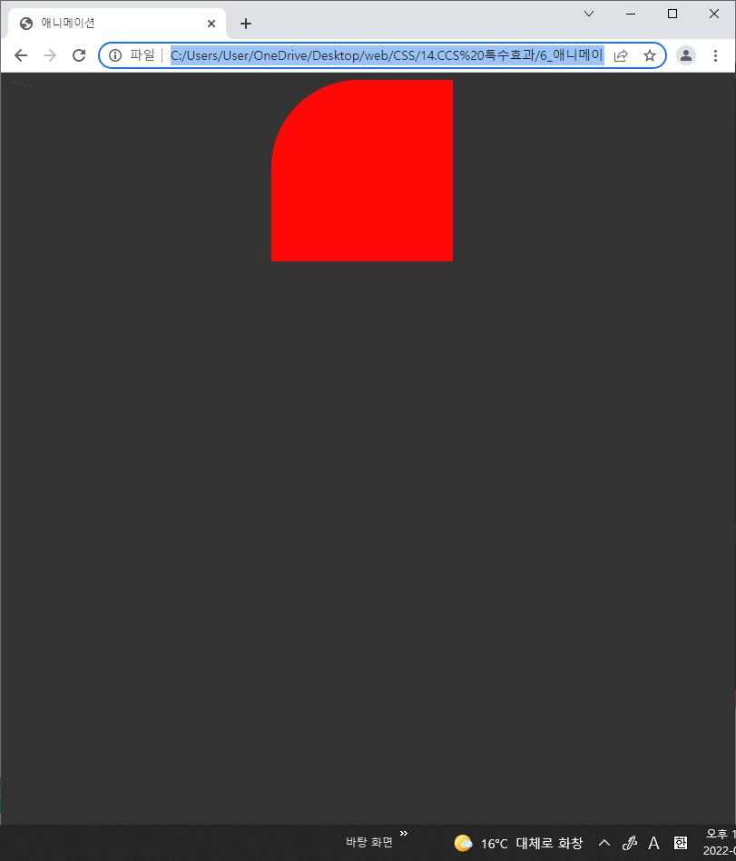
25% {
left: 300px;
top: 0px;
background-color: red;
border-radius: 50% 0 0 0;
}
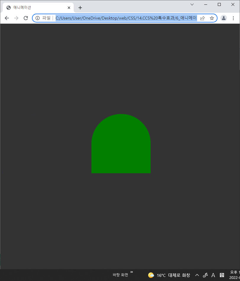
50% {
left: 300px;
top: 300px;
background-color: green;
border-radius: 50% 50% 0 0;
}
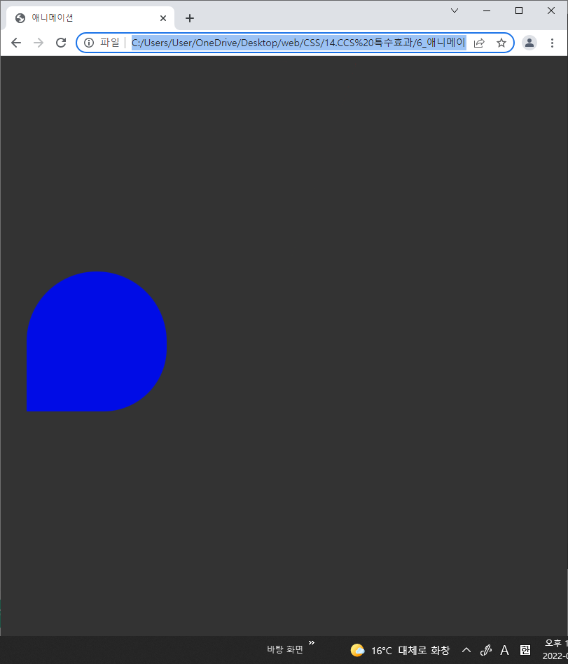
75% {
left: 0px;
top: 300px;
background-color: blue;
border-radius: 50% 50% 50% 0;
}
100% {
left: 0px;
top: 0px;
background-color: white;
border-radius: 50% 50% 50% 50%;
}
}
</style>
</head>
<body>
<div class="box"></div>
</body>
</html>

유망주