
이제 2년차를 넘기고 있는 front-end 개발자 입니다. 아직 부족한 부분이 많다는 것을 알아 주셨으면 좋겠습니다. 🙀
간단하게 길드원을 모집하는 사이트를 만들어 보았습니다.
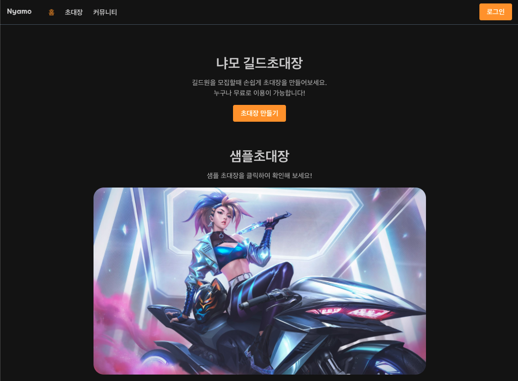
예전에 다니던 직장에서 모바일 초대장 작업을 했었고 그거를 바탕으로 길드원을 모집하는 초대장을 만들어 보고 싶었습니다. 하지만 전 직장에서 front-end 개발만 (react, vue 도 잘 사용을 하지 않았어요 ㅎㅎ) 했던 저에게 back-end 까지 혼자서 만들고 사이트를 만들고 출시하기에는 실력이 부족했고 우선 공부가 먼저! 온라인 강좌를 듣기로 했습니다.
우선 공부 후 만들자!
fornt-end 강의는 찍먹을 많이 한 것 같아요 react,vue,svelte 등등 하지만 다들 간단하게만 했던 것이라 깊이가 부족하다고 생각 했고 다시 한 번 처음부터 공부를 해야 한다고 생각을 했고 인프런에 React로 NodeBird SNS 만들기 를 보고 공부를 한 다음에 길드초대장을 만들었습니다.
다양한 기술?
front-end 기준으로 next.js, typescript, emotion, tailwindcss 를 기본 베이스로 사용 했습니다. 버튼을 예시로 들면 Storybook을 활용하여 본격적으로 디자인 시스템 구축하기 (링크) 에 나오는 버튼을 바탕으로
import { css } from '@emotion/react';
import React, { FC } from 'react';
import styled from '@emotion/styled';
import tw from 'twin.macro';
import { FontAwesomeIcon } from '@fortawesome/react-fontawesome';
import { faSpinner } from '@fortawesome/free-solid-svg-icons';

export type ButtonProps = {
  /** 버튼 안의 내용 */
  children: React.ReactNode;
  /** 클릭했을 때 호출할 함수 */
  onClick?: (e?: React.MouseEvent<HTMLButtonElement>) => void;
  /** 버튼의 생김새를 설정합니다. */
  theme: 'primary' | 'secondary' | 'tertiary';
  /** 버튼의 크기를 설정합니다 */
  size: 'medium' | 'big';
  /** 버튼을 비활성화 시킵니다. */
  disabled?: boolean;
  /** 버튼의 너비를 임의로 설정합니다. */
  width?: string;
  /** 버튼의 타입을 설정합니다. */
  type?: 'button' | 'submit' | 'reset';
  /** 클래스 네임 설정 */
  className?: string;
  // 로딩 설정
  loadingActive?: boolean;
};

const Button = ({ children, theme, size, disabled, width, onClick, type, className, loadingActive }: ButtonProps) => (
  <>
    <ButtonBox
      className={`${
        className && className
      } border-none outline-none box-border rounded text-white dark:text-opacity-80 leading-none hover:opacity-80 font-bold focus:outline-none focus:shadow-lg cursor-pointer`}
      onClick={onClick}
      size={size}
      theme={theme}
      disabled={disabled}
      width={width}
      type={type}
      loadingActive={loadingActive}>
      {children}
      {loadingActive && <FontAwesomeIcon style={{ marginLeft: '5px' }} icon={faSpinner} spin />}
    </ButtonBox>
  </>
);

Button.defaultProps = {
  theme: 'primary',
  size: 'medium',
  width: 'auto',
  type: 'button',
  loading: false,
  className: '',
};

const ButtonBox = styled.button<{ size: string; theme: string; width: string; loadingActive: boolean }>`
  width: ${(props) => props.width};
  // height: ${(props) => (props.size === 'small' ? '1.75rem' : props.size === 'medium' ? '2rem' : '3rem')};
  font-size: ${(props) => (props.size === 'medium' ? '1rem' : '1.125rem')};
  padding: ${(props) => (props.size === 'medium' ? '10px 15px' : '12px 17px')};
  ${(props) => (props.theme === 'primary' ? tw`bg-yellow-500` : props.theme === 'secondary' ? tw`bg-red-500` : tw`bg-gray-500`)}
  ${(props) => props.disabled && tw`cursor-default pointer-events-none bg-gray-300`}
  ${(props) => props.loadingActive && tw`cursor-default pointer-events-none`}
  svg {
    width: 20px;
  }
`;

export default Button;
위 코드처럼 만들었습니다. 그 밖에 다른 기능들은 velog-client git 을보면서 참고도 하면서 기능을 만들었습니다.
만들고 배포를 했지만...
front 는 next.js back 은 express 로 만들어서 배포를 성공적으로 했습니다. 하지만 만들고자 하는 의미만 강했지 세부적인 기획이나 디자인을 따로 만들지 않고 만들고 보니 어딘가 마음에 들지 않았습니다. 거기다 디자인도 도중에 막 바꾸고 그래서 처음 의도했던 디자인과 상당히 달라져 있었습니다. 무엇보다 처음만든 초대장 로스트아크 초대장의 모습도 상당히 부실했습니다. 물론 두번째로 만든 롤 초대장도 많이 부족하지만.... 나중에 다시 개선을 해야 할 것 같아요 😭
이것도 저것도 해보고 싶다?!
배포를 하고 개선사항도 있지만 그 와중에 nest.js 가 눈에 들어왔고

무언가에 이끌리듯이 충동적으로 사이트에 적용을 해봐야 겠다고 생각을 했고 또 다시 강의를 지르고 말았어요 그렇게 Slack 클론 코딩[백엔드 with NestJS + TypeORM] 를 듣고 바로 사이트에 적용하는 작업을 했습니다.

덕분에 한 프로젝트 안에 back폴더가 2개가 생겼습니다 ㅋㅋㅋㅋ
back을 nest.js 으로 변경하고 나서 이번에는 커뮤니티 기능을 만들고 싶어서 현재 꾸준히 만들고 있는 중입니다. 기존 초대장 개선도 해야하지만.... 여러가지 기능을 만들고 싶기도 해요
👉 사이트 바로가기 냐모 길드초대장