
예시
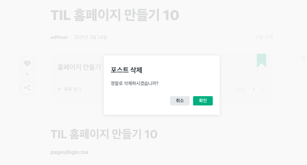
벨로그에 있는 포스트 삭제를 누르면 나오는 모달창을 참고해서 간단하게 만들겠습니다.
react 프로젝트를 기본적으로 설치를 해주고 아래와 같이 패키지를 설치해 줍니다.
현재 프로젝트는 next.js 로 되어져 있습니다.
설치 패키지
- @emotion/core
- @emotion/react
- @emotion/styled
기본구조
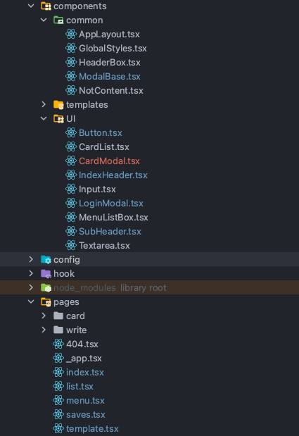
위 이미지처럼 구조를 짜실 필요는 없습니다. 저도 아직 잘... 갈팡지팡 하는 중이라 ㅠㅠ
components 디렉토리를 생성해 주고 common 디렉토리와 UI 디렉토리를 생성한 다음
common 디렉토리 안에 ModalBase.tsx 파일을 생성해주고 아래와 같이 입력해 줍니다.
ModalBase.tsx
import React, { useEffect, useState } from 'react';
import styled from '@emotion/styled';
import { css } from '@emotion/react';

export type ModalBaseProps = {
  active: boolean;
  closeEvent?: (e?: React.MouseEvent<HTMLDivElement>) => void;
  children: React.ReactNode;
};

const ModalBase = ({ active, closeEvent, children }: ModalBaseProps) => {
  const [closed, setClosed] = useState(true);
  useEffect(() => {
    document.body.style.overflowY = active ? 'hidden' : 'initial';

    let timeoutId: any;
    if (active) {
      setClosed(false);
    } else {
      timeoutId = setTimeout(() => {
        setClosed(true);
      }, 200);
    }
    return () => {
      if (timeoutId) {
        clearTimeout(timeoutId);
      }
    };
  }, [active]);

  useEffect(() => {
    return () => {
      document.body.style.overflowY = 'initial';
    };
  }, []);

  if (!active && closed) return null;

  return (
    <>
      <ModalBaseContainer active={active}>
        <div className="modal_back" onClick={closeEvent} />
        <div className="modal_content">{children}</div>
      </ModalBaseContainer>
    </>
  );
};

ModalBase.defaultProps = {
  active: false,
};

const ModalBaseContainer = styled.div<{ active: boolean }>`
  display: flex;
  position: fixed;
  top: 0;
  right: 0;
  bottom: 0;
  left: 0;
  z-index: 99;
  align-items: center;
  justify-content: center;
  padding: 1rem;
  box-sizing: border-box;

  .modal_back {
    position: absolute;
    left: 0;
    top: 0;
    right: 0;
    bottom: 0;
    z-index: 1;
    background-color: rgba(249, 249, 249, 0.85);
  }
  .modal_content {
    position: relative;
    z-index: 10;
    max-width: 400px;
    width: 100%;
    background-color: #fff;
    padding: 2rem;
    border-radius: 15px;
    overflow: hidden;
    box-shadow: rgba(149, 157, 165, 0.2) 0px 8px 24px;
    ${(props) =>
      props.active
        ? css`
            animation: popInFromBottom 0.4s forwards ease-in-out;
          `
        : css`
            animation: popOutToBottom 0.4s forwards ease-in-out;
          `}
  }
  @keyframes popInFromBottom {
    0% {
      opacity: 0;
      transform: translateY(400px) scale(0.75);
    }
    75% {
      opacity: 1;
      transform: translateY(-16px) scale(1);
    }
    100% {
      opacity: 1;
      transform: translateY(0px);
    }
  }
  @keyframes popOutToBottom {
    0% {
      opacity: 1;
      transform: translateY(0px) scale(1);
    }
    100% {
      opacity: 0;
      transform: translateY(400px) scale(0.75);
    }
  }
`;

export default ModalBase;
CardModal.tsx
그 다음 UI 디렉토리 안에 CardModal.tsx 생성하고 아래와 같이 입력해줍니다.
import React, { FC, useEffect, useState } from 'react';
import styled from '@emotion/styled';
import Button from './Button';

export type CardModalProps = {
  active: boolean;
  closeEvent: (e?: React.MouseEvent<HTMLButtonElement>) => void;
  title: string;
  children: React.ReactNode;
  actionMsg: string;
  actionEvent?: (e?: React.MouseEvent<HTMLButtonElement>) => void;
};

const CardModal = ({ closeEvent, title, children, actionMsg, actionEvent }: CardModalProps) => {
  return (
    <>
      <CardModalContainer>
        <h3>{title}</h3>
        <div className="msg">{children}</div>
        <div className="action_box">
          <Button onClick={closeEvent} theme="tertiary">
            닫기
          </Button>
          <Button theme="secondary" onClick={actionEvent}>
            {actionMsg}
          </Button>
        </div>
      </CardModalContainer>
    </>
  );
};

CardModal.defaultProps = {
  active: false,
};

const CardModalContainer = styled.div`
  h3 {
    font-size: 1.5rem;
    font-weight: bold;
  }

  .msg {
    line-height: 1.5;
    font-size: 1rem;
    color: rgb(73, 80, 87);
    margin-top: 1rem;
    margin-bottom: 1rem;
    white-space: pre-wrap;
  }

  .action_box {
    display: flex;
    align-items: center;
    justify-content: flex-end;
    button {
      margin-left: 0.5rem;
    }
  }
`;

export default CardModal;
모달창 띄우기
pages 디렉토리 안에 modal.tsx 폴더를 만들고 아래와 같이 입력해 주세요.
next.js 는 pages 에 폴더를 만들면 자동으로 페이지가 생성됨으로 react 를 기본으로 사용하시는 분들은 react-router-dom 을 설치해서 페이지를 생성해 주세요.
import React, { useState } from 'react';
import ModalBase from '../components/common/ModalBase';
import CardModal from '../components/UI/CardModal';
const Modal = () => {
const [isActive, setIsActive] = useState(false);
const onClickModalOn = () => {
setIsActive(true);
};
const onClickModalOff = () => {
setIsActive(false);
};
const onClickCardRemove = () => {
alert('이벤트 실행');
};
return (
<>
<div>
<h1>모달창 띄우기</h1>
<button onClick={onClickModalOn}>모달창 띄우기 버튼</button>
<ModalBase active={isActive} closeEvent={onClickModalOff}>
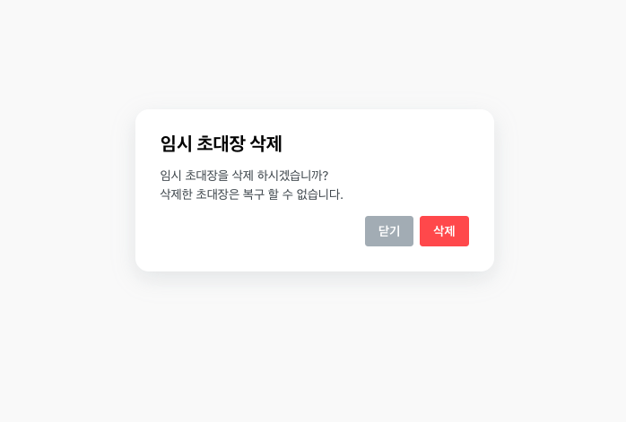
<CardModal closeEvent={onClickModalOff} title="임시 초대장 삭제" actionMsg="삭제" actionEvent={onClickCardRemove}>
임시 초대장을 삭제 하시겠습니까?
<br />
삭제한 초대장은 복구 할 수 없습니다.
</CardModal>
</ModalBase>
</div>
</>
);
};
export default Modal;
이제 localhost 에서 확인해 보면 아래 이미지처럼 나오는 것을 확인 할 수 있습니다.
고칠부분이 많이 있지만 나름대로 쓸 수 있을 것 같아서 적어봤습니다.
참고로 velog git (https://github.com/velopert/velog-client) 과 https://phrygia.github.io/2020-11-16/react-modal 여기 사이트를 많이 참고해서 만들었습니다.

안녕하세요