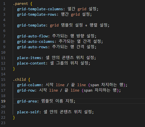
Why Grid?
 |  |
|---|
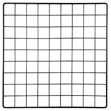
일정한 간격의 격자모양을 flexbox로는 만들어내기 어렵다.
따라서 이를 쉽게 만들어주는 grid가 탄생하였다.
First Rule of Grid
first rule : flexbox와 마찬가지로 부모 요소에 display: grid; 를 입력한다.
how many columns and rows? : grid-template-columns, grid-template-rows
gap : column-gap, row-gap, gap
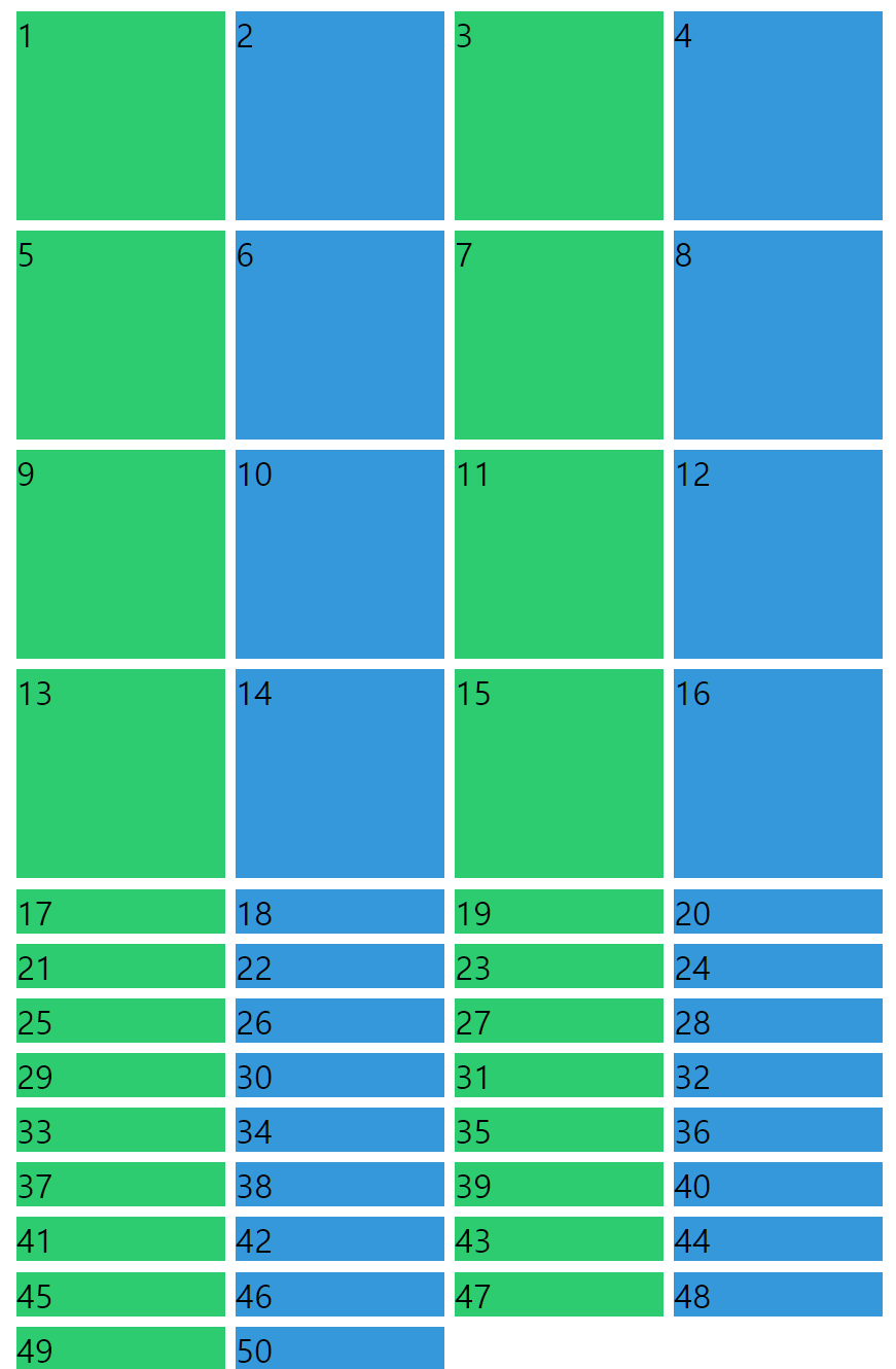
.wrapper {
  height: 100vh;
  display: grid;
  grid-template-columns: 250px 250px 250px;
  grid-template-rows: 100px 50px 300px;
  column-gap: 5px;
  row-gap: 10px;
}
Grid Template Areas
repeat
grid-template-columns: 200px, 200px; -> grid-template-columns: repeat(2, 200px);layout -> grid-template-areas
.grid {
  display: grid;
  grid-template-columns: repeat(4, 200px);
  grid-template-rows: 100px repeat(2, 200px) 100px;
  grid-template-areas:
    "header header header header"
    "content content . nav"
    "content content . nav"
    "footer footer footer footer";
}

.header {
  background-color: aqua;
  grid-area: header; // 자식 요소에 gird area 설정, no string
}

.content {
  background-color: crimson;
  grid-area: content; // 자식 요소에 gird area 설정, no string
}

.nav {
  background-color: darkgreen;
  grid-area: nav; // 자식 요소에 gird area 설정, no string
}

.footer {
  background-color: yellow;
  grid-area: footer; // 자식 요소에 gird area 설정, no string
}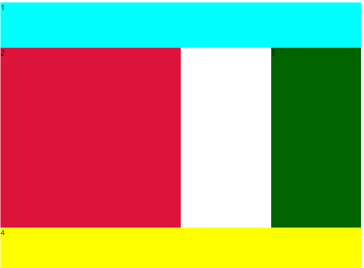 |  |
|---|
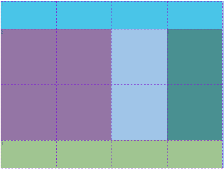
Basic of Grid Template Areas
Stretch Element line to line
.content {
  background-color: crimson;
  grid-column-start: 1; // not element, line number
  grid-column-end: 4;
  grid-row-start: 2;
  grid-row-end: 4;
}
shortcut
grid-column : (start) / (end)
: (start) / (span) -> cell을 얼만큼 차지하는지
-1 => 가장 마지막 라인
Grid Template
fraction : grid에서 사용 가능한 공간
fr값 비율로 공간을 나눈다.
px -> fr : 반응형 디자인 가능해짐 always work with proportion!
항상 block은 width와 height 주어져 있지 않은 경우에는 width는 가능한 한 최댓값, height은 0이다.
grid는 height가 없기 때문에
grid-template-rows: repeat(4,1fr); 비율로 rows를 결정하면 element들이 사라진다. (생각한대로 작동안되면 항상 height 생각)
grid-template-areas
grid-template-columns ----> grid-template
grid-template-rows
grid-template:
    "header header header header" 1fr
    "content content content nav" 2fr
    "footer footer footer footer" 1fr /
    1fr 1fr 1fr 1fr;
grid-template에서 repeat은 사용할 수 없다.
Place Item in Cell
justify-items, align-items
grid cell의 내부 contents 배치 방식을 일괄적으로 적용할 때 사용
Initally children width and height doesn't define but background cover the cell.
justify-items: center;
align-items: center;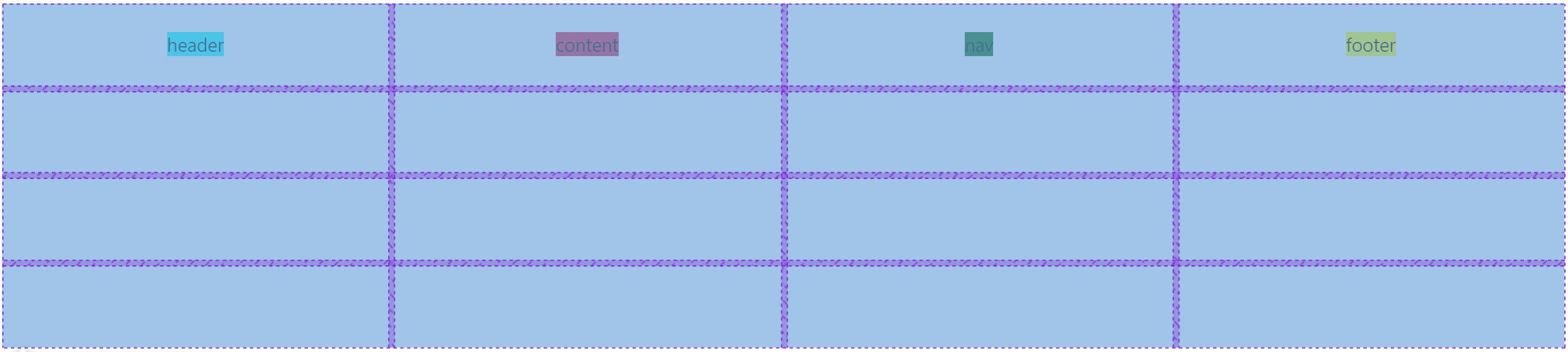
만약 child element의 default size가 있다면 stretch를 적용해도 cell 전체를 cover하지 않는다.
place-items: align-items justify-items
only one cell에 적용
.header {
  background-color: aqua;
  justify-self: center;
  align-self: end;
}
place-self : align-self justify-self
Place the Grid
justify-content : x축 방향 grid 전체의 위치
align-content : y축 방향 grid 전체의 위치
place-content : align-content justify-content
grid-auto-rows & grid-auto-columns
if we have more elements than expected?
grid-auto-rows : 100px // if more element create, that's height will be 100px


grid-template-columns: repeat(4,100px);
grid-auto-rows:100px						-----> 		grid-auto-rows:100px
if i want to create new columns when new elements create
grid-auto-flow : column; // flex-direction: column과 비슷하다
grid-auto-columns:100px;
minmax
각 cell들의 최소, 최대 size를 정해줄 수 있음
grid-template-columns : repeat(5, minmax(100px,1fr));
// 페이지가 계속해서 축소한다면 minmum size를 위해서 page scroll이 생긴다.
auto-fit & auto-fill
반응형 웹사이트의 기본
auto-fit, auto-fill은 전부 repeat() 함수 안에서만 동작한다.
specific number of columns or rows -> auto-fit, auto-fill
auto-fit : 지정된 size안에서 최대한 많은 빈 column을 만든다.
auto-fill : 화면에 남는 자리를 빈공간 없이 채운다.
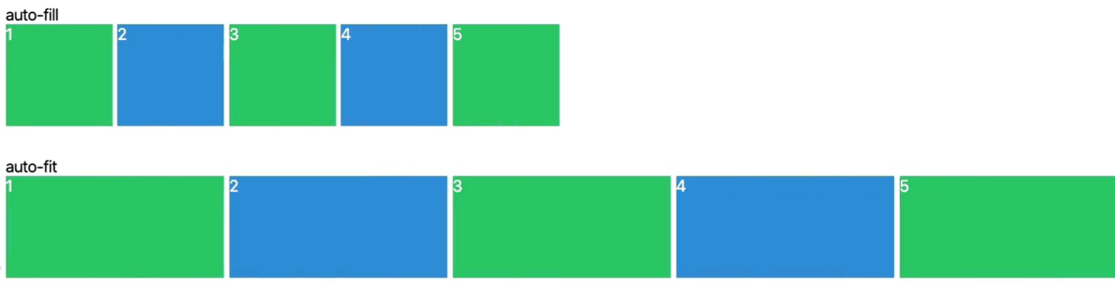
화면의 크기가 작을 때는 두개의 경우 모두 같지만 화면이 커질 때 어떤 방식을 채택할지 정할 수 있다.
Protect the Content
content가 깨지거나 밖으로 튀어나가는 일 없이 content의 크기에 따른 grid 제작 가능
grid-template-columns : max-content min-content;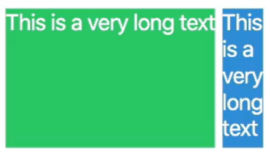
위 세가지의 결합으로 숫자를 사용하지 않고 content에 따른 반응형 디자인을 만들 수 있다.
grid-template-columns : repeat(auto-fill, minmax(max-content,1fr));
Grid Property 정리
grid tutorial game : https://cssgridgarden.com/#ko