CSS 자동완성
postcss extension을 꺼주고
 select language mode를 css로 변경한다
display 속성과 flexbox 필요성
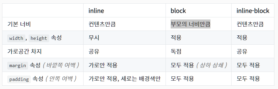
https://www.daleseo.com/css-display-inline-block/
inline(좁게) : span, a
block(넓게) : div, h1, p
inline-block(기본은 좁게, 조절 가능) : button, input
px 단위의 디자인 -.> 모두 다른 screen에 대해 디자인을 유지할 수 없다.
=> flexbox -> grid
first rule of flex box & axis
first rule : flexbox에서 element를 움직이고 싶을 때 => flexbox container를 만들어야 한다.
(inline-box의 weired margin이 사라짐)
main axis 방향으로 item을 옮길 때는 'justify-content'
cross axis 방향으로 item을 옮길 때는 'align-items'
원하는대로 위치이동이 안될 때는 flex-father의 크기 확인 (height 설정!!)
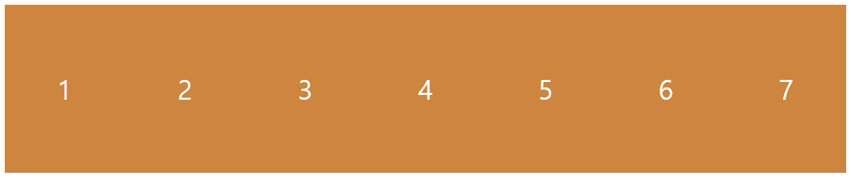
html,
body {
  height: 100%; // height 설정
}

.wrapper {
  height: 100%; // height 설정
  display: flex;
  justify-content: space-around;
  align-items: center;
}

.box {
  width: 200px;
  height: 200px;
  background: peru;
  color: white;
}

or

.wrapper {
  height: 100vh; // height 설정
  display: flex;
  justify-content: space-around;
  align-items: center;
}

.box {
  width: 200px;
  height: 200px;
  background: peru;
  color: white;
}
Child에게 줄 수 있는 유일한 property
align-self : father의 flexbox에 대해서 자신의 위치 설정 (cross-axis)
적용 순위 - align-self > align-items
order : html을 건들지 않고 flexbox 안의 요소들에 대한 순서를 바꿀 수 있다.
기본 order는 0으로 설정
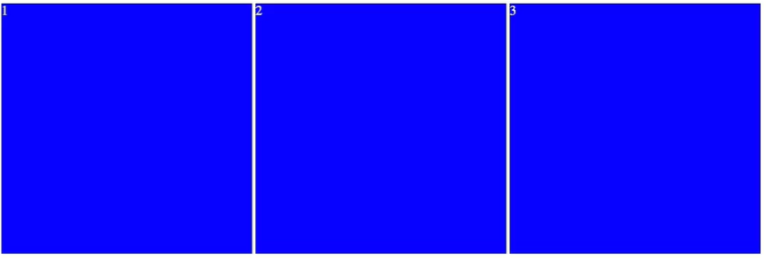
Element가 많아지는 경우 (wrap, align-content)
flexbox는 item들이 모두 같은 줄에 있도록 유지함
flex-wrap : wrap -> respect the size of children
align-content : 행간 공백 결정 (cross-axis)
-item => element 위치 결정
-content => element들 간의 간격 결정
Useful to Responsive Design
child에게 줄 수 있는 property 두번째
flex-shirink : flexbox가 squeeze될 때 element의 행동을 정의 할 수 있다. (어떤 element가 더 찌그러질지)
default = 1
flex-grow : flexbox가 여유 공간이 있을 때 해당 element가 남아있는 빈공간을 가져가 크게 만들 수 있다.
default = 0
.box:nth-child(2) {
  flex-grow: 2;  // 남아있는 공간 2/3 가져감
}

.box:nth-child(3) {
  flex-grow: 1;  // 남아있는 공간 1/3 가져감
flex-item 크기 설정
child에게 줄 수 있는 property 세번째
flex-basis => gie initial size
main-axis 쪽 크기(width) before grow or shirink
flexbox tutorial game : https://flexboxfroggy.com/#ko