
Emotion
Styled-Components와 같이 컴포넌트에CSS를 미리 적용하여 생성하는CSS전처리기
Emotion은 이전 포스팅에서 소개한 Styled-Components와 같이 자바스크립트로 CSS를 다루는 CSS-in-JS 아이디어 기반 도구이다.
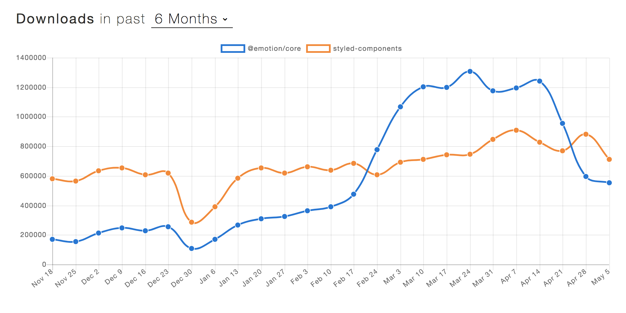
기본적인 문법은 Styled-Components와 큰 차이가 없으며__ 전 세계적으로는 Emotion이, 국내에서는 Styled-Components가 사용량 측면에서 미세하게 우위에 있다.
Emotion, Styled-Components의 차이점
Bundle Size는 Emotion이 작으며, 성능상으로는 유의미한 차이가 존재하지 않는다.
단, Emotion은 SSR(Server Side Rendering)을 위한 개별적인 서버 설정이 필요없다는 장점이 있다.
그래서 SSR시, Emotion과 달리 Styled-Components는 별도의 설정이 필요하다.
Global Styles
Emotion은 Global Styles을 위해 Global, css를 사용한다.
이렇게 정의된 Global Styles는 후에 stlyes props를 받는 Global 태그를 통해 전역으로 적용된다.
- Styled-Components
import { createGlobalStyle } from 'styled-components';
import reset from 'styled-reset';

const GlobalStyles = createGlobalStyle`
  ${reset};

  body {
    font-family: "Roboto", sans-serif;
  }
`

export default GlobalStyles;
// app.js
import React from 'react';
import GlobalStyles from '../styles/global';
const App = ({ Component }) => (
<>
<GlobalStyles />
<Component />
</>
);
export default App;- Emotion
import { Global, css } from '@emotion/react';

const style = css`
  body {
    font-family: "Roboto", sans-serif;
  }
`;

const GlobalStyle = () => {
  return <Global styles={style} />;
};

export default GlobalStyle;
// app.js
import React from 'react';
import GlobalStyle from './styles/global';
const App = ({ Component }) => (
<>
<GlobalStyles />
<Component />
</>
);
export default App;Theme
Theme은 Emotion, Styled-Components 모두 동일하게 별도의 theme style 파일을 생성하여 ThemeProvider를 통해 적용한다.
- Emotion
const size = {
  tablet: "640px",
  desktop: "1800px",
};

const colors = {
  red: '#f26462',
  primaryGray: '#3f4150',
};

const theme = {
  size,
  colors,
};

export default theme;
// app.js
import React from 'react';
import { ThemeProvider } from 'styled-components';
import GlobalStyle from './styles/global';
import Theme from '../styles/Theme';
const App = ({ Component }) => (
<>
<GlobalStyles />
<ThemeProvider theme={Theme}>
<Component />
</ThemeProvider>
</>
);
export default App;단, TypeScript 사용 시에는 theme.d.ts 파일을 생성하여 별도의 type을 지정해줘야 한다.
// theme.d.ts
import '@emotion/react';

declare module '@emotion/react' {
  export interface Theme {
    size: {
      tablet: string;
      desktop: string;
    };
    colors: {
      red: string;
      primaryGray: string;
    };
  }
}
Responsive Layout
Styled-Components는 styled-media-query 라이브러리를 사용하여 반응형 레이아웃을 구현한다.
- Styled-Components
import { generateMedia } from 'styled-media-query'
import { theme } from '../index'

export const media = generateMedia({
  ...theme.breakpoints,
})
export const ResponsiveStyle = styled.div`
padding: 1em;
${media.greaterThan('tablet')`
max-width: 640px;
padding: 2em;
`}
${media.greaterThan('desktop')`
max-width: 1800px;
padding: 4em;
`}
`;Emotion은 별도의 라이브러리 없이 다음과 같은 방법으로 반응형 레이아웃을 구현한다.
- Emotion
const breakPoints = [640, 1800];
const [tablet, desktop] = breakPoints.map(bp => `@media (min-width: ${bp}px)`);

const media = { tablet, desktop };

export default media;
export const ResponsiveStyle = styled.div`
padding: 1em;
${media.tablet} {
max-width: 640px;
padding: 2em;
}
${media.desktop} {
max-width: 1800px;
padding: 4em;
}
`;참고 자료