Styled Components
컴포넌트에 CSS를 미리 적용하여 생성하는 CSS전처리기
Material UI는 컴포넌트 스타일링을 위해 makeStyles, styled의 함수를 자체적으로 제공한다.
하지만 위 함수들은 props에 따른 조건부 스타일링, transition 속성 적용 실패...등등의 단점이 존재한다.
그래서 Material UI는 Styled Components와 같은 별도의 라이브러리를 조합하여 함께 사용한다.
이전 포스팅에서 소개한 Styled Components는 기존 React 컴포넌트에 CSS를 적용하는 CSS전처리기이다.
Material UI에서는 Antd와 동일하게 Styled Components를 사용하여 CSS in JS기법을 컴포넌트에 적용할 수 있다.
사용 방법
Material UI에서 Styled Components를 사용하기 위해서는 해당 컴포넌트를 StyledEngineProvider로 감싸줘야 한다.
import React from 'react';
import { Button, Typography } from '@mui/material';
import { StyledEngineProvider } from '@mui/styled-engine';
import styled from 'styled-components';

const StyleHeader = styled(Typography)`
  font-size: 30px;
  color: blue;
`;

const StyleBtn = styled(Button)`
  background: grey;
  border-radius: 10px;
  color: white;
  height: 40px;
  padding: 0 20px;
`;

const Home = () => {
  return (
    <StyledEngineProvider injectFirst>
      <StyleHeader>Hello, MUI!!</StyleHeader>
      <StyleBtn variant="contained">Button1</StyleBtn>
      <StyleBtn variant="contained">Button2</StyleBtn>
    </StyledEngineProvider>
  )
};

export default Home;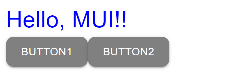
모든 컴포넌트에서 Styled Components를 사용한다면 페이지의 공통 속성을 관리하는 app.js, Applayout.js...등과 최상단 디렉토리 파일에 적용한다.
// app.js
import React from 'react';
import { StyledEngineProvider } from '@mui/styled-engine';

const Training = ({ Component }) => {
  return (
    <StyledEngineProvider injectFirst>
      <Component />
    </StyledEngineProvider>
  );
};

export default Training;
// Home.js
import React from 'react';
import { Button, Typography } from '@mui/material';
import styled from 'styled-components';
const StyleHeader = styled(Typography)`
font-size: 30px;
color: blue;
`;
const StyleBtn = styled(Button)`
background: grey;
border-radius: 10px;
color: white;
height: 40px;
padding: 0 20px;
`;
const Home = () => {
return (
<>
<StyleHeader>Hello, MUI!!</StyleHeader>
<StyleBtn variant="contained">Button1</StyleBtn>
<StyleBtn variant="contained">Button2</StyleBtn>
</>
)
};
export default Home;Styling Componets
Material UI에서 제공하는 Style 변경 목적의 컴포넌트
Material UI는 Styling을 위해 아래와 같은 Styling Componets를 기본적으로 제공한다.
CssBaseline
브라우저에 맞게 일괄적인 스타일을 적용하기 위해서는 CSS를 전역에서 정규화한다.
CssBaseline 컴포넌트는 이러한 정규화 과정에 사용되며, React의 최상위 컴포넌트에서 사용된다.
import React from 'react';
import { CssBaseline } from '@mui/material';

export default function MyApp() {
  return (
    <React.Fragment>
      <CssBaseline />
      {/* 컴포넌트 1 */}
      {/* 컴포넌트 2 */}
      {/*    :      */}
    </React.Fragment>
  );
}
Box
Box 컴포넌트는 HTML의 Div와 같이 스타일 적용을 위해 사용되는 컴포넌트이다.
스타일이 필요한 컴포넌트를 Box 컴포넌트로 감싼 뒤 CSS prop을 설정한다.
주로 padding, margin...등과 같은 가벼운 CSS 속성을 정의하기 위해 사용된다.
import * as React from 'react';
import { Box } from '@mui/material';

export default function BoxSx() {
  return (
    <Box
      sx={{
        width: 300,
        height: 300,
        backgroundColor: 'primary.dark',
        '&:hover': {
          backgroundColor: 'primary.main',
          opacity: [0.9, 0.8, 0.7],
        },
      }}
    />
  );
}
참고 자료
MUI: The React component library you always wanted
React UI 라이브러리 - MUI (Material-ui)