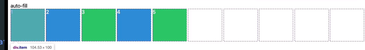
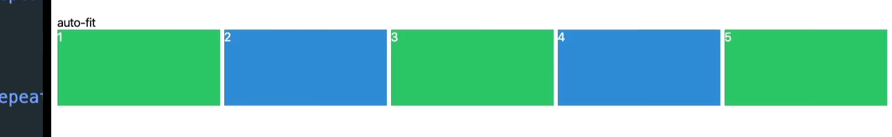
auto-fit auto-fill

특정한 수치를 적어주기 보다 column을 만들어주는 역할을 한다. 우리가 가진 width만큼 empty한 공간에 자동으로 해당 (empty)row룰 채워준다. column이 있는 만큼 가능한 많이 ! 이것이 auto-fill이다.
auto-fit은 남은 공간에 element를 늘려서 딱 맞춰주는 것이다.
이것을 반응형 디자인에 활용하면 좋을 것이다.
auto-fit 은 유동적인 사이즈를 위해서이고
auto-fill 은 정확한 사이즈를 위해서 사용한다.
이것이 반응형 디자인의 기본이다,
노마드 챌린지 반응형 디자인

auto-fit 과 minmax를 같이 써볼까?
<!DOCTYPE html>
<html>
<head>
<meta charset="utf-8">
<meta name="viewport" content="width=device-width">
<title>replit</title>
<link href="style.css" rel="stylesheet" type="text/css" />
<style>
@import url('https://fonts.googleapis.com/css2?family=Bebas+Neue&display=swap');
@import url('https://fonts.googleapis.com/css2?family=Archivo+Narrow:wght@500&family=Bebas+Neue&family=Black+Han+Sans&family=Do+Hyeon&family=Ubuntu+Mono:ital@1&display=swap');
</style>
</head>
<body>
<div class="grid">
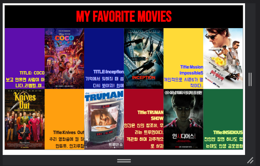
<div class="header">My favorite Movies</div>
<div class="line1">
<div><span>TITLE: COCO<br> 보고 안울면 사람이 아니다..리멤벌..미...</span></div>
<div><img src="https://mblogthumb-phinf.pstatic.net/MjAxODAxMTRfMTU1/MDAxNTE1OTI4MDg1NTk3.Tp4ENyWTJJsWp6Oq4enILlCLe4OK8x9Ekb1AVP0K4oog.711JDDepkM2KYx72wIeS_gFpp6P33UqhQPsbokPjUgQg.JPEG.dcc04134/coco_ver15_xlg.jpg?type=w800"/></div>
<div><span><b>TITLE:Inception</b><br> 기억에서 잊혀질 때 쯤 다시 봐야지! 최애</span></div>
<div><img src= "https://blog.kakaocdn.net/dn/b9DzWV/btqBYvqsc0I/HlpgHdF0smqsx4TLcmKdzk/img.jpg"/></div>
<div><span><b>Title:Mssion impossible5</b><br>개인적으로 시즌5가 명작이다..</span></div>
<div><img src="https://img.hankyung.com/photo/201506/BF.10165593.1.jpg"/></div>
</div>
<div class="line2">
<div><img src="https://blog.kakaocdn.net/dn/Gz1wC/btqAjWRlfKz/I6KULAb7voIP7piTeSe6yK/img.jpg"/></div>
<div><span><b>Title:Knives Out</b><br>추리 영화중에 젤 잘 만든듯. 안지루함<span></div>
<div><img src="https://upload.wikimedia.org/wikipedia/ko/6/6f/%ED%8A%B8%EB%A3%A8%EB%A8%BC_%EC%87%BC_%ED%8F%AC%EC%8A%A4%ED%84%B0.jpg"/></div>
<div><span><b>Title:TRUMAN SHOW</b><br>인간은 신의 창조물, 우리는 트루먼이다. <br>객관화 하며 자주적으로 살자<span></div>
<div><img src="http://t1.daumcdn.net/cfile/12474B4B503DAD2C1E"/></div>
<div><span><b>Title:INSIDIOUS</b><br>잔인한 장면 하나도 없는데도 인생 공포영화</span></div>
</div>
<script src="script.js"></script>
</body>
</html>.grid{
display:grid;
grid-template-rows: 15vh repeat(2, minmax(10px,40vh));
border: 1px solid black;
}
.header{
display: flex;
align-items:center;
justify-content: center;
font-family: 'Bebas Neue', cursive;
font-size: 10vmin;
font-weight: 600;
background-color:black;
color:red;
}
.line1{
display:grid;
grid-template-columns: repeat(auto-fit, minmax(1px,1fr));
grid-template-rows: 100%;
}
.line2{
display:grid;
grid-template-columns: repeat(auto-fit, minmax(10px,1fr));
grid-template-rows: 100%;
}
img{
width:100%;
height:100%;
}
.line1 div, .line2 div{
display: flex;
align-items:flex-end;
text-align: right;
font-size: 2vmax;
font-family: 'Do Hyeon', sans-serif;
}
.line1 div:nth-child(1){
color:yellow;
background-color:rgb(93, 14, 172);
}
.line1 div:nth-child(3){
color:rgb(180, 185, 255);
background-color:rgb(9, 17, 129);
}
.line1 div:nth-child(5){
color:rgb(61, 61, 255);
background-color:rgb(255, 218, 55);
}
.line2 div:nth-child(2){
color:rgb(53, 32, 18);
background-color:rgb(255, 159, 15)
}
.line2 div:nth-child(4){
color:rgb(255, 244, 148);
background-color:rgb(168, 6, 33);
}
.line2 div:nth-child(6){
color:rgb(232, 255, 141);
background-color:rgb(25, 104, 61);
}
텍스트는 font-size: 2vmax; 로 해서 페이지 크기에 맞게 커지고 줄어들도록 했다..

자신만의 속도로