border에 gradient 색상을 넣어야할 때가 있었다.
당연히 기존처럼
border: 1px solid linear-gradient(#e66465, #9198e5);이런식으로 넣어봤는데 먹히지 않았다...!
그 이유는 MDN에 적힌바에 따르면 다음과 같다.
Because <gradient>s belong to the <image> data type,
they can only be used where <image>s can be used.

For this reason, linear-gradient() won't work
on background-color and other properties that use the <color> data type.
gradient 는 image data type에 속해있기 때문에 image 에서만 쓸 수 있는 것이다.
color 관련 css에는 못 쓴다!
그래서 background-color 에 이 값을 넣으면 사용되지 않고, background-image 에 넣어야하는 제대로 동작하는 것을 볼 수 있다!
그래서 border의 color 쪽에는 동작하지 않는 것이다.
따라서 border에 gradient 를 주려면 약간의 꼼수? 를 써야한다.
그래서 알아낸 방식은 2가지가 있는데 아래와 같다.
import * as React from 'react';
import './style.css';
export default function App() {
return (
<>
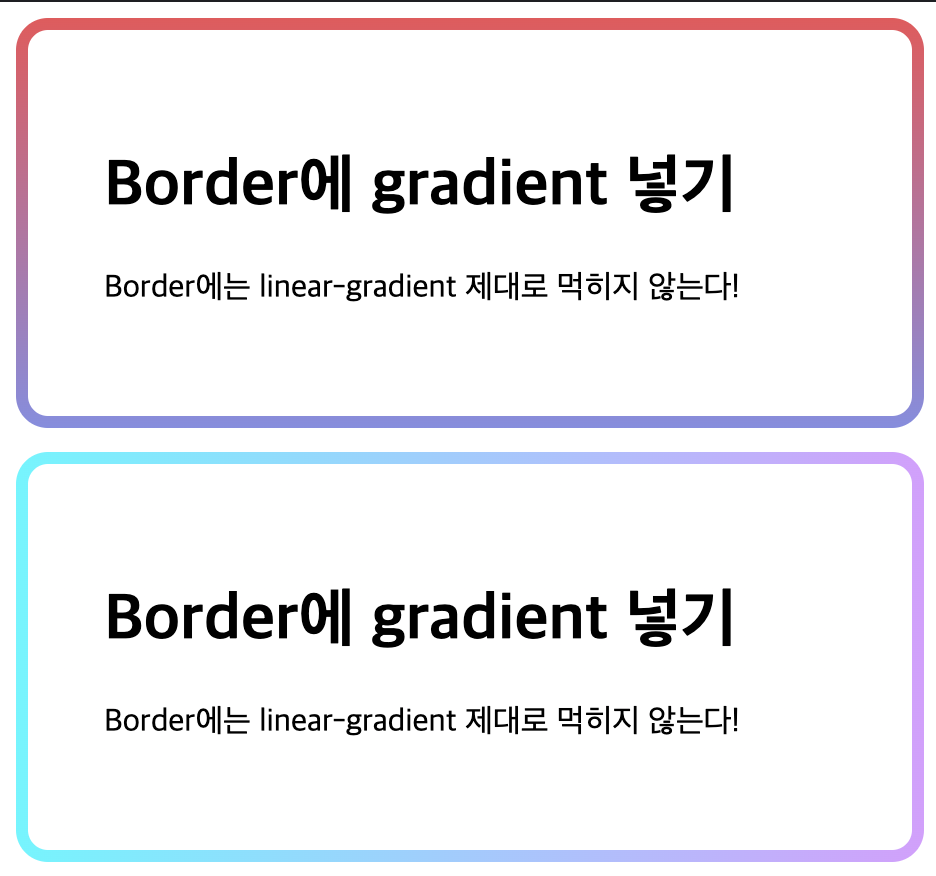
<div className="border__gradient">
<h1>Border에 gradient 넣기</h1>
<p>Border에는 linear-gradient 제대로 먹히지 않는다!</p>
</div>
<div className="border__gradient2">
<h1>Border에 gradient 넣기</h1>
<p>Border에는 linear-gradient 제대로 먹히지 않는다!</p>
</div>
</>
);
}
style.css
.border__gradient {
  position: relative;
  padding: 38px;
  border: 6px solid transparent;
  border-radius: 16px;
  background: white;
  background-clip: padding-box;
  box-sizing: border-box;
}

.border__gradient::before {
  content: '';
  position: absolute;
  top: 0;
  right: 0;
  bottom: 0;
  left: 0;
  z-index: -1;
  margin: -6px;
  border-radius: inherit;
  background: linear-gradient(#e66465, #9198e5);
  box-sizing: border-box;
}

.border__gradient2 {
  margin-top: 12px;

  padding: 38px;
  border: 6px solid transparent;
  background: linear-gradient(to right, white, white) padding-box,
    linear-gradient(to right, #78f7ff, #d9a9ff) border-box;
  border-radius: 16px;
}
첫번째 방법은 before로 아래쪽에 linear-gradient 가 그려진 곳 위에 흰바탕의 본문을 덮는 것이고,
두번째 방법도 비슷한데, border-box를 가지는 걸로 (더 크게) 바탕을 그리고 그 위에 padding-box 를 가지는 흰 바탕을 올리는 것이다. 결과는 아래와 같다.
전체 코드는 여기에서 확인해볼 수 있다.

5년차 프론트엔드 개발자 문건우입니다.