CONTENTS
- python 활용 데이터 시각화 ✅
SUMMARY
- 기본 그래프 그리기
-
데이터분석가에게 시각화란?
: 데이터 분석 결과를 시각적으로 표현하고 의사소통 하는것! 중요한 역량 중 하나로 필수로 필요한 기술!
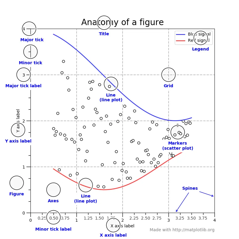
이런식으로 타부서에게 공유하여 한눈에 이해할 수 있게 해줘야한다. -
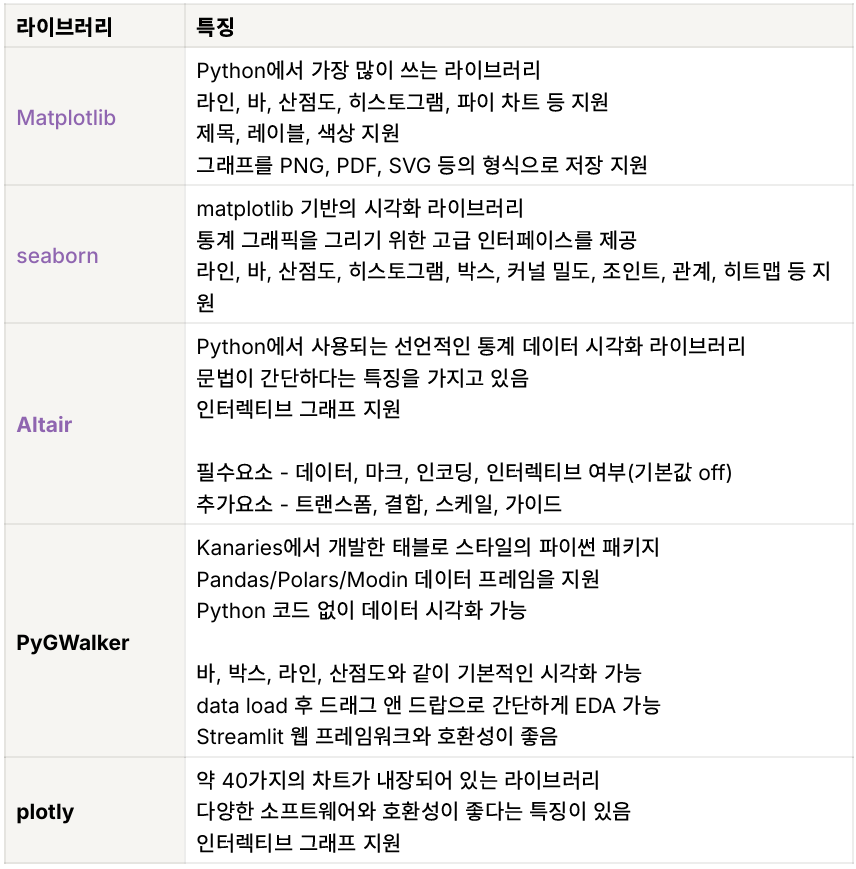
유용한 시각화 라이브러리
-
그래프 그리기.
파이썬에는 라이브러리가 없어도 기본 내장함수가 존재하기때문에.polt을 해주면 그래프가 바로 나온다. 하지만 비주얼적으로 많이 사용하지 않음.(너무 단순)
:group by 연산 이후 .plot 을 통해, 간단히 그래프가 구현된다.
# 기본 그래프 그리기
df2.groupby('Gender')['Customer ID'].count().plot.bar()
# 컬러 지정
df2.groupby('Gender')['Customer ID'].count().plot.bar(color=['yellow','purple'])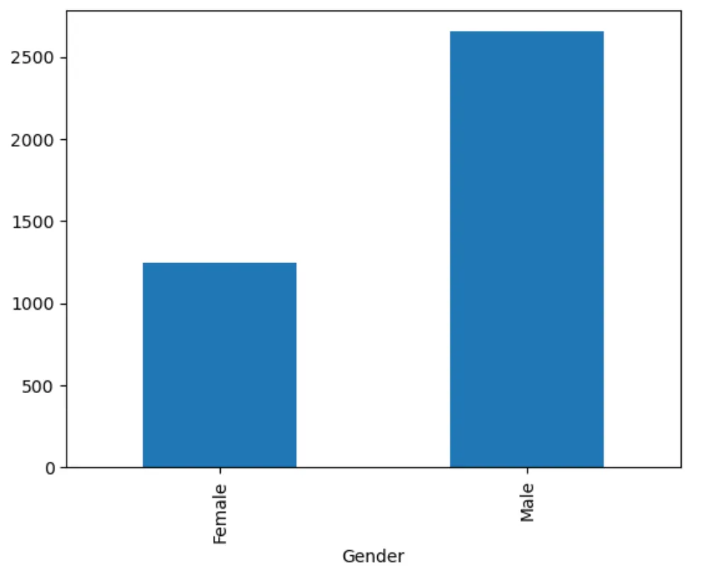
0_2. 라이브러리 import
import pandas as pd
import numpy as np
import time
from PIL import Image
import altair as alt
import seaborn as sns
import matplotlib.pyplot as plt
import datapane as dp
# seaborn 팔레트 설정
palette = sns.color_palette("pastel")

import warnings
# 오류 경고 무시하기
warnings.filterwarnings(action='ignore')
*기본적으로 전처리 이후에 시각화 가능!
- 데이터시각화 - matplotlib
-
설치: pip install matplotlib
:python 시각화 라이브러리 중 가장 많은 기능을 지원하는 라이브러리.
-
또한, 여러개를 동시에 그려볼 수 도 있다!
#총 4개의 구역 만들기
fig,ax=plt.subplots(2,2) -
라인그래프 그리기
# dataframe 컬럼 확인하기
df2.columns

# 카테고리별 유저수 구하기
# 인덱스 가리기: .style.hide_index() : 사용하면 그래프를 그릴 수 없습니다. 참고해주세요
d1 = df2.groupby('Category')['Customer ID'].count().reset_index()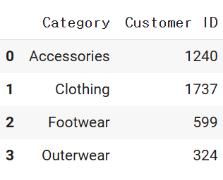
# matplotlib 라이브러리를 통한 그래프 그리기
# figure 함수를 이용하여, 전체 그래프 사이즈 조정
dplot1 = plt.figure(figsize = (4 , 3))

# x축, y축 설정
x=d1['Category']
y=d1['Customer ID']

# 그래프 그리기
# 보라색, * 으로 데이터포인트 표시, 투명도=50%, 라인 굵기 5
plt.plot(x, y, color='purple', marker='*', alpha=0.5, linewidth=5)

plt.title("group by category - user cnt")
plt.xlabel("category")
plt.ylabel("usercnt")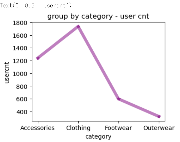
피벗을 먼저 만들고 시각화를 해줘야 편함!
- 막대그래프 그리기
# 카테고리, 성별 유저수 구하기
# stack 은 pivot 테이블과 비슷하게, 데이터프레임을 핸들링하는 데 주로 사용됩니다.
# 반대로 인덱스를 컬럼으로 풀어주는 unstack 이 있습니다.
d2 = df2.groupby(['Category','Gender'])['Customer ID'].count().unstack(1)# 성별이 컬럼으로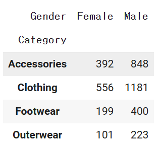
# python 내장함수 plot 사용하기
# 막대 그래프, 컬러는 hex code 를 사용하여 지정할 수 있습니다.
# hex code 찾기: https://html-color-codes.info/
dplot8 = d2.plot(kind='bar',color=['#F4D13B','#9b59b6'])
plt.title("bar plot1")
plt.xlabel("category")
plt.ylabel("usercnt")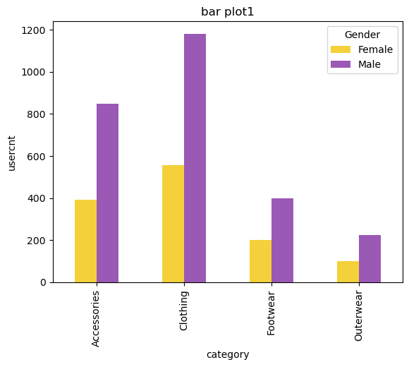
- 누적 막대그래프 그리기(상대치를 비교하기 위해서 사용)
# python 내장함수 plot 사용하기
# 카테고리, 성별 유저수 구하기
# stacked=True 로 설정하면 누적그래프를 그릴 수 있습니다.
dplot9 = d2.plot(kind='bar', stacked=True, color=['#F4D13B','#9b59b6'])
plt.title("bar plot2")
plt.xlabel("category")
plt.ylabel("usercnt")
*stacked=True의 차이만 존재!
- 파이차트 그리기
# 성별 비중 구하기
piedf = df2.groupby('Gender')['Customer ID'].count().reset_index()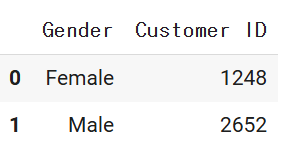
# matplotlib 라이브러리를 통한 그래프 그리기
# 파이차트 그리기
# labels 옵션을 통해 그룹값을 표현해줄 수 있습니다.
dplot7= plt.figure(figsize=(3,3))
plt.pie(
    x=piedf['Customer ID'],
    labels=piedf['Gender'],
    # 소수점 첫째자리까지 표시
    autopct='%1.1f',
    colors=['#F4D13B','#9b59b6'],
    startangle=90
)
# 범례 표시하기
plt.legend(piedf['Gender'])
# 타이틀명, 타이틀 위치 왼쪽, 타이틀 여백 50, 글자크기, 굵게 설정
plt.title("pie plot", loc="left", pad=50, fontsize=8, fontweight="bold")
plt.show()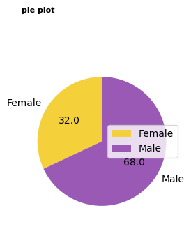
- 산점도 그리기
# 나이와 평균 결제금액 분포 나타내기
d3 = df2.groupby('Age')['Purchase Amount (USD)'].mean().reset_index()

# matplotlib 라이브러리를 통한 그래프 그리기
# x축: 나이 / y축: 구매금액, 데이터 포인트 색상: red
plt.scatter(d3['Age'],d3['Purchase Amount (USD)'], c="red")
- 이중축 그래프 그리기(심화)
: x축을 공유하지만 각각의 y축이 존재하는 그래프이다.
# matplotlib 라이브러리와 내장함수를 통한 그래프 그리기
# 1. 기본 스타일 설정
plt.style.use('default')
plt.rcParams['figure.figsize'] = (4, 3)
plt.rcParams['font.size'] = 12

# 2. 데이터 준비
x = np.arange(2020, 2027)
y1 = np.array([1, 3, 7, 5, 9, 7, 14])
y2 = np.array([1, 3, 5, 7, 9, 11, 13])

# 3. 그래프 그리기- line 그래프
# subplot 모듈을 사용하면 여러 개의 그래프를 동시에 시각화할 수 있습니다.
# 전체 도화지를 그려주고(figure) 위치에 각 그래프들을 배치한다고 이해해주세요.
fig, ax1 = plt.subplots()

# 라인 그래프
# 선 색상 초록, 굵기 5, 투명도 70%, 축 이름: Price
ax1.plot(x, y1, color='green', linewidth=5, alpha=0.7, label='Price')
# y 축 범뮈 설정
ax1.set_ylim(0, 20)
# y 축 이름 설정
ax1.set_ylabel('Price ($)')
# x 축 이름 설정
ax1.set_xlabel('Year')


# 3. 그래프 그리기- bar 그래프
# x축 공유(즉, 이중축 사용 의미)
ax2 = ax1.twinx()
# 막대 보라색, 투명도 70%, 막대 넓이 0.7
ax2.bar(x, y2, color='purple', label='Demand', alpha=0.7, width=0.7)
# y 축 범뮈 설정
ax2.set_ylim(0, 18)
# y 축 이름 설정
ax2.set_ylabel(r'Demand ($\times10^6$)')

# 레이블 위치
# 클수록 가장 위쪽에 보여진다고 생각하면 됨.
# ax2.set_zorder(ax1.get_zorder() + 10) 와 비교해보세요!
ax1.set_zorder(ax2.get_zorder() + 20)
ax1.patch.set_visible(False)

# 범례 지정, 위치까지 함께
ax1.legend(loc='upper left')
ax2.legend(loc='upper right')

plt.show()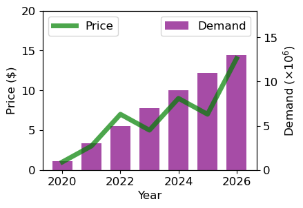
- 피라미드 그래프 그리기(선택)
# matplotlib 라이브러리를 통한 그래프 그리기
# 나이대별 성별 유저수 구하기
# 피라미드 차트 그리기
# 나이 구간 설정
bins2 = [10, 15, 20, 25, 30, 35, 40, 45, 50, 55, 60, 65, 70, 75, 80]

# cut 활용 절대구간 나누기
# bins 파라미터는 데이터를 나눌 구간의 경계를 정의
# [0, 4, 8, 12, 24]는 0~4, 4~8, 8~12, 12~24의 네 구간으로 데이터를 나누겠다는 의미

df2["bin"] = pd.cut(df2["Age"], bins = bins2)

# apply 와 lambda 를 활용한 전체 컬럼에 대한 나이 구간 컬럼 추가하기
#15는 15-20 으로 반환됨
df2["age"] = df2["bin"].apply(lambda x: str(x.left) + " - " + str(x.right))
#5 - 10이런식으로 표기해줌.

# 나이와 성별 두 컬럼을 기준으로 유저id 를 count 하고 인덱스 재정렬
df7 = df2.groupby(['age','Gender'])['Customer ID'].count().reset_index()

# 계산한 결과를 바탕으로 피벗테이블 구현
df7 = pd.pivot_table(df7, index='age', columns='Gender', values='Customer ID').reset_index()

# 피라미드 차트 구현을 위한 대칭 형태 만들어주기
df7["Female_Left"] = 0
df7["Female_Width"] = df7["Female"]
df7["Male_Left"] = -df7["Male"]
df7["Male_Width"] = df7["Male"]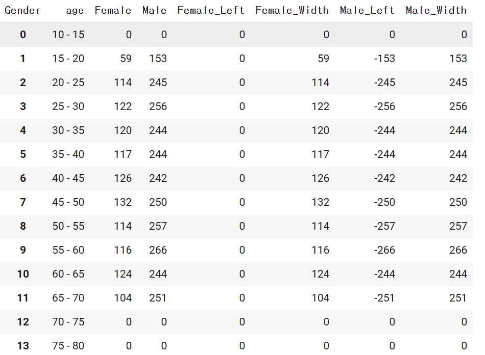
# matplotlib 라이브러리를 통한 그래프 그리기
dplot6 = plt.figure(figsize=(7,5))

# 수평막대 그리기 barh사용. 색상과 라벨 지정
plt.barh(y=df7["age"], width=df7["Female_Width"], color="#F4D13B", label="Female")
plt.barh(y=df7["age"], width=df7["Male_Width"], left=df7["Male_Left"],color="#9b59b6", label="Male")

# x 축과 y 축 범위 지정
plt.xlim(-300,270)
plt.ylim(-2,12)
plt.text(-200, 11.5, "Male", fontsize=10)
plt.text(160, 11.5, "Female", fontsize=10, fontweight="bold")

# 그래프에 값 표시하기
# 해당 구문을 없애고 실행해보세요!
# 외울 필요는 없습니다.
# plt.text()는 그래프의 특정 위치에 텍스트를 표시
# 텍스트를 표시할 위치 설정
# x=df7["Male_Left"][idx]-0.5: x좌표는 df7의 "Male_Left" 열의 값에서 0.5를 뺀 위치
# y=idx: y좌표는 현재 인덱스 (idx)로 설정되어, y축 방향으로 각 인덱스 위치에 텍스트 표시
# s="{}".format(df7["Male"][idx]): 표시할 텍스트는 df7의 "Male" 열에 있는 값을 문자열로 변환
# ha="right": 텍스트의 수평 정렬 오른쪽
# va="center": 텍스트의 수직 정렬 중앙
for idx in range(len(df7)):
    # 남성 데이터 텍스트로 추가
    plt.text(x=df7["Male_Left"][idx]-0.5, y=idx, s="{}".format(df7["Male"][idx]),
             ha="right", va="center",
             fontsize=8, color="#9b59b6")
    # 여성 데이터 텍스트로 추가
    plt.text(x=df7["Female_Width"][idx]+0.5, y=idx, s="{}".format(df7["Female"][idx]),
             ha="left", va="center",
             fontsize=8, color="#F4D13B")
# 타이틀 지정. 이름, 위치, 여백, 폰트사이즈, 굵게 설정
plt.title("Pyramid plot", loc="center", pad=15, fontsize=15, fontweight="bold")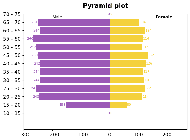
*값을 하나하나 입력해줘야하는 수고로움이 존재.
- 여러개의 그래프 그리기
#figure,ax 만들기
fig,ax=plt.subplots(2,2)

#그래프 그리기
ax[0,0].plot(np.linspace(0,100,20),np.linspace(0,100,20)**2, marker='o', markersize=2, markeredgecolor='y')
ax[0,1].hist(np.random.randn(500), bins=30, color='purple', alpha=0.5)
ax[1,0].bar([1,3,5,7],np.array([1,2,3,4]),color='r')
ax[1,1].boxplot(np.random.randn(500,5))# 표준정규분포 임의로 생성

#그래프 사이 간격 추가
fig.subplots_adjust(hspace=0.5,wspace=0.3)

#그래프별 타이틀 추가
ax[0,0].set_title("line plot", fontsize=9)
ax[0,1].set_title("hist plot", fontsize=9)
ax[1,0].set_title("bar plot", fontsize=9)
ax[1,1].set_title("box plot", fontsize=9)
plt.show()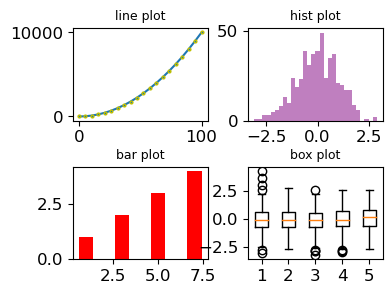
- 데이터시각화 - seaborn
-
설치: pip install seaborn
Matplotlib을 기반으로 다양한 색상 테마와 통계용 차트 등의 기능을 추가한 시각화 패키지.
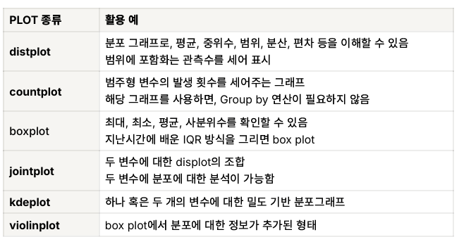
*Heat Map: 일반적으로 연속형 변수의 상관관계를 파악하기 위한 그래프 (pearson)
(범주형도 가능하나 자주 사용하지 않습니다. -Cramer's V) -
바 그래프 그리기
# seaborn 라이브러리를 통한 그래프 그리기
p = ["#F4D13B","red"]
sns.set_palette(p)

plot1 = (sns.barplot(data=df33,x= "Gender",y= "Customer ID"))
# containers: 각 막대 / labels: 각 막대의 높이를 텍스트로 반환
plot1.bar_label(plot1.containers[0], labels=df33['Customer ID'], fontsize=7, color='blue')
plot1.set_title("User - bar chart")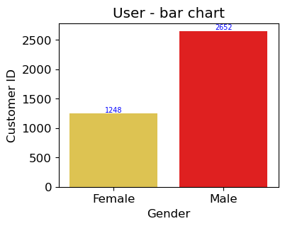
*plt.과 다르게 값을 바로 반영시킬 수 있다는 편리함이 존재한다.
- 바 그래프 그리기2
# seaborn 라이브러리를 통한 그래프 그리기
# 월별 유저수 구하기
mask2 = (df3['Time stamp']>' ')

# 시간이 있는 데이터 필터링
df8 = df3[mask2]

# 시간별로 유저수 카운트
df8.groupby('Time stamp')['user id'].count()
Time stamp
01/01/2023 0:00 18
01/01/2023 10:00 18
01/02/2023 10:00 6
01/03/2023 10:00 4
01/04/2023 10:00 4
..
31/05/2023 10:00 4
31/07/2023 10:00 3
31/08/2023 10:00 3
31/10/2023 8:00 20
31/12/2022 10:00 18
Name: user id, Length: 366, dtype: int64
# inner join 시행
merge_df = pd.merge(df2,df8, how='inner', left_on='Customer ID', right_on='user id')

# object -> datetime
df8['Date'] = pd.to_datetime(df8['Time stamp']).dt.strftime('%Y-%m')

# 월별 유저수 카운트
df9 = df8.groupby('Date')['user id'].count().reset_index()

# 컬럼명 변경, 기존 dataframe 덮어씌움
df9.rename(columns = {'user id' : 'user count'}, inplace = True)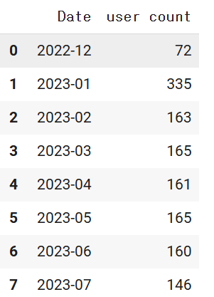
# seaborn 라이브러리를 통한 그래프 그리기
plt.figure(figsize=(15, 8))
dplot1 = sns.barplot(x="Date", y="user count", data=df9, palette='rainbow')
dplot1.set_xticklabels(dplot1.get_xticklabels(), rotation=30)
dplot1.set(title='Monthly Active User') # title barplot

# 바차트에 텍스트 추가하기
# patches 는 각 막대를 의미 .
for p in dplot1.patches:
    # 각 바의 높이 구하기
    height = p.get_height()
    # X 축 시작점으로부터, 막대넓이의 중앙 지점에 텍스트 표시
    dplot1.text(x = p.get_x()+(p.get_width()/2),
    # 각 막대 높이에 10 을 더해준 위치에 텍스트 표시
    y = height+10, #-로 하면 그래프 안에 텍스트 표시 가능!
    # 값을 정수로 포맷팅
    s = '{:.0f}'.format(height),
    # 중앙 정렬
ha = 'center') 
- 카운트그래프 그리기
# seaborn 라이브러리를 통한 그래프 그리기
# 시즌별 카테고리별 유저수(count 값과 동일) 구하기
plt.figure(figsize=(6, 5))
# hue 는 범례입니다.
dplot2 = sns.countplot(x='Category', hue='Gender', data=df2, palette='cubehelix')
dplot2.set(title='bar plot3')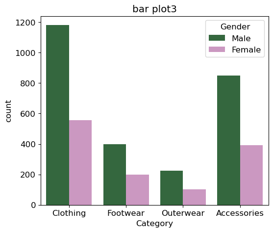
- 히스토그램 그래프 그리기
# seaborn 라이브러리를 통한 그래프 그리기
#나이별 데이터 count 나타내기
#분포를 나타내는 그래프로 데이터 갯수를 세어 표시

sns.histplot(x=df2['Age'])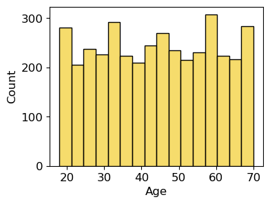
- 박스플롯 그리기
# seaborn 라이브러리를 통한 그래프 그리기
# 최대(maximum), 최소(minimum), mean(평균), 1 사분위수(first quartile), 3 사분위수(third quartile)를 보기 위한 그래프
# 이상치 탐지에 용이(저번시간에 배운 IQR)
sns.boxplot(x = df2['Purchase Amount (USD)'],palette='Wistia')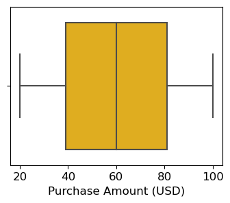
# seaborn 라이브러리를 통한 그래프 그리기
# 박스플롯 응용
dplot5 = sns.boxplot(y = df2['Purchase Amount (USD)'], x = df2['Gender'], palette='PiYG')
dplot5.set(title='box plot yeah')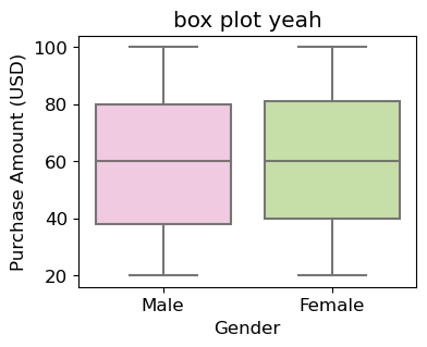
- 상관관계 그래프 그리기(heatmap, annot = True를 안하면 숫자제거됨)
#연속형 변수 상관관계 히트맵 구현
df10 = df2[['Age','Purchase Amount (USD)','Review Rating','Previous Purchases']]
df10.describe()

# 상관계수 구하기
df10.corr()

# seaborn 라이브러리를 통한 그래프 그리기
# annot: 각 셀의 값 표기,camp 는 팔레트
dplot10 = sns.heatmap(df10.corr(), annot = True, cmap = 'viridis') # camp =PiYG 도 넣어서 색상을 비교해보세요.
dplot10.set(title='corr plot')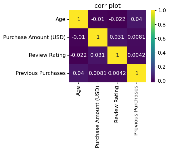
- 조인트 그래프 그리기
# seaborn 라이브러리를 통한 그래프 그리기
#두 변수에 분포에 대한 분석시 사용
#hex 를 통해 밀도 확인
sns.jointplot(x=df2['Purchase Amount (USD)'], y=df10['Review Rating'], kind = 'hex', palette='cubehelix')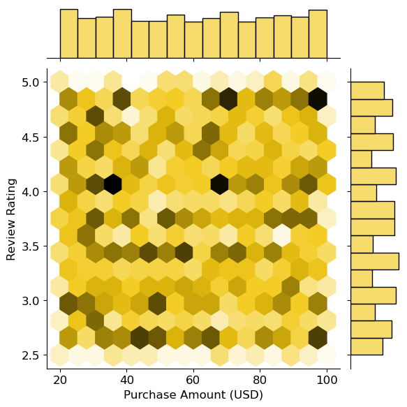
3.데이터시각화 - Altair
-
설치: pip install altair
:Altair 는 다른 라이브러리와 다르게, 문법적인 요소가 강한 라이브러리
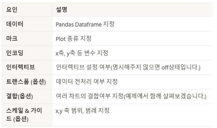
*데이터, 마크, 인코딩은 필수 문법으로 반드시 지정해줘야한다. -
바 그래프 그리기:Chart().mark_bar().encode()는 필수!
# altair 라이브러리를 통한 그래프 그리기
# 월별 유저수 interactive 그래프 구현
source=df9
alt.Chart(source).mark_bar().encode(
    x='Date',
    y='user count'
).interactive() # 동적 구현 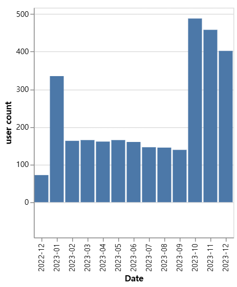
*.interactive(): 움직이게 만들 수 있음!
- 파이차트 그리기
# altair 라이브러리를 통한 그래프 그리기
source = df33
colors = ['#F4D13B','#9b59b6']
#innerRadius=50 >> 도넛차트의미
dplot3 = (
alt.Chart(source).mark_arc(innerRadius=50).encode(
    theta="Customer ID",
    color="Gender",

).configure_range(category=alt.RangeScheme(colors))) # 컬러 반영하기
dplot3.title = "donut plot" # 타이틀 설정
dplot3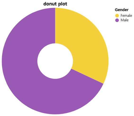
- 동적 그래프 그리기
# altair 라이브러리를 통한 그래프 그리기
#나이, 구매금액에 따른 남성/여성 유저수 확인하기
df5 = df2.groupby(['Age','Gender'])['Purchase Amount (USD)'].sum().reset_index()
df6 = df2.groupby(['Age','Gender'])['Customer ID'].count().reset_index()
merge_df =pd.merge(df5, df6, how='inner', on=['Age','Gender'])
# altair 라이브러리를 통한 그래프 그리기
source = merge_df
colors = ['pink','#9b59b6']
# 선택(드래그) 영역 설정
brush = alt.selection_interval()
points = (alt.Chart(source).mark_point().encode(
# Q: 양적 데이터 타입 / N: 범주형 데이터 타입
x='Age:Q',
y='Purchase Amount (USD):Q',
# 선택되지 않은 부분은 회색으로 처리
color=alt.condition(brush, 'Gender:N', alt.value('lightgray')),
).properties( # 선택 가능영역 설정
width=1000,
height=300
)
.add_params(brush)) # 산점도에 드래그 영역 추가하는 코드
# 아래쪽 가로바차트
bars = alt.Chart(source).mark_bar().encode(
y='Gender:N',
color='Gender:N',
x='sum(Customer ID):Q'
).properties(
width=1000,
height=100
).transform_filter(brush) # 산점도에서 선택된 데이터만 필터링해 막대 그래프에 반영
#산점도와 막대 그래프를 수직으로 결합
dplot4 = (points & bars)
dplot4= dplot4.configure_range(category=alt.RangeScheme(colors))
dplot4
*내가 선택한 그래프를 볼 수 있다!
- 그 외 꿀팁
- pygwalker
#pip install pygwalker
import pygwalker as pyg
df2 = pd.read_csv("customer_details.csv") # customer_details.csv
walker = pyg.walk(df2)
그래프가 어떻게 생겼는지 바로 확인 가능!추출도 가능하다!
집계를하면 그래프가 하나만 보이기때문에 집계를 꺼주면 해결 가능!
대신, 너무 많아서 잘 안보일 수 있음.
KEY POINT
그래프는 다양한 옵션이 있고, 이것을 설정하고 안하고는 개인의 선택!
그리고 많은 것을 담으려면 하나씩 설정을 해줘야하는 수고로움이 있지만, 이건 라이브러리에 따라 다르기 때문에 자신에게 잘 맞는 라이브러리를 선택하는게 좋다.
그리고 모든 과정을 암기할 필요는 없고, 손에 익히는 정도만!
가장 중요한것은 시각화 하기 전에 반드시 전처리 과정이 중요하다!