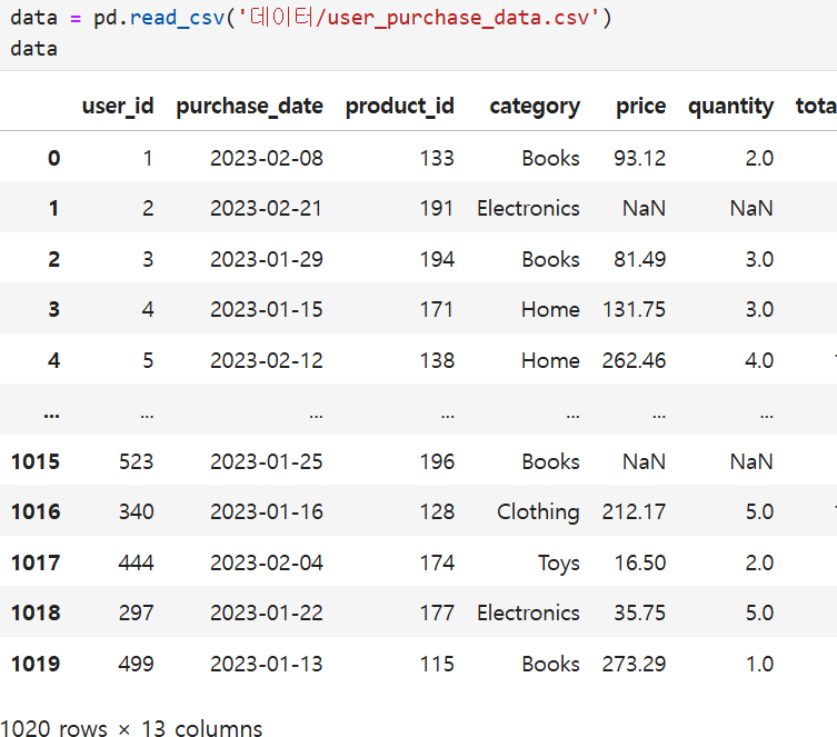
데이터 생성
import pandas as pd
import numpy as np
from datetime import datetime, timedelta
import random

# 데이터 크기 설정
num_samples = 1000

# 랜덤 시드 설정
np.random.seed(42)

# 랜덤 데이터 생성
user_ids = np.arange(1, num_samples + 1)
purchase_dates = [datetime(2023, 1, 1) + timedelta(days=np.random.randint(0, 60)) for _ in range(num_samples)]
product_ids = np.random.randint(100, 200, size=num_samples)
categories = np.random.choice(['Electronics', 'Books', 'Clothing', 'Home', 'Toys'], size=num_samples)
prices = np.round(np.random.uniform(5, 300, size=num_samples), 2)
quantities = np.random.randint(1, 6, size=num_samples)
total_spent = prices * quantities
ages = np.random.randint(18, 65, size=num_samples)
genders = np.random.choice(['M', 'F'], size=num_samples)
locations = np.random.choice(['New York', 'Los Angeles', 'Chicago', 'San Francisco', 'Houston', 'Dallas', 'Seattle', 'Austin', 'Miami', 'Boston'], size=num_samples)
membership_levels = np.random.choice(['Bronze', 'Silver', 'Gold', 'Platinum'], size=num_samples)
ad_spends = np.round(np.random.uniform(5, 50, size=num_samples), 2)
visit_durations = np.random.randint(10, 120, size=num_samples)

# 데이터프레임 생성
data = {
    'user_id': user_ids,
    'purchase_date': purchase_dates,
    'product_id': product_ids,
    'category': categories,
    'price': prices,
    'quantity': quantities,
    'total_spent': total_spent,
    'age': ages,
    'gender': genders,
    'location': locations,
    'membership_level': membership_levels,
    'ad_spend': ad_spends,
    'visit_duration': visit_durations
}

# 데이터프레임 완성
df = pd.DataFrame(data)


# 결측치 추가
nan_indices = np.random.choice(df.index, size=50, replace=False)
df.loc[nan_indices, 'price'] = np.nan
df.loc[nan_indices[:25], 'quantity'] = np.nan

# 중복 데이터 추가
duplicate_indices = np.random.choice(df.index, size=20, replace=False)
duplicates = df.loc[duplicate_indices]
df = pd.concat([df, duplicates], ignore_index=True)

# 아웃라이어 추가
outlier_indices = np.random.choice(df.index, size=10, replace=False)
df.loc[outlier_indices, 'price'] = df['price'] * 10
df.loc[outlier_indices, 'total_spent'] = df['total_spent'] * 10


# CSV 파일로 저장
df.to_csv('데이터/user_purchase_data.csv', index=False)
1.price 컬럼에 대해 제품 가격의 분포를 Box Plot으로 시각화하세요. 카테고리별로 그룹화하여 시각화하세요.
import matplotlib.pyplot as plt
import seaborn as sns

# 데이터 로드
data = pd.read_csv('데이터/user_purchase_data.csv')

# 박스 플롯 그리기
sns.boxplot(x='category', y='price', data=data)
plt.title('Price Distribution by Category')
plt.xticks(rotation=45) # X축 설정 45도 정도 기울여서 나타기기
plt.show()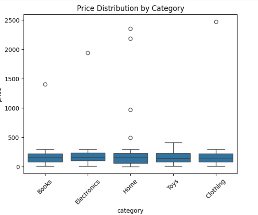
#2.age와 total_spent 컬럼을 이용하여 사용자 나이와 총 지출 금액 간의 관계를 Scatter Plot으로 시각화하세요.
# 데이터 로드
data = pd.read_csv('데이터/user_purchase_data.csv')

# 산점도 그리기
plt.scatter(data['age'], data['total_spent'])
plt.xlabel('age')
plt.ylabel('total_spent')
plt.title('Relationship between age and total spent')
plt.show()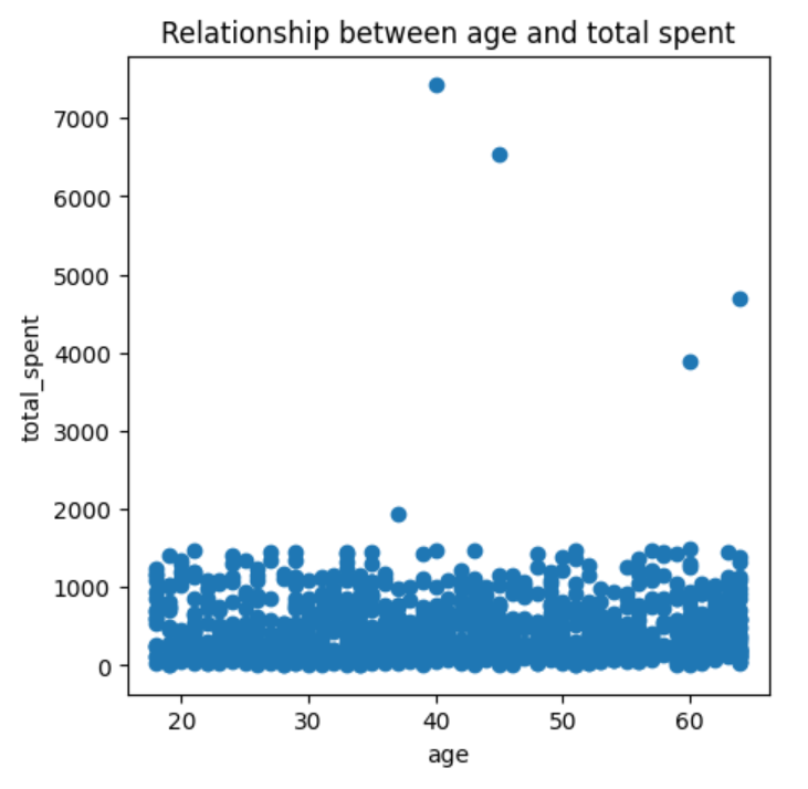
#3.모든 수치형 데이터 (price, quantity, total_spent, age, ad_spend, visit_duration) 간의 상관관계를 분석하고, heatmap을 사용하여 시각화하세요.
# 데이터 로드
data = pd.read_csv('데이터/user_purchase_data.csv')

#data.corr(numberic_only=True)--오류
# 상관관계 분석
correlation_matrix = data[['price', 'quantity', 'total_spent', 'age', 'ad_spend', 'visit_duration']].corr()
correlation_matrix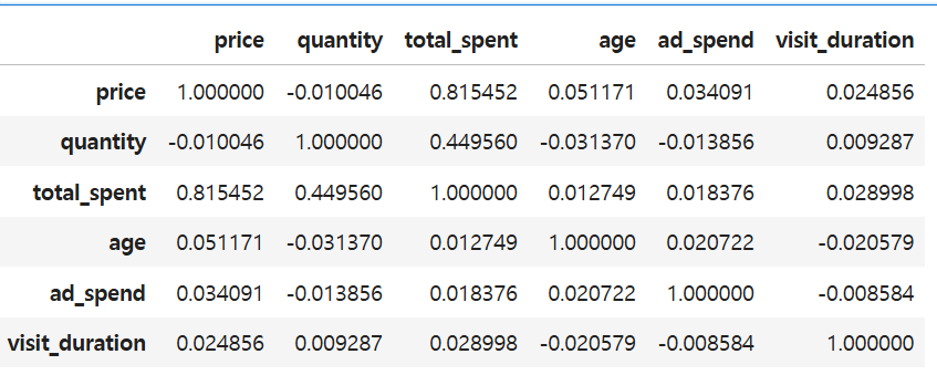
*#data.corr(numberic_only=True)--오류
결측치 존재때문!
그러므로 결측치를 제거해야 가능!
#heatmap으로 상관관계를 표시
plt.rcParams["figure.figsize"] = (5,5)
sns.heatmap(correlation_matrix,
           annot = True, #실제 값 화면에 나타내기
           cmap = 'Greens', #색상
           vmin = -1, vmax=1 , #컬러차트 영역 -1 ~ +1
          )
plt.title('Correlation Matrix')
plt.show()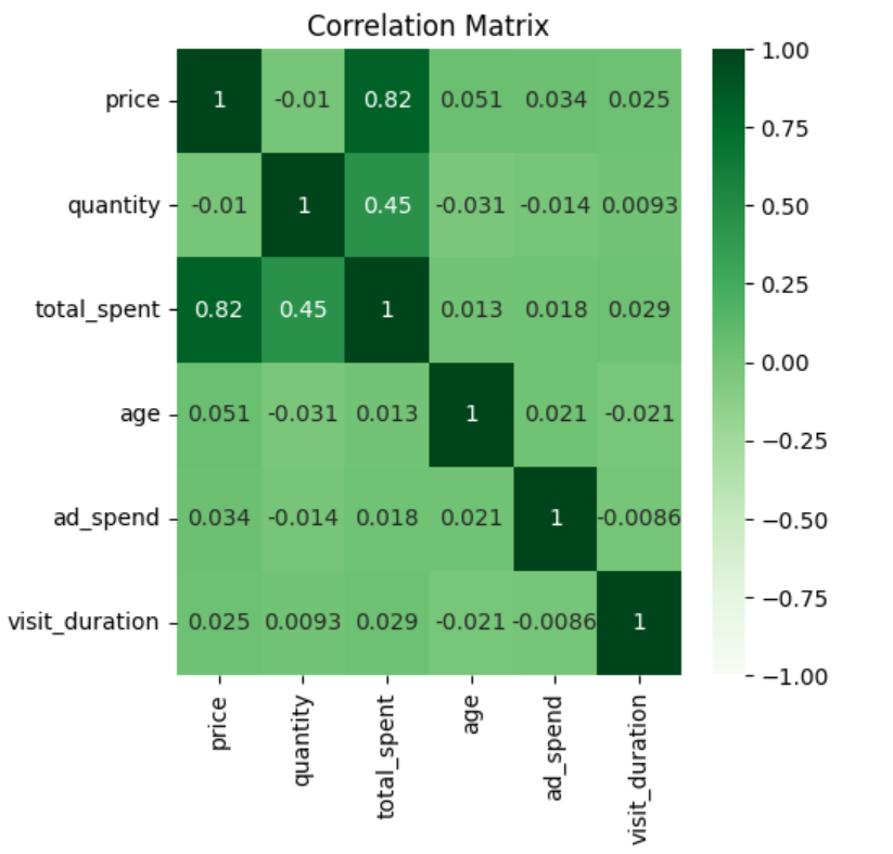
#4.age 컬럼에 대한 히스토그램을 작성하여 사용자 나이 분포를 시각화하세요.
# 데이터 로드
data = pd.read_csv('데이터/user_purchase_data.csv')

# 히스토그램 그리기
plt.hist(data['age'],bins=20, edgecolor='k')#edgecolor='k'테두리 검정색.
plt.xlabel('age')
plt.ylabel('Duration')
plt.title('age of Duration')
plt.show()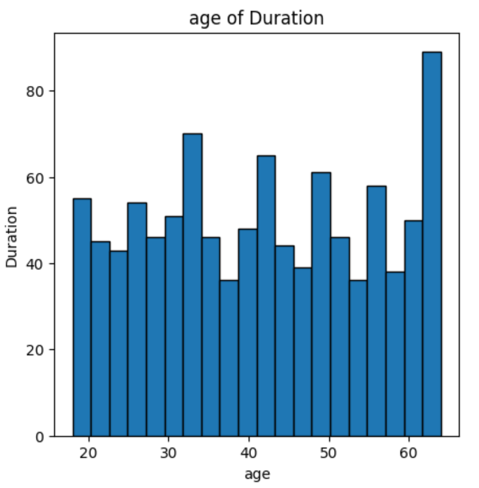
#5.membership_level 컬럼을 사용하여 각 회원 등급별 총 지출 금액을 바 차트로 시각화하세요.
# 데이터 로드
data = pd.read_csv('데이터/user_purchase_data.csv')

# 회원 등급별 총 지출 금액 계산
membership_spent = data.groupby('membership_level')['total_spent'].sum().reset_index()

# 막대 그래프 작성
sns.barplot(x='membership_level', y='total_spent', data=membership_spent)
plt.xlabel('membership_level')
plt.ylabel('total_spent')
plt.title('Total_spend by membership_level')
plt.show()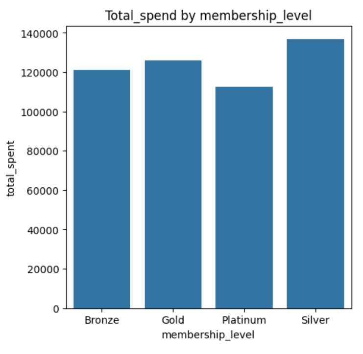
인사이트
아직 손에 익은 건 아지만, 시각화는 약간 흥미가 생기는 것 같다.
그리고 시각화의 경우 같은 그래프도 다양한 라이브러리에서 지원을 하기 때문에 그중에 가장 자신과 맞는 스타일을 찾는 과정이 필요한것 같다.
그렇기 때문에 각 라이브러리에 대한 지식도 공부해야할것 같다.

Be DBA