실습 데이터
import pandas as pd
import numpy as np
from datetime import datetime, timedelta
import random
import seaborn as sns
import matplotlib.pyplot as plt

# 데이터 크기 설정
num_samples = 1000

# 랜덤 시드 설정
np.random.seed(42)

# 랜덤 데이터 생성
user_ids = np.arange(1, num_samples + 1)
purchase_dates = [datetime(2023, 1, 1) + timedelta(days=np.random.randint(0, 60)) for _ in range(num_samples)]
product_ids = np.random.randint(100, 200, size=num_samples)
categories = np.random.choice(['Electronics', 'Books', 'Clothing', 'Home', 'Toys'], size=num_samples)
prices = np.round(np.random.uniform(5, 300, size=num_samples), 2)
quantities = np.random.randint(1, 6, size=num_samples)
total_spent = prices * quantities
ages = np.random.randint(18, 65, size=num_samples)
genders = np.random.choice(['M', 'F'], size=num_samples)
locations = np.random.choice(['New York', 'Los Angeles', 'Chicago', 'San Francisco', 'Houston', 'Dallas', 'Seattle', 'Austin', 'Miami', 'Boston'], size=num_samples)
membership_levels = np.random.choice(['Bronze', 'Silver', 'Gold', 'Platinum'], size=num_samples)
ad_spends = np.round(np.random.uniform(5, 50, size=num_samples), 2)
visit_durations = np.random.randint(10, 120, size=num_samples)

# 데이터프레임 생성
data = {
    'user_id': user_ids,
    'purchase_date': purchase_dates,
    'product_id': product_ids,
    'category': categories,
    'price': prices,
    'quantity': quantities,
    'total_spent': total_spent,
    'age': ages,
    'gender': genders,
    'location': locations,
    'membership_level': membership_levels,
    'ad_spend': ad_spends,
    'visit_duration': visit_durations
}

# 데이터프레임 완성
df = pd.DataFrame(data)


# 결측치 추가
nan_indices = np.random.choice(df.index, size=50, replace=False)
df.loc[nan_indices, 'price'] = np.nan
df.loc[nan_indices[:25], 'quantity'] = np.nan

# 중복 데이터 추가
duplicate_indices = np.random.choice(df.index, size=20, replace=False)
duplicates = df.loc[duplicate_indices]
df = pd.concat([df, duplicates], ignore_index=True)

# 아웃라이어 추가
outlier_indices = np.random.choice(df.index, size=10, replace=False)
df.loc[outlier_indices, 'price'] = df['price'] * 10
df.loc[outlier_indices, 'total_spent'] = df['total_spent'] * 10


# CSV 파일로 저장
df.to_csv('데이터/user_purchase_data.csv', index=False)
#1.total_spent 컬럼에 대해 회원 등급별 (membership_level)로 Box Plot을 작성하고, 이상치를 분석하세요. 이상치가 있는 데이터를 별도로 추출하여 outliers.csv로 저장하세요.
# 데이터 로드
data = pd.read_csv('데이터/user_purchase_data.csv')

# 회원 등급별 총 지출 금액 계산
membership_spent=data.groupby('membership_level')['total_spent'].sum().reset_index() #불필요했음.

# 박스 플롯 그리기
sns.boxplot(x='membership_level', y='total_spent', data=data)
plt.title('Total_spend by membership_level')
plt.xticks(rotation=45) # X축 설정 45도 정도 기울여서 나타기기
plt.show()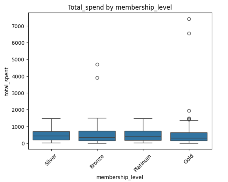
# Box Plot 시각화
sns.boxplot(x='membership_level', y='total_spent', data=data)
plt.title('Total Spent by Membership Level')
plt.show()
같은 결과 추출!
즉, membership_spent=data.groupby('membership_level')['total_spent'].sum().reset_index()
이과정은 불필요했다.
# 이상치 추출
def find_outliers(data, column):
    Q1 = data[column].quantile(0.25)
    Q3 = data[column].quantile(0.75)
    IQR = Q3 - Q1
    lower_bound = Q1 - 1.5 * IQR
    upper_bound = Q3 + 1.5 * IQR
    return data[(data[column] < lower_bound) | (data[column] > upper_bound)]

outliers = find_outliers(data, 'total_spent')
outliers.to_csv('데이터/outliers.csv', index=False)

# 결과 출력
print(outliers.head())
#2. ad_spend와 total_spent 컬럼을 사용하여 Scatter Plot을 작성하고, 두 변수 간의 관계를 분석하세요. 광고비 지출이 총 지출 금액에 미치는 영향을 분석하세요.
# 데이터 로드
data = pd.read_csv('데이터/user_purchase_data.csv')

# 산점도 그리기
plt.scatter(data['ad_spend'], data['total_spent'])
plt.xlabel('ad_spend')
plt.ylabel('total_spent')
plt.title('Relationship between ad_spend and total spent')
plt.show()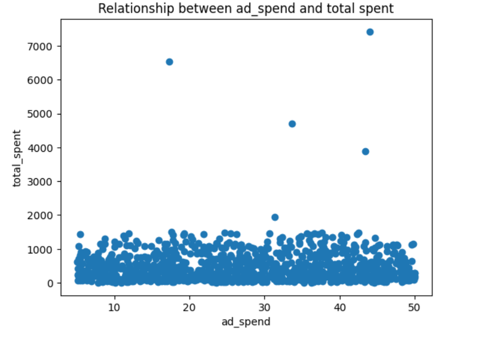
correlation_matrix = data[['ad_spend', 'total_spent']].corr()
correlation_matrix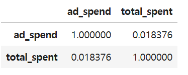
correlation= data['ad_spend'].corr(data['total_spent'])
print("Correlation between Ad Spend and Total Spent:",correlation)
->광고 지출과 총 지출의 상관관계는 0.0183으로 유의미한 상관관계를 보이지 않는다. 그러므로 광고비 지출은 총 지출 금액에 영향을 미친다고 볼 수 없다.
#3.모든 수치형 컬럼 간의 상관관계를 계산하고, 어떤 변수들이 높은 상관관계를 가지는지 분석하세요.
# 데이터 로드
data = pd.read_csv('데이터/user_purchase_data.csv')

#1결츨치 제거
# 컬럼의 타입과 결측치 데이터 타입 확인가능
data.info()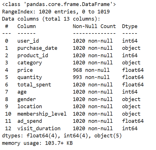
#컬럼별로 결측치(데이터가 없는) 확인하기
missing_data = data.isnull().sum()
print("Missing data before cleaning:")
print(missing_data)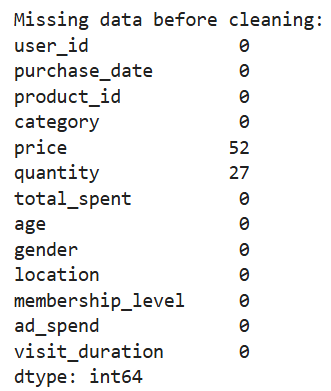
# 결측치 제거
data_cleaned = data.dropna()

# 결과 출력
print("Missing data after cleaning:")
print(data_cleaned.isnull().sum())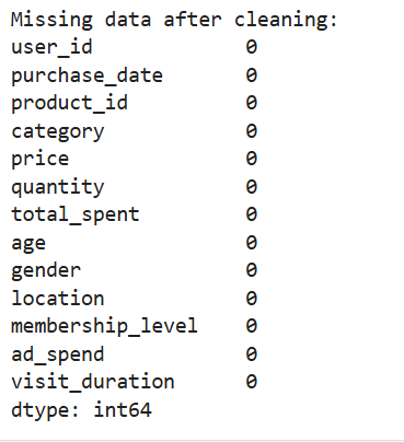
correlation= data_cleaned.corr(numberic_only=True)
correlation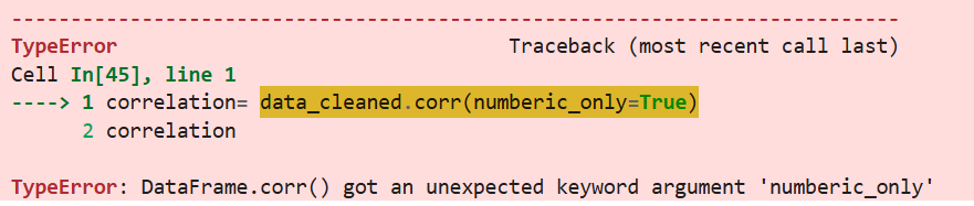
->에러... 결측치를 제거했지만, 값이 나오지 않음.
# 상관관계 분석
correlation_matrix = data[['user_id','product_id','price', 'quantity', 'total_spent', 'age', 'ad_spend', 'visit_duration']].corr()
correlation_matrix
결국 앞에서 info.로 뽑은 데이터에서 수치형 컬럼을 모두 써서 매트릭스로 만듦.
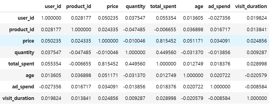
->가장 높은 상관관계를 보이는 건 price와 total_spent로 0.815로 높은 양의 상관관계로 가격이 올라가면 총 지출도 올라간다. 그리고 양과 총지출 사이의 상관관계가 0.449로 양의 상관관계를 보이고 있으므로, 둘 사이에 유의미한 영향이 있다고 판단할 수 있다. 그러나 사실 가격과 양이 총지출로 연관되는 것은 자연스러운 현상이기때문에 이 데이터들 사이에는 유의미한 상관관계가 있다고 판단하기 어렵다.
*시본사용해서 디벨롭하기.
sns.clustermap(correlation_matrix, annot=True)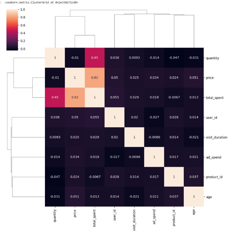
#4.price 컬럼과 total_spent 컬럼의 아웃라이어를 식별하세요. IQR 방법을 사용하세요.
# 데이터 로드
data = pd.read_csv('데이터/user_purchase_data.csv')

# 아웃라이어 식별 함수
def find_outliers(df, column):
    Q1 = df[column].quantile(0.25)
    Q3 = df[column].quantile(0.75)
    IQR = Q3 - Q1
    lower_bound = Q1 - 1.5 * IQR
    upper_bound = Q3 + 1.5 * IQR
    return df[(df[column] < lower_bound) | (df[column] > upper_bound)]

# price 컬럼의 아웃라이어 식별
price_outliers = find_outliers(data,'price')
print("Outliers in price : \n", price_outliers)

# total_spent컬럼의 아웃라이어 식별
total_spent_outliers = find_outliers(data,'total_spent')
print("Outliers in total_spent : \n", total_spent_outliers)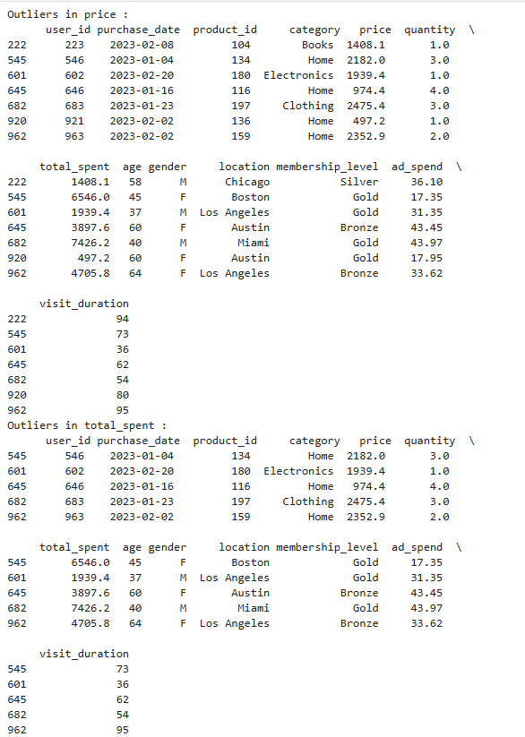
인사이트
같은 내용이어도 사용하는 라이브러리에 따라 완전히 다른 모습을 나타낼 수 있다는 것을 알았다. .corr을 사용하기 위해서는 결측값을 제거하는 과정이 필수적!
컬럼을 개별적으로 기입할때는 제외.