▶️ flexbox 레이아웃 사용법
  <div class="flex-container">
    <div class="box"></div>
    <div class="box"></div>
    <div class="box"></div>
  </div>
.flex-container {
display : flex;
}
.box {
width : 100px;
height : 100px;
background : grey;
margin : 5px;
}그냥 박스들을 감싸는 부모 요소에게 display : flex를 사용하면 된다. 그럼 박스들이 기본적으로 가로정렬로 배치된다.
▶️ Flexbox 세부속성 사용하기
  .flex-container {
    display : flex;
    justify-content : center;  /* 좌우정렬 */
    align-items : center;  /* 상하정렬 */
    flex-direction : column; /* 세로정렬 */
    flex-wrap : wrap;  /* 폭이 넘치는 요소 wrap 처리 */
  }
  .box {
    flex-grow : 2;  /* 폭이 상대적으로 몇배인지 결정 */
  }
▶️ 박스 좌측 & 우측정렬 동시에 하기
  <div class="flex-container">
    <div class="box"></div>
    <div class="box" style="flex-grow : 1"></div>
    <div class="box"></div>
  </div>
가운데 임시 div를 하나 만들어주고 flex-grow: 1 이런 식으로 사이즈를 크게 키워주면 된다.
▶️ align-content
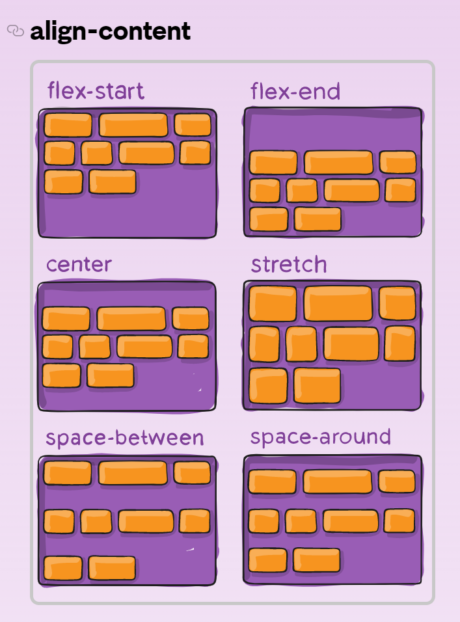
justify-content의 세로버전이라고 보면 된다.

관조, 사유, 끈기