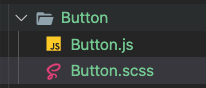
components/Button.js
import React from "react";
import "./Button.scss";
const STYLES = ["btn--primary", "btn--outline"];
const SIZES = ["btn--medium", "btn--large", "btn--mobile", "btn--wide"];
const COLOR = ["primary", "blue", "red", "green"];
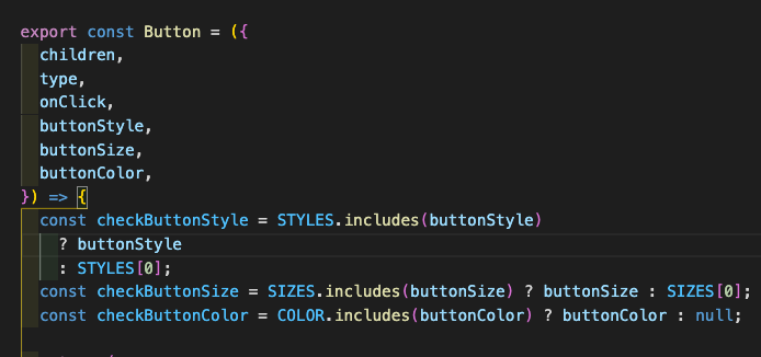
export const Button = ({
children,
type,
onClick,
buttonStyle,
buttonSize,
buttonColor,
}) => {
const checkButtonStyle = STYLES.includes(buttonStyle)
? buttonStyle
: STYLES[0];
const checkButtonSize = SIZES.includes(buttonSize) ? buttonSize : SIZES[0];
const checkButtonColor = COLOR.includes(buttonColor) ? buttonColor : null;
return (
<button
className={`btn ${checkButtonStyle} ${checkButtonSize} ${checkButtonColor}`}
onClick={onClick}
type={type}
>
{children}
</button>
);
};button 에서
components/Button.scss
$--primary: #fff;
$blue: #276afb;
$green: #25ce4a;
$red: #f00946;

.btn {
  padding: 8px 20px;
  border-radius: 4px;
  outline: none;
  border: none;
  cursor: pointer;
  white-space: nowrap;
}

.btn--primary {
  background-color: $--primary;
  color: #242424;
  border: 1px solid $--primary;
}

.btn--outline {
  background-color: transparent;
  color: #fff;
  padding: 8px 20px;
  border: 1px solid $--primary;
  transition: all 0.3s ease-out;
}

.btn--medium {
  padding: 8px 20px;
  font-size: 18px;
}

.btn--large {
  padding: 12px 26px;
  font-size: 20px;
}

.btn--mobile {
  text-align: center;
  border-radius: 4px;
  width: 80%;
  text-decoration: none;
  font-size: 1.5rem;
  background-color: transparent;
  color: #fff;
  padding: 14px 20px;
  border: 1px solid #fff;
  transition: all 0.3s ease-out;
}

.btn--wide {
  padding: 12px 64px;
  font-size: 20px;
}

.btn--large:hover,
.btn--medium:hover,
.btn--mobile:hover {
  transition: all 0.3s ease-out;
  background: #fff;
  color: #242424;
}

.btn--wide:hover {
  color: #fff;
  background-color: $red;
  transition: all 0.2s ease-out;
}

.btn-link {
  display: flex;
  justify-content: center;
  align-items: center;
  text-decoration: none;
  padding: 8px 16px;
  height: 100%;
  width: 100%;
}

.blue {
  background-color: $blue;
  color: #fff;
  border: none;
}

.red {
  background-color: $red;
  color: #fff;
  border: none;
}

.primary {
  background-color: #242424;
  color: #fff;
  border: none;
}

.primary:hover {
  background-color: #fff;
  color: #242424;
  border: none;
}

.green {
  background: $green;
  color: #fff;
  border: none;
}

.green:hover {
  background-color: #242424;
}
다른곳에서 Button 을 import 하면 된다.
import { Button } from "../Button/Button";
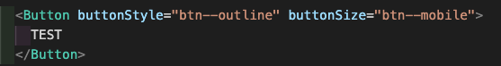
하게되면 ,
Button 이라는 컴포넌트에서
buttonStyle="btn--outline" 과 buttonSize="btn--mobile"
을 받게된다.
Button 을 여러곳에서 자주 사용할게 아니라면 ,
굳이 ..?라는 생각이 들 수도있겠지만
비슷한 Button 을 여러곳에서 사용할꺼라면
미리 Button Components 를 만들고 해당하는 Style 만 Props 로 받아서 Button 을 Rendering 하는것이 좋을 것 같다 .

꾸준함이란 ... ?