html/css를 이용하여 홈페이지 만들기
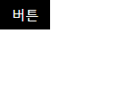
오늘은 버튼을 누르면 팝업창이 나오는것처럼 만들어보았다.
<body>영역
<body>
<input type="checkbox" id="layerPopup">
<label for="layerPopup">
버튼
</label>
<div id="layer_bg">
<div id="popup">
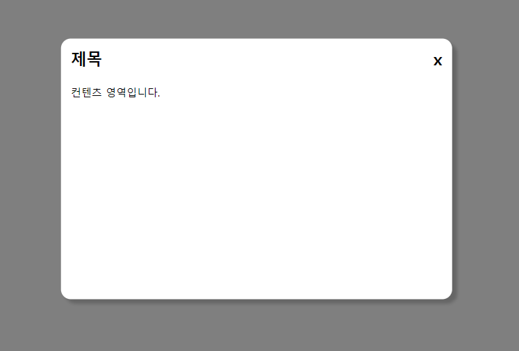
<h2>
제목
<label for="layerPopup">x</label>
</h2>
컨텐츠 영역입니다.
</div>
</div>
</body><input>을 사용해 체크박스를 만들었다.
<label for=""> 을 사용해 이름을 정하였다.
<div>를 사용해 버튼을 누르면 나올 popup 영역을 만들고 <h2>로 제목부분을 만들었다.
<CSS>영역
#layerPopup{
    display: none;
}

#layerPopup + label{
    display: inline-block;
    padding: 7px 14px;
    background: #000;
    color: #fff;
}

#layer_bg{
    display: none;
    position: absolute;
    top: 0;
    left: 0;
    width: 100%;
    height: 100%;
    background: rgba(0, 0, 0, 0.5);
}
checkbox부분을 display:none을 사용해 빈공간으로 만들었다.
버튼 부분에 inline-blcok 속성을 적용한 후 padding으로 간격을 띄어주고 크기를 키웠다.
버튼 클릭시 나오는 영역의 width/height 100%을 주고 전체 배경색이 변하게 하였다.
#layer_bg > #popup {
    position: absolute;
    padding: 15px;
    box-sizing: border-box;
    border-radius: 15px;
    top: 50%;
    left: 50%;
    transform: translate(-50%,-50%);
    width: 600px;
    height: 400px;
    background: #fff;
    box-shadow: 7px 7px 5px rgba(0, 0, 0, 0.2);
    /* x y 번짐 색상 */
}

#layer_bg > #popup > h2{
    margin-bottom: 25px;
}

#layer_bg > #popup > h2 > label {
    float: right;
}

#layerPopup:checked + label + #layer_bg{
    display: block;
}
버튼을 누르면 나오는 popup창의 크기,위치,색상,라운딩을 조절해준후 box-shadow를 사용해 그림자효과를 추가해보았다.
완성본