📁 프로젝트 파일 구조
OnboardingFlow/
├── OnboardingFlowApp.swift      # @main 진입점
├── ContentView.swift            # TabView (page 스타일) + 그라디언트 배경
├── WelcomePage.swift            # 첫 번째 온보딩 페이지
├── FeaturePage.swift            # 두 번째 온보딩 페이지
└── FeatureCard.swift            # 재사용 가능한 기능 카드 컴포넌트
📱 TabView — 페이지 스타일 (온보딩)
TabView에 .tabViewStyle(.page)를 적용하면 바텀탭바 대신 좌우 스와이프 페이지 형태가 된다.
struct ContentView: View {
    let gradientColors: [Color] = [.grdientTop, .gradientBottom]

    var body: some View {
        TabView {
            WelcomePage()
            FeaturePage()
        }
        .background(Gradient(colors: gradientColors))
        .tabViewStyle(.page)   // 핵심: 페이지 스타일 적용
    }
}
TabView 스타일 비교
| 스타일 | 코드 | 결과 |
|---|---|---|
| 바텀 탭바 | .tabViewStyle(.automatic) 또는 기본값 | 하단 탭 UI |
| 페이지 스와이프 | .tabViewStyle(.page) | 좌우 스와이프 + 점(dot) 인디케이터 |
온보딩 화면처럼 "순서대로 넘기는" UX에는
.page스타일이 적합하다.
🌈 Gradient 배경
let gradientColors: [Color] = [.grdientTop, .gradientBottom]

.background(Gradient(colors: gradientColors))
Gradient(colors:)는 위→아래 방향의 선형 그라디언트를 생성한다.
색상 배열의 순서가 그라디언트 방향을 결정한다.
🧩 파라미터 있는 컴포넌트 (FeatureCard)
컴포넌트에 let 프로퍼티를 선언하면 외부에서 값을 주입할 수 있다.
struct FeatureCard: View {
    let iconName: String      // 외부에서 받는 파라미터
    let description: String

    var body: some View {
        HStack {
            Image(systemName: iconName)   // 파라미터 사용
                .font(.largeTitle)
                .frame(width: 50)
                .padding(.trailing, 10)

            Text(description)

            Spacer()
        }
        .padding()
        .background(.tint, in: RoundedRectangle(cornerRadius: 12))
        .foregroundStyle(Color(.white))
    }
}

// 사용법 — 각각 다른 아이콘과 텍스트 전달
FeatureCard(iconName: "person.2.crop.square.stack.fill", description: "소셜 기능 설명")
FeatureCard(iconName: "quote.bubble.fill", description: "메시지 기능 설명")
파라미터 컴포넌트를 쓰면 같은 UI 구조, 다른 데이터를 반복 없이 표현할 수 있다.
🎨 .background(.tint, in:) 문법
.background(.tint, in: RoundedRectangle(cornerRadius: 12))| 파라미터 | 역할 |
|---|---|
.tint | 앱의 액센트 컬러 (자동 적용) |
in: RoundedRectangle(...) | 배경의 모양 지정 |
.tint는 앱 전체의 포인트 컬러를 자동으로 가져오므로, 특정 색상을 하드코딩하지 않아도 된다.
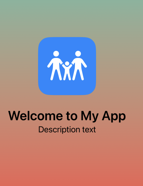
🏠 WelcomePage — 첫 화면
struct WelcomePage: View {
    var body: some View {
        VStack {
            ZStack {
                RoundedRectangle(cornerRadius: 30)
                    .frame(width: 150, height: 150)
                    .foregroundColor(Color.blue)

                Image(systemName: "figure.2.and.child.holdinghands")
                    .font(.system(size: 70))
                    .foregroundColor(.white)
            }
            Text("Welcome to My App")
                .font(.largeTitle)
                .fontWeight(.semibold)
                .padding(.top)

            Text("Description text")
                .font(.title2)
        }
        .padding()
    }
}
Day 1에서 배운 ZStack(배경 도형 + 아이콘) 패턴을 온보딩에 그대로 활용.
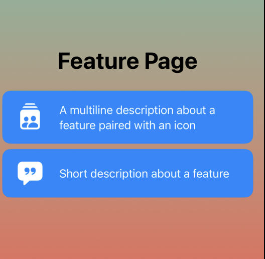
📄 FeaturePage — 기능 소개 화면
struct FeaturePage: View {
    var body: some View {
        VStack {
            Text("Feature Page")
                .font(.largeTitle)
                .fontWeight(.bold)
                .padding(.bottom)

            FeatureCard(iconName: "person.2.crop.square.stack.fill",
                        description: "A multiline description about a feature")
            FeatureCard(iconName: "quote.bubble.fill",
                        description: "Short description about a feature")
        }
        .padding()
    }
}
파라미터 컴포넌트 덕분에 화면은 단순히 카드를 나열하는 역할만 한다.
✅ 핵심 정리
| 개념 | 내용 |
|---|---|
TabView + .page | 좌우 스와이프 온보딩 UI |
Gradient(colors:) | 배열 순서대로 그라디언트 배경 |
let 프로퍼티 | 컴포넌트에 외부에서 값 주입 |
.background(.tint, in:) | 모양 + 색상을 한 번에 배경 지정 |
✅ 다음에 배울 것
@State,@Binding으로 온보딩 완료 여부 관리AppStorage로 온보딩 다시 안 보이게 처리- 온보딩 완료 후 메인 화면으로 전환 (
fullScreenCover)

Asher입니다. 하지만 Joon이라고도 불리는