신년운세 코딩 패키지_02
1. css 가운데 정렬 패키지
항상 아래 3가지 요소가 함께 다닌다고 생각하면 된다.
.btns {
    display: flex;
    flex-direction: row;
    justify-content: center;
}
2. 모바일 css
모바일과 웹페이지에 따라 콘텐츠 배치를 다르게 해야 한다. 방법으로는...
예) body의 백그라운드 색을 초록색으로 바꿔라!
@media screen and (max-width: 780px)  {

    body {
        background-color: green;
    }

}
이렇게하면 가로가 780px 이하가 됐을때,
백그라운드 색이 초록색으로 변한다.
이런 방법을 활용하여 result.html의 배치를 변경한다.
@media screen and (max-width: 780px)  {

    body {
        background-position: 70px -70px;
        background-size: 500px;
    }

    .rtan {
    	margin-top: 50px;
    }

    .msg {
    	font-size: 24px;
    	line-height: 36px;

    	margin-bottom: 36px;
    	padding:10px;
    }

    .msg > br {
    	display: none;
    }

}
index.html도 수정한다.
@media screen and (max-width: 780px) {
            body {
                background-position: 70px -70px;
                background-size: 500px;
            }

            .rtans {
                width: 100%;
            }

            .mytitle {
                margin-top: 20px;
                margin-bottom: 20px;
            }

            .rtans > a {
                color: darkred;
            }
        }
3. 뒤로가기js
function back(){
    let url = window.location.href;
    let new_url = url.split('result.html')[0] + 'index.html';
    window.location.href= new_url;
}
4. 공유하기js
function share(){
    var t = document.createElement("textarea");
    document.body.appendChild(t);
    t.value = window.location.href;
    t.select();
    document.execCommand('copy');
    document.body.removeChild(t);
    alert('복사 완료!')
}
5. function 적용
js로 fucntion을 버튼 클릭에 적용시키려면 onclick="함수이름()"
<button onclick="share()" class="btn-share">공유하기</button>완성본
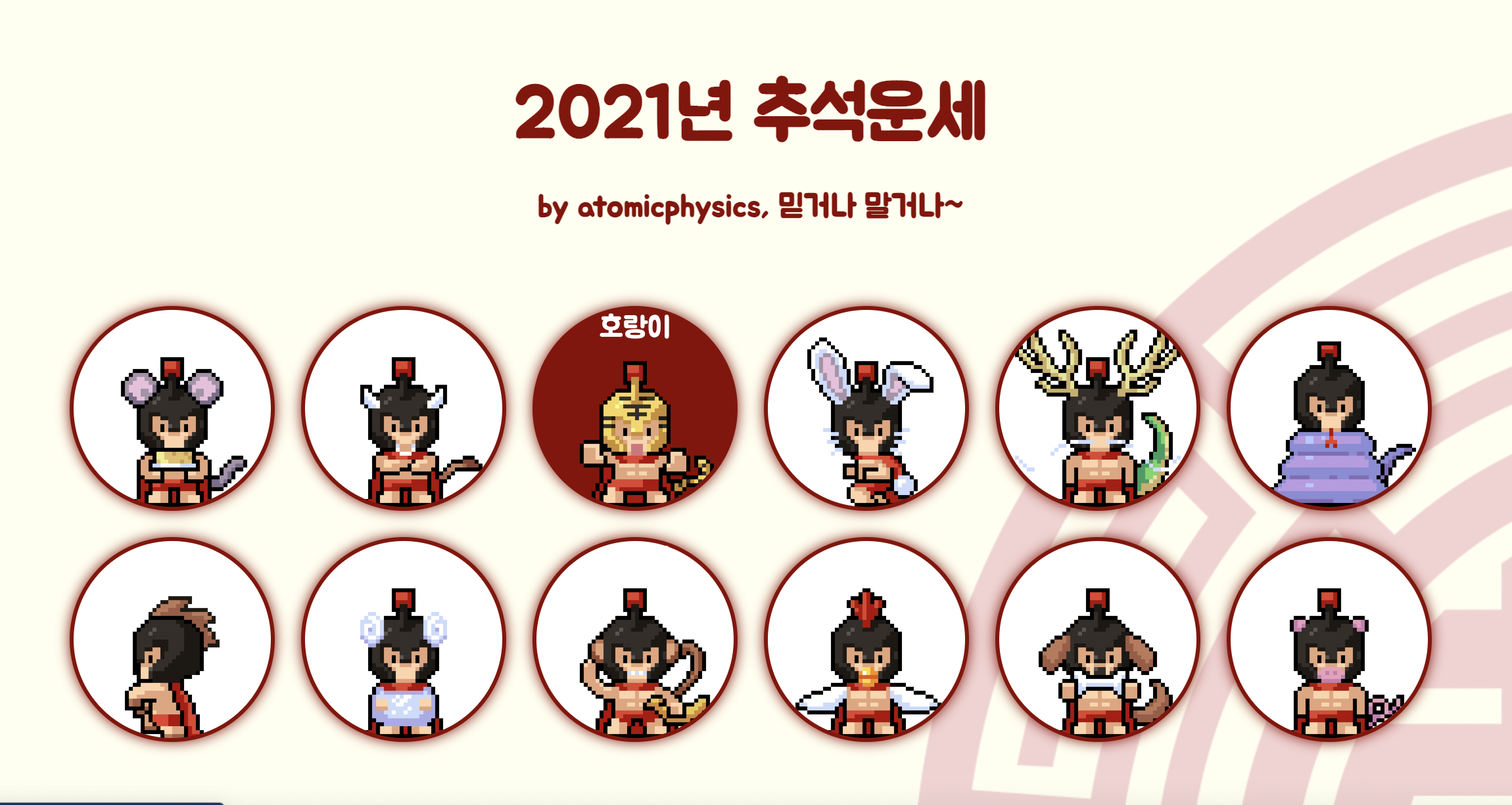
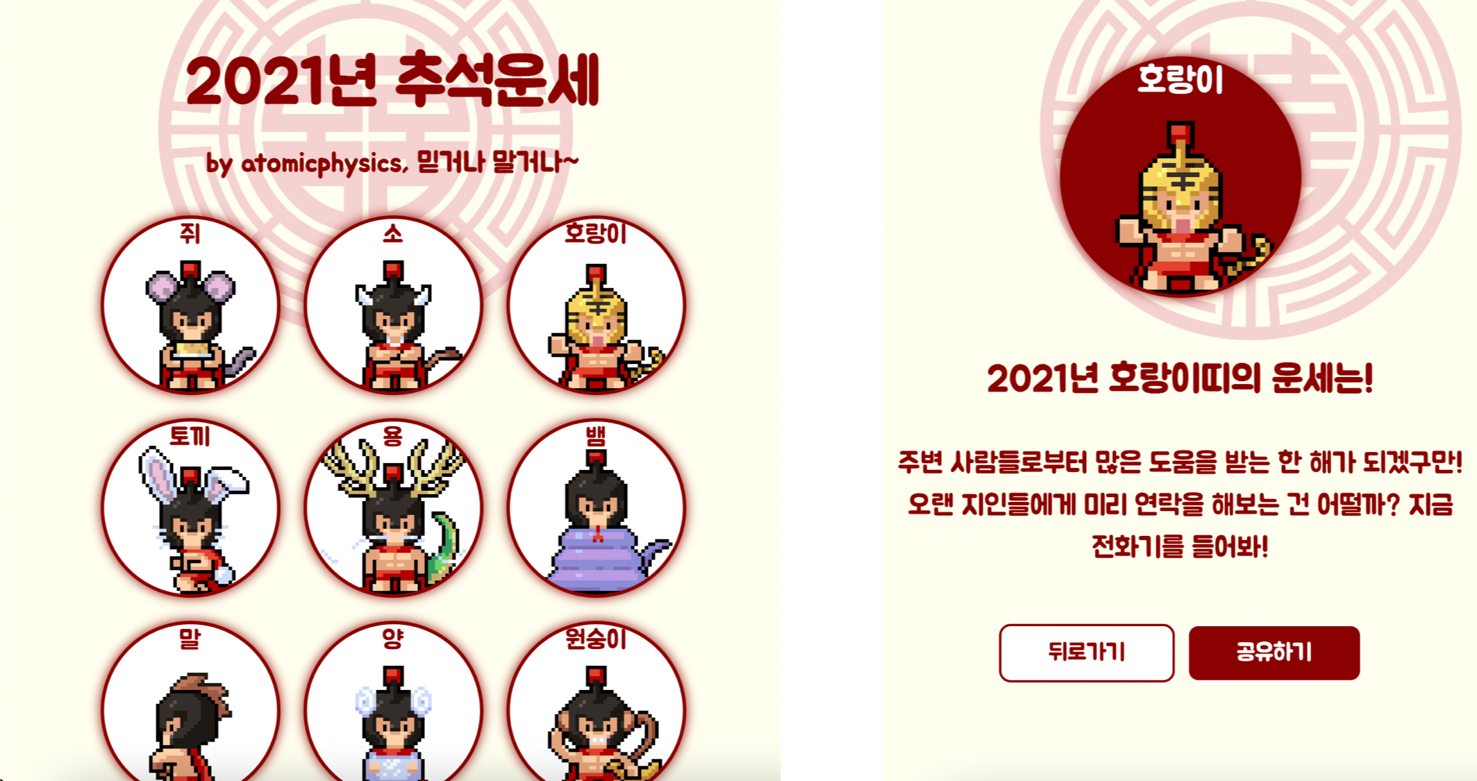
index 페이지다.
hover 기능을 더하여 마우스를 갖다 대면
배경색이 변하고, 글씨가 나타난다.
클릭하면 해당 띠의 운세 페이지로 이동한다.
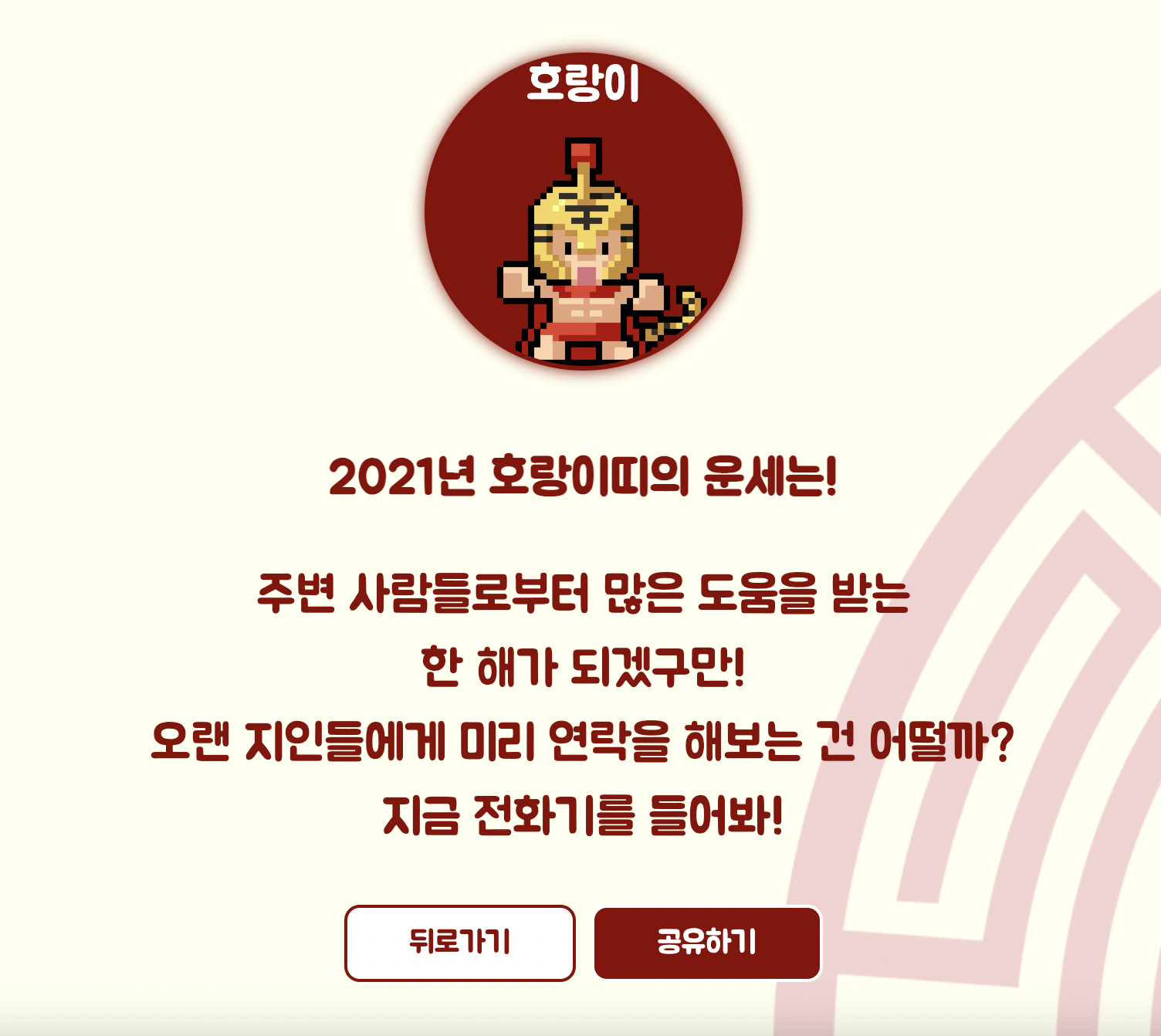
아래에는 뒤로가기 버튼과 공유하기 버튼을 구현했다.
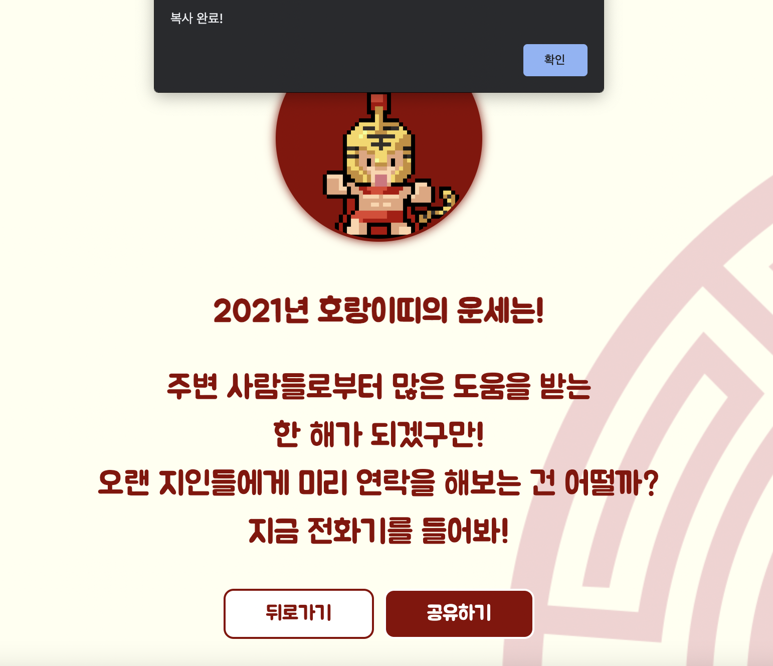
공유하기 버튼을 누르면 자동으로 웹페이지 주소가 복사되고,
복사 완료라는 alert이 뜬다.
모바일 환경을 고려하여 width가 780px 이하가 되면
사이즈에 맞도록 콘텐츠를 재배치하는 기능도 배워서 구현했다.

안녕하세요. 반갑습니다.