오늘은 CSS animation 속성에 대해 배웠다.
keyframe을 이용해 어떻게 다양한 animation을 구현하는지 정리해보자!
1. keyframe
CSS 애니메이션의 시작, 중간, 끝 등의 중간 상태를 정의한다.
덧셈, 뺄셈
/* keyframe 작성 방법 */
@keyframes 애니메이션이름 {
	from {
		left : 0;
	}
	to{
		left : 200px;
	}
}
from 과 to 대신 진행도(%) 표기도 가능하다.
/* keyframe 작성 방법 */
@keyframes 애니메이션이름{
	0% {
		left : 0;
	}
	50%{
		left : 200px;
	}
	100%{
		top : 200px;
		left :  200px;
	}
}
2. animation 속성들
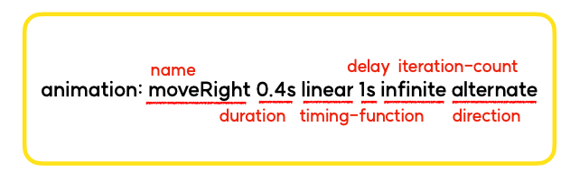
2-1. animation-name
어떠한 keyframes를 요소에 적용할 것인지 지정한다.
animation-name: moveRight;2-2. animation-duration
애니메이션을 한 번 재생하는데 걸리는 시간을 설정한다.
animation-duration: 2s;2-3. animation-direction
애니메이션 재생 방향을 정의한다. (정방향/역방향)
animation-direction: alternate | normal | reverse | alternate-reverse;-
normal : 정방향으로 재생
-
reverse : 역방향으로 재생
-
alternate : 정방향으로 재생 (단, 정방향/역방향을 번갈아 재생)
-
alternate-reverse : 역방향으로 재생 (단, 역방향/정방향을 번갈아 재생)
2-4. animation-iteration-count
애니메이션 재생 횟수를 정의한다.
animation-iteration-count : infinite | 3;2-5. animation-timing-function
애니메이션 재생 패턴을 정의하며, transition-timing-function과 유사하다.
animation-timing-function : ease-in-out;2-6. animation-delay
애니메이션 시작을 얼마나 지연할 지 설정한다.
animation-delay : 2s;*animation 단축속성

풀스택 대장이 되어보쟈