
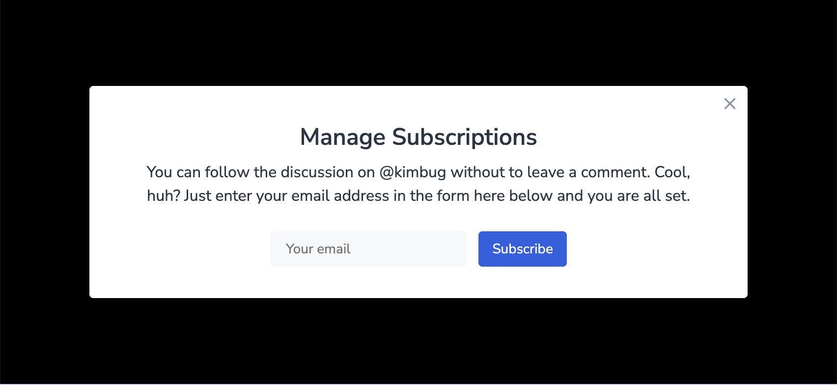
아래의 그림을 모달을 화면 정중앙에 고정시키고, 닫기 버튼을 우측 상단에 고정시켜보는 실습이다.
단순히 따라 만드는 게 아니라,
만들면서 헷갈렸던 부분들을 정리해보려고 한다.
만들면서 궁금했던 점들
1. position: absolute | fixed 어떤 걸 써야 할까?
이번 실습에서는 둘 다 사용했다.
.modal→position: fixed.close-button→position: absolute
처음에는
"둘 다 위치를 움직이는 건데 뭐가 다른거지?"
이게 헷갈렸다.
모달은 왜 fixed 인가?
- 모달은 화면 중앙에 떠 있어야 한다.
- 스크롤해도 따라 움직이면 안 되고 항상 화면 가운데 있어야 한다.
그래서 기준점을 viewport로 잡는 fixed 가 적절하다.
닫기 버튼은 왜 absolute 인가?
- 닫기 버튼은 모달 안에 붙어 있어야 한다.
- 화면 기준이 아니라 “모달 기준”으로 우측 상단에 붙어야 한다.
그래서 기준점을 .modal 로 삼는 absolute 를 사용했다.
이때,
.modal 은 이미 position: fixed 라서
(static이 아니기 때문에)
자동으로 .close-button 의 기준점이 된다.
2. <input>의 placeholder 앞 공간은 HTML로? CSS로?
placeholder 자체에 앞 여백을 주는 게 아니라,
<input> 에 padding 을 주는 게 맞다.
왜냐하면 placeholder 는 <input> 안에 들어가는 텍스트라서
<input> 의 내부 여백(padding)이 placeholder 에도 그대로 적용되기 때문이다.
3. 가운데 <p> 는 폭/높이만 정하면 끝일까? 문장을 끊고 싶으면 어떻게?
<p>를 가운데 정렬 + 최대 너비 제한만 해주면 된다.
- 폭을 제한해서 줄바꿈이 자연스럽게 일어나게 만들고
- 가운데 배치(
margin: 0 auto)로 정리하면 된다.- 자동으로 만들어진
margin왼쪽/오른쪽 골고루 배치해서 가운데 정렬
- 자동으로 만들어진
해결 방법
.modal-desc {
  width: 590px;
  margin: 0 auto 24px;
  text-align: center;
}
강의 보면서 정리한 것
모달을 정중앙에 고정하기
모달은 화면 위에 떠 있어야 하니까 position: fixed 가 맞다.
그리고 top/left: 50% 만 주면 모달의 왼쪽 위 꼭짓점이 중앙에 오기 때문에,
transform: translate(-50%, -50%) 로 내 크기의 절반만큼 되돌려서 진짜 중앙을 맞추면 된다.
.modal {
  position: fixed;
  top: 50%;
  left: 50%;
  transform: translate(-50%, -50%);
}
코드
html 코드
<!DOCTYPE html>
<html lang="en">
    <head>
        <meta charset="UTF-8" />
        <meta name="viewport" content="width=device-width, initial-scale=1.0" />
        <title>Position 3</title>
        <link href="https://fonts.googleapis.com/css?family=Nunito+Sans:400,600&display=swap" rel="stylesheet" />
        <link rel="stylesheet" href="./style.css" />
    </head>
    <body>
        <aside class="modal">
            <h1 class="modal-title">Manage Subscriptions</h1>
            <p class="modal-desc">
                You can follow the discussion on @kimbug without to leave a comment. Cool, huh? Just enter your email address in
                the form here below and you are all set.
            </p>
            <div class="input-group">
                <input type="email" placeholder="Your email" />
                <button type="button">Subscribe</button>
            </div>
            <button type="button" class="close-button" aria-label="Close the modal"></button>
        </aside>
    </body>
</html>
css 코드
* {
    box-sizing: border-box;
    margin: 0;
}

body {
    width: 100%;
    height: 100vh;
    font-family: "Nunito Sans", sans-serif;
    color: #273444;
    background-color: #000;
}

input:focus,
input:active,
button:focus,
button:active {
    box-shadow: none;
    outline: none;
}

.modal {
    background-color: #fff;
    position: relative;
}

.modal-title {
    font-size: 24px;
    font-weight: 600;
    line-height: 1.6666666667;
}

.modal-desc {
    font-size: 16px;
    line-height: 1.5;
}

.input-group input,
.input-group button {
    font-size: 14px;
    font-family: "Nunito Sans", sans-serif;
    line-height: 1.4285714286;
}

.close-button {
    width: 20px;
    height: 20px;
    border: none;
    background-color: transparent;
    background-image: url(./assets/icon-close.svg);
    background-position: center center;
    background-size: contain;
    background-repeat: no-repeat;
}

.modal {
	position: fixed;
	top: 50%;
	left: 50%;
	transform: translate(-50%, -50%);
	padding: 32px 40px;
	border-radius: 4px;
}

.modal-title {
	margin-bottom: 4px;
}

.modal-desc {
	width: 590px;
	margin: 0 auto 24px;
}

.modal-title,
.modal-desc {
	text-align: center;
}

.input-group {
	text-align: center;
}

.input-group input {
	width: 200px;
	height: 36px;
	padding: 0 16px;
	border-radius: 4px;
	border: none;
	margin-right: 8px;
	background-color: #F6F8FA;
}

.input-group button {
	height: 36px;
	padding: 0 14px;
	border: none;
	border-radius: 4px;
	background-color: #2860E1;
	color: #fff;
}

.close-button {
	position: absolute;
	top: 8px;
	right: 8px;
}
이번 실습에서 배운 것
✔ absolute는 부모 안에서 정확한 위치에 붙이고 싶을 때, fixed는 화면에 고정되어 있어야 할 때 사용한다.
✔ placeholder 의 앞 여백은 placeholder 가 아니라 <input> padding 으로 조절한다.
✔ top/left: 50% 는 요소의 모서리를 중앙에 두는 거라서 translate(-50%, -50%) 가 같이 필요하다.