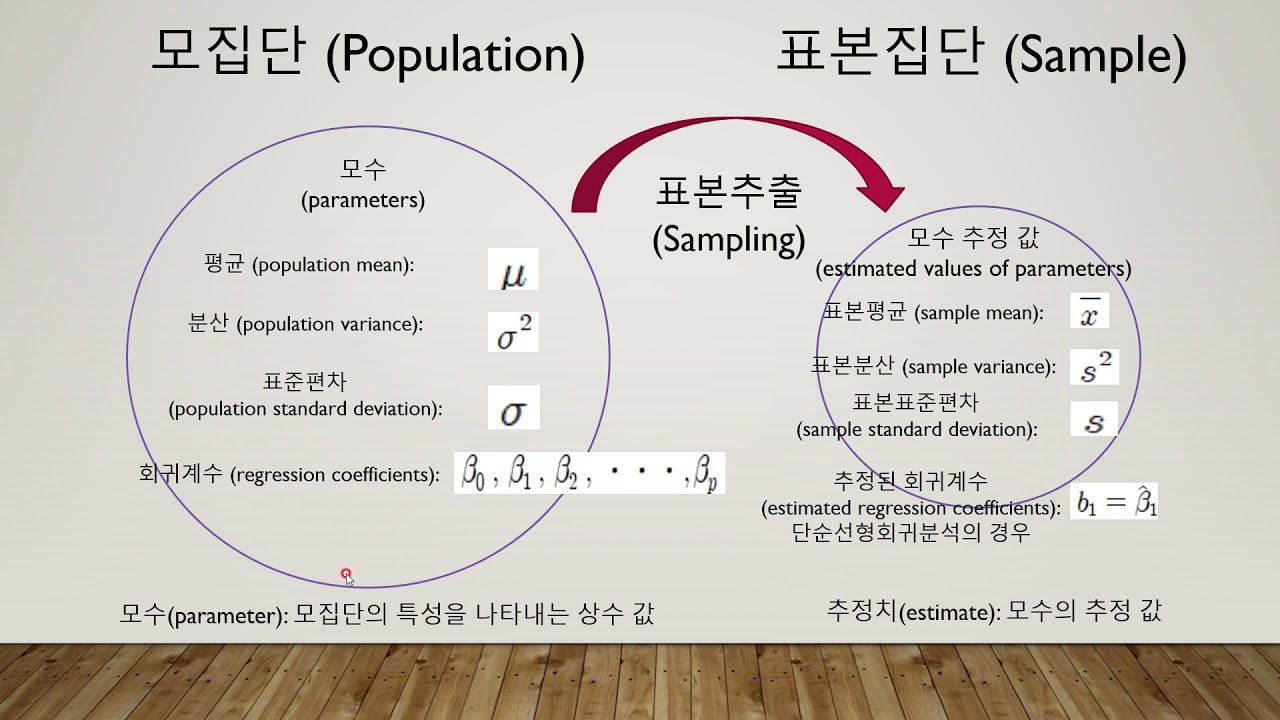
데이터 분석과 통계
- 목표
- 데이터 분석에 있어서 통계가 왜 중요한지 학습
- 기술통계와 추론통계에 대한 개념을 이해하고 각각의 차이점을 설명
- 통계분석 방법의 다양한 종류 배우기
1.1 데이터 분석에 있어서 통계가 중요한 이유
→ 데이터 기반의 의사결정 가능
(1) 통계가 중요한 이유
-
데이터를 분석하고 이를 바탕으로 결정을 내릴 수 있기 때문
- 데이터를 이해하고 해석하는 데 중요한 역할
- 데이터를 요약하고 패턴을 발견할 수 있음
- 보통 데이터는 굉장히 양이 많음 → 데이터가 많을 수록 정보가 많고 의미 있는 정보가 나오기 때문
- 데이터를 하나씩 사람의 눈으로 직접 확인할 수는 없기 때문에 방대한 양의 데이터를 손쉽게 보면서 데이터의 특징을 파악하기 위해 통계를 사용하는 것!
- 추론을 통해 결론을 도출화는 과정을 도움
- 데이터 기반의 의사결정을 내릴 수 있다!
- 기업이 보다 현명한 결정을 내리고 수익을 창출하기 위해 필요
-
통계를 활용한 데이터 분석은 필수!
(2) 실제 사용 예시
고객 만족도 설문조사 분석
- 설문 조사 중 고객의 불만 사항을 파악하고 이를 개선하는 데 활용
→ 단순하게 비율 계산하는 것도 결국 통계임!
고객 유형별 세그먼트(Segment) 상품 추천
- with 머신러닝: 고객을 유형별로 나누어 특징을 파악하고 각 유형에 맞는 상품을 추천하는 데 활용
그 외 다양한 상황
- 기업의 전략을 수립하기 위해서
- 마케팅을 진행하기 위해서
- 신제품을 개발하기 위해서 등등
1.2 기술통계와 추론통계
- 통계의 양대산맥!
(1) 기술통계
- 데이터를 요약하고 설명하는 통계 방법
- 주로 평균, 중앙값, 분산, 표준편차 등을 사용
- 즉, 데이터를 특정 대표값으로 요약
- 데이터에 대한 대략적인 특징을 간단하고 쉽게 알 수 있음
- 단, 데이터 중 예외(이상치)라는게 항상 존재할 수 있음
- 데이터의 모든 부분을 확인할 수 있는 것은 아님
- (예) 사람을 처음 만날 때 그 사람의 전체에 대해서 다 알 수는 없지만 기본적인 인적사항들(외모, 직업, 학력, 나이, MBTI 등)로 대략적으로 그 사람에 대한 요약을 할 수 있는 것과 같음
- 하지만 알다시피 어디까지나 대략적으로 파악하는 것일 뿐 그 사람에 대한 전부를 확인한 것은 아니며 예외가 항상 존재할 수 있음
평균(Mean)
- 데이터의 대표적인 값을 나타내기 위해 사용하는 값
- 데이터의 일반적인 경향을 파악하는 데 유용
- 모든 데이터를 더한 후 데이터의 개수로 나누어 계산
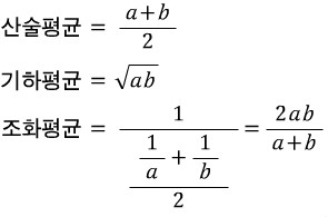
- "산술평균": 합의 평균
- 기하평균(곱에 대한 평균), 조화평균(역수의 산술평균의 역수)은 정의가 살짝 다름!
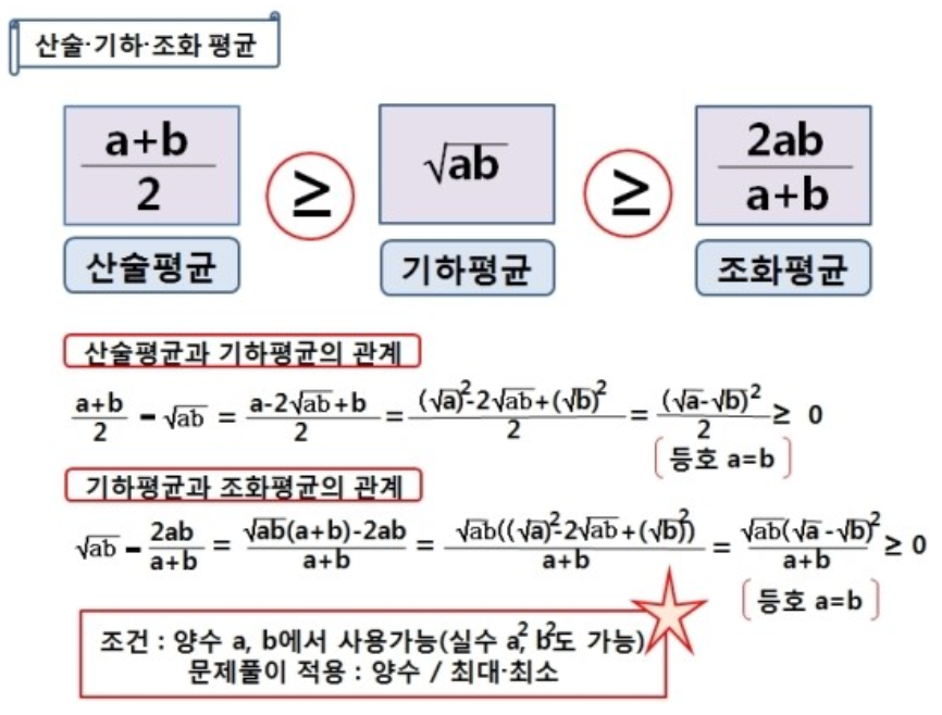
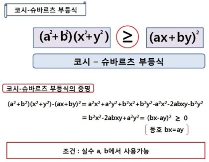
→ 코시-슈바르트 부등식
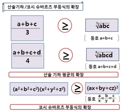
- 기하평균(곱에 대한 평균), 조화평균(역수의 산술평균의 역수)은 정의가 살짝 다름!
- "산술평균": 합의 평균
중앙값(Median)
- 데이터셋을 크기 순서대로 정렬했을 때 중앙에 위치한 값
- 중앙값과 평균 구분을 잘 해야 함!
★ 중앙값도 '중간'을 얻어내는 거고 평균도 어떻게 보면 중간을 얻어내는 것 아닌가요? → 서로 느낌이 다릅니다!
★ 평균은 계산해서 얻은 중간, 중앙값은 크기 순서대로 정렬해서 딱 가운데에 있는 숫자
★ 시험 점수가 10 10 10 90 90 이면 평균은 42점 중앙값은 10점
- 중앙값과 평균 구분을 잘 해야 함!
- 이상치(예외적인 값들)에 영향을 덜 받음 → 데이터의 중심 경향을 나타내는 또 다른 방법
- 만약 데이터가 짝수 개수라면, 중앙에 있는 두 값의 평균을 중앙값으로 함
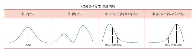
→ 자료의 평균값·중앙값·최빈값이 거의 비슷하다면 <그림 3>의 ①과 같은 단봉분포가 된다. 단봉분포의 평균값은 대푯값으로써 의미가 있다.
반면 <그림 3>의 ②처럼 자료가 쌍봉분포라면 평균값만으로 자료를 판단하기에 부족하다.
또한 자료가 ‘최빈값 < 중앙값 < 평균값’ 형태를 취한다면 <그림 3>의 ③처럼 봉우리가 왼쪽으로 치우친 모습을, ‘평균값 < 중앙값 < 최빈값’ 형태라면 <그림 3>의 ④와 같이 오른쪽으로 치우친 모양을 갖는다.
예를 들어 시험 결과 저득점자가 극단적으로 많으면 왼쪽으로, 고득점자가 극단적으로 많으면 오른쪽으로 쏠린 형태의 분포가 나온다.
분산(Variance)
-
데이터 값들이 평균으로부터 얼마나 떨어져 있는지를 나타내는 척도
- 데이터의 흩어짐 정도를 측정
- 분산이 크면 데이터가 넓게 퍼져 있고, 작으면 데이터가 평균에 가깝게 모여 있음을 의미
-
분산을 구하는 방법: 각 데이터 값에서 평균을 뺀 값을 제곱한 후, 이를 모두 더하고 데이터의 개수로 나눔
- 편차제곱의 평균
- 평균: 변량의 합/인원수
- 편차: 변량-평균
- 편차제곱의 평균: (변량-평균)^2의 합/인원수
- 제곱하는 이유: 양수, 음수가 중요한 게 아니라 '평균으로부터 떨어진 정도'가 중요하기 때문
- 단점:
수치가 너무 커 한눈에 파악하기 어려움
숫자를 직관적으로 이해하기 힘듦- 아래 예시에서 평균이 85인데 분산이 125인 게 무슨 뜻인지 알기 어려움
- 편차제곱의 평균
-
분산 계산 예시
- 네 명의 학생이 받은 시험 점수가 70, 80, 90, 100이라고 가정
- 이들의 평균은 (70 + 80 + 90 + 100) / 4 = 85
- 각각의 데이터 값에서 평균을 뺀 값을 제곱하면:
- (70 - 85)^2 = 225
- (80 - 85)^2 = 25
- (90 - 85)^2 = 25
- (100 - 85)^2 = 225
- 이 값을 모두 더한 후 데이터의 개수로 나누면 분산 = (225 + 25 + 25 + 225) / 4 = 125
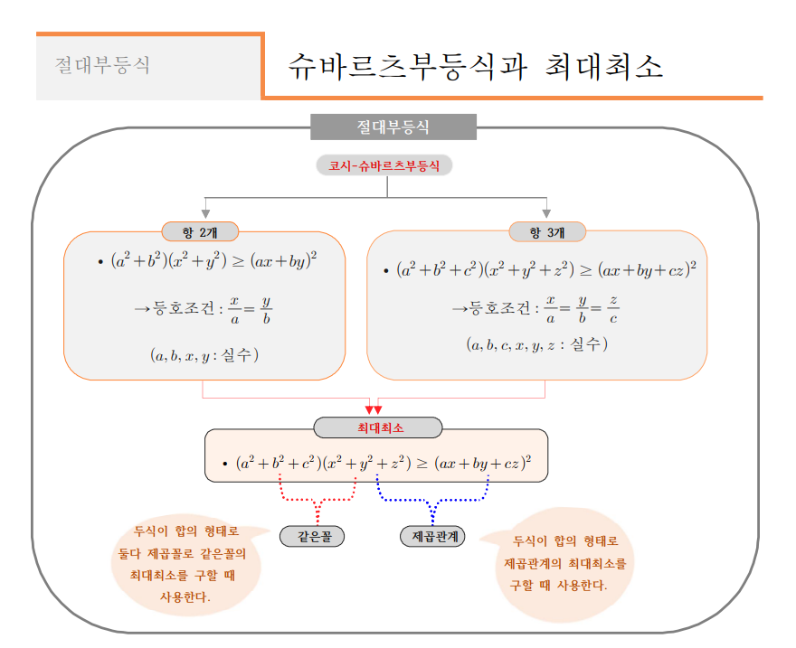
→ cf. 정확도(accuracy)와 정밀도(precision)
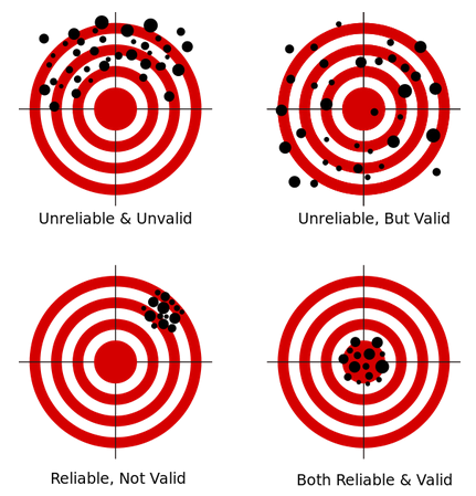
- 정확도: 측정값이 목푯값과 가까운 정도. 통계에서는 타당도(validarity)라는 용어로 사용
- 정밀도: 측정을 반복했을 때 측정값들 간에 가까운 정도. 통계에서는 신뢰도(reliability)라는 용어로 사용
- 3사분면은 정확도 낮지만 정밀도 높음
- 4사분면은 정확도 높고 정밀도 높음
- 1사분면, 4사분면의 모습이 분산 작은 거
2사분면, 3사분면의 모습이 분산 큰 거- 데이터 값들이 평균에서 많이 떨어져 있음
표준편차 (Standard Deviation)
-
데이터 값들이 평균에서 얼마나 떨어져 있는지를 나타내는 통계적 척도
- 분산의 제곱근을 취하여 계산
-
데이터의 변동성을 측정하며, 값이 클수록 데이터가 평균으로부터 더 넓게 퍼져 있음을 의미
- 우리가 가지고 있는 데이터의 단위와 같아진다는 게 포인트
-
표준편차 계산 예시
- 네 명의 학생이 받은 시험 점수가 70, 80, 90, 100이라고 가정
- 이들의 평균은 (70 + 80 + 90 + 100) / 4 = 85
- 각각의 데이터 값에서 평균을 뺀 값을 제곱하면:
- (70 - 85)^2 = 225
- (80 - 85)^2 = 25
- (90 - 85)^2 = 25
- (100 - 85)^2 = 225
- 이 값을 모두 더한 후 데이터의 개수로 나누면 분산 = (225 + 25 + 25 + 225) / 4 = 125
- 표준편차는 분산의 제곱근이므로 분산에 루트(root)를 씌워 약 11.18 → 평균에서 대략 10점 정도 값이 벌어져 있음
★ 우리가 가지고 있는 데이터의 단위에 맞는 숫자값이 나오게 된다★
표준편차와 분산의 관계
- 분산과 표준편차는 동일하게 데이터의 변동성을 측정하는 두 가지 주요 척도
- 두 개념은 밀접하게 연관되어 있음
- 표준편차는 분산의 제곱근
- 분산은 데이터 값과 평균의 차이를 제곱하여 평균을 낸 값이기 때문에 제곱 단위로 표현되지만, 표준편차는 다시 제곱근을 취하여 원래 데이터 값과 동일한 단위로 변환함 → 표준편차는 분산보다 직관적!
(2) 추론통계(Statistical Inference)
→ 가지고 있는 정보를 바탕으로 우리가 접하지 않은 것에 대한 '추론'을 진행
(inference: a guess that you make or an opinion that you form based on the information that you have)
Inference is an act of drawing a conclusion based on evidence or reasoning, while a guess is an attempt to predict or estimate something without sufficient information.
- 표본 데이터를 통해 모집단의 특성을 추정(추론)하고 가설을 검정하는 통계 방법
- 주로 신뢰구간, 가설검정 등을 사용
- 데이터의 일부를 가지고 데이터 전체를 추정하는 것이 핵심
- 비록 그 사람의 인생 전체를 다 본 것은 아니지만 대화를 진행하는 시간 동안 얻어낸 정보로 그 사람이 어떤 사람일지 알아가는 것과 같음
신뢰구간(Confidence Interval)
- 모집단의 평균이 특정 범위 내에 있을 것이라는 확률을 나타냄
- 일반적으로 95% 신뢰구간이 사용되며, 이는 모집단 평균이 95% 확률로 이 구간 내에 있음을 의미
- 만약 어떤 설문조사에서 평균 만족도가 75점이고, 신뢰구간이 70점에서 80점이라면, 우리는 95% 확률로 실제 평균 만족도가 이 범위 내에 있다고 말할 수 있음
가설검정(Hypothesis Testing)
- 모집단에 대한 가설을 검증하기 위해 사용
- 일반적으로 두 가지 가설이 있음: 귀무가설, 대립가설
- 귀무가설(H0)
- 검증하고자 하는 가설이 틀렸음을 나타내는 기본 가설(변화가 없다, 효과가 없다 등)
- 대립가설(H1)
- 귀무가설과 반대되는 가설
- 주장하는 바를 나타냄(변화가 있다, 효과가 있다 등)
- p-value를 통해 귀무가설을 기각할지 여부를 결정
- 귀무가설(H0)
- 예를 들어, 새로운 교육 프로그램이 학생들의 성적에 영향을 미치는지 알고 싶다면:
- 귀무가설
- "프로그램이 성적에 영향을 미치지 않는다"
- 대립가설
- "프로그램이 성적에 영향을 미친다"
- 귀무가설
(3) 실제 사용 예시
- 기술통계
- 회사의 매출 데이터를 요약하기 위해 평균 매출, 매출의 표준편차 등을 계산
- 추론통계
- 일부 고객의 설문조사를 통해 전체 고객의 만족도를 추정
1.3 다양한 분석 방법
- 통계 분석의 다양한 분석 방법 알아보기
(1) 위치추정
- 데이터의 중심을 확인
- 평균, 중앙값이 대표적인 위치 추정 방법
- (예) 학생들의 시험 점수에서 평균 점수, 중간 점수를 계산
파이썬 실습
# 데이터 분석에서 자주 사용되는 라이브러리
import pandas as pd
# 다양한 계산을 빠르게 수행하게 돕는 라이브러리
import numpy as np
# 시각화 라이브러리
import matplotlib.pyplot as plt
# 시각화 라이브러리2
import seaborn as sns

data = [85, 90, 78, 92, 88, 76, 95, 89, 84, 91]
data_mean = np.mean(data)
data_median = np.median(data)

print(f'평균: {data_mean}, 중앙값:{data_median}')
(2) 변이추정
- 데이터들이 서로 얼마나 다른지 확인
- 분산, 표준편차, 범위(range) 등을 사용
- 범위(range)
- 데이터셋에서 가장 큰 값과 가장 작은 값의 차이를 나타내는 간단한 분포의 측도
- 계산이 간단하여 기본적인 데이터 분석에서 자주 사용됨
- 범위를 통해 데이터가 어느 정도의 변동성을 가지는지 쉽게 파악할 수 있음
- 수식: 범위(R) = 최댓값 - 최솟값
- 범위(range)
- (예) 매출 데이터의 변이를 분석하여 비즈니스의 안정성을 평가
파이썬 실습
data_variance = np.var(data)
data_std_dev = np.std(data)
data_range = np.max(data) - np.min(data)

print(f'분산: {data_variance}, 표준편차: {data_std_dev}, 범위: {data_range}')
(3) 데이터 분포 탐색
- 데이터의 값들이 어떻게 이루어져 있는지 확인
- 히스토그램과 상자 그림(Box plot)
- 데이터의 분포를 시각적으로 표현하는 대표적인 방법
- (예) 시험 점수의 분포를 히스토그램과 상자 그림으로 표현
파이썬 실습
plt.hist(data, bins=5)
plt.title('histogram')
plt.show()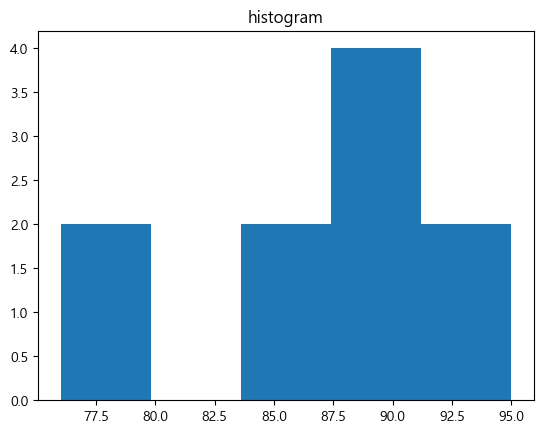
plt.boxplot(data)
plt.title('box plot')
plt.show()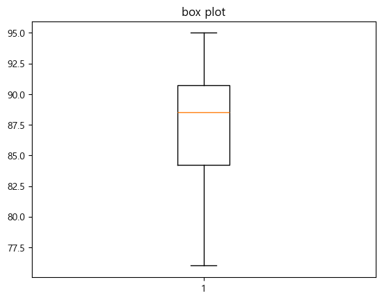
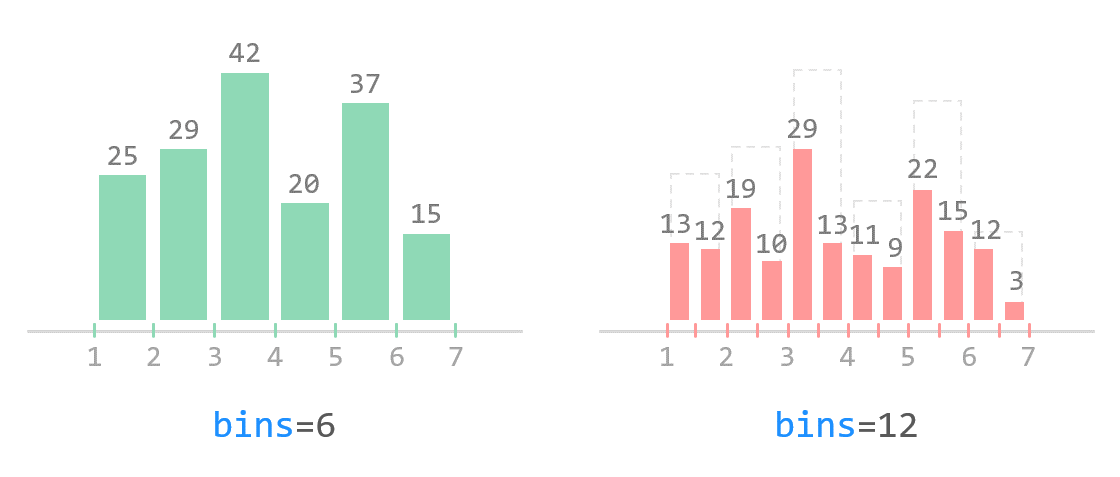
- 구간은 임의로 범위를 정할 수도 있음
- box plot에서 주황색 선은 중앙값임
보충 학습
bins=5더 알아보기bins=: 데이터를 몇 개의 구간으로 쪼개어(계급을 나누어) 히스토그램을 그릴지 설정하는 옵션- 구간==막대의 너비
bins=n: n개의 동일한 width를 갖는 bin을 생성하겠다는 뜻- 기본값은
10
plt.hist(data)
plt.title('compare')
plt.show()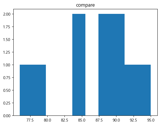
→ 구간의 개수에 따라 히스토그램 분포의 형태가 달라질 수 있음
→ 적절한 구간의 개수를 지정해야 함!
weight = [68, 81, 64, 56, 78, 74, 61, 77, 66, 68, 59, 71,
          80, 59, 67, 81, 69, 73, 69, 74, 70, 65]

plt.hist(weight, label='bins=10')
plt.hist(weight, bins=30, label='bins=30')
plt.legend()
plt.show()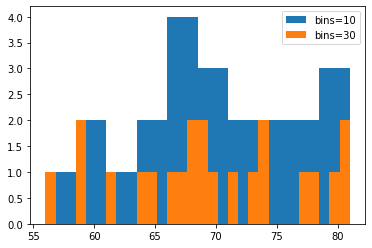
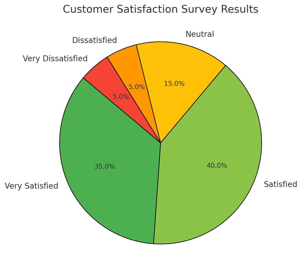
(4) 이진 데이터와 범주 데이터 탐색
- 데이터들이 서로 얼마나 다른지 확인
- 최빈값(개수가 제일 많은 값)을 주로 사용
- 파이그림(pie plot)과 막대 그래프
- 막대 그래프 vs. 히스토그램
- 막대 그래프: 범주형 데이터에서 사용
- 히스토그램: 수치형 데이터에서 사용 → 구간을 정해주지 않으면 개수 세기 모호함! 반드시 구간을 정한 후 그 구간에 대한 개수를 count(막대 그래프는 구간 정할 필요 없음)
- 생긴 건 비슷하지만 전혀 다른 시각화 방법임
- 이진 데이터와 범주 데이터의 분포를 표현하는 대표적 방법
- 막대 그래프 vs. 히스토그램
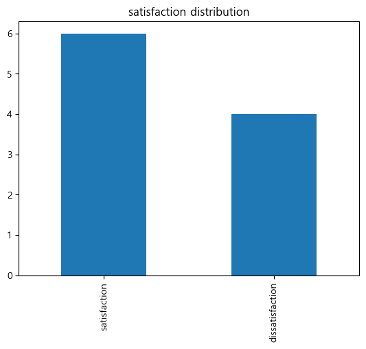
- (예) 고객 만족도 설문에서 만족/불만족의 빈도 분석
파이썬 실습
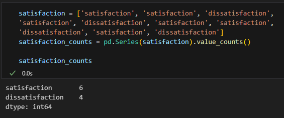
satisfaction = ['satisfaction', 'satisfaction', 'dissatisfaction',
'satisfaction', 'dissatisfaction', 'satisfaction', 'satisfaction',
'dissatisfaction', 'satisfaction', 'dissatisfaction']
satisfaction_counts = pd.Series(satisfaction).value_counts()

satisfaction_counts.plot(kind='bar')
plt.title('satisfaction distribution')
plt.show().value_counts()는 개수 세는 것임
보충 학습
satisfaction_counts.plot(kind='pie')
plt.title('satisfaction distribution: pie')
plt.show()
plt.pie(satisfaction_counts)
plt.title('satisfaction distribution: pie (2)')
plt.show()
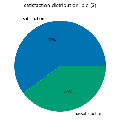
colours = sns.color_palette('colorblind6')
plt.pie(satisfaction_counts, labels=satisfaction_counts.index, colors=colours, autopct='%.0f%%')
plt.title('satisfaction distribution: pie (3)')
plt.show()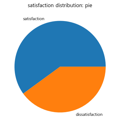
wedgeprops={'width': 0.7, 'edgecolor': 'w', 'linewidth': 5}
plt.pie(satisfaction_counts, labels=satisfaction_counts.index, colors=colours, autopct='%.0f%%', wedgeprops=wedgeprops, startangle=180)
plt.title('satisfaction distribution: pie (4)')
plt.show()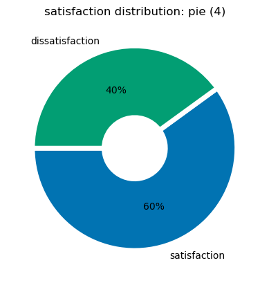
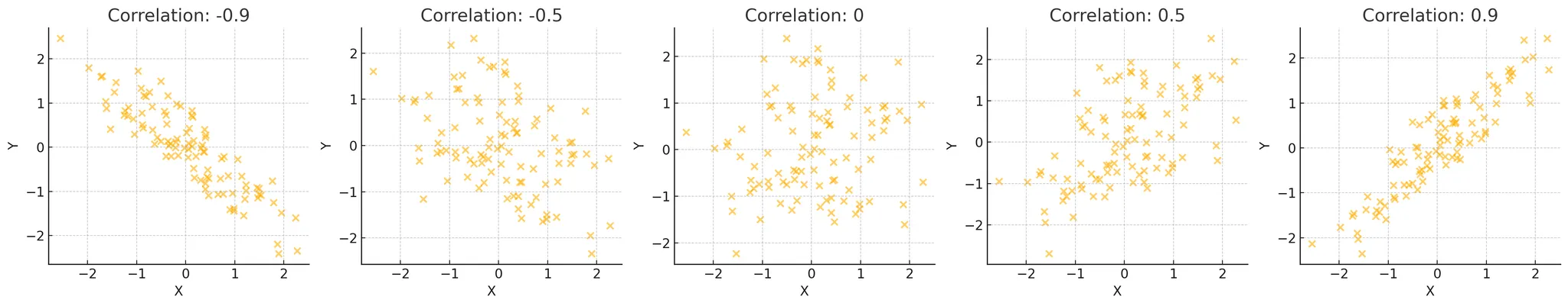
(5) 상관관계
-
데이터들끼리 서로 관련이 있는지 확인
-
두 변수 간의 관계를 측정
- 상관계수를 계산:
-1이나1에 가까워지면 강력한 상관관계- -1: 음의 방향(반비례), 1: 양의 방향(비례)
-0.5나0.5를 가지면 중간 정도의 상관관계0에 가까울수록 상관관계가 없음
- 상관계수를 계산:
-
산점도(Scatter plot)
-
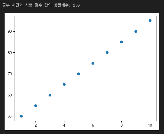
(예) 공부 시간과 시험 점수 간의 상관관계를 분석
파이썬 실습
study_hours = [10, 9, 8, 7, 6, 5, 4, 3, 2, 1]
exam_scores = [95, 90, 85, 80, 75, 70, 65, 60, 55, 50]
correlation = np.corrcoef(study_hours, exam_scores)[0, 1]

print(f"공부 시간과 시험 점수 간의 상관계수: {correlation}")

plt.scatter(study_hours, exam_scores)
plt.show()
correlation = np.corrcoef(study_hours, exam_scores)[0, 1]에서 [0, 1] 의미- indexing을 한 것!
- 안 한 것과 비교해보면 알 수 있음
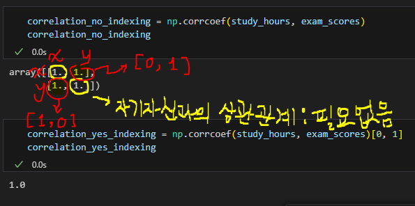
- indexing을 한 것!
보충 학습
-
np.corrcoef()- 피어슨 상관계수 값을 계산해줌
-
피어슨 상관계수

-
np.corrcoef() vs. df.corr()
-
x = np.array([[0, 2, 7], [1, 1, 9], [2, 0, 13]]).T
x_df = pd.DataFrame(x)
print("matrix:")
print(x)
print()
print("df:")
print(x_df)
print()

print("np correlation matrix: ")
print(np.corrcoef(x))
print()
print("pd correlation matrix: ")

print(x_df.corr())
print()
→ Why the numpy correlation coefficient matrix and the pandas correlation coefficient matrix different when using np.corrcoef(x) and df.corr()?
matrix: [[ 0 1 2] [ 2 1 0] [ 7 9 13]] df: 0 1 2 0 0 1 2 1 2 1 0 2 7 9 13 np correlation matrix: [[ 1. -1. 0.98198051] [-1. 1. -0.98198051] [ 0.98198051 -0.98198051 1. ]] pd correlation matrix: 0 1 2 0 1.000000 0.960769 0.911293 1 0.960769 1.000000 0.989743 2 0.911293 0.989743 1.000000 -
np.corrcoef(x.T)==x_df.corr()orprint(np.corrcoef(x, rowvar=False)) -
You are taking a different set of numbers in the correlation coefficients.
Think about it in a 2x3 matrix:x = np.array([[0, 2, 7], [1, 1, 9]]) np.corrcoef(yx)gives
array([[1.        , 0.96076892],
       [0.96076892, 1.        ]])
and
x_df = pd.DataFrame(yx.T)
print(x_df)
x_df[0].corr(x_df[1])
gives
   0  1
0  0  1
1  2  1
2  7  9

0.9607689228305227
where the 0.9607... etc numbers match the output of the NumPy calculation.
If you do it the way in your calculation it is equivalent to comparing the correlation of the rows rather than the columns. You can fix the NumPy version using
.Tor the argumentrowvar=False
-
-
corr와 np.corrcoef() 차이 비교의 내용에 따르면 NULL값에 따른 민감도 차이가 있다고 함
- stackoverflow에도 비슷한 내용이 있음
- One of the main features of pandas is being NaN friendly. To calculate correlation matrix, simply call df_counties.corr(). (df.corr() is NaN tolerant whereas np.corrcoef is not)
- stackoverflow에도 비슷한 내용이 있음
(6) 인과관계와 상관관계의 차이
- 인과관계는 상관관계와는 다르게 원인, 결과가 분명해야 함
- 상관관계는 두 변수 간의 관계를 나타내며, 인과관계는 한 변수가 다른 변수에 미치는 영향을 나타냄
- (예) 아이스크림 판매량과 익사 사고 수 간의 상관관계는 높지만, 인과관계는 아님!
(7) 두 개 이상의 변수 탐색
- 여러 데이터들끼리 서로 관련이 있는지 확인
- 다변량 분석
- 여러 변수 간의 관계를 분석
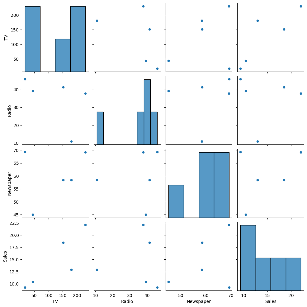
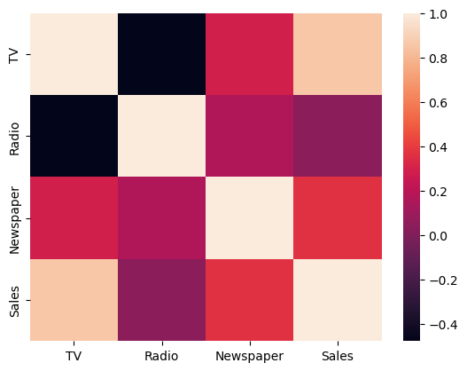
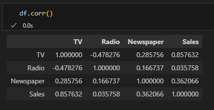
- (예) 여러 마케팅 채널의 광고비와 매출 간의 관계 분석
파이썬 실습
data = {'TV': [230.1, 44.5, 17.2, 151.5, 180.8],
        'Radio': [37.8, 39.3, 45.9, 41.3, 10.8],
        'Newspaper': [69.2, 45.1, 69.3, 58.5, 58.4],
        'Sales': [22.1, 10.4, 9.3, 18.5, 12.9]}
df = pd.DataFrame(data)

sns.pairplot(df)
plt.show()

# heatmap까지 그린다면
sns.heatmap(df.corr())
plt.show()