100. Solution: prettify
file: project-prettify.zip
Let's take just five minutes to quickly make this website a little bit prettier, just to show you how easy it is to customize a website once you have the layout done.
https://www.drawkit.io/
https://undraw.co/illustrations
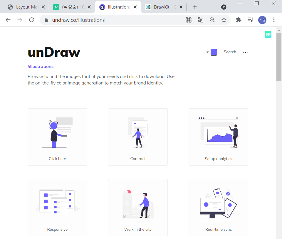
they have fonts, illustrations, mockups, UI kits, everything for free that you can use on your webstie.
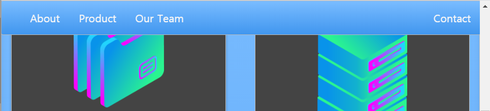
In our case, we can use something like Endre over here that gives us a ton of MIT illustrated or licensed.
Let's use the illustration in my project.
Change from
<div class="container zone red">Cover!!!</div>to
<div class="container zone red"><img class="cover" src="./img/undraw.png"></div>If I save and refresh
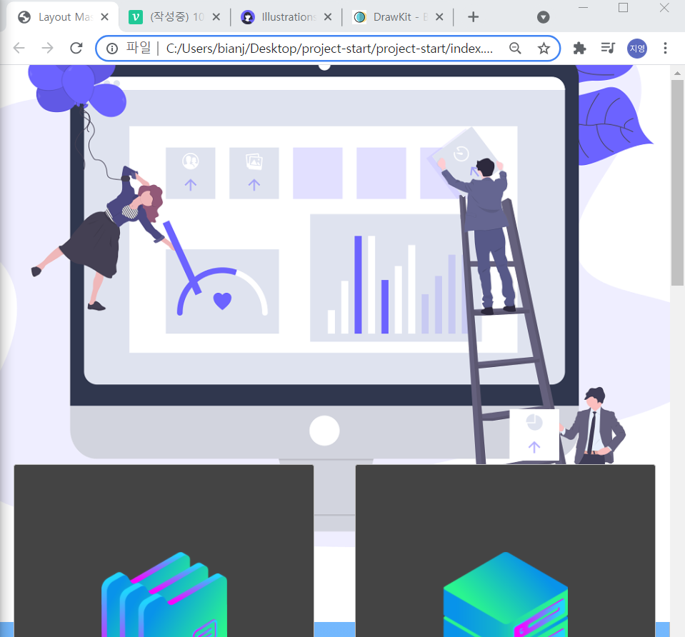
this image is too big. let's fix this by going to our style.
.cover{
    width: 100%;
}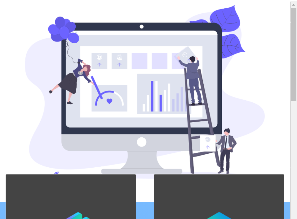
still big.
.cover{
    width: 30rem;
}
that's better
but we want to get rid of this red background.
let's go to our zone in html.
change from
<div class="container zone red"><img class="cover" src="./img/undraw.png"></div>to
<div class="container zone "><img class="cover" src="./img/undraw.png"></div>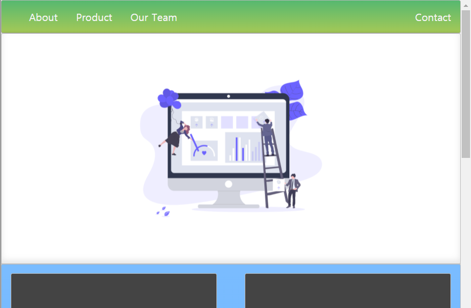
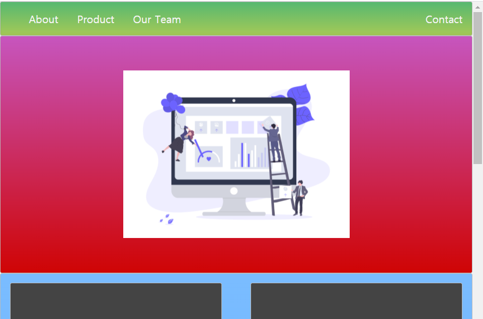
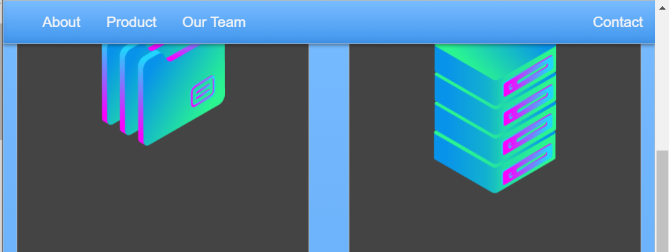
when the window size changes, it looks nice and pretty.
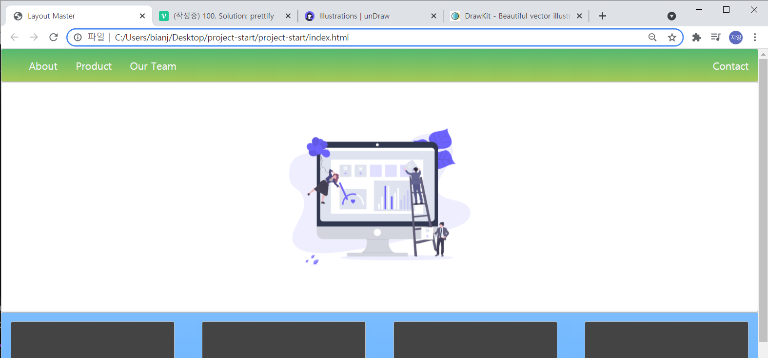
And I want the header tab to to be sticky(고정) that is to scroll with me.
we can just give the nav element
change from
<body>
  <nav class="zone green">
to
<nav class="zone green sticky">
that sticky class can have position of fixed.
and a top of zero that is sort of top
.sticky{
    position: fixed;
    top: 0;
}
^now header tab is fixed, it messed up our width.
so we want to make sure that the width is always a hundred percent.
.sticky{
    position: fixed;
    top: 0;
    width: 100px;
}
Again, those three properties together is a common pattern that you'll see to make.
let's make the green navigation bar blue.
<nav class="zone blue sticky">
What else we can change our font, let's say, to something.
change from
body{
    margin: auto 0;
}
to
body{
    margin: auto 0;
    font-family: Arial
}
it looks little bit cleaner.
And I want to do something different when we hover over the zone.
.box:hover {
    -webkit-transform: rotate(-7deg);
    -moz-box-shadow:rotate(-7deg);
    -o-box-shadow:rotate(-7deg);
    box-shadow:rotate(-7deg);
}
참고
ctrl + 각 문장 끝을 클릭 후 backspace 하면
문장 한꺼번에 끝에서 지우기 가능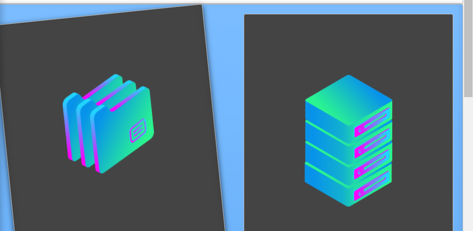
Look at that, we have some grid systems that when we hover over them, they rotate seven degrees.
