https://getbootstrap.com/docs/4.0/layout/grid/
column
<!DOCTYPE html>
<html>
<head>
<title>Bootstrap</title>
<link rel="stylesheet" href="https://maxcdn.bootstrapcdn.com/bootstrap/4.0.0/css/bootstrap.min.css" integrity="sha384-Gn5384xqQ1aoWXA+058RXPxPg6fy4IWvTNh0E263XmFcJlSAwiGgFAW/dAiS6JXm" crossorigin="anonymous">
<link rel="stylesheet" type="text/css" href="style.css">
</head>
<body>
<div class="container">
<div class="row">
<div class="col">
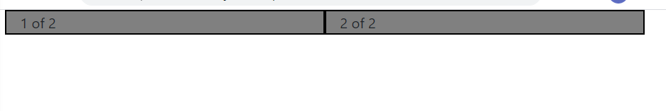
1 of 2
</div>
<div class="col">
2 of 2
<script src="https://code.jquery.com/jquery-3.2.1.slim.min.js" integrity="sha384-KJ3o2DKtIkvYIK3UENzmM7KCkRr/rE9/Qpg6aAZGJwFDMVNA/GpGFF93hXpG5KkN" crossorigin="anonymous"></script>
<script src="https://cdnjs.cloudflare.com/ajax/libs/popper.js/1.12.9/umd/popper.min.js" integrity="sha384-ApNbgh9B+Y1QKtv3Rn7W3mgPxhU9K/ScQsAP7hUibX39j7fakFPskvXusvfa0b4Q" crossorigin="anonymous"></script>
<script src="https://maxcdn.bootstrapcdn.com/bootstrap/4.0.0/js/bootstrap.min.js" integrity="sha384-JZR6Spejh4U02d8jOt6vLEHfe/JQGiRRSQQxSfFWpi1MquVdAyjUar5+76PVCmYl" crossorigin="anonymous"></script>
</body>
</html>
.col{
	background-color:grey;
	border: 2px solid black;
}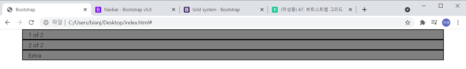
/*style.css*/<div class="container">
<div class="row">
<div class="col">
1 of 2
</div>
<div class="col">
2 of 2
</div>
</div>
</div>
<!--index.html-->
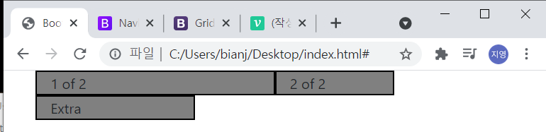
<div class="container">
  <div class="row">
    <div class="col col-sm-6">
      1 of 2
    </div>
    <div class="col col-sm-3">
      2 of 2
    </div>
  </div>
</div>
<!--index.html-->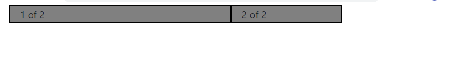
So it's saying that I want this column to have six spaces out of that 12.
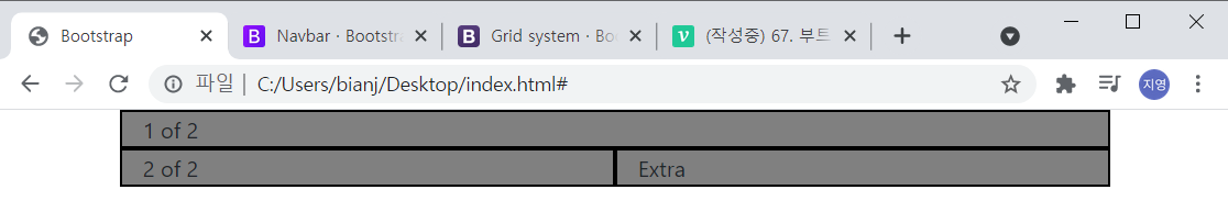
<div class="container">
<div class="row">
<div class="col col-sm-6">
1 of 2
</div>
<div class="col col-sm-3">
2 of 2
</div>
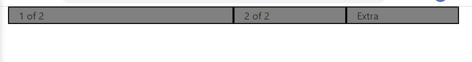
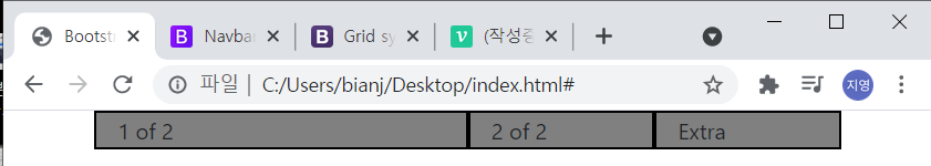
<div class="col col-sm-3">
Extra
</div>
</div>
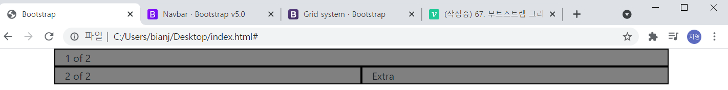
<!--index.html--> If you set extra as col-sm-4 like the picture below, Extra goes down to the next level.
<div class="col col-sm-4">
	Extra
</div>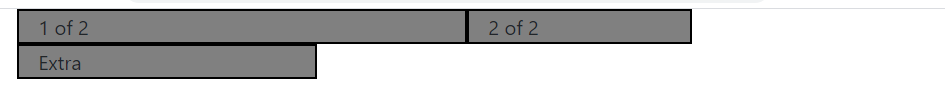
<div class="container">
  <div class="row">
    <div class="col col-sm-6 col-md-12">
      1 of 2
    </div>
    <div class="col col-sm-3 col-md-6">
      2 of 2
    </div>
    <div class="col col-sm-4 col-md-6">
      Extra
    </div>
  </div>
</div>
If the window is medium
If the window is small
<div class="container">
  <div class="row">
    <div class="col col-sm-6 col-md-12 col-lg-12">
      1 of 2
    </div>
    <div class="col col-sm-3 col-md-6 col-lg-12">
      2 of 2
    </div>
    <div class="col col-sm-3 col-md-6 col-lg-12">
      Extra
    </div>
  </div>
</div>
large
medium
small
Bootstrap it was solving this really really hard problem of making sure that our website looked good no matter what the screen size.
This is the hardest concept to grasp in Bootstrap.
