<!DOCTYPE html>
<html>
  <head>
    <title>Startup</title>

    <!-- Google Fonts -->
    <link href="https://fonts.googleapis.com/css?family=Montserrat" rel="stylesheet">

    <!-- Bootstrap CSS from a CDN. This way you don't have to include the bootstrap file yourself -->
    <link rel="stylesheet" href="https://stackpath.bootstrapcdn.com/bootstrap/4.3.1/css/bootstrap.min.css" integrity="sha384-ggOyR0iXCbMQv3Xipma34MD+dH/1fQ784/j6cY/iJTQUOhcWr7x9JvoRxT2MZw1T" crossorigin="anonymous">

    <!-- Your own stylesheet -->
    <link rel="stylesheet" type="text/css" href="style.css">
  </head>
  <body>
    <h1>The biggest startup event of the year</h1>
  </body>
</html>
<!--index.html-->
 <body>
    <h1>The biggest startup event of the year</h1>
    <button>find out more</button>
  </body>
<!--index.html-->
수정 후 ctrl+R

Responsive meta tag
Responsive meta tag allows us to add new information to our HTML page and there's different things that we can provide.
메타태그를 사용하면 HTML페이지에 새로운 정보를 추가할 수 있고 우리가 제공할 수 있는 다른 것들이 있습니다.
View point allows us to create web pages that are developed mobile first.
that is we let the page know or the browser know that this page should work on mobile devices and things like scrolling or touching or zooming.
    <title>Startup</title>
    <!-- Required meta tags -->
    <meta charset="utf-8">
    <meta name="viewport" content="width=device-width, initial-scale=1">
<!--index.html-->
background image
https://css-tricks.com/perfect-full-page-background-image/
Awesome, Easy, Progressive CSS3 Way
 background: url(images/bg.jpg) no-repeat center center fixed;
  -webkit-background-size: cover;
  -moz-background-size: cover;
  -o-background-size: cover;
  background-size: cover;
  /*style.css*/
위 코드를 css에 추가.
background: url(header.jpg) no-repeat center center fixed; 로 수정.

bootstrap class사용
"h1" tag를 헤더로 강조하기위해 "strong"요소를 사용하고 싶습니다.
    <h1><strong>The biggest startup event of the year</strong></h1>
<!--index.html-->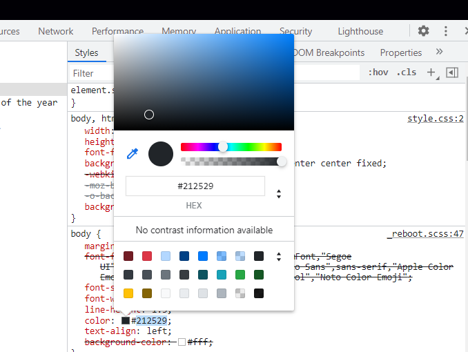
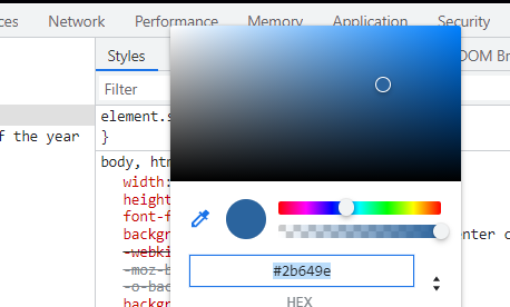
^and then grabs the hex of the color that I want.
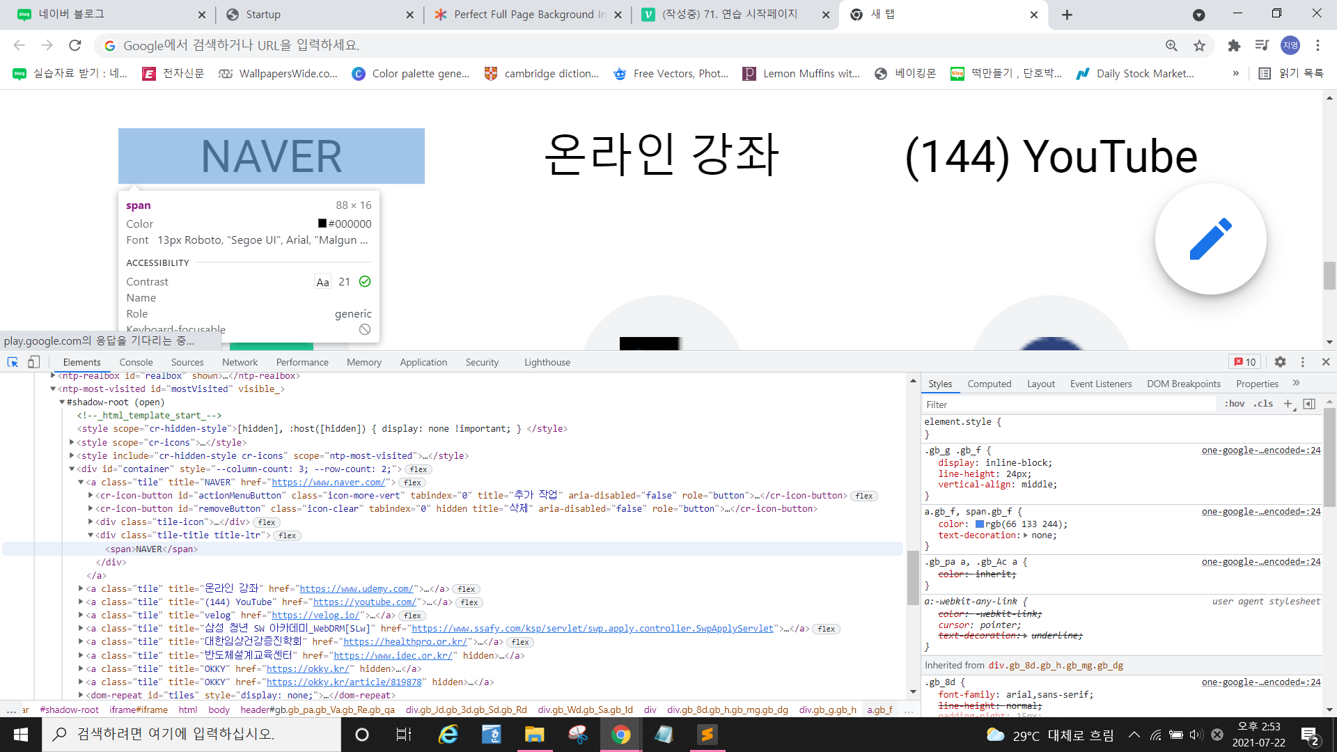
^when you hover over the text, then you can know the hex of the color.
h1{
	font-size: 3rem;
	color: #e2dbdb;
}
/*style.css*/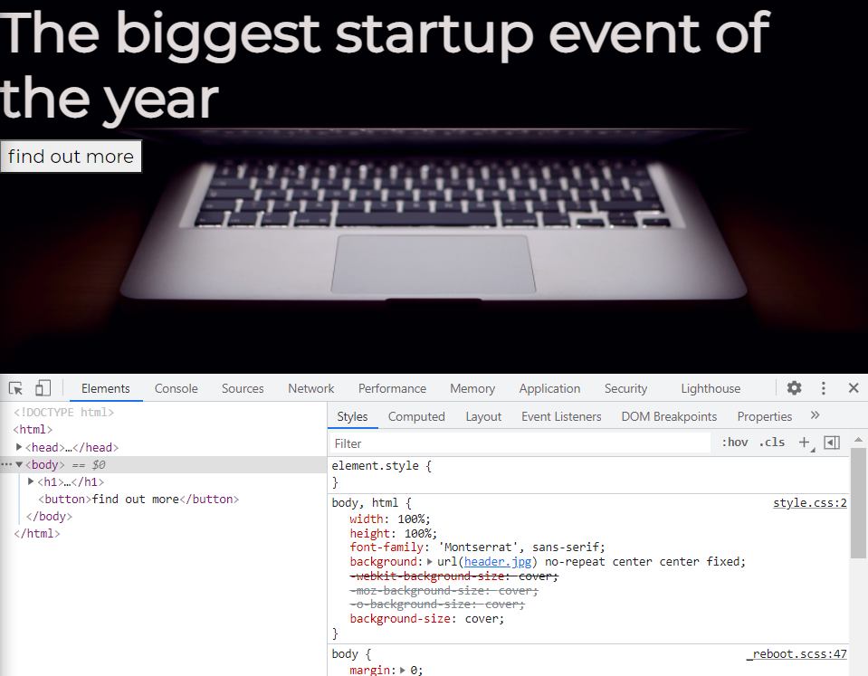
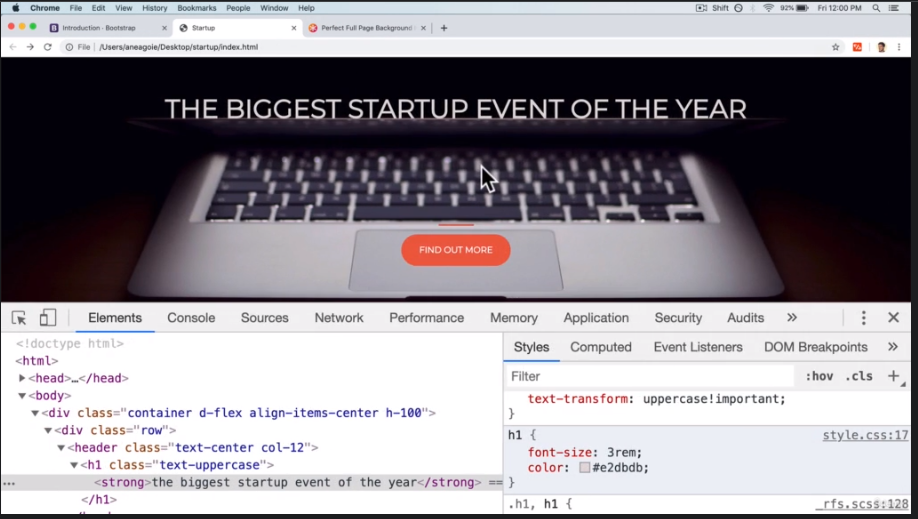
^what else can we do to this page to make it look more like this one?
I want the text uppercased here.
uppercase
<h1 class="text-uppercase"><strong>The biggest startup event of the year</strong></h1>
<!--index.html correct at body>
button
Let's add some Bootstrap styling to the buttons again.
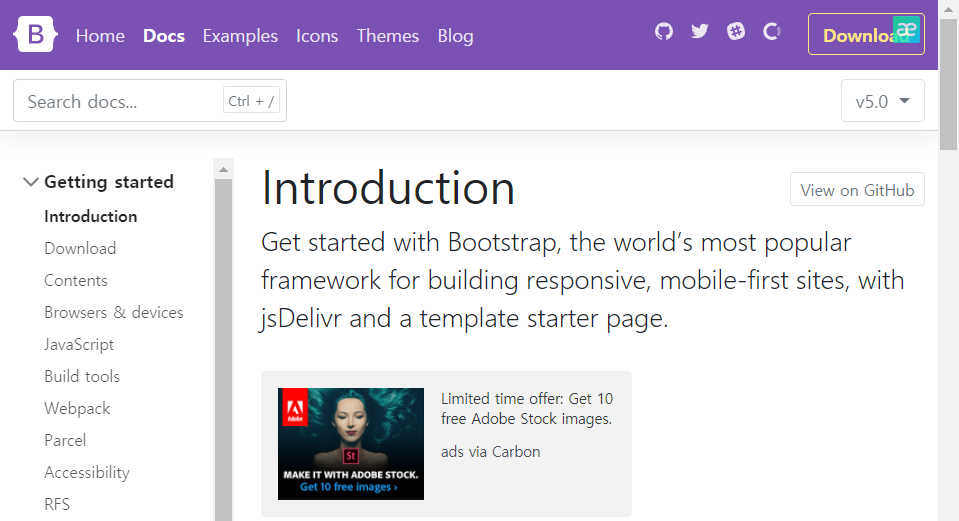
from ^ , search button.
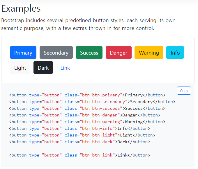
<button class="btn btn-primary">find out more</button>
<!--index.html correct at body>
if you want different color
<button class="btn btn primary btn-xl">find out more</button>
<!--index.html correct at body>
.btn-xl{
padding:1rem 2rem;
}
/*style.css*/padding of 1rem on the sides and 2rem top bottom.

^button is a lot bigger.
.btn{
	font-weight: 700;
	border-radius: 300px;
}
border-radius is to make the edges more circular.

.btn{
	font-weight: 700;
	border-radius: 300px;
	text-transform: uppercase;
}
/*correct .btn to make the button letter uppercase*/
.btn-primary{
	background-color: #F05F44
}
/* #F05F44: orange */
^when you hover the mouse over the button, then button turns blue.

^but one thing you notice is that border over here. The border has a bit of blue.
that's default for the bootstrap theme.
border-color: #F05F44;
^when you give it the same color to the border color.
.btn-primary:hover{
	background-color: #ee4b08;
	border-color: #ee4b08;
	border-width: 4px;
}

^when you hover, color turns a little bit darker orange.
line
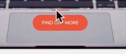
^I want to make a horizontal line over the button.

^it has a line but too long.
making a line thick
using border-width.
hr{
	border-color:#F05F44;
	border-width: 3px;
}
making a line short
hr{
	border-color:#F05F44;
	border-width: 3px;
	max-width:65px;
}
we want everything centered maybe around this laptop over here.
let's figure that out in the next post.