*files.zip
<!DOCTYPE html>
<html>
<head>
<!-- the below meta tag is default in most modern browsers. however if you have an
older browser, the emojis may not show up properly. In which case you need this meta
tag. Read more here: https://teamtreehouse.com/community/meta-charsetutf8-what-does-this-mean-or-what-does-it-do-i-deleted-it-from-the-code-and-nothing-changed -->
<meta charset="utf-8" >
<title>Grid Master</title>
<link rel="stylesheet" type="text/css" href="./style.css">
</head>
<body>
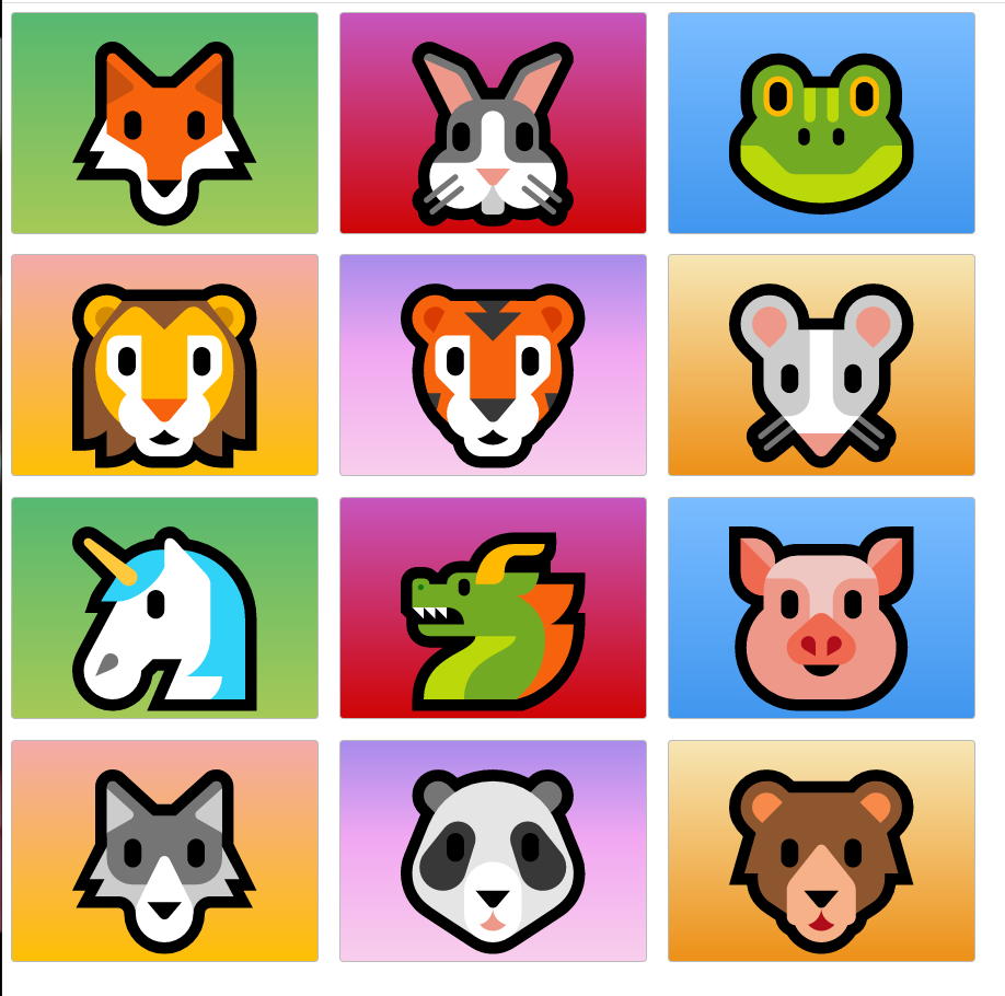
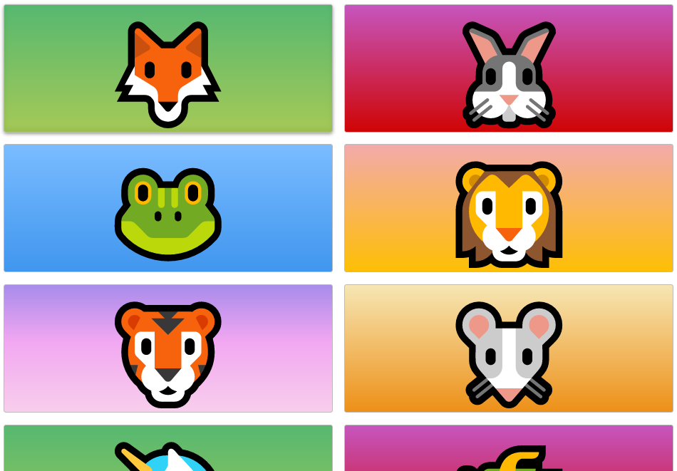
<div class="zone green">🦊</div>
<div class="zone red">🐰</div>
<div class="zone blue">🐸</div>
<div class="zone yellow">🦁</div>
<div class="zone purple">🐯</div>
<div class="zone brown">🐭</div>
<div class="zone green">🦄</div>
<div class="zone red">🐲</div>
<div class="zone blue">🐷</div>
<div class="zone yellow">🐺</div>
<div class="zone purple">🐼</div>
<div class="zone brown">🐻</div>
</body>
</html>.zone {
cursor:pointer;
display:inline-block;
text-align: center;
font-size:10em;
border-radius:4px;
border:1px solid #bbb;
transition: all 0.3s linear;
}
.zone:hover {
-webkit-box-shadow:rgba(0,0,0,0.8) 0px 5px 15px, inset rgba(0,0,0,0.15) 0px -10px 20px;
-moz-box-shadow:rgba(0,0,0,0.8) 0px 5px 15px, inset rgba(0,0,0,0.15) 0px -10px 20px;
-o-box-shadow:rgba(0,0,0,0.8) 0px 5px 15px, inset rgba(0,0,0,0.15) 0px -10px 20px;
box-shadow:rgba(0,0,0,0.8) 0px 5px 15px, inset rgba(0,0,0,0.15) 0px -10px 20px;
}
/*https://paulund.co.uk/how-to-create-shiny-css-buttons*/
/***********************************************************************
* Green Background
**********************************************************************/
.green{
background: #56B870; /* Old browsers */
background: -moz-linear-gradient(top, #56B870 0%, #a5c956 100%); /* FF3.6+ */
background: -webkit-gradient(linear, left top, left bottom, color-stop(0%,#56B870), color-stop(100%,#a5c956)); /* Chrome,Safari4+ */
background: -webkit-linear-gradient(top, #56B870 0%,#a5c956 100%); /* Chrome10+,Safari5.1+ */
background: -o-linear-gradient(top, #56B870 0%,#a5c956 100%); /* Opera 11.10+ */
background: -ms-linear-gradient(top, #56B870 0%,#a5c956 100%); /* IE10+ */
background: linear-gradient(top, #56B870 0%,#a5c956 100%); /* W3C */
}
/***********************************************************************
* Red Background
**********************************************************************/
.red{
background: #C655BE; /* Old browsers */
background: -moz-linear-gradient(top, #C655BE 0%, #cf0404 100%); /* FF3.6+ */
background: -webkit-gradient(linear, left top, left bottom, color-stop(0%,#C655BE), color-stop(100%,#cf0404)); /* Chrome,Safari4+ */
background: -webkit-linear-gradient(top, #C655BE 0%,#cf0404 100%); /* Chrome10+,Safari5.1+ */
background: -o-linear-gradient(top, #C655BE 0%,#cf0404 100%); /* Opera 11.10+ */
background: -ms-linear-gradient(top, #C655BE 0%,#cf0404 100%); /* IE10+ */
background: linear-gradient(top, #C655BE 0%,#cf0404 100%); /* W3C */
}
/***********************************************************************
* Yellow Background
**********************************************************************/
.yellow{
background: #F3AAAA; /* Old browsers */
background: -moz-linear-gradient(top, #F3AAAA 0%, #febf04 100%); /* FF3.6+ */
background: -webkit-gradient(linear, left top, left bottom, color-stop(0%,#F3AAAA), color-stop(100%,#febf04)); /* Chrome,Safari4+ */
background: -webkit-linear-gradient(top, #F3AAAA 0%,#febf04 100%); /* Chrome10+,Safari5.1+ */
background: -o-linear-gradient(top, #F3AAAA 0%,#febf04 100%); /* Opera 11.10+ */
background: -ms-linear-gradient(top, #F3AAAA 0%,#febf04 100%); /* IE10+ */
background: linear-gradient(top, #F3AAAA 0%,#febf04 100%); /* W3C */
}
/***********************************************************************
* Blue Background
**********************************************************************/
.blue{
background: #7abcff; /* Old browsers */
background: -moz-linear-gradient(top, #7abcff 0%, #60abf8 44%, #4096ee 100%); /* FF3.6+ */
background: -webkit-gradient(linear, left top, left bottom, color-stop(0%,#7abcff), color-stop(44%,#60abf8), color-stop(100%,#4096ee)); /* Chrome,Safari4+ */
background: -webkit-linear-gradient(top, #7abcff 0%,#60abf8 44%,#4096ee 100%); /* Chrome10+,Safari5.1+ */
background: -o-linear-gradient(top, #7abcff 0%,#60abf8 44%,#4096ee 100%); /* Opera 11.10+ */
background: -ms-linear-gradient(top, #7abcff 0%,#60abf8 44%,#4096ee 100%); /* IE10+ */
background: linear-gradient(top, #7abcff 0%,#60abf8 44%,#4096ee 100%); /* W3C */
}
/***********************************************************************
* Purple Background
**********************************************************************/
.purple {
background: #A88BEB; /* Old browsers */
background: -moz-linear-gradient(top, #A88BEB 0%, #F1A7F1 44%, #F8CEEC 100%); /* FF3.6+ */
background: -webkit-gradient(linear, left top, left bottom, color-stop(0%,#A88BEB), color-stop(44%,#F1A7F1), color-stop(100%,#F8CEEC)); /* Chrome,Safari4+ */
background: -webkit-linear-gradient(top, #A88BEB 0%,#F1A7F1 44%,#F8CEEC 100%); /* Chrome10+,Safari5.1+ */
background: -o-linear-gradient(top, #A88BEB 0%,#F1A7F1 44%,#F8CEEC 100%); /* Opera 11.10+ */
background: -ms-linear-gradient(top, #A88BEB 0%,#F1A7F1 44%,#F8CEEC 100%); /* IE10+ */
background: linear-gradient(top, #A88BEB 0%,#F1A7F1 44%,#F8CEEC 100%); /* W3C */
}
/***********************************************************************
* Brown Background
**********************************************************************/
.brown {
background: #f6e6b4; /* Old browsers */
background: -moz-linear-gradient(top, #f6e6b4 0%, #ed9017 100%); /* FF3.6+ */
background: -webkit-gradient(linear, left top, left bottom, color-stop(0%,#f6e6b4), color-stop(100%,#ed9017)); /* Chrome,Safari4+ */
background: -webkit-linear-gradient(top, #f6e6b4 0%,#ed9017 100%); /* Chrome10+,Safari5.1+ */
background: -o-linear-gradient(top, #f6e6b4 0%,#ed9017 100%); /* Opera 11.10+ */
background: -ms-linear-gradient(top, #f6e6b4 0%,#ed9017 100%); /* IE10+ */
background: linear-gradient(top, #f6e6b4 0%,#ed9017 100%); /* W3C */
filter: progid:DXImageTransform.Microsoft.gradient( startColorstr='#f6e6b4', endColorstr='#ed9017',GradientType=0 ); /* IE6-9 */
}
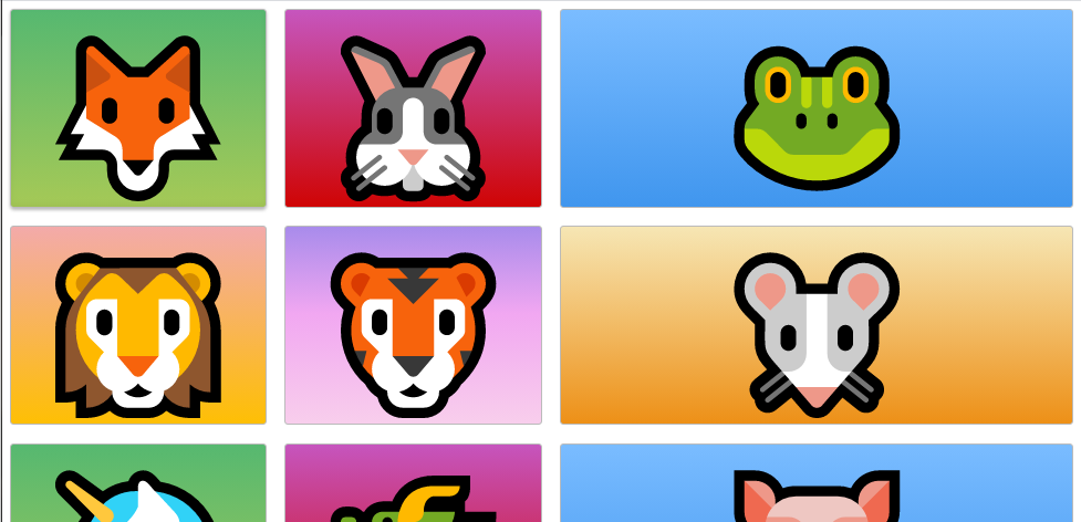
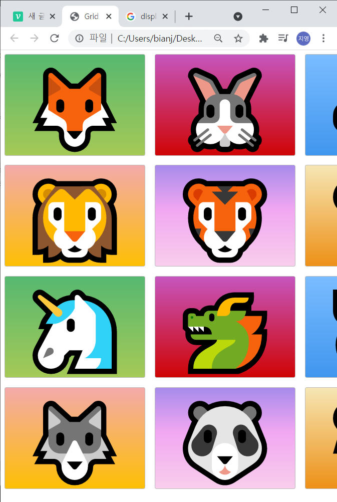
/*style.css*/If I change display from inline-block to block at '.zone' class, it changes like below.

<body>
<div class="container">
<div class="zone green">🦊</div>
<div class="zone red">🐰</div>
<div class="zone blue">🐸</div>
<div class="zone yellow">🦁</div>
<div class="zone purple">🐯</div>
<div class="zone brown">🐭</div>
<div class="zone green">🦄</div>
<div class="zone red">🐲</div>
<div class="zone blue">🐷</div>
<div class="zone yellow">🐺</div>
<div class="zone purple">🐼</div>
<div class="zone brown">🐻</div>
</div>
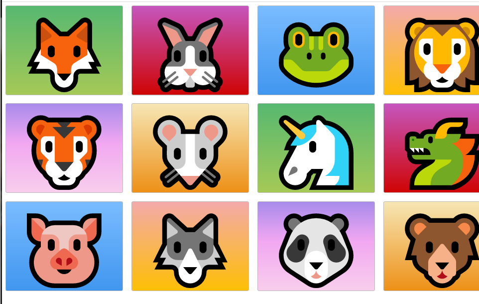
<!--index.html>.container{
display: grid;
grid-template-columns: 300px 300px;
}If I make this larger or smaller it's always going to have 300px two columns.
.container{
    display: grid;
    grid-template-columns: 300px 300px 300px;
}
^If I had let's say another 300px here and save. Refresh.
We now have 3 columns.
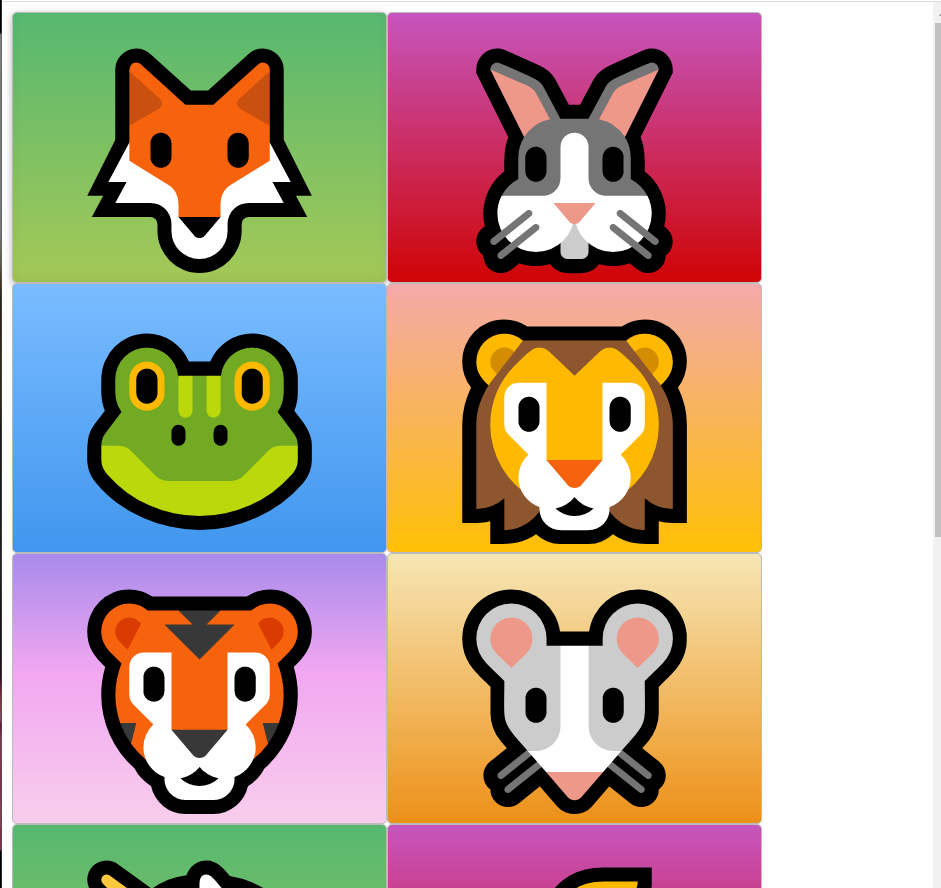
Grid gap
As you might guess from the name it tells us how much gap we want between the grids.
.container{
    display: grid;
    grid-gap: 20px;
    grid-template-columns: 300px 300px 300px;
}
Set grid-gap as 20px,
^see that we get 20px of gap.
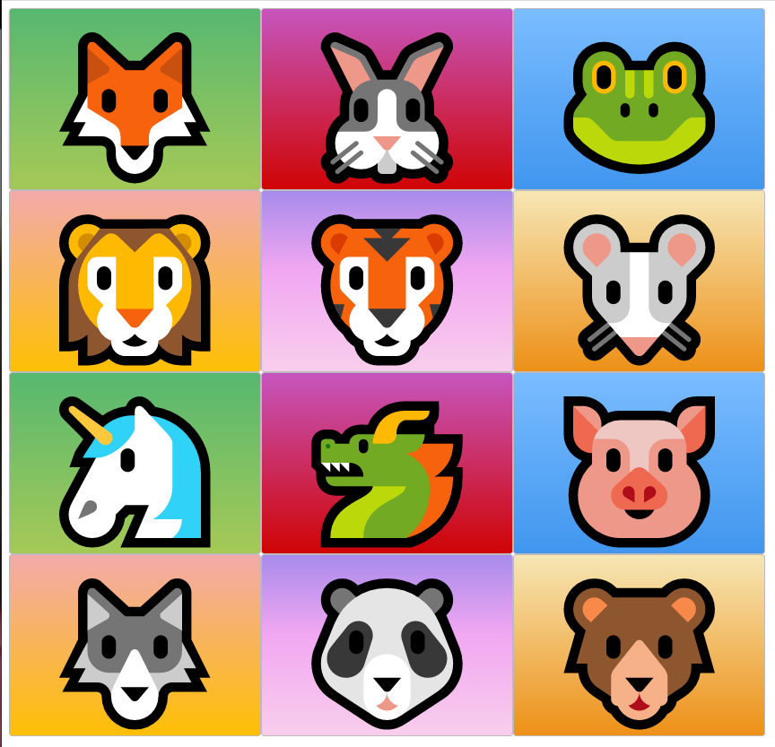
responsive
^This isn't responsive because each column is 300px wide.
And as we know users have different display sizes.
so you get these ugly grids where you have white space over here.
How will we go about solving this?
.container{
    display: grid;
    grid-gap: 20px;
    grid-template-columns: 25% 25% 25% 25%;
}

fr
I have four columns but there's still some scrolling involved.
Although we see that things are a little bit more responsive now.
'fr' means we have one fraction in this column so just fill it all up.
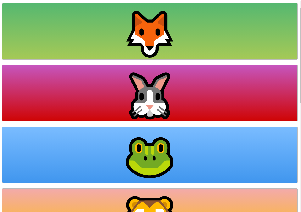
1fr
.container{
    display: grid;
    grid-gap: 20px;
    grid-template-columns: 1fr;
}
1fr 1fr
.container{
    display: grid;
    grid-gap: 20px;
    grid-template-columns: 1fr 1fr;
}
1fr 1fr 2fr
.container{
    display: grid;
    grid-gap: 20px;
    grid-template-columns: 1fr 1fr 2fr;
}