storybook
컴포넌트 단위의 ui개발 환경 지원 도구
사내 ui 라이브러리의 문서화, 디자인 시스템 개발 등 다양하게 사용 가능
storybook 설치
npm install --save-dev sbstorybook 설정
main.ts: 전반적인 스토리북 설정
.preview.ts: 미리보기 화면 설정
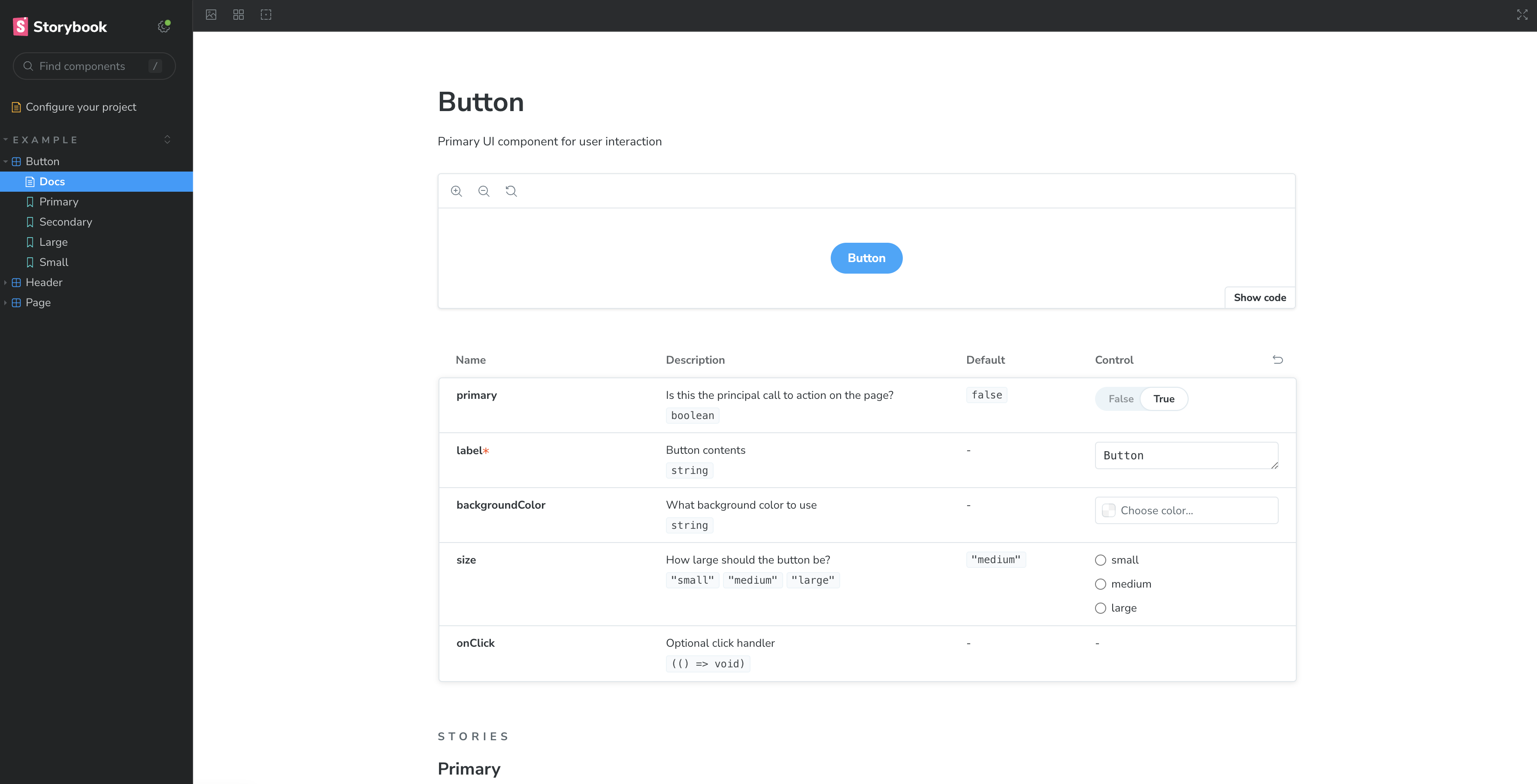
.storybook폴더의main.ts파일에서stories에서 Story로 인식할수 있는 파일들의 경로 설정addons에서 제공되는 addon들을 사용하면 다양한 기능 사용 가능
이를 통해 컴포넌트들을 원하는 폴더 구조로 생성 가능
stories: [
    "../stories/**/*.mdx",
    "../stories/**/*.stories.@(js|jsx|mjs|ts|tsx)",
  ],
아래와 같이 설정하면 src 폴더 안에 있는 stories 파일들을 인식
"...src/**/*/*.stories.@(js|jsx|mjs|ts|tsx)"컴포넌트 생성
Button.tsx 파일 생성하여 커스텀 컴포넌트 작성
// Button props type
interface ButtonProps {
  backgroundColor?: string;
  ...types
}

// button component
export const Button = ({
  backgroundColor,
  ...props
}: ButtonProps) => {
  const mode = primary ? 'storybook-button--primary' : 'storybook-button--secondary';
  return (
    <button
      type="button"
      {...props}
    >
      {label}
      <style jsx>{`
        button {
          background-color: ${backgroundColor};
        }
      `}</style>
    </button>
  );
};
story 추가
생성한 컴포넌트를 Story로 작성
.stories.ts 파일 안에 컴포넌트 예시들를 함수 형태로 작성
// Button.stories.ts
const meta = {
  title: 'Example/Button', // storybook에서의 컴포넌트 경로
  component: Button, // 사용 컴포넌트
  parameters: { // story 에서 설정할 추가 옵션
    layout: 'centered',
  },
  // 자동 문서화
  tags: ['autodocs'],
} satisfies Meta<typeof Button>;

export default meta;

// 스토리 타입
type Story = StoryObj<typeof meta>;

// Primary 의 이름으로 컴포넌트 story 생성
export const Primary: Story = {
  args: {
    primary: true,
    label: 'Button',
  },
};

// Secondary 의 이름으로 컴포넌트 story 생성
export const Secondary: Story = {
  args: {
    label: 'Button',
  },
};
storybook 실행
메인 프로젝트와는 따로 구동되는 웹화면
좌측 사이드바에 있는 메뉴들로 추가된 컴포넌트와 문서들 확인 가능
npm run storybook
yarn storybook