맷플롯립?

matplotlib은 파이썬에서 데이터 시각화를 위한 라이브러리입니다. 이 라이브러리는 그래프, 플롯, 차트 등을 만드는 데 사용됩니다. 다양한 스타일의 플롯을 생성하고 커스터마이징할 수 있는 기능들이 많이 있습니다. 주로 2D 그래픽을 다루지만, 3D 그래픽도 지원합니다. 또한 다른 라이브러리와 호환되는 특성이 있어 데이터 분석과 함께 자주 사용됩니다. Matplotlib은 히스토그램, 선 플롯, 산점도, 막대 차트 등 다양한 시각화를 할 수 있어서 데이터 분석과 시각적인 이해를 돕는 데 큰 도움이 됩니다.
import matplotlib.pyplot as plt
%matplotlib inline
from matplotlib import rc
rc('font', family='Arial Unicode MS')plt.figure(figsize=(10,6))
plt.plot([0,1,2,3,4,5,6,7,8,9],[1,1,2,3,4,2,3,5,-1,3])
plt.show()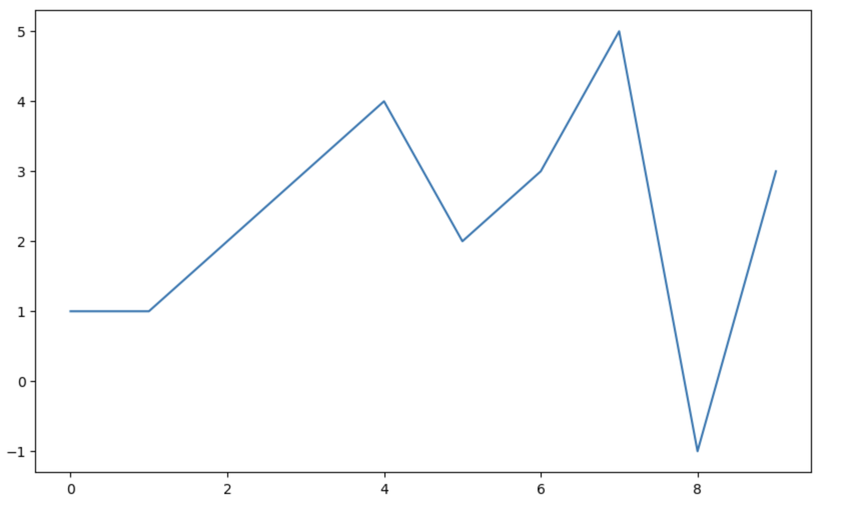
import numpy as np

t = np.arange(0,12, 0.01)
y = np.sin(t)

plt.figure(figsize=(10,6))
plt.plot(t, np.sin(t), label = 'sin')
plt.plot(t, np.cos(t), label = 'cos')
plt.grid()
plt.legend()
plt.xlabel('time')
plt.ylabel('Amplitude')
plt.title('Example of sinewave')
plt.show()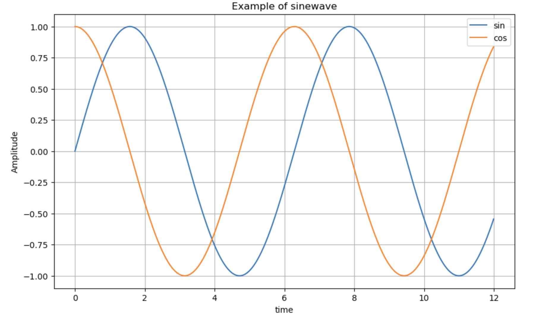
t = np.arange(0,5,0.5) # t = [0, 0.5, 1, ..., 5]

plt.figure(figsize=(10,6))
plt.plot(t, t, 'r--')
plt.plot(t, t ** 2, 'bs') # bs = blue square
plt.plot(t, t ** 3, 'g^') # g^ = green triange
plt.show()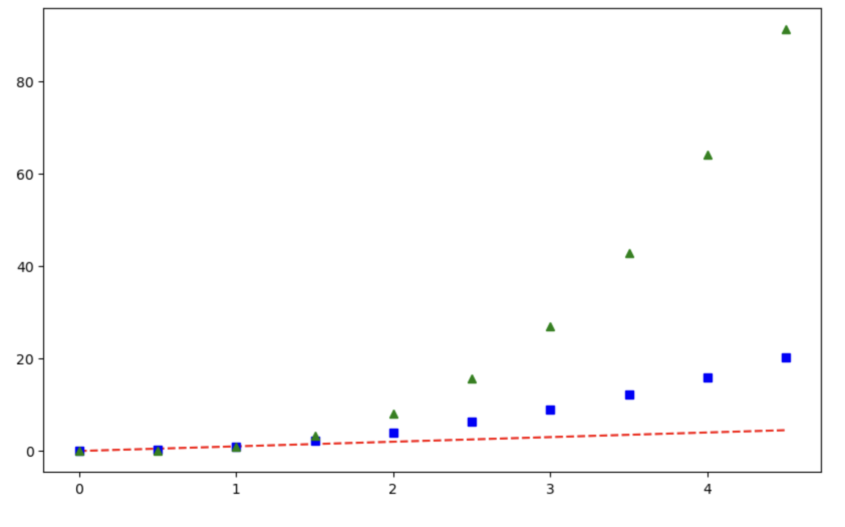
t = [0, 1, 2, 3, 4, 5, 6]
y = [1, 4, 5, 8, 9, 5, 3]

plt.figure(figsize=(10,6))
plt.plot(
    t,
    y,
    color = 'green',
    linestyle = 'dashed',
    marker = 'o',
    markerfacecolor = 'blue',
    markersize = 12
)

plt.xlim([-0.5, 6.5])
plt.ylim([0.5, 9.5])
plt.show()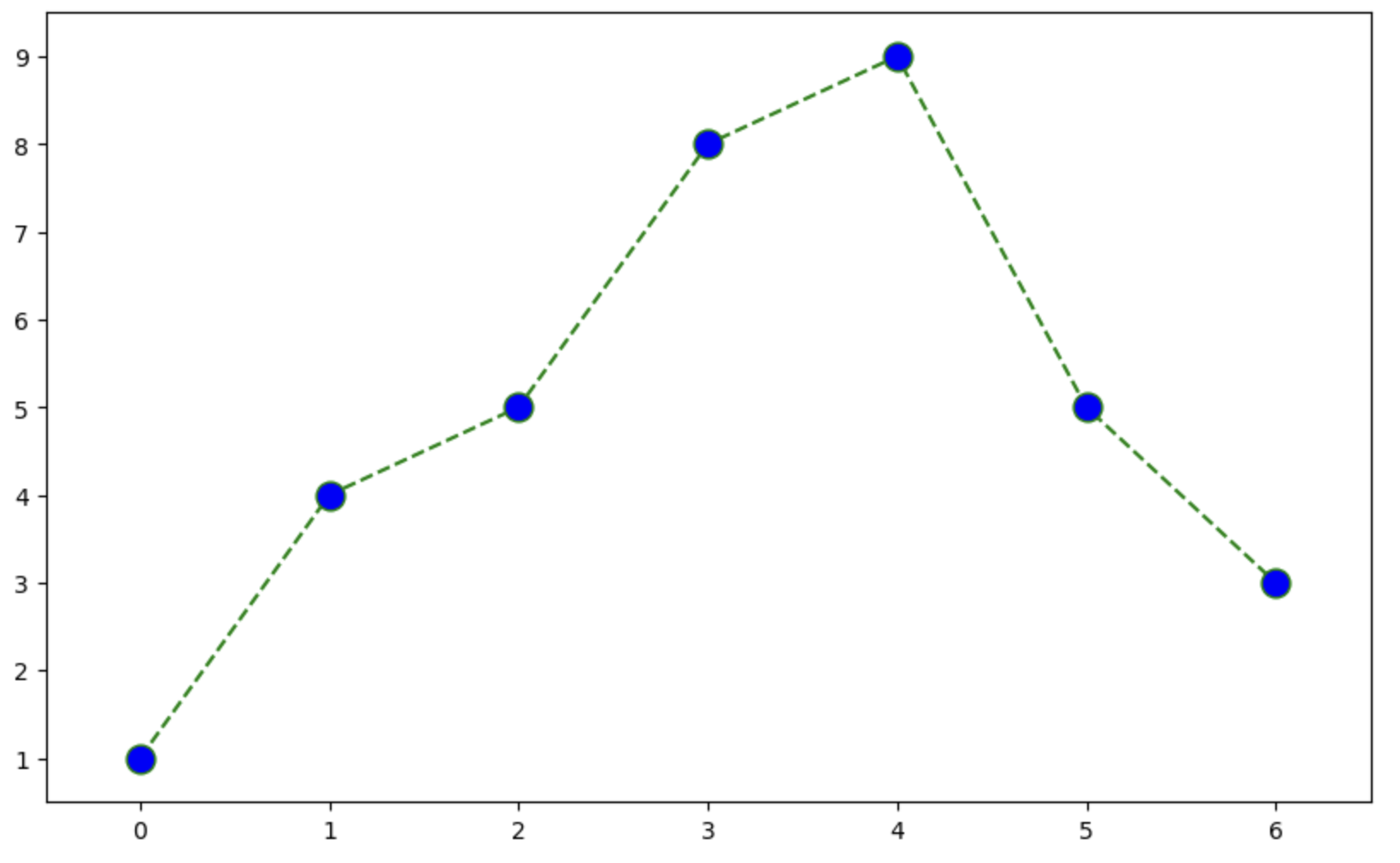
t = np.array([0,1,2,3,4,5,6,7,8,9])
y = np.array([9,8,7,9,8,3,2,4,3,4])
colormap = t

plt.figure(figsize=(10,6))
plt.scatter(t, y, s=50, c=colormap, marker = '>')
plt.colorbar()
plt.show()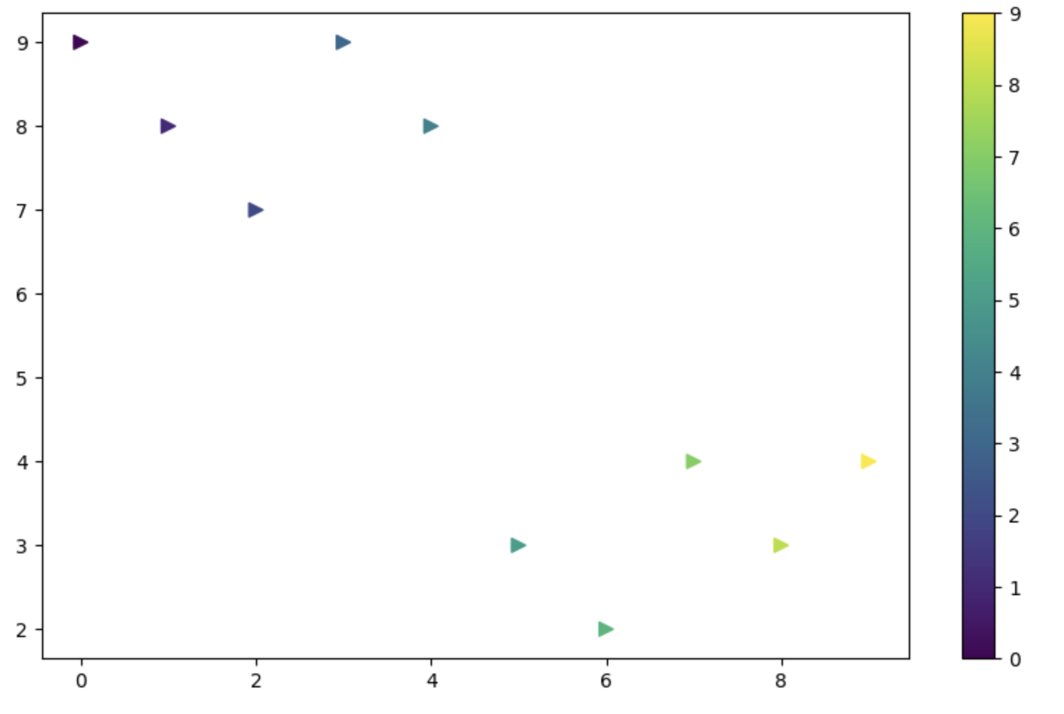
씨본?

시본(Seaborn)은 파이썬의 데이터 시각화 라이브러리 중 하나로, Matplotlib를 기반으로 만들어진 고수준 인터페이스를 제공합니다. 주로 통계 데이터를 시각화하고 분석하는 데 사용되며, Matplotlib보다 더 간결하고 편리한 API를 제공하여 보다 쉽게 아름다운 그래프를 생성할 수 있습니다.
import seaborn as sns

get_ipython().run_line_magic('matplotlib','inline')
x = np.linspace(0, 14, 100)
y1 = np.sin(x)
y2 = 2 * np.sin(x+0.5)
y3 = 3 * np.sin(x+1.0)
y4 = 4 * np.sin(x+1.5)sns.set_style('white')
plt.figure(figsize = (10,6))
plt.plot(x,y1,x,y2,x,y3,x,y4)
plt.show()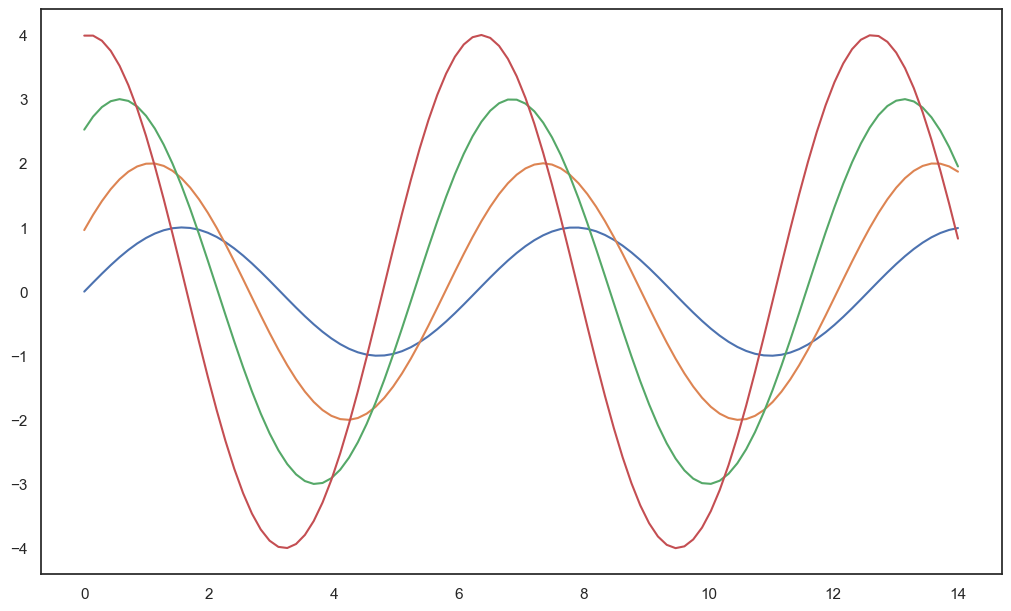
실습용 데이터 시각화
1. tips
# 실습용 데이터 불러오기
tips = sns.load_dataset('tips')
tips.head(5)plt.figure(figsize = (8,6))
sns.boxplot(x=tips['total_bill'])
plt.show()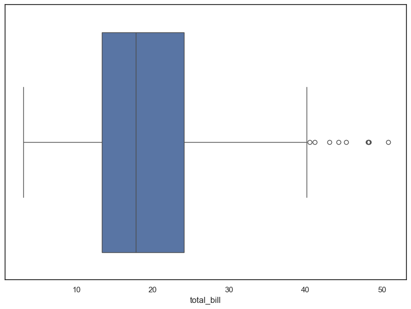
plt.figure(figsize=(8,6))
sns.boxplot(x='day', y='total_bill', hue='smoker', data=tips, palette='Set3')
sns.swarmplot(x='day', y='total_bill', data = tips, color = '.25')
plt.show()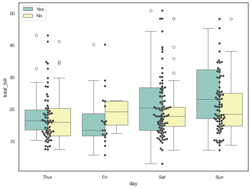
# total bill 과 tip 사이의 관계 파악
sns.set_style('darkgrid')
sns.lmplot(x='total_bill', y ='tip', data = tips)
plt.show()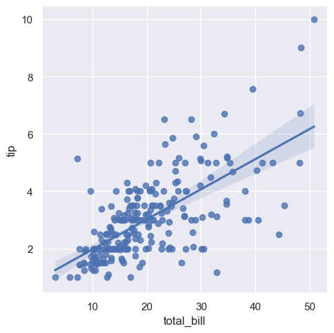
2.flights
flights = sns.load_dataset('flights')
flights.head()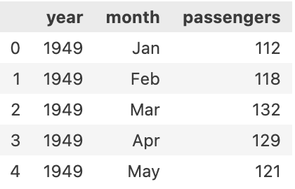
# 히트맵 표현하기
flights = flights.pivot(index='month', columns='year', values='passengers')
flights.head(5)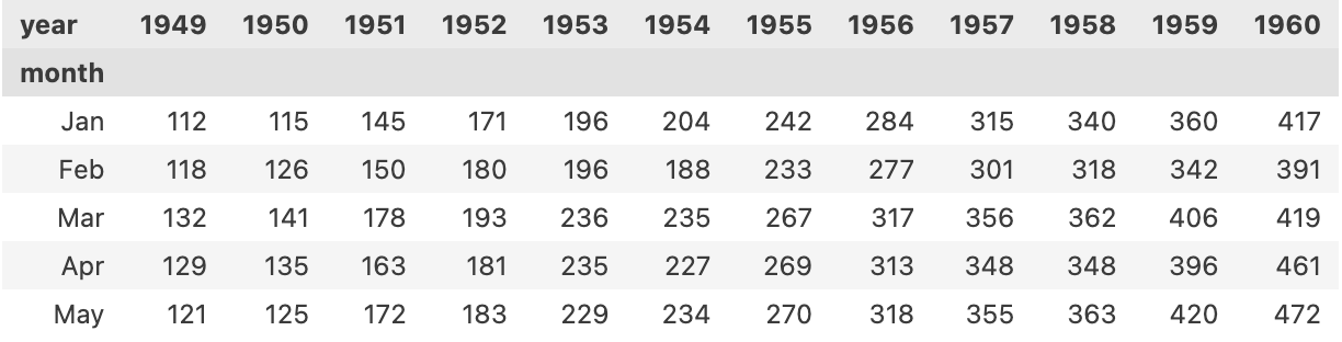
# 히트맵 표현하기
plt.figure(figsize = (10,8))
sns.heatmap(flights, annot = True, fmt = 'd', cmap='YlGnBu')
plt.show()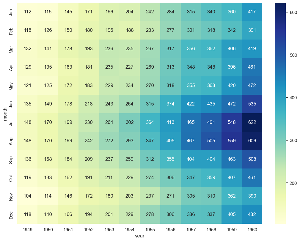
3. ticks
sns.set(style = 'ticks')
iris = sns.load_dataset('iris')
iris.head(10)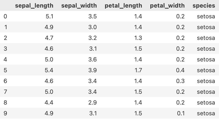
sns.pairplot(iris, hue = 'species')
plt.show()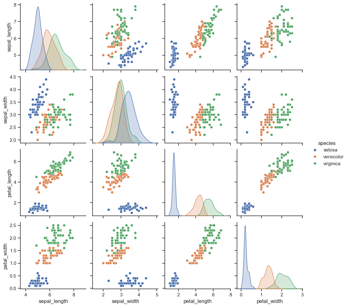
회귀 그래프 그리기
anscombe = sns.load_dataset('anscombe')
anscombe.head(5)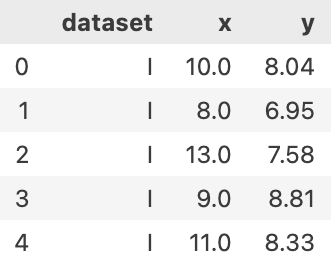
sns.set_style('darkgrid')

sns.lmplot(x='x', y='y', data = anscombe.query("dataset == 'I'"), ci=None, height = 7)
plt.show()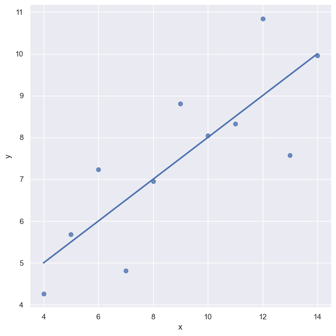
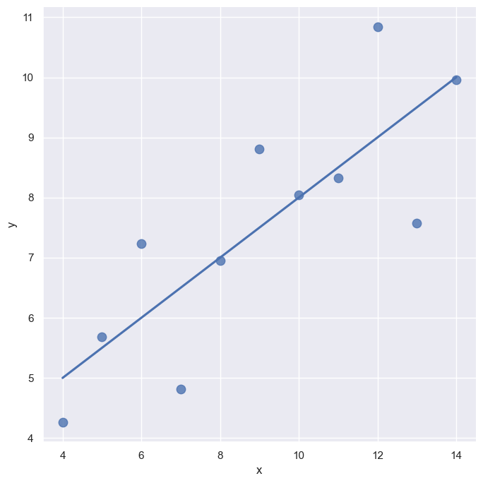
sns.lmplot(
    x='x',
    y='y',
    data = anscombe.query("dataset=='I'"),
    ci = None,
    scatter_kws = {'s':80},
    height = 7
)
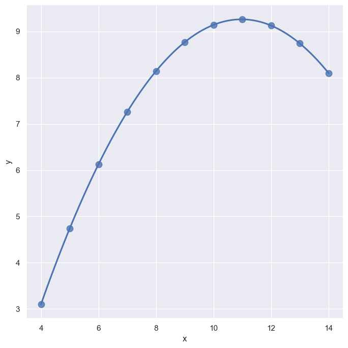
import statsmodels

sns.lmplot(
    x='x',
    y='y',
    data = anscombe.query("dataset=='II'"),
    order = 2,
    ci = None,
    scatter_kws = {'s':80},
    height = 7
)

낭만젊음사랑