
5주차까지는 바닐라 js로 진행했던 링크브러리 프로젝트를 6주차부터는 리액트로 마이그레이션 해야한다.
기존 페이지들을 싱글페이지에서 라우터로 나누고 기존 스타일은 styled-component로 만들어보기로 한다.
페이지 나누기
먼저, 기존의 페이지 구조는 단순하게 index와 같은 디렉토리에 다 들어있다.
6주차에 제출해야하는 페이지는 아래의 shared페이지 뿐이다.
리액트 프로젝트로 만들면서 vite를 사용하여 보일러플레이트를 마련했다. index.js에서 main.tsx를 모듈로 불러오고, main.tsx에서 다음과 같이 리액트 엘리먼트를 만들어 App컴포넌트를 렌더링한다.
// /src/main.tsx
import React from "react";
import ReactDOM from "react-dom/client";
import App from "./App";

ReactDOM.createRoot(document.getElementById("root") as HTMLElement).render(
  <React.StrictMode>
    <App />
  </React.StrictMode>
);
우선 App.tsx는 텅 비어있다.
// /src/App.tsx
import React from "react";

function App() {
  return <></>;
}

export default App;
이곳에서 기존 페이지를 구현해야 한다. 우선 라우터를 사용한다는 가정 하에 설계를 해보자. 이번주에는 shared 페이지만 구현하면 되지만, 로그인, 메인페이지, 회원가입 페이지 또한 나중에 구현하게 될 것이므로 확장성을 고려하여 라우팅 설계를 해야한다.
App컴포넌트에서 gnb와 푸터를 보여줘야 할 것 같은데, 로그인, 회원가입 페이지는 gnb와 푸터가 없다.
보통의 경우 리액트앱을 다음과 같이 설계한다고 한다.
// App.tsx
<Router>
  <header>
    <Link to="/">
      <button>Home</button>
    </Link>
    <Link to="/about">
      <button>about</button>
    </Link>
    <Link to="/users">
      <button>User</button>
    </Link>
  </header>
  <hr/>
  <main>
    <Route exact path = "/" component={Home} />
    <Route path="/about" component={About} />
    <Route path="/users" component={NotFound} />
  </main>
</Router>
위와 같은 설계는 모든 페이지에 gnb가 있음을 가정한다. 우리의 경우 로그인과 회원가입 페이지를 따로 두기 위해 다음과 같이 설계하는 편이 낫겠다.
// App.tsx
const Layout = () => {
  return (
    <>
      <header>GNB</header>
      <Outlet />
      <footer></footer>
    </>
  );
};

function App() {
  return (
    <Router>
      <Routes>
        <Route element={<Layout />}>
          <Route path="/" element={<HomePage />} />
          <Route path="/about" element={<>about</>} />
        </Route>
        <Route path="/signin" element={<SiginPage />} />
        <Route path="/signup" element={<SignupPage />} />
        <Route path="/*" element={<h1>NOT FOUND</h1>} />
      </Routes>
    </Router>
  );
}
위와 같이 중첩 라우팅을 통해 gnb와 푸터를 사용하는 페이지들은 Layout이라는 컴포넌트안에 중첩시킨다. Layout안에는 gnb와 footer가 들어갈 것이고, Outlet 컴포넌트의 자리에는 children, 즉 중첩된 Route안에 element로 들어가는 페이지가 위치한다. Outlet컴포넌트는 참고로 react-router-dom v6에서 지원하는 중첩 라우팅을 편하게 해주기 위한 컴포넌트이다.
Layout 컴포넌트 만들기
Layout에는 gnb와 footer가 들어가면 된다. 이전 주에서 만들었던 헤더와 푸터를 컴포넌트로 만들어서 넣어보자.
Gnb와 Footer컴포넌트를 만든 뒤, 다음과 같이 Layout컴포넌트에 넣어준다.
import React from "react";
import { Outlet } from "react-router-dom";
import Footer from "../components/Footer/Footer";
import Gnb from "../components/Gnb/Gnb";

const Layout = (props) => {
  const gnbProps = {
    username: "Kenny",
    email: "dhask@hjsdf.com",
  };
  return (
    <>
      <Gnb {...gnbProps} />
      <Outlet />
      <Footer></Footer>
    </>
  );
};

export default Layout;
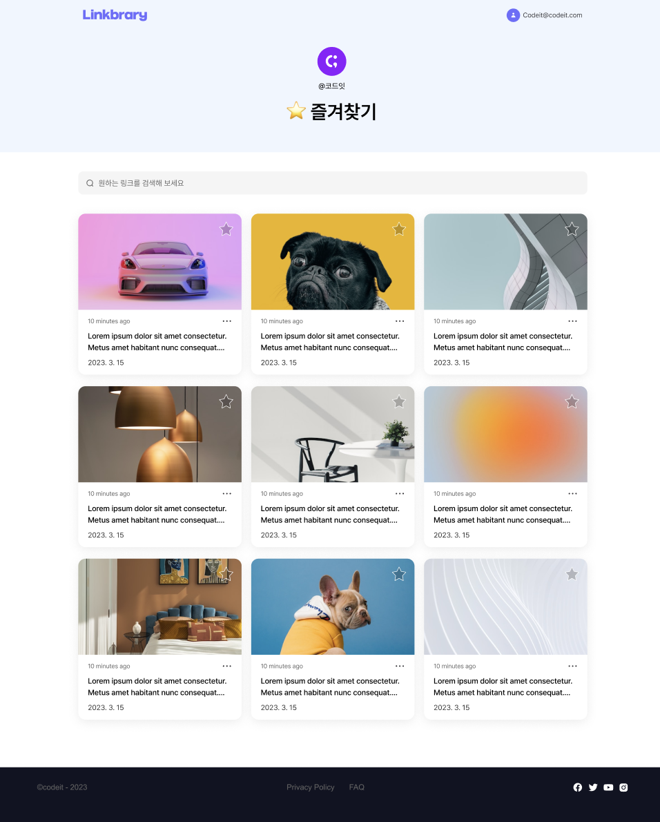
위와 같이 Outlet을 헤더와 푸터 사이에 넣어주면 이제 중첩된 라우트의 element는 저 자리로 들어가게 된다. shared페이지의 경우다음과 같이 gnb와 푸터 사이에 잘 나오는 것을 확인하였다.

shared 페이지 제작하기
필요한 컴포넌트 만들기
필요한 컴포넌트중 gnb와 푸터는 해치웠다. 이제 폴더에 대한 정보가 나오는 부분과 그 밑에 서치바, 그리고 카드리스트를 만들어서 sharedPage에 넣어주면 완성이다.
우선 api호출부는 최종으로 하기로 하고 목데이터를 사용하여 화면에 잘 나오는지부터 확인해야겠다.
LinkCardItem
export interface linkCardProp {
  id: number;
  href: string;
  thumbnailSrc?: string;
  createdDate: string;
  description: string;
}

const LinkCardItem = ({
  id,
  href,
  thumbnailSrc,
  createdDate,
  description,
}: linkCardProp) => {
  const [isLiked, setIsLiked] = useState(false);

  const parseDate = (dateString: string) => {
    const date = new Date(dateString);
    const year = date.getFullYear();
    const month = String(date.getMonth() + 1).padStart(2, "0");
    const day = String(date.getDate()).padStart(2, "0");

    return [year, month, day].join(".");
  };

  const getTimeSinceCreation = (dateString: string) => {
    const updatedDate = new Date(dateString);
    const today = new Date();
    const timeDiff = today.getTime() - updatedDate.getTime();

    const MINUTE = 60 * 1000;
    const HOUR = MINUTE * 60;
    const DAY = HOUR * 24;
    const MONTH = DAY * 31;

    const timeMap = {
      [MINUTE * 2]: () => "1 minute ago",
      [MINUTE * 59]: (diff: number) =>
        Math.floor(diff / MINUTE) + " minutes ago",
      [HOUR * 2]: () => "1 hour ago",
      [HOUR * 23]: (diff: number) => Math.floor(diff / HOUR) + " hours ago",
      [DAY * 2]: () => "1 day ago",
      [DAY * 30]: (diff: number) => Math.floor(diff / DAY) + " days ago",
      [MONTH * 2]: () => "1 month ago",
      [MONTH * 12]: (diff: number) => Math.floor(diff / MONTH) + " months ago",
      [MONTH * 12 * 2]: () => "1 year ago",
    };

    const diff = Object.keys(timeMap).find((key) => timeDiff < Number(key));

    if (diff) {
      return timeMap[diff](timeDiff);
    }

    const years = Math.floor(timeDiff / (MONTH * 12));
    return years + " years ago";
  };

  return (
    <a id="card-link" href={href} target="_blank">
      <SCardContainer className="card-container">
        <div className="thumbnail-box">
          <img
            id="thumbnail"
            className="thumbnail-img"
            src={thumbnailSrc ?? "/src/assets/images/default-thumbnail.svg"}
            alt="thumbnail"
          />
          <img
            id="like-btn"
            className="like-btn"
            src={
              isLiked
                ? "/src/assets/images/like-btn-liked.svg"
                : "/src/assets/images/like-btn-unliked.svg"
            }
            alt="like button"
            onClick={() => {
              setIsLiked(!isLiked);
            }}
          />
        </div>
        <div className="metadata-container">
          <img
            id="kebab"
            className="kebab"
            src="/src/assets/images/kebab.svg"
            alt="kebab"
          />
          <p id="updated-time" className="updated-time">
            {getTimeSinceCreation(createdDate)}
          </p>
          <div id="description" className="description-container">
            {description}
          </div>
          <p id="date" className="date">
            {parseDate(createdDate)}
          </p>
        </div>
      </SCardContainer>
    </a>
  );
};

const SCardContainer = styled.div`
  position: relative;
  width: 21.25rem;
  height: 20.875rem;
  box-shadow: 0px 5px 25px rgba(0, 0, 0, 0.08);
  border-radius: 0.9375rem;
  overflow: hidden;
  transition: all 0.2s linear;

  &:hover {
    background-color: ${colors.gray1};

    .thumbnail-img {
      transform: scale(1.2);
    }
  }
  .thumbnail-box {
    width: 100%;
    height: 12.5rem;
    overflow: hidden;
  }

  .thumbnail-img {
    display: block;
    width: 100%;
    height: 100%;
    transition: all 0.2s linear;
  }

  .like-btn {
    display: block;
    position: absolute;
    top: 0.9375rem;
    right: 0.9375rem;
    cursor: pointer;
  }

  .metadata-container {
    position: relative;
    height: 8.4375rem;
    display: flex;
    flex-direction: column;
    justify-content: space-between;
    padding: 0.9375rem 1.25rem;
  }

  .kebab {
    width: 1.3125rem;
    height: 1.0625rem;
    position: absolute;
    top: 0.9375rem;
    right: 1.25rem;
    cursor: pointer;
  }

  .updated-time {
    font-size: 0.8125rem;
    color: #666666;
  }

  .description-container {
    height: 3.0625rem;
    font-size: 1rem;
    line-height: 1.5rem;
    text-overflow: ellipsis;
    overflow: hidden;
    display: -webkit-box;
    -webkit-line-clamp: 2;
    -webkit-box-orient: vertical;
    word-wrap: break-word;
  }

  .date {
    font-size: 0.875rem;
    color: #333333;
  }

  #card-link {
    color: inherit;
  }

  a:visited {
    color: inherit;
    background-color: transparent;
    text-decoration: none;
  }

  a:hover {
    color: inherit;
    background-color: transparent;
    text-decoration: none;
  }

  a:active {
    color: inherit;
    background-color: transparent;
    text-decoration: none;
  }

  @media only screen and (max-width: 767px) {
    width: 20.3125rem;
    height: 20.4375rem;

    .thumbnail-box {
      height: 12rem;
    }

    .like-btn {
      transform: scale(0.8825);
    }
  }
`;
export default LinkCardItem;
처음에 LinkCardItem의 최상위 태그인 a태그를 Link태그로 만들었었다. 찾아보니 Link태그는 페이지 나의 사이트 내부에서 이동할 때 쓰이고, 외부로 이동할때는 a태그를 쓰면 된다고 한다.
스택오버플로우 질문 참고
또 의문이 드는 점은 styled component의 사용법이다. 우리 프로젝트의 경우 처음에 바닐라 js와 css로 해왔기 때문에 이미 있는 css파일들을 styled component로 어떻게 활용할까 생각하다가 클래스명을 최대한 활용하는 방법으로 거의 컴포넌트의 최상단 태그만 styled component로 만들고 자식들을 전부 복붙한 후 css파일 내용들도 styled컴포넌트 안에 복붙했다. 이렇게 하는게 맞는건지 모르겠다.. 코드리뷰 때 물어볼 에정
LinkCardList
import React from "react";
import LinkCardItem, { linkCardProp } from "./LinkCardItem";
import styled from "styled-components";

interface cardListProp {
  cardProps: linkCardProp[];
}

const LinkCardList = ({ cardProps }: cardListProp) => {
  return (
    <SCardListContainer>
      {cardProps &&
        cardProps.map((cardProp) => {
          return <LinkCardItem key={cardProp.id} {...cardProp} />;
        })}
    </SCardListContainer>
  );
};

const SCardListContainer = styled.div`
  width: fit-content;
  display: grid;
  grid-template-columns: repeat(3, 1fr);
  grid-auto-rows: auto;
  gap: 1.5rem 1.25rem;

  @media only screen and (max-width: 1100px) {
    grid-template-columns: repeat(2, 1fr);
    gap: 1.5rem;
  }

  @media only screen and (max-width: 767px) {
    grid-template-columns: 1fr;
    gap: 1.25rem;
  }
`;

export default LinkCardList;
SearchBar
import React from "react";
import styled from "styled-components";

interface searchBarProps {
  action: string;
  placeholder?: string;
}

const SearchBar = ({ action, placeholder = "검색하세요" }: searchBarProps) => {
  return (
    <SSearchForm className="search-form" action={action}>
      <label>
        <div className="search-icon-box">
          <img src="/src/assets/images/search-icon.png" alt="search icon" />
        </div>
        <input
          className="search-input"
          type="search"
          name="q"
          placeholder={placeholder}
        />
      </label>
    </SSearchForm>
  );
};

const SSearchForm = styled.form`
  position: relative;

  .search-icon-box {
    position: absolute;
    top: 1rem;
    left: 1rem;
    width: 1rem;
    height: 1rem;
  }

  .search-icon-box img {
    display: block;
    width: 100%;
    height: auto;
  }

  .search-input {
    font-size: 1rem;
    line-height: 1.125rem;
    width: 100%;
    padding: 0.9375rem 2.635rem;
    border: none;
    background-color: #f5f5f5;
    border-radius: 10px;
  }
`;
export default SearchBar;
FolderInfo
import React from "react";
import styled from "styled-components";

interface folderInfoProps {
  ownerName: string;
  folderName: string;
  profileImgSrc?: string;
}

const DEFAULT_PROFILE_IMG_SRC = "/src/assets/images/avatar.png";

const FolderInfo: React.FC<folderInfoProps> = ({
  ownerName,
  folderName,
  profileImgSrc = DEFAULT_PROFILE_IMG_SRC,
}: folderInfoProps) => {
  return (
    <SFolderInfoContainer className="user-info-container">
      <div className="profile-container">
        <div className="profile-img-box">
          <img id="profile-img" src={profileImgSrc} alt="avatar" />
        </div>
        <p id="username" className="username">
          {ownerName}
        </p>
      </div>
      <h1 id="folder-name" className="title">
        {folderName}
      </h1>
    </SFolderInfoContainer>
  );
};

const SFolderInfoContainer = styled.div`
  width: fit-content;
  margin: auto;

  .profile-container {
    display: flex;
    flex-direction: column;
    align-items: center;
    gap: 0.75rem;
    margin-bottom: 1.25rem;
  }

  .profile-img-box {
    width: 3.75rem;
    height: 3.75rem;
  }

  .profile-img-box img {
    display: block;
    width: 100%;
    height: 100%;
  }

  .username {
    font-size: 1rem;
    line-height: 1.5rem;
  }

  .title {
    font-size: 2.5rem;
    font-weight: 600;
    line-height: 3rem;
  }
`;
export default FolderInfo;
Shared 페이지에 퍼블리싱하기
필요한 컴포넌트들이 완성되었으니, 이제 페이지에 이 컴포넌트들을 배치해본다.
import React from "react";
import styled from "styled-components";
import FolderInfo from "../components/FolderInfo/FolderInfo";
import LinkCardList from "../components/LinkCard/LinkCardList";
import SearchBar from "../components/SearchBar/SearchBar";
const FOLDER_INFO_PROPS = {
  ownerName: "Kenny",
  folderName: "즐겨찾기",
};

const LINKCARD_LIST_PROPS = {
  cardProps: [
    {
      id: 1,
      href: "#",
      createdDate: "1995-12-17T03:24:00",
      description:
        "Lorem ipsum dolor sit amet consectetur. Metus amet habitant nunc consequat. Lorem ipsum dolor sit amet consectetur. Metus amet habitant nunc consequat.",
    },
    {
      id: 2,
      href: "#",
      createdDate: "1995-12-17T03:24:00",
      description:
        "Lorem ipsum dolor sit amet consectetur. Metus amet habitant nunc consequat. Lorem ipsum dolor sit amet consectetur. Metus amet habitant nunc consequat.",
    },
    {
      id: 3,
      href: "#",
      createdDate: "1995-12-17T03:24:00",
      description:
        "Lorem ipsum dolor sit amet consectetur. Metus amet habitant nunc consequat. Lorem ipsum dolor sit amet consectetur. Metus amet habitant nunc consequat.",
    },
    {
      id: 4,
      href: "#",
      createdDate: "1995-12-17T03:24:00",
      description:
        "Lorem ipsum dolor sit amet consectetur. Metus amet habitant nunc consequat. Lorem ipsum dolor sit amet consectetur. Metus amet habitant nunc consequat.",
    },
    {
      id: 5,
      href: "#",
      createdDate: "1995-12-17T03:24:00",
      description:
        "Lorem ipsum dolor sit amet consectetur. Metus amet habitant nunc consequat. Lorem ipsum dolor sit amet consectetur. Metus amet habitant nunc consequat.",
    },
    {
      id: 6,
      href: "#",
      createdDate: "1995-12-17T03:24:00",
      description:
        "Lorem ipsum dolor sit amet consectetur. Metus amet habitant nunc consequat. Lorem ipsum dolor sit amet consectetur. Metus amet habitant nunc consequat.",
    },
    {
      id: 7,
      href: "#",
      createdDate: "1995-12-17T03:24:00",
      description:
        "Lorem ipsum dolor sit amet consectetur. Metus amet habitant nunc consequat. Lorem ipsum dolor sit amet consectetur. Metus amet habitant nunc consequat.",
    },
    {
      id: 8,
      href: "https://www.naver.com",
      createdDate: "1995-12-17T03:24:00",
      description:
        "Lorem ipsum dolor sit amet consectetur. Metus amet habitant nunc consequat. Lorem ipsum dolor sit amet consectetur. Metus amet habitant nunc consequat.",
    },
    {
      id: 9,
      href: "#",
      createdDate: "1995-12-17T03:24:00",
      description:
        "Lorem ipsum dolor sit amet consectetur. Metus amet habitant nunc consequat. Lorem ipsum dolor sit amet consectetur. Metus amet habitant nunc consequat.",
    },
    {
      id: 10,
      href: "#",
      createdDate: "1995-12-17T03:24:00",
      description:
        "Lorem ipsum dolor sit amet consectetur. Metus amet habitant nunc consequat. Lorem ipsum dolor sit amet consectetur. Metus amet habitant nunc consequat.",
    },
    {
      id: 11,
      href: "#",
      createdDate: "1995-12-17T03:24:00",
      description:
        "Lorem ipsum dolor sit amet consectetur. Metus amet habitant nunc consequat. Lorem ipsum dolor sit amet consectetur. Metus amet habitant nunc consequat.",
    },
  ],
};
const SharedPage = () => {
  return (
    <SMain>
      <section className="intro-section">
        <FolderInfo {...FOLDER_INFO_PROPS}></FolderInfo>
      </section>
      <section className="card-section">
        <div className="search-bar-wrapper">
          <SearchBar
            action={"/search/links?q=null"}
            placeholder={"원하는 링크를 검색해 보세요"}
          />
        </div>
        <div className="card-list-wrapper">
          <LinkCardList {...LINKCARD_LIST_PROPS} />
        </div>
      </section>
    </SMain>
  );
};

const SMain = styled.main`
  .intro-section {
    text-align: center;
    background: var(--gray-1);
    padding-top: 1.25rem;
    padding-bottom: 3.75rem;
  }

  .user-info-container {
    width: fit-content;
    margin: auto;
  }

  .profile-container {
    display: flex;
    flex-direction: column;
    align-items: center;
    gap: 0.75rem;
    margin-bottom: 1.25rem;
  }

  .profile-img-box {
    width: 3.75rem;
    height: 3.75rem;
  }

  .profile-img-box img {
    display: block;
    width: 100%;
    height: 100%;
  }

  .username {
    font-size: 1rem;
    line-height: 1.5rem;
  }

  .title {
    font-size: 2.5rem;
    font-weight: 600;
    line-height: 3rem;
  }

  .card-section {
    width: fit-content;
    margin: 2.5rem auto 6.25rem auto;
    display: flex;
    flex-direction: column;
  }

  .search-bar-wrapper {
    margin-bottom: 2.5rem;
  }

  @media only screen and (max-width: 767px) {
    .intro-section {
      padding-top: 0.625rem;
      padding-bottom: 2.5rem;
    }

    .profile-container {
      gap: 0.375rem;
      margin-bottom: 0.625rem;
    }

    .profile-img-box {
      width: 2.5rem;
      height: 2.5rem;
    }

    .username {
      font-size: 0.875rem;
      line-height: 1.0625rem;
    }

    .title {
      font-size: 2rem;
      line-height: 2.375rem;
      letter-spacing: -0.0125rem;
    }

    .card-section {
      margin: 1.25rem auto 3.75rem auto;
    }

    .search-bar-wrapper {
      margin-bottom: 2rem;
    }
  }
`;
export default SharedPage;
다음과 같이 잘 나오는 것을 확인할 수 있다.

axios로 api호출하기
5주차에 다루었던 내용이다. 이번엔 node를 활용하여 axios를 사용해보도록 하자.
먼저 npm을 통해 axios를 받아주자.
npm install axios
1.4버전을 다운받았다. 이제 api라는 폴더를 src아래에 만들어 그 안에서 인스턴스와 api들을 만들어본다.

이제 shared 페이지에서 useEffect를 통해 api호출을 할 것이다.
받아온 데이터들을 스테이트로 관리해보자.
다음과 같이 폴더 인포 컴포넌트와 카드리스트 컴포넌트에게 넘겨줄 프롭을 useEffect에서 api호출을 통해 받아온 데이터로 가공하여 스테이트를 세팅한다.
const SharedPage = () => {
  const [folderData, setFolderData] = useState<folderInfoProps>();
  const [cardDataList, setCardDataList] = useState<linkCardProp[]>();

  const getCardListProp = (dataList) => {
    return dataList.map((data) => {
      return {
        id: data.id,
        href: data.url,
        thumbnailSrc: data.imageSource,
        description: data.description,
        createdDate: data.createdAt,
      };
    });
  };

  const getFolderInfoProp = (folder) => {
    return {
      folderName: folder.name,
      ownerName: folder.owner.name,
      profileImgSrc: folder.owner.profileImageSource,
    };
  };

  useEffect(() => {
    getFolderRequest()
      .then((res) => res.data)
      .then((data) => {
        const { folder } = data;
        setFolderData(getFolderInfoProp(folder));
        setCardDataList(getCardListProp(folder.links));
      })
      .catch((err) => {
        console.error(err);
      });
  }, []);

  return (
    <SMain>
      <section className="intro-section">
        <FolderInfo {...(folderData as folderInfoProps)}></FolderInfo>
      </section>
      <section className="card-section">
        <div className="search-bar-wrapper">
          <SearchBar
            action={"/search/links?q=null"}
            placeholder={"원하는 링크를 검색해 보세요"}
          />
        </div>
        <div className="card-list-wrapper">
          <LinkCardList cardProps={cardDataList as linkCardProp[]} />
        </div>
      </section>
    </SMain>
  );
};
위 코드에서 as 키워드로 assertion하지 않으면 타입에러가 뜬다. LinkCardList에 cardProps로 cardDataList를 넘겨주는데 api콜이 실패할 경우 cardDataList는 undefined이기 때문이다. as키워드는 되도록 안쓰는게 좋기 때문에 일단 다음과 같이 데이터가 잘 받아졌을 시에만 렌더링을 하도록 해주자.
<div className="card-list-wrapper">
  {cardDataList && <LinkCardList cardProps={cardDataList} />}
</div>
아래와 같이 서버 데이터가 잘 받아진 것을 확인하였다.

이제 같은 방법으로 gnb도 유저 데이터를 받아서 조건부 렌더링을 해 주고, 저번주차와 같이 스크롤에 반응하도록 만들어 보면 완성이다.