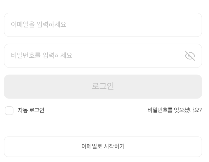
프로젝트를 진행하면서 디자인을 받았는데 아래와 같았다.
비밀번호를 입력할때, 눈 모양을 클릭하게 되면 아이콘이 바뀌고 비밀번호를 보여주게 하는 것이다.
이전에는 디자인을 받아 작업을 한 적이 없어 내 입맛대로 했지만 이제는 그렇게 하지 못한다.
한번INPUT태그를 커스텀 해보자!
 |  |
|---|
컴포넌트 만들기
프로젝트에서 같은 형태의 Input이 많이 사용될 예정이라 컴포넌트로 만들어서 관리를 할 예정이다
각 요소에 대한 내용은 다음과 같다.
태그에서 필요한 요소들을 props로 받아서 관리하며 iconUrl을 통해서 Input icon의 사용 여부를 결정할 수 있다.
// Input.tsx
interface InputProps {
  placeholder?: string;
  iconUrl?: string;
  inputFnc?: any;
  type: string;
  value: string | number;
  setValue: Function;
  isDisabled?: boolean;
}

export const Input = ({ placeholder, iconUrl, inputFnc, type, value, setValue, isDisabled }: InputProps) => {
  return (
    <S.InputWrap>
      <S.Input
        placeholder={placeholder}
        type={type}
        value={value}
        onChange={(e) => {
          setValue(e.target.value);
        }}
        disabled={isDisabled}
      ></S.Input>
      <S.Button onClick={inputFnc} iconUrl={iconUrl}></S.Button>
    </S.InputWrap>
  );
};
// Input.style.tsx
export const InputWrap = styled.div`
  position: relative;
  height: 56px;
  display: inline-block;
  width: 100%;
`;

export const Input = styled.input`
  display: flex;
  width: 100%;
  padding: 16px;
  align-items: center;
  gap: 8px;
  align-self: stretch;

  border-radius: 12px;
  border: 1px solid #eee;

  font-size: 16px;
  font-style: normal;
  font-weight: 400;
  line-height: 24px;

  padding-right: 50px;
  height: inherit;

  &::placeholder {
    color: ${(props) => props.theme.colors.textDisable};
  }
`;

interface ButtonProps {
  iconUrl?: string;
}

export const Button = styled.button<ButtonProps>`
  position: absolute;
  top: 0;
  right: 0;
  width: 50px;
  height: inherit;
  border: none;
  outline: none;
  cursor: pointer;

  ${({ iconUrl }) =>
    iconUrl
      ? `
      background: url(${iconUrl}) center center no-repeat;
      background-size: 50%;
    `
      : `
      display: none;
    `}
`;
기본 사용법
<Input type="text" value={email} setValue={setEmail} placeholder="기본" />
<Input type="text" value={email} setValue={setEmail} iconUrl="/icons/search.png" placeholder="icon사용" />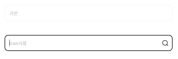
실제 적용 코드
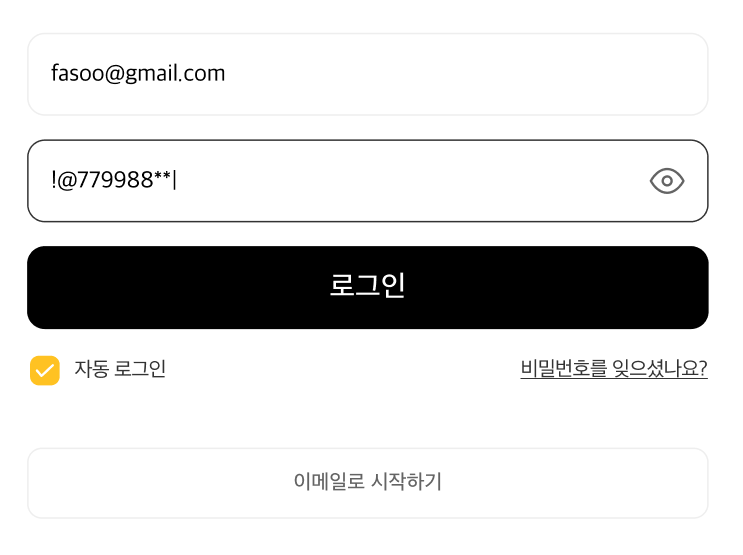
비밀번호의 경우 삼항연산자를 이용해서 showPassword가 true인 경우 eye.png를 보여주고 false인 경우 eye-off.png를 보여주게 했다. 그리고 showPassword에 따라서 input태그의 type을 다르게 해서 패스워드를 보여줄 수 있도록 하였다.
<Input
  placeholder="이메일을 입력하세요"
  iconUrl={email ? 'icons/x-small.png' : undefined}
  type="email"
  value={email}
  setValue={setEmail}
  inputFnc={clearEmail}
 />
<Input
  placeholder="비밀번호를 입력하세요"
  iconUrl={showPassword ? 'icons/eye.png' : 'icons/eye-off.png'}
  type={showPassword ? 'text' : 'password'}
  value={password}
  setValue={setPassword}
  inputFnc={changePasswordShow}
/>

안녕하세요.