
⚡ react 컴포넌트 2
📌 Upload
- 클릭을 통해 파일 업로드가 가능하다.
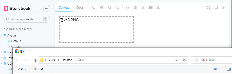
- 파일이 들어왔을 때 들어온 파일의 이름을 표시한다.
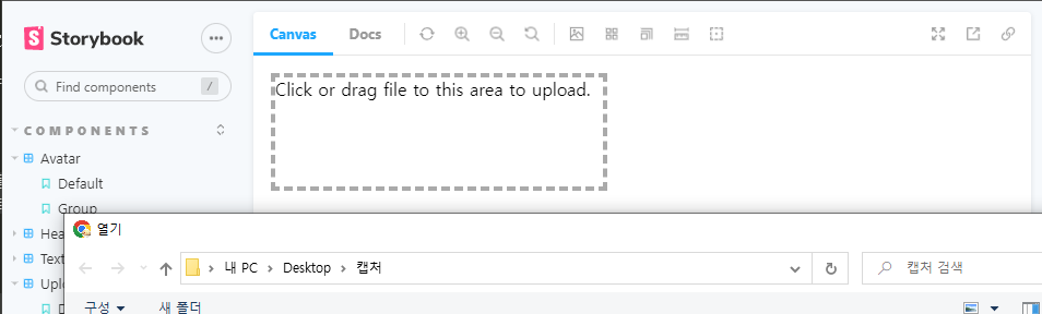
- drag and drop으로도 파일 업로드가 가능하다.
💻 Upload/index.js
import styled from "@emotion/styled";
import { useRef, useState } from "react";

const UploadContainer = styled.div`
    display: inline-block;
    cursor: pointer;
`

const Input = styled.input`
    display: none;
`

const Upload = ({ children, droppable, name, accept, value, onChange, ...props }) => {
    const [file, setFile] = useState(value);
    const [dragging, setDragging] = useState(false);
    const inputRef = useRef(null);

    const handleFileChange = (e) => {
        const files = e.target.files;
        const changedFile = files[0];
        setFile(changedFile)
        onChange && onChange(changedFile);
    }

    // 파일을 직접 선택할 때
    const handleChooseFile = () => {
        inputRef.current.click();
    };

    // 드래그를 통해 파일이 들어왔을 때
    const handleDragEnter = (e) => {
        if(!droppable) return;

        e.preventDefault(); // 브라우저 기본 이벤트를 막는다.
        e.stopPropagation(); // 부모나 자식 컴포넌트로 이벤트가 전파되는 것을 막는다.

        if(e.dataTransfer.items && e.dataTransfer.items.length > 0) {
            setDragging(true);
        }
    }

    // 파일이 드래그를 통해 나갈 때
    const handleDragLeave = (e) => {
        if(!droppable) return;

        e.preventDefault();
        e.stopPropagation();

        setDragging(false);
    }

    // 이벤트 전파(새 창이 뜨는 등)를 막기 위함
    const handleDragOver = (e) => {
        if(!droppable) return;

        e.preventDefault();
        e.stopPropagation();
    }

    // 실제로 파일을 놓았을 때
    const handleFileDrop = (e) => {
        if(!droppable) return;

        e.preventDefault();
        e.stopPropagation();

        const files = e.dataTransfer.files;
        const changedFile = files[0];
        setFile(changedFile);
        onChange && onChange(changedFile);
        setDragging(false);
    }

    return (
        <UploadContainer
        onClick={handleChooseFile}
        onDrop={handleFileDrop}
        onDragEnter={handleDragEnter}
        onDragLeave={handleDragLeave}
        onDragOver={handleDragOver}
        {...props}>
            <Input ref={inputRef}
            type="file"
            name={name}
            accept={accept}
            onChange={handleFileChange}
           	/>
            {typeof children === 'function' ? children(file, dragging) : children}
        </UploadContainer>
    )
}

export default Upload;
💻 Upload.stories.js
import Upload from "../components/Upload";

export default {
    title: 'Components/Upload',
    component: Upload,
};

export const Default = (args) => {
    return (
        <Upload>
            <button>Click me</button>
        </Upload>
    )
};

export const AccessFile = () => {
    return (
        <Upload>
            {(file) => <button>{file ? file.name : 'Click me'}</button>}
        </Upload>
    )
}

export const Droppable = () => {
    return (
        <Upload droppable>
            {
                (file, dragging) => (
                    <div style={{
                        width: 300,
                        height: 100,
                        border: '4px dashed #aaa',
                        borderColor: dragging ? 'black' : '#aaa',
                        cursor: 'pointer',
                    }}>
                        {file ? file.name : 'Click or drag file to this area to upload.'}
                    </div>
                )
            }
        </Upload>
    )
}
🖨 완성된 컴포넌트

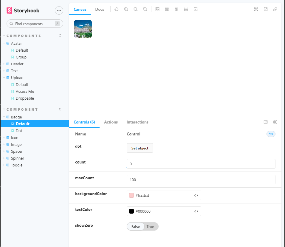
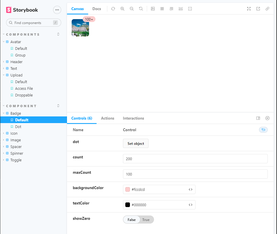
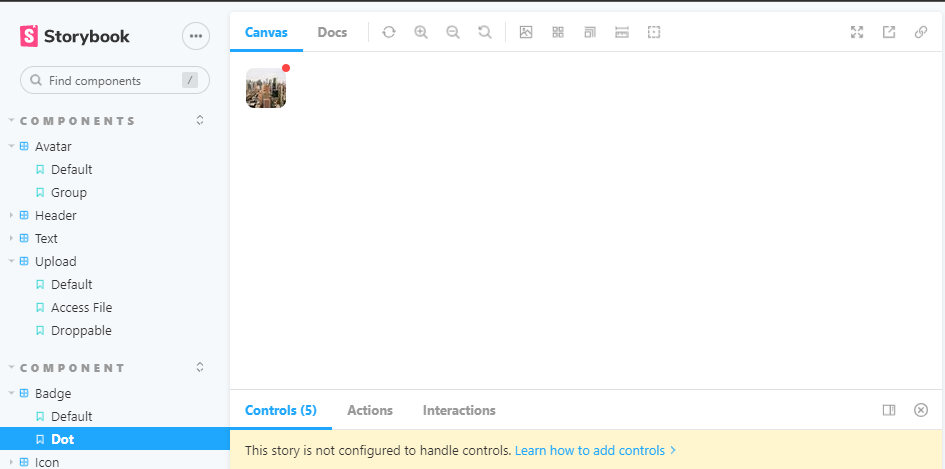
📌 Badge
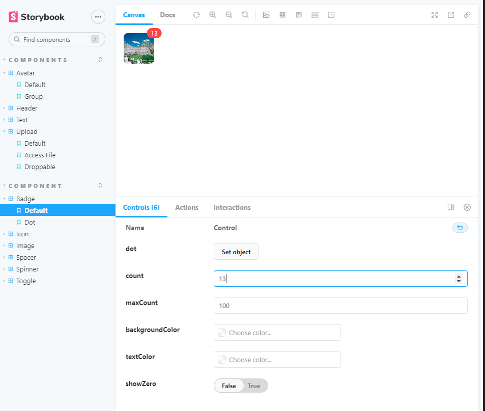
- 알림이 쌓인 수를 보여주는 UI
- 일정 개수를 넘어서면 '한계 숫자 +' 의 모습으로만 나타난다.
- 뱃지의 배경색과 글자색 지정이 가능하다.
- 알림이 0개일 때 뱃지가 보이게할지, 보이지 않게 할지 설정할 수 있다.
- 숫자가 없이 알림이 있다만 보여주는 뱃지로도 설정할 수 있다.
💻 Badge/index.js
import styled from "@emotion/styled";

const BadgeContainer = styled.div`
    position: relative;
    display: inline-block;

`

const Super = styled.sup`
    position: absolute;
    top: 0;
    right: 0;
    display: inline-flex;
    align-items: center;
    height: 20px;
    padding: 0 8px;
    font-size: 12px;
    border-radius: 20px;
    color: white;
    background-color: #f44;
    transform: translate(50%, -50%);

    &.dot {
        padding: 0;
        width: 8px;
        height: 8px;
        border-radius: 50%;
    }
`

const Badge = ({
children,
count,
maxCount,
backgroundColor,
showZero,
dot = false,
textColor,
...props }) => {
    const colorStyle = {
        backgroundColor,
        color: textColor
    };

    let badge = null;
    if (count) {
        badge = <Super style={colorStyle}>
            {maxCount && count > maxCount ? `${maxCount}+` : count}
        </Super>
    } else {
        if(count !== undefined) {
            badge = showZero ? <Super style={colorStyle}>0</Super> : null;
        } else if(dot) {
            badge = <Super className = 'dot' style={colorStyle}></Super>
        }
    }

    return <BadgeContainer {...props}>
        {children}
        {badge}
    </BadgeContainer>
}

export default Badge;
💻 Badge.stories.js
import Badge from "../components/Badge";
import Image from '../components/Image';

export default {
    title: 'Component/Badge',
    component: Badge,
    argTypes: {
        count: {defaultValue: 10, control: "number"},
        maxCount: {defaultValue: 100, control: "number"},
        backgroundColor: {control: "color"},
        textColor: {control: "color"},
        showZero: {defaultValue: false, control: "boolean"},
    }
}

export const Default = (args) => {
    return (
        <Badge {...args}>
            <Image src="https://picsum.photos/60" width={60} style={{ borderRadius: 8 }} />
        </Badge>
    )
};

export const Dot = () => {
    return (
        <Badge dot>
            <Image src="https://picsum.photos/40" width={40} style={{ borderRadius: 8 }} />
        </Badge>
    )
}
🖨 완성된 컴포넌트
다양한 컴포넌트 제작에 재미가 붙기 시작했다.
바쁘지만 매일매일 조금씩 만들어나가며 스토리를 채우는 것에 보람이 느껴진다.

Hodie mihi, Cras tibi