
⚡ react 컴포넌트 3
📌 Icon
- 아이콘 라이브러리 Feather를 사용한다.
yarn add feather-icons- 아이콘의 크기와 색깔, 테두리 굵기를 설정할 수 있다.
- 아이콘 이름을 통해 다양한 아이콘 사용할 수 있다.
- rotate 속성을 이용하여 아이콘의 회전도 가능하다.
💻 Icon/index.js
import styled from '@emotion/styled';
import { Buffer } from 'buffer';

const IconWrapper = styled.i`
    display: inline-block;
`

const Icon = ({ name, size = 16, strokeWidth = 2, rotate, color = '#222', ...props }) => {
    const shapeStyle = {
        width: size,
        height: size,
        transform: rotate ? `rotate(${rotate}deg)` : undefined,
    }
    const iconStyle = {
        'stroke-width': strokeWidth,
        stroke: color,
        width: size,
        height: size
    }
    const icon = require('feather-icons').icons[name];
    const svg = icon ? icon.toSvg(iconStyle) : '';
    const base64 = Buffer.from(svg, 'utf8').toString('base64'); // base64로 인코딩

    return (
        <IconWrapper {...props} style={shapeStyle}>
            <img src={`data:image/svg+xml;base64,${base64}`} alt={name} />
        </IconWrapper>
    )
};

export default Icon;
💡 Buffer
다양하게 사용하지만 여기서는 파일을 읽어들인 뒤 다른 방식으로 인코딩하기 위해 사용한다.
💻 Icon.stories.js
import Icon from "../components/Icon";
export default {
title: 'Component/Icon',
component: Icon,
argTypes: {
name: { defaultValue: 'box', control: 'text' },
size: { defaultValue: 16, control: { type:'range', min: 16, max: 80 } },
strokeWidth: { defaultValue: 2, control: { type:'range', min: 2, max: 6 } },
rotate: { defaultValue: 0, control: { type:'range', min: 0, max: 360 } },
color: { defaultValue: '#222', control: 'color' },
}
}
export const Default = (args) => {
return <Icon {...args} />;
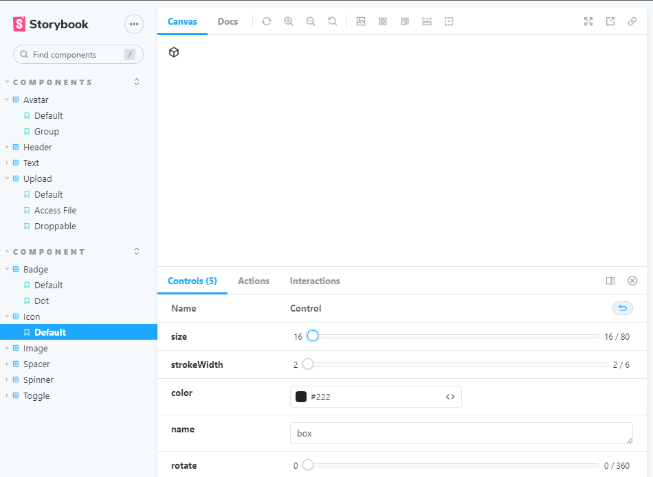
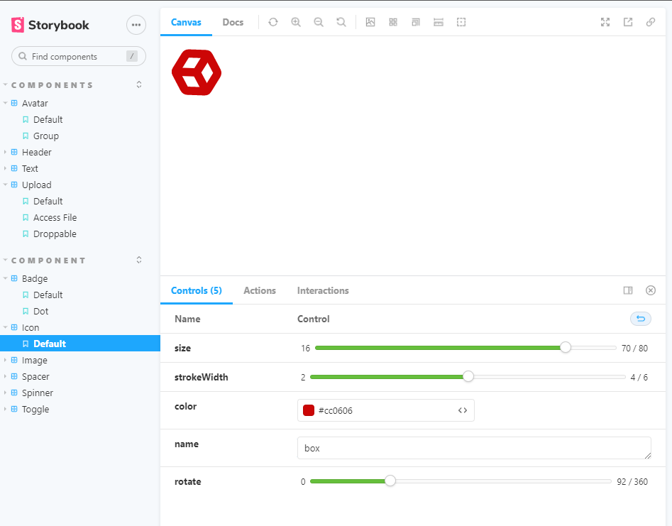
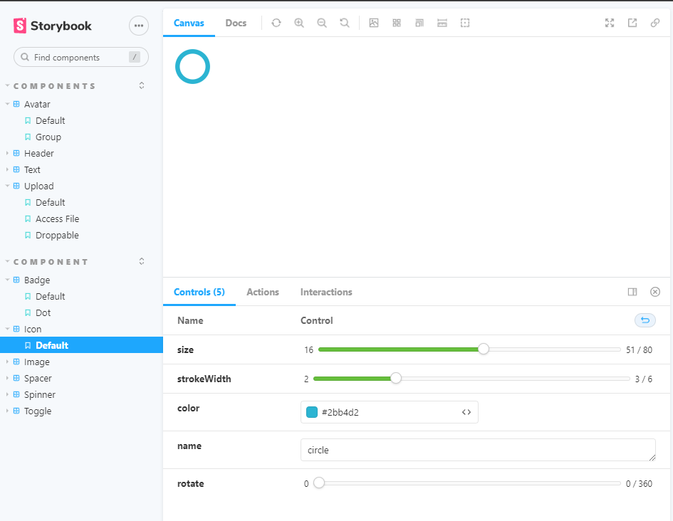
};🖨 완성된 컴포넌트
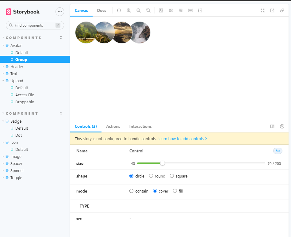
📌 Avatar
- 사용자의 프로필 사진을 나타낸다.
- 프로필 사진의 모양, 내부 사진이 들어갈 모드, 프로필 크기를 지정할 수 있다.
- 프로필 그룹을 통해 여러개의 프로필이 모여있는 모습을 만들 수 있다.
💻 Avatar/index.js
import styled from "@emotion/styled";
import { useEffect, useState } from "react";
import ImageComponent from "../Image";
import AvatarGroup from "./AvatarGroup";

const ShapeToCssValue = {
    circle: '50%',
    round: '4px',
    square: '0px'
}

const AvatarWrapper = styled.div`
    position: relative;
    display: inline-block;
    border: 1px solid #dadada;
    border-radius: ${({shape}) => ShapeToCssValue[shape]};
    background-color: #eee;
    overflow: hidden;

    > img {
        transition: opacity 0.2s ease-out;
    }
`

const Avatar = ({
    lazy,
    threshold,
    src,
    size= 70,
    shape="circle",
    placeholder,
    alt,
    mode="cover",
    __TYPE,
    ...props
}) => {
    const [loaded, setLoaded] = useState(false);

    useEffect(() => {
        const image = new Image();
        image.src = src;
        image.onload = () => setLoaded(true);
    }, [src]);
    return (
        <AvatarWrapper {...props} shape={shape}>
            <ImageComponent
            block
            lazy={lazy}
            threshold={threshold}
            width={size}
            height={size}
            src={src}
            placeholder={placeholder}
            alt={alt}
            mode={mode}
            style={{opacity:loaded ? 1 : 0}}
            />
        </AvatarWrapper>
    )
}

// 아바타 타입이 들어왔는지 확인하기 위해 defaultProps로 따로 지정한다.
Avatar.defaultProps = {
    __TYPE: "Avatar"
};

// 다른 타입으로 변환할 수 없도록 강제한다.
Avatar.propTypes = {
    __TYPE: "Avatar",
}

Avatar.Group = AvatarGroup;

export default Avatar;- AvatarGroup 컴포넌트 제작은 기존의 Avatar와 별개로 제작하지만 Avatar 컴포넌트 내에서 아래 코드를 통해 연결된다.
Avatar.Group = AvatarGroup;💻 Avatar/AvatarGroup.js
import React from "react";

const AvatarGroup = ({ children, shape='circle', size=70, ...props}) => {
    const avatars = React.Children.toArray(children)
    .filter((element) => {
        if(React.isValidElement(element) && element.props.__TYPE === "Avatar") {
            return true;
        }

        console.warn("Only accepts Avatar as it's children.")
        return false;
    })
    .map((avatar, index, avatars) => {
        return React.cloneElement(avatar, {
            ...avatar.props,
            size,
            shape,
            style: {
                ...avatar.props.style,
                marginLeft: -size/5,
                zIndex: avatars.length - index,
            }
        })
    })

    return <div style={{paddingLeft:size/5}}>{avatars}</div>
}


export default AvatarGroup;
💻 Avatar.stories.js
import Avatar from "../components/Avatar";
export default {
title: 'Components/Avatar',
component: Avatar,
argTypes: {
src: { defaultValue: 'https://picsum.photos/200/400' },
shape: {
defaultValue: 'circle',
control: 'inline-radio',
options: ['circle', 'round', 'square']
},
size: {
defaultValue: 70,
control: { type: 'range', min: 40, max: 200 },
},
mode: {
defaultValue: 'cover',
control: 'inline-radio',
options: ['contain', 'cover', 'fill']
}
}
};
export const Default = (args) => {
return (
<Avatar {...args} />
);
};
export const Group = () => {
return (
<Avatar.Group>
<Avatar src="https://picsum.photos/200?1" />
<Avatar src="https://picsum.photos/200?2" />
<Avatar src="https://picsum.photos/200?3" />
<Avatar src="https://picsum.photos/200?4" />
</Avatar.Group>
)
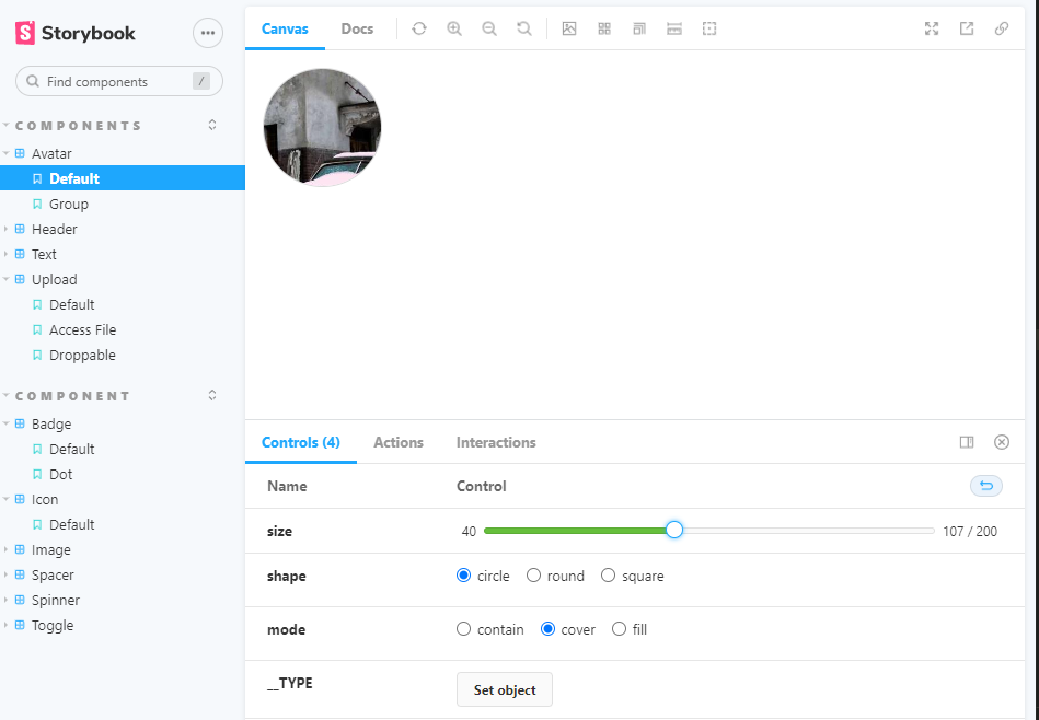
}🖨 완성된 컴포넌트

오늘도 다른 컴포넌트들을 제작해보았다.
만든 컴포넌트들을 확인하고 내 깃에 커밋하는 맛에 끊을 수 없을 것 같다.

Hodie mihi, Cras tibi