
⚡ 컴포넌트 연습 4
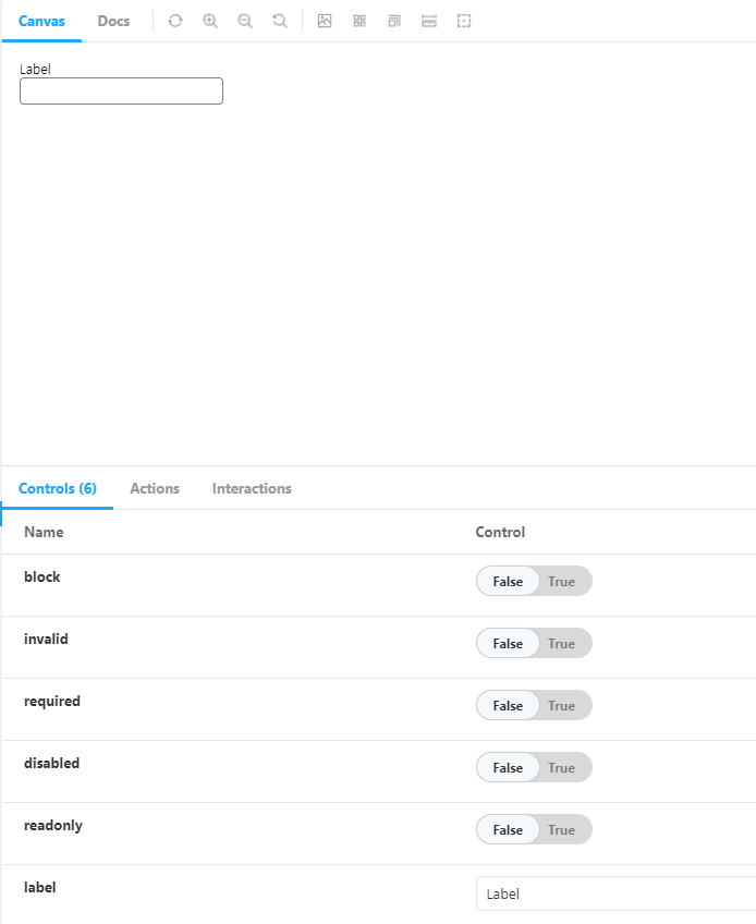
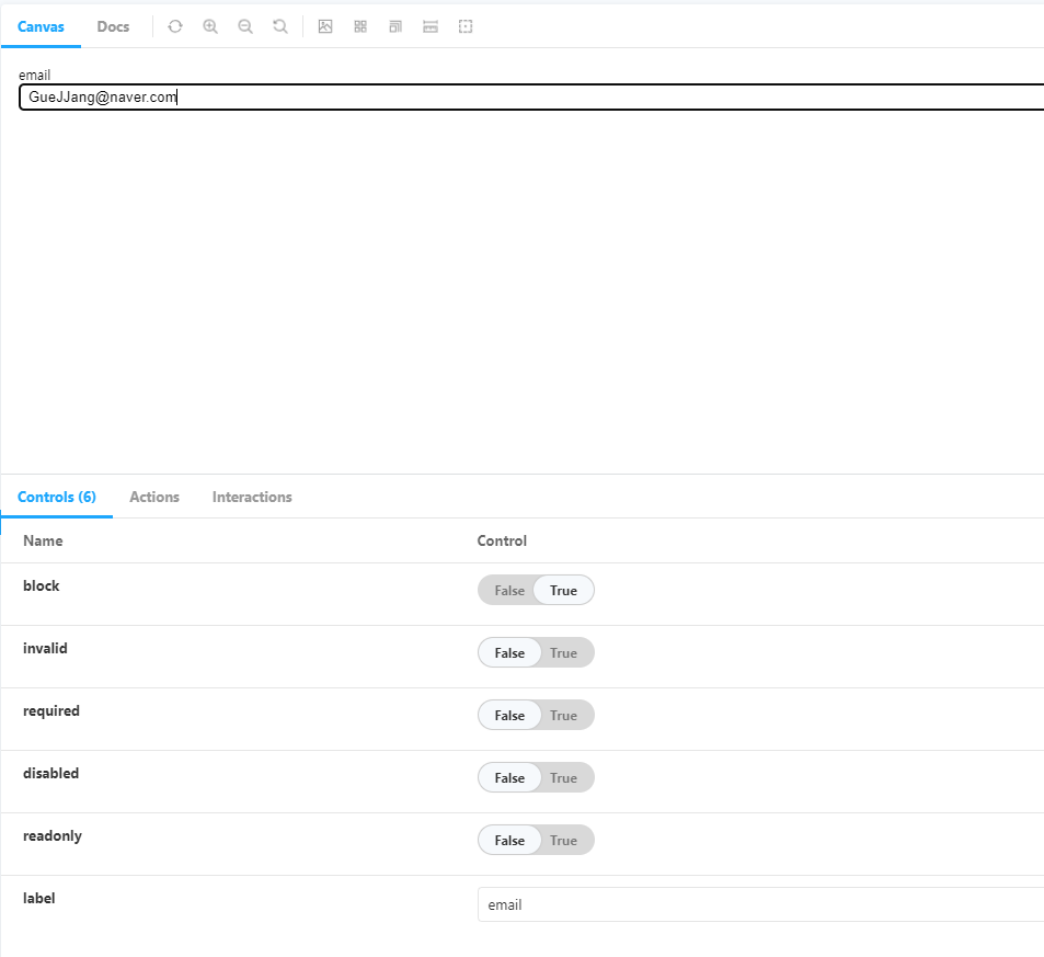
📌 Input
-
추후 확장성을 위해 Wrapper로 감싼 형태로 제작하였다.
-
Input창 활성화 여부, 읽기 전용 모드 활성화 여부를 바꿀 수 있다.
-
유효하지 않은 입력값이 들어왔을 때 표시할 수 있다.
-
꽉찬 block 형식과 inline-block 형식 모두 지원한다.
-
상단의 label로 입력 값으로 무엇을 넣어야 하는지 표시한다.
💻 input/index.js
import styled from "@emotion/styled";

const Wrapper = styled.div`
    display: ${({block}) => block ? 'block' : 'inline-block'};
`;

const Label = styled.label`
    display: block;
    font-size: 12px;
`

const StyledInput = styled.input`
    width: 100%;
    padding: 4px 8px;
    border: 1px solid ${({invalid}) => invalid ? 'red' : 'gray'};
    border-radius: 4px;
    box-sizing: border-box;
`

const Input = ({
    label,
    block = false,
    invalid = false,
    required = false,
    disabled = false,
    readonly = false,
    wrapperProps,
    ...props
}) => {
    return (
        <Wrapper block={block} {...wrapperProps}>
            <Label>{label}</Label>
            <StyledInput
            invalid={invalid}
            required={required}
            disabled={disabled}
            readOnly={readonly}
            {...props} />
        </Wrapper>
    );
};

export default Input;
💻 input.stories.js
import Input from "../../components/Input";

export default {
    title: 'Component/Input',
    component: Input,
    argTypes: {
        label: {
            defaultValue: 'Label',
            control: 'text'
        },
        block: {
            defaultValue: false,
            control:'boolean'
        },
        invalid: {
            defaultValue: false,
            control:'boolean'
        },
        required: {
            defaultValue: false,
            control:'boolean'
        },
        disabled: {
            defaultValue: false,
            control:'boolean'
        },
        readonly: {
            defaultValue: false,
            control:'boolean'
        },
    }
}

export const Default = (args) => {
    return <Input {...args} />;
};
🖨 완성된 컴포넌트
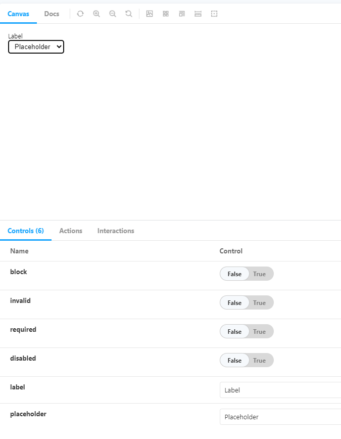
📌 Select
-
option과 placeholder에 대해 추가로 처리한 Input 컴포넌트와 비슷하다.
-
option 선택 전 placeholder로 보이기 위해 hidden 속성을 이용한 트릭을 사용한다.
💡 options로 넣은 맨 앞 요소가 hidden 속성이 true일 때
해당 요소는 다른 option을 선택하면 보이지 않지만 처음 화면 렌더링 시에는 보인다.
💻 Select/index.js
import styled from "@emotion/styled";

const Wrapper = styled.div`
    display: ${({block}) => block ? 'block' : 'inline-block'};
`

const Label = styled.label`
    display: block;
    font-size: 12px;
`

const StyledSelect = styled.select`
    width: 100%;
    padding: 4px 8px;
    border: 1px solid ${({invalid}) => invalid ? 'red' : 'gray'};
    border-radius: 4px;
    box-sizing: border-box;
`

const Select = ({
    data,
    label,
    placeholder,
    block = false,
    invalid = false,
    required = false,
    disabled = false,
    wrapperProps,
    ...props
}) => {
    const formattedData = data.map(item => typeof item === 'string' ? {label: item, value: item} : item);

    const options = formattedData.map(item => (
        <option key={item.value} value={item.value}>
            {item.label}
        </option>
    ));

    if(placeholder) {
        options.unshift(
            <option key="placeholder" value="" hidden>{placeholder}</option>
        )
    }

    return (
        <Wrapper block={block} {...wrapperProps}>
            <Label>{label}</Label>
            <StyledSelect
            invalid={invalid}
            required={required}
            disabled={disabled}
            {...props}
            >{options}</StyledSelect>
        </Wrapper>
    )
};

export default Select;
💻 select.stories.js
import Select from "../../components/Select";

export default {
    title: 'Component/Select',
    component: Select,
    argTypes: {
        label: {
            defaultValue: 'Label',
            control: 'text'
        },
        placeholder: {
            defaultValue: 'Placeholder',
            control: 'text'
        },
        block: {
            defaultValue: false,
            control:'boolean'
        },
        invalid: {
            defaultValue: false,
            control:'boolean'
        },
        required: {
            defaultValue: false,
            control:'boolean'
        },
        disabled: {
            defaultValue: false,
            control:'boolean'
        },
    }
}

export const Default = (args) => {
    return <Select data={['Item 1', 'Item 2', {label: 'Item 3', value: 'value'}]} {...args} />;
};
🖨 완성된 컴포넌트
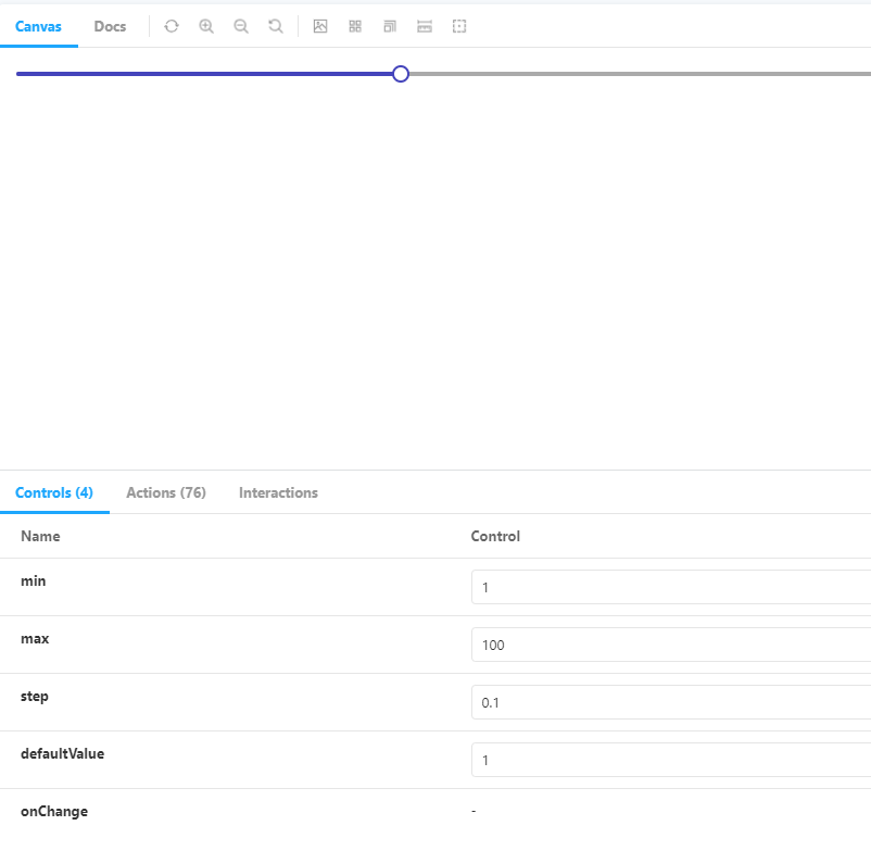
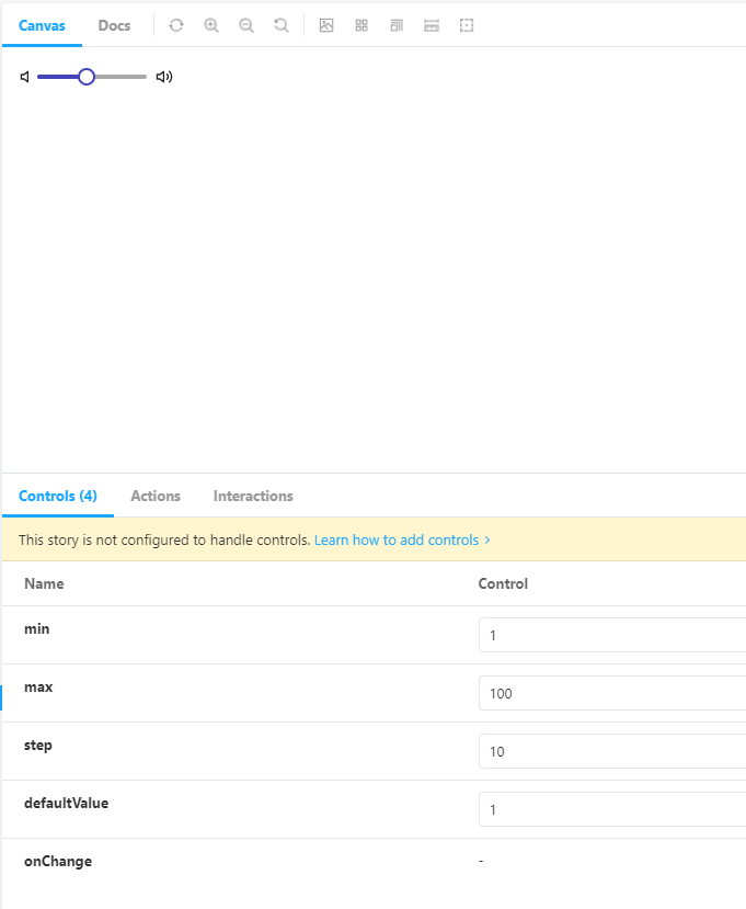
📌 Slider
-
비디오 재생바나 볼륨 조절과 같은 곳에 사용한다.
-
잡을 수 있는 곳을 핸들, 안쪽의 영역을 레일, 채운 영역을 트랙이라고 부른다.
-
이벤트를 브라우저 전역으로 잡아서 커서가 핸들을 한번 잡으면 레일을 벗어나도 이벤트가 작동한다.
💡 커서가 핸들을 꽉 잡고 움직이는 경우보다 레일을 벗어나는 경우가 더 많기 때문이다.
-
Spacer와 Icon 컴포넌트를 이용한 볼륨 조절 컴포넌트를 따로 제작하였다.
💻 Slider/index.js
import styled from "@emotion/styled";
import { useCallback, useEffect, useRef, useState } from "react";

const SliderContainer = styled.div`
    position: relative;
    width: 100%;
    height: 16px;
`

const Rail = styled.div`
    position: absolute;
    top: 6px;
    left: 0px;
    width: 100%;
    height: 4px;
    border-radius: 2px;
    background-color: #aaa;
`

const Handle = styled.div`
    position: absolute;
    top: 8px;
    left: 0px;
    width: 12px;
    height: 12px;
    transform: translate(-50%, -50%);
    border: 2px solid #44b;
    border-radius: 50%;
    background-color: white;
    cursor: grab;
`
const Track = styled.div`
    position: absolute;
    top: 6px;
    left: 0px;
    width: 0;
    height: 4px;
    border-radius: 2px;
    background-color: #44b;
`

const Slider = ({
    min = 0,
    max = 100,
    step = 0.1,
    defaultValue,
    onChange,
    ...props
}) => {
    const sliderRef = useRef(null);
    const [dragging, setDragging] = useState(false);
    const [value, setValue] = useState(defaultValue ? defaultValue : min);

    const handleMouseDown = useCallback(() => {
        setDragging(true)
    }, []);

    const handleMouseUp = useCallback(() => {
        setDragging(false);
    }, []);

    useEffect(() => {
        const handleMouseMove = (e) => {
            if(!dragging) return;

            const handleOffset = e.pageX - sliderRef.current.offsetLeft;
            const sliderWidth = sliderRef.current.offsetWidth;

            const track = handleOffset / sliderWidth;
            let newValue;

            if(track < 0) {
                newValue = min;
            } else if(track > 1) {
                newValue = max;
            } else {
                newValue = Math.round((min + (max -min) * track)/step) * step;
                newValue = Math.min(max, Math.max(min, newValue));
            }

            setValue(newValue);
            onChange && onChange(newValue);
        };

        document.addEventListener('mousemove', handleMouseMove);
        document.addEventListener('mouseup', handleMouseUp);
        return () => {
            document.removeEventListener('mousemove', handleMouseMove);
            document.removeEventListener('mouseup', handleMouseUp);
        }
    }, [value, min, max, dragging, sliderRef, handleMouseUp, onChange, step]);

    const percentage = ((value - min) / (max - min)) * 100;

    return (
        <SliderContainer ref={sliderRef} {...props}>
            <Rail></Rail>
            <Track style={{ width: `${percentage}%`}}></Track>
            <Handle onMouseDown={handleMouseDown} style={{ left: `${percentage}%`}}></Handle>
        </SliderContainer>
    )
};

export default Slider;
💻 Slider.stories.js
import Icon from "../../components/Icon";
import Slider from "../../components/Slider";
import Spacer from "../../components/Spacer"

export default {
    title: 'Component/Slider',
    component: Slider,
    argTypes: {
        defaultValue: { defaultValue: 1, control: 'number'},
        min: { defaultValue: 1, control: 'number'},
        max: { defaultValue: 100, control: 'number'},
        step: { defaultValue: 0.1, control: 'number'},
        onChange: { action: "onChange" },
    }
}

export const Default = (args) => {
    return <Slider {...args} />;
};

export const VolumeControl = () => {
    return(
        <Spacer>
            <Icon name="volume"></Icon>
            <Slider style={{width:100, display: 'inline-block'}}/>
            <Icon name="volume-2"></Icon>
        </Spacer>
    )
}
🖨 완성된 컴포넌트
📌 Progress
-
Slider를 응용한 로딩바의 형태이다.
-
keyframe과 애니메이션을 이용해 움직이는 로딩바를 구현하였다.
-
진행상황에 따라 로딩바가 움직인다.
💻 Progress/index.js
import styled from "@emotion/styled";

const ProgressContainer = styled.div`
    position: relative;
    width: 100%;
    height: 16px;
`

const Rail = styled.div`
    position: absolute;
    top: 6px;
    left: 0px;
    width: 100%;
    height: 4px;
    border-radius: 2px;
    background-color: #aaa;
`

const Track = styled.div`
    position: absolute;
    top: 6px;
    left: 0px;
    width: 0;
    height: 4px;
    border-radius: 2px;
    background-color: #44b;
    background-size: 20px 20px;

    background-image: linear-gradient(
        45deg,
        rgba(255, 255, 255, 0.15) 25%,
        transparent 25%,
        transparent 50%,
        rgba(255, 255, 255, 0.15) 50%,
        rgba(255, 255, 255, 0.15) 75%,
        transparent 75%,
        transparent 100%
    );
    animation: move 1000ms linear infinite;
    transition: width 100ms linear;

    @keyframes move {
        from {
            background-position: 0 0;
        }
        to {
            background-position: 40px 0;
        }
    }
`;

const Progress = ({
    value,
    ...props
}) => {
    return (
        <ProgressContainer {...props}>
            <Rail></Rail>
            <Track style={{ width: `${value}%`}}></Track>
        </ProgressContainer>
    )
};

export default Progress;
💻 Progress.stories.js
import { useState } from "react";
import Progress from "../../components/Progress";

export default {
    title: 'Component/Progress',
    component: Progress,
}

export const Default = () => {
    const [value, setValue] = useState(20)

    return (
        <div>
            <button onClick={() => setValue(100)}>Change Value</button>
            <Progress value={value}/>
        </div>
    )
};
🖨 완성된 컴포넌트
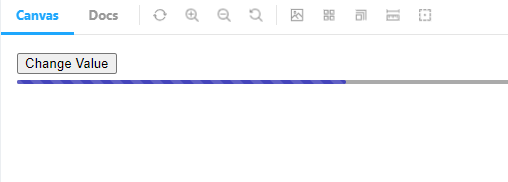
- 버튼을 누를 시
keyframe과 CSS animation을 배워야할 것 같다는 생각이 들었다.
당장은 아니더라도 조금씩 익숙해질 필요가 있어보인다.