Flutter 프로젝트 구조
hello_world
	ㄴ .dart_tool
	ㄴ .idea
	ㄴ android 		- Android 빌드 시 필요한 파일들이 포함된 디렉토리
	ㄴ build
	ㄴ ios   		- iOS 빌드 시 필요한 파일들이 포함된 디렉토리
	ㄴ lib   		- 소스 패키지
	ㄴ test  		- 테스트 코드 패키지
	ㄴ .metadata
	ㄴ .packages
	ㄴ analysis_options.yaml
	ㄴ hello_world.iml
	ㄴ pubspec.lock
	ㄴ pubsepc.yaml  - 앱 이름, 버전, 의존성, 리소스 경로를 관리하는 파일
	ㄴ README.md
Flutter 앱 구조
Flutter 앱은 일반적으로 다음과 같은 구조를 갖는다.

앱을 구성하는 테마를(MaterialApp 또는 CupertinoApp) 베이스로하여 그 위에 Scaffold(캔버스) 를 그리고 그 위에 AppBar나 Container와 같은 Widget을 덧그리는 형태다.
Flutter는 이러한 모든 요소들을 크게 Widget이라고 표현하고 있으며, Flutter 앱을 구성하는 모든 요소들은 Widget들의 모음이다. 모든 것이 Widget이기 때문에 (화면을 구성하는 레이아웃마저도) 약 1500개 이상의 Widget을 가지고 있다고 한다.
Flutter 구성 요소
Flutter 앱은 위젯의 모음으로 구성된다. 위젯은 StatefulWidget과 StatelessWidget 총 두가지의 종류가 있다.
- StatefulWidget: 화면의 구성이 상태가 변화함에 따라 재구성되어야 할 때 사용하는 위젯이다.
- StatelessWidget: 변화가 발생하지 않는 정적인 화면을 구성할 때 사용하는 위젯이다.
MaterialApp 클래스
MaterialApp 테마 클래스는 Google의 Material 디자인을 사용하는 앱을 만들때 사용된다. 기본적으로 흔히 사용되는 디자인이기 때문에 기본이 되는 클래스라 할 수 있다.
import 'package:flutter/material.dart';
void main() {
// 1. HelloWorld 생성자 호출
runApp(const HelloWorld());
}
// 2. HelloWorld는 SFW 위젯을 확장하는 앱의 기본 클래스
class HelloWorld extends StatefulWidget {
const HelloWorld({Key? key}) : super(key: key);
State<HelloWorld> createState() => _HelloWorldState();
}
// 3. _HelloWorldState는 State를 확장하는 클래스
class _HelloWorldState extends State<HelloWorld> {
Widget build(BuildContext ctx) {
return MaterialApp();
}
}title
title 속성은 사용자에게 보여주는 앱에 대한 설명이다. 최근 사용한 앱 목록 같은 곳에서 표시되는 앱의 제목이다. 그런데 현재 기준으로는 안드로이드나 iOS나 모두 직접 확인이 불가능하다.
Widget build(BuildContext ctx) {
return MaterialApp(
title: 'My HelloWorld App',
);
}theme
Material 위젯에 색상, 폰트, 모양과 같은 시각적 속성을 일관되게 적용되는 테마를 설정한다.
Widget build(BuildContext ctx) {
return MaterialApp(
theme: ThemeData.dark(),
);
}home
앱 실행 시 먼저 표시되는 화면을 설정한다. 주로 Scaffold 위젯을 사용하여 정의한다.
Widget build(BuildContext ctx) {
return MaterialApp(
home: Scaffold(),
);
}routes
화면 전환 시 named route를 정의하여 다른 화면으로 전환시키는 역할을 한다.
Scaffold
Material 디자인의 시각적인 레이아웃 구조를 구현하는 위젯이다.
appBar
Scaffold 상단에 표시되는 앱바를 표시하는 속성이다. 주로 화면의 제목과 액션 버튼을 제공한다.
Widget build(BuildContext ctx) {
return Scaffold(
appBar: AppBar(
title: const Text('Hello World!'),
),
);
}
backgroundColor
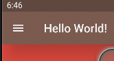
Scaffold 화면의 배경색을 지정하는 속성이다.
Widget build(BuildContext ctx) {
return Scaffold(
appBar: AppBar(
backgroundColor: Colors.red
),
);
}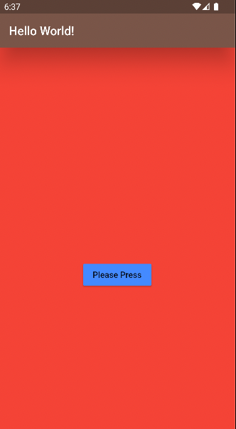
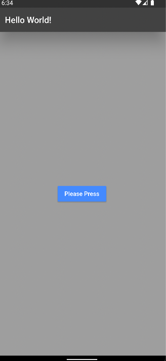
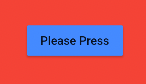
body
Scaffold 화면의 콘텐츠를 표시하는 속성이다.
Widget build(BuildContext ctx) {
return Scaffold(
body: Center(
child: MaterialButton(
child: const Text('Please Press'),
),
),
);
}
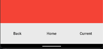
bottomNavigationBar
화면 하단에 네비게이션 바를 표시하는 속성이다. 주로 하단에 탭바를 지정해서 화면에 대한 전환을 구성하는데 사용된다.
Widget build(BuildContext ctx) {
return Scaffold(
bottomNavigationBar: NavigationBar(
destinations: [
MaterialButton(
onPressed: () {},
child: const Text('Back'),
),
MaterialButton(
onPressed: () {},
child: const Text('Home'),
),
MaterialButton(
onPressed: () {},
child: const Text('Current'),
),
],
),
);
}
drawer
화면 좌/우측에 터치 시 표시되는 패널을 표시하는 속성이다.
Widget build(BuildContext ctx) {
return Scaffold(
drawer: Drawer(),
);
}
AppBar
AppBar 클래스는 Scaffold 상단에 표시되는 제목 표시줄이다.
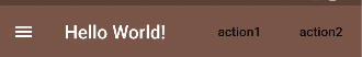
actions
AppBar 좌측에 표시되는 행위를 위한 버튼 위젯 목록을 선언하는 속성이다.
Widget build(BuildContext ctx) {
return Scaffold(
appBar: AppBar(
actions: [
MaterialButton(
child: const Text('action1'),
),
MaterialButton(
child: const Text('action2'),
),
],
),
);
}
backgroundColor
AppBar 배경색을 지정하는 속성이다.
Widget build(BuildContext ctx) {
return Scaffold(
appBar: AppBar(
backgroundColor: Colors.brown
),
);
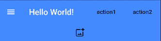
}bottom
AppBar 하단에 표시되는 위젯의 속성이다. 주로 TabBar를 구성할 때 사용된다.
Widget build(BuildContext ctx) {
return Scaffold(
appBar: AppBar(
bottom: const Tab(
icon: Icon(Icons.add_photo_alternate_outlined),
),
),
);
}
centerTitle
AppBar 타이틀을 중앙 정렬하는 속성이다.
Widget build(BuildContext ctx) {
return Scaffold(
appBar: AppBar(
centerTitle: true,
),
);
}elevation
AppBar에 z좌표를 부여하는 속성이다. Shadow 효과가 나타난다.
Widget build(BuildContext ctx) {
return Scaffold(
appBar: AppBar(
elevation: 30,
),
);
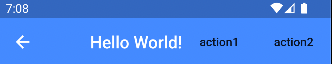
}leading
타이틀 앞에 위젯을 배치시킬 수 있는 속성이다. 주로 화면 전환 시 뒤로가기 버튼을 표현하는데 활용된다.
Widget build(BuildContext ctx) {
return Scaffold(
appBar: AppBar(
leading: const BackButton(),
),
);
}
title
AppBar에 제목을 작성하는 속성이다.