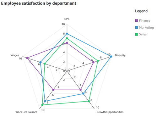
A spider chart, also sometimes called a radar chart, is often used when you want to display data across several unique dimensions. Although there are exceptions, these dimensions are usually quantitative, and typically range from zero to a maximum value.
<template>
  <div>
    <highcharts :options="radarOptions"></highcharts>
  </div>
</template>

<script>
export default {
  name: "RadarChart",
  props: {
    categories: {
      type: Array,
      default: () => ['전력', '부생가스', 'LNG', '스팀']
    },
    riskData: {
      type: Array,
      default: () => [1, 1, 2, 0]
    }
  },
  data() {
    return {
      radarOptions: {
        chart: { polar: true },
        title: { text: null },
        pane: { size: '80%' },
        xAxis: {
          categories: this.categories,
          tickmarkPlacement: 'on',
          lineWidth: 0
        },
        yAxis: {
          gridLineInterpolation: 'polygon',
          lineWidth: 0,
          min: 0,
          max: 2,
          tickInterval: 1,
          labels: {
            formatter: function () {
              return ['양호', '주의', '경계'][this.value] || this.value;
            }
          }
        },
        tooltip: {
          formatter: function () {
            const riskText = ['양호', '주의', '경계'][this.y];
            return `<b>${this.point.category}</b><br/>위험도: ${riskText} (${this.y})`;
          }
        },
        legend: { enabled: false },
        series: [
          {
            name: '위험도 점',
            type: 'scatter',
            data: this.riskData.map((v, i) => ({
              y: v,
              color: v === 0 ? '#28c935' : v === 1 ? '#ffed2c' : '#bf2329',
              category: this.categories[i]
            })),
            pointPlacement: 'on',
            marker: {
              enabled: true,
              radius: 5,
              symbol: 'circle'
            },
            enableMouseTracking: true
          },
          {
            name: '위험도 선',
            type: 'line',
            data: this.riskData,
            pointPlacement: 'on',
            lineWidth: 1,
            color: 'rgba(67, 67, 72, 0.4)', // 연한 회색
            // color: 'rgba(191, 35, 41, 0.4)', // 연한 빨강
            marker: { enabled: false },
            enableMouseTracking: false
          }
        ],
        credits: { enabled: false }
      }
    };
  }
};
</script>

Hi!